Week 8: Reading Reflection

I have always wondered whether I prefer form or function. To me, one of the most beautiful things in life is something non-functional, like my dad’s broken handheld camera that sits in my room back home. It doesn’t work or anything, but it has a vintage and worn-down look that I find appealing. I have attached a sense of history and personal meaning to it. I often think about my childhood memories and imagine my parents using it to film. As you grow older, it becomes harder to distinguish truth from fiction. However, I do have digitized videos from that camera from before. On the other hand, I’m not sure if I would be happy to have other non-functional items, such as my phone and laptop. I don’t want to deal with going to shady markets to get them fixed, but I also don’t want to pay Apple a lot of money when I can just buy a new laptop. There are so many more examples, and I can never truly establish which one I prefer more because i see it as a spectrum or a venn diagram. Objects inherently don’t have any meaning, we attach it to them, the good design we generally agree upon is also a product of the social and cultural era we live in. What might have been a perfectly fine clay container of the past is replaced by a stainless steel or glass container right now. Sure there are differences, but the aesthetic judgement or value we attach to this product is as I said a product of shifting tastes and consumer markets.

I was surprised by the reading on Margaret Hamilton. Of course, I was amazed by her visionary work in the 60s, but I was also intrigued by how coding was done back in those days. Currently, I’m accustomed to using p5.js and the Arduino IDE, where I can easily write code in English using familiar constructs like if, else if, and for loops. It’s much more understandable and accessible to us now. However, reading about how the most prominent scientists had to work with memory and hardwired code (I didn’t know about punch cards before this), it wasn’t entirely surprising, but it did put into perspective how far we have come in terms of technology and how much more accessible it has become.


Week 8: The Sims Green Crystal Connection

^Video of how it works!

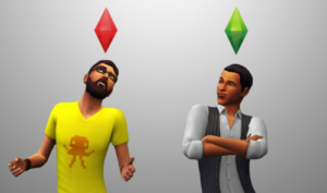
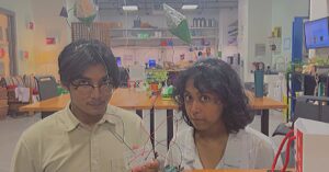
I decided on concept for this no-hands switch inspired by the Sims costume my friends did for Halloween. They had made these green crystals (they call it the Plumbob in the games) which we tied to a headband so it stays up on their heads.

Some images for reference:

I basically attached some aluminum foil to 3 sides of the crystal and that acted as the switch. Whenever 2 crystals touch each other, the LED starts lighting up.

Overall, I found it really fun to play around with the circuits. Maybe next time, instead of paper, I could use aluminium crumples to make the crystal and color it green so it is conductive from all sides and it would also look shiny as a bonus!

Midterm Project: “BOOGIE BOX”

https://editor.p5js.org/Saiki/sketches/3jMTkdbOt

CONCEPT 

As mentioned earlier, the concept of my drum machine was inspired by playing around with online drum pads/drum machines on the internet. After discovering p5.Sound, I wanted to challenge myself and gain a better understanding of audio programming while also creating music. It seemed like a fun idea to pursue.

For the artistic vision of the project, I drew inspiration from the minimalist design often used by electronic music producers. The default Helvetica font is popular in this style, and it complemented the minimal CSS I added, making it easier to define the desired aesthetic.


CODING TRANSLATION

The biggest challenge in my code was understanding the p5.Sound library. In hindsight, I realized that using the tone.js library might have made my life easier, but that’s a lesson for another day. One of the main aspects of audio programming was figuring out how to convert the beat array into p5.Phrase and p5.Part processes. Think of p5.Phrase as individual tracks in an audio DAW and p5.Part as the master audio track that encompasses all the multiple drum beat tracks.

Once that was accomplished, the challenge shifted to finding a way to change the value of the array based on mouse clicks on the grid and obtaining the index of the clicked cell to modify the array. After that, my focus shifted to styling the canvas and adding fun functions like shuffle beat. I found that my previous experience with if-else statements and for loops in previous classes greatly aided me in defining these functions.

HIGHLIGHT

The part I am most proud of is figuring out how to change the index of the three drum arrays.

// determines whether a beat/note is played when mouse is clicked on the grid
function mousePressed() {
  // let rowClicked = floor(3*mouseY/height)
  let rowClicked = floor((3 * (mouseY - 50)) / (height - 135));

  // let indexClicked = floor (16*mouseX/width)
  let indexClicked = floor((16 * (mouseX - 50)) / (width - 100));

  if (rowClicked === 0) {
    console.log("1st row" + indexClicked);
    hhPat[indexClicked] = +!hhPat[indexClicked];
  }
  if (rowClicked === 1) {
    console.log("2nd row");
    cPat[indexClicked] = +!cPat[indexClicked];
  }
  if (rowClicked === 2) {
    console.log("3rd row");
    bPat[indexClicked] = +!bPat[indexClicked];
  }

  //   updates the matrix with shapes added/removed
  drawMatrix();
}


REFLECTION

In my next iteration of the code, I would like to add a button that clears the code. Additionally, I would like to include more diverse drum sounds that can be selected through a menu. It would be a cool function to be able to change the time signature of the beat setup from 4/4 to 3/4 or 7/8. There is ample room for customization, but for now, I am content with establishing the foundation of this project.

Midterm Progress Report #2 Drum Machine

The progress on the midterm so far has been quite significant. I have realized that understanding and utilizing the p5.sound library is more challenging than I initially thought. The language of audio, with terms related to sample rate and frequency, took me some time to grasp, and I’m still unsure if I fully understand it. At this point, I have created the layout for the drum machine, which is interactive and responds to user clicks. I have included three sections for hi-hat, clap, and bass samples in the “drums” p5.part using the addPhrase method. I tried adding more samples, but for some reason, the audio keeps getting distorted on my browser. I looked it up online, and it seems to be a common issue with p5.js on the Chrome browser, so I am attributing it to that for now. I might test it with a different browser later but for now I am happy with having three rows of drum beats.

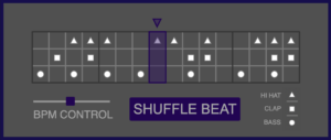
Currently, I have two versions of my project to display. One version has a background canvas, while the other version uses individual PNG files of the drum parts instead of circles to give visual cue as to which specific drum phrase is triggered. I made 2 functions: drawMatrix() and canvasPressed() for updating the grid on the canvas for when users deselect and add a 16th note phrase to the drum loop.

Press space to hear the beat.(open the sketch link)

https://editor.p5js.org/Saiki/full/m6MkI9vMD

Drum Icon Version (you can de-select/add beats in this version)

https://editor.p5js.org/Saiki/sketches/Mtr3z9iJ8

I have encountered some difficulties when implementing OOP (Object-Oriented Programming) into my code. I attempted to use a class called “Pattern” to create different drum phrases. However, when working with p5.part and p5.phrase, it did not function properly.

Additionally, I still need to add a start screen to my drum machine. I have implemented a BPM (Beats Per Minute) control slider, which I will provide captions for to make its purpose more obvious. For now, I am content that my project is functional, and I will now focus on refining the details to create a cohesive experience.

Week 5 – Reading Reflection

Computer vision algorithms have transformed the way I approach art and real-world problem solving. These algorithms track people’s activities in real-time, providing reports on identities, locations, gestures, and more. As a novice programmer, I have found it easy to implement user-friendly vision techniques quickly, while artists and designers can access advanced toolkits through popular authoring systems like Max/MSP/Jitter etc.

Software authoring tools have become more user-friendly, enabling art and design students, as well as novice programmers, to create interactive experiences for the web, installations, performances, kiosks, and prototypes. The integration of live video cameras as inputs has fueled the demand for straightforward computer vision capabilities.

Implementing machine vision techniques directly using environments like Processing, with its graphical capabilities, has proven rewarding. Computer vision has revolutionized art by enabling interactive and immersive experiences. In real-world problem solving, it has transformed fields like surveillance, robotics, and healthcare. Its ability to analyze visual data opens up new possibilities for understanding and addressing complex challenges and the reading has left me feeling more clear with what could be achieved with such stuff.

Midterm Progress Report #1 Drum Machine

Concept

The idea is to make a drum machine is on loop and where the user can tinker with the different sounds of the drum machine to create a beat. It’s a super fun thing to do and I thought it would be cool to learn how to make one, since it also is useful for me to teach more of the p5.sound library while at it.

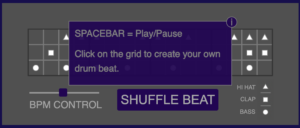
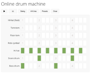
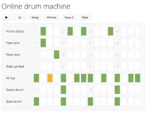
This is a reference image for a general drum machine you can find online:

My current progress has been learning about the p5 sound library and the various options available with it. Currently using p5.Phrase array and p5.Part, I have been able to create a working but kinda annoying hihat beat. My aim is to add more drum sounds into the p5.Part and make options available for stuff such as bpm select, volume, play/stop functionality as well.

I am currently still figuring out how it will look like, however for now i am focusing on the function so I figure out if it can work.


Week 4 – Reading Reflection

Norman’s book, “The Psychopathology of Everyday Things,” explores the significance of design in facilitating communication between users and objects or services. Written by a cognitive scientist, the book delves into different psychological theories and concepts that determine good and bad design. Norman focuses on discussing design principles that become apparent when a design malfunctions.

Norman introduces the concepts of affordances and signifiers, which play a crucial role in creating a user-centered design experience. Affordances refer to the perceived or unperceived capabilities of objects we interact with daily, while signifiers aid in facilitating the user experience by providing clear communication of purpose and structure. Despite their importance, signifiers can sometimes be misleading. Mapping and feedback are also vital factors in creating a cohesive user experience. Mapping deals with the connection and correspondence between different elements within a design, while feedback ensures that users receive adequate and vivid information about the results of their actions.

Norman’s analysis emphasizes the key design concepts and elements needed for a productive user experience. It highlights the importance of considering psychology, ergonomics, and design principles in basic object design.

Assignment 4 – F1 2021 WDC Points Tally Data Visualization

Concept

I just recently got back into F1. I have a sporadic relationship with it, sometimes not watching at all, and then for 3-4 races straight, I’ll be checking out all the different reports about the new Ferrari engine or whatnot. But basically, my data visualization came out of wanting to show a graphic representation of the points table at the end of the 2021 F1 Season which what got me into it as the final race also happened in Abu Dhabi.

I decided to create a bar table that shows the points tally for Formula 1, while incorporating elements that represent the essence of the sport. I obtained the data for the drivers, teams, and points tally from a Wikipedia table, which I extracted into a CSV file using a free online web tool. I cleaned up the data as necessary. Additionally, I wanted to include the team colors and the cars used by the 10 teams in the 2021 season. To add a dynamic element, I incorporated a smoke effect, giving the impression that the cars are revving.


Highlight

Besides loading the images next to the tally bar, the highlight of my code was definitely the smoke effect which was relatively easy using a Smoke class and put the instances of the object through an array to display them as they widdle out and get removed.

// smoke class!
class Smoke {
  
    //Constructor will take 2 parameters: x and y position
    constructor (x ,y ) {
        this.x = x;
        this.y = y;
      
        //Smoke radius
        this.r = 3;
      
        //Smoke velocity (for some motion)
        this.vx = random(-3,-2); 
        this.vy = -1; //Up
        this.color = 190;
        this.alpha = 235;
    }
    show() {
        noStroke(); //No borders on smoke
        fill(this.color, this.alpha); //Fill Ellipses
        ellipse(this.x, this.y, this.r); //Create Ellipses
    }
    update() {
        //Move smokes
        this.x += this.vx;
        this.y += this.vy;
      
        //Make smoke disappear slowly
        this.alpha -= 15; 
      
        //Make smokes bigger
        if (this.r != 5) {
          this.r += 1;
        }
    }
    delete() {
        return (this.alpha <= 0); //If smoke disappears, return true and remove it from smokes array.
    }
}


Reflection

This project was enjoyable for me, as it involved analyzing fascinating data and reflecting on Ferrari’s unfortunate performance this season, which is disheartening as I am a supporter. However, it was still an exciting season overall, especially since the championship title was decided in the final race.

As an additional feature, I would like to include an initial loading screen where the cars start moving from the driver name area and stop at specific x distances corresponding to the driver’s points.

Week 3 – Reading Reflection

Chris Crawford’s reading on what defines interactivity was both frustrating and informative. Personally, I wasn’t a big fan of the pre-internet sense of humor presented in the reading. It often felt like Crawford was overlooking levels of subjectivity and nuances regarding interactivity in mediums such as books and movies. These aspects could have been explored more thoroughly instead of being briefly touched upon. However, the reading provided valuable insights into how interactivity became part of the collective technology lexicon, how it was distorted by various products, and the potential it still holds for the future.

I agree with the idea of interactivity being just a feature of a piece of art or a product, it does not inherently imply merit, which Crawford seems to propose as well. I thought the gradient of interactivity from zero, low to high seemed fruitful, however Crawford’s inisistence on an objective understanding of interactivity was honestly frustrating, but atleast he played into the fact that i cant argue with him through the book.

I found the distinction between a user experience designer and an interactivity designer fascinating. The idea that graphic designers who primarily focus on form and then implement function are not considered interactive designers makes sense. Interactivity requires an equal level of emphasis on both form and function from the beginning in order to provide a “good” interactive experience.

Overall, I found the reading to be thought-provoking. It made me reflect on the importance of interactivity in technology and helped me define my own understanding of interactivity, whether it is “two actors that listen, think, and speak to each other,” or something different.

Assignment 3 – “welcome to fish school!”

Concept

So, my concept was primarily inspired by Coding Train’s video on the starfield. Initially, it was just a practice video for me to learn how to create a starfield. As I worked on it, I came across other starfield videos, such as the one by Barney Codes, which helped me understand the intricacies and complex techniques involved in creating a starfield. These techniques included pushing and popping elements from arrays, using velocity increments, and adjusting background opacity to achieve the famous trail effect.

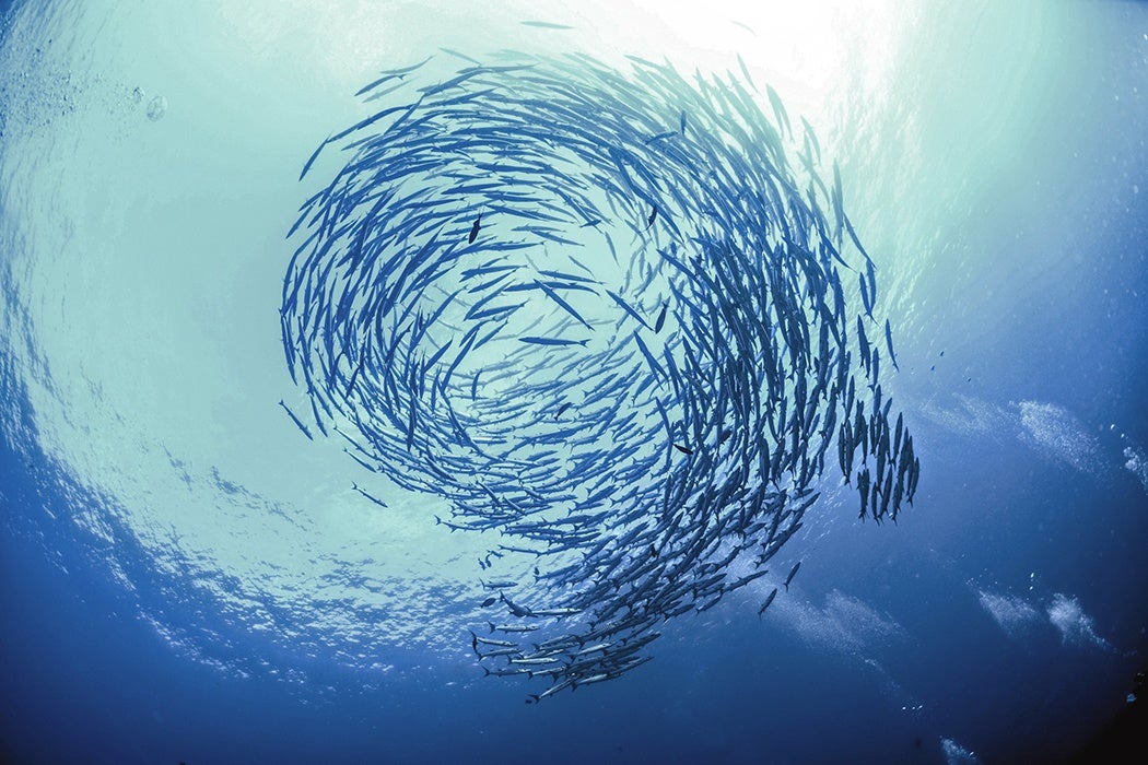
To add a unique twist to the concept, I decided to make the movement more angular and dependent on the mouse, introducing interactivity. This led to the idea of creating a generative art piece resembling a school of fish, where the movement of the mouse also influences the way the fish move.

Fish School

The code that I am most proud of is the way I added angular movement to the “fish trail”. Despite not having done math in a while, I refreshed my knowledge of trigonometry before experimenting with the arctan function and mouse coordinates (mouseX/Y) to create dynamic angles between the origin, previous position, and current position. This resulted in a fish-like movement that works well when moving the mouse around.

// for more dynamic angular movement of fish i.e velx vely and the inverse tan function with mouseX and mouseY values
    this.velx = map(mouseX,0, width, 0,5)
    this.vely = map(mouseY,0,height,-3,5)
    
    this.vel = createVector(this.velx, this.vely);
    
    this.ang = atan2(y - (mouseY/2), x - (mouseX/2) );


Reflection:

I feel more confident in using mathematical functions and coding with p5.js in general. I’ve realized that it’s not always necessary to start from scratch when writing code. Instead, I can be inspired by existing functions, adapt them for my own use case, and come up with new concepts. Even the more challenging math aspects can be intimidating at first, but once I figure out an equation, it becomes enjoyable to tweak and play with the values. Sometimes, I don’t even know where the project will end up, which adds to the fun. As for the project itself, I plan to find a way to give the initial screen a fish-like quality from the beginning, rather than it only appearing once mouse movement starts. Currently, it looks like a regular starfield until then, which can be jarring.