Midterm Progress/ Reading response – Shaikha AlKaabi

Midterm Project Progress:

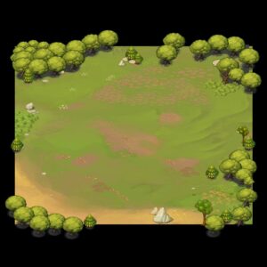
Whimsical Garden: Seasons of Growth is a point-and-click game where players nurture a magical garden through the changing seasons. The core gameplay involves planting, watering, and harvesting a variety of plants, each with unique needs. The game is a garden simulation where the player’s objective is to grow and manage a garden. You start by planting a flower in a location of your choice within a designated area. As the game progresses, you need to water the plants to ensure they grow. If a plant doesn’t receive water for too long, it will wither and die. Players must balance their attention between different plants, making strategic decisions about which plants to water with their limited resources. The challenge lies in keeping all plants alive and thriving, which becomes more difficult as the garden grows in size and complexity. The game ends when the player successfully maintains the garden for a certain period, or if all the plants die. There’s an option to restart the game after completion to try different strategies or improve your previous score.

Game Structure:

1. Start Screen: The game opens with a start screen that displays instructions for playing. This screen explains the basics of gardening mechanics, seasonal changes, and the objectives of the game. The start screen awaits user input (such as pressing a ‘Start’ button or hitting a specific key) to begin the game.

2. Gameplay Session: Once started, the player enters the main gameplay area, where they manage their garden through the various seasons, facing challenges like planting, watering, harvesting, and solving environmental puzzles.

3. End Session and Restart: After a gameplay session is completed (which could be defined by reaching a certain goal, surviving through a set number of seasons, the game transitions to an end screen. This screen summarizes the player’s achievements and offers the option to start a new session. Choosing to start a new session resets the game environment , allowing players to begin with a fresh garden.

Challenges:

1. Managing Game States: Implementing a system to manage different game states (e.g., start screen, active game, end screen) is crucial. This requires careful design to ensure smooth transitions between states based on user inputs.

2. Session Reset Functionality: Developing a way to reset the game environment for a new session without restarting the sketch poses a challenge. This involves resetting game variables, clearing the garden area, and preparing the game for a new set of seasonal cycles.

3. User Input Handling: Creating an intuitive and responsive input system for navigating between the start screen, gameplay, and restart option is essential. This includes implementing event listeners for keyboard, mouse, or button inputs that trigger the correct actions within the game’s flow.

By addressing these challenges, Whimsical Garden: Seasons of Growth aims to offer a rich and engaging gameplay experience that is accessible, educational, and enjoyable for a wide range of players.

let gameState = 'start'; // Possible states: 'start', 'game', 'end'
let garden = [];
let restartButton;

function setup() {
  createCanvas(600, 600);
  textAlign(CENTER, CENTER);
  
  // Restart button (hidden initially)
  restartButton = createButton('Restart');
  restartButton.position(width / 2 - 50, height / 2 + 20);
  restartButton.mousePressed(restartGame);
  restartButton.hide();
}

function draw() {
  background(161, 196, 170);
  
  if (gameState === 'start') {
    drawStartScreen();
  } else if (gameState === 'game') {
    drawGarden();
  } else if (gameState === 'end') {
    drawEndScreen();
  }
}

function drawStartScreen() {
  textSize(32);
  text('Whimsical Garden: Seasons of Growth', width / 2, height / 3);
  textSize(25);
  text('Click to start', width / 2, height / 2);
}

function drawGarden() {
  for (let plant of garden) {
    // Simple representation of plants
    fill(20, 180, 60);
    ellipse(plant.x, plant.y, 20, 20);
  }
  
  // Example end condition: 5 plants
  if (garden.length >= 5) {
    gameState = 'end';
    restartButton.show();
  }
}

function drawEndScreen() {
  background(47, 54, 50);
  textSize(50);
  fill(184, 46, 64);
  text('Garden is Full!', width / 2, height / 3);
  textSize(25);
  text('Restart to play again', width / 2, height / 2);
}

function mousePressed() {
  if (gameState === 'start') {
    gameState = 'game';
  } else if (gameState === 'game' && mouseY < height - 100) {
    // Allow planting only within the game area (excluding UI elements, e.g., buttons)
    plantSeed(mouseX, mouseY);
  }
}

function plantSeed(x, y) {
  // Add a new plant to the clicked position in the garden
  garden.push({x: x, y: y});
}

function restartGame() {
  garden = []; // Clear the garden
  gameState = 'start'; // Set game state back to start
  restartButton.hide();
}


Reading Response: 

We’ve come a long way in how we interact with computers, starting with some really early virtual reality that let people play in digital spaces just by moving around. Myron Krueger was one of the first to make this happen with his Videoplace, and it was a big step forward because it made the connection between people and computers feel natural and easy.

Then there’s Bob Flanagan’s Suicide Box, which is a lot more serious. It’s a piece of art that makes us think about tough topics like sickness and the choice to end one’s life. It’s a strong reminder that technology can do more than just entertain us; it can also make us think deeply about life’s big questions.

Understanding how these systems work is pretty cool too. They can tell the difference between what’s important for the interaction and what’s just background noise. They look for the brightest spot they can find to keep track of what the user is doing. This is really important for making games and art installations where you can move around and have the game or art react to what you’re doing.

Jonah Warren’s Master’s thesis takes this idea further. He found new ways for games to understand our body movements. He talks about direct ways to interact with games, like touching, covering, or mirroring, which are now common in games that use body movement for control.

From the early days of virtual reality to the deep questions raised by interactive art, and the nitty-gritty of tracking movement, it’s clear that the way we communicate with computers has many sides to it. Technology keeps getting better, and it changes how we play, create, and think about the world. The field of human-computer interaction is really about connecting with each other, sharing ideas, and getting to grips with both the real and digital worlds we live in.

Assignment 4 / Reading Response – Shaikha AlKaabi

For this week’s assignment the main goal was to make the letters of the word “Cotton Candy change color to shades of pink, purple, or blue and to float when the mouse hovered over them, with an automatic reset of the effect after a specified time.

One of the challenges faced was ensuring that the floating effect was smooth and visually appealing. This required fine-tuning the sine function used to calculate the floating amounts so that the movement would be gentle and continuous. Another challenge was to center the word on the canvas regardless of the window size, which involved calculating the correct positioning for each letter relative to the canvas dimensions for which I applied what we learned in class.

A highlight of the code that I’m particularly proud of is the implementation of the timed reset function. This feature automatically resets the color and floating effect every  seconds, which gives the sketch a dynamic feel as it periodically returns to its original state without user intervention. This was achieved by using the modulo operator with the `frameCount` variable that keeps track of the number of frames since the sketch started.

Here’s the snippet of the code responsible for the timed reset:

// Reset colors and floating effect 
if (frameCount % resetInterval == 0) {
  resetEffects();
}

// Function to reset colors and floating effect
function resetEffects() {
  for (let i = 0; i < letters.length; i++) {
    letterColors[i] = color(255, 182, 193); // Reset color to pink
    floatingStartFrames[i] = -resetInterval; // Ensures the effect is stopped
    floatingAmounts[i] = 0; // Reset floating amount
  }
}

This part of the code demonstrates the use of a simple yet powerful timing mechanism, allowing for periodic actions without the need for complex timing functions. It also shows how a clear understanding of the p5.js framework’s drawing loop can be used to create interactive and dynamic animations. Overall, despite the challenges, this project was an enjoyable and educational experience in using p5.js to create engaging visual effects.

Reading Response: 

In his book, “The Design of Everyday Things,” Don Norman hits on something we all kind of know but don’t always talk about: how everyday stuff around us can be super annoying when they’re badly designed. He’s not just talking about making things pretty, he’s diving deep into why we struggle with simple things like doors and switches and how good design can make our lives way easier.

Norman drops some real talk about design concepts, like affordances and signifiers. Affordances are basically what an object lets us do, and signifiers are like hints or clues on what actions we can take. It sounds fancy, but it’s really about making stuff user-friendly.

He brings up some wild examples that show just how weird design can get. Like, ever heard of a sink in a fancy London hotel that makes you dirty your hands again just to drain it? Or a wall in Korea that wasn’t meant to be a shelf but ended up as one because it looked like it could hold your coffee cup? These stories aren’t just funny, they show how designs can mess with our heads.

Then there’s the Coffeepot for Masochists – a design so backward it’s like a joke, but it actually makes a point about how not to design things. And those confusing doors that don’t tell you whether to push or pull? We’ve all been there, and Norman uses these everyday traps to show why design needs to be clear and intuitive.

Even digital watches get a shout-out for being needlessly complicated. Why do we need a manual to tell time? On the flip side, Norman props up car seat controls that just make sense because they mimic the seat’s layout. It’s like, why can’t all things be this straightforward?

So, what’s Norman really getting at? He’s saying that design isn’t just about looking good, it’s about making our interactions with objects smooth and natural. Designers need to think about how we, as humans, use stuff and then make it as easy as possible for us. It’s about getting the small things right, so we don’t end up fighting with a door or a coffeepot. In a way, Norman’s book is a call to make the world a less frustrating place, one well-designed object at a time.

Assignment 3 / Reading Response: Shaikha Alkaabi

For this project, I was super inspired by those amazing nights spent away from the city lights in the dessert, looking up at a sky full of stars. I wanted to try and capture a bit of that night sky with code.

I started by creating a bunch of twinkling stars using classes and arrays, which felt a bit like putting together a digital constellation. The fun  started when I played around with the `noise` and `sin` functions to make the stars change colors and gently pulse. 

Adding a gradient background to mimic the night sky’s colors was a bit tricky at first, but once I got it, it really brought the whole scene together. The whole process was a lot of trial and error, but seeing the final result was totally worth it. It was a cool mix of creativity and coding.


Code:

let stars = [];

function setup() {
  createCanvas(600, 500);
  for (let i = 0; i < 100; i++) {
    stars.push(new Star());
  }
}

function draw() {
  // To set the gradient background from blue to black
  setGradient(0, 0, width, height, color(25, 25, 112), color(0), Y_AXIS);
  
  // Update and display each star
  for (let star of stars) {
    star.update();
    star.display();
  }
}

// Function to create a vertical gradient background
function setGradient(x, y, w, h, c1, c2, axis) {
  noFill();
  for (let i = y; i <= y + h; i++) {
    let inter = map(i, y, y + h, 0, 1);
    let c = lerpColor(c1, c2, inter);
    stroke(c);
    line(x, i, x + w, i);
  }
}

// Constant to specify vertical gradient
const Y_AXIS = 1; 


class Star {
  constructor() {
    this.x = random(width);
    this.y = random(height);
    this.size = random(0.5, 3);
    this.t = random(TWO_PI);
    this.color = color(random(255), random(255), random(255), random(100, 255));
  }

  // Update the star's properties
  update() {
    this.t += 0.02; 
    this.size = this.size + sin(this.t) * 0.5;
    // Randomly move the star
    this.x += random(-1, 1);
    this.y += random(-1, 1);

    // Change the star's color using Perlin noise for smooth transitions
    this.color = color(
      noise(this.t) * 255,         
      noise(this.t + 5) * 255,     
      noise(this.t + 10) * 255,    
      random(100, 255)             
    );
  }

  display() {
    noStroke(); 
    fill(this.color); 
    ellipse(this.x, this.y, this.size); 
  }
}

The provided code is designed to create a gradient background transitioning from a dark blue color to black. This effect is achieved by calling the `setGradient` function with specific parameters: the starting coordinates `(0, 0)`, the width and height of the canvas (`width`, `height`), the initial color (dark blue, defined by `color(25, 25, 112)`), the final color (black, defined by `color(0)`), and the direction of the gradient (`Y_AXIS`). This setup results in a vertical gradient that fills the entire canvas, creating a visually appealing background effect for graphics or visualizations.

Reading Response:

In the book “The Art of Interactive Design,” Chris Crawford explains that true interactivity is like having a good conversation. For something to be interactive, both sides need to listen, think, and then speak or react. He argues that many things we call interactive, such as books or movies, aren’t truly interactive because they don’t allow for this two-way communication. Crawford points out that simply pressing a button isn’t enough, there needs to be a deeper level of engagement where both the user and the system or product can exchange information and respond to each other in a meaningful way.

Crawford also criticizes how the word “interactive” is often used more for marketing than to describe a genuine interactive experience. He warns that this can lead to confusion and disappointment when the interaction isn’t as rich as expected. He urges designers and users to think more critically about what interactivity means and to seek out or create experiences that allow for a genuine conversation-like exchange, where both parties can learn and adapt from the interaction. The book challenges readers to look beyond the hype and to strive for genuine, quality interactivity in technology and design.

Reflection

Casey Reas’ exploration of chance operations, as presented in his Eyeo Festival talk, provides a fascinating lens through which we can view the intersection of randomness and structured systems within the realm of digital art. 

Reas’ work, which combines the precision of algorithms with the unpredictability of random events, challenges the conventional notion of control in the creative process. This duality of chaos and order, as showcased in his artworks, prompts us to reconsider the role of the artist in the age of digital creation. 

The historical context provided in Reas’ talk, linking back to earlier practices of chance operations in art, enriches our understanding of this concept. This perspective not only bridges the gap between past and present art practices but also illuminates the continuous search for balance between intentionality and serendipity in artistic expression.

In reflecting on Reas’ presentation, it’s clear that the inclusion of chance operations within the realm of digital art opens up new avenues for creativity. It challenges artists to give up a degree of control, allowing randomness to introduce unique, unrepeatable elements into their work. This approach not only enriches the aesthetic and conceptual dimensions of the artwork but also mirrors the complexity and unpredictability of the world around us.

Overall, Casey Reas’ talk at the Eyeo Festival serves as a compelling reminder of the potential that lies at the intersection of technology, art, and randomness. His exploration of chance operations invites us to embrace the unpredictable, seeing it not as a limitation but as a source of endless creative possibilities.

Assignment 2- Shaikha AlKaabi

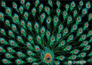
For this week’s assignment I wanted to create a feather-like magazine design. I got some inspiration from Peacock feathers since they are known for their iridescent colors and striking patterns, featuring an eye-like design.  While working on the code I wanted each “feather” to move whenever the mouse move over it so I used the sin function to scale the flutter effect. 


A code that I’m particularly happy about is the one that creates an ombre effect on the “feathers”:

let inter = map(i, 0, featherHeight, 0, 1);

let col = lerpColor(c1, c2, inter);

This code helps the colors to smoothly change from c1 and c2 creating the ombre effect.

let featherWidth = 100;
let featherHeight = 100;
let cols, rows;
let c1, c2;

function setup() {
  createCanvas(400, 400);
  cols = width / featherWidth; 
  rows = height / featherHeight * 2; 

}

function draw() {
  background(255);
  for (let i = 0; i <= cols; i++) {
    for (let j = 0; j <= rows; j++) {
      let x = i * featherWidth;
      let y = j * featherHeight / 2;

      // Adjusting for every other row to create a staggered effect so that the feathers dont overlap
      if (j % 2 === 0) {
        x += featherWidth / 2;
      }

      // Check if the mouse is over the current feather shape
      let mouseOver = dist(mouseX, mouseY, x, y) < featherWidth / 2;

      drawFeather(x, y, mouseOver);
    }
  }
}

function drawFeather(x, y, mouseOver) {
  if (mouseOver) {
    // Generate a gradient of colors for the ombre effect
    c1 = color(random(255), random(255), random(255), 100);
    c2 = color(random(255), random(255), random(255), 100);
  } else {
    c1 = color(0, 100);
    c2 = color(0, 100);
  }

  // Draw and color the feather with a diamond shape using QUAD_STRIP
  noFill();
  strokeWeight(1);
  beginShape(QUAD_STRIP);
  for (let i = 0; i <= featherHeight; i++) {
    let inter = map(i, 0, featherHeight, 0, 1);
    let col = lerpColor(c1, c2, inter);
    stroke(col);
    
    // Introduce fluttery motion when mouse is over
    let flutter = mouseOver ? sin(frameCount / 10 + i / 3) * 2 : 0; // Adjust flutter effect here
    let baseXOffset = sin(map(i, 0, featherHeight, 0, PI)) * featherWidth / 2;
    let xOffset = baseXOffset + flutter; // Apply flutter effect
    vertex(x - xOffset, y + i - featherHeight / 2);
    vertex(x + xOffset, y + i - featherHeight / 2);
  }
  endShape();
}

function mouseMoved() {
  redraw(); 
}


Assignment 1 (Self-Portrait) Shaikha Alkaabi

While working on this assignment, I wanted to recreate my middle school self. I had some experience with Processing so working with P5.js wasn’t so hard to navigate and work with. The thing I struggles with the most in this assignment was the bow. The idea is simple but I never worked with triangles in code before so it was quite difficult trying to figure out the right coordinates. For future assignments I’d like to make my projects much more interactive and fun.


function setup() {
  createCanvas(400, 400);
  background(250, 195, 231);
  rectMode(CENTER);
 

}

function draw() {
  
  //Hair
  fill(99, 64, 18, 20);
  rect(200, 235,160, 250, 70);

  //Dress
  fill(232, 133, 12);
  rect(200, 390, 190, 200,60);
    
  //Neck
  fill(250, 207, 150);
  rect(200, 245, 70, 150);

  //Face
  fill(250, 207, 150);
  ellipse(width/2, height/2, 130, 150);
  
  //right eye
  fill(255,255,255);
  ellipse(173, 200, 25, 25);
  //pupil color
  fill(0),
  ellipse(173, 200, 11, 20);

  //left eye
  fill(255,255,255);
  ellipse(226, 200, 25, 25);
  //pupil color
  fill(0);
  ellipse(226, 200, 11, 20);  

  // Eyebrows
  strokeWeight(3);
  noFill();
  //Left eyebrow
  arc(173, 183, 35, 20, PI, TWO_PI); 
  //Right eyebrow
  arc(226, 183, 35, 20, PI, TWO_PI); 
  
  //Nose
  fill(166, 128, 78);
  ellipse(200, 220, 10, 15);

  //Mouth
  fill(255,255,255);
  arc(200, 240, 40, 40, 0, PI + 0, CHORD);
  
  //Bow
  fill(171, 50, 66);
  ellipse(250, 120, 20, 20);
  triangle(240,120,210,90,230,150);
  triangle(260,120,270,90,300,145);

  
  //Earings
  fill(237, 192, 66);
  //right earing
  ellipse(134, 210, 10, 10);  
  //left earing
  ellipse(267, 210, 10, 10);  


}