Reading Response 4

Golan Levins work makes me rethink the role of technology in the creative process. He puts much emphasis on the accessibility of computer vision tools which are often seen as complex to inexperienced programmers. His idea personally excites me as a student of computer science and art. It makes me consider how I can use my programming to enhance my art projects especially in interactive media. I often focus on technical aspects of my work but Levins work has taught me that technology should also work to deepen emotional impact of art works.

I personally resonated and liked his exploration of Myron Krueger’s Videoplace as it was a great example of how one can merge physical presence with digital interactivity. Krueger’s belief in using the whole human body in interaction counters the notion of passive use of technology. I hope to use this idea of full-body engagement with digital systems in my future work.  It makes me question the boundary I set when making interactive systems – am I too focused on screens and isolated user inputs? His work makes me think beyond the basic interactions and imagine more immersive experiences in digital art.

I was  triggered by the social implications of surveillance in artworks like the Suicide Box. The controversy around the suicide box made think of my responsibility as an artist to become mindful of the impact my work has on other people .

Assignment 5 – Midterm Progress

Concept
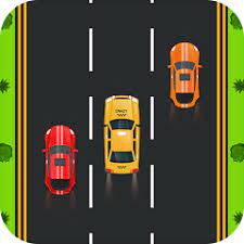
The concept for my midterm is simply my interest in arcade racing games and love for cars. I was inspired by car games such as Asphalt and Forza which I played for most of my childhood and with the knowledge from the class I felt compelled to try and implement some of these games in the best way I can. My objective is to come up with a visually engaging and simple game where a player navigates a car in a street road avoiding obstacles(oncoming traffic).
Other than that, I was eager to come up with something that will be 100% user engaging unlike my other projects and creating a game seemed to cater for this. I wanted to enhance user experience in my projects while also maintaining the good visual style which is appealing like the other projects.


Design
My design is centred around user interaction. It is a user engaging game where the player has to manouver the car across three lanes in all directions with the use of arrow keys and avoid obstacle cars. The background is a road, while the cars on canvas are specifically chosen to be sleek and easily distinguishable. As the player progresses, the game becomes increasingly difficult since the game speeds up gradually. I thought that this design will enhance the game clarity and ease of control, ensuring that the player quickly gets the mechanics but still feel challenged.


Frightening/Challenging Aspects
The most frightening parts while drafting and planning the project was how I will handle the collisions between the cars. This is the most crucial part for the game to function thus I can’t afford any errors in it.
Another challenge might be how I will balance the increasing speed of the game.


Risk Management

To counter this challenges, I did some research on how I can handle collisions and it turned out to be a really simple mathematical logic to compute. I was able to come up with an algorithm that calculates the distance between the player car and the obstacles and since the cars are rectangular it might be easy to handle.

Reading Reflection 3

Reading Don Normans writing left me more aware of how designs of everyday objects really affects our experiences and emotions. His concept of “Norman doors” particularly resonated with me. I have in many occasions been embarrassed by something simple just as opening a door due to poor designed handles or unclear instructions like the doors in D2. Its frustrating how a door can become a source of confusion and even anxiety even when it is a very basic object.  This explanation by Norman made me realise how much I take for granted the simplicity of well-designed objects and how design fails can turn simple interactions into stressful experiences. It was an eye opened for me as a future engineer on the role of design and importance of user-centred designs.

One of the things that I really frustrates me in my everyday life that Norman doesn’t fully talk about is how confusing digital interfaces are. Our phones, for example. The settings menu  always feel like a maze to me. Important options are always hidden under many other menus which makes it hard for me to find what I need quickly. It might be a personal issue but we can agree that the settings application is always frustrating.  I do understand that most digital interfaces don’t always have clear signs or clues, like Normans concept of affordances and signifiers, like physical objects. I believe that these interfaces can be improved and made better by looking into the principles of discoverability and feedback that Norman discusses. His ideas can also be applied in interactive media while designing interactive experiences by ensuring that users understand what actions they can take and how the actions affect the environment.


Assignment 4- SpotiStats

Concept

My inspiration for this weeks project was my love for music. I often spend a lot of time listening to music daily so after a hard time trying to figure out what data I could represent it popped in my mind that I could easily rank my top artists and their number of streams. I was also fascinated by how one can represent any random data in visually appealing way rather than the boring graphs and charts that are usually used. This made me eager to try and represent the music data in a way that is desirable and fun.

Code

Hover above the bubbles to find your popular artist and their number of streams.

Code Highlight

// Set color from red to blue based on position in the sorted array
    this.color = lerpColor(
      color(255, 0, 0, 150),
      color(0, 0, 255, 150),
      index / total
    ); // Gradient from red to blue

I was really proud of how I was able to make my project look more appealing. I had the idea of mixing colours in a pattern that can show the rankings but I did not know how I could do it. After doing some research I came across the lerpColor function which basically enables you to smoothly blend two colors based on some factor. I used it to transition from blue to red with index/total determining the blend. The artists with higher streams appear more red and those with lower are blue.

Reflections/Future improvements
I am proud of what I was able to come up with and how I was able to represent data in p5. Working on this was really useful in helping me understand how to load data and read files using p5. It also exposed me to how powerful p5 can be. For the future I would really love to include music in the work. It would be fun to have each artists best song play when the user clicks to check their data. Other than that I am impressed and proud at my progress.

Reading Response 2

I totally agree with Chris Crawfords definitions and explanation of interactivity and how he breaks it down to three simple actions ; listening, thinking and speaking. While I found these insights  valuable, I felt like he downplayed the concept of unpredictability  in interactions. He relates good interactions to conversations, which I agree, but fails to acknowledge the fact that real conversations have moments of misunderstanding and confusion. How should a program  respond when it doesn’t comprehend user commands? This made me to think deep and come to appreciate the importance of having systems that handles unexpected interactions from users.

Other than that, I find it interesting how Crawford draws a fine line between reactive and interactive systems. Prior to reading I had often confused reactions to interaction, a perception which has now been changed. The way he puts interactive programs as ones that adapt and change based on user input has made me look into how I implement my user interactivity in future projects. I have learnt how incorporating adaptability helps to achieve deeper engagement with inputs by evolving dynamically instead of sticking to a rigid pattern.

Crawfords work has really challenged me and how I come up with my p5 works. I hope to use his ideas of interaction to ensure better user interactivity in my projects

Assignment 3 – KaleidoTiles

Concept
My work was inspired by my exploration of recreating the kaleidoscopic visuals using the concept of optical art that I learnt from the artist Victor Vasarely. His works plays with perception and geometric patterns and color. His work inspired me to create infinitely evolving visuals that portray the kaleidoscope. I was also looking into exploring the concept of randomness in creating art as learnt from Casey Reas In the previous weeks reading.

Visual code
Click mouse to change color and press keys to change rotating speed.

Code Highlight

 
class Tile {
  constructor(x, y, w, h, size, col) {
    this.x = x;
    this.y = y;
    this.w = w;
    this.h = h;
    this.size = size;
    this.angle = 0;  // Rotation angle
    this.growthSpeed = random(0.01, 0.03);  // Controls how fast size oscillates
    this.rotationSpeed = random(0.02, 0.05);  // Controls the rotation speed
    this.col = col;
  }

  // Update the size and angle of the tile
  update() {
    this.size += sin(frameCount * this.growthSpeed) * 2;  // Size oscillates over time
    this.angle += this.rotationSpeed;  // Rotate over time
  }

  // Display the tiles
  display() {
    push();
    translate(this.x, this.y);  //Move origin to center
    rotate(this.angle);  //rotate on angle
    fill(this.col);
    noStroke();
    rectMode(CENTER);
    rect(0, 0, this.size, this.size);  
    pop();
  }

  // color of tile
  changeColor() {
    this.col = color(random(255), random(255), random(255));
  }

  // increase/decrease rotation speed
  changeSpeed() {
    this.rotationSpeed += random(-0.03, 0.03);  // Change speed randomly 
  }
}

// Change colors of all tiles when the mouse is pressed
function mousePressed() {
  for (let i = 0; i < tiles.length; i++) {
    tiles[i].changeColor();  // Change color 
  }
}

// Modify the rotation speed of tiles when a key is pressed
function keyPressed() {
  for (let i = 0; i < tiles.length; i++) {
    tiles[i].changeSpeed();  // Change rotation speed 
  }
}

My code implementation was quite smooth since I took a simple approach. I am proud of how I implemented my class function in a very simple way.

Reflection/Future improvements
I am really proud of my progress so far. I have been able to be more creative in coming up with the art work and my implementation. I am also proud of how I have implemented the object oriented programming for the assignment. I have also incorporated user interactivity to my work which is really impressive. However, there is still room for improvement. In future works I would like to improve my user interactivity more and also work on having a 3D version. Overall I am proud with what I have been able to come up with

Reading Reflection 1

Casey Reas ideology of art made me reevaluate my thought that art is something that should be consciously shaped by an artist. His concept makes me embrace the capabilities of letting the unknown unfold and curating it to become what one wants it to be and this is enough to be considered as creativity. I bared the thought that randomness in art is an accident but on viewing his catalogue of artwork I came to understand that randomness is an active and thoughtful way to come up with new possibilities in art. This has changed my view of artists ownership where an artists role is not reduced but rather redefined as someone who curates chance and thus expanding what is considered  art.

Ultimately, Reas discussion on randomness in art has impacted how I approach my creativity in art. The idea of using chance not as an afterthought but as a way of discovery creates more freedom in art. This has inspired me to take chance as an opportunity rather than a risk as in this way I become a collaborator with the unknown, guiding it to become something surprising yet deeply personal. This has consequently enlightened me that art is not just the outcome but rather everything from the imagination, process and implementation and it is not only what is planned but what comes out naturally through the process.

Assignment 2(Loops)- Blinding Lights

Concept

My art assignment was inspired by a The Weeknd concert that I attended. I was amazed by the stage setting particularly how the lighting was done which I really liked. The criss-crossing lights that were constantly moving from all around the stage and changing colors perfectly rhymed with the vibe of the song being performed. If the song was more chaotic the lights would move faster and the color be more dark but when the song was more of chill the lights would move more slowly and be of more bright color. Adding to the video by Casey Reas on art, I came to visualize how the lights bear a chaotic theme in terms of movement and color but this chaos is what makes the concert more lively by creating a good vibe. This inspired me to try and recreate a similar thought but in terms of art. I do this by excluding the stage as a whole and just focus on the lights and the pattern of illumination and color. My art has light coming from the top and side which is moving to represent the light that is fixed to illuminate the stage alone. The circles which change size and color represent the moving lights that illuminate the audience.
Code Highlight
The part of the code that I am really proud of is how I executed the moving circles and making them change their size while moving.

// Changing size of circles
let size = 30 + sin(speed + i * 0.05 + j * 0.05) * 20;

fill((speed * 20 + i) % 255, (speed * 30 + j) % 255, 200);//random colouring
ellipse(x + sin(speed + i * 0.1) * 20, y + cos(speed + j * 0.1) * 20, size);

j += 50;

I implemented this by first ensuring that the circles have a minimum size. Then I used the sine function to generate values that change between -1 and 1. The sine wave makes the circles to move up and down and each circle having a different oscillation . Then by multiplying the sine function by the constant 20 ensures that the size of the circles also changes as they move. This whole results in the circles changing size in a wavy way. The circles also change color depending on their position on the screen which results in the circles having unique color in different places on the screen.

Visual Code

Reflection/Future improvements

I am proud of how I have been able to use loops to come up with something lively as compared to my first assignment. I am also proud of how I explored my creativity and being able to put down my experiences in terms of art using p5. For the future work I would like to have more user interaction with the art work like having mouse or keyboard engagement to directly change the art. I would also like to refine the movements of my art to be more complex and more random in order to embrace Casey’s logic of chaos. Other than that I am impressed with the art that i came up with and the progress that I have had.

Assignment 1- Self portrait.

Concept
A portrait of myself. I was inspired to create the portrait by the assignment and also to play around and learn how to use p5.js
Code
Coming up with the sketch was really fun and helpful in implementing what I learnt in class. It was a great way to interact with p5.js and know what I can do with it. I am proud of how I managed to incorporate what was taught in class particularly using the arc function to come up with the sketch.

Reflection
I believe that I still have room to improve the portrait. I had challenges making the hair and ears so learning how to make it more realistic would be really great. I would also like to make the portrait more lively by adding more things in the background and having more movements.