Assignment 4: Text & Data

I was very drawn to the ramen ratings dataset on Kaggle and initially thought of a lot of ambitious ideas for it, like making an interactive map of  ramen distribution, a ratings chart linked to the actual images (pulled from Google Search?) of the ramen, and grouping ramen by brand or flavor.

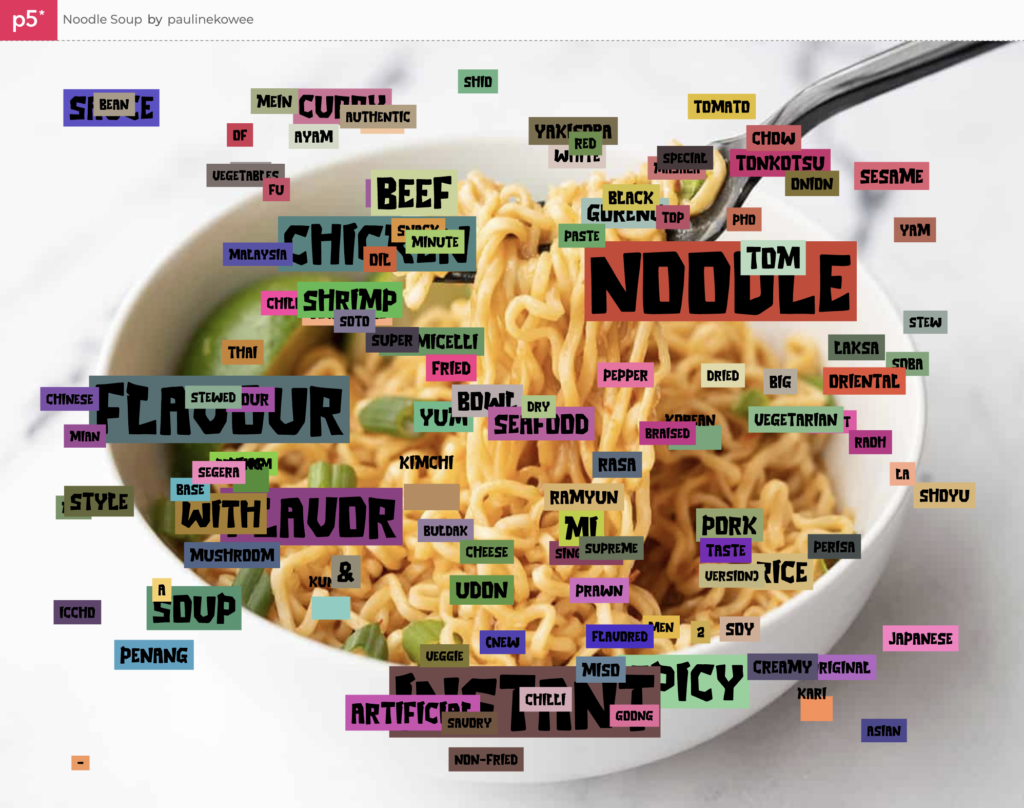
However, upon closer analysis of the dataset, I realized that I didn’t have enough clean information to do those things, and therefore narrowed my focus to one question: what name words are most commonly used and loved in instant ramen? I assumed that these would be fancy Japanese words like “tonkotsu”, but was curious to see what the dataset would reveal.

With this in mind, I went through the CSV of the ramen ratings to split the names into their individual words. I then turned each of these into objects (checking first if they were repeated) so that I could store their name, rating, and other attributes like x and y position.

I ranked words more highly if they were used in more highly-rated ramen, but more generally gave them points as long as they were used in a name. I also only displayed words above a certain threshold of ratings; otherwise, the entire screen would be consumed by words.

I’m most proud of how I was able to split the words and sort them out so that there were no duplicates and ranks cumulatively added into ratings with each time a word was passed into the loop.

//if the word not yet in list, add it
for (let i=0; i<ramen.length; i++) { //for each word in name
  
  let inList = false;
  //check if it's in the list
  for (let k=0; k<ramenWords.length; k++) { //for each entry in list
    if (ramenWords[k].name==ramen[i]) {
      inList = true;
    }
  }
  
  //if it's not in the list, add it; if it is, update the rating
  if (inList == false) {
    let x = new ramenWord(); //new word
    x.name = ramen[i];
    x.rating = ramenRank;
    ramenWords.push(x)
  } else {
      for (let k=0; k<ramenWords.length; k++){
        if (ramen[i] == ramenWords[k].name) {
          ramenWords[k].rating += ramenRank; //add rank to rating
        }
      }
  }
}

I had the most trouble with presentation. I found a cool ramen-related font and knew I wanted to use it, which was the easy part. Then, I really wanted to present the words in a word cloud so that I could essentially show the data swimming in a soup bowl. However, I had a lot of trouble with presenting the data in that way, mostly because my data (a list of objects) prevented me from using many common solutions I found in p5.js examples and stack overflow (which often “deleted” overlapping values; I couldn’t do this because my values are unique rather than identical.) After a few hours of trying, I eventually decided to shelve the idea.

Instead, I ran with the more wild-city-signage look of the overlapping words, gave them background fills, and put a ramen picture in the back. While it wasn’t the vision I initially imagined, it has its own charm as a dataviz project that generates a new layout and color scheme each time it runs.

I’m pretty happy with the final work. I think the colors help make the entire piece look more interesting, and while the data isn’t perfect, it reveals some interesting insights: chicken seems to be the most popular (or at least more well-represented) as compared to beef, seafood, or fish, “flavour”/”flavor” is king, and “artificial” isn’t as big of a deterrent to good ramen as I thought it would be.

Some cool words that I wasn’t as familiar with also made it through the threshold, like Ayam, Rasa, and Goong. It made me realize that even though I’m a college student who’s quite often in the instant ramen aisle, I still don’t actually know much about the world of ramen, the various types that are out there, and what people actually like.

Final Sketch

View it in Fullscreen (A lot better since the image is so big)

In a future iteration of this project, I’d try to make my noodle word soup happen for real, probably by reworking my data structure or finding a smarter solution for all the crashing while loops I had to deal with. I’d also play with using sine waves for “noodles” or making the piece more interactive; right now it’s more of a generated work than an experience.

Assignment 3: OOP Fishpond

For this assignment, I chose between 3 ideas: a fishpond simulator, a fizzy drink, a popcorn machine, and an ant smasher game. I ultimately decided to go with a fishpond simulator. I thought it would be cool, and I also kind of missed my fish back home.

I started by looking at a particle simulation example from p5. I then wrote my own and modified it so that each particle was a fish rather than a particle. I then worked on making classes for the lilies, lilypads, and finally, the ripples.

A few things I added on were the camera that allows you to see your reflection on the fishpond, a star function to more easily draw the patterns on the lilypads, and some light rotations on the fish.

The code I’m most proud of is probably the lilypad part because I finally got to understand how to rotate, push, and pop the petals without destroying everything.

fill("#f0f0f0")
translate(this.x, this.y)
for (var i = 0; i < 10; i++) {
ellipse(0, 40, 25, 32);
rotate(PI / 5);
}

fill("#ffffff")
for (var i = 0; i < 10; i++) {
ellipse(0, 30, 20, 32);
rotate(PI / 5);
}

In the end, I’m pretty happy with the final work! It generates a new pattern of lilies and pads whenever it’s run, and the fish just drift aimlessly throughout the pond. It definitely has the vibes of a fishpond. With a bit of music, it would be a very chill and zen piece to stare at and contemplate life with.

Final output (Open in P5js to show your reflection!)

The most difficult part was trying to make certain elements rotate without making the entire piece rotate around the origin. I still wish I did better on that aspect and will probably try to improve it still.

I want to improve my piece by adding a few things: a particle simulator for bubbles rising up in the background (here’s one I’m looking at from Nature of Code), an interaction where the fish move towards a hovering cursor then scatter off when clicked, and rotating / subtly floating lilies and lilypads. I also wish the fish pointed in the direction they were swimming.

Other minor things I would add are speckled or multi-colored fish, lily buds and stems, and a way to “ripple” the camera photo when the screen is clicked.


Assignment 2: For Loop Patterns

For this assignment, I was inspired by the patterns I saw in Casey Reas’ Eyeo talk and some of the repeating patterns in the Computer Graphics and Art magazines. I thought that it would be really cool to generate my own pieces of “interactive modern art” focused on simple shapes and patterns, and I loved the idea that every bit of user interaction would change the outcome of the resulting pattern.

I focused on the for loop because of previous bad experiences with the while loop crashing and deleting my programs. I customized it so that it works with any width and height. I ended up making three experiments: Space Lines, Waves, and Multi Grid, which are all different takes on the same core concept.

The core technical concept for all three pieces is that the program is given four random structures to choose from, the user’s actions influence factors like color and stroke width, and clicking reveals a simpler view of the piece that focuses on the structures involved.

First is Galactic Lines. Galactic Lines is very similar to one of Casey Reas’ works. It reminded me of the “Galactic Chaos” carpet pattern of movie theaters from when I was young, hence the name.

What was up with the galactic chaos movie theater carpets of the '90s? | Boing Boing
Galactic Chaos, the movie carpet pattern itself

Here, the program chooses between four kinds of lines: vertical, horizontal, diagonally up, and diagonally down. The user’s mouse movement determines the possible colors from the RGB scale that can be displayed. It then provides a slider that users can change stroke width with. Clicking reveals the bare bones of the structure in black while the background continues to change color.

The second piece is Waves, which resulted from an experiment with Bezier curves. It reminded me of waves rolling in at the beach, hence the name. Moving the mouse changes the color of the strokes, which almost made me feel like I could see the waves under different kinds of lighting at different times of day. Clicking once again reduces the piece to its more structural elements.

The last piece is Multi Grid, which plays with the same grid structures that artists have played with for centuries using rect and random coordinate points. I made this piece the most interactive; it also changes the stroke width as you hover around, leading to stills that look extremely different from each other. In the upper left corner, it’s a colorful puzzle that could be a crowd of brightly-dressed people; at upper right corner it’s hot pink and thick-stroked. Clicking makes it as minimalist as you might expect.

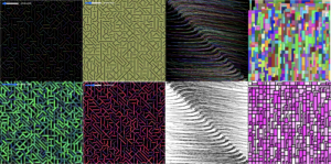
Making these pieces was very fun. I tried to focus more on making interesting, responsive, and generative concepts rather than an overly technical piece. I also wanted each still to look like a piece of its own, so that someone playing with the pieces could come up with stills that look cool enough to use as wallpapers or shirt patterns or a piece of modern art. Here are some select stills I liked:

I would improve these in the future by trying to have the structures themselves respond to mouse movement (like leaving a circle of empty space around the mouse, or allowing the mouse to push and pull the structures with dragging). I would also try smoother animations since the rapidly shifting colors can come off a bit jarring. Lastly, I would try and make more complicated shapes and structures, not just grids, lines, and shapes.

For example, an extension of this project would probably be some kind of generated village, where houses, streets, lamps, cars, and people are randomly placed throughout the map, and colors of roofs/cars or the heights of buildings change with user input.


Assignment 1: Self Portrait

After the first session, I played around with p5.js and made this embarrassed-looking koala using shapes, lines, fills, and the mouseX and mouseY variables. Clicking the koala makes it blush, because why not?

Embarrassed Koala

I thought it was pretty cute, so I decided to use it as a template for my actual self-portrait. I wanted to make it funny and representative of my personality of not taking things too seriously, especially with a practice as playful as IM.

In the process, I found p5.js to be an interesting adjustment. Instead of seeing color or stroke width as a property of an object, I had to type them out as separate lines of code every time I wanted something to have a different property. I couldn’t just do leftEye.color = “black” – I had to first declare the fill, then draw the left eye.  This was rather tedious, so next time, I will probably plan ahead so that I can more effectively group colorways and avoid back-and-forth switching.

After drawing the basic shapes of my self-portrait, I accidentally wrote an infinitely calling while loop, which auto-ran (because auto-running was turned on) and immediately crashed and destroyed the entire self-portrait, which I thought was being auto-saved, but was actually not. I was very sad, but I soldiered on and started again from scratch, a little faster this time around. Advice to anyone else doing this: turn off auto-run when making risky decisions like while loops.

I eventually decided to have the character hover around (to somewhat reveal NYUAD! WOO on its shirt), the eyes follow the mouse, and the background color also respond to the user’s mouse.

Originally, I was going to use a slider for changing background color, but I found that it distracted from the user experience of moving your mouse around. I also added a little “click for awesome” so that they know something will happen (the character blushes and the background goes neon yellow) when they click.

Making the portrait was quite time consuming because I had to restart, do a lot of little tweaks to put my layers in the right order, and make everything more or less symmetrical. Nevertheless, I was able to use circles, ellipses, lines, rectangles, arcs, text, a rotating transform, and mouseX and mouseY to achieve this very memey final self portrait. I think I’m pretty proud of it!

Overall, the activity made me more excited to learn more time-efficient way of doing things on p5.js, as well as more advanced techniques in producing generative effects and interesting animations. I enjoyed the process and am looking forward to figuring out more complex interactions.

Final Self-Portrait