Week 8: Reading response

The text delves into the intricate interplay between the usability and aesthetic appeal of everyday objects. It posits that while usability is undeniably crucial, the significance of aesthetics and the emotional response they evoke should not be underestimated. Essentially, a product should excel not only in terms of its functional efficiency but also in its capacity to captivate users visually and stir positive emotions.

A central argument which interested me is that our emotional state, referred to as affect, has a profound impact on our ability to interact with products. During periods of stress or anxiety, our focus tends to narrow to immediate tasks, often causing us to overlook minor design flaws. Conversely, when experiencing positive emotions, our creativity and problem-solving capabilities are enhanced, making us more tolerant of design imperfections.

The future of everyday objects lies in achieving a harmonious equilibrium between usability, aesthetics, and emotional resonance. The overarching goal should be to create products that not only fulfill their intended functions effectively but also deliver a delightful and emotionally enriching user experience. In essence, it calls for a comprehensive design approach that takes into account both functionality and emotional impact.

The central idea that I totally agree with is that well-designed, visually appealing products tend to not only excel in usability but also enhance the overall user experience. Striving for a seamless fusion of practicality, aesthetics, and emotional appeal should be the aspiration of designers and manufacturers to create products that deeply resonate with their users.

Mid-Term project

Link to the sketch: https://editor.p5js.org/nafiha/full/215NRUgea

Concept : From the beginning of my mid-term project, I was inspired to create a cooking game, a passion that has been with me since my childhood. Initially torn between the realms of cooking and baking, I eventually decided to choose baking, given my fondness for it. However, as I started on the journey to develop the game, I soon realized that simulating baking was a far more complex task than actually baking in the real world.

Over the past few weeks, I hunt through into the mechanics of enabling users to click on various ingredients and watch them smoothly move towards a designated destination, such as a mixing bowl or even autonomously. I began with simple shapes like circles to grasp the fundamentals of this interaction. I focused on the feature of clicking on ingredients rather than implementing a drag-and-drop functionality, mastering these concepts before delving into the coding aspects.

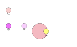
What particularly piqued my interest was a class where our professor taught us how to create a dynamic, moving background. I decided to incorporate this element into my game, kickstarting my coding journey. The concept is intentionally straightforward and minimalist to ensure a hassle-free user experience. Upon starting the game, the required ingredients will be presented. Users need to simply click on each ingredient to successfully complete the game. Once the game is won, a cupcake will appear and they have the option to restart and play again. A picture of the sketch which was initially done to practice the method has been attached.


Part of the code that I am proud of  : This is the picture that I drew as a screen for instructions. The part of the code that I am especially proud of is when I learned to add the moving background as I mentioned earlier and to click on images from the computer to add on. And learning the function of lerp, was also exciting.

if (img.moving) {
// Move the image towards the center of the screen
let targetX = width / 2 - img.size / 2;
let targetY = height / 2 - img.size / 2;
let speed = 0.5; // Adjust the speed as needed
img.x = lerp(img.x, targetX, speed);
img.y = lerp(img.y, targetY, speed);
}
image(img.image, img.x, img.y, img.size, img.size);
}
}

Areas for improvement: Throughout the development process, I encountered numerous challenges, some of which I successfully resolved, while others remained elusive. Initially, I struggled with the issue of smoothly transitioning from one screen to the next, a task that seemed quite discouraging. After acquiring the necessary skills to address this, I then faced the problem of the background image overlapping with the added objects, which required a significant amount of time and effort to pinpoint and rectify.

In addition to these hurdles, I had originally intended to implement a time limit for the ingredient addition phase, which I, unfortunately, still couldn’t figure out. Nevertheless, apart from the time limit issue, I managed to overcome every other challenge that came my way.

Week 5: Mid-term progress

For my mid-term project, my initial inspiration was to create a minimalist cooking game, a concept deeply rooted in my childhood experiences. During those early years, I would eagerly scour websites in search of every cooking and Barbie game available, often spending entire days immersed in these virtual culinary adventures. Drawing from my love for baking, I decided to develop a game focused on making cupcakes.

The core interaction in this game revolves around the user’s ability to add ingredients and craft a delightful cupcake. The user can click the ingredients to add them, and a cupcake would appear. To enhance the overall experience, I incorporated lively and playful background music that would accompany the gameplay.

 However, when I began coding the game, I encountered my first major hurdle: I couldn’t figure out how to call the function responsible for the cupcake’s creation. While I successfully implemented the ingredient addition aspect, the expected output of a fully-formed cupcake remained difficult to track down. These are basic coding that I have done till now. I would like to change the background to a self created portrait and add additional elements. 

Additionally, I encountered difficulties when attempting to integrate music seamlessly into the gameplay as I had initially envisioned. This obstacle prompted me to consider a more straightforward approach, where I would include a continuous background music track instead.

In summary, my mid-term project revolves around a nostalgic cooking game centered on baking cupcakes. Despite encountering challenges with function calls for cupcake creation and integrating music as part of the interactive experience, I am determined to overcome these obstacles and provide an enjoyable and immersive gaming experience for players.

Week 5: Reading response

 Among the three sections of the paper, the one I liked the most was “Computer Mission in Interactive Art.” When the author initially introduced the idea that our entire body could interact with computers, I was a bit skeptical and didn’t fully grasp it. However, as I read more about it, I found it to be truly amazing because it represented the first step in enabling people to interact with computers in this way. It was like the initial building block for human-computer interaction. What I found particularly fascinating was how people were exposed to a new platform they had never encountered before. Just imagine the reactions of those who first learned about it; it must have been quite impressive.

Though many examples are given, One of the examples that caught my attention within this section was “Messa di Voce,” a performance where voices were transformed into images. What struck me as the coolest aspect of this artwork was that the sounds themselves generated the images. At a time when audio platforms were not as common as they are today, the concept of visuals emerging directly from audio would have been incredibly intriguing for the audience.

The next art installation, “Standards and Double Standards” from 2004, featured fifty belts suspended from the ceiling using special robotic motors. The interactive element here was particularly engaging and exciting for viewers. The belts responded to the movements of people in the room, creating a dynamic and immersive experience. It was as if the belts came to life, interacting with those present, making the overall experience dynamic and captivating.

These examples span a wide range of artistic categories, highlighting the diversity in how artists use technology to create interactive experiences. It’s remarkable to think about how these early innovations have played a significant role in shaping the technology-driven world we live in today. They served as the foundation for the kinds of interactive experiences we now take for granted.


Week 4: Data visualization

For this assignment, I drew inspiration from a previous project where text elements orbited around a central point. I aimed to create an illustration resembling a solar system, complete with data on the distance and mass of each planet. My goal was to have the planets rotate around the sun at controlled speeds. However, I encountered challenges that proved to be more complex than I initially anticipated.

I successfully implemented a data view in the console section, but I faced difficulty in displaying the data directly within the visual output. My primary areas for improvement include finding a solution to display data in the visual output and refining the motion of the objects to accurately simulate the planetary orbits. And the part of the code I am particularly proud of is given below. This is something I learned newly by doing this project.

console.log(`Name: ${name}, Mass: ${mass}`);


Reading Reflection: Week 4

I appreciated the way the author narrowed down the essential characteristics of good design to discoverability and understanding. While these are undoubtedly crucial, there are many other vital characteristics to consider, such as a clear purpose, simplicity, balance, consistency, clarity, and efficiency, among others.

When the author addressed complex designs and emphasized the quality of interaction, I wholeheartedly agreed. I believe that simplicity and complexity both have their beauty. A device or design that offers complexity can be just as captivating as a simple one because the process of discovering and learning its potential is a unique form of beauty. Each new revelation makes the user perceive the device as outstanding.

Reading about the challenges stemming from the lack of human-machine interaction highlighted the gravity of this problem. It underscored the importance of addressing these issues in design. Yes its a crucial concept in design, but the author made us understand the impacts it could create by giving examples. 

The concept of Human-Centered Design (HCD) fascinated me when the author emphasized the need for designers to focus on potential errors during the design process. I believe this is a critical consideration that every designer should keep in mind because it significantly impacts the end-user experience.

Reading reflection: week 3

The author’s humble introduction, where he admitted that none of us truly have a crystal-clear understanding of what interactivity is, immediately resonated with me. It’s a sentiment many of us can relate to – we often have a sense of what certain concepts mean, but articulating a precise definition can be difficult to find.

The idea of using the conversation between Fredegund and Gomer as an example to define interactivity was a pleasant surprise. It underscored the importance of key elements in any interactive exchange: listening, thinking, and speaking. It made me realize that without these components, a conversation can hardly be considered truly interactive; instead, it becomes a one-way process, lacking the depth and richness of true interaction.

The analogy of actors and a branch of a tree further clarified the concept. I’ve always believed that interactions are a two-way street, and when I engage with someone new, I often observe how they perceive the interactive process. Do they view it as a collaborative effort, like the intertwining branches of a tree, or is it merely a one-sided performance?

Prior to reading the article, I was uncertain about what qualified as interactive and what did not. The depiction of interactivity into different levels provided me with a valuable framework for understanding and categorizing interactive experiences.

However, it was the author’s explanation about the importance of listening that truly resonated with me. Each sentence in that section felt relatable. We’ve all encountered individuals who do not truly listen, and the negative vibe they emanate in such interactions is noticeable. Conversely, engaging with someone who not only listens but comprehends and engages with our thoughts is an immensely positive experience.

In conclusion, the article shed light on the multifaceted nature of interactivity and the crucial role of listening, thinking, and speaking in fostering meaningful interactions. It provided clarity on what constitutes true interactivity and offered a humorous take on subjective perspectives. Ultimately, it reminded me that genuine interactions are a delicate balance of engagement, empathy, and active participation.

“Pookalam” with animation

For this assignment, I was inspired to create a generative piece that would celebrate my cultural tradition. That’s when the idea of animating a “pookalam” came to mind. A “pookalam” is a vibrant and intricate floral arrangement made during the festival of “Onam,” in Kerala where various colorful flowers are meticulously plucked and their petals separated. These petals are then artfully arranged in front of houses as given in the picture below.

To bring this tradition to life in my assignment, I tried to create an animation where colorful flower petals descend from above, autonomously converging towards the canvas’s central point. This concept not only pays homage to the beauty of “pookalam” but also adds a dynamic and engaging visual element to the tradition.

Initially, my approach involved animating a single flower falling from above, but as I progressed, I decided to incorporate an array function and created an empty array to work with. To achieve the effect of multiple flowers descending, I introduced a variable for the number of flowers and utilized multiplication to replicate them.

Animating their falling was a relatively straightforward task, but the challenge arose when I aimed to gather them elegantly at the center point of the canvas. It was during this part that I acquired a deeper understanding of using the “target” function to achieve this goal. And that is the part of coding I am particularly proud if:

moveTowards(targetX, targetY) {
  // Move the dot towards the target position
  let dirX = targetX - this.x;
  let dirY = targetY - this.y;
  let distance = sqrt(dirX * dirX + dirY * dirY);
  let speed = map(distance, 0, width, 0, 4);
  this.x += (dirX / distance) * speed;
  this.y += (dirY / distance) * speed;
}

While my original intention was to transform these grouped flowers into a beautiful “pookalam,” like arts, this is the outcome I managed to create.

Reading reflection : week 2

Casey Reas’ work, particularly his piece “Maharam,” indeed offers an exploration of randomness and the interplay between simplicity and complexity in art. The concept of “tissue work” that he employs is a remarkable way to create interesting patterns and forms that emerge from seemingly basic elements.

What’s striking about “Maharam” is how it mirrors natural processes. By allowing simple wiring to interact and cross-connect in an uncontrolled manner, Reas simulates a sort of artificial evolution. This process mimics the way natural systems, like neural networks or ecosystems, evolve and adapt over time through countless interactions. It’s a testament to how computational art can capture the essence of complexity found in nature.

When he multiplied the connections, which might be a reflection of how complex systems can appear chaotic or overwhelming when viewed up close. Yet, as mentioned, Reas’ ability to eventually shape this chaos into a discernible figure demonstrates the power of coding and computational art.

Assignment 2: Generative art

I wanted to craft a celestial portrait in the cosmic expanse. I wanted to portray the animation of the galaxy in motions with every bit detail. Even though its a bit complex, I started coding. Initially, I experimented with mixing various colors and intertwining with for loop and strokes to create an appearance of radiating rays.This was the output.

And then I tried to make the beginning point to the center. Although I wanted to recreate it like a swirl. And then I added some animations to it. I wanted it to be like ellipse, but I appreciated the artistic form it took, so I opted to leave it unchanged. This was the output.

As I mentioned previously, I had a strong desire to enhance its realism. It occurred to me that with a deeper understanding of 3D animations, I might be able to achieve this goal in the future.