WEEK 10 RADIO (Amna and Noura)

CONCEPT:

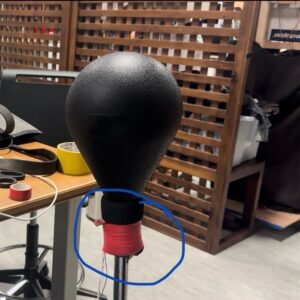
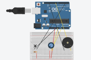
While brainstorming project ideas with Amna, we thought about how a radio works and decided it would be fun to make a simple version. Our goal was to create an Arduino “radio” that lets you switch between different songs, similar to tuning a real radio. We used a knob as the channel switch, allowing us to choose between three different songs that we got from Github and the exercises we did in class. Each channel has its own song, and turning the knob instantly switches to the next song, giving it a real radio-like feel. We also added a button that acts as a power switch to turn the radio on and off. This way, pressing the button starts the radio, and pressing it again turns it off. We even added a feature so that any song stops playing immediately when the channel changes, so you don’t have to wait for a song to finish before switching to a new one.

HIGHIGHT:

The part Amna and I are most proud of is getting the button to work smoothly with the debounce feature. At first, the button would trigger multiple times with a single press, turning the radio on and off too quickly. By adding a debounce function, we made sure the button only registers one press at a time, making it much more reliable. A former student in IM (Shereena) helped us understand how debounce works and guided us in fixing this issue, explaining how it makes the button’s response stable and accurate.

Here’s a snippet of the debounce code we used:

// Variables for debounce
int buttonState; // Current state of the button
int lastButtonState = LOW; // Previous state of the button
unsigned long lastDebounceTime = 0; // Last time the button state changed
unsigned long debounceDelay = 50; // Debounce time in milliseconds

void loop() {
int reading = digitalRead(buttonPin);

// Check if the button state has changed
if (reading != lastButtonState) {
lastDebounceTime = millis(); // Reset debounce timer
}

// If enough time has passed, check if the button is pressed
if ((millis() - lastDebounceTime) > de
bounceDelay) {
if (reading != buttonState) {
buttonState = reading;
if (buttonState == HIGH) {
radioState = !radioState; // Toggle radio on/off
}
}
}

lastButtonState = reading;
}


This debounce function prevents accidental multiple triggers, making the button interaction smoother. We’re also proud of how the radio switches songs instantly when we turn the knob, making it feel real.

REFLECTION:

Working on this project with Noura was a nice experience, as we got to share our thoughts and class experience by working together. One of our main struggles was making the button work without triggering multiple times, which led us to use debounce for stability. While adding Debounce solved the problem, in the future, we’d like to explore other ways to troubleshoot and fix issues like this without relying on debugging alone.

For future improvements, we’d like to add more interactive features, such as volume control with an additional knob and possibly a small speaker for clearer sound. We could also include more “channels” with various songs or sound effects, giving users a richer experience. Another idea is to add an LED indicator that lights up when the radio is on and changes brightness with volume, making the design even more engaging. These changes would make our project more realistic for a radio and enhance.

How it works:

CODE:

https://github.com/nouraalhosani/Intro-to-IM/blob/426c7d58639035c7822a4508f2e62dab34db0695/Radio.ino

WEEK 10 READING

This rant on “Pictures Under Glass” made me realize how strange it is that we’re so comfortable reducing our interactions to something as flat and lifeless as a touchscreen. We have our hands (the most useful body part), and yet we limit them to swiping and tapping like we’re settling for the simplest form of interaction possible. It’s almost like we’re choosing numbness over true engagement, relying on a screen instead of exploring the world with our hands.

To me, this flat, touch-only future ignores a huge part of being human. While reading, I thought about how much richer experiences are when you can actually feel things. Imagine the difference between seeing a piece of pottery on a screen versus shaping it yourself. It’s a completely immersive experience that teaches you in ways a screen never could. If tech continues down this path, I feel like we’re just training ourselves to be satisfied with empty interactions that don’t ask much of us.

Furthermore, I think relying so heavily on screens is what’s making us lazy; it feels like we’re choosing convenience over truly connecting with the world. Screens limit how we explore and interact, reducing everything to a simple swipe or tap. Technology should be enhancing our natural abilities, not shrinking them down to one basic motion.

Moreover, the push for brain-computer interfaces is even worse. It takes away the real, physical experiences that make life interesting. Instead of cutting out physical interaction, I believe tech should work with our bodies, such as the Wii console or the VR, helping us connect in more meaningful, hands-on ways.

WEEK 9 READINGS

Reading Tom Igoe’s ideas in “Making Interactive Art: Set the Stage, Then Shut Up and Listen” and “Physical Computing’s Greatest Hits (and Misses)” really clicked for me, especially after experiencing “Luminous Play” by Carsten Höller at Manarat Saadiyat in Abu Dhabi, which was in 2023. Igoe’s whole perspective on stepping back and letting the audience shape their own experience feels like it could have been written about Höller’s work. The exhibition is basically a playground of light, where the audience can wander, touch, and interact with installations in a way that feels completely open to interpretation.

In the Luminous Play exhibition, you are surrounded by all these moving, colorful light displays, and there are no set directions or explanations. You just go in and feel free to explore anything you want, including standing back and seeing the patterns or walking about to see how the light changes with your movement. The whole thing allows you to experience it in your own way, and you find yourself creating your meaning from the interaction. It’s a perfect example of Igoe’s point: sometimes, the most powerful art is when the artist just sets up the space and then “shuts up,” letting the audience take over.

Moreover, both readings reminded me that, as creators, we don’t always have to control every detail or push others to see things from a specific perspective. It’s enough to create an environment that allows individuals to discover at their own pace and leave it for the audience to interpret it whichever way. Igoe’s emphasis on simplicity and openness shows us to focus less on trying to be “original” and more on creating experiences that invite others to take part. It allows everyone who interacts with the work to complete it and makes the art itself feel more alive and human.


WEEK 9 ASSIGNMENT

CONCEPT:

For this assignment, I created an object detector using my shoes as the trigger by using the ultrasonic sensor for detection. When my shoes are within a specific range (within 20 cm), the red LED lights up, indicating that the object is close. As for the switch, it’s really simple,—an off and on switch to turn on the blue LED.

The area I’m most proud of:

Setting up the ultrasonic sensor to accurately detect when my shoes were within range wasn’t hard after all, but I didn’t realize I had to set like an accurate range because at first I set it high and it wouldn’t detect the objects accurately; it would just light up. I thought there was an error in the code or the wiring itself, but when I changed the threshold to a small number, meaning the objects had to be closer, it was more accurate. So the light lit up when my shoes were in the right spot.

Reflection:

Honestly, I received a lot of help from Amna, as at first I tried using the LDR, but I couldn’t get it right even watching YouTube videos. I still didn’t figure out where I went wrong, so hopefully I get to understand that more. Hence why I changed and used the Ultrasonic; as Amna understood it, she explained it to me, and I gave it my own twist.


https://github.com/nouraalhosani/Intro-to-IM/blob/c4c8dde35515a6d5f9771a0c6b308841baaeb59b/Sensor.ino

The video: (I forgot to record the switch but I promise it works!)

set up


UNUSUAL SWITCH

Concept:

For this project, I decided to create a simple on-and-off switch using aluminum foil, inspired by the idea of a chair pillow switch. Imagine a seat cushion that lights up when you sit on it, that’s the effect I wanted to recreate! I set up two layers of aluminum foil each connected to a different wire with a thin separator (tissue) in between, which makes it act like a “pressure switch.” When you sit down, the pressure causes the foil layers to touch, completing the circuit and turning on an LED. Although it looks like a regular chair pillow, it’s actually just layers of aluminum foil working as a switch.

I based my code on what we learned in class, using the code examples from the PowerPoint as a reference. The code is straightforward: it checks if the foil layers are touching (circuit closed) and turns the LED on or off based on that.

The Code Im most proud of is probably the loop function even though its simple:

const int switchPin = 2;     // Pin connected to the aluminum foil switch
const int ledPin = 13;       // Pin connected to breadboard led

// Setup function runs once when the program starts
void setup() {
  pinMode(switchPin, INPUT);   // Set the switch pin as an input
  pinMode(ledPin, OUTPUT);     // Set the LED pin as an output
}

// Main loop function runs repeatedly
void loop() {
  int switchState = digitalRead(switchPin);   // Read the state of the switch (HIGH or LOW)
  
  if (switchState ==HIGH) {      // If the switch is OPEN - the foils are touching
    digitalWrite(ledPin, HIGH);   // Turn on the LED
  } else {                        // If the switch is closed - the foils are not touching)
    digitalWrite(ledPin, LOW);    // Turn off the LED
  }
}

Reflection:

For improvements, I’d like to experiment with adding a parallel circuit so multiple LEDs light up at the same time or even make them blink, using what we covered in class. I really wanted to use a sensor for the switch but kept it simple this time with just aluminum foil, definitely something to try next time.

Set Up:

https://github.com/nouraalhosani/Intro-to-IM/blob/d62862d42bf6ee36d8aa94884c7f4c3ee04de1c8/1switch.ino

WEEK 8 – Reading Response

Thinking about Don Norman’s and Margaret Hamilton’s reading, I realize they both focused on designing with people’s real needs and future challenges in mind. Norman’s belief that attractive designs make things easier to use connects with how Hamilton built error-proof software for the Apollo mission, even when others didn’t see the need. It’s similar to how modern smartphones such as Apple aren’t just functional; they’re designed to be enjoyable and comfortable for people to use, which builds trust and loyalty to this certain company.

Furthermore, Hamilton’s focus on catching potential errors reminds me of safety checks in airplanes today, where every possible issue is planned ahead because lives are on the line. Her extra coding to avoid mistakes saved missions—just like self-driving cars are programmed now to avoid crashes. Both she and Norman understood that good design means planning for things that might go wrong, not just what we expect to happen.

Their stories also show why having different perspectives matters. Hamilton was one of the few women in tech at the time, breaking stereotypes, and now we know that having diverse teams helps products connect with more people. Whether we’re building an app, writing software, or designing a gadget, Norman and Hamilton’s work reminds me to think ahead and consider how our choices might affect people in ways we can’t yet imagine.

MIDTERM

CONCEPT:
For my midterm project, I decided to combine my two favorite things together, SpongeBob and my childhood game Geometry Dash (which was my first inspiration for the game).
I decided to be more creative and create my own version of geometry dash using Spongebob as my main theme. Furthermore, instead of jumping over obstacles, you have to jump over SpongeBob characters.
The main goal of the game is to score as many points as possible by avoiding colliding with an obstacle; it’s pretty simple. I also added a twist to it; there’s a feature where you can fuel up the power bar by gaining more points, which leads to a rocket mode effect where you can collect double points but instead of jumping, you’re flying. For the characters, I decided just to use png images online, which I will attach to the website at the bottom; however, to incorporate shapes and colour, I decided to use shapes and gradients to create the theme of the background, including the burgers and jellyfish. I also used a Spongebob font for the text to add more to the aesthetic. To organize my codes, because at some point it got messy, I decided to create multiple files, for functions and classes, which made it a lot easier as I knew where everything was and it was most helpful in debugging anything if there was an error.

HIGHLIGHT:
The code I’m most proud of is probably the jellyfish part of the game because it handles more than one thing like spawning, moving, and removing jellyfish, while also checking for player collisions. It also has conditional behavior since the jellyfish can only cause the game to end when the player is in rocket mode. I had to redo the code multiple times as there were a lot of errors in the beginning and I had to update multiple loops. Additionally, it depends on variables like `isRocketMode` and `gameOver` from other parts of the game, which makes it more complicated to manage since it must stay in sync with the overall game.
here is the code:

function updateJellyfishObstacles() {
  // Spawn new jellyfish obstacles at intervals
  if (frameCount % jellyfishInterval === 0 && jellyfishObstacles.length < maxJellyfish) {
    let jellyfishY = random(70, height - 80);
    let jellyfish = new Jellyfish();
    jellyfish.y = jellyfishY;
    jellyfishObstacles.push(jellyfish);
  }
   // Update jellyfish obstacles and handle rocket mode collisions
  for (let i = jellyfishObstacles.length - 1; i >= 0; i--) {
    jellyfishObstacles[i].move();
    jellyfishObstacles[i].show();
    
    // Remove off-screen jellyfish
    if (jellyfishObstacles[i].offScreen()) {
      jellyfishObstacles.splice(i, 1);
      continue; // Move to the next jellyfish
    }
    
    // Only trigger game over if the player hits a jellyfish while in rocket mode
    if (jellyfishObstacles[i].hits(player)) {
      if (isRocketMode) {
        deathSound.play();
        gameOver = true;
      }
      
    }
  }
}


IMPROVEMENTS:
In the future, I would probably like to add more elements to the game as it gets repetitive. Also, if I had more time I would fix this upside-down section of the game, as I feel like it looks odd in some sort of way, since the obstacles are upside down but not the player. Moreover, I would also improve the way the obstacles are shown in the game, as I fear they aren’t visually clear or hurt the eyes when you look at it too long, and it is because its moving fast, however, if its too slow, the game would be easier.

Here is the game:


REFRENCES:
https://www.jsdelivr.com/package/gh/bmoren/p5.collide2D. (my collide reaction HTML)
https://www.fontspace.com/category/spongebob (font)
https://www.pngegg.com/en/search?q=spongebob (all my images)

Reading Response 5:

Computer vision and human vision differ in interesting ways. While human vision is natural and intuitive, allowing us to recognize patterns and emotions effortlessly, computers need specific algorithms to make sense of images. For instance, what we instantly understand as motion or objects, computers detect through methods like frame differencing or background subtraction. I honestly find it intresting how rigid and task-specific computer vision is compared to our flexibility. Furthermore, to help computers “see” what we want, it uses techniques like brightness thresholding or background subtraction, and sometimes adjusts the physical environment by using better lighting or reflective markers.
Moreover, in interactive art, computer vision creates exciting new opportunities but also brings up ethical questions. For instance, Videoplace used computer vision to create playful, full-body interactions, while Standards and Double Standards used it to explore themes of authority and surveillance. However, a question that popped into my mind is that, when you consider the ability of these systems to track movements and gestures, do you feel like the line between creative interaction and surveillance can sometimes blur? This reminded me of the movie M3GAN, where AI uses computer vision to care for a child, but the surveillance becomes invasive. What if we might see something similar with interactive art or technology, where the systems that are meant to engage us could start to feel more like surveillance. Hence, it’s an interesting balance between enhancing the experience but also respecting privacy.

MIDTERM PROGRESS

CONCEPT:

I couldn’t decide between a game or an artwork for my midterm project. However, I was playing on my phone, and there’s this one game that I still play to this day “Geometry Dash”. My siblings and I grew up around this game and we still love it to this day, and as the game design is basically shapes, I thought it would be the perfect game to try and re-create.

The main idea or goal is to control a character that moves through several/ repeating obstacles. The difficulty increases over time as the player’s score rises, with obstacles speeding up and appearing more frequently. There’s also a feature where the game randomly switches to an upside-down mode, adding unpredictability and complexity to keep the player more engaged.

Design:

So far, I haven’t really worked on the design but the layout of my game. I want to have a similar concept to the actual game, where the background is gradient, and changes colour that aligns to the beat of the background music and the obstacles. As for the obstacles, for now, I left them as simple shapes, rectangles, and spikes just to test everything out and see how it flows in the game. For the use of sound, I found online the original music used in Geometry Dash and implemented it in my game as well as adding a sound effect when the player dies. However, I still need to fix the background music so that when the player dies the song stops until he starts playing again, since I used the loop function it’s just playing over and over non-stop.

This is the inspiration for my design and how i would like it to turn out in the end.

User Interaction:

My user interactions are basically the player’s input in the game. The player must press the spacebar to jump. If the spacebar is held down, the player continues jumping until the key is released. As for my instructions and text, I’ve applied it in the beginning, so the game begins when the player presses the spacebar at the start screen. After a game is over, pressing “1” will restart the game. Moreover, I still need to work on the visual design of the Start page, as of now, I just left it as text. I’ve also added a score count which is displayed at the top of the screen, which increases by one as the player successfully passes an obstacle. In the game, the obstacles appear from the right side of the screen, and the player must jump to avoid them. Then the game randomly switches to an upside-down mode at higher scores, adding an extra challenge, but I still think I need to make it more complex and play around with the obstacles, as I fear the game might be too simple and boring the way it is now.

The Most Difficult Part of the Project:

The hardest part of making this game has been figuring out how to make the difficulty increase smoothly as I want the game to stay engaging throughout. I want the game to get harder as you play, but I also need to make sure it doesn’t become too hard too soon, to the point it just gets frustrating.

Collision Detection (When the Player Hits an Obstacle):

The other tricky part is making sure the game knows when the player hits an obstacle, especially the spikes.  For the spike obstacles, the spikes are drawn as triangles, but I treated them as if they were inside an invisible rectangle (called a bounding box) that surrounds the spike. This makes it easier for the game to detect if the player hits the spike. Even though the spike is a triangle, the game checks if the player touches the rectangle around the spike. I used the collideRectRect() function in p5.js. This function checks if two rectangles touch each other. Even though the spike is a triangle, the game uses a rectangle around it for simpler collision detection. If the player’s rectangle overlaps with the spike’s rectangle, the game registers a hit. The same goes for the rectangle obstacles.

How I Made It Less Risky:

To make sure the game doesn’t get too hard too fast, I tested how quickly the obstacles speed up and how often they appear. By setting limits on both, I made sure that the game gradually gets harder, but not too difficult right away.


Code so far:


SOLAR SYSTEM

Concept:

For this assignment, I honestly had no clue what to create, at first, I wanted to create generative text data; however, I couldn’t think of a sketch, so I decided to do visualization data instead. My concept was straightforward as I was still trying to understand the codes, so I decided to do a simple solar system, but the data wasn’t accurate it was just for the sketch and the placements in p5. I first started with a blank black background with the planets orbiting, which was too basic, so I decided to use the Lerp function, which I got my inspiration from Jheel’s assignment last week, to change the color to blue gradually. Furthermore, I added shooting stars and normal starts, to make it look more appealing.

Highlight:

The highlight of my code is the animation of the planets and setting the planets, as it was the hardest to figure out. However, the PowerPoint and previous in-class work helped a lot, and without them, I would still be trying to make it work.

// Draw and animate planets orbiting the sun
 for (let i = 0; i < planets.length; i++) {
   let planet = planets[i];

   // planet position based on orbit
   angles[i] += planet.speed;
   let x = sun.x + cos(angles[i]) * planet.distance;
   let y = sun.y + sin(angles[i]) * planet.distance;

   // Draw the orbit path
   stroke(255, 255, 255, 50);
   noFill();
   ellipse(sun.x, sun.y, planet.distance * 2);

   // Draw the planet
   noStroke();
   fill(planet.color);
   ellipse(x, y, planet.diameter);

   // Display planet name
   fill(255);
   textSize(12);
   text(planet.name, x + planet.diameter / 2 + 5, y);
 }

Reflection:

For improvements , as you can see the planet, are going out of the canavs, i tried fixing it by making the orbit smaller, but then everything look tight, so i left it as it is. Also I believe some user interaction would’ve been a great addition, as of now there isn’t any interaction, I should’ve maybe allowed the users to control the orbiting of the planets using the mouse, or maybe the shooting stars.

My design: