Week 3 – (OOP) Emotions

Inspiration & Thought Process:

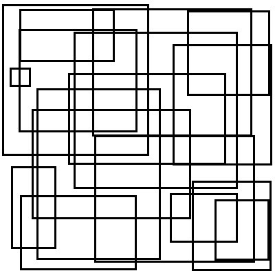
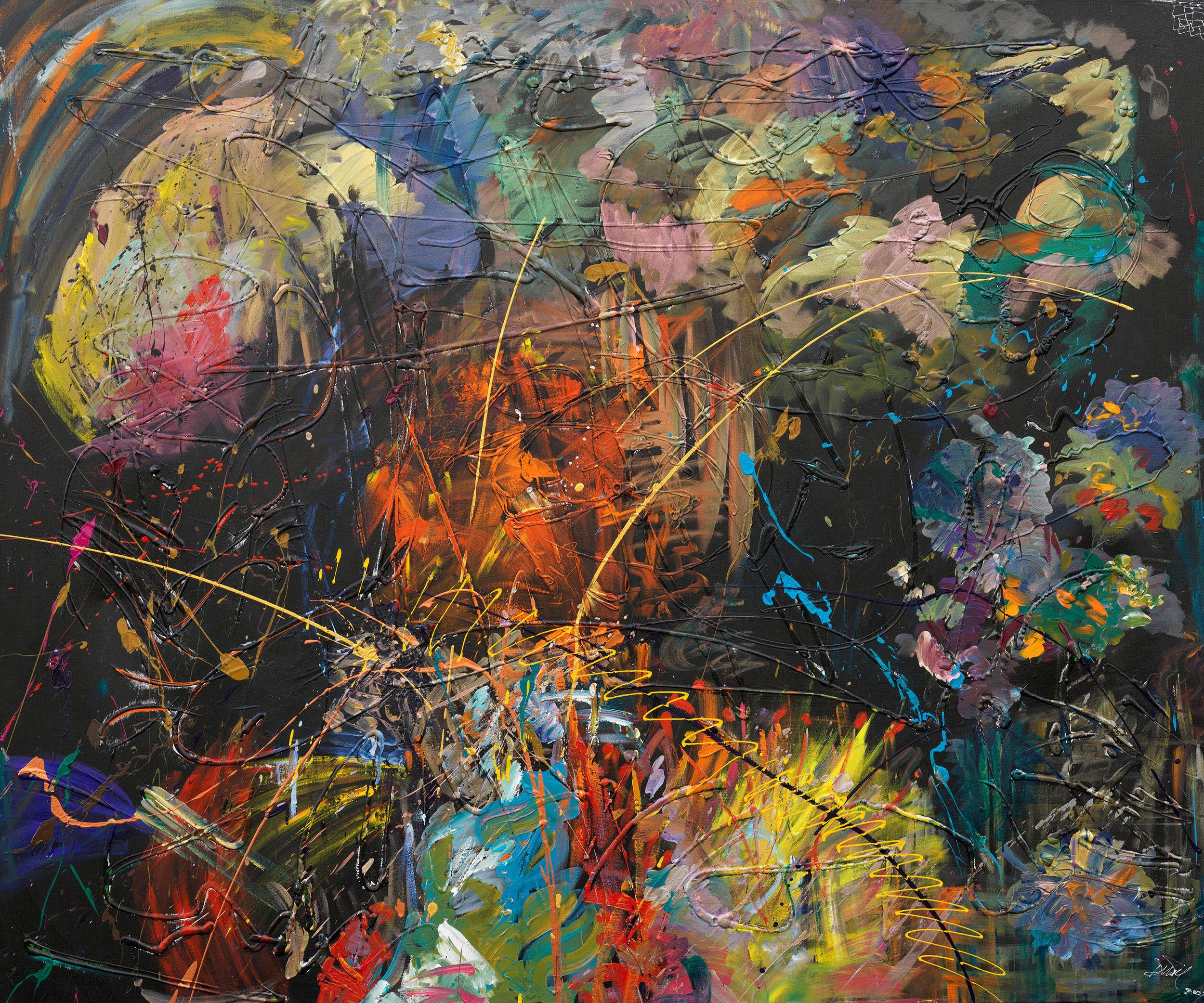
During the class discussion facilitated by Saamia and Yerk, we discussed various emotions and how they can be depicted through art. As they displayed the brush strokes on the canvas, I could sense the chaos and anger that the artist was attempting to express. In class, I argued that digital art could not accurately represent emotions, and thus I disregarded the idea of attempting to recreate a similar artwork. However, while looking for inspirations on the internet I came across this picture:

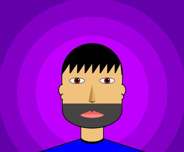
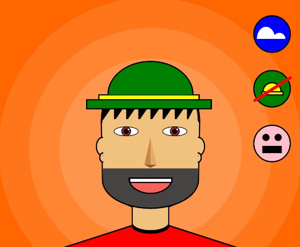
As soon as I encountered this task, the entire classroom discussion came to mind and I realized I had to challenge myself to determine if digital art could effectively convey emotions just as traditional art can. The challenge then became choosing which emotions to depict. After careful consideration, I chose to depict chaos and sadness, as these emotions best reflected my state of mind over the past four days. The chaos in my project symbolizes the numerous assignments and tight deadlines I was facing, which contributed to a sense of being overwhelmed. Meanwhile, the sadness in my project represents my feelings of homesickness and illness, both of which were constantly present in my thoughts. I wanted to bring these emotions to life in my project, to provide a visual representation of my innermost thoughts and feelings.

Work Process and Code:

To begin, I had to brush up on the basics of Object Oriented Programming and familiarize myself with the syntax differences in p5js compared to other languages. It took me almost two days to figure out the best way to depict my emotions. I conducted various experiments, trying out both emotions separately in different p5js files and adjusting different elements to see what worked best. For the chaos aspect, I created a “Circle” class that took in the x and y coordinates, as well as the diameter, of the circles as parameters. This class also had a display() function that filled the circles with random colors with each iteration of the draw() loop, and then created a circle at the specified location with varying diameters. The update() function in the Circle class updated the x and y coordinates of the circles randomly, based on a specified speed, to display chaotic behavior. In the setup() function, a for loop was used to append a large number of Circle class objects (150 in this case) to an array passing random x coordinates, y coordinates and diameters. The code for the Circle class looked like this:

class Circle //circle class
{
  constructor(x, y, diameter) //pass three parameters to the constructor
  {
    //update the variables that define size and position
    this.x_cord = x;
    this.y_cord = y;
    this.diameter = diameter;
    this.speed = 10;
  }

  display() 
  {
    noStroke();
    fill(random(255), random(255), random(255)); //random colored circles e  every iteration of the draw loop
    ellipse(this.x_cord, this.y_cord, this.diameter, this.diameter); //circles
  }

  update() 
  {
    //update the x and the y value randomly between speed value left and right (or up and down)
    this.x_cord += random(-this.speed, this.speed);
    this.y_cord += random(-this.speed, this.speed);
  }
}

The task of depicting the second emotion proved to be more challenging than the chaos emotion. Initially, the representation of rain appeared flat and the background lacked a gloomy atmosphere. After several hours of research and watching YouTube videos, I discovered the “map()” function, which allowed me to effectively depict the rain droplets as I desired. The process of using Object-Oriented Programming was similar to that of the Circle class. Another array was used to store objects of the “Drop” class. The constructor of the Drop class ensured that each drop had a random x value within the canvas, while the y value of the raindrops was randomly placed above the canvas to create the illusion of actual rain. The “z_coordinate” variable influenced the depth, size, and speed of each raindrop. If the drop was closer to the screen, it appeared thicker, longer, and faster compared to drops that were farther away from the screen. The Drop class looks like this:

class Drop 
{
  constructor() 
  {
    this.x_cord = random(width);
    this.y_cord = random(-500, -50); //this will start at various different locations above the canvas
    this.z_cord = random(0, 20); //this is to add depth effect to the rain
    this.len = map(this.z_cord, 0, 20, 10, 20); //length of the drop will be corresponding to the depth of the drop
    this.yspeed = map(this.z_cord, 0, 20, 1, 20); //the depth will also influence the speed of the drop
  }

  fall() 
  {
    this.y_cord = this.y_cord + this.yspeed; //falling
    let grav = map(this.z_cord, 0, 20, 0, 0.2); //more depth will be less speed
    this.yspeed = this.yspeed + grav;

    if (this.y_cord > height) //when the drops go out of canvas
    {
      this.y_cord = random(-200, -100); //respawn them by changing their y coordinates to above frame
      this.yspeed = map(this.z_cord, 0, 20, 4, 10); //map their speed again depending on the depth
    }
  }

  display() 
  {
    let thick = map(this.z_cord, 0, 20, 1, 3); //thickness also depends on the depth of the rain drop. more depth means less thick drop
    strokeWeight(thick);
    stroke(200, 200, 0);
    line(this.x_cord, this.y_cord, this.x_cord, this.y_cord + this.len); //rain drops are basically lines of different lengths
  }
}

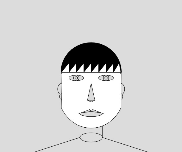
Finally, I combined both classes into one p5js file, included suitable royalty-free sounds, and implemented the feature where clicking anywhere on the canvas changes the song and the emotion. I struggled to create a gloomy background for the second emotion, so I searched the web for an image and set it as the background. To ensure all assets were loaded before the start of the drawing loop, I utilized the preload() function. The final result appears as follows:

CLICK IN THE CANVAS TO CHANGE EMOTION

Reflection:

My viewpoint on representing emotions through digital art underwent a significant transformation after completing this task. I feel like I was able to accomplish most of what I wanted to convey. I am particularly pleased with how the rain droplets turned out, as they required a lot of effort to create a convincing depth effect. I faced some challenges with the audio, where one sound would not stop when the other started playing, but it was eventually resolved. For future assignments, I hope to improve by creating my own original background, instead of using a pre-existing image. I also intended to include a joyful emotion, but I was unable to create a rotating sun with precisely angled triangle rays. Maybe with more practice, I would be able to do that as well. In the future, I plan to continue working on this project to add more emotions such as scared and surprised.

Week 2 – Generative Art

Inspiration & Execution

I was looking through the documents given in the syllabus for inspiration, and as I was looking at the patterns and shapes, I was transported back to my childhood days spent playing around in Microsoft Paint. Back then, I did not have access to the internet, and as someone with no artistic skills, I would just randomly draw rectangles of different sizes over and over again.  The “painting” that I used to make on Microsoft Paint looked somewhat like this:

This experience inspired me to try and recreate those old drawings, but this time using only my keyboard. I was able to use the random number generator that was taught in class, combined with my own research on frame rates and frame counts, to create a piece that alternates between black and white backgrounds. I did not want a single rectangle appearing every frame so I played around with a for-loop till I found the perfect balance between the number of rectangles per frame and the frameRate. I also subtracted 50 from the random numbers generated for the x-coordinates so that some of the rectangles start outside of the frame.  The final product looks like this:

Reflection

Even though this is a simple piece and I spent way less time on this than my first project (self-portrait), I still like it much more because of how connected I feel to this. Something that I am particularly proud of this time is that I was able to implement all that I had initially thought. Moreover, adding a pop sound every time a pair of rectangle pops was something new to me and I am really proud of that as well. Something that I would like to possibly change for the future is to add interactivity to it and instead of just being black and white, I would want to add different colored rectangles with different opacity in order to make it more colorful. Furthermore, I would want to randomly select different shapes (and hopefully add a better sound instead of the “annoying” pop sound).

Self-Portrait

Overall Experience

In the first assignment for “Introduction to Interactive Media,” I was eager to dive in and see what the course had in store. As someone who typically prefers to stick to science, I was excited to challenge myself and explore my creative side. Being pushed out of my comfort zone and into the realms of creative programming was a very enjoyable experience to say the least. I was excited to see how p5.js could help me bring my ideas to life and add a unique interactive component to my personal projects. Consequently, working with tool allowed me to imagine the potential for creating interactive and engaging games in the future. One idea that instantly came to mind was an NYUAD themed “Dress Up” game or a game for the bookstore to try on merchandise while shopping online. The initial challenge of using basic shapes to create a realistic portrait was tough, but I was excited to take on the challenge and expand my skills. Additionally, This project not only honed my technical skills, but it also sparked my imagination and allowed me to tap into my inner creativity.

Work Process

I initially started by creating a canvas of (500, 415) and after some research on how artists create portraits I added a few reference lines to the self-portrait for ease of location, symmetry, and to get the proportions right. I did not want the face shape to be a perfect ellipse so I added a few triangles with strokeWeight(0). At this stage the face shape looked like:

Although it took me a while to understand how layering works in order to hide the rectangles, I was pretty satisfied with my progress. Then I revisited the concepts of arcs, ellipses, rectangles, and lines in order to create the basic structure of eyes, nose, lips and the body. I found drawing the lips to be hardest till this step because it was a combination of three triangles and an arc. It took me a while to figure out how to use the angles in order to change the orientation of the arcs/semi-circles. The reference lines helped save time as I did not have to constantly figure out the co-ordinates. After this step, my self-portrait looked like:

Now came the most crucial step which was ensuring that I had a good hairstyle. Even in real life I have struggled with sticking to a single hairstyle so for this portrait I chose the hairstyle I had back in grade four. I am glad I was able to come up with an equation in a for-loop that saved me from all the manual labor it would have taken me to create the hair effect. The code that I used was:

This led me to successfully make the hair style I was looking for. I also added ears using the arc() function and found this to be very challenging as I could not get the shape right but eventually the portrait started looking like:

After that it was all about coloring and making small adjustments. After this project I realized how difficult it can be to choose the right colors and how colors can make or break the project. I tried using three ways to choose colors i.e. RGB, Hexadecimal, and writing the name of the color in string. I am very proud of how I used concepts of simultaneous equations and gradient of lines to figure out where the two lines of the shoulder would meet, in order for me to color them right. After coloring , adding a beard and changing the background, the portrait looked like:

This was supposed to be my final submission but I was enjoying p5.js so much that I wanted to experiment with it more. I was really fascinated by the animations that professor showed us in class and hence I wanted to add something to my portrait as well. I added three buttons to the portrait that add/remove a hat, change the season (background) while also changing the color of the shirt respectively, and add/remove smile from the face. I wanted to show how I am most “happy” when I am wearing my “hat” on a beach in the middle of “summers.” The following picture is a depiction of a happy me:

I had a lot of fun ensuring the buttons worked and the animations in them changed as the button is pressed as well. So the final product looks like the following:

Reflection

I really enjoyed the whole process and this project has enabled me to connect more with my creative side. I am glad that I was forced to get out of my comfort zone. For future projects, I would want to continue certain things such as making separate functions for each of the component as that made editing the code really easy. Furthermore, I would want to continue using reference lines or use the mouseX/mouseY values for getting coordinates. There are a few things that I feel I could have improved. One of them is making the portrait look more realistic and I feel like I could have done that by making use of the bezier curves. I found them very difficult to use in this project. Apart from that, I would want to add more unique ways of making the project interactive and more user-friendly. In the future, I would want to every project to have a story and meaning behind it and I look forward to the remaining assignments.