Short Description:
The project for week 8 asks to design a switch without manually connecting the switch to the power. By looking through some online resources and reviewing the Arduino documents, I created a switch using the distance sensor that detects if there is an object in front of the circuit and two LED diodes that reflect if an object is present. When an object is present, the circuit would light the red LED, and when there isn’t an object, the circuit would light the green LED.
INITAL APPOACH
Going into the project, I knew I wanted to use the sensors that came with the kit because I wanted to learn more about the connections of the components and coding in the Arduino IDE. By searching on Youtube and Arduino documentations, I initially played around with the light senor and was able to create a switch that is dependent on the amount of light that is present in the room. If there was low visibility, the LED would turn on, and if there was high visibility, the LED would turn off. Here is the link I referenced.
However, I felt this design wasn’t creative enough and sill had other components in my kit I want to learn about, so I decided play around with the distance sensor as well.
Light Sensor LED Switch (from Arduino)
The Process
The biggest challenge in the project was understand how the distance sensor worked, but I found a useful Youtube video that was able to explain the manual to me and walk through the process of connecting each pin to the Arduino board. I understood how to connect the GND and VCC pins, and through the Youtube video, I learned that the trig pin sends out an ultrasonic wave and the echo pin would receive the ultrasonic wave if something was in front the component — similar to bats & echolocation.
Physical Components
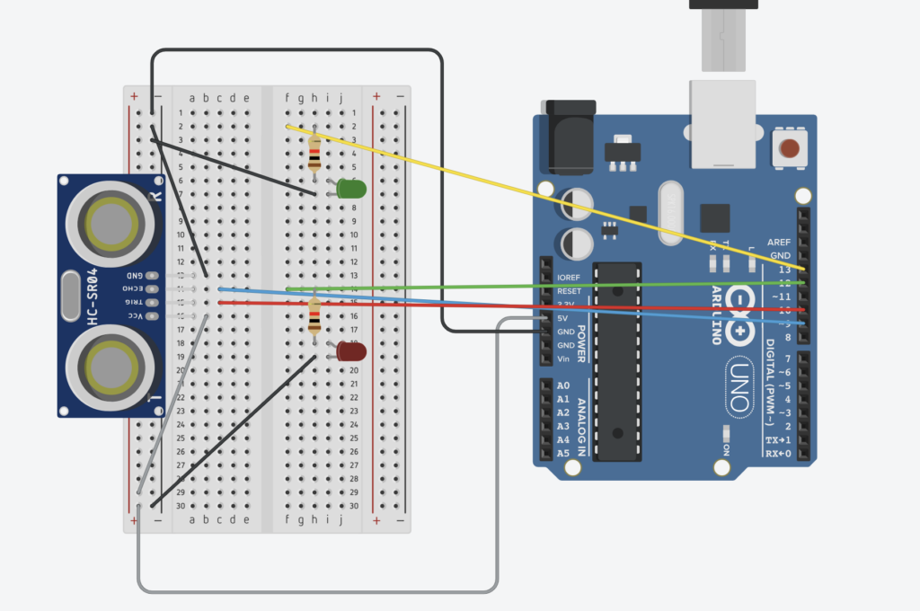
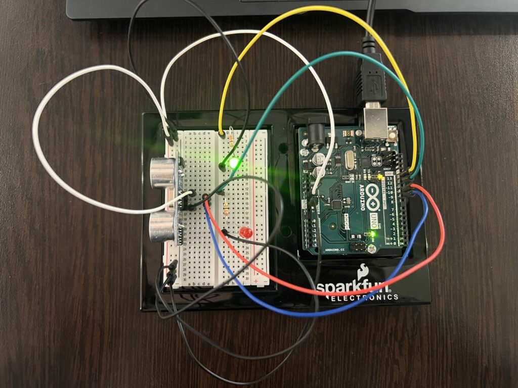
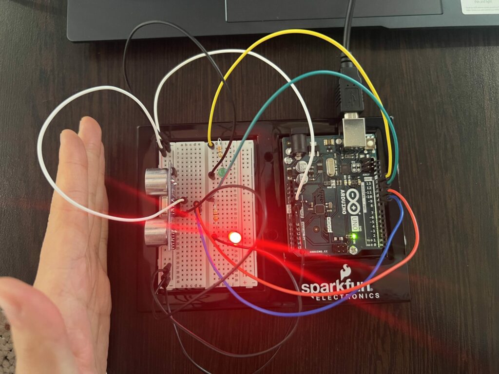
After understanding the component, all that was left was to connect my circuit and set up the code to run the project. Below is the photo of my circuit connections from TinkerCAD and physical circuit. Here is a short video (IMG_4697) of how the circuit would work.
TINKERCAD
GREEN LIGHT -- No Object Present
RED LIGHT -- Object Present (i.e: my hand)
The Code
Through the in-class exercise, tinkering with the light sensors, and looking through Youtube videos, I was able to write a short code in the Arduino IDE that makes the circuit function. Below is the main looping function.
void loop() {
// sets the trig pin to a low state
digitalWrite(trigPin, LOW);
delayMicroseconds(2);

// every 10 mircoseconds sends out a pulse (based off the manual)
digitalWrite(trigPin, HIGH);
delayMicroseconds(10);
digitalWrite(trigPin, LOW);

// from the echoPin --> returns the time it took the sound wave to travel in microseconds
timeTraveled = pulseIn(echoPin, HIGH);

// calculate the distance (in micrometer)
distance= timeTraveled * 0.034/2;
onDistance = distance;
if (onDistance <= 5){
  digitalWrite(ledRedPin, HIGH);
}
else{
  digitalWrite(ledRedPin, LOW);
}
Conclusion
Overall, I am very happy with how it turned out and being creative with the hand motions of “stop” for red and “go” for green in the circuit. I liked that I was able to learn more about the components and also work in software to make the circuit function the way I wanted it. For anyone else curious or wanting to learn more about Arduino, there are numerous resources and tutorial online that are so helpful, and I recommend anyone else just starting out in Arduino to take a learn and have fun.

