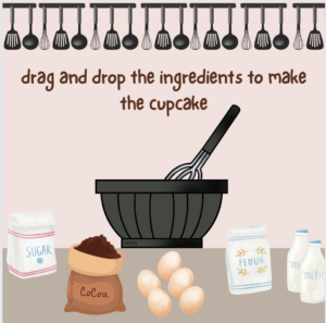
Week 8: Reading response

Her Code Got Humans on the Moon—And Invented Software Itself:

I have heard about Margaret Hamilton several times before, but I have never actually read her story until now. I find it so inspiring how she managed to defeat all the stereotypes and the stigmas around her working in the field and managed to not only create a successful code that would allow people to go to the moon but she was also able to detect an error no one else had found and when she was told that it would never happen, she still didn’t give up on it and found a short term solution, telling astronauts not to choose P01, and a long term solution, the actual solution that saved the Apollo 8 when the astronaut chose P01. I believe that more people should take a page from her book and be persistent and consistent with their software projects and not brush off minor mistakes. Up until this reading most readings were focused on design and creativity, but I like that this reading invites us to think about the technical aspect of coding and interactive media, Additionally it highlights the fact that minor errors should be taken care of or else they might turn into major catastrophes.


Emotion & Design: Attractive things work better:

I have always underestimated the process of design, I have always thought of it as something very easy to master, but once again I have been proven wrong. I did not realize how complex design actually is. Having to understand how the human mind works so that you can design a product that would make the person feel better about themselves in positive situations and not induce extra stress and anxiety in extreme situations is a skill that unfortunately not all designers possess. At several points throughout the reading, I found myself nodding and agreeing with the author, i found myself thinking back to scenarios where an object that is poorly designed would annoy me more than i am already annoyed and ruin my whole day just because it wouldn’t function the way i want it to, or when I’m having a good day and everything just seems to make sense and work perfectly fine. I realize now that it is not a coincidence but rather a thing that designers take into account when designing everyday things to ensure that humans are satisfied with the product. The author described the concept of affect in such a way that makes it so clear and easy to understand without over complicating it. The example of walking, dancing and jumping on a plank got me wondering how our gut feeling and intuition have such a strong influence on our thoughts and our decisions which makes it even harder for designers to predict our feelings at a certain point and tailor their products accordingly.

Week 8: unusual switch

Concept: 

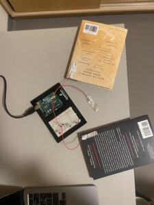
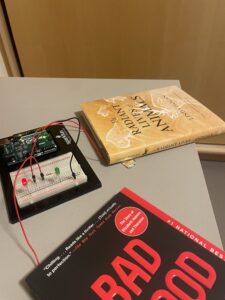
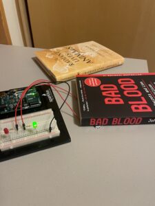
The concept of the switch is pretty straightforward, you place a book on the designated part of the desk and if I had read this book already the Red LED turns on indicating that this book has already been read. If I hadn’t read that book yet then the Green LED would turn on indicating that this book is new. 

Process & Highlights:

I created the following circuit that has two LEDs in parallel and the switch determines which, if any, is turned on:

Then I connected the aluminum foil ends to each of the books and on the desk by glue pads and that was it. Whenever I place one of the books on the desk, it shows whether I have read it or not!


Here is a video demo of the switch:

https://youtu.be/2xE2YWdkiFQ

Reflections:

I found this exercise pretty easy and fun to implement. I would love to create more advanced switches in the future and find a way to incorporate more creativity within.

Week 6: Midterm Project

Concept:

Anyone who knows me knows that I love baking and cooking. Being in the kitchen and creating something from scratch is such an amazing experience for me. Even though some people may argue that being in the kitchen is actually stressful, I don’t see it that way. It disconnects me from all the stress and anxiety of the outside world for a while and leaves me feeling relaxed. So for my midterm project, I wanted to create a kitchen simulation to let others feel a semblance of the calmness and joy I get when in the kitchen. 

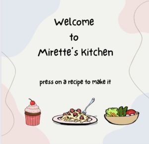
My program is so easy to navigate. At first, the user is prompted to choose one of three recipes, Chocolate Cupcakes, Spaghetti and Meatballs or Avocado salad. After clicking on a recipe, the program takes the user through a few steps to prepare the recipe they chose. The user has to follow all the instructions to successfully deliver the recipe or else they fail and have to start over. After completing a recipe, the user is given two options, to follow a link with the actual recipe, if they want to try it in real life, or to go back to the homepage to start a new recipe. The program also allows users to return to the home page at any given time by pressing esc on the keyboard. I tried to make the program as fun and as engaging as possible. Additionally, I chose a calm music track for the background to add an extra level of tranquility as well as a soft palette of colors to maintain the overall theme of the program which is calming and relaxing.

*open in a new window to hear the music

How it works:

I created my program by creating a function for each screen and calling these functions at the necessary time. I created a list to store the ingredients that are being displayed on the screen and used OOP to define an ingredient class that handles the display and hide-when-clicked methods. I used clip art images for all the icons and pictures included in the program and sized them as necessary to fit the way I want them to. Additionally, I linked a font file to define the font I wanted to use. I chose this font because it looks cute and cartoon-ish even, which makes the program look more fun and gives it an element of style that my program would lack if I had used a standard font.

I included dynamic features where possible and tried to make the motion randomized instead of defined (the dressing drops, the home page animation and the smoke). I handled all the transitions using the mouseClicked() function to determine which screens are displayed when and after which conditions are met. I tried to make my code as modifiable as possible, that is making it easy to add more screens, more ingredients, more functionalities, even more recipes if needed, by using encapsulation and modularity. I found that compressing the functions in p5js made it easier and clearer for me to navigate through the code. 

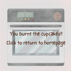
For the smoke screens, I included an internal timer in my code that records the start time and the current time and compares them till the required time has elapsed and then if no action was taken then the smoke screen is displayed. I tried severaltimesto create it with a different logic but it did not work and I found this to be the most appropriate to use in my code.

if (screen === 3) { //screen is the cupcake oven screen
   CupcakeOven();
   currentTime = millis();
   if (currentTime - startTime > cupcakeinterval) { //count the seconds elapsed and //compare it to the allowed interval, if it is greater than the time allowed, //cupcakes burnt so go to smoke screen
      screen = 5; //go to the cupcake smoke screen
   }
}
 

Problems faced:

The main problem I faced in the beginning was the transitions. I had all the screens defined and working perfectly, but I could not get them to link together properly without facing so many bugs. I tried so many different ways to get them to call each other from within the functions itself, but I would get stuck on one single screen forever. I tried to link them using mouseButton, it worked partially but I faced so many problems with the ingredients when I implemented it. When I finally decided to use mouseClicked(), I tried to call the functions from within and use if functions to identify when and which screen is needed to be called, but I also faced errors 🙁  It was after a lot of trial and error that I realized having a screen variable that is controlled through the mouseClicked() and then having draw() call the screen functions is the way to go. 

Another major problem I faced was implementing the ingredients objects and how to make them disappear when clicked and how to link the screen transitions with the ingredients. At first it was mostly trial and error, but then I decided to take a step back and understand every little detail related to how I am implementing them and come up with a solution that works on paper and then implement it step by step. I am proud of the way I got it to work in the end because it just makes sense to me and makes the whole process smooth and straightforward as well as easy to add/remove/modify the ingredients as needed. It is also worth noting that I originally wanted to implement a drag and drop feature for the ingredients but it was too complicated to use within my program especially that I wanted to use resized images for the ingredients so I settled on mouse clicks instead.

Last but not least, I faced problems with implementing the smoke screens and how to make them appear automatically after the time elapses. It was a bit confusing for me at first to implement it, it never worked at all to the point where I decided to completely disregard the idea of smoke screens, but I managed to get it working in the end. I wanted to add a timer functionality where it displayed the timer on screen so that the user can visually see how much time they have left, but it created so many bugs and did not work effectively, even though it is a straight forward feature, it clashed with my other functionalities, so i decided that the users can count to 5 or 7 themselves.

Future improvements and reflection:

I would love to add more features to make the program more advanced like adding mixing and frosting stages for the cupcakes and adding a stirring stage for the spaghetti as well as some steam while it is cooking. I would also love to add more choices within the recipes so that users can choose what dressing they want for the salad for example. I am overall satisfied with what I have now and I am proud that I got my program to look like what I had initially planned for it.

References:

images:

https://www.clipartmax.com/

https://www.freepik.com/

https://www.vecteezy.com/vector-art/11234689-cocoa-sack-with-seeds

recipes:

https://sallysbakingaddiction.com/super-moist-chocolate-cupcakes/

https://www.onceuponachef.com/recipes/spaghetti-and-meatballs.html

https://www.onceuponachef.com/recipes/summer-avocado-salad.html

music:

https://www.ashamaluevmusic.com/cooking-music

Font:

https://textfonts.net/one-little-font.html#google_vignette

Week 5: Reading response

The author outlines several ways computer vision can be enhanced to work on identifying human beings which include but are not limited to using retro reflective marking material. This raises multiple questions in my head about the efficiency of the programs if it only works under certain conditions. I know that this is considered a huge improvement when compared to earlier solutions however I find it interesting that the author is overlooking the main problem which is that having people wear retro reflective film to be detected by the program makes the program non reusable which in turn makes it inefficient. 

The author also mentions how the program would only be able to detect objects that can be described using code or by relating it to other objects the computer understands which further makes me question whether it is reliable to use in all cases. 

The reading made me wonder how much this technology has advanced since this article has been written considering the amount of facial recognition, virtual reality and augmented reality softwares that have emerged and are being used more frequently and more accurately.

Week 5: Midterm Progress

Concept:

For my midterm project I want to create a piece that resonated with a hobby of mine. I have always enjoyed baking and cooking. It’s such a calming experience, creating something from scratch. Whenever I get stressed out, I turn to my kitchen and let myself get lost in my recipe book, I let it take away my stress and heavy thoughts, therefore I decided to create a small kitchen simulation. I hope that through interacting with my piece users a can get to feel a semblance of the calmness I get to experience when I bake/cook.

I will design it in a way so that the user will get to choose one of 3 recipes, cupcakes, spaghetti and meatballs or an avocado salad, to bake/cook. 

Each recipe will be displayed as an icon on the homepage, when pressed it takes the user to the next page to start the preparations. The user will have to drag and drop the ingredients in order to prepare the food and then put it in and take it out of the oven if needed, there will be different steps for each recipe that resemble the actual recipe being followed. I will also try to attach a recipe that the user can download at the end to try the recipe in real life if they’re interested. 

Design:

I want to use a soft palette to resonate with the calming experience I am relaying to the users as well as deliver an aesthetically pleasing design. I did a quick sketch to show what I have in mind for the homepage and an example of the following stages, I will add more dynamic objects and interactivity features within my design when I am actually implementing it.

homepage:

cupcake-making page:

Expected Challenges:

I am expecting to have some troubles with the drag and drop feature and the transitions between the screens. I want the transitions to be as smooth as possible without having any awkward jumps or glitches. I also expect to have some troubles with transitioning between different music files when switching different scenes because I do not want to have any weird transitions when switching tracks.

Risk Prevention:

For the drag and drop, I plan on watching several youtube videos, and look at other people’s code to understand how to implement the drag and drop feature as easily and as efficient as possible because I am a bit conflicted on how to make without running into other bugs in the code.

for the transitions, so far I have come up with having multiple screen variables and a function for each screen that would be called at the relevant times to switch to the desired screen. I will also refer to the p5js. reference page and examples page to get some inspiration for the transitions that could be used to make my project as close to perfect as I can.

p5js Sketch:

for now this is what I have created, I am still working on class definitions, function creations and music loading. I have only created the first page, but I have implemented the icon buttons, however they only direct the user to an empty screen right now.

An issue I faced is the decrease in the resolution of the icons when I loaded them onto p5js, which I am trying to fix as well because it completely ruins the visuals.

I have also used MouseIsPressed to implement the buttons, but I realize that this makes the selection harder and not as smooth so I plan on changing it to MouseIsClicked to function better.

Week 4: Reading Response

This reading had one quote that extremely stood out to me and it was as follows “It is the duty of machines and those who design them to understand people. It is not our duty to understand the arbitrary, meaningless dictates of machines”, I have to admit I used to be one of those people the author describes in the reading that think that design is pretty straightforward and is pretty much based on logical decisions. I didn’t think that there is a human behavioral aspect to it. But it makes sense that designers should be able to understand human behaviors to tailor their products to be most comfortable for users, and not the other way around.

I must say, I had my fair share of frustration using laundry machines here on campus, each machine has a different set of features and It’s really hard for me to memorize every single functionality so I tend to choose a random setting each time. The amount of times I’ve thought to myself if only I was smarter to interpret what the signs mean without having to google the manual every time I’m doing laundry are countless. Therefore, Laundry days are almost always so emotionally overwhelming for me and so dreadful. The laundry machines are only one example of complex machines that tend to make me blame myself for being stupid and not competent enough, that’s why I resonate so much with what the author is saying that designers must understand that design is not just about delivering a working product but also about understanding how easy/hard this product will be for the general public and not to fellow engineers/specialized personnel.

However I cannot deny that multiple questions pop up in my mind about the feasibility of intertwining technology and psychology together for enhanced design. I wonder how combining both fields would affect each other. What sorts of compromises have to be made for Human Centered Design to take place? I know that it’s not about choosing one or the other but rather about integrating behavioral sciences within design, but without doubt there will be consequences. How can designers work on simplifying individual complex functionalities without affecting their overall product functionality, because I believe that having to come up with something logical is easier and more straightforward than having to think about all aspects of the human brain and decision making while designing a product that meets certain criteria. I often think that designers are bound by the rules and criteria set to them to make their product as efficient as possible on a budget, so it makes me wonder how taking human centered design into consideration affects all that.

Week 4: F1 data visualization

The concept:

For this project I decided early on that I wanted to do something related to Formula 1 racing, because I have been so interested in racing and race cars since I was very young. I went on Kaggle.com and found so many F1 datasets. I couldn’t decide what to do with them though. I initially wanted to do a visualization of the lap times over time (1950-2023), but the trends weren’t very interesting so I decided to focus on where the drivers are from instead. The whole concept of my project is to show you a visual representation of the countries F1 drivers are from. When you first run my program, you get a screen of two F1 cars racing towards the finish line, each round they have varying speeds though. When you click on the screen, you see the main screen where a map is displayed with red pins on the countries where F1 drivers are from. When you hover over a pin, it displays the country name and the total number of drivers who have raced in F1 from this country over the years. 

A highlight I’m proud of:

One thing I am really proud of is how I got the pins to work in a way so that when they are hovered, the stats are shown above. I used OOP to define the stats class which displays both the pin on the country (I had to create a csv file with the exact locations manually though) and the text displayed when the pin is hovered over. 

class stats { //pins placed on the countries' location and stats displayed
  constructor(countryCode, x, y, countryCount) {
    this.countryCode = countryCode;
    this.x = x;
    this.y = y;
    this.diameter = 3; // Initial circle diameter
    this.isHovered = false; //boolean variable to know whether the pin is hovered or not
    this.hoveredDiameter = 20;//diameter of the circle when hovered on
    this.countryCount = countryCount;
  }

  display() {
    noStroke();
    fill(255, 0, 0);
    ellipse(this.x, this.y, this.isHovered ? this.hoveredDiameter : this.diameter); // Adjust size when hovered accordingly
    
    if (this.isHovered) {//display the stats above when pin is hovered
      fill(220);
      textSize(22);
      textAlign(CENTER, CENTER);
      text(str(this.countryCount), width - 70 , 15);
      text(str(this.countryCode),width/2 - 50 , 15)

    }
    
  } 
  
  checkMouseHover() {
    // Calculate the distance between mouse and pin center
    let distance = dist(mouseX, mouseY, this.x, this.y);

    // Check if the mouse is within 2 pts of the pin 
    this.isHovered = distance < (this.diameter / 2) + 2;
  }
   
}


Reflection and ideas for future work or improvements:

I really enjoyed working on this project because it allowed me to explore new concepts and challenge myself to make it as close to what I had in mind as possible. One thing I really wanted to do though, but I couldn’t get the hang of was to create a smooth transition between the opening screen and the main screen. What I had in mind was to code it so that it would show the opening screen first and when the cars cross the finish line, there would be confetti all over the screen and transition into the main screen, where users can hover over the pins and display the country stats. This is the one extra thing I would’ve loved to include in my code. 

References:

Car and Map clipart: https://www.clipartmax.com/ 

Week 3 – train tracks

Concept:

For this assignment, I wanted to portray train tracks. I don’t know what it is about trains, but I have been fond of them ever since I was a little girl.  I decided to combine the concept of OOP and arrays with my love for trains to create the piece. I used two classes to define the train cars and the tracks and used arrays to store the instances created. The speed of the trains is randomized to have a visually pleasing image of trains moving in different directions at different speeds.

When the mouse is clicked, the screen is paused for 1 second and then the trains start moving again. I also added another functionality so that when a key is pressed the day changes into night.

A highlight I’m proud of:

I am proud of the way I got to make the trains move in alternating directions by creating a variable that stores either 1 or -1 and depending on the value, the direction of motion is set.

move(direction) {

  if(direction == 1){
      this.x = this.x + this.xspeed * this.xdirection;
      this.y = this.y + this.yspeed * this.ydirection;
  }else{if(direction == -1){
          this.x = this.x - this.xspeed * this.xdirection;
          this.y = this.y + this.yspeed * this.ydirection;
  }
    
  }

Reflection and ideas for future work or improvements:

For future work, i would like to work on creatively coming up with more visually and aesthetically pleasing art works. I would also like to include more advanced interactivity elements within my artwork.

Reference:

setTimeout() functionality: https://www.w3schools.com/jsref/met_win_settimeout.asp


Week 3- Reading Response

What exactly is interactivity? This is a question that I asked myself when I first decided to pursue Interactive media as a minor. At one point, I thought that interactivity is anything that is dynamic, then I learned that interactivity doesn’t necessarily mean dynamic. It took me some time to realize that interactivity is a complex definition that is commonly misunderstood. 

Taking the Mona Lisa as an example, I have always thought that the Mona Lisa is an interactive painting, inviting people to go around trying to see her eyes moving, but now that I think of it, it shouldn’t be considered an interactive painting, in fact the example of the tree branch the author gave is very similar to the example of the Mona Lisa, it constitutes a reaction not an interaction. I now realize that I have confused the concept of reactivity and interactivity most of my life.

The author invites readers to consider the following question: Is interactivity subjective? I believe that to some extent you can argue that interactivity is indeed subjective, depending on the quality of both the processing power that generates the action, and the response action itself. However, I believe that there is a limit to what we can call interactive. If there is no processing power and action whatsoever, like the example of the rock then this cannot be labeled as an interactive object. After thinking this through for quite some time, I realized that I agree with the author that interactivity can and should be scaled to levels to be able to compare different types of interactivity.

I was intrigued by the argument the author raised of whether a book is considered interactive or just reactive. I asked myself what I consider a book is. I guess you can say that I have never actually thought that books are interactive. I have always thought that a book is subjective, no two people can or will interpret it the same way. No matter how detailed a book is, it leaves some room for each person’s imagination to fill, but that does not mean that it is interactive, I would say that it is just a matter of different reactions and not different answers as the author puts it.

Lastly, the example of the movie given in the reading reminds me of a movie I watched, or putting it in a more accurate way, I experienced, a while back. The movie is Black Mirror: Bandersnatch on Netflix. Throughout the movie, Netflix pauses and asks you which decision you want the main character to make and depending on what you choose, you go through a different track of the movie. The decisions range from “should the main character take this job” to “should the main character kill this person”. It is reported that there are 5 main endings to the movie but there are trillions of different tracks you can follow in the movie making each experience unique. I believe that this “movie” makes the argument that movies are not interactive stronger. I would rank this movie high on the interactivity scale because it offers endless answers and invites users to keep trying over and over to see how many different endings they could reach.

Week 2: Reading Response

I have always thought of code as something that requires precision and organization, having structure and rules that require following. When I think about art, It’s quite the opposite. I see art as something that is unstructured and chaotic, messy.

At first thought, I associated digital art with coding. I started thinking of all these rules and constraints that I should follow, but after watching Casey Reas’s talk, I started questioning my assumptions. Can art be structured? Can coding be uncontrolled? Can the chaos of art and the structure of code be intertwined? Is it possible to let go of our control and embrace the outcome? Am I limiting my capabilities by creating imaginary categories to place different art forms in?

I was surprised to learn that sometimes the power of chaos can lead to better outcomes when it comes to digital art. I was surprised to know that there are people who are studying the art of creating generative art pieces using the simplest of codes and iterations to generate small randomized shapes that add up to build the whole picture. But most importantly, I learned the idea of embracing chaos and randomness through structure. By making a series of calculations, you can allow your program to generate a randomized artwork that you cannot control, but can build upon. I was extremely inspired by the “Fractal Invaders” piece, which plays on the fact that randomly placed squares of white and black that seem like nothing when duplicated using symmetry, can be interpreted by our minds as faces and symbols. 

This talk certainly left me curious to explore the topic of creating art using the simplest ideas but adding on a layer of randomness, symmetry and letting go of the idea of order and precision. I am amazed by the idea of embracing the territory of controlled randomness/ chaos. The talk piqued my interest in exploring more examples similar to the ones shown in the video and get inspired from them to enhance my future work.