A Sky of Falling Stars (Assignment 3)

I was very excited to go to the Coldplay concert next Tuesday, and I did not get tickets because of an error page. Despite being very disappointed, I decided to turn this feeling into inspiration for this week’s assignment of generative art. Basing myself on the class activities and A Sky Full of Stars, one of my favorite song from the band, I decided to portray a sky where the stars were falling into the ground. This scene would represent the crumbling dreams of seeing my favorite band on stage. Unlike previous assignments, I did not have a clear vision of what I wanted to obtain at the beginning, and thus, experienced a very different creative process.

I began by drawing a simple circle moving through the screen from left to right as a shooting stars would. I then, created a class for “Star” and an array of stars in order to give them all a random position. This is the point where the art became generative, as every frame was determined by the random parameters of height.


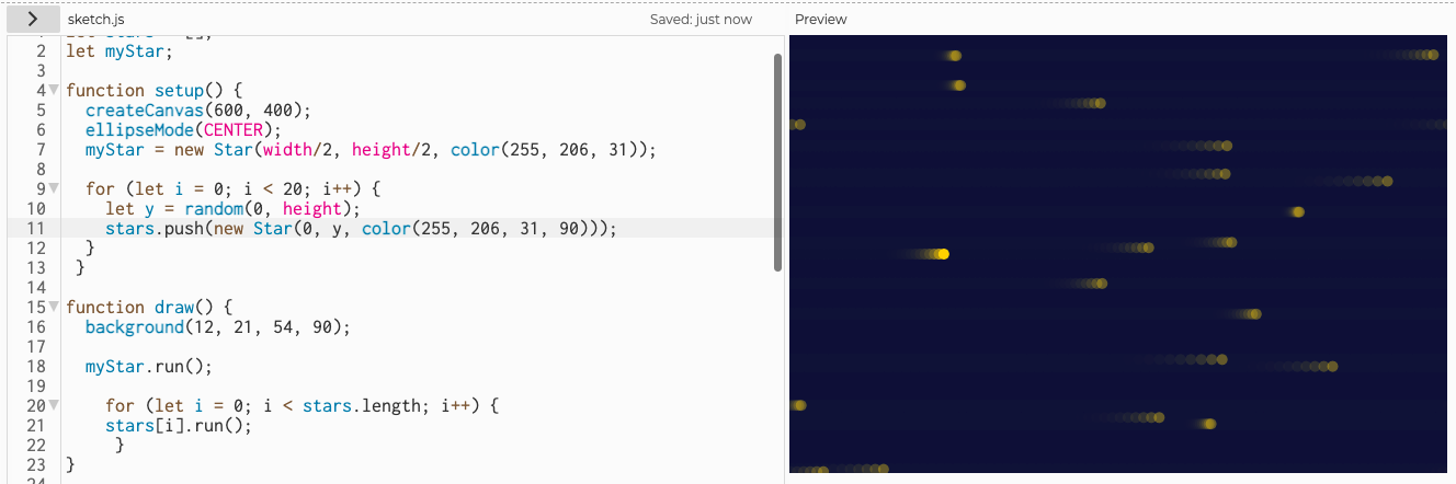
At this point, I spent a long time making sure elements fit together in a nice aesthetic. I didn’t like how things looked so I attempted for a while to replace the circle for a star shape. Nevertheless this implied having a for function inside a class, and I am unsure if this is possible, but I could not make it work. After few hours of frustration, I gave up on the idea of star shapes & decided to add interactivity to the piece. This would allow me to use different functions within the class, make my artwork more interesting, and provide an outlet for me and the user to express their frustration through the click of the mouse. I also decided to alter the movement of the objects from top to bottom, in order to create the sensation of falling stars.

For the interactivity I created another array of orange stars. The original array would shift slightly to the right or left upon clicking, and the orange array would vary sizes randomly. This created a much more cohesive artwork with a chaotic feeling that I also intended to convey.

Albeit a bit confusing at the beginning, working with OOP forced me to further organize my code, my approach to it, and opened a wide array of possibilities. I really appreciate not having to copy and paste code multiple times for multiple objects, and how I was forced to used only variables for the code to work.

This is my final result. Make sure to click multiple times 🙂

Here’s the failed attempt from class’ activity. Sorry for the inconvenience.

I am very happy with the result, especially because of the power the user has in determining the output. The more clicked, the more chaotic the piece is. Nevertheless, I spent more time than I would have liked figuring out the star shape (which did not work). In the future I would like to figure out how to do this, and include interaction in between particles.


Symmetry? (Assignment 2)

After browsing endlessly through the magazines and articles, I decided I was going to build a piece that resembled the following design by Georg Nees. I thought that using six different items in my work with different patterns would allow me to play arround with the functions we learned in class and further grasp the concept of randomness and noise.

My first order of business was to draw the six circles on screen. Unlike the original piece, I decided it would look better if I prevented them from touching each other. This, because I wanted to use different colors on each. Below are some pictures of the initial code and experimentation. 

As soon as I set up everything I began to play arround with lines. I realized that, in order to build something to resemble the picture I was basing myself on, I would need lines with different lengths, and thus decided to play a little with the shapes I knew. I did this because I wanted my focus to be on for() loops, noise and randomness. Hence, I created three pairs of patterns that would give my art a symmetrical and unique feeling.

The more I worked on the project, the more I made it my own. I changed a lot of components I was not expecting to, and the last few hours of work were spent making sure that all of the elements made sense together and that the piece was aesthetically pleasing. Overall I am very happy with the final product. In the future, I would like to spend some time figuring out how to randomize the beginning and endpoints of the lines to, perhaps, do something more similar to the original piece.

The final product is composed of:

  • Circles 1 & 6: for() function creating green lines rotating with a noise value  on opposite directions and different scaling.
  • Circle 2: for() function creating circles in a random pattern slowed down by an “if” statement.
  • Circle 5: Orange circles varying in size through a noise value.
  • Circles 3 & 4: Blue rectangles rotating on opposite directions and with slightly different scaling.

Throughout the process, I lost all my work once because my computer crashed when I used i+3 as opposed to i+=3 when writing a noise function. One of my biggest takeaways is to constantly save the code, and to document the process. Never losing anything again 🙂


Juanma’s Self Portrait (Assignment 1)

When tasked about developing a self portrait through basic shapes  in .p5js, I was a bit confused as to how to start. I first spent a long time playing arround with shapes to choose a body figure fitting to my vision. However, this body was not a self portrait in any way. It was not me. So, I asked my suit mates which physical elements characterize me. To this, I was told my glasses, my curly hair, my bee necklace and my white T-shirts mark my style. So I decided to focus on these elements as I built an image of myself. Here are some of them: (My hair and clothes you’ll see in class)


I designed my portrait from top down using the following elements:

  1. Hair: My hair was composed of a multitude of circles with “noStroke();” that would illustrate my curly hair. I made three different hair colors to give this element depth and importance in the image.
  2. Face: My face was composed of ellipses for the shape, eyes, and ears; and arcs for the nose, eyebrows and the smile.
  3. Neck: My neck was built with rectangles and an ellipsis.
  4. Body: The body is made with rectangles and lines for the holes between the arms and the core.
  5. Glasses: My glasses are composed of two circles, an arc and to lines.
  6. Necklace: Two lines and two ellipses.

The greatest challenge in designing the portrait was making sure that the elements I included made sense. Sometimes a specific color or shape that I thought would fit in a specific place, looks horrible. In these situations, playing with individual values was the only way I knew how to fix this, and thus was very time consuming.

I also learned the importance of shadows, as adding them had a significant impact on the final product and took much less time than I initially expected.

Furthermore, in an attempt to include an interactive element, I added mouseX and mouseY qualities to the variable defining the color of my glasses so that the user could change it according to their preference.

Here’s my portrait:

Some elements to improve is that I hard coded my body, so if the dimensions of the canvas are changed, my head will adapt accordingly but my body will not. I would have also liked to include a background and more interactive portrait. Regardless, with this exercise being my first experience with .p5js and processing I am very happy with the final result.

So, which color of glasses do you think better fit me?