Week 8 Reading Response

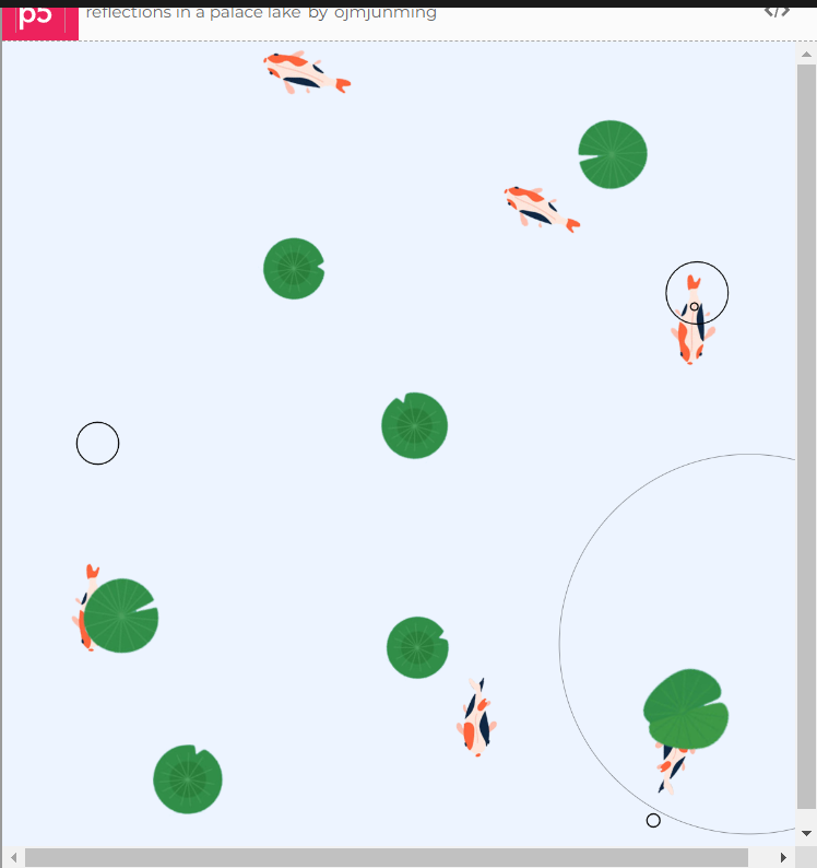
Norman’s chapter on emotions in good design was enlightening and reminds us that humans are more than just rational, logical machines. People appreciate art and beauty, and I suppose that even in the field of design, where ones of the goal is to make something as logically simple for a user as possible, there is still room for aesthetics. He wrote that ‘attractive things work better’, and I was reminded of how that applies to human interactions too — pretty privilege is a real thing. “Pretty people are perceived as smarter, funnier, more sociable, healthier, and successful” (First link I found on Google). Between two teapots that achieve the same goal of brewing tea, the more attractive design is usually the favored one, and sometimes you might even be willing to give up some functionality in favor of the design. Norman also talks about how different designs might be interacted with depending on the user’s mood or situation. In a stressful situation, a panicking user might not know how pull the fire doors, and might just push harder. This principle should be applied to all manners of design, and consider users that might not have the privilege of the time of figuring out a badly-designed place. For example, a hospital should be well-designed and clearly marked, because a panicking person bringing in their mother will not have the mental capacity to stand and read signs on where the Emergency Room is.

I found the anecdote in Margaret Hamilton’s article on her repeatedly warning the higher-ups about a potential bug really funny, and representative of the experiences I have had so far. A common design principle is to assume the user is stupid. Any error that is possible to be made can be made, even if they’re trained, or given the manual, or even if there’s a written “Do not Touch” sign in front of the object they’re not supposed to touch. From a design perspective, they have done everything right — verbally warn the astronauts not to touch the program, add a reminder in front of the screen to not touch the program. Yet, the astronauts touched the program even when it is usually not run in this scenario. Designs should always have tolerance for fault, no matter how unlikely the fault is. Of course, not every fault can be covered, for example you can’t design a door that can handle being torn apart by someone, so there should be some risk-reward management. How unlikely is it for this fault to be encountered, and how bad will it be if this fault is triggered? In the case of Hamilton’s code, the fault was unlikely to be triggered, but it causes a very scary crash with data loss if it was triggered, thus it would made sense to guard against that case, though I am saying this with the gift of hindsight.

Week 6 – Midterm Memory Box

Link to sketch: https://editor.p5js.org/ojmjunming/full/W-301y_lp 

Concept

I wanted to create an installation-type piece, something that you leave in a gallery or in some space and let users naturally interact with the piece. The idea behind my project is based off a thought I had a few weeks ago. I thought that despite all the new memories I make, I find myself forgetting things and people in my past who were once dear to me. This project is my take on trying to convey that feeling — the idea of losing memories for every new ones you gain.

How it Works

The screen prompts the user from a list of pre-determined questions and the viewer is encouraged to type a short response to it. When they press ‘Enter’, a photo will be taken of the viewer the viewer’s response and photograph will be inserted into the ‘Memory Box’, while an older memory is removed.

I also try to convey a feeling of fleetingness by making the title and question text look wobbly/jittery. The text doesn’t feel static and feels a little uncertain as they do not stay in one place, which I thought helps sell a feeling of dreamy-ness. The text input is also accentuated by the sounds of a typewriter, which I use to help create an atmosphere of retro-ness and nostalgia.

Technical Parts I’m Proud Of

class WobblyText {
  constructor(message, x, y, size = TEXT_SIZE) {
    this.letters = []
    this.size = size
    this.message = message
    this.x = x
    this.y = y
    
    let curString = '';
    for (let i = 0; i < message.length; i++) {
      let curLetter = message[i]
      this.letters.push(new Letter(curLetter, this.x + textWidth(curString) * 1.2, this.y, this.size))
      curString += curLetter
      
    }
  }
  
  render() {
    for (let letter of this.letters) {
      letter.render()
    }
  }
}
         
class Letter {
  constructor(letter, x, y, size = 16) {
    this.letter = letter
    this.size = size
    this.originX = x
    this.originY = y
    this.offsetX = 0
    this.offsetY = 0
    this.maxOffset = 2 + (size / 12)

    this.noiseX = random(10000)
    this.noiseY = random(10000)
  }
  
  render() {
    push()
    textSize(this.size)
    text(this.letter, this.originX + this.offsetX, this.originY + this.offsetY)
    pop()
    
    this.offsetX = (noise(this.noiseX) - 0.5) * 2 * this.maxOffset
    this.offsetY = (noise(this.noiseY) - 0.5) * 2 * this.maxOffset
    this.noiseX += 0.01;
    this.noiseY += 0.01;
  }
}

I’m really proud of the wobbly/jittery text as I feel that it helps add to the emotional feeling of the project. It was a little harder to achieve than I thought, as I had to manually create every letter of the text so I created two classes to help me achieve this effect without having to manually draw each of the letters. I maintain a separate state for each letter, so each letter moves independently of the other letters ( though within a certain bounds of it’s starting point ).

Things to improve

I left out the instructions for pressing ‘Enter’ as I assumed that it’s something that most viewers will know how to do, but I’m not sure if thats a good decision I’ve made and I wish I had more time to test my project with other people to see if there are any improvements I could’ve made on the UI/UX. I would’ve also liked to improve the animations for removing/creating a new memory, as right now there is only a simple fade out animation. A more dreamy animation for inserting the new memories would’ve been nice.

Week 5 – Midterm idea

Design and Concept


Over the first few weeks of this class and our class projects, I’ve found myself leaning towards pieces that would work well in an art installation setting ( or at least I think so ), ones that don’t require much user interaction but is just pleasant to look at.

For my midterm, I wanted to do something similar, but at the same time incorporating some more interaction in it while retaining the essence of being an ‘installation piece’ . I was inspired by Chris Milk’s “The Treachery of Sanctuary”, Romy Achituv & Camille Utterback’s “Text Rain”, and more than the others, Scott Snibbe’s “Deep Walls”. I loved the concept of leaving behind little snippets of yourself, seeing the snippets left behind by other people, and the idea that for every memory that is added, a memory is lost.


Picture of Scott Snibbe’s “Deep Walls”

For my midterm project, I’d like to do something similar with a camera and a keyboard. On the screen, there will be a few black and white photo threshold’d to be fully black or white so that the person is not identifiable, along with some text that was left behind by that person. The next viewer will be given one of a few prompts, such as “What is your favorite memory?” , “Who do you miss the most?”, “What are you looking forward to?”, and the viewer can type their answers with the keyboard while the camera takes a photo of them without a prompt. Their memory and photo will be left on the screen, replacing one of the existing ‘memories’, causing it to be lost forever.

I’ve been thinking about the concept of memory for a while, and I thought that this will be a good project to incorporate my thoughts into a physical piece. The biggest challenge for this project I think will be getting the camera and photo-taking to work with Processing, and doing so in a meaningful way. I would also have to think of some good prompts for the piece, as some prompts would be too simple, while having them be too complicated might discourage viewers from typing.

Week 5 – Computer Vision Reading

It’s fascinating how many technologies were developed first for military use, before finding it’s way into the commercial space! This was the first time I’ve heard of computer vision originating from military origins, but I knew that the Internet was first invented for war-time communications, and super-glue was an accidental invention from other military-based research. Those inventions that were first made for something as violent as harm has eventually settled down and turned into technologies that we use in our everyday lives, and even in art.

I still think it’s funny how some tasks that are so simple for humans are extremely difficult problems in computation, and some tasks that are nigh-impossible for humans is easy for computers. Computers can calculate 3 to the power of 100 almost instantly, a task that no sane human can do. In the case of computer vision, any human can identify a pigeon in a picture, yet it took computers decades of research before it started being able to identify objects well.

I also found it interesting how many of the early applications of computer vision in projects has a theme of surveillance around it, and I think it reflects how the scene viewed cameras at the time — tools of surveillance. Standards and Double Standards and Suicide Box both use computer vision to highlight societal observations through the lens of an array of pixels.

Week 4 – Reading response

It is sometimes unfair to expect a user to read a manual before using our application. I agree with the author that not everything has to be completely intuitive, such as an airplane cockpit does not have to be designed to be easily usable by an untrained passenger. However, complexity should not be added to objects that simply do not require it. A door should be easy to figure out, and it should be designed from an average layperson’s POV. What would an average person do? Would they pull/push the door? If so, then the door should be designed with that in mind, unless there is an actual need for using a non-conventional approach to design like having to tap the door three times for it to open. Or if you’re designing an escape room, where the intention is inverted on it’s head — you try to design something that is difficult to use.

From the perspective of designing my p5.js sketches, I think this idea of intuitiveness and familiarity comes into play. Would a user know to press specific buttons on their keyboard if there is no instruction to do so, without reading the code ( in this case, why should they read the code before running our sketch? ). Yet we must not treat the users as completely incapable and instruct them every single step of the way. Personally, I think it should be safe to assume that users would move their mouse around a sketch, and maybe press the mouse buttons a few times, thus I personally think that instructions are not needed for mouse interactions , but should be there for keyboard interactions. In an ideal world, instructions should be there for what the user is ignorant of, and instructions should be left out for what users know as it just adds clutter.

Week 4 – Data Viz Wind Turbines

Concept:
During class on Wednesday, one of the example datasets that was brought up in class was wind data as the professor played with the globe data visualization. When I saw the wind data, I immediately thought of drawing wind turbines that matched the wind speed data, and that’s what I ended up doing for this project.

Sketch:

While in the planning phase, I thought that this project would be just fun to look at and not a data-focused piece, but this had the unexpected result of being surprisingly insightful about wind speeds during the day. The wind is strongest during the day at about 14:00-17:00, and weakest around midnight to late morning.

Code: 
I was proud of my day/ night cycle code, as I thought it was clever. I drew a black box over the entire screen, and the opacity changes depending on the time of day so it is able to give off a feeling of ‘darkness’ during midnight hours, and it is fully transparent during the daytime.

// opacity of black screen over the screen to give illusion of day/night cycle
const darknessLevel = mapOfHourToDarkness[curHour - 1]
push()
fill(0, 0, 0, darknessLevel * 5)
square(0, 0, 400)
pop()

// complex math -- basically calculates the curSkyColor as an average of darkSky and brightSky, weighted towards darkSky based on the current darknessLevel
curSkyColor = p5.Vector.add(p5.Vector.mult(darkSkyColor, darknessLevel), p5.Vector.mult(brightSkyColor, 10 - darknessLevel)).div(10)

Improvements
There was more data in my .CSV file including wind direction, but I couldn’t think of a good way to implement but it would’ve been nice. I was also not able to find a free API for UAE wind data, and I had to manually scrape the data for a certain day. It would have been fun to be able to visualize the wind speeds of the current/previous day instead of being stuck on 27 Sept 2023.

week 3 -reading

I greatly enjoyed the discourse on interactivity versus reactivity, and as someone who’s been trying to read a lot recently, the description the author gives on why books are not interactive was enlightening. An interactive object has to “listen, think, and speak”, and when you think about it, many forms of entertainment center around the object “speaking” to us, be it a TV or a book.

For a piece to be a good interactive piece, it has to strike a good balance between the three as pointed out by the author, and “trading off” one component to prioritize the other two weakens the whole project’s interactivity as a whole. However, personally I feel that for an interactive piece, I disagree with the author in that it doesn’t need to fulfill all three components to be a successful piece. For example, Chris Milk’s “The Treachery of Sanctuary” may not be the most interactive piece from the “listening” perspective, but it does “think, and speak” well enough to compensate for the relatively few actions that a viewer can take, saying a lot even if it isn’t listening that much ( for example, the first two screens where it doesn’t really matter what the viewer is doing ).

A question I had was that I struggled to understand how an object would “think”. I understood it in the context of a conversation between two people, but I don’t really get it from the perspective of something like an art piece. In my opinion, the “think” part of an interactive object does not matter too much, and the most important parts is “listening” and then “speaking” back an appropriate reply, though “thinking” is likely needed to construct a good reply. Is the “thinking” for a piece then simply how the UI/robot/art constructs a reply to a user’s interaction with the piece?

Week 3 – Assignment – Reflections on a Lake

Concept

I was looking up examples of generative art to find something to be inspired by. However, I found that most generative artworks are too messy/noisy for my liking. Personally I like simpler, more calming structures than the ones seen in the picture below so I took another approach — to design something that’s relaxing to look at, instead of being chaotic.

I’ve been listening to a lot Umitaro Abe, a Japanese composer that mostly has instrumental pieces. They’re very relaxing to listen to, so I thought that I might try making a p5 work that can hold that atmosphere of peace while being entertaining enough to capture a viewer’s attention.

The sketch


The sketch is pretty much a koi pond, and the fishes will move around and leave behind temporary ripples in the water. The wave ripples remind us that most disturbances are temporary, and can sometimes even be pretty to look at. I think it’s very fun to look at while listening to some piano pieces, so the version on the p5 editor plays a song from Umitaro Abe to accompany this piece.

Proudest part

My proudest part for this project was not the code, but simply getting the sprites for the fishes to make the little animation. I couldn’t find sprites that I wanted online, but I managed to find static images of koi fishes that matches the style I wanted. I used Photoshop to edit the fishes tails to give each fish two frames of animation, but it surprisingly took more time than it should because I didn’t have much experience with creating animated sprites myself, only with using them.

Reflections

I’m proud of this one! Code could always be cleaner but I’m pretty satisfied with this piece. I might add more fish variations in the future, or maybe create a better motion path for the fishes like a curved zig-zag instead of a straight line as it is right now.

Assignment 2 – Loops

I thought Mondrian art was pretty fun to look at, and I liked the geometric simplicity of it, and so I thought of making a simple p5.js program with loops to try to mimic the look. However, I somehow also thought of sliding puzzles, where there’s a grid of squares and there’s one empty cell that other pieces can be slid into. I thought it might be fun to combine the two of them, and I ended up creating a little animated piece that runs on its own randomly.

    • A highlight of some code that you’re particularly proud ofI came across a problem where I wanted to randomly select 3 indexes in an array without any duplications, and it was something that I had to stop to think about as just randomly selecting elements sequentially could run the risk of the same index being selected twice. My code removes the selected index from the array before randomly selecting again.
      // make sure that there are always 3 colors, and we dont select same index for two colors
      let redBoxIndex = random(listOfNums);
      let index = listOfNums.indexOf(redBoxIndex);
      listOfNums.splice(index, 1);
      
      let blueBoxIndex = random(listOfNums);
      index = listOfNums.indexOf(blueBoxIndex);
      listOfNums.splice(index, 1);
      
      let yellowBoxIndex = random(listOfNums);
      index = listOfNums.indexOf(yellowBoxIndex);
      listOfNums.splice(index, 1);
    • Embedded sketch

  • Reflection and ideas for future work or improvements

    I feel that this piece did not meet my own expectations compared to my Hello Kitty self-portrait I did for last week, but I thought it was my idea that was weak rather than the execution. It’s satisfying to watch the pieces move, especially when a coloured square moves, but I’m not too sure what the entire point behind this project is.

Week 2 – Reading Reflection

I enjoyed Casey Reas’s talk on the randomness, and how the chaos of randomness can sometimes be turned into art. I love the concept presented — of making order out of chaos, as noise exists all around us. Computers were once thought to be orderly machines, that would calculate the exact same result every time it is run. In an already-chaotic world, why would one introduce chaos to one of the very few things that are orderly? Yet, I think that managed chaos can be beautiful. Renaissance paintings are considered good art, but they are not perfect. Simply because of the fact that it exists in the real world, there are always minor deviations even in a perfect brush stroke. Each individual hair in a brush creates enough deviation that no two brush strokes are the same, and somehow those minor deviations are what gives character and life to the drawing. In digital drawing apps, it would not be difficult to create brushes that always produce uniform results, but yet, noise is artificially added in to mimic brushes in the real world, intentionally creating chaos and randomness.

Something that I’ve been thinking about in context to P5.Js and randomness is that I won’t be fully able to control the user experience of the output. What if the randomness I’ve implemented spits out a ‘bad’ output for a certain user? But the more I thought about it, the less likely that sounded to happen. Order from chaos was the moral I’ve learnt from Casey Reas’s video, and I must constrain the randomness in a way that’ll look like something I expect most, if not all the time. A sketch of 10 randomly generated points might sometimes gets me a good result, for example 10 points shaped like a heart or a box, but most of the time it will just give me something that makes no sense. Perhaps then, it might make more sense to generate 10 points in the shape of a heart, but with minor, randomly generated deviations in it’s coordinates so that the heart looks jittery which might be more interesting than a perfect heart. The BASIC lines program of infinitely generated forward and back slashes. If every viewer generates 500 characters of the program, the chances of two viewer having the same outputs of /\/\ would be (1/2)^500, infinitesimally small. It is likely that two users have never seen the same output, but yet the program generates a neat, pleasant-looking output no matter how often it’s run. Perhaps that the idea behind randomness.