Week 8: Reading Response

I found the article “Her Code Got Humans on the Moon—And Invented Software Itself” to be very inspiring and thought-provoking. I am always amazed whenever I read about people who defy the norms of their times to do something extraordinary. Margaret Hamilton’s story is a shining example of resilience, determination, and innovation in the face of societal expectations.

In an era when women were not commonly encouraged to pursue careers in high-powered technical fields, Hamilton not only ventured into the world of software engineering but also became a trailblazer in the field. What struck me most is how Hamilton balanced her roles as a working mother and a programmer. The fact that she brought her daughter to the lab speaks to her unwavering commitment to her work.

In a world where gender inequality within the tech field still remains a challenge, I think Hamilton’s story provides a very promising avenue for doing the extraordinary.

The second reading “Emotion and Attractive” offers intriguing insights into the interplay of aesthetics, usability, and emotional response in design. I liked how the author used his teapot collection to illustrate the idea that design isn’t a one-size-fits-all concept; it depends a lot on the context, mood, and personal preference. The analogy of transitioning from black and white to color screens in the early days of personal computing is particularly fascinating. The author’s initial skepticism about the value of color screens, despite their popularity, speaks to the subjective nature of design preferences. While the cognitive perspective may suggest that color doesn’t add significant value to productivity, the emotional response to color cannot be discounted.

The concept of “affect” and its role in design has left me with some intriguing food for thought. It’s fascinating to consider how our emotional responses to design can have such a profound impact on our decision-making and behavior. Affect, in this context, acts as a sort of silent influencer, guiding our judgments, shaping our perceptions, and even affecting our reactions.

What’s particularly striking is how affect doesn’t just serve as an emotional compass but also as a practical tool. It can alert us to potential dangers, which is incredibly valuable, but it can also steer our creative problem-solving processes. This dual role of affect makes me ponder the delicate balance between emotional response and practicality in design.

Midterm: DanceVille

Link to my sketch: https://editor.p5js.org/is2587/full/Bn466sW2p

Concept

My midterm project began as a whimsical idea: imagine a disco party where your favorite cartoon characters hit the dance floor. But this idea seemed too simple and I could not figure out how to make it more interactive and engaging for the user. As I began coding, I stumbled upon Dan Shiffman’s Teachable Machine playlist on YouTube. His playlist sparked a new inspiration – why not infuse ML into my project as well? Plus, a repeated suggestion I got from my friends regarding making the project more engaging was to somehow make the users mimic the dancing characters movement.

This fusion of disco vibes and machine learning transformed my simple “disco experience” into an engaging game. Now, users don’t just watch the dance moves; they become the stars of the show, mimicking poses detected by the webcam. To enhance the scene, I added dancing characters, some spotlights, and floor highlights.

Sketch

Problems/WHAT IM PROUD OF

Since working with a machine learning model was a new experience for me, I faced quite a lot of challenges throughout the coding process. One significant hurdle was integrating my trained machine learning model to recognize user poses. I had a hard time figuring out how I can increment the users score according to the poses detected by the model.

function classifyVideo() { 
classifier.classify(video, gotResults); 
}

function gotResults(error, results) {
  if (error) {
    console.error(error);
    return;
  }
  // Store the label and classify again
  label = results[0].label;
  classifyVideo();
}

function updateScore() {
  if (currentImage == clappingImage && label == "Clapping") {
    score += 1;
  } else if (currentImage == dabbingImage && label == "Dabbing") {
    score += 1;
  } else if (currentImage == handsUpImage && label == "Holding hands up") {
    score += 1;
  } else if (currentImage == armRollImage && label == "Rolling arms") {
    score += 1;
  }
}

Here’s how it works: when the machine learning model processes the user’s dance moves, it returns a label indicating the detected pose, like “Clapping” or “Dabbing.”

Then, the updateScore function comes into play. It’s responsible for comparing the detected pose to the pose displayed on the screen (like clapping or dabbing images) and, if they match, incrementing the user’s score.

Another puzzle was dealing with user stillness. Initially, even if users stood frozen, the machine learning model would guess a dance move. This unexpected stillness would inadvertently increase the user’s score. The solution I came up with was to train my model to identify moments of “no movement,” ensuring it could distinguish between action and inaction.

Since I could not find the right poses online that were also consistent with the overall aesthetics of the game, I decided to sketch the different poses on my ipad and integrated that into my sketch which was another aspect I really enjoyed working on.

What I like the most is how little features such as the dancing characters or the music choice really add to the whole experience. Before you enter the disco, I added a special touch to the music. At the beginning, it’s like you’re standing right outside a disco, and you can hear the muffled sounds of music from inside. It sets the stage and builds anticipation. But as soon as you enter, the music changes to something lively and funky, perfectly matching the energetic and vibrant atmosphere of the game.

Reflections

I knew working with machine learning would not be easy however, taking on this challenge working on this project all the more exciting. It was a blend of fun and anxiety I would say. I’m particularly proud of how I managed to keep track of scores and how I elevated the game’s aesthetics. Details like animated characters grooving on the dance floor and hand-illustrated dance move images added an extra layer of vibrancy.

If I could revise one aspect of my project, it would be fine-tuning my model to better recognize distinct dance poses. This, I believe, would further enhance the user’s dance-off experience, making it even more enjoyable and accurate.

REFERENCES

Dan Shiffman’s teachable machine playlist: https://www.youtube.com/watch?v=kwcillcWOg0&list=PLRqwX-V7Uu6aJwX0rFP-7ccA6ivsPDsK5&index=3


Midterm progress

Concept

For my midterm, my ideas were all over the place. Eventually, I settled on the concept of creating the disco night project because I think it’s one of those projects with a lot of flexibility so you can be super creative with it.

I want to create a disco night where users have the option to select different characters to dance to different songs and possibly other features too that I might come up with during the coding process.

At first, I considered using sprites or GIFs of random characters dancing. However, I soon discovered that GIFs of real humans didn’t quite blend well with a 2D background, and it lacked the charm I was aiming for. So, I made a decision to bring to life the ultimate disco night with some of my favorite cartoon characters.

One aspect that initially concerned me was finding the right sprites for my chosen characters. As I scoured the internet for suitable sprites, I quickly realized that there were none available for the specific characters I wanted to feature in my project. This left me with two options: create my own sprites or opt for GIFs instead. After some experimentation, I found that using GIFs turned out to be a visually appealing choice that added the dynamic quality I was aiming for.

Week 5 reading reflection

I found Golan Levin’s article, “Computer Vision for Artists and Designers: Pedagogic Tools and Techniques for Novice Programmers,” to be the most informative reading we have done so far. Levin’s exploration of the application of computer vision in art and design resonated deeply with me, and it left me pondering the pervasive impact of computer vision in our daily lives.

The historical perspective Levin provides with the example of the videoplace immediately captured my attention. It is crazy to think how deep the roots of computer vision run and how they have been intertwined with the development of virtual reality for decades. It’s intriguing to realize that the seeds of a technology so pervasive today were planted half a century ago. w

What struck me most was the broader implications of computer vision in our daily lives. Levin’s examples, while rooted in the world of art and design, made me contemplate the ubiquity of computer vision in the modern world. From facial recognition on our smartphones to the automation of industrial processes, computer vision is quietly shaping our interactions and experiences. It’s no longer a niche technology; it’s a fundamental part of our daily existence today.

Reading: The Design of Everything

Donald Norman’s exploration of the intersection between technology and psychology in the context of design strikes a chord with anyone who has ever interacted with modern products. In a world where technological advancements abound, Norman’s central argument, that design should encompass more than just functionality, resonates deeply. It’s a view that goes beyond the realm of theory and feels undeniably pertinent to our daily lives.

Engineers often excel at creating products that function flawlessly, yet they may falter when it comes to the user experience. A personal experience that illustrates this disconnect is the time I ordered a make at home clock on amazon that came with a complete user manual. On the surface, assembling the clock seemed like a straightforward process. However, despite the presence of a user manual, I found myself grappling with the intricacies of the clock’s operation.I think this experience underscores Norman’s assertion that effective design should prioritize the user’s experience, making products not only functional but also intuitive and accessible. The clock’s design may have been functionally sound from an engineering perspective, ensuring that it kept accurate time. Still, it failed in terms of user-friendliness.

Morever, Norman’s discussion on “discoverability” also resonates with my own experiences. He emphasizes the importance of understanding the connection between cognition and emotion in design. When interacting with products, users must effortlessly perceive how they work and what operations are possible based on the design cues and characteristics (affordances) of the product.

I think Norman’s insights challenge the conventional engineering-centric approach, advocating for designs that seamlessly cater to the average user’s perspective and understanding. I think Human centered design, as proposed by Norman, has the potential to bridge the gap between technological functionality and intuitive user experiences.


Assignment 4 – Cards Against Humanity

Concept

For this assignment, I decided to recreate a popular game called “Cards against humanity.” In this game, each participant is presented with a black card containing a humorous or absurd prompt. The objective is for players to select from a set of white cards, each bearing a comical response, aiming to match the prompt with the funniest, most unexpected, or outrageous answer.

Sketch
Code highlight
function generateCards() {
  let randomIndex = floor(random(blackCardTexts.length));
  blackCardText = blackCardTexts[randomIndex];

  whiteCardOptions = [];
  while (whiteCardOptions.length < 3) {
    randomIndex = floor(random(whiteCardTexts.length));
    let selectedCard = whiteCardTexts[randomIndex];
    if (selectedCard.trim() !== "" && !whiteCardOptions.includes(selectedCard)) {
      whiteCardOptions.push(selectedCard);
    }
  }

  cardsGenerated = true;
  displayInitialText = false; // Update the variable to switch to displaying cards
}


The function generateCards() is responsible for displaying the cards with random prompts from the csv files. First, I generate a random index to pick a prompt at random from the blackCardsTexts array which holds all the possible prompts in my game. Next, I initialize an empty array whiteCardOptions to store the white card responses to display on the 3 white cards. To ensure they are all distinct responses, I use a while loop which continues until whiteCardOptions array has 3 distinct responses. I did this by:

1. generating a another random index (randomIndex) from the whiteCardTexts array.

2. extracting the white card response at this random index and storing it in a variable called selectedCard.

3. checking if selectedCard is not empty (i.e., it contains text) and if it’s not already included in the whiteCardOptions array. This  is the step that ensures I only add valid and unique responses to the white cards.

Reflection

I had the most fun working on this assignment so far because I tried to recreate a game that I love playing with my friends. While I’m quite happy with the outcome and how the core mechanics of the game function, I think there is definitely room for improvement, particularly in terms of the aesthetics of the sketch. For this project, my primary focus was recreating the fundamental concept and gameplay of the game rather than emphasizing the visual design.

Nonetheless, I’m still pretty satisfied with what I’ve been able to create. Reading some of these responses made me chuckle as well (even though I wrote them myself), and that’s ultimately what this game is all about—laughter and amusement.

Ferris Wheel

Concept

Initially I wanted to recreate the Dubai Eye wheel, however due to complexity of the intricate structure of the wheel, I decided to channel my creativity and imagination to design a simpler but visually captivating ferris wheel. The core idea was to create a dynamic scene where a whimsical ferris wheel continuously rotates against a serene evening sky backdrop. This piece combines the charm of a classic carnival ride with the enchantment of a starry night, offering viewers a sense of nostalgia and wonder.

Highlights
class FerrisWheel {
  constructor(x, y, radius, cabins) {
    this.x = x;
    this.y = y;
    this.radius = radius;
    this.cabins = cabins;
    this.angle = 0;
    this.cabinWidth = TWO_PI / cabins;
  }

  update() {
    this.angle += 0.01;
  }

  display() {
    for (let i = 0; i < this.cabins; i++) {
      let cabinAngle = this.angle + i * this.cabinWidth;
      let cabinX = this.x + this.radius * cos(cabinAngle);
      let cabinY = this.y + this.radius * sin(cabinAngle);

      stroke(255);
      fill(220, 220, 220);
      line(cabinX, cabinY, this.x, this.y);
      
      fill(255);
      stroke(0);
      drawCabin(cabinX, cabinY);
    }
  }
}

The highlight of my code would be the ferris wheel class itself. Initially, the cabins on my ferris wheel remained static, failing to mimic the natural rotation of a real ferris wheel. This static appearance detracted from the realism and overall visual appeal of the piece. figuring out the math behind making the cabins move as the wheels rotate made the entire piece look so much more realistic.

The update and display functions play the most important role here. In the “update” function, a subtle but crucial change occurs as the “angle” of the wheel is incrementally adjusted by 0.01 units with each frame update. This seemingly minor alteration is, in fact, the driving force behind the entire dynamic effect. The magic happens in the “display” function. Here, a loop iterates through each cabin, accurately calculating their positions based on the current wheel rotation angle. By incorporating trigonometric functions,”cos” and “sin,” the cabins are positioned equidistantly around the wheel’s circumference. This calculation ensures that each cabin moves synchronously with the wheel’s rotation.

Reflection

In hindsight, while my final art piece has achieved a significantly more lifelike representation, I think there is still room for improvement. If given the opportunity for further refinement, I would consider the addition of towering skyscrapers in the background. This addition would not only serve to augment the visual appeal of the artwork but also create a captivating juxtaposition between the timeless charm of the ferris wheel and the modern urban landscape, further enriching the narrative and depth of the composition.


Art of Interactive Design

I have always viewed interactivity as a simple “switch” where something is either interactive or not, with no middle ground. However, Crawford’s nuanced exploration of the concept as a spectrum rather than a binary has opened my mind to a more complex understanding of the concept.

Crawford believes there can be varying levels of interactivity and his use of conversations as a metaphor to illustrate his idea struck me the most. He views interactivity as having 3 essential components.

First, there’s the “listening” component, representing the user’s input or actions. This marks the point where users engage with the system or content. It’s where users contribute their choices, commands, or interactions to an ongoing conversation.

Following that, there is the “speaking” component, where the system responds to the user’s input. Here, the system acknowledges the user’s actions and provides feedback, making users feel heard and valued within the interaction.

Finally, there is the “reacting” component, which encapsulates the user’s response to the system’s feedback. This is where users assess whether the system’s response aligns with their expectations and intentions. It’s intriguing because it underscores the user’s agency and their role in shaping the direction of the interactive experience.

I think this more nuanced approach to understanding interactivity can have a significant impact on design in the sense that it encourages a more thoughtful and user-centric approach. By recognizing that interactivity exists along a spectrum, designers can tailor their creations to align with the specific goals and preferences of their audience. For example, when it comes to designing mobile apps, with the realization that interactivity isn’t a binary on-off switch, designers can employ a variety of interactive elements to enhance the user experience. They might incorporate features that range from simple taps and swipes for quick interactions to more complex decision points and branching narratives for deeper engagement. This flexibility allows designers to cater to a broader audience, accommodating both users who prefer a streamlined, efficient experience and those who seek a more immersive and participatory one.

Response post – Casey Reas

Prior to watching Casey Reas’ eyeo2012 presentation, the interplay between structure and randomness in art hadn’t been a central focus for me when working on a new piece. However, his ideas really intrigued me and have reshaped my perspective on design. As someone with a knack for creative design, I’ve often contemplated the idea of subtly infusing randomness into my work, though it had largely remained an unexplored concept until now. Upon reflection, I’ve come to realize that I’ve instinctively incorporated elements of randomness into my creative process on numerous occasions, often without conscious intent.

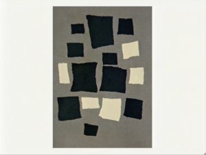
Reas’ ideas really illuminated the potential power of putting together structure and randomness as tools for artistic expression. They have pushed me to think about how “controlled chaos” could enhance the richness of artistic pieces. One of my favorite visual examples is this untitled piece by Jean Arp:

This juxtaposition of ordered geometric shapes against what seems to be a more chaotic composition is what really captured my interest. I think the piece does a very good job at illustrating the idea of controlled chaos and finding the right balance between chaos and structure.

My main takeaway from Reas’ presentation revolves around the idea of incorporating subtleties of randomness within my work and finding the right balance between this randomness and intentionality within each piece which I believe, ultimately leads to more dynamic outcomes.


Assignment 2: Art Work

Concept

I had a hard time deciding what I wanted to create at first. Then, while I was listening to music, the idea struck me: why not make a sketch of a spinning CD while playing music in the background? I thought the fusion of auditory and visual elements would be an interesting challenge for this assignment.

Donald Glover served as the muse for this artwork, as it was his music I was listening to when the initial idea came to me, influencing my choice of song for this project.

Sketch

Code highlight
// colored lines to give the illusion of a cd
for (let angle = 0; angle < 360; angle += 2) {
  let x1 = centerX + cos(radians(angle + rotationAngle)) * (circleRadius - 20);
  let y1 = centerY + sin(radians(angle + rotationAngle)) * (circleRadius - 20);
  let x2 = centerX + cos(radians(angle + rotationAngle)) * 150;
  let y2 = centerY + sin(radians(angle + rotationAngle)) * 150;

  let randomColor = color(random(100, 255), random(100, 255), random(100, 255), 150);
  stroke(randomColor);

  strokeWeight(7);
  line(x1, y1, x2, y2);
}

I found this bit particularly challenging as I had a hard time trying to figure out how to give the illusion of a spinning CD. I decided to create a series of lines that radiated from the circle in the center, incrementing the ‘angle’ variable from 0 to 360 in steps of 2 degrees to find the right angle for all the lines. For each angle, I calculated the coordinates (x1, y1) and (x2, y2) for the endpoints of the line. And to add an extra touch of realism, I decided to randomly generate different colors for the lines.

Reflection

I’m really pleased with how I was able to incorporate audio into my sketch; it added a dynamic and immersive element to the overall experience. Initially, my vision was for the CD to remain stationary until the user clicked on the screen, at which point it would start spinning. However, I was not very pleased with my implementation of applying a gradient color to the CD during its stationary phase. Therefore, I decided to make the CD spin continuously. This experience has underscored the importance of further refining my skills with gradient colors, as I believe it holds the potential to elevate my creations. Overall, I am very satisfied with how the final piece turned out.

References
  • https://www.youtube.com/watch?v=vwwRWCErx_Q
  • “Redbone” by Childish Gambino