Assignment 5 Midterm Progress Report

Project Concept:

I’ve always had a fear of snakes. Overcoming it seemed impossible until I started working on my game. Inspired by how snakes consume food whole, I had the idea of the game I am working on for my midterm called “Going Through It”. It is be an obstacle course game where the obstacle course is be designed in the shape of a snake. The player controls a small stick character trying to escape the snake as fast as possible. Adding my own unique twist to the game, the player cannot directly control the jumping ability of the stick figure, instead the stick is more akin to a ‘pogo stick’ where it bounces off with every obstacle it collides with and the player only controls the rotation of the stick figure using their keyboard.

User Interaction Design:

Player Input: The player uses the “A” and “D” keys to control the rotation of the stick figure. Player needs to angle the jump correctly to get through each part of the obstacle course.
Obstacles: The whole level design acts as the obstacle in this game, where the stick figure can bounce around by hitting walls or the insides of the ‘snake’ and can even get stuck in some traps laid out to make the game trickier to play.
Game Progression: As death is not an element of this game, the players race against themselves and other players to complete the level in the shortest possible time as they understand the mechanics of the game better.

Code Design: Functions, Classes, and Interactivity:

‘Going Through It’ is built using Object Oriented Programming (OOP) where every entity within the game belongs to a separate class that interact closely to make the game function.

The primary classes and their major functionalities are as follows:

Obstacle Class: The obstacle class defines the parameters for the rectangles make up the ‘snake’, it also contains functions such as display() which display the obstacles as one cohesive interactable object.

Stick Class: The Stick class defines the stick object itself and contains functions such as rotate() and update() which help establish rules for collision and input caused rotation. This serves as the biggest and most important class for the game code

Snake Level Class: The snake level class instantiates the obstacle class objects with coordinates to make one cohesive snake level and adds them to a list so collision checks can be performed.

Game Class: Game class deals with all functionality not handled by the other classes, this includes functions for pausing the game, showing the start screen, showing a lowest time, and starting the level itself. It also checks when a level has ended and displays a text with the time taken to clear the obstacle.

Identifying and Addressing Risks:
The most challenging aspect of the project is implementing accurate collision detection between the stick character and the obstacles. Since there are a multitude of angles the stick can collide with the obstacles with, figuring out accurate and responsive collision detection has involved a lot of trigonometry and I definitely believe there is more to come in order to account for all possible scenarios.

In order to mitigate the risk of the stick phasing through the level, or getting stuck at certain points I have tried to account for detection with each corner of the stick, each side vertical and horizontal and collision with vertical, horizontal and obstacle walls at diagonals. This is a tedious process and there is a lot of room for error which I am minimizing through meticulous play testing of the level.

Another risk I am trying to mitigate is the complexity of the level, as this is a single player game, a level that is too easy will make the game not enjoyable after a few playthroughs, on the contrary a level that is too complex and difficult to compete will cause players to quit and not wish to progress sooner. I hope to continue doing play testing, also involving friends who have never played the game before so that I can get input from them and adjust the level and individual paths within the level to make the game the perfect mix of complex but pushing people to beat the level in shorter and shorter times.

Snapshots from the game and further steps:


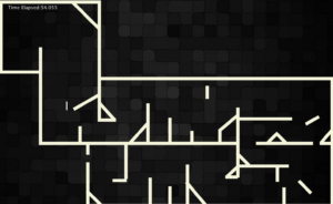
This is the design of the Snake Level, the time is shown in the top left corner and stops running once the level is completed

Next Steps:

Adding a Lowest Score: I want to keep a track of the lowest time achieved which is displayed on the game start screen and is meant to be an initial challenge for new players  to beat.

Start Screen: I want to add a start screen which shows, the level itself, the tutorial for the game and lowest time someone has taken to complete the level.

Reading Response 1


After watching Casey Reas’ talk, I’ve found my randomness and controlled chaos held within art. The way he intertwined randomness with controlled elements presented me with a unique perspective on creating art, showing how seemingly chaotic processes could yield meaningful and structured outcomes.

One of the standout examples from his talk was his work with cancer cell data, where he uses controlled randomness to produce distinctive visual patterns. This application of data not only served an artistic purpose but also pushed the boundaries of the interpretation of scientific information. It sparked a realization in me: the artistic process can be deeply intertwined with scientific exploration, leading to new interpretations and insights.

It was remarkable to see how even simple elements like dashes could serve as building blocks for more complex patterns. This idea compelled me to reconsider my creative practices. Instead of getting overwhelmed by the complexity of my projects, I now have the ability to start small and hopefully snowball into a project that I can be proud of.

Moreover, his talk provoked a deeper philosophical inquiry into the nature of creativity itself. If art can emerge from a system of randomness and algorithms, it challenges our conventional understanding of ownership and intentionality. In a time when machines contribute more and more to the artistic and creative process, is there a line we can draw regarding owning a piece of art or even whether something can be called art itself?

After Reas’ talk, I’m inspired to experiment more freely with randomness and tiptoe within the lines of control and chaos.

Week 5 Reading Response

Golan Levin’s article on Computer Vision opened my eyes to the fascinating world of computer vision in art. As a computer science major also delving into the visual arts, I found this piece incredibly relevant to my studies and personal interests.
The historical overview of computer vision in interactive art was eye-opening. I was unaware of the fact that artists have been experimenting with this technology since Myron Kruger’s work in the 1970s. It’s amazing to see how far society has progressed in the past half a century and how artists continue to push the boundaries of what’s possible with these tools.
One thing that really stuck with me was the explanation of basic computer vision techniques. I’ve always been curious about how interactive installations work, and learning about motion detection and object tracking was akin to getting a peek behind the curtain. It was fascinating to think that these fundamental concepts are behind so many of the interactive artworks in galleries and online.
The article made me think a lot about the difference between human and machine vision. I never realized how much work goes into making a computer “see” things that we take for granted. The fact that algorithms have to assign meaning to visual data is mind-blowing. It makes me appreciate the complexity of human perception even more.
I was particularly intrigued by the ethical implications of using computer vision in art. The example of the Suicide Box by the Bureau of Inverse Technology made me think about the fine line between art and surveillance. As someone who wants to create interactive pieces, I’m now more aware of the responsibility that comes with using these technologies. How do we make sure we’re not invading people’s privacy while still creating engaging experiences? It’s definitely something I’ll be considering in my future projects.
I appreciated that Levin included code examples, so I could see firsthand the effort and technique that went into creating such pieces. In conclusion, this article has changed the way I think about interactive art. It’s not just about creating engaging and fun experiences anymore; it’s about understanding the technology behind it and using it responsibly. I’m looking forward to experimenting with computer vision in my own work, but I hope to be more mindful of the ethical considerations involved.

Assignment 4

Inspiration:

In this project, I aimed to create a dynamic visualization of baby names by ethnicity, year, and gender using data from a CSV file. The inspiration for this project came from the realization that names are not just identifiers; they often carry cultural significance and reflect societal trends. By exploring how different ethnicities and genders influence naming patterns over time, I wanted to highlight the diversity and richness of society. This interactive visualization allows users to engage with the data, making it easier to understand how names evolve and resonate within various communities within the US. The data for the USA was readily available and organized, and thus I decided to pick that as my dataset.

Code that I am particularly proud of:

One of the sections of my code that I am particularly proud of is the get_top_names function. This function processes the CSV data to extract the top ten baby names based on user selected criteria including ethnicity, year, and gender. This code tallies the occurrences of each name and sorts them to ensure that the most popular names are displayed in the visualization.

// This function processes the provided data to get the top 10 names
function get_top_names(ethnicity, year, gender) {
  let names = {};
  for (let row of table.rows) {
    // filters the data based on our current selection
    if (row.get('Year of Birth') === year && row.get('Ethnicity') === ethnicity && row.get('Gender') === gender) {
      let name = row.get("Child's First Name");
      let count = parseInt(row.get('Count'));
      // sums up counts for each name to account for duplicates
      if (name in names) {
        names[name] += count;
      } else {
        names[name] = count;
      }
    }
  }

Final Product:

Conclusions and Reflections:

Reflecting on this project, I recognize the power data visualization holds in uncovering trends and fostering human understanding and comprehension. I learned how to manipulate data and create interactive elements that allow users to explore and compare information. However, there are several areas for improvement. For instance I hope to incorporate additional features such as user-input filters or a broader range of years. I hope to also include an overlay feature where two separate bar charts can be compared on the same canvas, this could be useful for example if someone wants to more clearly see the trend of a certain name through time. Additionally, I plan to improve the aesthetics of the visualization by experimenting with different color palettes and designs to make it more appealing. Overall, this project has been a valuable learning experience, and I look forward to applying these insights in later projects.


Reading Response Week 4

Norman’s exploration of everyday objects like doors, switches, and scissors turns the mundane into a reflection of hidden complexities and subtle interactions. As I dove into his ideas about affordances and signifiers, I began seeing my surroundings in a different light. The handle of my coffee mug, the curve of my desk lamp, and even the layout of my keyboard buttons weren’t just functional anymore; they became silent storytellers, each with their own design narrative.

As a left-handed person, Norman’s ideas on affordances and signifiers took on an even deeper meaning for me. I’ve often struggled with objects clearly not designed with me in mind can openers, scissors, and the constant smudging when I write. These frustrations were aptly highlighted in Norman’s push for more inclusive, human-centered design. His arguments about making design accessible to everyone, not just the majority, struck me on a personal level.

The concept of discoverability really stood out during the time I spent reading the chapter. I’ve often found myself baffled by unfamiliar appliances, caught between curiosity and confusion. Norman helped explain why some objects feel intuitive and welcoming, while others seem to thrive on leaving us puzzled. I think back to my experiences with the university printers, with poorly labelled buttons, and an digital interface buried in endless menus. Something as simple as scanning a document became a frustrating guessing game, all because there were no clear signifiers to guide me. In contrast, a well-designed printer would have had intuitive, clearly marked buttons or icons, making the process straightforward and stress free. It was a perfect illustration of Norman’s design principles or lack thereof.

Norman’s “paradox of technology” also resonated with me. As our devices become more advanced, they often become harder to understand. It’s ironic how progress can make us feel more disconnected. I think about my grandmother struggling with her new smartphone, a device that’s supposed to make life easier but instead leaves her feeling lost. It’s a clear example of how our pursuit of innovation can create barriers instead of breaking them down.

The emphasis on feedback also struck me as important. In our world of touchscreens and voice commands, clear feedback is more necessary than ever. I find myself missing the click of a button – the small but essential signal that something has actually happened. Without feedback, it’s easy to feel disconnected from the technology I am using.

Norman’s idea of conceptual models made me reflect on my own assumptions. How often do I approach a new device or system with a flawed understanding of how it works? It’s humbling to realize that many of my mental models are incomplete, and that much of what I think I know is just a simplified version of reality.

After finishing the chapter, I felt both inspired and responsible. Norman reveals how design influences every interaction we have, and as someone studying interactive media, I realize I might one day contribute to shaping these interactions. Norman’s call for human-centered design isn’t just about convenience – it’s about honoring the complexity and diversity of the human experience.

In the end, his message reminds us that between people and objects lies a world of potential – and that good design is about more than just solving problems. It’s about understanding what it means to be human.

Reading Response: What is interactivity?

In Chapter 1 of The Art of Interactive Design, Chris Crawford describes interactivity as a continuous loop with three steps: listening, thinking, and speaking. A system that truly engages users is one that doesn’t just react—it listens, processes input and responds differently based on type of the input.

The strongest interactive systems create a kind of “conversation” between the user and the program. It’s not just about clicking a button and getting a fixed response, but more about the system understanding the user’s input and adapting to it. For example, a simple calculator provides weak interaction because it only gives pre-programmed results. On the other hand, a video game provides a much richer experience by reacting to the player’s choices and strategies in real time.

To make my p5.js sketches more interactive, I could start by making them more adaptive to user behavior. My most important takeaway from the chapter is separating ‘participation’ as compared to ‘interactivity’. In my old sketches I have used ‘participation’ where no matter how the user approaches the system, the system outputs from a list of fixed effects. Moving to making my systems interactive would mean that any system I design would not just respond the same to each output but contain an algorithm that accurately digests the variability of inputs whether that is length, type of interaction, active or passive interaction and then react accordingly.

Instead of just reacting with basic changes like color shifts when the mouse is clicked, I hope to now build in more complex systems of interactivity in my sketches. For instance, if the user holds the mouse down longer, maybe the system reacts in a different manner. Or, I could design it so that the faster someone moves their mouse, the more dramatic the visual change. The more, the user thinks that not just their input matters, but their type of input matters as well, the more I will know I did a good job creating an interactive piece of media. By adding this kind of real-time feedback, the sketch can feel more dynamic and have deeper user involvement, a system of ‘inputs’, ‘processing’ and ‘outputs’, that Crawford would consider ‘interactive’.

Assignment 3 Generative AI

Concept:

For this project, I viewed a lot of generative artwork created using P5.JS but the idea for my particular design did not click until I was watching a 3Blue1Brown, a math youtuber’s video on Dirichlet’s theorem. The theorem tries to explain how prime numbers create certain spirals, and the randomness of primes means you cannot accurately predict the pattern. Thus the idea of working with random spiral shapes was born. I decided to create a 6×6 grid of spirals, each generating a gradient of color for unique spiral shapes. I wanted to add a level of interactivity which I did by making the spirals spin when the mouse hovers over them (mimicking an electron’s spin and change of behavior when ‘observed’). Furthermore I made it so that any mouse click on a particular spiral, changed the direction of the spin.

Code I am particularly proud of:

A part of the code I am particularly proud of is the draw_ background() function that created a smooth gradient for the background. In plain white the sketch looked dull and uninteresting but I believe the new gradient background has allowed each spiral color to ‘pop’.

//this function draws the background gradient going from dark blue to pink
function draw_background() {
  let c1 = color(60, 120, 200);  // navy blue shade
  let c2 = color(255, 182, 193);  // light pink shade
  //loop through each pixel row to create the gradient
  for (let y = 0; y <= height; y++) {
    let gradient_color = lerpColor(c1, c2, y / height);  //finds an in-between color for each pixel depending on height in the sketch
    stroke(gradient_color);  // color for the current row
    line(0, y, width, y);   // draws a line of that color
  }
}


Final Sketch:

Reflections:

I am happy with the results of this assignment. It is visually interesting, pleasing to look at and interactive but I do believe there is room for improvement. Another level of interactivity I hope to add is the spirals changing colors when hovered over or maybe when clicked upon. Another idea I had was the spirals morphing into different shapes based on user movement across the canvas. Overall I believe this assignment sets up a good basis for further development of this seemingly simple idea.

Assignment 2

Concept:

For this project I really wanted to experiment with geometry and adding chaos to a shape which is commonly deemed as stable, the humble rectangle. I chose to have the rectangles rounded and translucent to further add to the playful nature of the artwork. The randomness in size, color, and movement makes each play through unique, creating a sense of spontaneity every time the code runs. The fact that they only begin to move  when the mouse is hovered is meant to mimic the human ability to see art even if any isn’t there. If a tree falls in a forest and no one is there to hear it, does it still make a sound? (If your mouse is hovering over it, then sure)

Code Highlight:

The part of this code that I’m really proud of is the way the rectangles handle hitting the edges of the screen:

if (mouseX > 0 && mouseX < width && mouseY > 0 && mouseY < height) {
    //if statement checks whether mouse is inside the canvas by analyzing       x and y positions
    //if inside the canvas, the x and y values of each rectangle is changed based on its speed and direction value which was assigned in the setup function
    rect_object.x += rect_object.speed_x * rect_object.dir_x;
    rect_object.y += rect_object.speed_y * rect_object.dir_y;

    //this checks whether the object is hitting the horizontal border by analyzing if the left or right side of the rectangle have exited the canvas, it then reverses the rectangle's direction to ensure it stay on screen 
    if (rect_object.x <= 0 || rect_object.x + rect_object.w >= width) {
      rect_object.dir_x *= -1; // Reverse horizontal direction
    }
    //this checks whether the object is hitting the vertical border by analyzing if the top or bottom side of the rectangle have exited the canvas, it then reverses the rectangle's direction to ensure it stay on screen 
    if (rect_object.y <= 0 || rect_object.y + rect_object.h >= height) {
      rect_object.dir_y *= -1; // Reverse vertical direction

It’s a small section, but it’s key to making the animation feel fluid and continuous. Each time a rectangle hits a boundary, it bounces back in the opposite direction, keeping each rectangle within the bounds of the canvas. This adds to the randomness of their movement and ensures the canvas is not slowly emptied throughout a run.

Final Product:

Reflections:

Looking ahead, I think there’s a lot of potential to make this interaction even more engaging.  I want to add a feature where clicking on a rectangle changes its size or color. Another idea would be to incorporate deceleration/acceleration effects to make the motion more organic, and make it seem as if the rectangles have weight. I’d also love to experiment with sound or other visual effects that react to the movement, turning this simple animation into something that engages multiple senses.

Assignment 1 Self Portrait

Concept: 

For my self portrait I wanted to do something slightly unconventional. Joan Miro is an artist that I really like and I thus decided to do my self portrait in his unorthodox surrealist style. I wanted to have fun background elements commonly seen in his artwork such as the crescent moon and a star.

Something I’m proud of:

Something I’m proud of for this assignment are the random curves across the whole portrait, and especially drawing the crescent moon. These aspects took me the longest time to figure out and are thus the ones I am most proud of.

function details() {
  
  fill(255,255,0);//drawing a crescent moon shape by drawing two intersecting circles and having one of them be the color of the background
  //this effect makes it so that the second circle cuts the first one to make the moon shape
  noStroke();
  ellipse(150,630,100,100);
  fill(240, 248, 255);
  ellipse(170,630,100,100);

  //drawing the diagonal lines for the eyebrows
  stroke(0);
  strokeWeight(4);
  line(300, 300, 450, 400);
  line(500, 400, 650, 300);

  //drawing the yellow curve around the mouth
  noFill();
  stroke(255, 215, 0);
  strokeWeight(8);
  beginShape();
  vertex(250, 550);
  bezierVertex(350, 500, 450, 700, 550, 550);
  endShape();
}

Final Product:

Reflections:

I enjoyed working on this assignment quite a lot, it was a fun experience juggling between taking inspiration from Miro and then also trying to add my own personality into the portrait so I could make something I could be truly proud of. An aspect that I would like to work on in the future is adding some sort of interactivity maybe with eye movement or some background features morphing into others to further portray the dreamlike essence of Joan Miro.