Midterm Project: Speedrunning Procrastination

CONCEPT

You know when you sit at your desk, open up your assignments on your laptop, and after thinking about what it is you have to do, you finally come to the conclusion: “Man, I could really go for a walk right now”? I know it all too well. I did the same with my midterm project, going on walks on and around campus, beyond the barriers across the welcome center (definitely not trespassing), above the highway behind campus, below the tunnel across the highway, but not starting my project. I’d listen to my playlist on Spotify while looking at the stars in the light-polluted Abu Dhabi sky, or at the stunning night skyline from the bridge on the highway (again don’t call the cops). Struggling to settle on an idea, I finally thought of making the exact thing that I was using to procrastinate on starting work in the first place – an interactive music library interface, just like Spotify. Now I could procrastinate while working, if that makes sense.

WORKFLOW

I had come up with an idea, sure, but I soon realized that to actually bring my idea to life, it was ME who would have to work, to write code endlessly, to face disappointment because of errors, to fix said errors, to do it all over again God knows how many times. Grappling with the truth, I started first with loading whatever I would need for my project: album cover art, that font Spotify uses, the actual songs I would have in the library (definitely not downloaded from a sketchy website that might as well have phished me). I picked the songs very intricately to kind of form a parallel with the stages of procrastination as experienced by me:


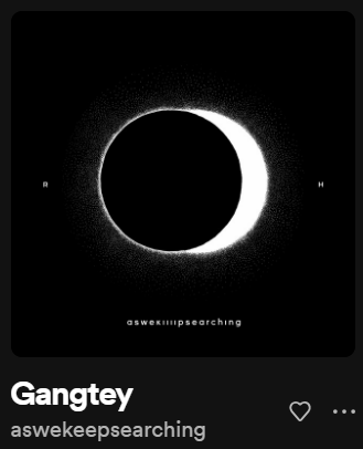
Gangtey- aswekeepsearching

This song by Indian band aswekeepsearching represents for me the stage where my assignment’s deadline is far away and not thinking about it poses no immediate threat. The repeated mystifying chants are melancholic, but calm.


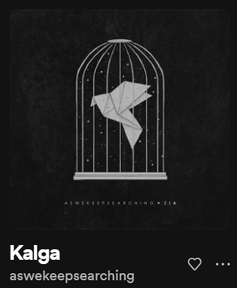
Kalga – aswekeepsearching

By the same band, this one represents the shift from the calm to the storm. It starts off calm but is then interrupted by loud drums and vocals, representing the interruption of calm by dread when the realization of incoming deadlines hits.


Nahin Milta – Bayaan

Nahin Milta, by Pakistani bad Bayaan, is a song about acceptance following hopelessness. Which in the sense of procrastination is pretty self-explanatory…
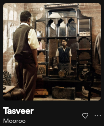


Tasveer – Mooroo

Another melancholic but calm song, this one you’d listen to while finally working on your assignment, maybe even singing along with it. Maybe don’t look too much into the lyrics though, because it can get sad. Tasveer means picture, and Mooroo sings about spent memories only living in pictures after they are lived.
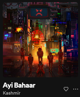
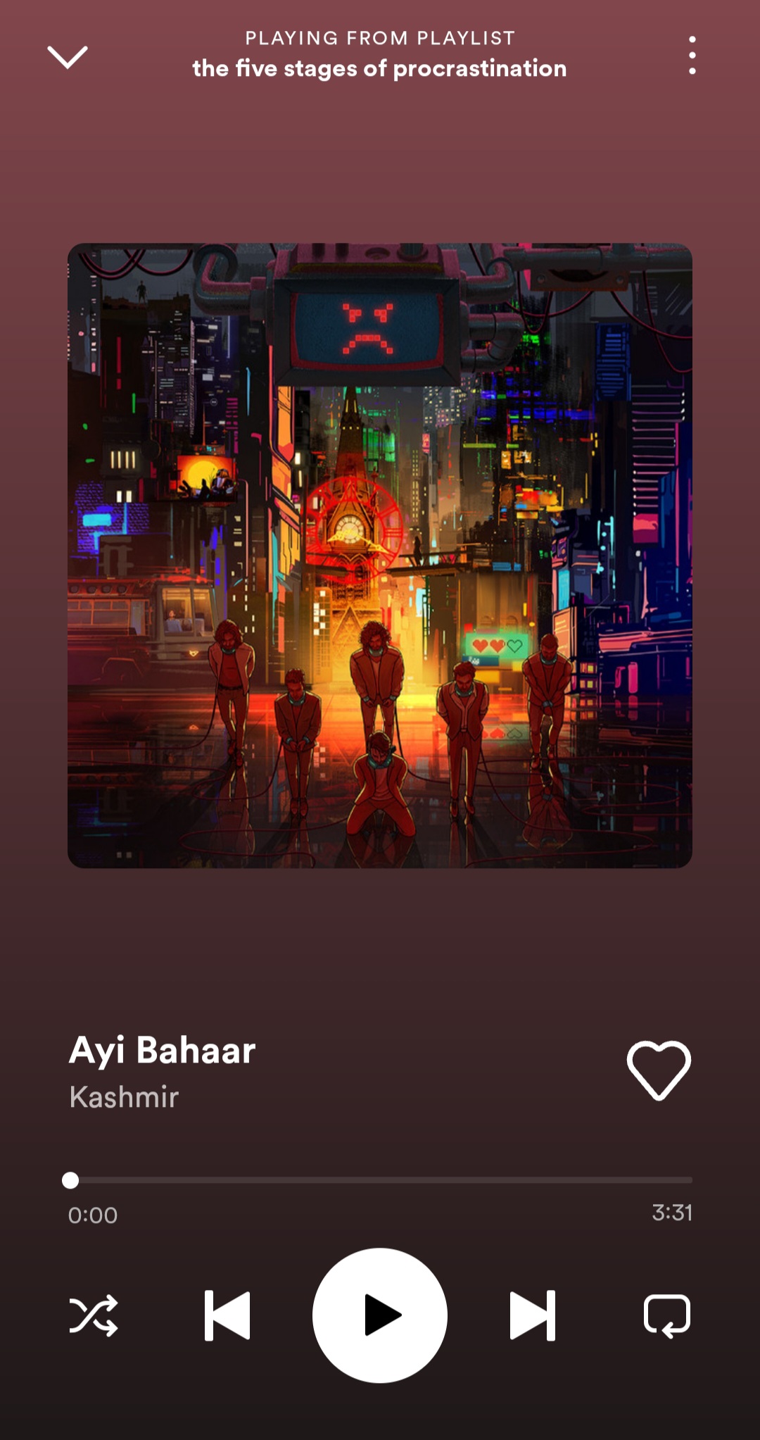
Ayi Bahaar – Kashmir

This upbeat song is about the coming of spring. You guessed it – you’ve finally finished your assignment, and things aren’t too bad after all. There is still good in the world.


Here is the  playlist that I’ve used in my sketch:

After loading everything, I had to think of the logic behind different functions of a music player: play, pause, skip, go back, add to favorites, etc. At one point I was convinced that I would in no way be able to do all that because I could not for the life of me figure out how to implement  it. A few long walks later, I decided to start writing in the hopes that it would come to me itself; and come to me it did. I implemented the whole music player as  a class with methods for displaying relevant information like images, shapes, text, etc. It starts at a screen that introduces the concept and requires you to click to begin the experience. You can return to the screen from the music player by pressing any key on the keyboard. In the player, you can pause and play songs, skip to the next song, go back to the previous song, repeating the same 5 songs without going out of bounds. The code aspect can be understood using the comments on my sketch, the link to which I have provided below:

https://editor.p5js.org/haroonshafi/sketches/9mTUs7KrB

SKETCH

Here is how I wanted my sketch to look like:

Here is the sketch:

I am quite proud of finally figuring out the million conditions for implementing playback options. Embedded below are specific parts of the code: the first one that displays the details for a single song and the second skips the current song.

case 0:
        background("#484848"); // set background according to colour of album cover

        push(); // drop down icon
        strokeWeight(4);
        stroke("#373737");
        line(this.x, 0.7 * height, (width * 8) / 9, 0.7 * height);
        stroke(220);
        line(
          // duration slider constantly updating as time passes using the ratio of two methods as follows
          this.x,
          0.7 * height,
          (gangteyAudio.currentTime() / gangteyAudio.duration()) *
            (7 / 9) *
            width +
            (1 / 9) * width,
          0.7 * height
        );
        pop();

        textFont(gothamBlack);
        textSize(16);
        fill(240);
        text(songNames[songNum], this.x, this.y); // displaying name of song
        textFont(gothamThin);
        textSize(12);
        fill(220, 220, 220, 150);
        text(artistNames[songNum], this.x, this.y + 20); // displaying artist name

        textSize(10); // the following code displays the time of the song and its duration in minutes and instead of showing it in seconds by default by using modulus and integer division functions
        text(
          Math.floor(gangteyAudio.currentTime() / 60),
          this.x,
          0.7 * height + 15
        );
        text(":", this.x + 7, 0.7 * height + 15);
        if (Math.floor(gangteyAudio.currentTime() % 60) < 10) {
          text("0", this.x + 10, 0.7 * height + 15);
          text(
            Math.floor(gangteyAudio.currentTime() % 60),
            this.x + 17,
            0.7 * height + 15
          );
        } else {
          text(
            Math.floor(gangteyAudio.currentTime() % 60),
            this.x + 10,
            0.7 * height + 15
          );
        }
        text(
          Math.floor(gangteyAudio.duration() / 60),
          (8 / 9) * width - 15,
          0.7 * height + 15
        );
        text(":", (8 / 9) * width - 8, 0.7 * height + 15);
        text(
          Math.floor(gangteyAudio.duration() % 60),
          (8 / 9) * width - 5,
          0.7 * height + 15
        );

        if (gangteyAudio.isPlaying()) {
          // for alternating between the pause/play icon shape
          fill(220);
          noStroke();
          circle(width * 0.5, height * 0.85, 60);
          fill(0);
          rect(width * 0.5 - 8, height * 0.85 - 12, 4, 24);
          rect(width * 0.5 + 4, height * 0.85 - 12, 4, 24);
        } else {
          fill(220);
          noStroke();
          circle(width * 0.5, height * 0.85, 60);
          fill(0);
          triangle(
            width * 0.5 - 6,
            height * 0.85 + 10,
            width * 0.5 - 6,
            height * 0.85 - 10,
            width * 0.5 + 10,
            height * 0.85
          );
        }

        image(
          // displaying album cover
          gangteyImage,
          (1 / 9) * width,
          0.2 * width,
          (7 / 9) * width,
          (7 / 9) * width
        );
        break;
if (
      // if forward icon pressed
      mouseIsPressed &&
      mouseY > height * 0.85 - 12 &&
      mouseY < height * 0.85 + 12 &&
      mouseX > width * 0.7 - 10 &&
      mouseX < width * 0.7 + 12
    ) {
      greenFlag = 1; // reset heart flag to clear as song changes
      switch (
        songNum // stop song currently playing
      ) {
        case 0:
          if (gangteyAudio.isPlaying()) {
            gangteyAudio.stop();
          }
          break;
        case 1:
          if (kalgaAudio.isPlaying()) {
            kalgaAudio.stop();
          }
          break;
        case 2:
          if (nahinMiltaAudio.isPlaying()) {
            nahinMiltaAudio.stop();
          }
          break;
        case 3:
          if (tasveerAudio.isPlaying()) {
            tasveerAudio.stop();
          }
          break;
        case 4:
          if (ayiBahaarAudio.isPlaying()) {
            ayiBahaarAudio.stop();
          }
          break;
      }
      if (songNum == 4) {
        // update index to next index by incrementing
        songNum = 0;
      } else {
        songNum += 1;
      }
      switch (
        songNum // play song from next index
      ) {
        case 0:
          if (gangteyAudio.isPlaying() == false) {
            gangteyAudio.play();
          }
          break;
        case 1:
          if (kalgaAudio.isPlaying() == false) {
            kalgaAudio.play();
          }
          break;
        case 2:
          if (nahinMiltaAudio.isPlaying() == false) {
            nahinMiltaAudio.play();
          }
          break;
        case 3:
          if (tasveerAudio.isPlaying() == false) {
            tasveerAudio.play();
          }
          break;
        case 4:
          if (ayiBahaarAudio.isPlaying() == false) {
            ayiBahaarAudio.play();
          }
          break;
      }
    }

I think it is possible to enhance the functionality even more, for example by enabling shuffle, but this specific playlist is meant to be listened to in its exact order so maybe next time! Other than that, I am quite satisfied that even though I didn’t think it possible in the beginning, by revisiting the concepts and spending hours revising everything we’ve learnt so far and even checking out some other concepts, in the end I was able to bring my concept to life. Also, you guys should definitely put this playlist on while on a walk and maybe tell me what you thought about it! Hope you like the experience!

Week 5 – Reading Reflection

While reading this week’s article, I thought about where I had seen implementations of live images being input into a dynamic program and was reminded of Michael Reeves. For those of you who don’t know, Michael, a college dropout, makes YouTube videos about his absurd programming and design projects which, at the same time as being informative, always get a good laugh out of you. I remembered watching one of his videos where he pointed a camera toward his goldfish in a tank and used the goldfish’s live position from the camera’s feed to influence his trades in the stock market. I don’t recall how much of the fifty thousand dollars that he initially invested to test his project remained after the whole experiment but it was for sure an interesting concept. In another one of his videos, he uses his hand’s movement in air to replicate the movement of a surgical tool – or, well, a knife – on an operating table. According to the article, such dynamic image processing was not explored publicly until a few years ago, but was limited to military and research institutions. With recent advancements in this technology and rise in availability of resources for common programmers, however, the innovations in the fields of arts and sciences have exploded in number. Computer vision has provided yet another way for artists to express their interactive ideas, making actual physical interactivity possible. Whether the innovations are actual scientific advancements in the field of medicine like tracking body cells with computer vision, or Michael Reeves’ silly experiments such as making a taser electrocute you if you look less than six feet tall in a photograph, the use of computer vision is likely to become even more widespread and for good. I for one cannot wait to implement such ideas in silly projects of my own.

Week 4 – Reading Reflection

In his book, The Design of Everyday Things, Don Norman explores our relationship with everyday objects and how the very fundamental concepts of design influence this relationship. He mentions how people tend to blame themselves when they can’t get the hang of an everyday object, the working of which is supposed to be easy to figure out. For example, when freshmen just arrived on campus, even figuring out how the various doors on campus worked was a challenge. When should we push, and when should we pull? It took some time to finally figure it out, but when we hadn’t, even the act of opening and closing doors made some feel inadequate. Norman says that this tendency to feel inadequate for not operating something simple correctly is misguided. Most of the time, it is poor design at fault, and not the user. This leads him into talking about the central theme of the chapter: design flaws in everyday objects are often responsible for user difficulties.

Norman says that merely making something work is not enough; the designer needs to think of the user’s psychology while curating the design. He discusses the importance of designing objects that are intuitive and easy to use without requiring extensive instructions or training. He suggests that design should follow from mental models that simply present what the object should accomplish. He also recommends objects being conversational – they should be able to correct the user and provide feedback on their actions so the user can better understand how to interact with the object effectively.

Personally, I agree with Norman’s view. There is no need to over-complicate what can be done using simple sequences. Design should always be user-centered, perhaps with the exception of objects that are more artistic than functional.

Assignment #4 – Jilemma: A J-Term Dilemma

Concept:

It’s that time of the year where you decide whether your dream of seeing NYC is urgent enough for you to consider going there in the dead of winter where temperatures hide beneath zero (Celsius for the Americans). I’ve looked at infographics that have proven to me that I would become a popsicle a minute after leaving the gates of JFK if I decide to take a January Term in NYC, considering I’ve never spent a minute in sub-zero temperatures. And the snow! Whole other coin. But then I thought why trust the internet? So I set out to make my own infographic on the climate of NYC to determine the best time to take a J-Term there.

Sketch:

Highlight:

// Displaying bars to show monthly precipitation

  let transparency = 0;

  for (i = 0; i < rowNum; i++) {
    noStroke();
    if (i % 2 == 0) {
      //for every non-odd index i.e. 0, 2, 4, etc.
      transparency = 150; //changing the transparency of alternate bars
    } else {
      transparency = 100;
    }
    fill(0, 50, 220, transparency);
    rect(40 + 40 * i, 500, 40, -mPrecipitation[i] / 3);

This piece of code alternates between the bars to change their opacity. It uses the modulus function to determine whether the bar is even or odd and then changes the value in the variable transparency which updates the opacity after the conditional statement.

Reflection:

I would like to change the line drawing to make the corners smooth, and maybe add a pointer where it shows you instantaneous information on the lines on the graph in a text box. Overall I am quite happy with the result! (Even though it does confirm that I’ll become a human popsicle in NYC…)

Week 3 – OOP

Concept:

With this assignment, I wanted to further familiarize myself with objects and methods, which I feel like was accomplished. In my last assignment, the backbone of the piece was essentially just a grid of quadrilaterals, and there was really no way to switch it up between other shapes. Learning about OOP has broadened the creative liberty we have and so I experimented to make another grid piece, but this time with random shapes, making each shape an object.

Sketch:

Code Highlight:

With this assignment, I also learned to use the Case conditional statement which I utilized to assign a random shape to the object depending on the argument passed to it in the constructor. I also attempted translation and rotation, and made use of the push() and pop() functions to reset the grid after translations.

  show() {
    fill(random(255), random(255), random(255), 180);
    strokeWeight(0.1);
    switch (
      this.Sides //using a conditinal case statement to assign a random shape to the this.Sides attribute depending on the value it holds between 2 and 4
    ) {
      case 2:
        push();
        circle(this.X, this.Y, 20);
        pop();
        break;
      case 3:
        push();
        translate(this.X, this.Y); // translating the grid so the triangle is centered
        rotate(1);
        triangle(0, -9, -10, 10, 10, 10);
        pop();
        break;
      case 4:
        push();
        translate(this.X, this.Y);
        rotate(0.5);
        rectMode(CENTER);
        rect(0, 0, 20, 20);
        pop();
        break;
    }
  }
}

Reflection:

I would like to go back and figure out how to rotate the shapes where the rotation continues from the same stage even when the shapes change. I would also like to experiment with more methods in this class. I do think this captures the essence of OOP, making use of classes every time the loop iterates.

Reading Reflection – Week#3

In the first chapter of The Art of Interactive Design, Crawford attempts to define the word interactivity, which he feels is misunderstood due to its popularity. Instead of defining it in technical terms such as ‘input, process and output’, Crawford sees the more human side of interactivity: listening, thinking, speaking. For him, interactivity comes from reciprocal action between two actors, an action that, in his words, has blood in its veins, or one that imitates life. He draws a distinction between the degrees of interactivity, claiming that it is more like an ever-changing variable than a boolean property; there are high interactivities and low interactivities. For it to be classified as high interactivity, it should perform all three steps, namely listen, think and speak. If it fails in any one of these steps, it falls short and falls under the category of low interactivity. Crawford also differentiates between interactivity and reaction, arguing that mere reaction to forms of media such as books and films fall short of the true definition of interactivity since they do not carry out all of the three steps.

Crawford points out the different approaches to solving a problem by ‘user interface people’ and ‘interactive design people’, mentioning how the ‘user interface people’ seem to be concerned more with the objective side to the solution while the ‘interactive design people’ bring to the table an artistic way of solving the problem. Crawford attempts to unite the two peoples by suggesting that good interactivity design integrates form with functionality, and that they are far from being mutually exclusive.

Crawford is self-aware of how his definition might not resonate with everyone and acknowledges that he cannot claim to provide a definition that truly encompasses everything interactivity is about. His ideas prompted a reconsideration of what I define interactivity as. However, I do think that the degree of interactivity does not matter as much as the thought behind it – which, essentially, is an unspoken understanding between the artist and the beholder, a conversation that might never have been had if not for the interactive art. After all, why, as long as it listens, thinks and speaks, should one compartmentalize the degree of art at all?

Reading Reflection – Week#2

In his speech at the Walker Art Center, Casey Reas talks about navigating the balance between order and chaos in generative art. We had to do something somewhat similar in our assignment this week, where a lot of us started with a structure, writing code that defined the rules and parameters governing the creation of our artwork, as sort of a form of order imposed on the creative process. We then manipulated these rules to introduce variability and chaotic randomness into the system, allowing for serendipitous and visually striking outcomes.

He also explored how some generative art is dynamic and responsive to user interaction, which leads to the evolution of chaos as the art interacts with its environment. Some of us had this element of controlled chaos in our art as well, seemingly chaotic in response to changing inputs but again, governed by underlying rules.

Ultimately, what I took away from his insight is a welcoming attitude toward the idea that order and chaos are not opposing forces but can coexist with each other in meaningful ways. If you look at my assignment for long enough, the blinding randomness of colorful boxes soon blends into intricate patterns, the artist of which is chaos itself.

Assignment 2: Digital Art

Concept:

Going over the reference digital art pieces, I was reminded by the black and whites of a sight we’re all very familiar with (I assume) – TV static.

Pixel Noise Vector. VHS Glitch Texture TV Screen. (683656)

I thought about recreating TV static, something I remember sitting perplexed in front of for (concerningly) long periods of time as a child. It would be fairly easy to make while still using loops, conditionals and animation. It would also be reminiscent of our reading material this week, for I, the artist, would have control over the degree of randomness and chaos of my art.

Highlight:

While making the black and white static, I experimented with random colors for each box instead of a grey. Had my childhood TV had color static, my eyes would probably never have left the screen.  At first I assigned a random color to each 10*10 box, but that seemed a bit dull.

I made the boxes bigger, 50*50 to be exact, although they show on the surface as 10*10 boxes, and the vibrancy increased much more softly than it would have had I just increased the value of the transparency in the fill() function.

I also retained a touch of the old black and white which appears when the mouse is pressed. This adds some interactivity to the art.

Here is the code:

if (!mouseIsPressed) {
for (let y=0; y<=500; y+=10) {
for(let x=0; x<=500; x+=10) {
  noStroke()
  fill(random(255),random(255),random(255),70)
  rect(x,y,50,50)
}
}
}
else {
for (let y=0; y<=500; y+=10) {
for(let x=0; x<=500; x+=10) {
  noStroke()
  fill(random(50,200))
  rect(x,y,10,10)
}
}    
}

Sketch:

Reflection and Ideas:

In the future, I would like to change the properties such as color of each box as the mouse approaches it once I learn how to do that with object-oriented programming.

Assignment 1: Self Portrait


Concept:

I’m basically using this self portrait to experiment with what I’ve learned so far (which is obviously not a lot) because let’s be honest – I’m not very artistic. I did however try to compensate for the lack of artistic accuracy by making some other aspects of the portrait interactive.

A highlight of code that I’m particularly proud of:

I thought about what it was that I could make interactive, and I settled on making my (or my sketch’s) eyes follow the mouse pointer. In the process, I  stumbled upon some other people’s sketches, and also found inspiration in Maryam’s sketch, particularly how her expression changes as you hover the mouse pointer over her face (apologies if there are multiple Maryams in our class). Without looking at the code behind it, I tried, with much initial disappointment, to do something similar, and thus finished with two interactive features: the eyes, and the facial expressions.

//interactive eyeballs
  if (mouseX<=350 && mouseY<=250) {
  fill(255)
  ellipse((320-(255-mouseX)/120),(200+mouseY/120),6,6)
  ellipse((380-(255-mouseX)/120),(200+mouseY/120),6,6)
}
  if (mouseX>350 && mouseY<=250) {
  fill(255)
  ellipse((320-(255-mouseX)/120),(200+mouseY/120),6,6)
  ellipse((380-(255-mouseX)/120),(200+mouseY/120),6,6)
}
  if (mouseX>350 && mouseY>250) {
  fill(255)
  ellipse((320-(255-mouseX)/120),(200+mouseY/120),6,6)
  ellipse((380-(255-mouseX)/120),(200+mouseY/120),6,6)
}  
  if (mouseX<=350 && mouseY>250) {
  fill(255)
  ellipse((320-(255-mouseX)/120),(200+mouseY/120),6,6)
  ellipse((380-(255-mouseX)/120),(200+mouseY/120),6,6)
}
  
  //interactive mouth + eyebrows
  if(mouseX<310 || mouseX>390) {
  fill('rgb(253,91,91)')
  stroke('#B0764A')
  strokeWeight(2)
  curve(300, 0, 310, 290, 390, 280, 300, 0);
  fill('#C7A184')
  strokeWeight(4)
  curve(310,220,305,181,330,178,328,220)
  curve(370,220,365,181,390,178,388,220)
  }
  if (mouseY<285 || mouseY>320) {
  fill('rgb(253,91,91)')
  stroke('#B0764A')
  strokeWeight(2)
  curve(300, 0, 310, 290, 390, 280, 300, 0);
  fill('#C7A184')
  strokeWeight(4)
  curve(310,220,305,181,330,178,328,220)
  curve(370,220,365,181,390,178,388,220)
  }
  if(mouseX>=310 && mouseX<=390 && mouseY>=285 && mouseY<=320) {
  stroke('#B0764A')
  strokeWeight(4)
  line(320,300,390,280)
  line(310,175,330,180)
  line(365,180,385,175)
  }

The sketch:


Reflection and ideas for future work or improvements:

I was limited by my familiarity with JavaScript and could use only some of the various functions it is capable of executing, so I would like to revisit this assignment – just to see how far I’ve come – at the end of this course and do more stuff (or just improve on this existing stuff).