Assignment 4 – Data Visualization

Concept

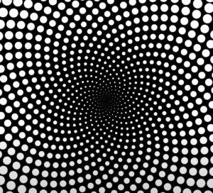
This assignment required  to make some sort of data visualization, or create a generative text output. This project was quite interesting to work on as it was hands-on practice for most of the concepts we have learnt so far. The design was  inspired  by  some pretty cool  videos  by weidi on Youtube. The project originally started with having them aim of visualizing data for World Cup searches over the past months, since it is coming soon. However, very limited data for that could be found hence the change to the world population dataset.

Code

The coding aspect of this assignment was very informative. It made use of many of the functions we have learnt and has enabled me to understand better how they work. Some of the functions and methods include the transformations, the map() method, as well as loops and conditions. Among the parts of the code which I am proud of is the hovering logic, which makes the data presentation a tad bit interactive with the user’s actions.

 //calculates distance between pointer and circles
    let distance = dist (mouseX, mouseY, pointx, pointy);
    let circlesize;
    
  //this condition changes the circles to green when hovered over
    if(distance < 3){
      fill ("green");
      circlesize = 7;
      noStroke();
      circle(pointx, pointy, circlesize);
      
    //this block prints the countries and populations
      push();
      stroke("white");
      strokeWeight(2);
      noFill();
      translate(width/2, 0)
      rect(0, 0, 300, 200);
      noStroke();
      fill("#F3AA4E");
      textAlign(CENTER);
      textSize(25);
      text(population[i], 0, 90);
      text(country[i], 0, 60);
      text(abbrev[i], 0, 30);
      pop();
    }
    else{
      fill("#F3AA4E");
      circlesize = 3;
      noStroke();
      circle(pointx, pointy, circlesize);
    }
  }
}


Reflection / Future Improvements

I am quite proud of the progress I am making with p5js and creative art in general. I feel like I am starting to get the hang of things and actually enjoying doing cool stuff with it. As for the piece itself, the visualization was meant to be a bit cooler with varying lengths of lines depending on how large the numbers are relatively. However I am not quite sure if the fault was in my map function or just the fact that there were huge variations in my dataset hence the failure to portray the effect intended. Nevertheless, I am looking forward to improving further and making better use of different capabilities in p5js.

Assignment 3 (GenArt)

Concept

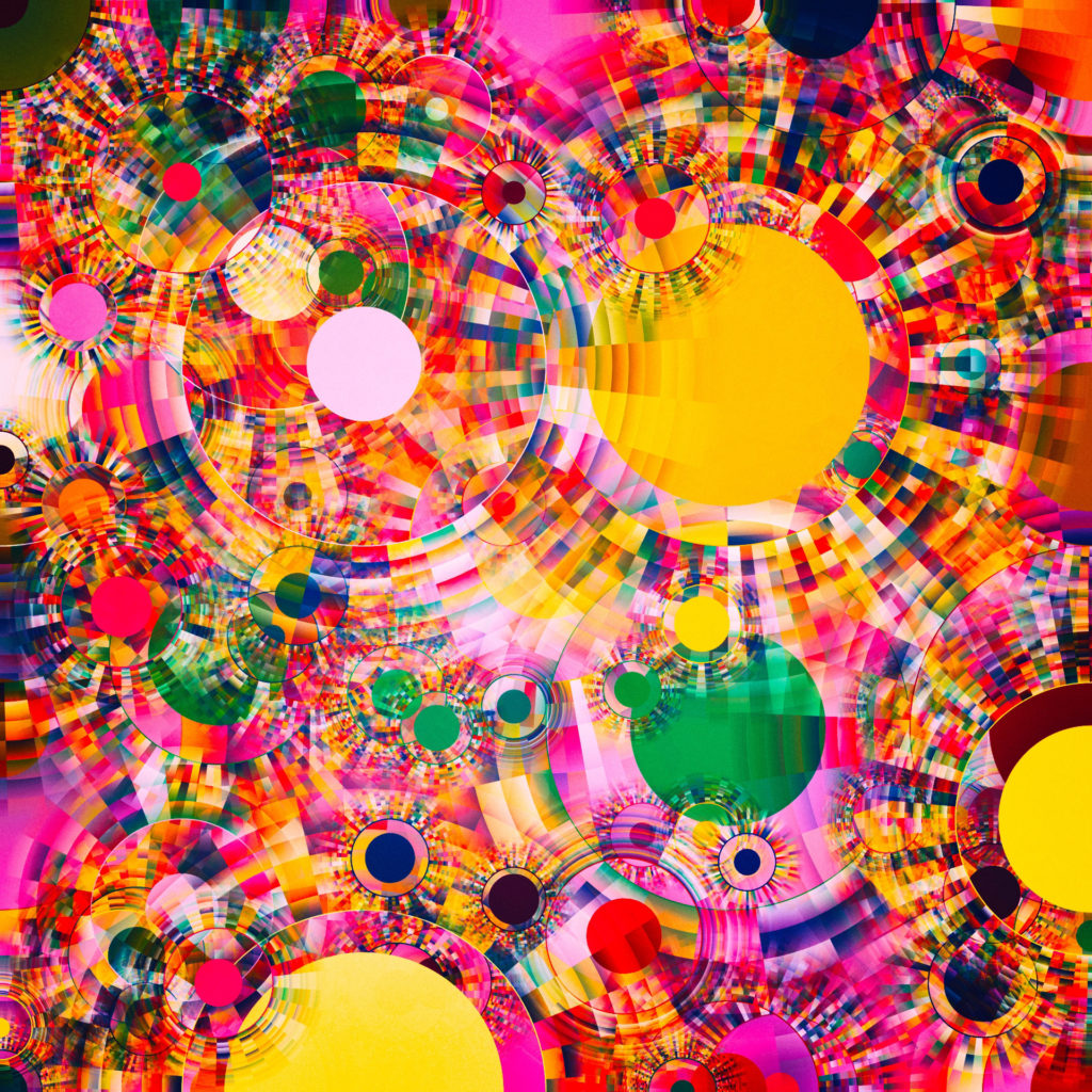
This assignment required creating a generative artwork using Object-Oriented Programming, paying attention to the structure, clarity, and organization of the program. As usual, I started off the project with something very ambitious, a piece inspired by Manolo Gamboa Naon (Link to his art).

Code

A greater part of the code was inspired by the examples we had in class as well as the tutorials we were required to watch. While my final piece had nothing particularly interesting to represent in terms of code, I must admit the learning process was an interesting ride. I tried applying most of the concepts we learnt, and was pretty confident that they should have been enough to produce a similar piece to the one I was inspired with. However, there were quite some challenges, such as generating the vectors surrounding the circles,  during the process which required me to improvise and come up with the piece that I have.

for (let i = 0; i < 5; i++){
      fill(random(100,255), random(100,255), random(100,255));
      push();
      translate(this.x, this.y);
      rotate(TWO_PI * i / 5);
      ellipse(60, 0, 10, 10);
      pop();
    }

Reflection / Future Improvements

I am not quite sure how I feel about my piece. I spent a lot of time on it yet I could not reach the level of creativity I was envisioning. On the bright side I believe I have learnt a lot, and there is still more to learn along the way. Some things I would work on the piece is it being more detailed, sophisticated, perhaps even animated.

Assignment 2 – Loops

Concept

This work of art was inspired by maximschoemaker based on the golden spiral. The Golden Spiral is a derived from a special ratio called the Golden Ratio. It is very common even within nature as can be seen in the arrangement of sunflower seeds. Now while my vision was more inclined to produce a work like the one in the picture below, I found myself exploring and learning cool stuff up to the point I reached my final piece.

Code Highlight

The most challenging and interesting part of the process was the logic required to draw the circles in a spiral form. It took quite some time to figure out the mechanics behind the movement, but upon figuring it out I came to realize I could do a lot of cool stuff with the logic developed.

for (let i = 0; i < 10; i++){
   let x = cos(angle) * scalar;
   let y = sin (angle) * scalar;
   let dist = 200 * i/2;
   ellipse(x + dist , y + dist, 3, 3);
   scalar += 0.04;
   angle += i;

Reflection / Future improvements

This assignment pushed me to learn new concepts, apply them, and realize that there is still much room for growth in general. Some of the things I would have liked to better in this work is having animations, more user-interactivity, and more efficiency by having less hard-coding. Overall it was a fun experience.

Cool Self-portrait

Concept

For the first assignment, I was eager to play around and discover different capabilities of p5.js.

Code

The sketch was good practice to figure out how things work with p5.js and play around with shapes, coordinates and colors. Albeit the most challenging part was drawing the beard, but it was enjoyable seeing it come together and work in the end. Among the most important things I learnt was the power of breaking down a bigger task into many smaller tasks and focussing on one at a time to eventually create a masterpiece. Organization and clarity of code also cannot be overemphasized given how simpler it makes to figure out and cater for any changes in the sketch.

Reflection / Takeaway

Among the things I appreciate about design is that there is always room to make better art. I believe this sketch still has a lot of room for growth both visually and technically. With regard to the code, a lot of hardcoding was used to specify the numbers, which could have been made better with automatic calculations. Visually, I would also like to add more features in the background and give the sketch a bit more life to it.