Reading week 8

Don Norman’s “Emotion and Design: Attractive Things Work Better” connects into psychology, especially how emotions affect our thinking and problem-solving. The reading made me think of affective neuroscience, which looks at how emotions, like being happy or stressed, can change the way we think. It ties into the broaden and build theory, which suggests that positive emotions, like happiness, make us more creative and flexible In our thinking. However negative emotions like anxiety, narrow our focus, which can be helpful for immediate problems but isnt  great for creative tasks. He explains how positivity can make us more tolerant of small design flaws. Because positive emotions activate brain areas like the prefrontal cortex. Affective neuroscience explains that while positive emotions broaden our thinking, negative emotions activate survival focused areas like the amygdala, narrowing our focus and making creative tasks more difficult, which makes sense because when we feel good, we’re more patient and less likely to get frustrated, allowing that creative flow to unfold. I also really liked how Norman said aesthetically pleasing designs not only look good but actually make things work better. Since I notice that when my study notes look organized and pretty I understand and memorize them much better.

This connects to the article on Margaret Hamilton too, where her ability to stay calm under pressure helped her solve those Apollo 11 software issues. Just like how Norman argues that positive emotions improve performance, her emotional state played a huge role in how she handled the stress. Both readings show that emotions, whether it is about dealing with stress or how a design makes us feel, directly affect how well we can perform on tasks. I find It interesting how much emotions actually affect and impact us.

Midterm Project

Concept

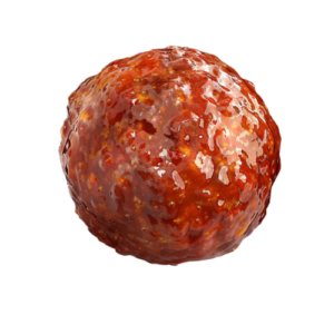
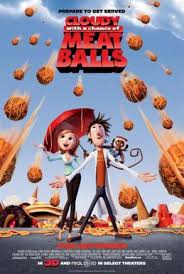
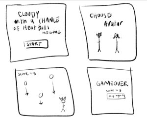
For my midterm I created a simple game inspired by the movie “Cloudy with a Chance of Meatballs.” The goal of the game is to avoid the falling meatballs. The longer the player survives without getting hit, the higher their score will be and the harder it will become. The game consists of a start screen, avatar selection, the main gameplay, and an end screen showing the player’s final score.

Sketch

https://editor.p5js.org/fatimy/sketches/8T66V9Gl1

Mechanics

  1. Avatar Selection: Players choose between two avatars, Flint or Sam.
  2. Gameplay: Meatballs fall randomly from the top of the screen. The Player is controlled by the mouse. Users must react quickly to dodge the falling meatballs.
  3. Scoring System: users earn points for surviving longer without getting hit by a meatball. The score increases based how many meatballs avoided. The game tracks the users best score, stored locally, encouraging players to improve their survival time in future attempts.
  4. End of Game: The game ends when the player is hit by a meatball, triggering the “Game Over” screen. The users current score is displayed along with the best score.
  5. Music and Sound Effects:  light background music plays during the start and player selection screens. Fast-paced music plays during the gameplay to heighten the tension as players dodge the meatballs. Both audios are soundtracks from the movie.


Highlighted code

Im happy with the speed of the meatball. even though it does seem pretty slow at first, I like how it increases and gets difficult after a while. Making it difficult to beat the best score.

Im also happy with the look of the end screen. I found it hard to choose the background, fonts and colors to try to make it look good, and im still not satisfied with the overall look of the game, but I tried my best to make it look ok.

  // reset ball position and increase speed if it goes off the screen
  if (y > height) {
    // check if the ball goes off-screen
    y = -20; // reset the ball to the top of the screen
    speed += 0.5; // increase the ball's speed
    score += 1; // add to score
    pickRandom(); // randomize ball's x-position
  }
}
// end screen (screen 3)
function endScreen() {
  background(0);
  fill("rgb(177,10,10)");
  textAlign(CENTER);
  textFont(myFont1);
  textSize(60);
  stroke("red");
  text("GAME OVER", width / 2, height / 2 - 40);
  fill(255);
  textFont(myFont2);
  textSize(30);
  stroke("red");
  text("YOUR SCORE = " + score, width / 2, height / 2 + 20);
  // check if the player's score is a new best score
  if (score > bestScore) {
    bestScore = score; // update
    localStorage.setItem("bestScore", bestScore); // save it to localStorage
  }
  fill(255);
  stroke("red");
  text("BEST SCORE = " + bestScore, width / 2, height / 2 + 60); // display best score
  // detect hover for "PLAY AGAIN"
  if (
    mouseX > width / 2 - 100 &&
    mouseX < width / 2 + 100 &&
    mouseY > height / 2 + 100 &&
    mouseY < height / 2 + 160
  ) {
    fill("red");
    textSize(40); // make "PLAY AGAIN" bigger when hovered
  } else {
    fill(225);
    textSize(30);
    noStroke();
  }
  text("PLAY AGAIN", width / 2, height / 2 + 150);
}


Improvements

The selection for the Avatar isn’t perfect and the collision detection isn’t perfect. Also I didn’t include the fullscreen function (I tried, didn’t work).

I wrote everything in one javascript, I kept saying I’ll organize it when Im done. Once I was done I didn’t want to change a lot of things to not affect the gameplay etc. I wish I created classes for the balls, avatar and had everything organized. I also think I could’ve written my code a lot simpler.

I think adding sound when the collision happens would be good. Also having other foods fall other than meatballs or having powers ups, to make the game more interesting and fun.

Problems

The main problems I faced were

  1. the images (for some reason they only showed on the top left corner) RESOLVED
  2. Full screen didn’t work (I tried different types of fullscreen functions (maybe its just my laptop) NOT SOLVED
  3. problems with the audio overlapping and lagging RESOLVED
  4. P5.js kept saying that image or sound wasn’t loaded even though it was (very frustrating)
  5. trying to figure out the area for the player selection and collision HALF SOLVED

Sources

https://editor.p5js.org/ehersh/sketches/Hk52gNXR7

chat-gpt:

  • saving best score to local storage
  • song playing (to fix overlapping problem)

Midterm Progress | week 5

For my midterm I want to create a simple game inspired by the movie “Cloudy with a Chance of Meatballs”

where the avatar has to avoid the meatballs, each meatball avoided a point is gained. Using this catching game as a template I would have to change the code from catching the circles to gain a point to avoiding them.

Also I would like to have the player pick their avatar (the girl or boy) before starting. But I am worried that maybe I can’t do it because the collision between the ball and avatar might look off because different avatars means different sizes or shapes.

If everything goes well and I end up finishing faster than I think I could add levels to the game.

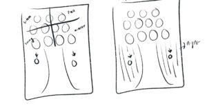
this is a rough sketch of what it will look like

reading response | week 5

The reading explains how computer vision, originally used in military and law enforcement, is now accessible to artists and designers. It discusses the challenges of making computer vision work effectively and suggests tools to help artists use it in their projects. Computer vision and human vision differ in a few ways. Human vision relies on the brain’s ability to understand complex scenes, recognize patterns, and adapt quickly, while computer vision is a set of algorithms that extracts data from digital images. Human vision is intuitive, recognizing objects in various lighting conditions and angles. Computers, however, require explicit programming to process pixels and identify patterns. While human eyes focus on the most relevant parts of a scene, computers process images as data without any true understanding of what they’re “seeing.” Human visual perception isn’t fully understood, so computer vision isn’t perfect.

In interactive art, computer vision allows artists to track movements and respond to viewers in real-time, making the experience more engaging and interactive. But because it can also be used for surveillance, it raises questions about privacy and control. This mix of being both creative and intrusive becomes a double edged sword.

Week 4 Assignment

Concept

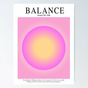
After struggling to come up with a concept/ create something I decided to look at p5.js examples to help me. I found this interactive moving circle that uses the map() function. It reminded me of those Aura Circles and so I decided to do that.

This was the Inspo

Sketch

and this is what I created..

Move the mouse around and click


Highlight

I’m happy with the look of the Circle. I think it looks fairly similar to those Aura Circles. I like the effect it gives when it’s moved.

// drawing the outer circle
fill(circleHue, 20, 100);
circle(width/ 2, height/ 2, diameter);

// drawing the inner circle
fill(circleHue, 10, 200); // Lighter color for inner circle
circle(width/ 2, height/ 2, diameter * 0.5);


Reflection

I could’ve added a lot more words, or even the descriptions that is on the Inspo picture I attached.

Maybe I could’ve also added the “Move the mouse around and click” to be part of the sketch itself.

But honestly I struggled a lot with this assignment. I think it was because I wanted to include the most I could of everything we learned so far, make it interactive, etc. while also improving every assignment. That pressure couldn’t make me work the way I wanted to. So I opted to go for something simple.


week 4 | reading response

Don Norman argues that poor design in everyday objects causes unnecessary frustration because they often prioritize aesthetics over functionality. One thing that annoys me is when the design does not align or make sense with the overall aesthetic or function of a website, app, power point, etc. It throws everything off and feels disjointed like the design and content are in two different worlds. It’s distracting. 

He introduces key concepts such as human centered design which emphasizes designing products to match users’ needs and abilities, making them intuitive and easy to use. He explains the importance of discoverability, understanding, affordances, signifiers, mapping, and feedback in creating user friendly designs. For applying Normans principles, I would focus on using signifiers in a subtle way. I want users to understand how to interact with the interface without me having to guide them or make it too obvious. The challenge here is creating an intuitive experience where signifiers are present but blend naturally into the design, guiding the user seamlessly without overwhelming them. Trying to be clear without being too in your face.

Week 3 Assignment

Concept

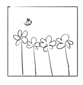
I aimed to build on my previous assignment by creating flowers using the lollipop example from class and crafting a bee inspired by the bouncing ball technique. Having already created a tree, I wanted to continue developing this theme.

Sketch

press to add bees

I chose the color of flowers to be this pink/magenta shade because there use to be a similar flower that would bloom very high we could never pick them as kids.

Highlight
My original bee looked like this. I couldn’t figure out how to get the bee to look like how I originally wanted it to. But then I remembered that I could -/+  this.x/this.y and it worked. I’m happy with the current bee especially since looking back, this one just looks weird.
show() {
  // bee's wing
  fill("#D5EBEE");
  stroke("#EBFAFC");
  ellipse(this.x - 3, this.y - 15, 15, 23);
  ellipse(this.x + 6, this.y - 15, 17, 24);

  // bee's body
  stroke("#E7D534");
  strokeWeight(3);
  fill("#FFEB3B");
  ellipse(this.x, this.y, 40, 30);
  
  // bee's stripes
  fill("rgb(15,15,15)");
  noStroke();
  ellipse(this.x, this.y, 3, 30);
  ellipse(this.x - 8, this.y, 3, 25);
  ellipse(this.x + 8, this.y, 3, 25);
  ellipse(this.x + 15, this.y, 3, 20);

  // bees' eye
  stroke(0);
  point(this.x - 15, this.y - 2);
}

I got the petals to rotate from Fasya Rahmadhani ‘s rotating strawberries.

Reflection

Overall I’m happy with the final piece. I did want to add the push/pop function to add/remove bee’s but they ended up just following each other. When I added the bee after the flowers the flowers shifted, I used chat gbt to figure out what went wrong, I ended up needing to add push(); and Pop(); to restore the transformation and style to isolate them from translate() and rotate().

For future improvements I wish to make It way more interactive. like adding (which I added after professor’s comments)or removing bees but also using the mouse pressed and key pressed function for visual changes.


Reading Response | Week 3

I believe that interactivity comes from the use of our senses. Sight, touch, hearing, smell, and even balance. While not every interactive system needs to involve all of these senses, it must engage at least one. I agree with the idea that anything can be interactive because we can interact with everything around us. However, what’s crucial is distinguishing the level of interactivity (as he mentioned) whether it’s high, moderate, or low, since different forms of interaction have different impacts. 

When the author claimed that printed books aren’t interactive because they can’t “speak,” I would argue that interactivity can also be one-sided. For instance, I am reading this author’s views, which may or may not influence or challenge my own thinking. The author created the book, and I am engaging with it—how can that not be considered a form of interaction? The experience of reading may not be a conversation, but it’s an intellectual exchange, a dialogue between the creator’s ideas and the reader’s mind. 

Regarding Improving User Interaction in p5 Sketches I think allowing users more control over the artwork itself, such as changing colors, adding or removing elements, etc, could make the experience feel more personal and engaging. And offering users guidance on how to interact with the sketch, such as through on-screen prompts or hints, would help them understand how to navigate and manipulate the artwork more effectively. Also, adding sounds or auditory information. Though I haven’t seen any examples of that so I don’t know if It is possible. 

Assignment 2

Concept:

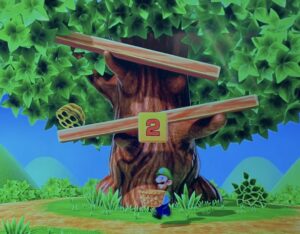
I got my inspiration from this tree while watching my sisters play.

I wanted to create a tree that showcased the four seasons. And when you would move the mouse around the tree you would get to see the different seasons in each corner. Then when pressed, it would be dark (night). And just for visuals sake have the leaves fall automatically.


Sketch:

I couldn’t figure out how to include all 4 seasons without rewriting most of what I already did, so I moved on. I ended up adding apples, and when you move the mouse around the leaves they appear on the tree as well. When the sketch is pressed the autumn version appears; where instead of apples falling they are now leaves. 

Falling circles effect

Highlight:

There isn’t a code I’m proud of, I’m mainly happy that I was able to take something that I envisioned and was able to create it since I was worried about that.

But I am pleased with how easily I was able to incorporate the loop function.

//   leaves
  for (let x=0; x<=width; x+=35){
    for (let y=0; y<=height; y+=50){
      fill('#4CAF50');
      strokeWeight(5);
      stroke('#54AF4C');
      circle(x,y/2,40);
    }
  }

Improvements:

I think it would be cool to incorporate all four seasons instead of two. Also if I could actually recreate the game that originally inspired me; and be able to somehow catch the apples.

Reading Reflection | Week 2

Casey Reas explored the interplay between order and chaos in art. The artworks he showed in the start intrigued me, it was simple but didn’t look like art created by code. It felt organic, having movement even through it was still. It maintained a sense of human touch and spontaneity despite its underlying systematic principles; the mix of chaos and order. 

I liked his approach and perspective. towards the end he says the graphics are underwhelming/simple. But he thinks it encourages you to look closer (his goal). I like the last art pieces he showed where it’s interactive in how the art piece ends. As you have control to create as well. He claims that each of these are algorithmically uninteresting. Except the idea of being able to expose the system, which he finds engaging. I think this explains art perfectly: the relationship between surface simplicity and underlying complexity. That the value of art lies not in its immediate visual impact but its capacity to reveal the deeper truth and meaning of it. That also viewing art and understanding the process/meaning of it gives you two very different perspectives.