Midterm Project – Interactive Bar

Concept:

Link to the sketch: https://editor.p5js.org/ff2185/sketches/J9qU9jniU

The concept behind this idea was born from the coffee shop experience shown in class. When I saw it, I immediately recognized an opportunity to tinker around and produce an experience that would be similar to the one offered in the example. I was heavily interested in generating an interactive experience that would feature various types of “mini-games” or small interactive screens. In this case, I ended up choosing 3 options that would fit perfectly into the bar theme:

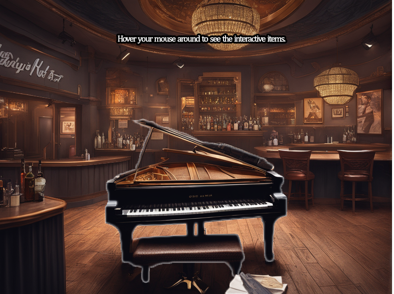
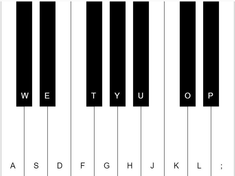
  1. Piano Simulator: The first experience would be the piano, as it was something that I have been interested in since we started working with audio. Thankfully, I managed to implement a piano that I found in a sketch someone shared online (see reference). By adapting this piano into the system that my sketch was running, I was able to offer the user the capacity to play a fully functional piano made with the p5js.oscillator() in p5js.
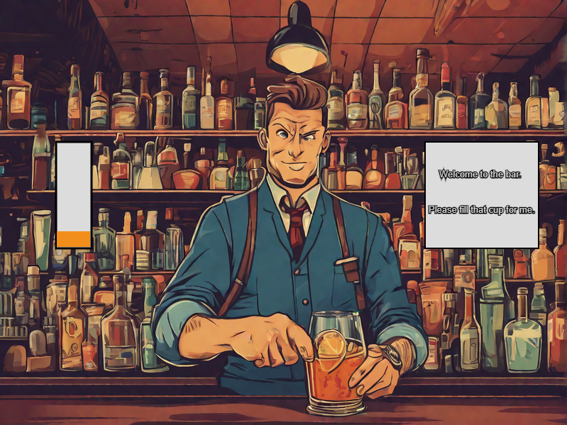
  2. Bartender Game: The bartender game was inspired by an old famous game for people born around the 2000’s. This game is called “The Right Mix”, and the idea is simple: Tap on a drink and add it to the mix. If the mix is good, then the score is high. If it isn’t, the score will be low.
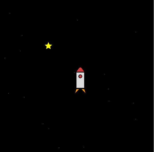
  3. Seated experience: Sit down and enjoy a drink at the bar. You will hear music playing in the background while you enjoy it and take it slow.


Design and Implementation:

For starters, the biggest challenge I knew I would face would be the state management. Having so many different interactive screens that do multiple varied functions is a big trouble considering how P5Js works. The reason behind this is mainly that P5JS is a framework that requires the user interaction to be screen-dependent: if you want to output something, it has to be relative to the coordinates. Same with the input. This is the only way to interact with the screen: that is why it’s called a sketch, it’s all about drawing.

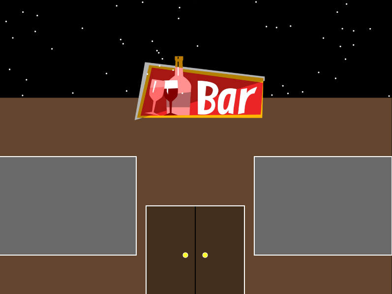
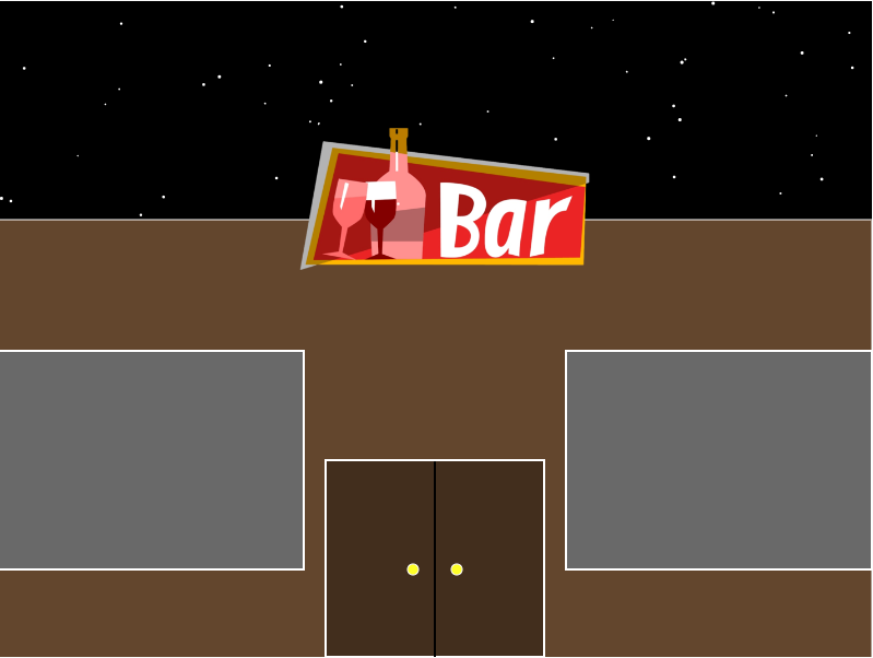
The first part was to design the bar front, which I did manually by putting shapes in certain coordinates:

After this, I decided to start coding the piano. The piano sound is made naturally from p5js, as opposed to the other option which was to add the sounds of each key manually. As the second option was a nightmare in terms of implementation and code cleanliness, I decided to research how to generate it naturally. This is the result:

if(state == "piano"){
    if (keyCode === 65) { //osc refers to the oscillator
    rSide[0].red();
    osc[0].start();
    osc[0].freq(midiToFreq(root));
    envo[0].play();
  } else if (keyCode === 87) {
    black[0].red();
    osc[1].start();
    osc[1].freq(midiToFreq(root + 1));
    envo[1].play();
  } else if (keyCode === 83) {
    mid[1].red();
    osc[2].start();
    osc[2].freq(midiToFreq(root + 2));
    envo[2].play();
  } else if (keyCode === 69) {
    black[1].red();
    osc[3].start();
    osc[3].freq(midiToFreq(root + 3));
    envo[3].play();
  } else if (keyCode === 68) {
    lSide[2].red();
    osc[4].start();
    osc[4].freq(midiToFreq(root + 4));
    envo[4].play();
  } else if (keyCode === 70) {
    rSide[3].red();
    osc[5].start();
    osc[5].freq(midiToFreq(root + 5));
    envo[5].play();
  } else if (keyCode === 84) {
    black[3].red();
    osc[6].start();
    osc[6].freq(midiToFreq(root + 6));
    envo[6].play();
  } else if (keyCode === 71) {
    mid[4].red();
    osc[7].start();
    osc[7].freq(midiToFreq(root + 7));
    envo[7].play();
  } else if (keyCode === 89) {
    black[4].red();
    osc[8].start();
    osc[8].freq(midiToFreq(root + 8));
    envo[8].play();
  ............

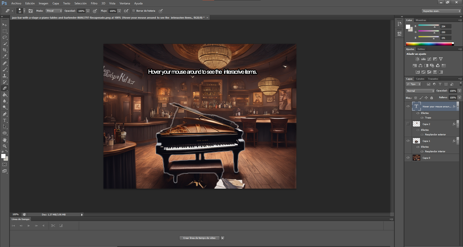
The next step was to design the interior of the bar. After we linked the bar front door click with the interior, we had to design the background for it. For this, my approach was to utilize Ai generated pictures as a starter and work over that. After generating the background, I decided to add it in Photoshop and create the hover options by selecting the different elements and adding a shiny border to them:

For the drink game, I coded a simple interaction where the user can click on the cup and fill it. When it fills to the brim, the bartender will say thanks and the user can leave.

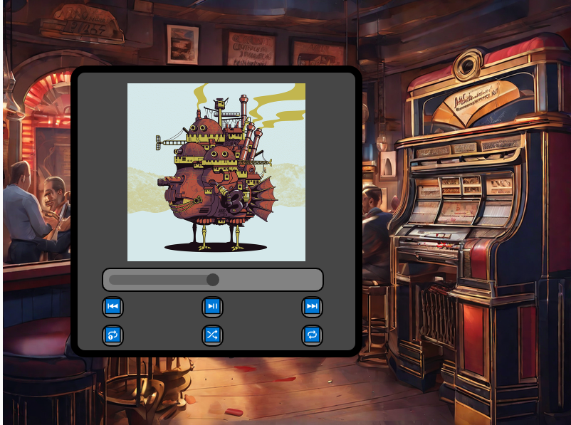
Lastly, the jukebox was made by utilizing the p5.TouchGUI library. This library allowed me to utilize buttons and generate a GUI with a volume slider in a very simple manner. By adding 2 lists, one containing the album covers and the other one containing MP3 files for every song, I managed to create a proper, functional music player with user-inputted files.

Reflections:

For this project, I am ultimately proud of my improvement on the creative side. The thing I struggled with the most was imagining the concepts and functions of my sketches, rather than how to do them. In this midterm assignment, I consider that finally challenged myself in terms of coding and creativity, and finally made an experience I find enjoyable.

Regarding improvements that I could make, I personally consider that there are multiple design decision that were a by-product of my coding decision rather than a conscious design choice. I would have like to utilize the TouchGUI library more to generate a better user experience around the bar (maybe jump through screens easily?).

In general terms, I have learned a lot doing this project and I hope to keep improving my coding and creative skills by the end of this semester.

Reference:

Midterm Progress

Sketch link: https://editor.p5js.org/ff2185/sketches/J9qU9jniU

After tinkering around with different ideas, I decided on the concept of my midterm project: The Interactive Bar.

Here, I will feature different parts of a bar that will allow the user to have 3 actions that intend to simulate a bar experience:
– Make your own drink.
– Play the piano.
– Sit down and enjoy a performance.

For this midterm progress, I have managed to do the front view of the bar and the piano, which was one of the most intimidating experiences.
The inspiration for the bar front was taken from “Moe’s Bar”, an iconic spot in the popular TV show “The Simpsons”

In addition to this, the piano is made using sounds generated directly from the oscillator function in P5js, which creates a signal that oscillates between -1.0 and 1.0. Using this, we can replicate the piano notes, at least the most basic ones.

for (var j = 0; j < 17; j++) {
    envo.push(new p5.Env()); //p5.Envelope,  controls the output volume of oscillator.
    envo[j].setADSR(0.01, 0.05, 1, 0.1);
    envo[j].setRange(1, 0);
    osc.push(new p5.Oscillator());
    osc[j].amp(envo[j]);
  }

  for (var i = 0; i < 10; i++) {
    rSide.push(new rSideKey(i, space, rKee[i]));
    black.push(new BlackKey(i + 0.667, space, blKee[i]));
    mid.push(new MidKey(i, space, midKee[i]));
    lSide.push(new lSideKey(i, space, lKee[i]));
  }

Potential challenges and next steps:

Starting from here, the most challenging parts of the project will be designing the interior of the bar. In order to make this functional, we have to allow the user to click in a certain object to start the experience. In addition to this, the project needs to include navigation options. By this I mean that every new screen should allow the user also to go back.
For this, I included a state management system to organize every screen and make navigation easier.

Reading Response— Computer Vision for Artists and Designers

Reading afterthoughts:

In “Computer Vision for Artists and Designers”, there are multiple interesting concepts and projects presented that piqued my interest heavily.

For starters, one term that caught my attention instantly was “computer vision techniques”. I did not expect the text to dive into this topic because my expectations when I dived into this was that the concept mentioned would be more related to the uses and applications of computer vision rather than proper explanation of how it works. As a Computer Science major, I was immediately shocked to discover that “there is no widely agreed-upon standard for representing the content of video”. Having worked with video myself, it never crossed my mind that there are multiple standards for handling the information of videos, which for many cases might be as bad as having no standard at all. Why? The problem relies on the level of understanding computers have. They have no knowledge on the content itself, but rather, they only know how to show it. In better ways, blurred, black and white, or whatever way you want, but they are not able to know if a person or a dog is there.

Instead of diving into AI and model training, I wanted to mention how interesting it is that older projects were able to work with computer vision even when there was no concept of artificial intelligence. It is not needed to teach the computer how to understand it, but we can start working by simply telling it how to recognize it. The simplest idea is detecting motion. By doing something as trivial as checking whether the frames changed, we can properly detect motion and movement. Even better, we can check how the pixels changed: if there was pixel A in position X, and that same pixel and neighbor pixels are found in position Y, then we can confidently guess that what pixel A and its neighbors portrayed moved from X to Y.

Overall, this reading was very enjoyable from the point of view of someone who loves coding and working with computer vision. It was interesting to see concepts that I could recognize, but at the same time exciting because I could learn new information about these exact topics.

Week 4 Reflection

After reading this text, I started to think and investigate about discoverability. In my opinion, the concept of how easily users can understand, find, identify, and access a design product’s features, functions, or content is a vital pillar in UX design.

I especially agree with the author’s idea of good design. The washer-dryer machine example was a scene that I felt really close to home. I remember multiple designs that even though they provided high levels of personalization to the user, they did not allow an intuitive learning of its use. Discoverability ensures that users can navigate and operate an interface with minimal effort with minimal guidance or instructions, which in my personal experience, is what makes a great design.

The idea the author provides that “machines have no leeway or common sense” is interesting, because it shows one of the fatal flaws of bad design. Failing to follow the exact process of the machine leads to problems, frustration, and misunderstandings. If the machine cannot provide an experience that is forgiving to user mistakes, then it is a bad design. Even if the design itself does not lead to the correct functioning, then it is a bad design. So, what can we do to improve this?
Every design should not be ruthless. The idea of having no mercy in terms of how many errors can the user make goes completely against the whole concept of user experience and interactivity. In special, when designing, it is crucial that we are able to lead the user toward the main user flow. Therefore, we allow the washing/drying machine to have many options and different customizable settings: however, users should be directed with colors, arrows, sizes, and lights to the main features, washing and drying clothes.

Week 4 Assignment

Concept:

For this week, I focused on creating a project on data visualization. The idea here was to provide a map of every single airport in the world, no matter the size or the location. To provide some interactivity in the project, I decided to add the function of moving the mouse and slowly revealing the map.

I was inspired while checking the passport map and ranking available at https://www.passportindex.org/. In here, we can see a map that is divided by countries and shows the ranking of each passport in terms of visa-less travel.

Having obtained the altitude, longitude and latitude of each airport, I presented a map that would plot all three coordinates. Hovering the mouse will show the airports around that area and pressing will reveal the map.

Implementation:

For this project, I browsed different APIs and datasets that I could plot and represent in the sketch. I ended up finding this dataset in Kaggle.

https://www.kaggle.com/datasets/mexwell/world-airports

Initially, I implemented different types of datasets for the airports. However, the biggest problem was regarding the size. Due to the fact that removing items from the list would go against the purpose of the project itself, I decided to search for a CSV file that would be within the limits of P5JS.

function draw(){
  background(0);
  for(let i = 0;i<airportsX.length;i++){
    //if it is close to the mouse and we are not pressing the mouse.
    if(abs(mouseX-airportsX[i]) < 100&&abs(mouseY-airportsY[i]) < 100 && !mouseIsPressed){
      stroke(255);
      strokeWeight(airportsAlt[i]/400)
      point(airportsX[i],airportsY[i]);
    }
    //show whole map if we pressing.
     else if (mouseIsPressed){
       stroke(255);
       strokeWeight(airportsAlt[i]/400);
       point(airportsX[i],airportsY[i]);
     } 
  }
}


Challenges and Improvements:

I would have liked to improve the interactivity and the amount of data provided. For example, I already have the names of each airport and their altitude. With this, I would have liked to show the name of each airport, but I was not able to solve the problem with the size of the dots. In order to show every dot properly, I could not change the size too much, because it relies on the altitude.

Interestingly, the map ended up showing a very pretty plot, which resembles logically the altitude of different areas around the world. We will see that the north-western side of South America has a lot of big circles, which symbolize the amount of high airports there are around Bolivia and countries around the area.

Week 3 – Reflection

Just like every Interactive Media major (or people who intended to major) who once was a freshman fighting to get a spot on any of these courses, I always used to wonder what exactly this name meant. What makes media interactive? And especially, as mentioned in the text, to what extent can (or should) our media be interactive?

Diving into the world of User Experience Design, I learned that interactivity is a result rather than a component we can add to our projects. In some sense, proper user interaction ends up being more of a reward, born from “good/correct” design decisions, rather than a feature added inside our work. As much as it’s ideal to think of interactivity as a simple exchange of information as in: the developer sets a certain function for the user, the user makes use of it, and feedback returns, reality shows us that it is not easy. Humans are attracted to certain things, and interaction is the ultimate signal of respect for them. We touch whatever thing we are curious about, we smell it, we taste it and we look over and over for it. The question comes as to whether our projects are able to return that feeling. Are our objects able to talk? If so, then our interactivity is born essentially from how well they can also listen to the feedback that they will receive. If we can portray information, but most importantly, if we can, at the same time, receive and react to the information that comes back, then we have achieved interactivity.

User interaction has a long way to go. AI has shown that we are easily capable of generating a high level of interaction with machines, either verbally or virtually. Therefore, I am more than excited to see what the future of user experience and interaction has in store for us.


Week 3 – OOP (Tornado Effect)

Concept/Inspiration:

This week, we dived into object-oriented programming and arrays. I wanted to utilize a certain movement on a set of objects, and for that, I decided to arrange an array of shapes that would be independent but would also have a function that could move them in a certain pattern.

My inspiration came from a phenomenon called the “Butterfly Effect”. For those who don’t know, the butterfly effect is the idea that small things can have non-linear impacts on a complex system. The concept is imagined with a butterfly flapping its wings and causing a typhoon. Butterfly effect - Wikipedia

Therefore, in this sketch, there are multiple variables that rely on the random() function in order to show shapes on screen.

WARNING: The sketch plays multiple colors shaking at a really fast speed. If you are sensible to any of these effects, please proceed with caution.

Code Highlight:

In order to make every shape move on its own, I decided to modify the X, Y values of the object itself. The class would contain a function called move() that would slightly change the X and Y of the object by a random value. This random value will change based on the mouse position to create the idea that the “tornado” is following the mouse.

class Form {
  constructor(x, y, r) {
    this.x = x;
    this.y = y;
    this.r = r;
  }

  move() {
    if(mouseX>=this.x){
      this.x = this.x + random(5);
    }
    else{
      this.x = this.x + random(-5);
    }
    
    if(mouseY>=this.y){
      this.y = this.y + random(10);
    }
    else{
      this.y = this.y + random(-10);
    }
    
    //vibration. Can also use perlin noise.
  }

Future Improvements:

I realized just after writing the code that several parts of the structure could have been improved. One big thing I missed while writing it was the fact that I could have attached the color to the object in order to make every shape a random color. However, I decided to keep it as it is because it would look too fuzzy. In the future, I would like to plan accordingly how I intend to express my inspiration, because even though this topic (butterfly effect) offered many different possibilities, but I couldn’t adapt any of them to P5js.

Week 2 – Reading Reflection

After watching the video, I started researching a little about the concept of “chaos” and “randomness”. There is something very powerful, even ironic behind the idea of wanting to create something that drifts apart from the author’s will. Moreover, utilizing an element such as computer processing, which relies completely upon rational decisions and binaries, is especially interesting. There are no middle points in the computer’s processing, and yet artists manage to create such varied art through chance operations.

Now, all this makes me think more about the fact that we managed to create a “chaos” formed entirely from a controlled, non-stochastic environment. Therefore, can we really say it is “true chaos”? Same happens with “true randomness”(see reference) The existence of “controlled chaos” could be a point that more artists explore and think about. William Paley, in his book Natural Theology: or, Evidences of the Existence and Attributes of the Deity, Collected from the Appearances of Nature, said: “Chance seems to be only a term, by which we express our ignorance of the cause of anything“. Maybe the key does not rely on trying to create “real chaos” or “real randomness”, but rather, being able to constantly create things that do not align necessarily with our own thoughts, but instead create an entirely new thought from that “randomness” and that “chaos” we have created earlier.

Reference:

Does True Randomness Exist? –  https://medium.com/illumination/does-true-randomness-exist-5d2fc7f413dd

Week 2 – Natural Movement Among Chaos

Concept: Natural Movement Among Chaos:

This week, I intended to work on a piece that would make the most out of simulated natural movement with noise() and the random() function. To do so, I inspired myself to do something related to space after playing Starfield, an action videogame with a space theme. I experimented using new ways of portraying my shapes, such as vertex(), curveVertex(), and trigonometric functions. The movement of the Spaceship is completely dependent on the noise() function, both on the x-axis and the y-axis, while the star position in the x-axis is randomized by the random() function. The stars in the background also appear in a random sequence. They are placed one by one in a “for” loop, and the amount of stars that appear per frame is also varied.

Code Highlights:

I am personally proud of the application of the noise function. The movement of the spaceship looks just like a natural turbulent run through the space. Also, it is my first time working with the beginShape() function, which allows to “record” vertices and make them a whole drawing.

 //NOISE
xoff = xoff + 0.01;
let n = noise(xoff) * width;
let j = 400;


//STARSHIP
beginShape();//<---- TOP
fill(205,60,60);
curveVertex(n+15, j-30);
curveVertex(n+15, j-30); 
curveVertex(n, j-50);
curveVertex(n-15, j-30);
endShape();
//-----------
fill(220);//<---BODY
rectMode(CENTER);
rect (n,j,30,60);
fill(0);
ellipse (n,j-15,15,15);
fill(205,60,60);
ellipse (n,j-15,10,10);
fill(250,150,10);//<-----FIRE
triangle(n-15,j+35,n-20,j+50,n-5,j+35);
triangle(n+15,j+35,n+20,j+50,n+5,j+35)

Reflections and Improvements:

Initially trying with more realistic drawing, I have come to realize utilizing P5JS for that purpose would be some sort of “golden hammer problem” (see reference for explanation), where I would try to use this one tool to experiment on all art styles. Instead of forcing this tool on an art style it is not made for, I decided to improve my shapes and the details of my shape drawings.

For next time, I would like to improve my art style by exploring more abstract expressions instead of things that exist in real life. It is okay to portray objects and people, but my thoughts go beyond material subjects, and I would like to include more of them in my projects.

References and inspirations:

Randomness: https://medium.com/re-write/randomness-in-p5js-ed152d93cd26

Shooting Stars: https://codepen.io/acekreations/full/pYQOxP

Golden Hammer: https://en.wikipedia.org/wiki/Law_of_the_instrument

Self-Portrait: Introduction to Shapes

– Concept:

In this assignment, since I am not someone used to making portraits and descriptions of real objects/people, I wanted to make a simple, cartoon-style approach to how I perceive myself.
With basic shapes, I intended to rely on the noStroke() function to give a feeling similar to the characters seen in the art style of the “South Park” series. In the portrait, I tried to highlight subtly characteristics of my face that most people recognize from me: A middle part hairstyle, glasses, slightly closed eyes, and a thick lower lip side.

– Highlights of my code:

In my code, I wanted to experiment with the moving animations we could produce with the draw() function. To do so, instead of making an element of my face move, I decided to add a cloud to try and move it around the portrait.

//Cloud
  fill(255);
  ellipse(x, 40, size, size);
  ellipse(x+10,50,size,size);
  ellipse(x+30,50,size,size);
  ellipse(x+30,30,size,size);
  ellipse(x+15,30,size,size);
  ellipse(x+40,40,size,size);
  
  //Movement of cloud
  x = x += 0.2 ;
  if(x >= width){
    x = 0;
  }

Here, I used various circles with a modifiable size to make a cloud that would move thanks to sharing a common x-axis that I would change dynamically. At the end, I also added a condition that returns the cloud to the start if it reaches the max width.

As a personal preference, I am also proud of how I managed to utilize the arc() function to generate the mouth. Having experimented (and failed) with ellipses before the use of this, I am happy that I found a way to improve the drawing of my mouth.

//Mouth
  //Half a circle painted red.
  fill(170,51,0);
  arc(250, 450, 75, 40, 0, 180);


– Sketch:

Reflection and ideas for future work or improvements:

In future projects, I would like to experiment and explore a more realistic art style, a style that could reward the use of more specific shapes and figures. In addition to that, having tried the movement of the cloud, I would like to generate more varied movement (other than just lateral movement) all around my drawings and possibly include interactive components. However, I am aware now of the time it takes to animate even easy movements like the cloud just going from side to side.

In addition to all this, I would plan my code in a different way next time. I would possibly create functions that can improve the legibility and reusability of the code (maybe creating the eyes, the glasses, and the hair, being such symmetric drawings, would have been easier with a proper structure of the code).