Week 8: Reading Reflection

A friend returned from Bosnia with the nicest pack of cigarettes I’ve ever seen. They were gold tipped, shiny, and bodied black in a velvety way. Smoking one, I felt like a Roaring Twenties aristocrat, a brooding Hollywood actress swept up by the whirlwinds of doomy and gloomy, a Peaky Blinder, a potayto, a potahto, it goes on. Disappointingly, much like the Hollywood actresses I was embodying, the cigarettes were all glitter and no gold, all show and no sand. They were tasteless, bland, and vapid. I write all this to say that I understand Norman’s proclivity towards usability in design. In this day and age, everything is about being pretty to the point of sacrificing utility. Everything is curated for the aesthetic. In the Decade of the Doom Scroll and the Age of the Advert, you don’t really need substance to get by, just sexiness. It’s all tricks and no party. Just look at the Kardashians. We have christened Captain Kim to helm us into the maw of Charybdis. I shudder for our souls.

Nevertheless, we are creatures of beauty. And design really does work better when it works in tandem with the aesthetic tendencies within us. We sort of, sway, together then. Our insides match our outsides and all is right with the world. That’s why it’s important for cities to be beautiful. I hope one day humanity will gain enough sense to raze every American suburb and most Midwestern cities to the ground. Beauty is necessary for objects to reflect the higher profundity within us. Norman nailed it on the head when he said designers have to balance both. The zeitgeist of today prioritizes prettiness over punctiliousness, but I will always petition for prioritizing usability while using beauty like a cherry–an ice cream sundae is never quite right without that cherry.

Everything really is about equilibrium, ain’t it. Norman’s comments on balancing between negative and positive affect struck deep too. We live in an ultra-motivated society, and I think the best way to navigate it is to channel strength and energy from your darker emotions while retaining a positive-enough mentality that keeps you from becoming an incel. I think the greatest individuals are people who achieve both great depth and breadth and while extracting from each side to maximum effect. Margaret Hamilton was probably one such individual. I admire her more than anyone could know.

Midterm Project: The Sea

I frequent a tiny film theater back home. For a while, they were streaming old films from the French New Wave every day, and I would stop in after school to watch Breathless or Children of Paradise and whatnot. But my favorite out of them all was The 400 Blows. I still remember that little yellow text at the bottom of the screen. I guess a lot of people do. That’s why you’ll see film text on nearly every poetry post on Instagram these days. Celebrity photographer @sarahbahbah made a whole career off of it. See below a still from  The 400 Blows:
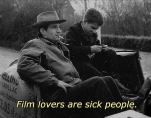
Karina died. And I don’t know what that means. I don’t know what to do about it. I don’t know what to do about any of it. Fucking Palestine. Allen Iverson never won a championship. Everyone sucks. Even as I write this, you’re not going to understand what I’m saying. And that sucks too. There’s this great Samuel Beckett quote: “You’re on Earth. There’s no cure for that.” And how true that is! The night after Karina died, we went to the ocean. I don’t want to talk about it too much because it’s not really something that can be talked about. But I tried to code what I had seen at the ocean that night. I’ll let what I made speak for itself:

In my last Midterm update, I posted about a morphing mandalas video I had seen on Youtube. It was mesmerizing. I tried to emulate that by coding the pulsating circles. At some points, the project looks like a big eye:
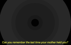
Sometimes, the abyss will creep up on you. That’s why the saying goes, “The abyss stares back,” because it really does. I hope my project conveyed that. I coded the pulsing circle, the changing text, and the sound in separate tabs before combining them together, just to make sure I understood the logic of everything that was going on before overwhelming myself. I’ve posted the links to each here:

https://editor.p5js.org/EloraTrotter/sketches/UtiZG2jDy
https://editor.p5js.org/EloraTrotter/sketches/yKrbaYS2A
https://editor.p5js.org/EloraTrotter/sketches/EMQC92jbz
https://editor.p5js.org/EloraTrotter/sketches/PLBd_2y6e

And while I am, uh, proud, of what I made. I also recognize that my code is very inefficient. For example:

var maxDiameter;
var secondmaxDiameter;
var thirdmaxDiameter;
var fourthmaxDiameter;
var fifthmaxDiameter;
var sixthmaxDiameter;
var seventhmaxDiameter;
var eightmaxDiameter;
var theta;

function setup() {
  createCanvas(900, 500);
  
// establish the parameters for the max diameter of each circle
  maxDiameter = 1000;
  secondmaxDiameter = 700;
  thirdmaxDiameter = 600;
  fourthmaxDiameter = 300;
  fifthmaxDiameter = 150;
  sixthmaxDiameter = 90;
  seventhmaxDiameter = 50;
  eighthmaxDiameter = 20;

And:

// calculate the diameter of the circle
//height/2 + sin(theta) * amplitude
  var diam = 100 + sin(theta) * maxDiameter;
  var seconddiam = 100 + sin(theta) * secondmaxDiameter;
  var thirddiam = 100 + sin(theta) * thirdmaxDiameter;
  var fourthdiam = 100 + sin(theta) * fourthmaxDiameter;
  var fifthdiam = 100 + sin(theta) * fifthmaxDiameter;
  var sixthdiam = 100 + sin(theta) * sixthmaxDiameter;
  var seventhdiam = 100 + sin(theta) * seventhmaxDiameter;
  var eighthdiam = 100 + sin(theta) * eighthmaxDiameter;

// draw the circles
  stroke(0);
  strokeWeight(0);
  fill(40);
  ellipse(width / 2, height / 2, diam, diam);
  fill(35);
  ellipse(width / 2, height / 2, seconddiam, seconddiam);
  fill(30);
  ellipse(width / 2, height / 2, thirddiam, thirddiam);
  fill(25);
  ellipse(width / 2, height / 2, fourthdiam, fourthdiam);
  fill(20);
  ellipse(width / 2, height / 2, fifthdiam, fifthdiam);
  fill(15);
  ellipse(width / 2, height / 2, sixthdiam, sixthdiam);
  fill(10);
  ellipse(width / 2, height / 2, seventhdiam, seventhdiam);
  fill(2);
  ellipse(width / 2, height / 2, eighthdiam, eighthdiam);

See how I list everything out one by one when I could sort it into different classes, etc. To be honest, even though I bare-bones know what I should do to make the code cleaner, I have no idea how. And the idea of not having every single line of code cut clear in front me line by line, one by one, was quite overwhelming.

I guess I’m proud that I was able to do any of this. This life is a weird one. There’s this great Emil Cioran quote that goes: “If your hardships do not make you grow, and do not put you in a state of energetic euphoria, but rather depress and embitter you, know that you have no spiritual vocation.” Kawhi Leonard still played basketball the night his dad died. I was watching a playoff game last summer, and the commentator said about Kevin Durant or someone else, “He never gets tired!” And isn’t that exactly what we demand from each other? If you, for a moment, expose your exhaustion, we know: You have no spiritual vocation. That’s our judgment anyways. And why humans are so compelled towards judgement rather than understanding, I don’t understand that either. Every man must decide for himself whether he has a spiritual vocation. Lord, that’s something I’m figuring out these days.

Assignment 5: Midterm Progress

Can you remember the last time your mother held you? How it felt so good, you didn’t want it to stop? The sea really is your Great Mother. She can rock you for forever, for as long as you need, even if you need it until you die. I’ve been thinking of the sea a lot these days. At night, it stretches out so dark. The horizon–it’s so dark. It’s black. I see it a lot these days.

I’d seen a project before that resembled the picture in my head, starting with morphing mandalas. I watched Youtube videos making these linked here. The ebb and flow reminded me of the ocean. I want to capture the trance effect. The black horizon, you can’t take your eyes off it. See below:

I also wanted to incorporate elements of interactivity by taking inspiration from this video. Maybe the sea starts out in day time. And then when you click, it’s the sea at night. And lastly, I wanted to incorporate an element of generative text. This poem by Naomi Shihab Nye has also been on my mind a lot these days. (She’ll be at the university for a writers summit on October 31 by the way.) And I want the poem to play throughout the piece like subtitles for a movie. I also want to load in sounds of the ocean that get softer and louder, corresponding with the visuals. All in all, the concept is still coming together and it’s the coding part that will be difficult but. We move.

Assignment 5: Computer Vision for Designers Reflection

Have you ever met a genius? I’m grateful to say that I have. You don’t stumble across geniuses very often. He doesn’t live on earth with everyone else. His mind is always in worlds beyond this one. And his computational genius extends to accommodate that. He makes virtual worlds that look like ours. He’s buying a tracking suit soon that will allow him to put himself and other actors in his video games and virtual simulations. It’s quite extraordinary. But the way he talks sometimes–”Very soon, you won’t need people to make movies. You can program them. If you want to make something in the sea, you won’t actually need to go to the sea. You can program it all on your own.” And it scares me. The technology that fueled computer vision is fantastic. It allowed us to put ourselves in worlds that allow us to express our deepest emotions and cognitive dissonances. But as what point do we abandon this world for the virtual one? And what will we sacrifice for it? I don’t want to live in a totally virtual world. My genius friend, he has no problem. As if he thinks there was nothing special about the one we occupy already anyways. And this world, which is never living up to our expectations, which we have no control over. This world, with its chaos and limitations and stopped dreams. Why would you choose this world over the one in your head? And hasn’t that always been humanity’s ultimate vision? To return to the Garden of Eden inside us. To be free. There’s this Arcade Fire lyric: “My body is a cage.” And computer vision and its associated technologies– it’s a way out of that. And I can see that. But even now, as our world grows increasingly digitally interactive, and the lines between technological worlds and reality increasingly blur, we are feeling the effects. And I’m not too sure that they’re all good. The old adage goes you can’t have your cake and eat it too. But have we ever really believed that, for a second?

I really loved the projects the reading used as examples. They reminded me of artistic conceptual pieces I’ve read about in photography and video classes. They’re so original. Such perspective-bending ways of interpreting reality that make you feel the way you do when you see a good design, that “aha!” moment–”life IS that way.” But they’re still innovations grounded in this reality. And in my heart, I was feeling I would rather stick to these methods of using the technology at our disposal. Even pieces like the Suicide Box, however jarring, stabilize me on Planet Earth. At least I’m grounded in this world, with its sadnesses and its issues. I still think, “And this is the story of us.” Soon, we’ll be leaving this world altogether. For better ones? I don’t know. I don’t know if being anxious about that makes me a luddite, short-sighted, conservative.

How far will you go to make a world? For me, I have to just focus on learning how to make even the most rudimentary projects using computer vision. Cute artistic pieces. But for the rest of humanity, for the farthest thinking of us, I think that will be the question on their minds as they delve deeper into these technologies. What is line between art and escape? Between reinterpretation and delusion? Either way, in the end, there is no escaping this life. Same party, different props I like to say. Mary Shelly was asking the same questions writing Frankenstein. The “modern day Prometheus” he’s called. How long can you play with the fire before getting burned?

Assignment 4: Socializing

I was talking to a friend the other day who quoted Sartre: “Hell is other people.” Kanye summed it up when he said, “If you hang around people who act like you aren’t who you are, then you forget who you are.” We can’t control how we’re perceived, or force people to see us as we see ourselves. Consequently, a bit of ourselves is compromised in our interactions. You are who you’re perceived as as well as who you are. Isn’t that awful. So I wrote a fake-deep meme-inspired code about social awkwardness. To be honest, I’m not sure if the meaning translates.

I’ve attached a bit of my code below:

if (mouseIsPressed) {
   noFill();
   stroke(2277,28,121);
   strokeWeight(1);
   translate(390,125);
   
   for(var i = -150; i < 200; i ++) {
     push();
     
     rotate(sin(frameCount + i)*100);
     rect(0,0,600-i*3,600-i*3,200-i);
     pop();
   }
   
   stroke(0);
   strokeWeight(12);
   fill(255);
   text('GET ME OUT',-300,330);

The objective for this assignment was to write text, so I loaded the font I wanted (Impact) at the beginning, established the size and font in the set up, and then finally got it to show in the draw function after pressing my mouse.

I learned how to load the stock image watching this. It was very easy to follow and I know I’ll be using it a lot in the future. I learned how to make the lines here. However, you’ll notice after clicking on the video that the lines in my project look quite different from what the video shows. This is because I tried to speed up the movement of the object and my computer crashed. After getting P5JS up and running, I rewrote the code and these spiky bezier-like lines are what came out and, frankly, I have no idea why. I’m not complaining because they’re the coolest part of my project. But they’re the coolest part of my project-by far-and I have no idea how it’s happening. Yeah.

This is one of those projects where the more you look at it, the worse it gets. I really felt that the lines needed to be hot pink. It reminds me of a meme I’ve attached below:

I’m going to set aside time this long weekend to make some things that I’m genuinely proud of/think are cool. I should be doing this everyday given my computational limitations. It’s a daily pressure on my mind. I want to create a project using data visualization as well, since I didn’t explore it for this assignment. It’s more difficult than simply loading a font. I’m going to ask Professor Riad how the lines function and update the post with my personal explanation later, to prove that I know. You know, when you’re starting from the beginning, it’s so easy to get overwhelmed because you know how much there is to do. You question your motivations. Do you really love what you say you love? Hemming and hawing. Twiddling thumbs.

Assignment 4: The Psychopathology Reflection

Regarding the Bauhaus: “The basic teaching error of the academy was that of directing its attention towards genius rather than the average.” 

I am a naturally thoughtless person in that I lack situational awareness and forget to consider other people. My entire life is a Hanlon’s razor situation. People would call me selfish and I used to brush it off as thoughtlessness. It took my entire life to figure out that thoughtlessness is selfishness. That’s why design occupies a place in my head on par with Bob Dylan, Better Call Saul, and Jane Birkin–my gods, my idols. Design acknowledges that Average is the mother and judge of genius. Designers force thoughtfulness and direct attention towards the Average. Design is total empathy. Design is everything that I’m not. It’s all I want to be.

Your feelings are not arbitrary. There is a reason things are the way they are. I spent my entire teenage life working in restaurants. When I was fourteen, I realized for the first time that I had taken restaurants for granted my whole life. When you serve someone food, they don’t think about who designed the menu, about who picked the chair they’re sitting in, about who drew the art on the walls, about who cooked the food, chopped the spinach, weighed the beef, or wrapped the silverware. In short, they don’t think about anything. They only know what they feel. They don’t ask why. Most people go through all of life like this.

It only takes a little bit of paying attention to realize how malleable life is. To realize it’s really all up to you. Goffredo is the head of our design department. He told us a story related to him from a friend. The friend had workers come over to fix and repaint his living room. But he had a grand piano that was too heavy to move, so he wrapped it in paper. On the first day, the workers arrived and set all their tools on the piano. On the second day, the friend raised the piano lid and re-wrapped it, making it impossible for the workers to set their supplies on it. This was a matter of design: anticipating how people would act in a given setting, and arranging said setting to direct their natural movements. It’s endlessly fascinating.

The reading said poor design results in “frustration.” And it’s true. Life is a series of mini-frustrations. There are always too many things to carry. I take solace in the knowledge that even celebrities have too many things to  carry. See below:

Good design is a way to mitigate this. You’ll never be able to stop having big frustrations. But eliminate the small ones as much as you can.

Assignment 3: The Blue Hour

The world grows most quiet during the Blue Hour, that sliver of time right before night. So short as to almost not have existed. During the Blue Hour, babies stop crying. So mothers gaze out their windows. Candles burn a bit dimmer. The Blue Hour is the world heaving one last sigh before going to sleep. I’ve always maintained that poets write from the Blue Hour of their brains.

I look for the Blue Hour in every movie. It’s in Moonlight. When Chiron’s staring into the ocean, it goes, “In the moonlight, black boys look blue.” It’s in The Act of Killing, a documentary about Indonesian genocide. I don’t think there’s a word in the English language to describe the action of sharply taking in a breath, out of breathlessness. The kind of breath that moves you into an almost-cry. It’s not a gasp. But whatever you call it, that’s what I did when I saw that blue picture. All the night birds taking flight. It’s in Wong Kar Wai’s In the Mood for Love. I’ve inserted a picture below:

It’s in Babel. I’ll never forget those two boys laughing against the wind on the mountain, before they knew their lives were over. The sound cut out with all the blue. Like the blue was in your head. In their heads. I noticed that Past Lives did the same thing with its own Blue Hour shot. Cut out all the sound. The Blue Hour is Eternal. It is quiet. It is sad. Profoundly so. I exist in the Blue Hour in the cave of my head and the trench of my heart. It’s the best time to smoke a cigarette. Hence my assignment. I wanted to capture the spirit:

https://editor.p5js.org/EloraTrotter/sketches/GX1kLdNr6

You can take a look at the code above. I’m very glad that I was able to implement loops, classes, and constructors. I wanted to increase the frame rate but P5Js kept crashing. With help from Professor Riad and the ever-reliable Coding Train (Youtube video linked here: https://www.youtube.com/watch?v=UcdigVaIYAk), I was able to fully understand what I was writing. I tried tweaking the the particles so that they became different sizes, or less opaque, but I scrapped all that in the end. Simplicity suited this piece, just like simplicity suits the Blue Hour. I would like to continue working on this piece because I have an unfinished vision of the smoke being huge Van Gogh-like swirls. But that’s a task for future Elora. Carpe the noctem. You learn.

Also- you know on second thought. I’d also like to learn how to integrate music and coding. One song that captures Blue Hour for me is “Midnight Blues” by Pavel Milyakov (Bryan Waterman rec). I’d like people to listen to that while viewing this.

Assignment 3: The Art of Interactive Design Reflection

Crawford thinks of interactivity the same way I measure consciousness. I believe rocks are conscious–just less conscious than we are. I describe consciousness as “witnessing.” Everything is witnessing each other. A rock is witnessing you just as you are witnessing it. And the more complex your way of “witnessing” is, the more conscious you are. Similarly, Crawford measures the interactivity of an exchange based on how complex it is. He says you achieve the highest level of interactivity whenever you have a good conversation. And I agree.

There have been people I tried over and over again to have good conversations with. And it never worked. Some of the best conversations of my life were with strangers on the street. I’ve thought hard and often about what makes a conversation good. And I’ve settled on the idea that it’s a mutual acknowledgment that you’re speaking from the same spiritual mycelium. A look in your eyes that says, “You feel as I feel. You speak from the same hiding place I speak.” And you can see in their eyes that they know how rare this is too. That they’re acknowledging what a relief it is to find that, having trudged for miles, they’ve finally stumbled across another fisherman at the bank of the same river. They’ve found you. One of my favorite Fitzgerald quotes goes: “Let your convictions be, not caves in which you hide, but hills upon which you stand.” And during a good conversation, you feel yourself dancing on that impossible hill.

All of this got me questioning, thinking about interactivity in Crawford’s terms, can media actually be interactive? As interactive as a good conversation? How can you interact with installations, with mere objects, as intricately and intimately as you do with your closest friends? But the thing is, I have been moved by interactive installations as profoundly as I have been moved by special conversations. And I concluded it’s because the artists of those particular installations poured themselves into what they had created. As if their art was a placeholder for them themselves. Some incarnation. By interacting with what they had made, I was touching their head, their thoughts, their visions, their dreams. That’s why we love the musicians we love. When we hear a particularly moving song, whether it’s by Kanye or Bob Dylan, it’s a strange kind of magic that happens when we realize that they know us down to the bone. We ask, “How do you know me when you have never met me?” And when we’re interacting with what someone has created, in a very important way, we’re interacting with them. Crawford said that opening a refrigerator door is an exchange with extremely low interactivity. But for the child who obsesses over opening and closing the refrigerator door over and over again, I believe, in their case, it is a highly interactive experience because they truly believe the refrigerator is alive.

Crawford goes into the differences between regular designers and interactive designers. Bruno Munari is one of the greatest designers of all time. I love a quote by him that goes: “There is no such thing as a personal style in a designer’s work.” Of course, no designer in the world can achieve this. But they try pretty damn hard. I believe the principle difference between regular designers and interactive designers is that the former’s objective is to put as little of themselves into their designs as possible. Interactive designers aim for the absolute, complete opposite. They demand: “See me.” And if what they made was good enough, you can acknowledge that you did.

But songs do this. Movies do this. And those weren’t interactive enough for Crawford. Maybe it’s only when installations seem to say: “Let me try to see you” that they meet the picture in his head. I got the sense that Crawford was relegating a lot of his understanding of the medium to the certainty of the future. I understand him very much in this aspect. I am never able to say what I am trying to say until the future says it for me. I’m no prophet.

Assignment 2: One More Time

As a kid, my first drawings were of stick figures in magical places. One stick figure would be jumping rope. Another would be reading. Two others would be playing tag. All in a giant flower field, or in space, or in a park. You get the picture. I’m still drawing stick figures now. Make sure to press your mouse down:

I don’t know how much to admit, but who really reads these besides the Professor. I’m already frustrated. I’m keenly aware of how behind my peers I am. I have big ideas but have no idea how to translate them. Between my brother and me, he’s the logical thinker. They say the devil is in the details. And as a lifelong airhead, I’m constantly worried about all the details I’m missing. I feel the consequences of my natural inattention in daily life. I feel the consequences of it when coding.

The best part of my code is the bit I saw on the Internet, linked here: https://happycoding.io/tutorials/p5js/for-loops. And embedded down below:

let lineWidth = random(minLineWidth, maxLineWidth);
  for(let lineY = 0; lineY < height; lineY+=3){
    lineWidth += random(-lineWidthChange, lineWidthChange);
    lineWidth = constrain(lineWidth, minLineWidth, maxLineWidth);
    line(width / 2 - lineWidth, lineY, width / 2 + lineWidth, lineY);

It looks straight out of a Joy Division or Arctic Monkeys poster. I took the time to thoroughly understand what was happening and make my own adjustments, but it’s something I never could’ve written myself as of now. Coding is like writing proofs. When you read a proof, you can go back through the trail of logic and understand how the mathematician arrived at their conclusion. But could you have written the proof yourself? That’s the real test of knowledge.

Never be so arrogant that you think you deserve to have been born an expert. Everyone started at one point, and what they made was bad. It was bad for a long time before it got good. You study the greats. You copy and copy and copy until you’re able to make something that’s truly your own. From here on out, I don’t want to be borrowing bits of code off the Internet. I want to write everything myself. I’ve discovered this whole new world. You have to decide whether some worlds are worth exploring. I want it to be worth it.

Assignment 2: Casey Reas Reflection

Reality is so insubstantial, sometimes, you don’t even know if it’s really there. Can’t quite trust your senses. Really, you can’t trust your senses at all, and yet, your senses are all you have. I’ve never been able to accept this. It’s a daily pressure on my mind.

Life comes, as Casey read, as a “rude and indigested mass.” And we order it. If you’re a painter, maybe you recognize the patterns of colors or the different hues and tones in the sky. You structure your life around these things. If you’re a writer, every picture inspires a barrage of words. You attempt to organize your surroundings into perfect sentences. You live your life on the line, through lines. However life comes, depending on who you are and what you love, you order it differently. Reality initially seems such a stable thing. But between the painter and the writer, between you and me, everything is different. Our very eyes, though they look the same and work the same, are in completely different worlds. It’s quite lonely sometimes.

I think Casey’s talk was an acknowledgment of the history and heritage that made him. I was only able to have these realizations about reality because of when I was born. Did people in the 1700s have thoughts like these? Or did they never question the stability of the reality around them? They were living in a completely different reality than I am now. One whose face was never questioned, no double glance in the mirror.

As a photographer, I was struck by how similar some of Casey’s geometrical designs were to photograms. Making photograms is the first exercise a film student does in the dark room. You throw random objects on some light sensitive paper and expose it. You end up with the outlines of simple, vague, white shapes on a black piece of paper. Casey said the simplicity of his geometrical designs encouraged you to look closer. If you changed one aspect of the code, the visuals looked completely different. In photograms, because you only see dark and white outlines, you have no idea what the objects that formed them really are. I couldn’t shake the newfound feeling that I was living in a world where all objects are in disguise. Even with the simplest of designs, you must look closer. Perhaps you could find the nature of the whole world there.

Casey visualized human experience in his art. We all begin by living in a world that is stable. And it determinedly morphs into a reality that we feel like strangers in because we realize our lack of control. The grid turns into a maze. Hence Casey’s transition into art where he was not in total control over his images. Much of the art he referenced evoked the “supremacy of pure feeling.” Our feelings mean nothing. They change on whims. They make us feel like Superman or like the world is falling apart from one moment to the next. And yet, our feelings are all we have.  Casey quoted Richter, who admitted “how much better chance is than I am.”

And maybe I can start to come to terms with my existence by acknowledging that it is the push and pull between the chaos of the universe and my attempts to order it that make it so interesting, so beautiful, so wonderful. Maybe I wouldn’t have changed a thing. Living in your own reality gets lonely. But watching Casey flick from one piece of art to the next, I got the sense that we make all these things to temper that. This is what Interactive Media is. Sharing this. Tempering that.