Week 9 – Unusual switch – PCGuard

Concept – PCGuard

Nowadays people spend a lot of time on their computers. I wanted to create a switch that rewarded users for closing their laptops. The name of my project clearly reflects its use. PC = computer and Guard = police/close it

Process 

I used: a green LED, 330 resistor, wires, blue-tack, and my computer.

Project

Reflection

I am excited to have created this switch. In the beginning, I was a bit stuck as I did not know where to attach my switch to. Now I have gone through all the class slides and done all the exercises and I am feeling more comfortable as I understand a bit better how this system works. 😉

Improvements

I would like when the computer closed the light turned on and a sound (victory music) turned on. It would add interaction and an increased feel of reward.

Reflection week 8a

To begin with, having been in the Spanish National Table tennis team and competed at a worldwide level the mental classes that we took usually talked a lot about fear and anxiety. Every time I worked with pressure, my coach always said, “Pressure is a privilege,” and I agree with him 100%. “Anxiety focuses your mind, reducing distractions,” is a very powerful remark from the writing that resonates with my experiences. True, paralysis and fear can result from excessive anxiety. Although anxiety is sometimes misinterpreted negatively, when it is present in the right levels, it encourages self-improvement, ambition, survival, and guard against overconfidence. The key is to manage our anxiety such that it doesn’t become an impediment and improves our performance. While difficult to master, striking this balance is essential for successful performance.


Secondly, the piece clarified something I had not realized before: our emotional condition affects how much bad design we can tolerate. Everyday annoyances like traffic lights and slow computer loads can cause anger when under pressure or strain. On the other hand, when we’re at ease, we’re more understanding of these shortcomings. This finding makes me wonder how our emotional states affect how good a design seems to us. It emphasizes the subjectivity of experiences, which is in line with a current perspective on user experience. Even in situations that are objectively pleasant, a person’s mood can have a significant impact on how they interpret an experience. This thought connects with the reading we read a few weeks ago. This realization highlights the value of designing with empathy by recognizing that users’ emotional states at any one time can have a big impact on how they interact with and feel about a design. Designers may build more robust, user-centered solutions that accommodate a greater range of emotional states and events by taking into account the user’s emotional context.

A question that I wonder is the following: What effects does the design of commonplace technology take from the idea that “attractive things work better”? How does this affect the user experience?


When we consider Margaret Hamilton’s tale, we see not just the incredible achievements of women in STEM fields, but also the significance of these stories in empowering young girls. It is imperative that girls hear stories like this in order for them to understand that they, too, can be excellent in industries that have historically been controlled by males. By introducing them to the accomplishments of trailblazers such as Hamilton, we can spark an interest in science and technology and contribute to closing the gender gap in these sectors. These tales act as historical lessons as well as hope-filled reminders of possibilities for the coming generation.

Which approaches can mentors and educators use to make sure that curricula honor and appreciate the accomplishments of women in science and technology, like Hamilton?

Midterm Project- Floral Frenzy!!

Project concept: “Floral Frenzy”

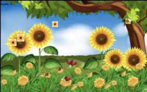
“Floral Frenzy” is a digital tribute to one of my favorite activities—picking flowers—which is a calm and fascinating experience that I share with my mom. This game attempts to capture the feeling of serenity and beauty that the act of picking and collecting flowers gives. It is inspired by the tranquil times spent in nature. In contrast to conventional fast-paced slicing games, “Floral Frenzy” offers players a more relaxing and pleasant gaming experience.

In “Floral Frenzy,” players take a virtual trip through a blossom garden, where they must pick flowers with care. Like the therapeutic experience of actually choosing flowers, every kind of flower and cut has a unique relaxing effect.

This project is a dedication to the peaceful and nature-connected moments that flower picking offers, rather than just a simple game. It’s intended for anyone looking for a break from the daily grind, providing a little peace and a reminder of the basic joys that nature has to give.

With “Floral Frenzy,” I hope to let players feel the calm serenity of floral beauty and to spread the joy and relaxation that comes from being surrounded by flowers.

Steps:

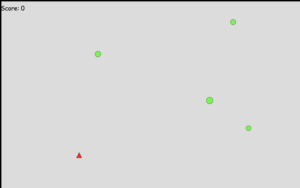
First I decided that I was going to start by coding the most basic functions of the game. Making ellipses that resembled the flowers and triangles that resembled the snails. The cursor poped/sliced the flowers.

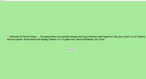
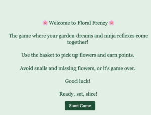
After that, I gave these shapes functions and added the score system. Once I had the skeleton of my game, I incorporated the images, and sounds and worked on the aesthetics of the instruction and game over page.

Difficulties: 

I encountered a lot of challenges along the way. I don’t even want to think about how many hours this game took me to program. What matters is that in the end, it was worth it.

One of the most challenging parts of the game was to figure out the scoring system and the collisions. I spent quite a lot of time in the p5 library trying to figure out how this worked. Another quite challenging thing but it ended up simplifying a lot of my code was to add the GameObject class.

Using the GameObject class made my code much simpler as I didn’t have to write the same code repeatedly for each object in my game, such as snails and flowers. I just set up this class with the basics (speed, position…) After that, I used this blueprint every time I needed a new object, like a sunflower, and it already knew how to move and check to see if it went off the screen. Since all of those objects only need to be set up once in the GameObject class, they all share the same starting point and set of rules, which allowed me to save time and write cleaner code.

It was very exciting to figure out the game speed multiplier that I introduced in the GameObject class.

this.y += this.speed * speedMultiplier;

Getting the area of the basket to intercept the snail or flower image was challenging.

One last thing that was complicated was to add the bonuses (+2)points ellipses. I wanted to program that for every time the score reached 5 a +2 bonus appeared. The problem was that every time the game reached 5 it froze. Later on, every time it reached 5 a tone of +2 ellipses flooded the screen. It took me a while to figure out and achieve the balance.

Code that I am proud of: 

// Update and display each Bonus object
for (let i = bonuses.length - 1; i >= 0; i--) {
  bonuses[i].update();
  bonuses[i].display();

  // Remove the Bonus object if it goes off screen, is popped, or has been visible for more than 2 seconds
  if (millis() - bonuses[i].timestamp > 2000) { // Check if 2 seconds have passed since creation
    bonuses[i].toDelete = true; // Mark for deletion
  }

  if (bonuses[i].offScreen() || bonuses[i].toDelete) {
    bonuses.splice(i, 1); // Remove the Bonus object from the array
  }
}

// Generate Bonus objects when score is a multiple of 5 and no bonus is currently displayed
if (score % 5 === 0 && score !== 0 && bonuses.length === 0) {
  bonuses.push(new Bonus()); // Add a new Bonus object
}
function handleSunflower() {
  // Generate new Sunflower instances periodically
  if (frameCount % 60 === 0) { // Adjust according to your game's difficulty
    sunflower.push(new Sunflower()); // Use Sunflower class
  }

  // Update and display each sunflower
  for (let i = sunflower.length - 1; i >= 0; i--) {
    sunflower[i].update();
    sunflower[i].display();

    // Check if the sunflower goes off-screen
    if (sunflower[i].offScreen()) {
      gameOver = true;
      break;
    }
  }
}

GAME!! 

Future improvements: 

or future improvements of my game I would like that every time a flower is sliced there was a calm sound in the background. (scissors sound)

Another thing that I wanted to add but had no time for was that every X points a new background and a new flower would display. This would give the game more dynamism.

Evolution:
Final Result: 
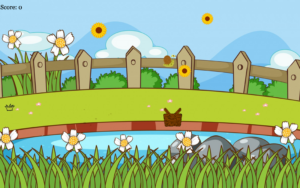
Bibliography: 

https://p5js.org/es/reference/#/p5.PeakDetect/update

https://p5js.org/es/reference/#/p5/createButton

https://p5js.org/es/reference/#/p5.Score

https://p5js.org/es/reference/#/p5/keyIsPressed

https://p5js.org/es/reference/#/p5/pop

https://www.freepik.es/

Midterm project First draft

For my midterm project, I want to create a fruit ninja game but instead of cutting fruits, I want the user to cut flowers. Simulating you’re cutting flowers from a garden.

This first week I wanted to work on the hardware of the game.

I have the backbone of the game coded. Starting with the instructions display, the game which ellipses simulate the flowers and triangles simulate insects which simulates bombs. I started with a simple design so that it would be easier for me to code and understand every step.

It was a bit challenging for me to understand and to add the GameObject class.

Everything that moves or shows on the screen in your game, such fruits or bombs, is designed after the GameObject class. This is why it’s helpful:

In simple terms, GameObject is like the basic DNA for all the items in the game. It makes creating and managing game items easier and more organized.

  1. Saves Time: It avoids writing repetitive code for common game item functions, such as moving or displaying on the screen. All items can use it after you write it once in GameObject.
  2. Maintains Order: It assists you in maintaining the clean code of your game. Aware of the locations of the common elements
  3. Facilitates Modifications & Simple to Add New Content: Modifying an attribute that should be shared by all items (such as movement) only requires making a change in GameObject; all items will then update accordingly.

Another thing that I had to learn was to increase difficulty as the user sliced flowers. I added this feature to my GameObject class.

This formula allows for dynamic adjustment of the game’s difficulty or pace, making objects fall faster or slower based on the speedMultiplier value.

Accordingly, if the game is playing at 60 frames per second (fps), the object will glide smoothly down the screen because its y location will be updated 60 times in a second.

this.y += this.speed * speedMultiplier;

Furthermore, I had to add a lot of If statements such as If an ellipse was not cut – game over or if a triangle was cut then – game over.

A handle function handles particular tasks within the code. For example, handleFruits() in a game might add new fruits, update their positions, and check if you missed any, all in one place. It ensures that everything that has to happen with fruits is done correctly and helps keep your code neat.

function handleFruits() {
  if (frameCount % 60 === 0) { //60(fps) a new EllipseFruit object is added to the fruits array every second. 
    fruits.push(new EllipseFruit());
  }
  for (let i = fruits.length - 1; i >= 0; i--) {
    fruits[i].update(); //Updates the position or state of the fruit 
    fruits[i].display(); //Draws the fruit on the screen 
    if (fruits[i].offScreen()) {
      gameOver = true; // End the game if any fruit goes off-screen
      break; // Exit the loop to immediately handle game over
    }
  }
}


Next steps: 

This next week I’ll work on improving the game and make it more aesthetic. I need to add the pictures of the flowers and change the cursor to some scissors. I have to add some music so that every time the user cuts a flower there is a sound in the background. Lastly, I have to figure out how to display the instructions first with the fullscreen option.

Bibliography: 

https://p5js.org/es/reference/#/p5.PeakDetect/update

https://p5js.org/es/reference/#/p5/createButton

https://p5js.org/es/reference/#/p5.Score

https://p5js.org/es/reference/#/p5/keyIsPressed

https://p5js.org/es/reference/#/p5/pop

When Art Meets Tech: The Magic of Computer Vision for Creatives

For anyone who has ever been interested in fusing art and technology but has been afraid to take the step, Golan Levin’s paper, “Computer Vision for Artists and Designers: Pedagogic Tools and Techniques for Novice Programmers,” is an awakening. It basically says:  “Hey, you don’t need to be a tech whiz to play with computer vision. Come investigate!”It aims to dismantle the stigma associated with technology and demonstrate how it can be an interesting and easy tool for designers and artists.


In the past, computer vision was a high-tech field only utilized by the military or for severe scientific applications. But Levin demonstrates that it’s no longer exclusive to specialists. Artists are now utilizing computer vision to create amazing and interactive works of art because of more affordable devices, quicker computers, and an online community of shared code.


This paper made me think about broader issues, such as the responsible use of technology in art and privacy considerations. While it’s exciting to see how far technology can take art, it’s also critical to consider the effects of our creations.

To conclude I would like to end with two questions for reflection-

  1. How can artists ensure that their use of computer vision respects individuals’ privacy?
  2. What influence will designers and artists have on how society perceives and uses this technology going forward?

https://www.flong.com/archive/texts/essays/essay_cvad/index.html

Reading week 4

The Design of Everyday Things” begins with an introduction to the basic ideas of excellent design and stresses the value of user-centered design. Norman talks on how the way that commonplace things and interfaces are designed can either help or hurt our ability to use them. He highlights how important it is to comprehend user experience and the psychology of how people interact with products in order to produce designs that are understandable and practical. The chapter frequently draws attention to typical design defects in commonplace items to show how bad design can cause user errors and irritation.


How does Norman distinguish between well-designed and poorly designed commonplace items?
Norman makes his distinctions based on user experience and usability: while poorly designed designs lead to irritation because of poor function communication, well-designed designs are intuitive and satisfy needs without misunderstanding. A poorly designed chair, on the other hand, could be visually beautiful but unpleasant. A well-designed chair, for instance, is solid and comfy, encouraging use.

What impact do affordances have on a product’s usability?
Affordances improve usability by indicating possible uses for an item. A door handle that allows for pulling instead of a flat plate implies pushing, assisting the user in an instinctive manner.

Examples of designs that are non-intuitive versus intuitive?
Similar to the swipe feature on a smartphone, intuitive design conforms to user expectations. Unintuitive design, such a complicated remote control, can cause confusion among users and have a detrimental impact on engagement.

How may design be improved by an understanding of user psychology?
It foresees user requirements, actions, and mistakes, resulting in more considerate and effective products. Designs that provide a greater variety of interactions are made possible by the knowledge that users do not always follow intended paths.

How should designers address mistakes made by users in their creations?
by foreseeing mistakes and reducing the likelihood and consequences of them. This improves user safety and experience by incorporating fail-safes, unambiguous feedback systems, and simple corrective pathways.

To finish I liked this quote from the reading-  “Experience is critical, for it determines how fondly people remember their interactions.”
Norman, Don. The Design of Everyday Things : Revised and Expanded Edition, Basic Books, 2013. ProQuest Ebook Central, http://ebookcentral.proquest.com/lib/nyulibrary-ebooks/detail.action?docID=1167019.
Created from nyulibrary-ebooks on 2024-02-17 12:55:08.

Assigment 4: Data visualization

Idea and Inspiration:

I am really into cryptocurrency, especially Bitcoin. I am doing an internship in a crypto exchange. I always read price tendency graphs and wanted to create one of my own.

Sketch: 

Code that I am proud of: 

//  X axis- dates
let dates = btcTable.getColumn("Date");
let years = {};
for (let date of dates) {   // Iterate over each date
  let year = date.substring(0, 4); //Extract the year from the date
  years[year] = true; //ensures that the years object will only contain unique year values by the end of the loop.
}

let uniqueYears = Object.keys(years); //// Extract the keys (unique years) into an array
for (let i = 0; i < uniqueYears.length; i++) {
  // // Iterate over each unique year
  let x = map(i, 0, uniqueYears.length - 1, 50, width - 50); //// Map the year index to x-coordinate
  text(uniqueYears[i], x - 15, height - 35); //// Display the year as text at the calculated position

The first step in the procedure is to extract every date entry from a database (btcTable) that contains the prices of Bitcoin. Each date is represented by a string to indicate a particular day. Every date string in a loop is handled with the substring(0, 4) function to extract only the year part. Essentially separating the year (assuming a YYYY-MM-DD format) with this method is to take the first four characters from the date string. After that, the values of each of the extracted years are set to true and they are used as keys in an object called years. By ensuring that every year is only recorded once, this technique produces a collection of unique years, independent of the number of entries for that year in the dataset.


In the 2 sample code provided, we first utilize the year of each date as a key in an object named years. Next, we use the Object.keys(years) function to obtain an array of those distinct years.

Creating the years Object: We take the year (the first four characters of the date string) and use it as a key in an object called years when we loop over each date in our dataset. We give every key a value of true. As a result of JavaScript’s prohibition on duplicate keys, this step effectively eliminates any duplicate years, guaranteeing that each year appears only once in the years object.

Object.keys(years): Extracting Unique Years: Object.keys() is a JavaScript function that accepts an object as input and returns an array with all of the object’s keys, or property names.
The years object contains an array containing all of the keys, which is returned when we apply Object.keys() to it. The uniqueYears array that is produced now contains every unique year in our dataset, without any duplicates, because the keys are the unique years that we previously extracted.

Why It’s Done This Way: This method makes sure that, no matter how many data points we have for a given year, we only include that year once when we visualize the data (e.g., putting it on a graph). This ensures that every year is represented uniformly and without repetition.


Difficulties: 

I encountered so many difficulties…

First of all the data was not uploading correctly into P5. It was complicated to figure out why. Then I realized the thing that was causing the problem was the year formating. Initially was (1.feb 2022) then (1/2/2022) and finally I changed to 2022-02-1.

then I did not know how to portray a graph. I followed these steps from the P5 website — https://editor.p5js.org/pedbad/sketches/sbGhi7GwU

Then I didn’t know how to leave some margin ant the bottom  bottom of the canvas. I used this equation to help me with map(value, start1, stop1, start2, stop2) let y = map(price, 0, 60000, height – 50, 50);

Improvements: 

I would like to have more up-to-date data.


Reading 2 – Interactivity

Interactivity, to me, is the intimate, hands-on interaction with tools, systems, or experiences that change according to your input. It’s about engaging in a conversation with technology such that your actions produce significant, real-time results. This definition places a strong emphasis on having a hands-on, interactive engagement with the digital world in which you interact with technology or media as a conversation rather than just as a means of consumption. Your inputs are met with responsive and developing feedback.

The Significance of Interactivity

Creating responsive, captivating, and—above all—conversational experiences is what makes an experience interactive. It goes beyond simply having buttons to click and menus to navigate. Crawford’s concept, which describes true interaction as a cycle of speaking, hearing, and thinking between the user and the system, forces us to reconsider what true interaction actually entails. The significance of creating systems that can actually “understand” and “respond” to user inputs in a meaningful way is increased by this concept.

Putting Real Interactivity Into Practice

Developers and designers need to give communication flow top priority in their work if they want to achieve meaningful interactivity. This entails developing systems that are able to intelligently analyze user input, deliver pertinent, contextual feedback, and receive input from users. It’s about building an ecosystem in which the system thoughtfully responds to each action taken by the user, encouraging dialogue and a sense of community.

The Future of Interactive Media

Future-oriented, the possibilities for interaction appear endless. Advances in artificial intelligence, machine learning, and natural language processing may allow for ever more sophisticated and customized user conversations in the upcoming generation of interactive systems. Imagine interactive systems that can anticipate our wants and gradually adjust to our preferences in addition to obeying our directions.

Interesting questions

How can designers make sure that consumers are still having meaningful conversations with interactive systems?
How does empathy fit into the process of creating interactive experiences?
How can we keep the human factor in interactive design as AI gets more advanced?

Assigment 3 – Functions, Arrays, and Object-Oriented Programming

Idea and Inspiration:

My piece of art aims to create an interactive garden where viewers can witness blossoming flowers and fluttering butterflies. I love nature and I wanted to make a tribute to gardens. At home, my mom and I spend hours working in the garden, it is our bonding time. This project is inspired by nature and the delight of immersing in the sensory experiences of a tranquil garden.

Code that I am proud of: 

grow() {
  if (!this.fullGrown) {
    this.size += this.growthRate;
    if (this.size >= 90) {
      this.fullGrown = true;
followMouse() {
   if (mouseIsPressed) {
     let angle = atan2(mouseY - this.y, mouseX - this.x);
     this.vx = cos(angle) * 3;
     this.vy = sin(angle) * 3;


Sketch: 

Difficulties: 

First of all, it was complicated to get the classes in order. It was not working as they were all in random positions. I had to change the names to numbers so that it was in the correct order.

Secondly, I wanted the flower to expand. So I searched in the internet the function to do it. “https://editor.p5js.org/amcc/sketches/3ZLqytY_4”

Thirdly, I wanted to do something interactive with the MousePress option. These lines of code use the atan2() function to determine the angle between the butterfly’s current position and the location of the mouse pointer. Next, they calculate the velocity vector’s horizontal and vertical components using the trigonometric functions cos() and sin(). These results are scaled by a factor of three to determine the butterfly’s speed as it follows the mouse pointer.

followMouse() {
   if (mouseIsPressed) {
     let angle = atan2(mouseY - this.y, mouseX - this.x);
     this.vx = cos(angle) * 3;
     this.vy = sin(angle) * 3;

Improvements: 

I am pretty proud of the work. I spend a lot of time figuring everything out. For improvements, I would like the butterflies to look more real. Adding stripes inside the body.

I think it would also be cool if the flowers after a certain amount of time they disappeared.


Assigment 2

My concept

The concept for my artwork came from an experiment in which I created different shapes by generating random codes. The primary goal of this technique was to discover the possible outputs of coding without having a predetermined goal, therefore it was informal and exploratory. The speech by Casey Reas “Eyeo2012” talked about the need to discover novel ideas without overanalyzing, this served as my motivation.

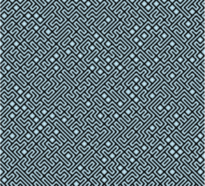
The series’ first drawing is intended to represent a maze. It is a metaphor for the hardships that come with life, suggesting that despite obstacles and complex paths, perseverance will ultimately lead to the finding of the right route. The journey through life’s complexity and the eventual triumph in finding direction is intended to be represented by this sketch.

The second sketch, however, shows a substantial change. It shows the maze’s walls falling down to reveal an open, direct, and clear path. This exemplifies overcoming the difficulties and barriers encountered earlier. This drawing is meant to evoke feelings of freedom and clarity, representing those times in life when challenges are overcome and the path ahead becomes easy and uncomplicated.

Embedded sketch


Code that you’re particularly proud of

strokeWeight(1); // Sets the thickness of the lines
  frameRate(3); // 
}

function draw() {
  background("lightblue"); // background color for each frame

  // Nested loops to iterate over each cell in the grid
  for (let x = 0; x < width; x += size) {
    for (let y = 0; y < height; y += size) {
      let E = random(9); // Generates a random number between 0 and 9

      if (E < 1) {
        // Draws a line from top left to bottom right of the cell
        // line(x, y, E + size, y + size);
      } else {
        // Draws a line from top right to bottom left of the cell
        line(x, y + E, x + size, x);
      }
    }
  }
}

Ideas for future work or improvements

Ideas for the future that I would want to implement are some kind of visual effect. Effects that make you dizzy and hypnotize you. I think that would be very cool.