MAYBE ITS MAYBELLINE


For my assignment idea, I really wanted to incorporate makeup because it’s something that I really love and use everyday (especially red lipstick). I know that I am technically using my hands, but I really didn’t want to let go of this idea!

I connected my Arduino to the breadboard, making use of the techniques we used in class and then taped my jumper wires onto my lipstick (not very subtly, if I may add) and used foil  as my “conductor fabric” to get the LED to switch on and off.


For next time, I would like to create some sort of holder for the lipstick so I don’t have to physically apply it and also find a way to hide the wires since they are so obvious.

WEEK 8 REFLECTION (:

Norman,“Emotion & Design: Attractive things work better”

The main takeaways!

  • “Design matters, but which design…depends on the occasion, the context, and above all the mood.”
  • “Pleasing things work better, are easier to use, and produce a more harmonious result.”
  • “The design should not become a barrier, it should be carefully tailored for a task.”
  • “A product must be beautiful, have useful function, work well, and be usable and understandable.”

With these quotes, I took away the importance of balance in regards to great design. It is essential to make sure you are covering all aspects of the design process: 

  • Ensuring your product is providing some sort of benefit or fulfilling a certain purpose
  • Catches the user’s eyes with its attractive design, whether it be adding a combination of colors or cool features that ultimately enhance the likability of the product.
  • Making sure that there is a certain level of learnability. This is where the human centered design really comes through. A product should be pretty self explanatory to ensure that the user doesn’t become frustrated with the product, therefore halting the usage of it.

Her Code Got Humans On the Moon — And Invented Software Itself. 

I really appreciate how this article highlighted the female computer scientist Margaret Hamilton and her role in the Apollo Mission, as well as how her creations deeply impacted the future of computer science. It is refreshing to hear more about female contributions to the field of computer science since the field is so male dominated. 


The section of the article about Hamilton being under great pressure to be perfect while building the computer software for the mission was very relatable. I can understand her worries about not being perfect, because she was not only representing herself, but women (at the time) in computer science. The article writes, “I [Hamilton] was always imagining headlines in the newspapers and they would point back to how it happened, and it would point back to me.”. When she says this, she demonstrates how much pressure was placed on her to be flawless. This is something I believe many women, particularly in technical fields, experience. 

MIDTERM PROJECT “AURA”

https://editor.p5js.org/dianadonatella/sketches/0Rv4DeXZ_
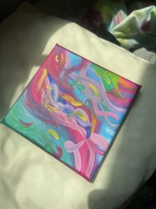
Concept:

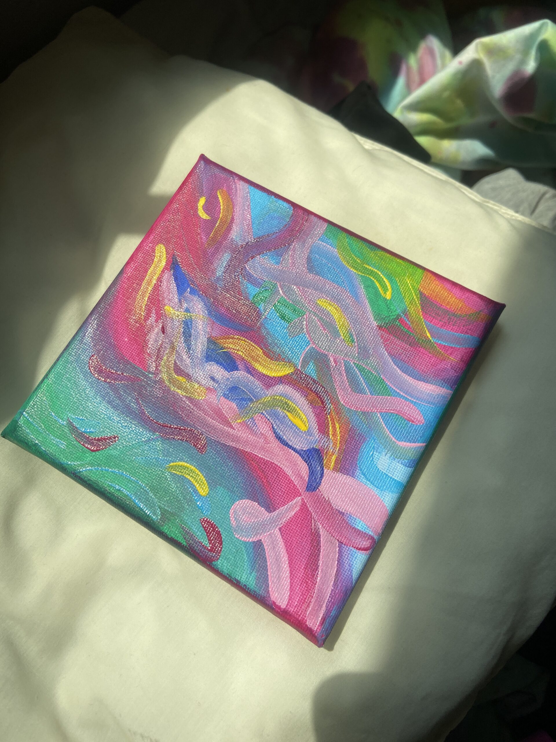
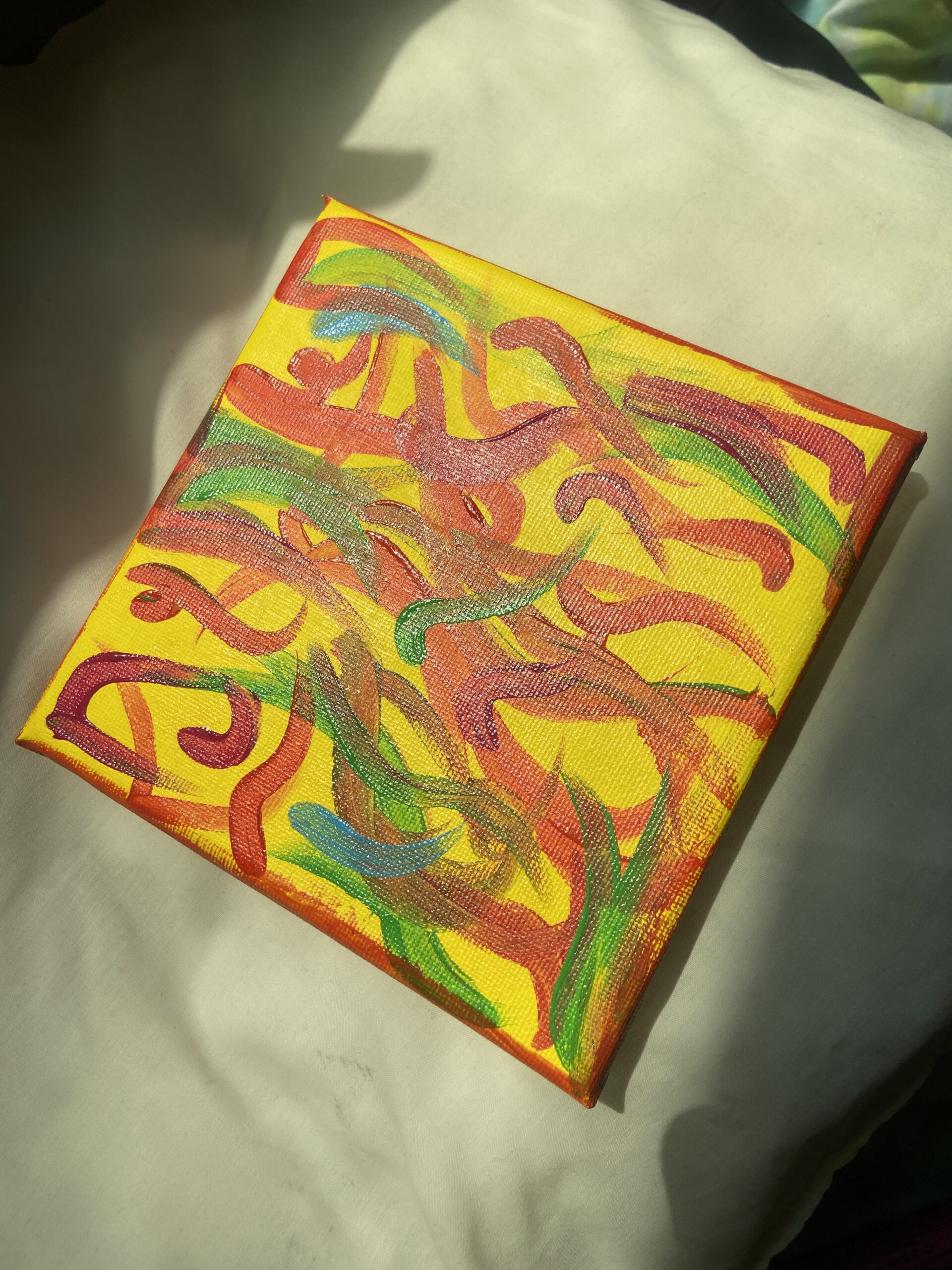
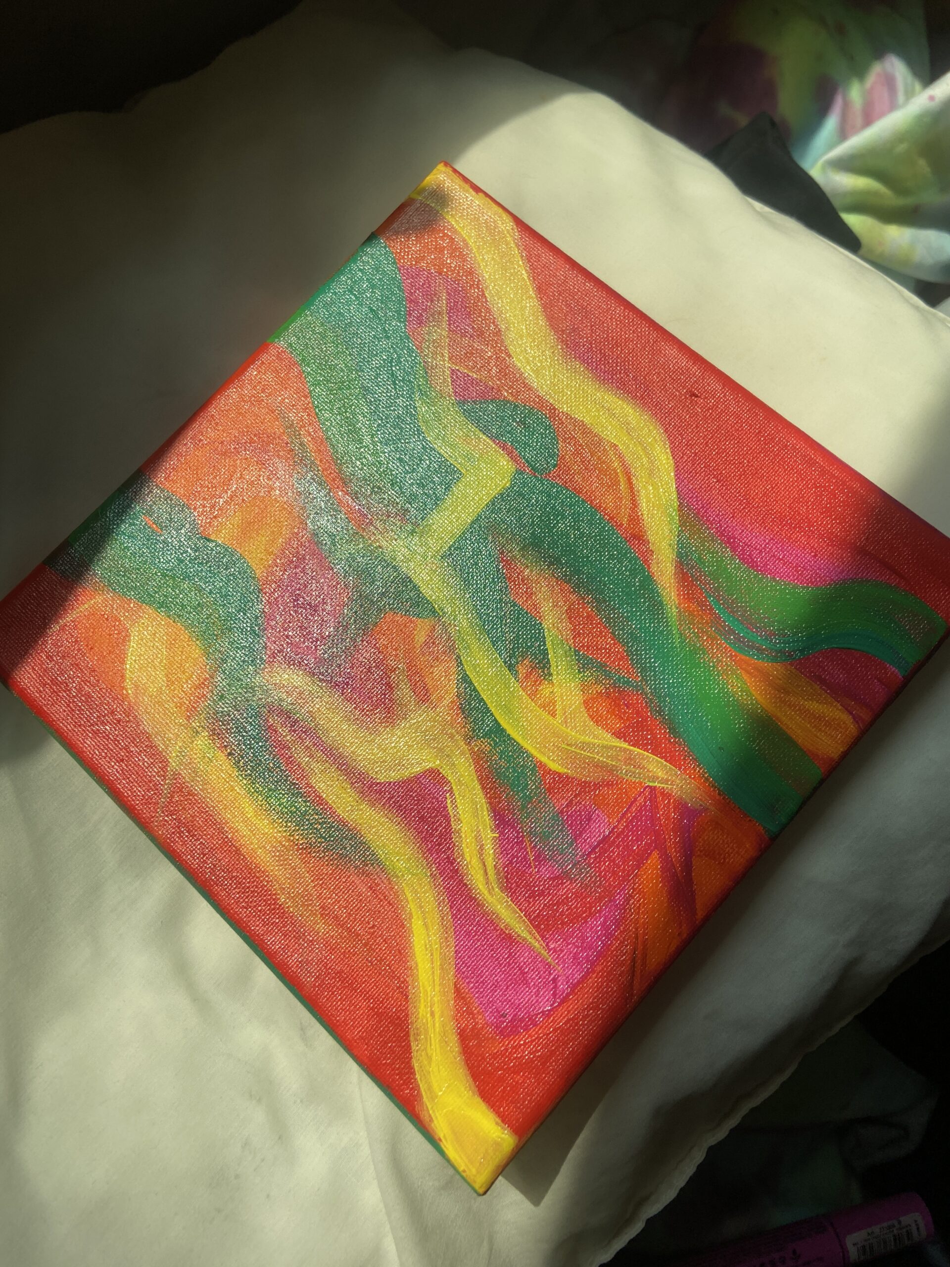
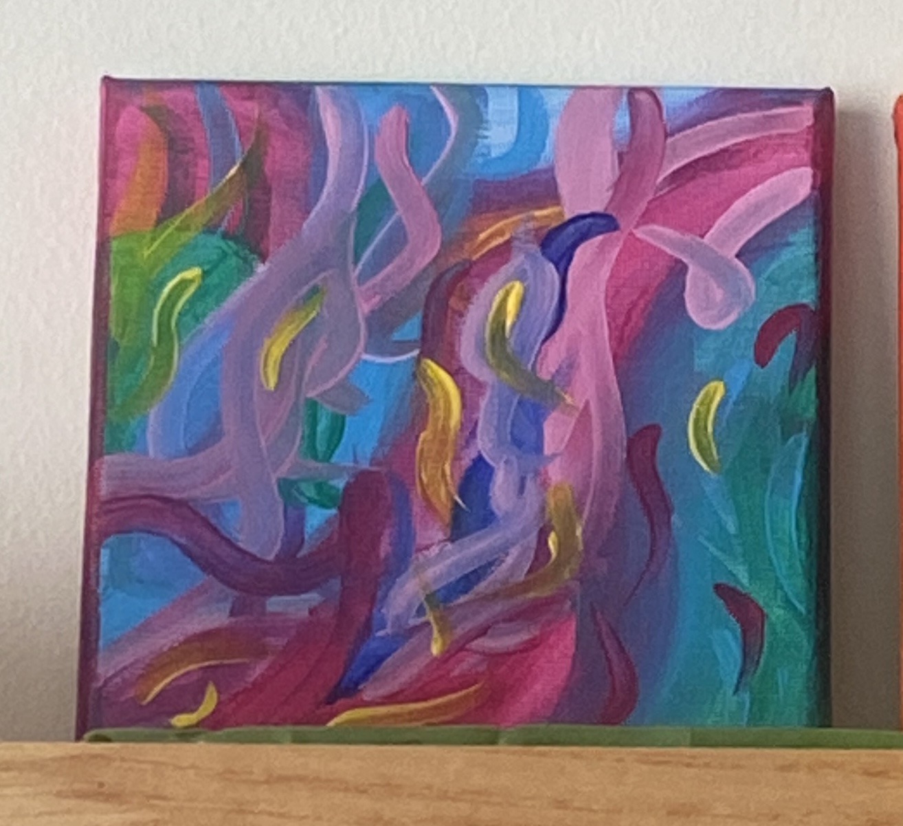
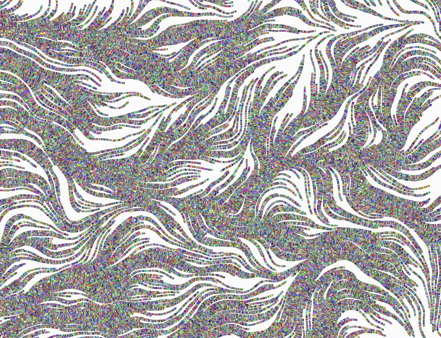
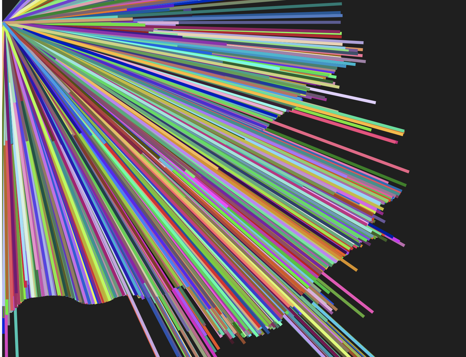
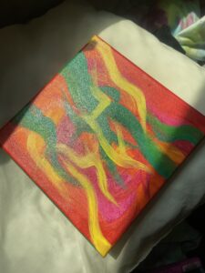
My project was inspired by a series of paintings that I created over the last couple of weeks. I am not sure why exactly, but this style of painting really speaks to me.  It allows me to freely paint using as many colors as my heart desires. It was once stated to me that my pieces reminded people of energies, specifically auras. This idea became the foundation of my midterm project. My initial goal was to create a sketch that allowed for user input to type in an initial of their name and generate a unique interpretation of their aura both visually and sonically. Unfortunately due to the amount of errors and complications I faced during this process the idea has slightly shifted.  Now the user can actually build their own depiction of their aura by typing in single letters to generate a concoction of colors and sounds. Though this wasn’t the initial idea, I actually think this process is much more interactive for the user, giving the user more control of how they want their “aura” to look or sound.

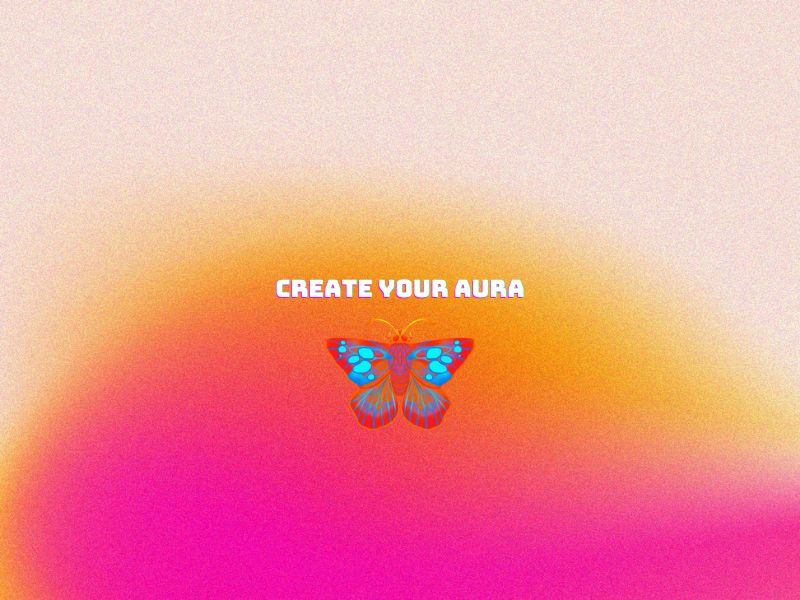
The program starts with the following opening image:

I made this image in Canva with their free gradient backgrounds and added the butterfly and text as well!

The user then has access to the user input when they click generate, which generates the base color of their sketch. In the box directly next to it, the user can input ONE capitalized letter at a time, creating a wall of color and sound to build what their aura looks and sounds like.

What I have implemented into my code from class!

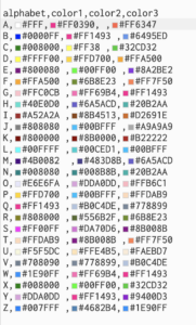
Within my code I have made use of CSV files and images:

function preload() {
  bg = loadImage('gradient.png')
  initials = loadTable("initials.csv", "csv", "header");

I used sound (specifically .wav files):

 
//continuation of the preload section
songA = loadSound("A.wav");
  songB = loadSound("B.wav");
  songC = loadSound("C.wav");
  songD = loadSound("D.wav");
  songE = loadSound("E.wav");
  songF = loadSound("F.wav");
  songG = loadSound("G.wav");
  songH = loadSound("H.wav");
  songI = loadSound("I.wav");
  songJ = loadSound("J.wav");
  songK = loadSound("K.wav");
  songL = loadSound("L.wav");
  songM = loadSound("M.wav");
  songN = loadSound("N.wav");
  songO = loadSound("O.wav");
  songP = loadSound("P.wav");
  songQ = loadSound("Q.wav");
  songR = loadSound("R.wav");
  songS = loadSound("S.wav");
  songT = loadSound("T.wav");
  songU = loadSound("U.wav");
  songV = loadSound("V.wav");
  songW = loadSound("W.wav");
  songX = loadSound("X.wav");
  songY = loadSound("Y.wav");
  songZ = loadSound("Z.wav");

I used functions:

//function for main page (SIMPLE EXAMPLE
function main_page() {
  // sets up variables to get the alphabet and color columns
  alphabet = initials.getColumn("alphabet");
  color1 = initials.getColumn("color1");
  color2 = initials.getColumn("color2");
  color3 = initials.getColumn("color3");

I used conditional statements:

if (initial === "A") {
   songA.playMode("untilDone");
   songA.play();

 }
 if (initial === "B") {
   songB.playMode("untilDone");
   songB.play();
   
 }

 if (initial === "C") {
   songC.playMode("untilDone");
   songC.play();
 }

 if (initial === "D") {
   songD.playMode("untilDone");
   songD.play();
 }

 if (initial === "E") {
   songE.playMode("untilDone");
   songE.play();
 }

 if (initial === "F") {
   songF.playMode("untilDone");
   songF.play();
 }

 if (initial === "G") {
   songG.playMode("untilDone");
   songG.play();
 }

 if (initial === "H") {
   songH.playMode("untilDone");
   songH.play();
 }

 if (initial === "I") {
   songI.playMode("untilDone");
   songI.play();
 }

 if (initial === "J") {
   songJ.playMode("untilDone");
   songJ.play();
 }

 if (initial === "K") {
   songK.playMode("untilDone");
   songK.play();
 }

I used User input/buttons/text:

//function for homescreen 
function homescreen() {
  fill("white");
  square(0, 0, width);
  background(bg);

  fill(0);
 
  text("Click generate & type in a letter!", width/7.5, 20);
  textAlign(CENTER);
  textSize(14);
  
  input = createInput();
  input.position(20, 30);
  button = createButton("generate");

I used arrays:

// an arrray to store the Particles
let particles = []; // variable for the particles
const num = 3500; // how many particles will be displayed


An extra step! (USING LOGIC PRO X and PLUGINS)

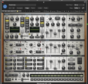
This is the DAW that I used to create the Sounds/Chords for my project. They are all synthesizers!

Parts you are proud of or challenges you have overcome:

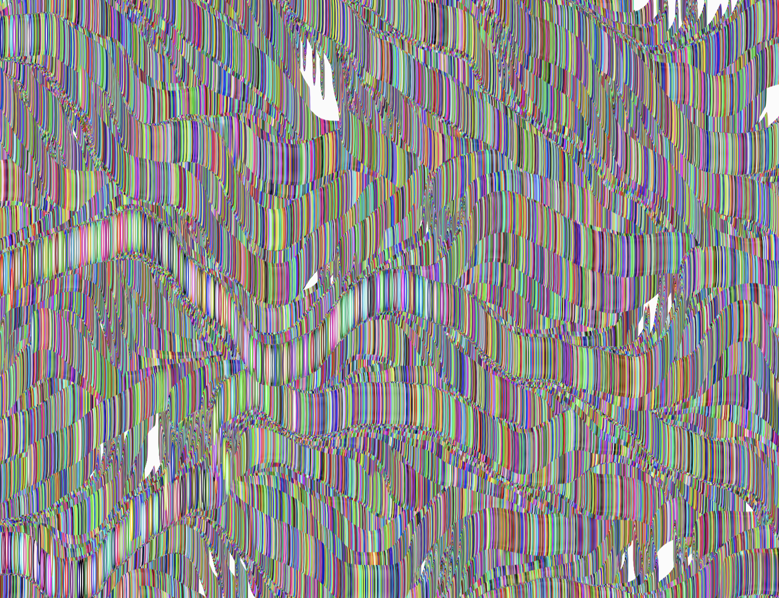
I am really happy that I was able to achieve a similar interpretation of my painted pieces. I feel that not including a background and letting the perlin noise loop really brought the stroke affect and colors out of my paintings.

for (let i = 0; i < num; i++) {
    let p = particles[i];
    square(p.x, p.y, 2);

    color1 = color(colors_for_sample[0]);
    color2 = color(colors_for_sample[1]);

    fill(lerpColor(color1, color2, noise(p.x * noiseScale, p.y * noiseScale))); // lerpColor() function is used to interpolate two colors to find a third color between them.
    noStroke();

    let n = noise(p.x * noiseScale, p.y * noiseScale); //Multiplies the x-coordinate of the point p by a value noiseScale.... Multiplies the y-coordinate of the point p by the same value noiseScale. X and y coordinates are mutiplied by the noise scale before passed onto the noise. Basically generates random-like values based on the input coordinates and maps out the coordinates before the noise is generated
    let a = TAU * n; //TAU = 2PI & n = value calculated in previous line
    p.x += cos(a); // incrementing the x and y coordinates of a point based on the cosine and sine of angle (a)
    p.y += sin(a);
  }

I really wish that my code didn’t have to be so redundant when including the sound files. Having lines like these:

if (initial === "A") {
    songA.playMode("untilDone");
    songA.play();

  }
  if (initial === "B") {
    songB.playMode("untilDone");
    songB.play();
    
  }

  if (initial === "C") {
    songC.playMode("untilDone");
    songC.play();
  }

  if (initial === "D") {
    songD.playMode("untilDone");
    songD.play();
  }

  if (initial === "E") {
    songE.playMode("untilDone");
    songE.play();
  }

  if (initial === "F") {
    songF.playMode("untilDone");
    songF.play();
  }

really stunted my mobility within the code, made figuring out errors 1,000,o00 times harder, was very overwhelming to look at, and took so much extra time to write out, (even if copy and pasted).

In the future, I would really like to work on expanding on this project and creating a better set up around the user input, since it’s a bit plain and doesn’t really contain a means of restarting the sketch. My sketch overall is really lacking user input which is such a key aspect of any interactive piece, so for that I am a bit disappointed with my project.

MIDTERM PROJECT UPDATE 2

AURA PART 2 UPDATE

If you can remember, I was basing my original concept on this painting that I made a couple of weeks ago.

Here is an update of how things are going.

PROGRESS:

So for this iteration of the project, I was mainly focusing on getting the user to be able to type in an initial of their name and the particles in the sketch to change colors accordingly via a CSV file I made connecting each letter of the alphabet to a different set of colors. FUN I know!

I was able to get this part of the project going and start mixing and matching the colors so that the user can actually see multiple colors being displayed in the sketch. 

COOL CODE:

 //TYPE IN INITIAL
  let sample = "A";
  
  // find the row index of the input sample initial and set that value to idx
  for (let i = 0; i < alphabet.length; i++) {
    if (alphabet[i] == sample) {
      idx = i; //4
    }
  } 
  // get corresponding colors 
  colors_for_sample = [color1[idx], color2[idx], color3[idx]];


  for (let i = 0; i < num; i++) {
    particles.push(createVector(random(width), random(height)));
  }
}

function draw() {
  background;
  for (let i = 0; i < num; i++) {
    let p = particles[i];
    square(p.x, p.y, 2);
    
    let color1 = color(colors_for_sample[0]);
    let color2 = color(colors_for_sample[1]); 
    
    fill(lerpColor(color1, color2, noise(p.x * noiseScale, p.y * noiseScale)));// lerpColor() function is used to interpolate two colors to find a third color between them.
    noStroke();

In the next step of my project I hope to add a background image behind my sketch, as well as some sound to make things a bit more interesting.


Week 6 MIDTERM PROGRESS REPORT # 1 : AURA 🦋


MY CONCEPT:

MY IDEA FOR MY MIDTERM COMES FROM THIS ARTWORK I PAINTED A WEEK AGO. WHILE I WAS PAINTING THIS PIECE, ONE OF MY FRIENDS SAID THAT THE PAINTING REMINDED HER OF AN AURA. I FOUND THIS INTERPRETATION OF MY PIECE VERY INTERESTING, SO I DECIDED TO PURSUE IT FURTHER AND CREATE A GENERATIVE P5 ARTWORK BASED ON IT. I THOUGHT IT WOULD BE REALLY COOL TO USE PERLIN NOISE AS ONE OF THE METHODS TO RECREATE THIS PIECE DIGITALLY.

https://editor.p5js.org/dianadonatella/sketches/GEIf0_ruE


TO MAKE THIS PIECE MORE INTERACTIVE AND INTIMATE, I WOULD LIKE TO ADD A FEATURE IN WHICH THE USER CAN TYPE THEIR NAME INTO A DESIGNATED LINE OF CODE AND THE ARTWORK WILL DISPLAY A UNIQUE RANGE OF COLORS THAT REPRESENT THEIR AURA. (MANY THANKS TO PIERRE FOR THE NAME) ADDING TO THIS IDEA, I’D LIKE THE NAMES THAT ARE TYPED OUT TO HAVE A UNIQUE SOUND IN ADDITION TO THE ARRANGE OF COLORS! FOR THIS PART, I WOULD MOST LIKELY COMPOSE SOME MELODIES OR USE A RANDOMIZED ARRAY OF NUMBERS REPRESENTING STAFF NOTES.


THIS PROJECT WILL BE DIFFICULT BUT I REALLY LIKE THE IDEA, SO I AM EXCITED TO TAKE ON THE CHALLENGE.

HERE ARE SOME BRIEF IDEAS FOR HOW THE SKETCH COULD APPEAR. (THESE ARE ROUGHHHHHHHH)


Week 5 Reflection

The article begins by discussing the historical context of computer vision, giving a story of Marvin Minsky’s early attempts in the 1960s to solve the difficult subject of computer vision. It highlights the field’s continuing difficulty, particularly in high-level picture-processing tasks like pattern recognition. Given these difficulties, the text recognizes that low-level computer vision algorithms have been developed and become available to even young programmers.

The article goes on to discuss how digital video lacks fundamental conceptual information and requires computer vision to extract meaning from it. The author then introduces three essential methodologies for computer vision research: frame differencing, background subtraction, and brightness thresholding. He stresses the importance of developing physical conditions in combination with software development for good computer vision. The text points out the need to increase the contrast between objects of interest and their surroundings in the physical environment in order for algorithms like background removal and brightness thresholding to function properly.

The article also emphasizes the significance of the physical environment in computer vision, because algorithm performance is highly dependent on the quality of the incoming video scene. It goes on to predict that as technology advances and software tools improve, computer vision applications will become more common in a variety of areas, particularly media art education and interactive artworks.

I like how the text discusses how computer vision continues to impact the field of interactive media and the tremendous potential computer vision offers for interactive artwork. The artwork Messa di Voce was very interesting to me in this article. I think it was an incredibly exciting idea to have computer graphics (using computer vision) create real-time graphics to interpret the sonic quality of the singers’ voices. I only wish I could have seen this demonstration live!

ASSIGNMENT 4: The Weeknd does it again!

Concept:

I wanted to challenge myself a bit and do a data visualization sketch. I had to do a lot of research on which type of data I wanted to use since most of the data I found was quite boring. That is why I chose a topic that greatly interested me. I decided to create a data visualization of the most streamed Spotify songs in 2023.  I, like everyone else, enjoy listening to music on Spotify, so this type of data was really exciting to work with!


fill(50);
      textSize(9);
      text("Lucid Dreams", 5, 575);
      text("Dont Start Now", 50, 550);
      text("Watermelon Sugar", 85, 525);
      text("Lovely", 155, 500);
      text("Say You Wont Let Go", 160, 475);
      text("Se��o", 225, 450);
      text("As It Was", 275, 430);
      text("Heat Waves", 310, 450);
      text("Perfect", 363, 420);
      text("Starboy", 405, 410);
      text("Closer", 450, 400);
      text("Believer", 485, 385);
      text("STAY", 535, 418);
      text("One Dance", 560, 395);
      text("Sunflower", 610, 375);
      text("Dance Monkey", 640, 355);
      text("Shape of you", 685, 180);
      text("Blinding Lights", 725, 130);

This portion of my code was used for placing the text over the bars. I thought that I could maybe create a loop so I wouldn’t have to write the same lines over and over again, but there was so much variation in the placements of the text that I ended up doing it the old fashion way!

I was really amazed that I was able to find the Spotify logo and text for FREE?! It looks so good!

Of course for the design, I included the infamous #1DB954 color and incorporated some blacks and whites to fit the companies branding.

If I had more time, I definitely would make my design a bit more elaborate and maybe even rebrand it (the colors,font,etc..). For this assignment though, I wanted to keep it a bit more straight to the point and simple.

Blinding lights continues to lead the way with (as of today) 3.76 billion streams!! GO ABEL (:::::

ASSIGNMENT 4: “The Design of Everyday Things”

Don Norman’s book “The Design of Everyday Things” explores some of the characteristics of good design in chapter 1, focusing on the importance of discoverability and understandability.


 When defining discoverability and understandability, Norman poses the following questions: “Is it possible to even figure out what actions are possible and where and how to perform them?…What does it all mean? How is the product supposed to be used? What do all the different controls and settings mean?”. 


Design impacts everything we do, from electronic devices to organizational systems of businesses. Norman believes that good design places importance on the interaction between people and the technology being used. When designs are not human-centered and rely too heavily on accuracy and pure logic, things tend to go awry. 


 Norman writes “It is the machine and design that are at fault. It is the duty of machines and those who design them to understand people. It is not our duty to understand the arbitrary, meaningless dictates of machines.”. I couldn’t agree more with this sentiment. If engineers and those capable of creating these machines are the only ones who understand how to use these machines then what exactly is the point of creating these products? This surely cannot be classified as universally “good” design.


 In fact, I would classify this as a more niche or exclusive design, since it leaves out a large demographic of the population. According to Norman’s writing, great design must be simple, straightforward, and allow for some nuance. Whether it’s nuance in the type of person using the product or nuance in how the product is designed.

ASSIGNMENT 3 “Rocket Man”

Concept:

For this assignment, my goal was to depict a bunch of mini rockets (triangles) blasting off. This idea was mainly because, I wanted to practice using OOP, functions, and arrays in a very simplified manner. If you press down on your mouse, the rockets should shoot up, each at different times!

CODE I’M PROUD OF:


// applies thrust to rockets if the mouse is pressed
  if (mouseIsPressed) {
    for (let i = 0; i < rocketArray.length; i++) {
      rocketArray[i].thrust(20);
      //increases the thrust value if the mouse is pressed

I know it’s simple, but it seemed like a really cool idea to me.

REFLECTION:

I ran into a multitude of issues while trying to finally complete this assignment. The main issue that I came across, was that I kept creating infinite loops that made P5 keep crashing. It was really frustrating because for a while, I couldn’t figure out what was happening, but in the end, everything was sorted.


ASSIGNMENT 3 REFLECTION


The first chapter in Chris Crawford’s book “The Art of Interactive Design” identifies some of the essential traits of great design and addresses common misconceptions about interactive design. 

He begins the chapter by analyzing the increasing popularity of “interactivity” over the years, as well as the numerous ways that “interactive design” has been mischaracterized as a result of its unexpected popularity. He specifically mentions the overuse of the term “interactivity” in marketing campaigns for products ranging from children’s toys to shampoo and even cereal. 

Before getting into the fundamentals of great design, he attempts to describe interactivity through metaphor, stating that interactivity must allow for hearing, speaking, and thinking. Crawford acknowledges that there are degrees to interactivity but emphasizes that without these qualities, true interactivity cannot be achieved or done so to the greatest extent. He also provides numerous instances of non-interactive items, such as books, movies (not yet), and paintings, since these items fail to meet all three elements of interactivity. 

Later on, Crawford touches on the differences between user interface design and interactive design, stating that UI design focused on “…optimizing communication between people and electronic devices”, while interactive design “…addressed the entire communication between the user and computer.”.  

Crawford’s concept for great design as “speaking, listening, and thinking” was very intriguing to me in this chapter. Each of these activities has an enormous effect on the individual, allowing for full-body engagement with whatever they are observing. For me, this will always be what I find most astonishing about the work being done in the IM field. Interactive media/design transcends passive observation and evokes emotion, showcasing the most beautiful parts of life.