Reading Reflection – Week #4

Personally, I found the first chapter of Don Norman’s The Design of Everyday Things to be an insightful introduction to human-centered design and user experience. However, some aspects of it struck me as somewhat contentious. Having already read some of my peers’ reflections on the infamous “Norman Doors” (which are also found on our campus), I was intrigued by the mixed reactions. Some people found the design intuitive and user-friendly, while others have consistently struggled with it over time.

This divergence reminded me of my early experiences with social media. When I was 9, I had an account on the Russian social network VK, which (even then) I found incredibly easy to navigate. I also had a Facebook account at the same time, but I could never quite figure it out due to its cluttered and complex design. Interestingly, when I later traveled to Armenia, I discovered that many people there had the opposite perspective: they viewed VK’s interface as poor in terms of user experience, while Facebook was considered relatively straightforward. To this day, I still find Facebook extremely annoying to use, overwhelmed by its numerous buttons and pages whenever I open the sidebar or attempt to navigate through it.

This brings me to a broader question: is user experience really as universal as Don Norman suggests? Are there only conceptual models — mental representations of how objects work, based on users’ past experiences — that determine the value of design? How do cultural differences influence or limit the usability of objects? When discussing Norman Doors, who do we consider as the elusive “ideal user”? Is there truly a universal standard for which almost anyone can be considered the model for evaluating a design’s discoverability?

Assignment #3: Non-Ugly Ducklings


Concept & Inspiration.

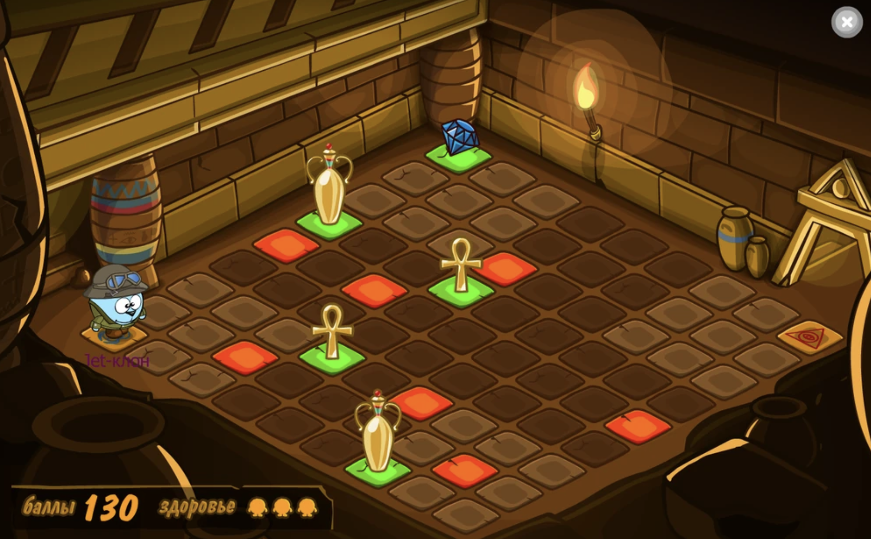
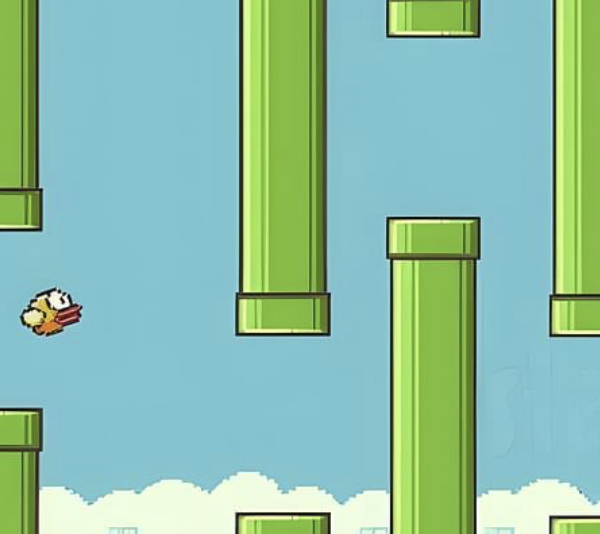
My primary inspiration comes from the game Flappy Bird, which I used to play on my phone as a child. While reflecting on it, I didn’t intend to fully replicate the game, but rather merge its concept with something else. I then remembered the children’s book The Ugly Duckling and thought about incorporating that theme. One duckling may be considered ugly, but what if there were an endless number of them? Would they still seem as ugly?

With this idea in mind, I decided to write code using classes, and through careful use of color, I aimed to show that a whole flock of supposedly ugly ducklings might not look so ugly after all.

Highlights.

For this project, I created a class and made it an array birds[] so that the user can add endless number of ducklings on canvas. Moreover, I used the .push and .pop functions for adding and removing the ducklings. Even though it took me a while to understand how to flip the bird horizontally after bouncing, I eventually implemented it in my code by creating the facingRight variable inside the class.

// Flip the bird after bouncing
if (this.x > width - 60 || this.x < 0) {
  this.xspeed *= -1;
  this.facingRight = !this.facingRight;
}

It was also the first project where I worked with text() (which was relatively easy) and some of the text-related functions.

 if (birds.length === 0) {
  fill(255);
  textSize(24);
  textAlign(CENTER);
  textStyle(BOLD);
  textFont("Helvetica");
  text("mouse click to add a duckling", width / 2, height / 2);
}

Reflection.

I am proud of this project, as I was able to implement almost all the new functions we learned in class this week. Additionally, I experimented with incorporating text for the first time. One challenge I faced was with the ducklings near the right corner, which glitch after a mouse click. I attempted to solve this issue using generative AI, but unfortunately, I wasn’t successful.

Overall, I believe the project achieved its intended purpose. In the future, I hope to create a more detailed background for the canvas, as I didn’t have enough time to include that in this version.

Embedded Sketch.

Mouse click to add a new duckling & click any key to remove the last one.

Reading Reflection – Week #3

As I searched for the definition of “interactivity,” I found two distinct meanings placed side by side: (1) the process of two people or things working together and influencing each other, and (2) the ability of a computer to respond to a user’s input. In The Art of Interactive Design, Chris Crawford claims that the term “interactivity” is commonly “misused and misunderstood” due to the prevalence of the second definition. He challenges this misinterpretation by outlining three essential criteria for true interaction: (1) listening, (2) thinking, and (3) speaking. Importantly, Crawford argues that all three principles must be equally present in both “actors” of the interaction, with no trade-offs. This helps to clearly differentiate between interaction and mere reaction (such as reading a book) or participation (like dancing to music), which, as I agree, are not truly interactive activities.

While I found the text enjoyable overall, some examples provided by Crawford were based solely on his personal assumptions (for instance, his discussion of performance art and the extent of interaction involved). This led me to reflect on a question posed at the beginning of the chapter that remained unanswered: what is the role of subjectivity in interactivity? How much of interaction depends on the perspective of the individual interactor?

From the text, I gathered that there is some subjectivity in interactivity, which Crawford acknowledges. However, he also emphasizes that an objective foundation for interactivity exists as well, rooted in the essential definition of interaction. I agree with this view and also concur that defining interactivity merely as “the ability to respond to input” is a misuse. Such a limited definition can constrain designers. Therefore, in my future artworks, I plan to implement Crawford’s “rule of three” when assessing the interactivity of my code.


Assignment #2: Sense of Time


Concept & Inspiration.

How do we understand time? How do we grasp its relativity, and how does time differ across the globe in each corner of the world?

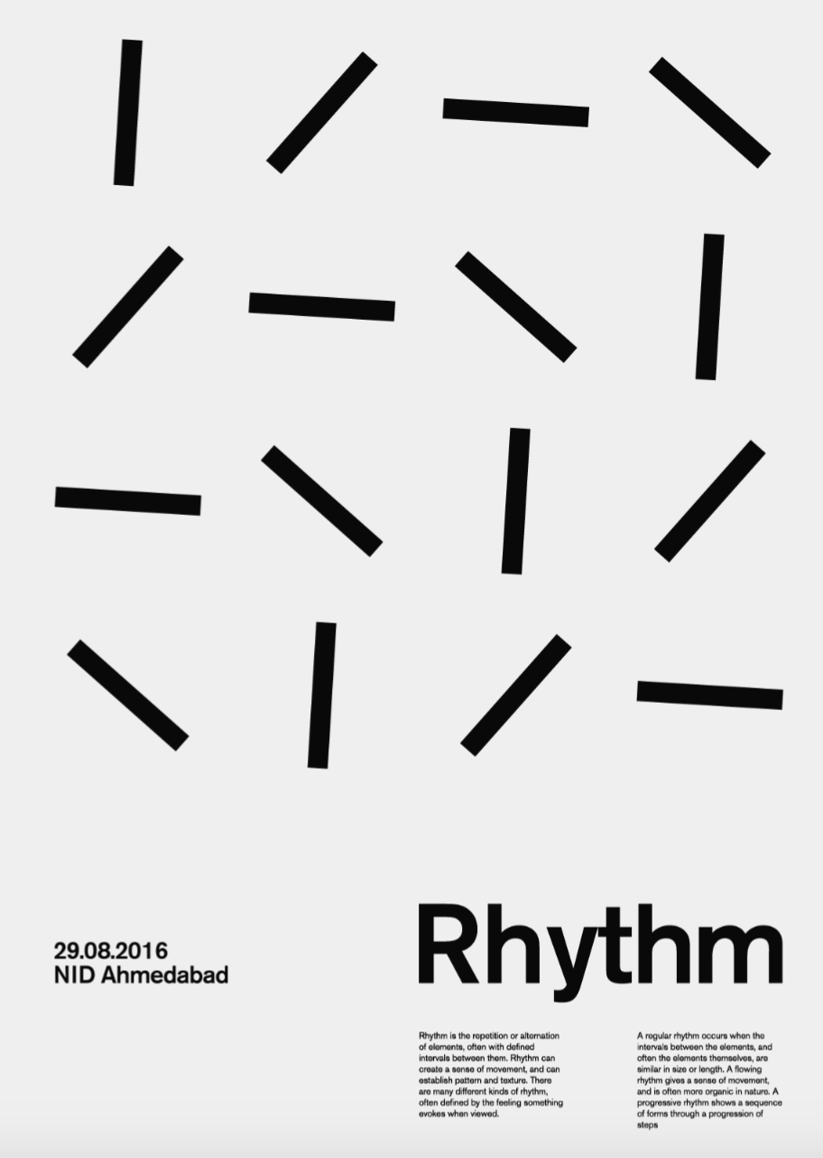
These questions came to mind as I reflected on the nature of time. My inspiration came from a piece of artwork I encountered on Pinterest titled “Rhythm.” As I observed the moving rectangles in the artwork, they reminded me of the movement of a clock. But what do these many clocks represent? For me, they symbolized two key ideas: (1) the relativity of time, and (2) the global nature of time, with its 24 time zones that shape the rhythm of life around the world.

Additionally, I drew heavy inspiration from a talk by Casey Reas, which I reflected on in a recent writing assignment. His discussion on randomness and order heavily influenced the way in which I approached my work.

Highlights.

In my interpretation, the background of the piece represents a chaotic flurry of clock dials, moving at a faster pace than the clock hands themselves. This fast-paced, seemingly erratic animation of ellipses symbolizes the relativity of time—its ability to feel both slow and fleeting, elusive and constant. Through this hectic background, I aimed to convey how time can feel overwhelming, moving quickly yet still slipping away before we can fully grasp it.

One aspect I’m particularly proud of is the grid of 24 clock hands, which I arranged to move with a calculated precision. Each clock hand is offset by PI/6 radians, representing a one-hour difference in the 24 time zones of the world. Although the movement of the arrows may seem chaotic when viewed all at once, there’s an underlying pattern — each line is meticulously timed to reflect the rhythm of global time. I have also learnt how to implement such functions as push() and pop().

for (let lineX = 0; lineX < 4; lineX++) { 
  for (let lineY = 0; lineY < 6; lineY++) { 
    push(); 
    translate(100 + lineX * 120, 100 + lineY * 120); 

    let offset = (lineX * 6 + lineY) * PI / 6; 
    rotate(baseAngle + offset); 
    line(-50, 0, 50, 0); 
    pop();
  }
}

Reflection.

I loved working on this project, as it gave me opportunity to master the basic knowledge of loops (specifically, “nested loops” which I got particularly curious about during the class). Furthermore, I aimed to focus more on the idea and conception (relying on the talk by Casey Reas and “randomness in order”), and gave myself more time to understand what I want to achieve before sitting to code.

Probably, the only thing I could not figure out is how to properly indicate time in numerical aspect in my artwork. In the future, I would like to create more sophisticated animated shapes so the idea is conveyed clearly.

In essence, this piece is an exploration of time’s complexity — how it can be experienced in so many different ways, how slowly yet at lighting speed it can pass by, and how it is governed by a specific order we all live within.

Embedded Sketch.

Reading Reflection – Week #2

For me, Casey Reas’ talk on the balance between randomness and control in artistic process appeared to be extremely motivational and spot-on. Although Reas does not provide a definitive answer on where this balance lies, the ideas he presents are still compelling and thought-provoking. For instance, I loved the way in which he highlighted the beauty of imprecision, suggesting that it stems from nature itself (which unexpectedly reminded me of the recent reading from another class on the beginning of life on Earth). To prove his point, Casey refers to the “randomness in order” seen in the artwork that demonstrates protein molecules communicating within a cancer cell. This non-obvious connection between the chaotic patterns of nature and those found in computer programming was truly eye-opening.

As I begin to work on my own creative projects using coding, I am constantly reflecting on how much I will rely on chance. For me, randomness is simply a tool to help achieve a creative goal, but it is by no means the most decisive factor. I firmly agree with Reas that artistic choices involve a little magic of chance, but they are mostly guided by thoughtful decision-making about the final result. This applies to all forms of art, as the artistic process is always shaped by stylistic choices, vision, and ideas that arise from the creative mind long before the actual craft begins. Henceforth, there is no “chance” in the foundational decision of what the work will make the viewer feel. The uncertainty only lies in the ways the effect is reached: that’s where embracing the beauty of chance and experiment becomes so handy.

Assignment #1: An Honest Self-Portrait.


Idea & Sketching.

As a newcomer to coding, this small project has been an important exercise in practicing what I have learned in class so far. I primarily focused on experimenting with basic shapes, still trying to find useful tools to add (at least) some interactivity to a static portrait.

First, I made a quick sketch in Figma of what I roughly aimed to create (see below). As a Film & New Media major, I couldn’t help but show my passion for filmmaking by incorporating a “Kodak” T-shirt (which I actually own and wear) paired with a green jacket made up of two symmetrical triangles.

My cartoon character shows no mercy to my real self: protruding ears, furrowed eyebrows, and a discontented smirk. Nevertheless, I’m still fine with that…

Highlights.

Having finished the layering of the character in p5.js, I felt that something was missing, and I had to soon realize that it was the absence of movement. Since it was my first time coding, I did a quick research to find different options for animating in JavaScript. The most suitable and easiest to comprehend for my case turned out to be the lerp() function.

I implemented the lerp() function to animate my character’s mouth by following a tutorial on p5.js.

if (mouseX > 150 && mouseX < 450 && mouseY > 150 && mouseY < 600) { // to check if the mouse reaches the body
  finalX = 300;  
  finalY = 400; 
} else {
  finalX = 280; 
  finalY = 410;  
}

initialX = lerp(initialX, finalX, 0.5);
initialY = lerp(initialY, finalY, 0.2);

I’m particularly proud of how I figured out the pace of the animation, specifically the “amt” parameter, which I set at 0.5 and 0.2. After experimenting with the function for a while, I decided to use different values for the “x” and “y” positions, so that the mouth movement would look more natural and eye-catching.

Reflection.

To summarize, I truly enjoyed working on this tiny project. I’m quite satisfied with my whatever cartoonish self and excited to dive deeper into the lerp() function as the course progresses to create more sophisticated animations and interactive projects. So far so good – JavaScript seems to be fun.

Embedded Sketch.

P.S. Place the mouse around the body so the mouth moves.