Assignment #8: Stranger Things [in team with Ryan]

Concept & Inspiration.

For this project, we thought of recreating a recognizable music theme from film/TV series that we could easily manipulate. We ended up on the eerie and haunting Stranger Things theme, as it is truly one of those few captivating intros that you would never skip. We also decided to dedicate this project to the upcoming final season of the series, which will be released next year.

By using the ultrasonic distance meter and tricolor LED, we made a musical instrument that is responsive to the distance of the hand: the music speeds up when the hand is closer and slows down when it goes farther, and the LED changes its color accordingly.


Highlights.

It was difficult at first to find the music in the proper format so that it can be implemented into the Arduino code. As we tried to somehow extract the notes from the .mxl (.musicxml) files, we couldn’t find a software that could do that. Hence, we ended up recreating the soundtrack by using the array of sequences (representing the 48 notes and their durations) that we luckily found on the GitHub.

We using mapping for the tricolour LED lights, keeping greenValue at zero so that we could get a somewhat “gradient” effect.

The key (and most challenging) aspect in the code was to speed up the music according to the varied distance. We used mapping to set the shortest and longest duration of the music, as well as implemented  a delay by multiplying the adjustedNoteDuration by 1.3 (a factor commonly used in Arduino to maintain a natural pacing) to add a slight pause between notes, making each note more distinct.

void loop() {
buttonState = digitalRead(buttonPin);

if (buttonState == LOW) { 
for (int thisNote = 0; thisNote < 48; thisNote++) {

// distance measured with ultrasonic sensor

digitalWrite(trigPin, LOW);
delayMicroseconds(2);
digitalWrite(trigPin, HIGH);
delayMicroseconds(10);
digitalWrite(trigPin, LOW);

duration = pulseIn(echoPin, HIGH);
distance = duration * 0.034 / 2;

// mapping the tricolor LED values

int redValue = map(distance, 5, 50, 255, 100); 
int greenValue = 0; 
int blueValue = map(distance, 5, 50, 100, 255);

analogWrite(redPin, redValue);
analogWrite(greenPin, greenValue);
analogWrite(bluePin, blueValue);

// mapping to adjust duration between notes

int adjustedNoteDuration = map(distance, 5, 50, StrangerThingsNoteDurations[thisNote] / 2, StrangerThingsNoteDurations[thisNote] * 2);

// playing with the new tempo

tone(buzzerPin, StrangerThingsMelody[thisNote], adjustedNoteDuration);

// a short pause

delay(adjustedNoteDuration * 1.3);
}

} else {

// when button is not pressed, turning off the LED and buzzer

analogWrite(redPin, 0);
analogWrite(greenPin, 0);
analogWrite(bluePin, 0);
noTone(buzzerPin);
}

delay(50); 
}

Embedded Sketch.

GitHub


Reading Reflection – Week #10

Reading Bret Victor’s “rant” on the future of interaction design sparked a myriad of thoughts for me. His critique of touchscreens and how we are moving away from hands-on interaction is surprisingly relevant even though the article was written more than a decade ago.

One of the most striking points was Victor’s emphasis on the importance of hand as the true measure of a tool’s capability. I’d never thought of it this way: our hands not only manipulate objects, but they also shape our understanding of the physical world. If we’re constantly tapping and swiping on flat screens, are we limiting our brains as well as our bodies? It reminds me of the difference between learning something hands-on, like playing an instrument, versus passively watching a video. Both activities are valuable, but one engages the whole body and mind in a way that feels essential. The fact that modern-day children are learning to use touchscreens before they can tie their shoes is impressive, but is it the progress we need? It is, in fact, totally possible to avoid sacrificing our innate capabilities for the sake of innovation. But if we keep focusing on screen-based interactions, we might be undermining our potential to use our hands — and by extension, our creativity.

Even though Victor doesn’t provide specific answers or solutions in these articles,  I think he calls for more exploration into technologies that can genuinely integrate our physical abilities. For me, reading these pieces was an important reminder that it is technology that adapts to human nature, not the other way around — something to keep in mind as an aspiring interaction designer.

Assignment #7: Moving Closer

Concept & Inspiration.

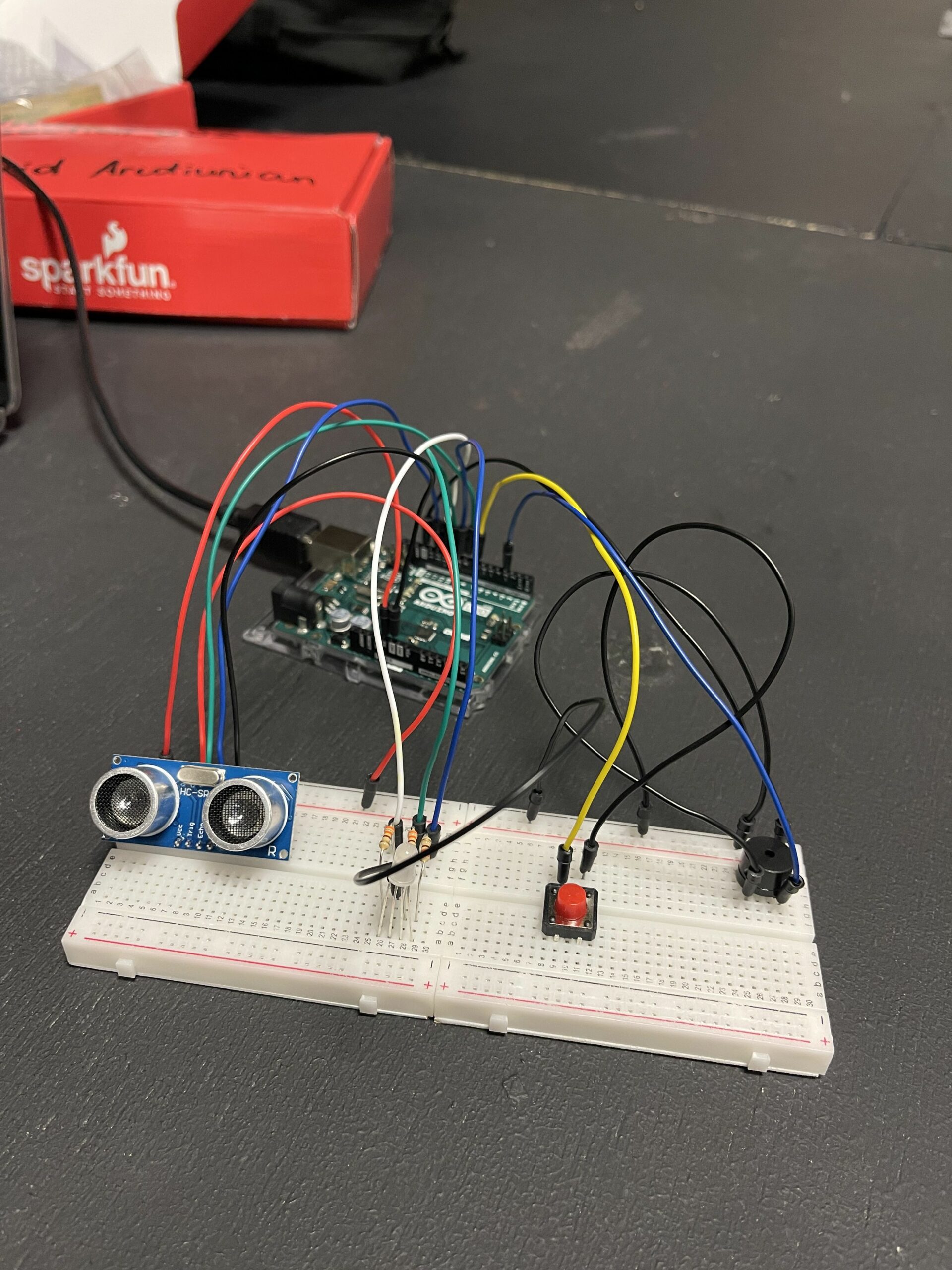
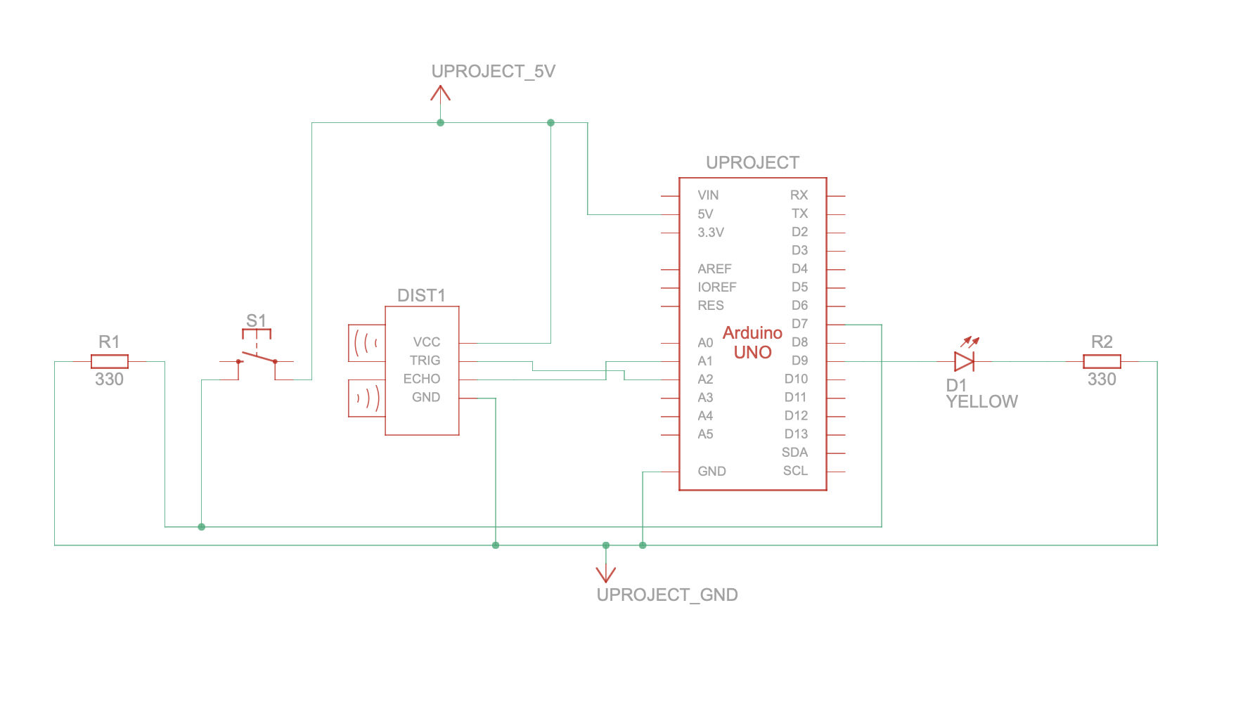
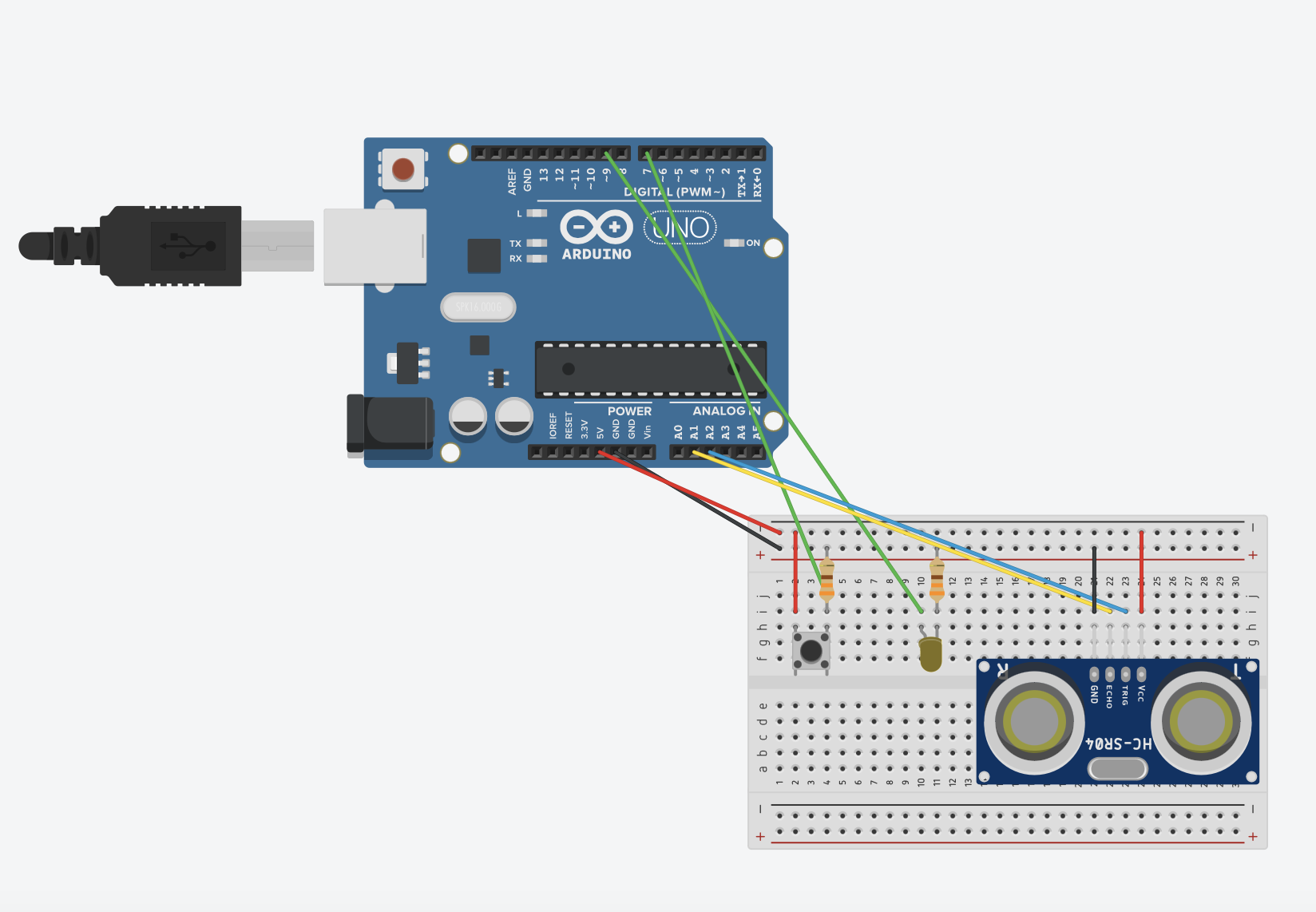
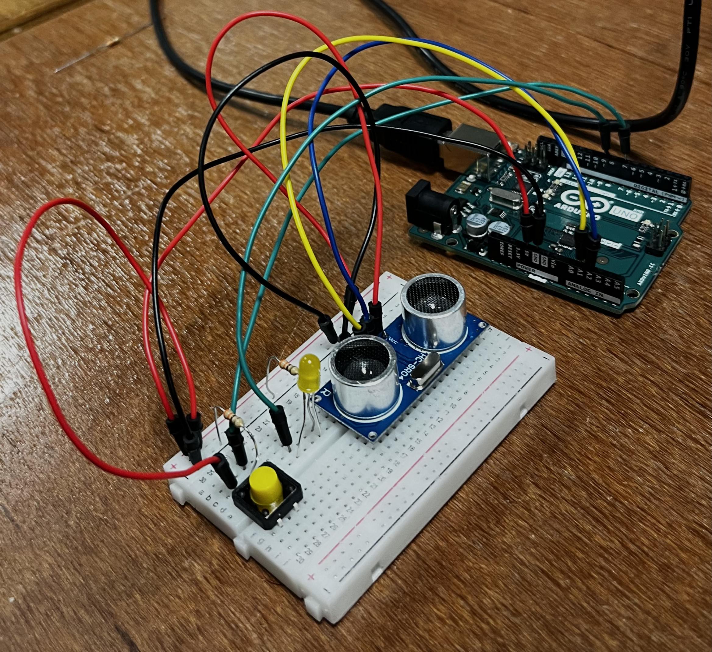
For this project, I decided to practice what has been covered in the class so far but also try to implement a new sensor. My choice fell upon the most bulky of all sensors in our kit – the ultrasonic distance sensor.  By following the tutorial on YouTube, I built my Arduino with a yellow LED light and a button switch.

I got inspiration from final scene of the animated film Inside Out 2, when the emotions gathered together to hug the tree of the Self and “calm down” Riley.

When an object is close to the sensor for at least 10 centimetres, the LED lights up and becomes brighter as the object moves closer. However, when the button is pressed and released, the LED is turned off and it will not react to the object until the button is pressed again.


Highlights.

According to the guidelines of the task, I got information from two sensors – digital (the button switch) and analogue (the ultrasonic sensor). In order to make the button turn on and off, and the LED change the intensity according to the distance from the object, I implemented Boolean functions into my code. I also had to manipulate with delay() function to make the brightness change a bit smoother.

void loop() {
int currentButtonState = digitalRead(buttonPin);

if (currentButtonState == LOW && previousButtonState == HIGH) {
ledState = !ledState; 
delay(50); 
}
previousButtonState = currentButtonState;

digitalWrite(trigPin, LOW);
delay(20);
digitalWrite(trigPin, HIGH);
delay(20);
digitalWrite(trigPin, LOW);

duration = pulseIn(echoPin, HIGH);
distance = duration * 0.034 / 2;

int brightness = 0;

if (ledState) { 
if (distance <= 10) {
brightness = map(distance, 0, 10, 255, 0);
} else {
brightness = 0;
}
} else {
brightness = 0; 
}

analogWrite(ledPin, brightness);
delay(10);
}

Embedded Sketch.

GitHub


Reading Reflection – Week #9

Having read Physical Computing’s Greatest Hits (and Misses), I was struck by its relevance and abundance of crucial ideas. As an aspiring interactive media artist, it’s critical for me to understand the balance between creativity and repetition. It’s always a bit intimidating to search for an idea, only to find that it’s been done before. This often leads me to hesitate on projects that feel “too done” and hackneyed. How, then, can one avoid being constrained by the thought that everything has already been made, and still maintain creativity even when an idea isn’t entirely novel?

What’s compelling about this text is that the author offers a fresh perspective: we can harness familiar themes as frameworks for exploration, allowing each iteration to create room for personal interpretation. By illustrating common patterns across various physical computing projects, the author demonstrates that creativity arises not only from the novelty of ideas but also from how people interact with the artwork. The examples provided in the article are very illustrative and somewhat familiar to many of us, as we all encounter similar physical computing models in different forms throughout lives. What sets them apart is, possibly, the way people’s interactions shape each project in unique ways.

This was also the main takeaway from the article Making Interactive Art: Set the Stage, Then Shut Up and Listen, which challenged me to reconsider my approach to interactive art. I often overthink the explanations in my projects, whether they are films or interactive artworks, worrying that the audience might misunderstand or overlook important details. This text was a reminder that such explanations can limit interaction, turning the audience into passive viewers rather than active participants. I strongly agree with the idea that an artwork should invite the audience to “complete” it through their responses, making it less about conveying a single message and more about fostering a dialogue. Transitioning to a mindset where my work is an initial invitation, with the audience’s engagement shaping its evolution, feels both liberating and challenging but essential for impactful interactive art. In this way, recurring themes in my projects become flexible templates rather than restrictive molds, providing me with opportunities for personal expression.

Assignment #6: Mind Your Posture!

Concept & Inspiration.

For this small project, I was thinking of making something feasible to construct yet useful for me. As I was almost lying on the chair after barely 5 minutes in the IM Lab, it didn’t take me long to come up with an idea of a switch that would regulate posture and indicate how well the person is seated (a so-called “posture fixer”) by using the LED lights, a regular paper tape, and conductive fabric.

Highlights.

I set two variables (“yellowState” and “greenState”) in my code to regulate the LED switches by using the “if” condition functions.

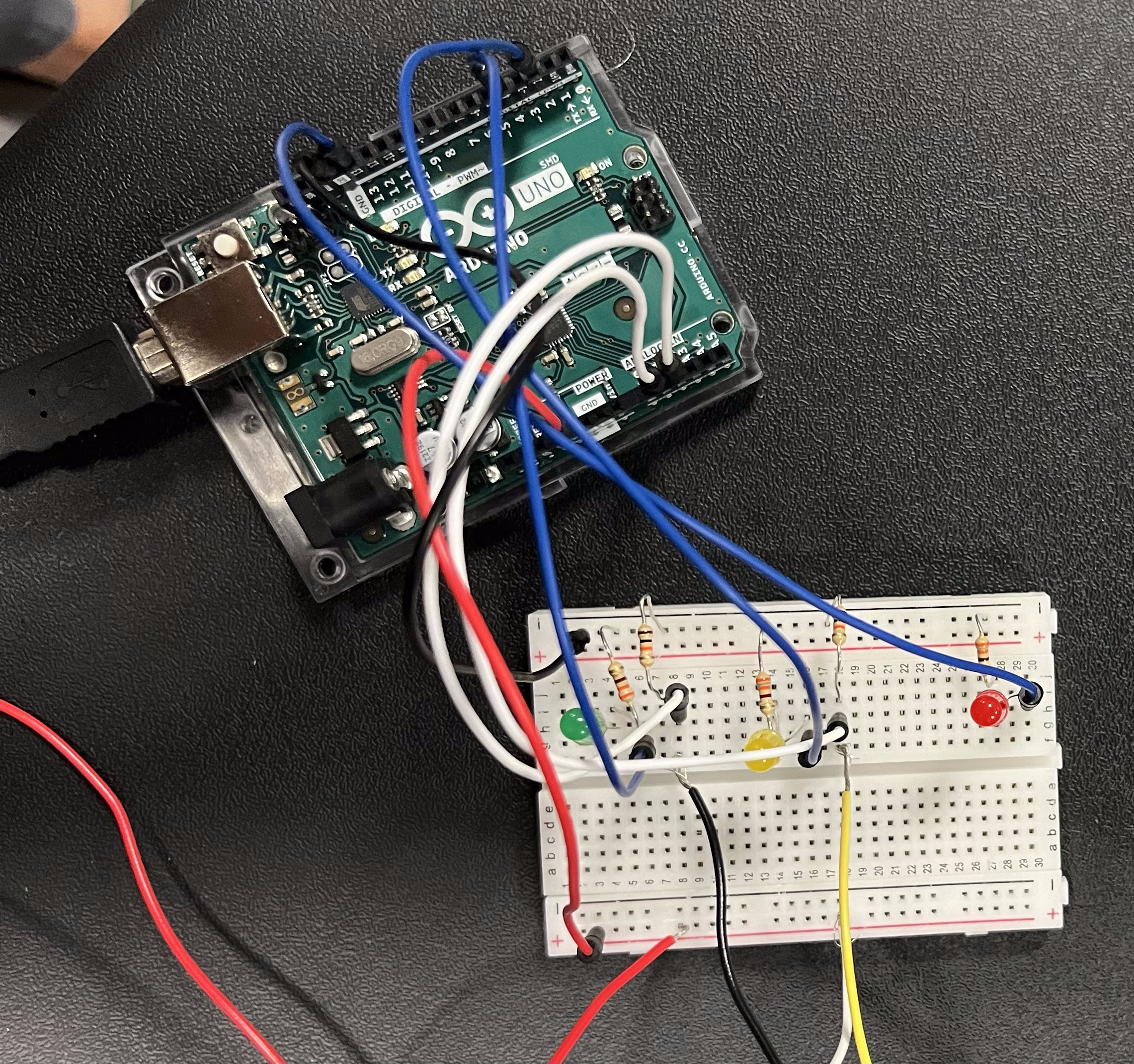
My main goal was to make the LED lights react accordingly to a certain number of “buttons” pressed. For instance, when no button is pressed, the red LED is blinking as a sign of warning. When only one of the buttons is pressed (either green or yellow), the yellow sign is switched on, meaning that the posture is satisfactory yet not perfect. In case if both buttons are pressed, green LED is switched on, indicating decent posture.

if (yellowState == HIGH && greenState == HIGH) { // When both buttons pressed
digitalWrite(4, HIGH); // Turn on green LED
digitalWrite(2, LOW); // Turn off yellow LED
digitalWrite(LED_BUILTIN, LOW); // Turn off red LED

} else if (yellowState == HIGH || greenState == HIGH) { // When only one button pressed
digitalWrite(4, LOW); // Turn off green LED
digitalWrite(2, HIGH); // Turn on yellow LED
digitalWrite(LED_BUILTIN, LOW); // Turn off red LED

} else { // When no button is pressed
digitalWrite(4, LOW); // Turn off green LED
digitalWrite(2, LOW); // Turn off yellow LED
digitalWrite(LED_BUILTIN, HIGH); // Blinking red LED (for 1 second)
delay(1000);
digitalWrite(LED_BUILTIN, LOW); 
delay(1000); 
}
}

Embedded Sketch.

GitHub


Reading Reflection – Week #8

I was intrigued to revisit Donald Norman’s work after reading the excerpt from The Design of Everyday Things earlier in class. Personally, I find this article more compelling for how it emphasizes the importance of blending usability with attractiveness to create what Norman terms “good design.” Several ideas stood out to me, particularly the argument that design is inherently contextual, relying on the specific person interacting with it at a unique moment and place. Moreover, what influences how a design functions is the individual’s mood, or “affect,” which constantly shifts. I find this concept extremely helpful for designers as it highlights the fluid and responsive nature of truly effective design.

Another eye-opening point was Norman’s suggestion to consider the context of a design based on the overall stress level of the situation where it will be used. The example he gives — struggling to decide whether to push or pull a door due to one’s stress level — felt especially relatable. I agree with Norman’s implication that a good designer anticipates and accommodates the immediate needs of the user in such moments. For me, the article’s key takeaway lies in the concluding section, where Norman redefines beauty in design as something not superficial and “skin deep”, but holistic and comprehensive. It may seem slightly sarcastic at first when he concludes with “attractive things work better,” yet it underscores the essence of good design. Functionality and attractiveness are always in balance, and functional design, in the end, evokes a unique appeal that aligns with its purpose and context, crafted to enhance the user’s experience.

It is interesting to note how Margaret Hamilton’s experience complements Norman’s ideas about design as a process shaped by context, adaptability, and human limitations. Just as Norman emphasizes how design must account for users’ moods and stress levels, Hamilton’s work highlights the need for resilience in coding to accommodate human error. As for me, both illustrate that effective design — whether in physical objects or software — requires a deep awareness of the user’s state and context. Hamilton’s insistence on error-checking, despite opposition, resonates with Norman’s view that design is not just about fulfilling a basic function but about anticipating a range of human interactions, including mistakes.

I also found similarity between Hamilton’s approach to coding as a blend of technical precision and intuition and Norman’s idea of beauty in design as holistic rather than superficial. Just as Norman advocates for designs that appeal and function seamlessly, Hamilton’s coding enabled the Apollo missions to perform flawlessly in unpredictable situations. Her case proves us that true innovation comes from crafting systems that are both effective and resilient, achieving beauty and function through an intuitive understanding of human and technological dynamics, similarly to the ideas developed by D. Norman.


Midterm Project: Collect the Shells!

Concept.

As soon as I figured it out that I want my midterm project to be a mini-game, there was no other option but to make something I would really enjoy playing myself. The “treasure hunt” mini-game was something that I really liked playing online as a child. As a fan of Lilo & Stitch animated feature, I had little doubt about the decision to make this version of the game revolve around my favourite characters.

The backstory of the game is preparation for Lilo’s birthday celebration: Stitch has to collect shells in order to tinker a bracelet for her beloved friend, avoiding the dead fish bones on his way. The game uses timers (10 seconds to memorize the position of the bones & 4 minutes to collect the shells) as well as a counter for shells throughout the game.

I really wanted this game to be helpful to train memorisation, as I know it might be a struggle for quite a few nowadays (including me) to memorise information. I truly hope that the players will get immersed into this game and have the urge to play it over and over again, so it will turn out not only as a simplistic entertaining experience but also as a good exercise for the mind.

Highlights & Reflections.

The most challenging part of the code was to make the shells & fishes appear exactly on the sandbox grid, because I accidentally made the wrong starting positions for the grid itself at the very beginning, which I had to figure out only later on.

My favorite part was working on the sound effects and other UI-experience functions (such as the winning & losing signs). The particular part of the code I am proud of is working with timers for the first time, because there are many conditions to take into consideration when resetting both timers and making sure they do not overlap one onto another:

// CHECKING IF SECOND TIMER IS :00 // 
if (isHuntTimerActive && huntTimerValue === 0) {
stitchX = initialX;
stitchY = initialY;
showLosingSign = true;
isHuntTimerActive = false; // Stop the hunt timer
canMove = false; // Disable Stitch movement when timer hits 0
}

if (timerValue > 0) {
// CASE 1: TIMER IS STILL RUNNING (NEED TO SHOW FISH ICONS)
for (let i = 0; i < cols; i++) {
for (let j = 0; j < rows; j++) {
sandboxes[i][j].display();
}
}

for (let i = 0; i < fishes.length; i++) {
fishes[i].display();
checkFishCollision(fishes[i], i);
}

for (let i = 0; i < shells.length; i++) {
shells[i].display();
checkShellCollision(shells[i], i);
}
} else {
// CASE 2: TIMER IS :00, DRAW FISH ICONS BEHIND THE GRID
for (let i = 0; i < fishes.length; i++) {
fishes[i].display();
}

for (let i = 0; i < cols; i++) {
for (let j = 0; j < rows; j++) {
sandboxes[i][j].display();
}
}

// CHECK IF STITCH STUMBLES UPON THE FISH ICONS //

for (let i = 0; i < fishes.length; i++) {
checkFishCollision(fishes[i], i);
}

for (let i = 0; i < shells.length; i++) {
shells[i].display();
checkShellCollision(shells[i], i);
}
}

The Game.

Future improvements:

    • It would be nice to have the game in the full screen mode, but due to the presence of grid in the game, I didn’t manage to figure out how to achieve this without any distortions.
    • There is a minor bug in the game that I would like to fix in the future: it’s the fact that the randomly generated fish and shell icons can overlap and be drawn one on top of another, which makes it impossible for user to win the game. As for now, the suggestion is to simply restart the game.
    • Last but not least, I would like to have a higher resolution images in the game in the future. Honestly, I was a bit scared to upload high quality images as I had the game crashed over and over again at the beginning of my work on it. Nonetheless, I believe that in future I will find a way to make the resolution higher (by drawing specific images right in the p5 editor, e.g. the pop-up window with instructions).

Midterm Progress: Collect the Shells!

Concept & Inspiration.

For my midterm project, I got inspired by the mini-game I used to play as a child online: a treasure hunt that trains memorisation.

As a huge fan of Lilo & Stitch animated feature, I decided to create an authentic version of the game with my favourite character. The (so fat intended) rules of the game are as follows:

Stitch has to collect 5 shells, moving by one sand square with each step from start to finish. The sand squares can hide hazards – dead fish bones – which make the progress fall down to 0 and restart the game.

At the beginning of the game, the player has 5 seconds to take a look at the “revealed” danger zones. After that, all sand squares will be closed, and players will have to rely on their memory not to entrap themselves into a dead fish bone on the way.

Below, I attached two images which I designed in Figma: (1) showing the game interface after 5 seconds, and (2) showing the interface at the very beginning, when the dead fish bones are just revealed.

Uncertainties.

As we have never touched upon working with a timer inside p5.js, I am unsure if I will be able to implement the timer in the way I initially wanted to. Nonetheless, I believe that I will be able to find a solution that will eventually satisfy me (even though it might not be according to what I initially planned).

Also, I had perpetual struggles with uploading images to my canvas throughout the process of working on the first draft. I am still figuring out how to fix this issue, because otherwise some of the icons (including the character) and the background can suddenly disappear during the actual game.

In my first draft of the project, I have only managed to create the user interface (without some of the icons) and make some kind of movement for Stitch with the key arrow presses. I have also included the soundscape, using the music from the original Lilo & Stitch film: to turn it off, user can click the mouse at any part of the canvas.

Embedded Sketch.

Key functions to implement:

    • Add the missing icons (including the shells & fish bones).
    • Make the music respond to the button.
    • Make a pop-up window with game instructions.
    • Implement a timer (or its equivalent).
    • Make Stitch move on the sand squares more precisely.
    • Add a sound effect for the failure.
    • Make the fish bones appear as soon as Stitch touches the sand squares with them.
    • Make the shell count as soon as Stitch touches them.

Reading Reflection – Week #5

I found Golan Levin’s article on computer vision to be extremely informative and useful for my future artworks, as it is highly illustrative and detailed in explaining what computer vision actually is. I particularly appreciated how the examples Levin provides demonstrate the vast array of forms in which computer vision is used in interactive media arts: from the sociopolitical Sorting Daemon by David Rokeby to the metaphorical Standards and Double Standards by Rafael Lozano-Hemmer. I believe, as the article suggests, that there is still significant room for improvement in computer vision. It undoubtedly cannot be compared to human vision, as it requires meaning to be assigned to it (a thing human eye has no need to do) through the careful design of algorithms that analyze individual pixels and patterns using techniques like differencing, background subtraction, and brightness thresholding for detection tasks.

Beyond the obvious potential for growth, one concerning issue with computer vision is its possible use as a tool for surveillance, and thus as a powerful method of control. The ethical concerns here are significant: computer vision in art has the potential not only to create but also to exploit those who interact with it without their consent (as in Suicide Box by the Bureau of Inverse Technology).

Therefore, while Golan Levin successfully demystifies the concept of computer vision, it remains unclear how we, as artists, should address the ethics of its use in relation to surveillance. How do I make an interactive artwork that is engaging and immersive without being intrusive and exploitative? That is one of the primary questions an artist should ask when working with computer vision.


Assignment #4: Watch Out!

Concept & Inspiration.

For this project, my main goal was to create generative text that transforms everyday, mundane things we’re so used to into something unexpectedly funny and slightly absurd.

When thinking about text we frequently encounter, warning signs came to mind. They are a common part of our daily lives, but we have become so accustomed to them that we barely notice what is written anymore. In this project, I wanted to experiment with something as rigid and conventional as warning signs, turning them into something absurd through generative text.

Perhaps my surreal warning signs might catch the attention of passersby, if only for a moment?..

Highlights.

In this code, I worked with file uploads in p5.js to import both my spreadsheet (containing three rows of random text) and a custom font (Heavitas), using the loadFont() and loadStrings() functions we learned in class throughout the week.

This is the first project where I focused on making the code as concise and efficient as possible by identifying repetitive patterns. To achieve this, I used a technique we didn’t cover in class but found intuitive—an array of arrays, let rows = [[], [], []];.

Additionally, I applied concepts from previous lessons to optimize the use of for() loops in various parts of the code, which I’m particularly proud of.

// Splitting each row into separate words and storing in 'rows' array
for (let i = 0; i < 3; i++) {
rows[i] = split(strings[i], ','); 
}
// Setting array to store the randomly generated text for three rows
let signText = ["", "", ""];

// Building a function to generate a random sign from three rows
function generateRandomSign() {
for (let i = 0; i < 3; i++) {
signText[i] = rows[i][int(random(rows[i].length))]; // Random selection for each row
}
}

Reflection.

Although this project may seem simple, the code was challenging to work with as I struggled for a while to shorten it without removing any functionality. Nonetheless, despite these difficulties, I enjoyed the process, especially at the initial stage, when coming up with random words and imagining the crazy possibilities of their combinations.

In the future, I would like to focus more on making the text responsive and adding real interactivity. I would also love to incorporate a warning pattern animation to make the code more visually engaging when I have more time. Overall, working on this assignment was extremely valuable for my coding skills, as I can see myself using generative text for other projects, like creating a mini-game.

Embedded Sketch.

Mouse click to generate a random warning sign.