Week 8- Reading Reflection

“Emotion and Attractive” by Donald A. Norman and “Her Code Got Humans on the Moon- And Invented Software Itself” by Robert McMillan

We were assigned to read two different materials with varying ideas, but both were thought-provoking. 

I would like to start with the most influential article about the mother of software engineering- Margaret Hamilton. She is a living example of the phrase “everything is possible”. While reading the text, I immediately thought about the photo of her standing next to the tons of coded papers- Apollo code. The reading material tells more about the background of that photo, showing the first gigantic step toward software engineering. Her dedication to work and the result of her achievements impressed me the most. Imagine writing the code to the system, which gets the humans on the moon and back when no one even had an idea what the software engineering was. Her biography leaves me astonished every time I read it. 

Scene at MIT: Margaret Hamilton's Apollo code | MIT News | Massachusetts  Institute of TechnologyFig. 1. Scene at MIT: Margaret Hamilton’s Apollo code | MIT News | Massachusetts Institute of Technology. Source: margaret-hamilton-mit-apollo-code_0.jpg

Discussing the reading “Emotion and Attractive” by Norman, I would like to say that the reading told the basic things, which are usually overlooked by the designers. In other words, he mentioned such a foundational, yet significant aspect of the design that is neglected in the production of the goods and services. Making a connection with the previous reading “The Psychopathology of Everyday Things”, I would like to suggest that the complexity of the things is part of the “ugliness” of the goods. The point of view of the author is that the aesthetics of the product is more than its facade, including usability, understandability, and easiness along with beauty. However, I think that this focus on aesthetics may vary depending on the context because the things made for emergency situations need to be as simple and as understandable as it is possible, giving less attention to physical appearance, while the things for the occasional use in free time or for professional purposes can give the priority to the aesthetics. Furthermore, I would like to admit that his idea that the beauty of the product stimulates cognitive thinking better could convince me. We tend to put more mental effort into understanding the usage of the thing subconsciously if we find that appealing than non-attractive things. This might vary depending on the mood and the conditions. He gave a well-drawn example of that with the teapots. If you are in a mood and have free time, you would probably go with the most aesthetic teapot even if it’s not the most user-friendly, but if you are in a hurry, the most usable one, even if it’s not the most pleasurable one. Overall, it can be concluded that Norman emphasized the fundamental aspect of the design in clear terms and examples, which resonates with my perspective of the significance of the aesthetics of products.

Week 6 – Midterm Project

DiDesign – create your room design

Link to my sketchhttps://editor.p5js.org/Diannella/full/BCjYoXQdw

My Concept: “DiDesign” is a realization of my childhood dreams. As a child, I wanted to become an interior designer and was always interested in choosing and drawing the pieces of furniture and allocating them inside the room. Being inspired by the “coffee shop” game shown during the class, I also wanted to produce a calming experience with aesthetic images and pleasing sounds. The users have a chance to feel themselves as interior designers and even get imaginary payment for that. 

The explanation of how the project works: The rules of the game are simple. The game starts with the instructions section, where the character asks the user to design the room for the client and gives instructions on how to play the game. The users click on the “PLAY” button, which leads them to the room with the default most simple design. The users should click on each of the pieces of furniture and choose their favorite one from the array of six options. The users can change the sofa, the decors on the left and right sides of the sofa, and the lamp. In addition to that, the users can click on the character on the left side, who will give comments about the design process. When the users are done with the design, they can click on the button “SELL” to sell their designs to the client. This would lead to the last section, which shows the payment amount for the project. This amount is randomly chosen from the range of $2000 to $20000. If the users want to create another design, they can click on the button “RESTART” which would restart the game with the instructions section, followed by the default furniture.

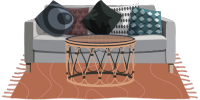
The examples of the each image of sofa created by me on Canva

The areas I am proud of: Overall, I am proud of the project because the reality met my expectations of the project by around 90% and, most importantly, I have seen a huge development since the beginning of the semester. Firstly, I am very proud of the aesthetics of the game because I believe that the colors, shapes, allocation, the chosen pieces of furniture, and the sound effects are chosen great so that the users have an enjoyable experience of playing this game. Secondly, I am proud of the process of creating this game. Specifically, other than coding, the project includes the work on the design of each of the pieces of furniture. I selected each piece of an image and constructed the whole image of the room in the canvas to make sure that they looked great with each other resized every image to match the dimensions and downloaded every piece separately. Last but not least, I am most proud of the code with the mouseClicked function. It includes every conditional of the game, operating the change of each furniture and dialogue box, as well as the change over the stages with the resetting of the game and random payment. 

function mouseClicked() {
  clicking.play (); //every click is accompanied with clicking sound
// everything inside this conditional happens only in the playing state, which is the state inside the room
  if (gameState == 'playing') {
//if the mouse is clicked inside the area of piece of furniture, the next image is shown from the array of that piece of furniture
    if (mouseX >= width / 2 - sofas[0].width / 2 &&
        mouseX <= width / 2 - sofas[0].width / 2 + sofas[0].width &&
        mouseY >= height * 0.5 &&
        mouseY <= height * 0.5 + sofas[0].height) {
      currentSofa++;
      if (currentSofa >= sofas.length) {
        currentSofa = 0;
      }
}
//there are four more similar conditionals to manipulate the array of the left decor, right decor, lamp and the dialogue bubbles
  }
//one button is responsible for changing the game states. Every time the rectangle is clicked, the state of the game changes.
   if (mouseX >= width * 0.8 &&
      mouseX <= width * 0.9  &&
      mouseY >= height * 0.8 &&
      mouseY <= height * 0.9) {
    if (gameState == 'start') {
    gameState = 'playing';
    stopPayment() ; //random payment amount is generated every time the game starts
    } else if (gameState == 'playing') {
    gameState = 'end';
  } else if (gameState == 'end') {
//the design is returned back to default design of interior, which is the image in the first position of each array of images.
    currentSofa = 0;
    currentLeftDecor = 0;
    currentRightDecor = 0;
    currentLamp = 0;
    currentBubble = 0;
    restartGame();
  } 
}
    return false;
}

Areas for improvement: 

Initially, I also had an additional idea of adding the character from the sprite sheet, which could be controlled by the user. By pressing the arrow buttons, it would be possible to move that character inside the room. However, the issue was that I simply couldn’t find the sprite sheets of the character, which would match the vibe of the game. Most of the characters are made for arcade games with the jumping and falling images of little cartoon-looking characters. As there was no image that would match the style, I was thinking of drawing that character. Because of the time restrictions, the image of the girl was inserted, which talks when gets clicked by the user, but doesn’t move. As it doesn’t fully replace the initial idea, the drawing of own sprite sheet of the character would be a good improvement of the game for the future. 

Furthermore, the array of images I found might not be enough as well as the number of pieces that can be changed. In the future, room decor can be developed into house decor, so the users would have a chance to decorate every room in the house such as the bathroom, bedroom, kitchen, and living room. Each of the rooms would have at least ten changeable pieces of furniture with at least 10 options in each. This would expand the project and make it more interesting for older people because for now, only children would be engaged with the game. 

The resolved problem:

  1. I had an issue with the change of the pieces of furniture because the new image was added on top of the previous image, instead of replacing that. It was solved by adding the background image and the current image of the piece of furniture in every frame, so the old pieces of furniture would be covered by the background image and the new piece of furniture. I was not using this way initially because I thought that would lead to the freezing issues of p5.js, but everything works well with this strategy. 
  2. I had an issue that the game doesn’t go to the default design every time I restart the game, but stays in the last chosen images of the furniture. The solution was very obvious and was solved by explaining the steps of refreshing the game. I simply forgot to specify in the conditional that each element in the arrays should be in the first position, which is the default image. 

The unresolved problem: 

  1. I had a huge issue with the hover of the images, so when the mouse is on top of the image, that image would be colored white. This actually worked with single images, but couldn’t be applied to each of the images as a class. Just a hover for one image took almost 100 lines and just copy-pasting that code to each image wouldn’t be effective. The idea of using that in the class was not very successful. Because of this, I still should work on this and find a better solution. 

Reference List:

The website used for the images: canva

Sound used: 

Modern technology select. Source: https://mixkit.co/free-sound-effects/click/?page=2 

Simple Piano Melody by Daddy_s_Music. Source: https://pixabay.com/music/search/?order=ec&pagi=6 
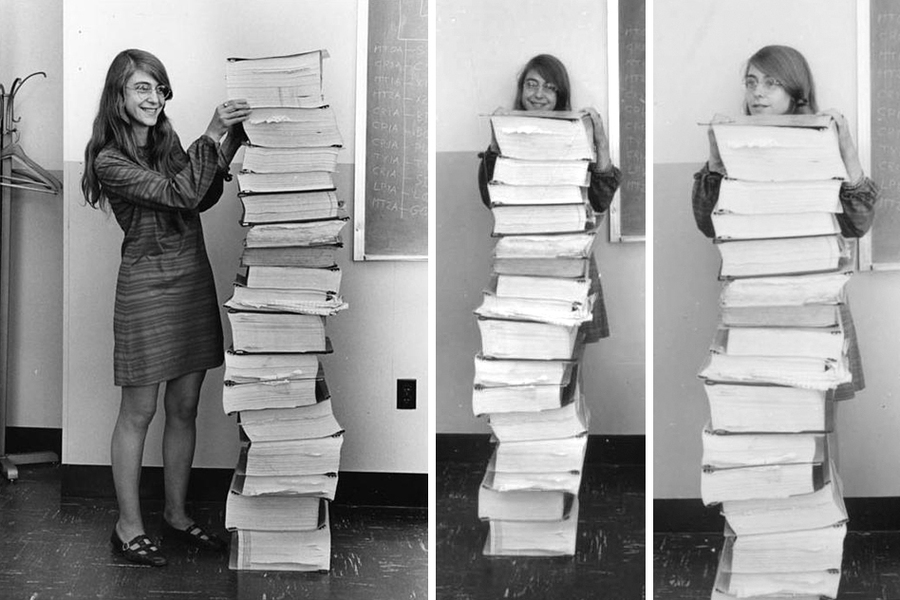
Week 5- Reading Reflection

Computer Vision for Artists and Designers

We always see the stage but the backstage remains secret for most of us until we get interested and look at it by ourselves. Today’s material opened the curtains and showed the backstage of the computer vision. We all have been imposed on face and movement recognition to some extent, starting from the face masks in the Instagram filters and the face ID of the iPhone to the movement recognition in various artworks. Although I always wondered how it works, I didn’t have a chance to look at it by myself until today. 

Although I could predict beforehand that the motion is detected by the comparison of the pixels in each subsequent frame, the information about the detection through brightness threshold was new for me, yet so simple. It was interesting to read all these operations made by the computer, which is hidden from our eyes. After reading the article, I have a question whether the advanced technologies still operate the same way, or whether their way of detection might be changed over time. 

I am surprised by the amount of constraints and limitations of the detection of presence and motion, object tracking, etc. Although the technologies have developed rapidly since the day of the first interactive media artworks such as Videoplace, there are still many things, that need to be developed. For instance, simply the face ID in my iPhone recognizes me and my 11-year-old sister as one person. 

Last but not least, I would like to mention examples of artwork using computer vision. While some create an entertaining and aesthetically pleasing experience with voice recognition as Messa di Voce or movement recognition as Videoplace, others use computer vision to raise social issues such as Standards and Double Standards and Suicide Box. I liked the idea of Suicide Box in a way that this project could be developed further as a safety tracker. Every time the vertical motion is recognized, the net can be released under the bridge to catch the falling person and the signal can be sent to the police about possible suicide. Considering the statistics of 17 suicides in 100 days of deployment, the issue of suicide remains significant and needs a solution.

Week 5 – Midterm Progress

DiDecor- decorate the room and interact with the character

My concept: When I was a child, I used to play games involving the decoration of rooms of different kinds. When Professor Mang showed the example of a midterm coffee shop, I recalled this experience as the coffee shop looked a lot like one of those games. While looking at that project, I really wanted to change the furniture and play around with the different images. At that moment, I realized that I would like to create my own game with room decoration, so the furniture such as sofas, cupboards, tables, etc could be changed as shown in Fig 1. 
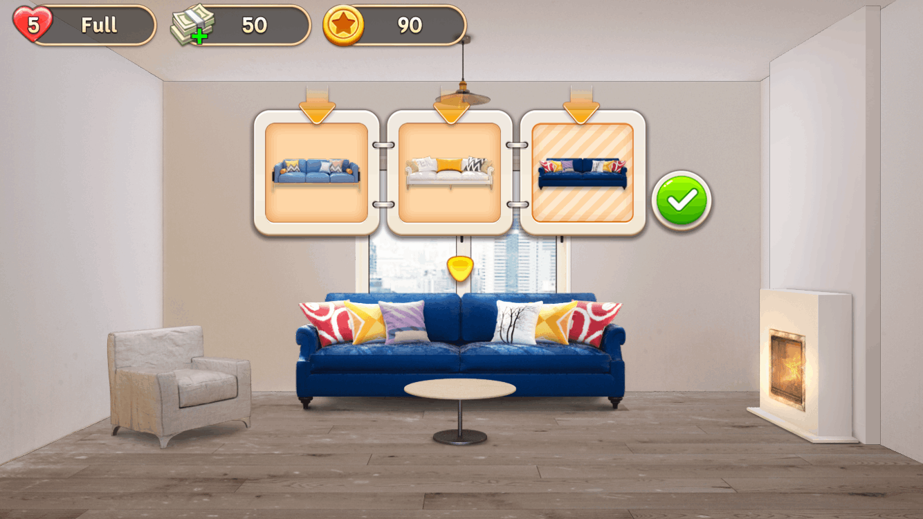
Fig 1. Room decor game example. Source: 1,334 × 750

The interactivity of the game: I will create an array of images of each of the furniture types, which can be changed by clicking the mouse on top of that particular piece of furniture, and the last shown picture will remain in the game until the user clicks one more. Additionally, I would like to create a character, who lives in this room. The user can move the character and make her sit, and talk with another character (this one isn’t movable) when clicking on that character. I liked the idea of the radio, which changes the music by clicking or stopping it. I would like to implement that with the TV or radio as well because the music sets the vibe of the room too. Additionally, if I have time, I would like to add the story at the beginning of the game how the young lady bought the house and wants the interior designer (the user) to create a design of the room and explain the rules of the game such as which buttons to click. 

Complex part of the game and minimization of risk: First, one of the challenging parts would be finding the images of pieces of furniture. Secondly, talking about the code, it seems hard for now to set the conversation between the characters. For now, I am thinking about making conditionals, so the user can choose what to answer from the given options and the reply of another character changes depending on that answer. If this is too complicated, I will make a random conversation. Each time the user clicks on the second character, a random conversation is generated between the characters, so each time, they are talking about different things but without the interaction of the user. 


Week 4- Data Visualization

The World’s Best Countries For Women, 2021

My concept: While scrolling through Kaggle, I found an article with an interesting title “The World’s Best Countries For Women”. I wanted to know the ranking of the countries and on which categories they were assessed such as women’s employability, women’s rights, women’s literacy rate, etc. Although the article doesn’t exhaustively describe these aspects, the visualization of this data was particularly interesting for me. I have been inspired by the image attached below in Fig. 1, meaning that the circles representing the countries needed to align on a circular path. Additionally, the circles should demonstrate a visible differentiation of the score of the overall assessment of each country’s performance, which could be achieved by the different radius of circles corresponding to the specific countries: the higher the score, the bigger the radius. During the coding, I decided to give a more interesting shape for the data visualization, so the circles would be in a more spiral path. Last but not least, the array of the shades of the purple colors was created because it is believed that purple is a color of feminism. I wanted to raise awareness of women’s conditions and opportunities in different countries through this data visualization. 

Fig 1. The data visualization I was inspired by.

A highlight of the code I am proud of is the for loop because it incorporates many functions and steps such as naming each variable in the data set, giving the size of circles to corresponding countries based on score, and the path of the spiral path according to the ranking. More specifically, I am proud of the function of the x and y coordinates of each circle because the formula used for that creates a perfectly drawn 2D spiral path I was looking for. 

 for(let r=0; r<table.getRowCount();r++) {
    const name = table.getString(r, "Country");
    const rank= table.getNum(r, "Rank");
    const score = table.getNum(r, "Score");
//calculating the positions x, y of the ellipses based on the rank of each country.
    const x = 2*(180-rank)*cos(rank*5)+width/2;
    const y = 2*(180-rank)*sin(rank*5)+height/2;
//scaling the score range of (0,100) to fit the range of (0, 30) to control the size of the ellipses, so they could fit the canva.
    const scoremap = map(score, 0, 100, 0, 30);
    ellipse(x, y, scoremap);
    fill(0);

//calculating the positions of x, y of the names of the countries  based on the rank of each country.
    let xtext=2.5*(180-rank)*cos(rank*5)+width/2-19;
    let ytext=2.5*(180-rank)*sin(rank*5)+height/2;
//changing the x position of the names of the countries to specific countries in order to avoid overlapping of the names with the ellipses.
    if (rank>=97 && rank<=116){
      xtext = 2.5*(180-rank)*cos(rank*5)+width/2-35; 
    }
    if (rank>=136) {
      xtext = 2.5*(180-rank)*cos(rank*5)+width/2+5;
    }
//checking the distance between the mouse and the ellipse. 
    let d = dist(mouseX, mouseY, x, y);
//if the mouse is on the ellipse, the name of the country and the ellipse corresponding to that country is filled is orange color. 
  if (d < scoremap/2) {
    fill(255, 95, 31);
    text(name, xtext, ytext);
    ellipse(x, y, scoremap);
  } else {
    fill(0);
    text(name, xtext, ytext);
    fill(random(colors));
    ellipse(x, y, scoremap);
    }
  }

Embedded sketch

MOVE YOUR MOUSE OVER ANY CIRCLE TO SEE WHICH COUNTRY IS REPRESENTED

Reflection and ideas for future work or improvements: Because of the small distance between the countries, some of the names overlap. Hence, it is better to resize the canvas or make the changes in a space for each of the country names so that one is closer to the circle, while the other is a bit in a distance. Additionally, for aesthetic purposes, it would be great to add more details to the sketch such as Perlin noise which appears when the mouse is clicked, or the line of the small circles going from the country circles to the center.

Week 4- Reading Reflection

The Design of Everyday Things, The Psychopathology of Everyday Things

While reading the text, so many real-life examples of me having trouble with the designs of the things came to my mind. Just taking the example of our campus, the heavy automatic doors in the entrance of the buildings, which open to one side only, or the design of the grass in front of the D2, which makes people bypass them instead of walking straight (although some people just step on the grass instead of bypassing it), or the lighting in the huge study rooms which turn off by itself if no movement is detected under some unlogically built detectors. By providing these examples, I am suggesting that I support the author’s position about the abundance of user-unfriendly everyday things. 

I would like to extend the author’s idea by claiming that the difficulty of understanding the design isn’t the only issue. The main issue is having a continuous uncomfortable experience while using the devices because of poor design. Once you understand how things work, it becomes easier to manage. However, if the thing is itself unfriendly, the difficulties with the utilization of the object continue. For instance, taking the same example of the study rooms, it might be hard in the beginning to understand how to open the door. For those who don’t know, the button on the wall (separated from the door) should be pressed in order to open the door. However, by doing the same thing over and over again, this aspect becomes like a habit so the people intuitively start pressing the button before opening the door. However, the issue of lamps turning off when the movement isn’t detected continues to make the uncomfortable experience in study rooms. Usually, the detectors of movements are placed at the entrance, so the lights will be turned on when the people enter. However, no one sits in front of the entrance door. Because of the lack of detectors on top of the chairs or putting them in random spots, the light turns off being unable to recognize that someone is really sitting in the room. This is the reason for terminating my presence in the study rooms. 

This reading really gave a feeling of satisfaction as if the author really raised the voice of all the users. As the author mentioned, the design of the objects should rely on common knowledge rather than logical explanations as people are the way they are, not the way the engineers expect them to be. Here raises the question of the range of the common knowledge. To what extent we can simplify things to common knowledge without sacrificing the functionality of things? For instance, is it better to have many functionalities in the washing machine with detailed instructions to them or is it better to limit the washing machine design to several buttons with the most obvious functions, so the instructions paper is not needed? 

Week 3- Generative Artwork

Generative City Artwork 

My concept: I was really inspired by the work “Patchwork City 65” by Marilyn Henrion (fig 1), which depicts the development of urbanization. The ever-growing urban landscape is a familiar phenomenon for the majority of us because the migration from rural areas to urban places has skyrocketed last 20 years, significantly affecting the demographics of the countries. In order to accommodate the citizens and the immigrants, the countries are building more and more civil constructions of different levels. I wanted to make a ‘timelapse’ kind of thing, presenting the growth of the urban landscape. 

Fig 1.“Patchwork City 65” by Marilyn Henrion

A highlight of the code I am proud of is the code for creating one building at a time and moving it randomly by the X and Z axis in the specified range. Considering the fact that the box which is the 3D object is initially positioned in the center of the canvas and the specific dimensions cannot be given directly for them, I was struggling to move the boxes. Every new box was created at the same point. Because of this, I tried to implement the translation learned in class and the movement has created. 

function draw() {
  orbitControl();

//setting the limits of the range the buildings can be created on the X and Z axis. 
  let randomX = random(-60, 60);
  let randomZ = random(-50, 50);

// creating one building at a time and moving it randomly by the X and Z axis. 
  for (let i=0; i<1; i++){
   translate(randomX, 0, randomZ);
    buildings[i] = new Building(); 
    buildings[i].show();
  }
}

Embedded sketch 

FINAL WORK

Reflection and ideas for future work or improvements: I was trying to make the city develop in a parabolic function so that the highest buildings would be constructed in the center, giving a nice image of the city. However, the parabolic function worked oppositely, meaning that the vertex became the lowest point in the center. So all the high buildings were created from two sides with the low buildings in the center of the canvas. The example of the sketch is attached below. Although I tried to make the function inversely proportional by dividing one by the parabolic function, the outcome wasn’t successful either because the extreme heights in the center were ruining the overall image. Hence, I would like to try to work with the giving the limits on the outcomes of the functions more to achieve the initial idea. 

FAILED ATTEMPT (THE PREVIOUS SKETCH IS FINAL, NOT THIS)

Week 3- Reading Reflection

“The Art of Interactive Design” by Chris Crawford

Chris Crawford raises the issue of the ambiguity and overuse of the term “interactivity” in “The Art of Interactive Design”. Although I have never thought about the meaning of the word and intuitively identified the products as highly interactive, this article was the ‘wow’ moment for me, making the clear distinguishment between interaction and reaction. 

During the class, Professor Michael Ang told an interesting debate between the artists and the interactive media designers about whether the drawings are interactive or not. The artists’ argued, claiming that the artworks interact with the audience by making them think about the meaning and interpretation to which designers have their own opposing claim. Although before, I was closer to the artists’ perspective, after reading the text, I absolutely support Chris Crawford’s point of view. It is for sure the paintings make the people think, but nothing more. According to the author, in order to have the interaction, three components should be well delivered from BOTH sides such as listening, thinking, and speaking, or in professional terms, input, process, and output. In this case, the audience has the input as seeing the painting and process as thinking and interpretation of the painting. Of course, the viewer can comment orally but the painting is not going to either listen, think, or respond to you. Hence, there is no mutual interaction. Because of this, the response of the viewer is no more than a reaction, which cannot turn into interaction. These thoughts came to my mind, forming my perspective on the definition of interactivity. 

After distinguishing the interaction from the reaction, another question was raised in my head is there a quantitative way to distinguish the level of interaction? Although the author touched on this topic, he didn’t consider that in-depth. Consequently, I am interested in whether this level of interaction is subjective, whether it depends on the time and space as well as the age of the person interacting with. Additionally, should the interaction be connected with the person to be considered as the interaction or can the interaction between machines and AIs be considered an interaction too? 

Week 2- Loops

Qazaq heritage

My concept: Ironically, I connect with my culture more tightly while being abroad by listening to Kazakh songs, cooking traditional foods and simply wearing clothes in a national style. I am pretty sure that there is a psychological reason for this. As I am abroad now, this feeling is again part of me, inspiring me to create something related to my culture and nation. Immediately, the national ornament in animalistic style came to my mind, which I wanted to illustrate as all our traditional pieces of art and clothing include ornaments of different types. Then, it felt like the ornament was not enough, so I wanted to add another symbol, which has a significant cultural value- Shanyrak (the top backbone of the yurt). For the nomadic nation, the yurt was the transportable house for every season of the year and shanyrak was the essential top part of it. Although we don’t live in yurts anymore, shanyrak still has its cultural significance nowadays. It is even illustrated in the center of the national emblem, symbolizing the unity, peace, family well-being, and common home for all people living in Kazakhstan. 
Fig 1. the ornament. Source: 94f8734cfd84b69702e6f58f422c16cb.jpg
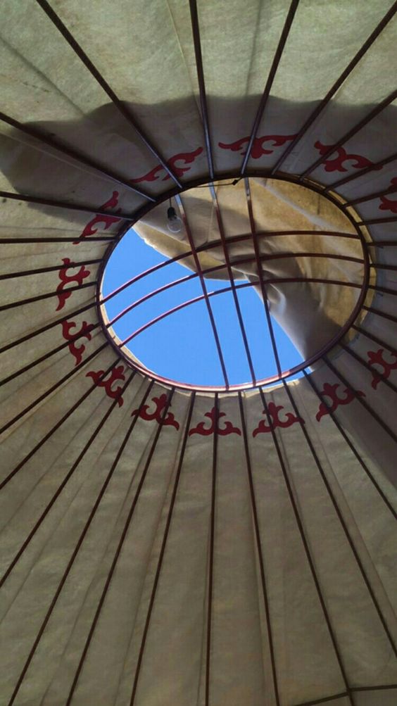
Fig 2. The shanyrak. Source:
ae69d0f81abd14305022e8706d34d6a6.jpg

A highlight of the code I am proud of is the nested for loop code itself because I could create several ornaments just with the three lines of the code (not considering the lines needed to draw the ornament). In the previous assignment, I was copy-pasting the same code multiple times with a slight change in the x and y axes to multiply the same shape. The for loops made the task easier this time. 

for(let x=5; x<width-5; x+=70) {
    for(let y=20; y<height-5; y+=60) {
      noStroke();
      fill(100, 100+mouseY, mouseX+100);
      beginShape();
      vertex(x, y);
      vertex(...); //here many lines of vertex coordinates
      vertex(x+10, y+10);
      endShape(CLOSE);
    }
 }

Embedded sketch: Please move the mouse and click on the sketch.

Reflection and ideas for future work or improvements: If you click the mouse, the word “CULTURAL HERITAGE” appears. However, the initial idea was to make this phrase move in a circular path around the shanyrak continuously. Although I could make all other simple shapes such as ellipses and rectangles rotate along the circle, I couldn’t do the same with the text. I have to learn the functions of this and try to realize my idea. As this idea took me several hours and wasn’t successfully completed, I consider it a challenge to include it in future work. 

Week 2- Reading Reflection

Reflection on “Eyeo2012 – Casey Reas”

The idea that chaos and order can interact with one another to create something unique is what interested me the most. Pure randomness causes the disorder, while the strict rules limit the imagination by creating predictable patterns. Because of this, the application of randomness to the basic rules is the golden line, which allows to have the unpredictable details of the predictable general image. However, the way the computational designers achieve this randomness through the pre-written variables, book of ‘random numbers’, etc. raises the question of the extent to which randomness is achieved through coding. As a piece of evidence for that, the variable ‘random’ itself can be taken. In Python, this variable is referred to as “Generate pseudo-random numbers” where the ‘pseudo’ already means that numbers generated are not really random, but follow the pattern and various distributions. Moreover, the author also provides an example, claiming that the random images created actually tend to have patterns such as all moving in one direction (monotonic) or surrounding the pivotal points, etc.

The author slightly changed my perspective on the abstract art style with the use of geometric figures and random paints. In this case, I am referring to Kasimir Malevitch’s “Black Square”, Piet Mondrian’s “Composition II in Red, Blue, and Yellow” and Cy Twombly’s “Leda and the Swan” and other similar works. Before it was tough for me to understand the message of abstract art as it cannot be associated with a particular real-life object or situation in most cases. However, this is what makes these artworks unique as they don’t follow the rules, don’t reflect reality, and don’t carry one specific message, giving more freedom to artistic expression. The author claims that these artworks became popular particularly because of their randomness as the authors moved away from realism by refusing to follow the rules. The political situation mentioned in the video as the influence of the world wars is an interesting aspect for me as these artworks seem to be a kind of political movement in their own way because they convey the idea of independence, abundance of strict rules, and creation of their own reality opposed to the order created by politicians. Because of these aspects, I think that I started noticing the beauty of abstract art.