Assignment #3 (OOP) – Sugar cube!

Concept:

Coffee is undoubtedly my favorite go-to drink, especially as a sleep-deprived college student. Everything about coffee is wonderful – whether it be the scent of the coffee beans, the warm, inviting atmosphere of cafes, or even its bitter aftertaste. So, naturally, I wanted to dedicate at least one of my projects to create an animation with coffee, although I wasn’t entirely sure what and how. Then an idea of having a coffee cup and a sugar cube being dropped inside it came randomly to me, so I decided to try and recreate that. It was perfect because it incorporated movement, which was something I wanted to try since day 1! Initially I wanted to create a kettle and have coffee pour out from it, but I quickly decided against it when I realized my skills weren’t that advanced enough to recreate that. Instead, I decided to create a simple clock to fill the empty space on the canvas.

Process/Coding:

I wanted my background to have a vintage vibe to it, so I decided to go with a slightly darker orange. Then I created the coffee cup, which took a while because I was still trying out and adjusting the position, length, etc. of the shapes. Eventually I was able to put the different shapes and lines together to create a mug with coffee inside, but then I had some trouble trying to empty the space between the handle and the mug’s body; because I colored the entire arc with white, it wasn’t letting me discolor the smaller arc space within it.
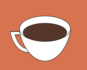
(it was this tiny space between the handle and the body of the mug.)

So in order to color that part as the same orange shade as the background, I simply decided to create an arc that will fit perfectly in that space and color it orange. Here’s the coding that I’ve used:

fill(230, 109, 69);
arc(93, 240, 77, 130, radians(37), radians(143), CHORD);

Once that was done, I moved onto creating the clock, which I initially visioned to also have a bit of animation in it because I wanted to move the clock’s hands. However, when I tried to animate the clock hands only, it instead hid most of my coffee cup’s body, which is an error/mistake that I’m still trying to figure out. So, unfortunately, the clock hands are fixed and frozen for now.

Now, the true challenge was creating a “class,” because I had no clue where to begin or what it would do. Thankfully, one of our Intro to IM upperclassman was kind enough to teach me the basics – once I understood that a “class” was simply a cookie cutter (using Professor Shiloh’s metaphor from class), it was a little easier to plug in the characteristics of whatever object that I wanted to create in the “class.”

I decided to name my class “Sugarcube,” true to the image and the role of the little white square that I was dropping into the coffee via animation. Here are all the codes that I used to create sugarcube:

let yPos = 30;
let sc1;

class Sugarcube {
  constructor() {
    this.yPos = 30;
    this.ySpeed = 2;
  }

  move() {
    if (this.yPos < 250) {
      this.yPos = this.yPos + 2;
    }
  }

  draw() {
    fill(255);
    square(120, this.yPos, 30);
  }
}

Then, in order to move it, all I had to do is plug in the below:

sc1.move();
sc1.draw();

And voilà, here’s the final product:

Reflection:

Although this was a pretty challenging assignment that I started off with very little knowledge in the function “class,” it definitely pushed me out of my comfort zone and learn new efficient skills! I realized just how convenient this function can be if it is used correctly, because all I need to do is plug in (variable name) move(); or (variable name) draw(); in order to reproduce the exact same variable.

Assignment #2 – Disco Disc

Concept:

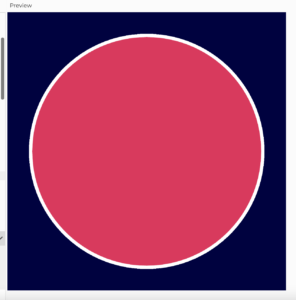
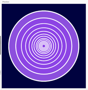
I didn’t have a clear image of what I wanted to produce when I first created the canvas, but I knew I wanted to incorporate the skill of randomly switching from one color to another. At the very beginning, I wanted to devise many small circles with switching colors, but after having problems duplicating the circles, I decided to just focus on creating one giant one, which inspired me to create a disc with flashing colors, like a disco-themed disc. I also added some repeating white circle outlines within the giant disc, so that it will create an effect of a record disc.

* duplicating many circles like this one to fill the entire screen was my original vision.

Process/Coding:

First, I created my background, which I made into a dark navy color. I wanted the background to be dark so that it will help the flashing colors pop out more, but I also didn’t want it to be completely black because that was too basic! As for creating the main “disc” as well as its details such as the switching colors, white outline strokes, etc., I consulted a YouTube video called “4.1: while and for Loops – p5.js tutorial” from a channel called “The Coding Train.” From this video, I was able to learn new skills such as how to use the “strokeWeight()” (which controls the thickness of a stroke) and “stroke()” (which controls the color of a stroke) function, which I used to outline my disc circle and to create smaller circles within it. This was a huge highlight of this project, and here’s the coding that I used for creating the white stroke around the entire disc:

// thick white stroke around the "disc"
function draw() {
  strokeWeight(7);
  stroke(255);

(original author of the code: Daniel Shiffman, link to the code: https://thecodingtrain.com/tracks/code-programming-with-p5-js/code/4-loops/1-while-for)

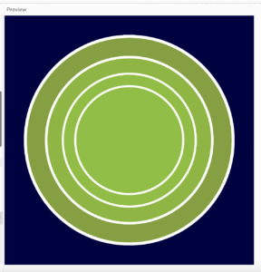
Here’s the gradual progress from the original one big circle to adding more white circle outlines within the disc:

As for the loop, which was the main technique that we had to use for this project, I set xPos, yPos, height, and width, and used “for” to create a condition in which the loop will continue to run. Because I was still unsure about how to create loops, I got help from Professor Shiloh’s example from the lecture notes. Here’s the code that I used to create the loop:

//loop
for (yPos = 300; yPos < height; yPos = yPos) {
  for (xPos = 300; xPos < width; xPos = xPos) {
}
}

(original author of the code: Professor Michael Shiloh, link to the code: https://github.com/michaelshiloh/IntroductionToInteractiveMedia/blob/master/lectureNotes.md)

Final Product:

It took a while to figure out how to switch colors in order to create the “flashing” effect, as well as layering the white circle outlines so that none of them overlap but decrease slowly in size, but eventually I was able to finalize my disco disc:

Reflection:

This project has taken significantly less time than my first one, although the skills that I’ve used were less “basic” and a little bit more “intricate,” which I found interesting. I’ve had a blast with this one because I’m slowly grasping the language of coding, and it’s so awesome to be able to conquer one skill at a time and use them to produce something that I’ve visualized in my head. I’m extremely happy with the switching of colors, and if I try something like this again next time, I’d like to figure out how to make the entire disc move around, because I still haven’t really figured out how to make mobile projects!

(a very rushed) self-portrait!

Concept:

To be frank, I didn’t have the luxury to be creative with my self-portrait because I was running dangerously low on time; actually, creating a mini version of me with my (very) limited knowledge of coding seemed almost impossible.
So in hopes of keeping the assignment as simple as possible, I focused on the main central characteristics of myself: the colors of my hair, skin, eyes, etc., my general build, and my most common facial expression. Although I initially hoped to focus on the details of my face specifically, I quickly realized the limits of my current coding experience, which mdae my drawing very basic.

Process/Coding:

Thankfully, I was able to gather bits of coding techniques from Professor Shiloh’s lecture notes, specifically on shapes, colors, and the background. Some struggles that I’ve faced during this project were: 1) figuring out the RGB color codes manually until I realized that I can use a tool called “color picker” to generate the codes without having to try out a bunch of different ones, 2) positioning the shapes in the desired spots, which also took a lot of trials and tribulations, and 3) creating arcs, which was honestly the hardest part of this project. Because the arc was the most challenging for me, it’s also the part of my project that I’m most proud of.
Here’s the code that I used for it:

fill(252, 28, 3);
arc(x, y, 70, 100, radians(30), radians(150), CHORD);

Despite the numerous complications (and the frustrated growls I’ve made while creating this), I did have some small wins as well, such as being able to master features such as “fill” and “function draw,” as well as learning how to create the general shapes such as a rectangle, ellipse, etc.

Here is my final product:

Reflection:
There are so many new skills that I want to try out for my upcoming projects that I didn’t quite have the time (and energy) to master yet. Although this one wasn’t exactly a satisfying end product, I’m compromising with myself by believing that given time, I’ll be able to come around to the world of coding and unlock all the cool, fun techniques that I can use to express my creativity! I’d like to make a non-stationary product next time, because I’d like to experiment with coding that generates movements, etc. But for now, I’m glad with this quirky little character that I’ve made. 🙂