Week 8: Creative Switch

Concept:

The inspiration for this assignment came from a common problem: phone distractions while studying. I wanted to create a practical solution to keep my phone away during study sessions. To achieve this, I decided to make a phone stand with a built-in switch. When my phone is placed on the stand, the switch activates, turning on a red LED. This serves as a visual cue to remind me that it’s time to concentrate on my studies.

Process & Highlights:

  1. Materials Used: I gathered a few basic materials for this project, including a resistor, a red LED, foil paper and copper tape.
  2. Circuit Design: I sketched a simple circuit with a switch schema using these components. Then, I have made a simple circuit without a switch as we have done in class. And then, I have added my phone stand switch to the circuit.
  3. Switch Mechanism: To implement the switch, I used foil paper and copper tape. I used foil paper on the phone stand, connecting it to the circuit board. Copper tape was used to connect arduino UNO board and my phone. When I set my phone on the stand, the foil paper came into contact with the copper tape, effectively closing the circuit.

Reflection:

This assignment was a practical learning experience that reinforced my understanding of circuit and switch mechanisms. I think my implementation provided an effective solution to the issue of phone distractions during study sessions by using a simple LED cue.


Week 8: Reading Response

In the first reading by Norman, “Emotion & Design: Attractive things work better,” I found his exploration of the emotional aspect of design very interesting. Indeed, good design isn’t just about aesthetics or functionality; it’s also about how we feel when interacting with the product. Norman’s emphasis on the importance of considering users’ emotions and needs, particularly in high-stress situations, highlighted the human-centered nature of design. I particularly appreciated his vision for the future: “Let the future of everyday things be ones that do their job, that are easy to use, and that provide enjoyment and pleasure”. This statement is a good reminder of how important the design itself is depending on the emotion and the situation in which the user is under and what kind of experience we, as developers, want to give the users.

The second reading, “Her Code Got Humans on the Moon,” further illustrated the idea that “we should not solely rely on users when designing technology.” Users can sometimes behave unpredictably, especially in high-pressure contexts like space missions. The story of Margaret Hamilton serves as a compelling example of how careful and well-planned design is vital for the success and reliability of complex systems. This reading reinforced my belief in the importance of meticulous design and efficient code to create technology that is not only robust but also user-friendly. It also highlights the need for proactive problem-solving and consideration of user behavior to achieve success in complex projects.

Midterm Project

Link to the Sketch: https://editor.p5js.org/be2143/full/wxUp4YLBf

Concept

“The Brain Game” is a game designed to challenge the user to complete 3 levels. Initially, my idea was to implement only “The 5 Hats to 3 Men Problem.” However, I later changed the concept to make it more engaging. One alternative idea I had was presenting the challenge in a storytelling format. Eventually, I drew inspiration from the “Brain Challenge” mobile game and developed the current game concept.

Key elements

Level 1: Reach the Exit


In level 1, the user’s task is to guide the character to the exit using arrow keys. To reach the exit, the player must first collect a key to clear the path. Once the player reaches the exit, the game proceeds to the next level.


Level 2: Odd One Out

The player is presented with an image and must identify what’s unusual. A cursor circle outlines the cursor, and the player must position it over the odd item and click. If the player makes two incorrect selections, a “hint” appears. Once the player correctly identifies the odd item, the game proceeds to the next level.

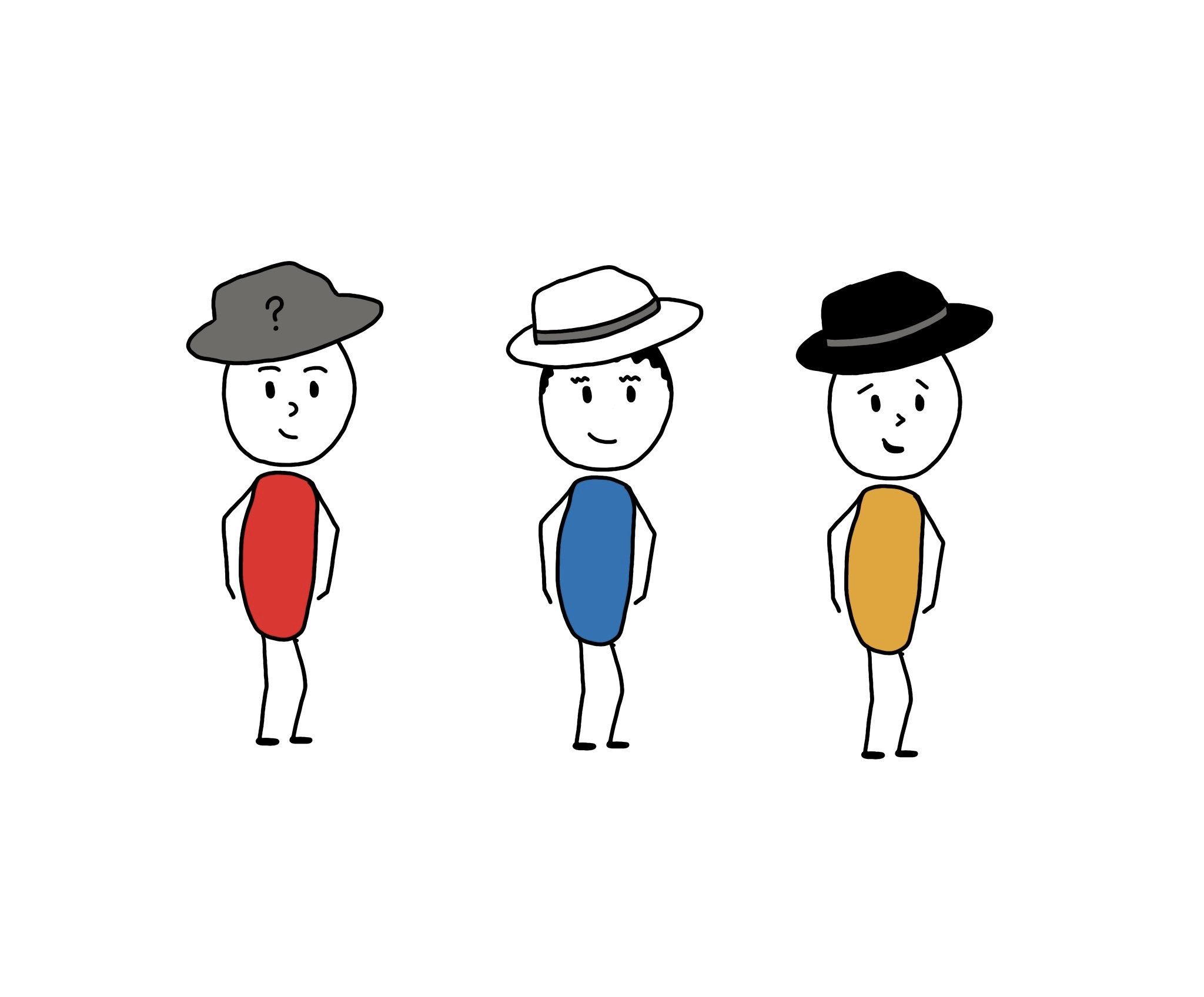
Level 3: Solve a Riddle

This level presents “The 5 Hats to 3 Men Problem,” challenging the player’s logical thinking skills. Three characters and five hats (three black and two white) are involved. The three hats are randomly assigned to each character. Given the ability to see the hats of the other two characters and the answer they have given, the player’s task is to guess the color of their own hat. An incorrect guess results in the level restarting, while a correct guess ends the game.


You can read more about the problem here: https://www.pumpfundamentals.com/The%205%20hats%20to%203%20men%20problem%20solution.pdf 


Design

I have intentionally provided instructions for each level before they begin to enhance player engagement and understanding.

Sound effects have been included throughout the game to enhance the user experience and provide feedback. For instance, an incorrect choice triggers a specific sound effect to signal that the player should try again.

A “home” button allows the player to restart the game without resetting the entire session.

I asked two of my friends to play my game to understand: what’s confusing for the user and to spot the areas to improve in the game. Based on their feedback, I added a hint feature for Level 2 to assist players in spotting the odd item. Additionally, in Level 3, I implemented a feature where the cursor touching a hat changes the background color around the image to clarify how to make a guess.

Problems I ran into

The most challenging part of this project was adapting “The 5 Hats to 3 Men Problem” into a playable game. To ensure solvability, I created specific hat combinations for the three characters, limiting the possibilities to wwb, wbb, and bwb (w = white; b = black). And it is not a random selection of combinations which limits the problem setting. I chose this combination based on the problem setting that the other two characters have already answered that they don’t know the color of their hat color. So that we should eliminate the combinations in which those two characters will be able to make the guess. 

let blackHatImg, whiteHatImg, greyHatImg;
let hats = [[1, 0, 1], [0, 1, 1], [0, 0, 1]]; // 1 for black, 0 for white
let randomHatSet;
let characters = 3;

// randomly choose hat set
  randomHatSet = floor(random(3));
function playPuzzle() {
  if (puzzleImgIndex < puzzleImg.length) {
    image(puzzleImg[puzzleImgIndex], 0, 0, width, height);
  }

  // Calculate the available width for the rectangles (canvas width minus margins)
  let availableWidth = width - 60; // 30 pixels from the left and 30 pixels from the right

  // Calculate the width of each section for three hats
  let sectionWidth = availableWidth / 3;

  // Draw the hats
  for (let i = 0; i < characters; i++) {
    // Calculate the x-coordinate for each hat based on the section
    let x = 30 + (i * sectionWidth) + sectionWidth / 2;
    let y = height / 4;

    // Draw the assigned hat images
    if (hats[randomHatSet][i] === 1) {
      image(blackHatImg, x - 45, y + 30, 90, 45);
    } else if (hats[randomHatSet][i] === 0) {
      image(whiteHatImg, x - 45, y + 30, 90, 45);
    }
  }
  // Draw a mystery hat on top of the hat of the user
  image(greyHatImg, (30 + (2 * sectionWidth) + sectionWidth / 2) - 45, (height / 4) + 30, 90, 45);
  
  // Choose from the black or white hat
  
  if (puzzleImgIndex === 1) {
    if (mouseX > blackHatGuess.x && mouseX < blackHatGuess.x + blackHatGuess.w && mouseY > blackHatGuess.y && mouseY < blackHatGuess.y + blackHatGuess.h) {
      // Change the color when the cursor is inside
      noStroke();
      fill('#FFB8CD');
      rect(blackHatGuess.x - 2, blackHatGuess.y - 2, blackHatGuess.w + 4, blackHatGuess.h + 4);
    } else if (mouseX > whiteHatGuess.x && mouseX < whiteHatGuess.x + whiteHatGuess.w && mouseY > whiteHatGuess.y && mouseY < whiteHatGuess.y + whiteHatGuess.h) {
      // Change the color when the cursor is inside
      noStroke();
      fill('#FFB8CD');
      rect(whiteHatGuess.x - 2, whiteHatGuess.y - 2, whiteHatGuess.w + 4, whiteHatGuess.h + 4);
    }
    // Draw a rect around the hat choices
    image(blackHatImg, blackHatGuess.x, blackHatGuess.y, blackHatGuess.w, blackHatGuess.h);
    image(whiteHatImg, whiteHatGuess.x, whiteHatGuess.y, whiteHatGuess.w, whiteHatGuess.h);
  }
}

function makeGuess(mouseX, mouseY) {
  if (mouseX > blackHatGuess.x && mouseX < blackHatGuess.x + blackHatGuess.w &&
      mouseY > blackHatGuess.y && mouseY < blackHatGuess.y + blackHatGuess.h) {
    pauseAndResumeDraw();
    levelCompleteSound.play();
    gameState = 'end';
  } else {
    pauseAndResumeDraw();
    // restart level 3
    wrongChoiceSound.play();
    restartPuzzle();
  }
}

Areas for improvement

If I had more time, I would implement additional features, such as allowing players to skip levels or revisit previous levels. I also observed that players tend to forget the challenge scenario in Level 3 thus it  would be better to enable players to revisit instructions for clarification.

Despite my overall satisfaction with the game, I could have enhanced the game’s visual appeal by investing in more attractive graphics, animations, and a user-friendly interface design. For my future projects, I will certainly prioritize the overall graphic design, its aesthetics, and user coherence.

Midterm Project Progress

Concept

For my midterm project, I have decided to implement a puzzle for the user to solve, “Black and White Hat Puzzle”. The puzzle typically goes something like this:

There are 5 hats: 3 black and 2 white. Three characters can see each other’s hats but not their own. They must figure out the color of their own hat based on what they see on the others’ heads, using logic and deduction.

Design

I will implement this puzzle as the user to be one of the three characters wearing a hat, and can see the other two people’s hat. The user needs to correctly guess the hat color he/she is wearing. The user can make only 2 guesses.

If the user can’t make the right guess, the solution will be presented to the user.

A simple wireframe:

Challenging Part

  • Drawing the each elements and characters on the canvas
  • Assigning the hats randomly to the characters and displaying it
  • Building the algorithm behind explaining how the user should solve the puzzle correctly.

Risk Prevention

  • I will not draw everything on the canvas, but I will draw them on my ipad and insert them as images to the canvas.
  • Assign each of the hats values (and an image of white or black hat) and randomly choose one of them and display it on the screen (on each characters’ head). But the hat of the user must be hidden until user makes the correct guess or two guesses.
  • Depending on the other two characters’ hat, the guessing logic must be one of the following:
    1. If a character sees that both of the other characters are wearing white hats: In this case, the character deduces that their own hat must be black. This is because if they were also wearing a white hat, it would mean that there are two white hats in total, which contradicts the given hat distribution.
    2. If a character sees one white hat and one black hat on the other two characters: In this scenario, the character cannot deduce the color of their own hat based solely on this information. They don’t have enough information to determine their own hat color. Their guess would be uncertain.
    3. If a character sees that both of the other characters are wearing black hats: In this situation, the character can deduce that their own hat must be white. This deduction is made based on the knowledge that there are only two white hats and three black hats in total. If they were also wearing a black hat, it would result in three black hats, which contradicts the given hat distribution.

Week 5 – Reading Response

In the reading “Computer Vision for Artists and Designers,” Levin introduces the computer vision, algorithms for implementation, and its creative potential. I particularly liked the project examples he provided to illustrate how computer vision can be applied in real-world scenarios; they were all so interesting to read about. One project, “Suicide Box,” stood out to me because it aims to address a social issue and privide an evidence, not just for entertainment (which was a bit different from what I was expecting from interactive projects). This project inspired me to consider how technology can be a tool for raising awareness and gathering evidence on important social issues through creative projects. It expanded my thinking on the project ideas I could work on in future assignments, emphasizing that the purpose and meaning behind our work is essential consideration, and it can be one that delivers an important message of social impact.

I agree with Levin’s idea for the reliability of computer vision and its ongoing development. He mentions the challenge that computer vision is “opaque,” meaning it requires explicit programming to distinguish objects based on factors like contrast, color, motion, and brightness. This emphasizes the need for continued efforts to enhance accuracy in machine vision. The reading also made me reflect on the limitations of current AI-generated visuals, which often lack accuracy. For example, chatGPT is quite good at solving math problems and writing essays/texts. However, if we ask it to provide us with code for an aesthetic image, the result would be just a few lines of different colors on the canvas. Of course, it needs more details to design something like that, but my idea is that AI still lacks the ability to recognize images and generate various types of images accurately. Not only chatGPT, also other image generating AI often generate logically wrong images. It raised the question of how working on machine vision and using it to improve AI-generated visuals could be a promising avenue for advancing computer development.

Week 4 – Data Visualization

For this assignment, I visualized the “Cost of Living 2017” dataset in a circular diagram. I thought circular diagram would look much neater and allows to visualize much more countries than other diagrams. Also, it showcases the extremes very well, allowing us to compare the most expensive and most affordable places to live in a single glance.

In my circular design, each country from the dataset finds its place along the perimeter. The distance from the center of the circle to each country is determined by its cost of living. So, the more expensive a country, the farther out from the center it appears. To keep things visually appealing, I also added dots and text labels to each country.

One of the trickier parts of this project was making sure that the dots and text labels rotated in sync. I also had to figure out how to represent each country’s cost of living accurately by adjusting the length of the lines connecting them to the center. I’m particularly proud of successfully aligning the rotation of text and dots. I think achieving this synchronization made the diagram more intuitive and easy to understand.

// Calculate the rotation angle based on the length of the data
  const angleIncrement = 360 / (data.length - 2);

  // Define a scaling to make the diagram bigger
  const scaleFactor = 2;

  // Get the rotated text and dots based on the CSV data
  for (let i = 1; i < data.length; i++) {
    const rowData = data[i].split(",");
    const countries = rowData[0]; // coutries
    const cost = parseFloat(rowData[1]); // parse the cost as a floating-point number

    // Calculate the rotation angle based on the index
    const rotationAngle = radians(textRotation + i * angleIncrement);

    // Calculate the radius based on the cost and scaling 
    const radius = cost * scaleFactor;

    const x = centerX + radius * cos(rotationAngle);
    const y = centerY + radius * sin(rotationAngle);

    // Draw a line from the center to the dot
    stroke("#FF5733");
    line(centerX, centerY, x, y);

    // Display the dot with the same rotation angle
    push();
    translate(x, y);
    rotate(rotationAngle);
    noStroke();
    fill("#FF5733"); 
    ellipse(0, 0, 4, 4); 
    pop();

    // Display the rotated text of countries next to the dot
    push();
    translate(x, y);
    rotate(rotationAngle); // apply the same rotation to the countries
    noStroke();
    text(countries, 20, 0); // display the countries
    pop();

In the future works, I’d like to explore more creative ways to present data. I want to achieve a good balance between functionality and aesthetics, making the visualizations not only informative but also visually engaging and fun.

Week 4 – Reading Response

Don Norman’s observations regarding the design of everyday objects, such as doors, were so interesting for me to read as they raise the issue in technology: engineers and designers sometimes get so caught up in logical thinking that they forget about the end user’s perspective. I liked how this idea can actually relate to what we read last week about Crawford’s idea of “interactivity” as a conversation. It’s almost like technology and users speaking a different language, and this disconnect can lead to a host of problems. In a good conversation, it’s not just about speaking; it’s about listening, understanding, and responding thoughtfully. This same principle applies to human-machine interactions. Users need to “listen” to the machine by deciphering its controls and understanding how it works, while the machine must “listen” to the user’s commands and respond appropriately. When there’s a breakdown in this dialogue, things can quickly go awry.

What particularly interested me is how the difficulty users face in comprehending a machine’s interface can be likened to the “listening” aspect of interactivity. Users struggle to figure out how a machine functions, which makes it harder for them to effectively communicate with it. This can result in the machine misinterpreting their intentions or causing confusion, essentially a conversation that’s gone off the rails. So, my take on this connection between Norman and Crawford is that intuitive and straightforward design is non-negotiable for fostering better interactivity. It’s about designing technology that speaks the user’s language, aligning with their mental model and expectations. But it’s also about making sure the machine can “listen” and understand the user’s commands without any issues.

With all of this, I realized the critical importance of UX design: considering the end user when creating technology. We can’t simply assume that users will figure things out the way we do; we need to empathize with their needs, thought processes, and limitations. And user experience and user testing must be a part of my work when I start working on my midterm project.

Week 3 – Reading Response

Reading “The Art of Interactivity” by Chris Crawford has definitely reshaped my understanding of interactivity. I would have initially defined interactivity as when you get to do things like click, tap, or choose, and your device responds to what you do. Crawford, however, defined this concept in a much simpler and easier way. I particularly liked how he differentiated the interactivity from the reaction and participation. Nonetheless, one particular aspect of the first chapter of the book left me wondering. Crawford briefly touched upon the misconception of dividing the design process into two distinct phases: graphic design and the interactivity step. Even though he have discussed this in the later chapter of the book, I have came up with my ideas of why the potential challenges this division can pose.

One immediate concern is the possibility of losing sight of the user experience. Design should always prioritize meeting the users’ needs and preferences. If we plunge headfirst into graphic design without considering how users will interact with our creations, we might end up with aesthetically pleasing but impractical designs, inevitably leading to user frustration. I believe that such an approach could yield inconsistencies and reduced usability, primarily due to the disconnect between graphic design and interactivity. As an aspiring designer or software developer, I understood the importance of integrating the design process with interactivity, ensuring that the two are both important for maximum effectiveness and efficiency. By doing so, the creation would not be just visually appealing interfaces but also include interactions that are intuitive and user-centric, resulting in a more harmonious and engaging user experience.

Week 3 – Generative Art Work

For this assignment, I decided to create a simple demonstration of a mandala. I used only three shapes of small, big circles and rectangles; which rotate around the center, forming a visual pattern.

A mandala is a geometric pattern that holds deep symbolic and spiritual significance in various cultures around the world. It often represents unity, harmony, and the balance of elements. In my work, I tried to capture the essence of a mandala by creating a dynamic composition of shapes that radiate from the center, reminiscent of the sun.

Compared to my previous coding assignments, this time I had fewer issues. However, I found it challenging to implement the rotation drawing for the shapes. I used the “translation” function to establish the center of the screen as the point around which the shapes would rotate. This function moves the rotating point to the desired center position. Next, I computed the angles of rotation using the “map” function, based on each shape’s index within the array of shapes. These angles of rotation were then used in the “rotation” function, for shapes to spin around the central point.

let angle = map(this.index, 0, shapes.length / 3, 0, TWO_PI); // Calculate the angle for rotation
let x = cos(angle) * this.radius;
let y = sin(angle) * this.radius;

push(); 
translate(x, y); 
rotate(angle); // Rotate based on the angle

In the future, I would like to try to use more shapes like triangles and spirals to create visual variety. I think expanding the color choices with gradients and dynamic color changes will make the artwork more visually appealing.

Reading Reflection – Week 2

In Casey Rea’s talk of chance operation in digital art, a central theme that stood out was the delicate balance between structure and randomness. What caught my attention was a specific example he shared. He took simple visualizations of hypothetical neuron vehicle movements within the animal kingdom and used them to create unique patterns in his artwork. This approach fascinated me because it transformed scientific data into art, making complex information visually appealing.

I also appreciated Rea’s insight that even in complete chaos, there’s an underlying structure and delicate geometry. This idea adds depth and intrigue to digital art.

Rea’s talk challenged traditional artistic norms and encouraged breaking free from conventional constraints. His emphasis on embracing randomness as a creative catalyst raised questions about finding the right balance between chaos and order in art. I found myself wondering if there are specific techniques or guidelines for achieving this balance in the creative process.

In conclusion, Casey Rea’s exploration of chance operation in digital art has inspired me to push my creative boundaries. I believe that incorporating elements of chance into my own art could lead to exciting breakthroughs and help me move beyond my artistic understanding.