 Concept
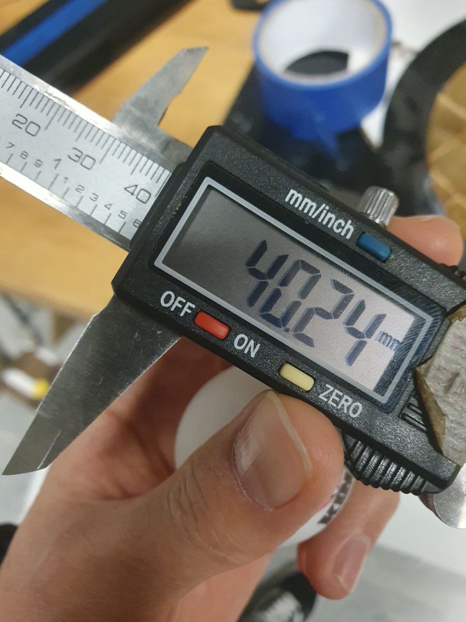
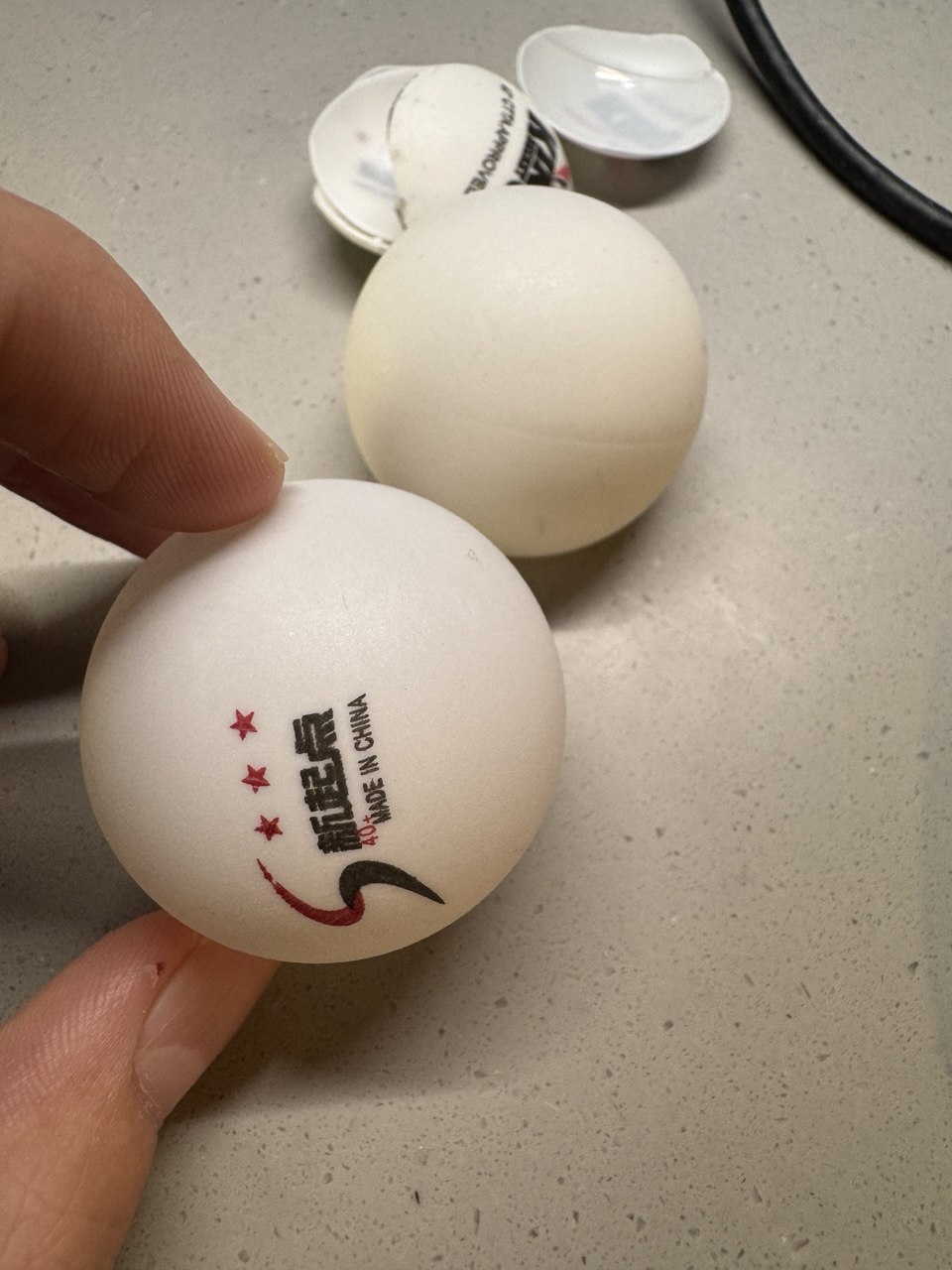
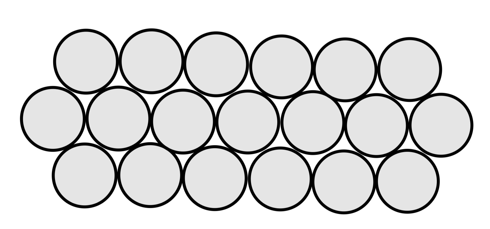
I’ve created a unique digital clock that uses ping pong balls arranged in a hexagonal pattern as a display. Each ball is illuminated by an individually addressable LED, creating a distinctive way to show time. The project combines modern technology with an unconventional display method, making it both functional and visually interesting.
The hexagonal layout adds an extra layer of intrigue to the design. Unlike traditional square or rectangular displays, this arrangement creates a honeycomb-like pattern that challenges the conventional perception of digital time display. The use of ping pong balls as diffusers for the LEDs adds a soft, warm glow to each “pixel,” giving the clock a more organic feel compared to harsh LED matrices.
Demo
The initial setup process is designed to be user-friendly while maintaining security. When first powered on, the Wemos Mini creates its own WiFi network. Users need to connect to this temporary network to provide their home WiFi credentials. Once this information is received, the device reboots itself and connects to the specified WiFi network. To complete the setup, users must then connect their device to the same WiFi network. The clock’s IP address is displayed on the hexagonal LED screen, allowing users to easily access the configuration interface through their web browser.
After the connection stage, the user can proceed directly to configuring the clock.
Description of Interaction Design
The interaction design for this clock project focuses on simplicity and intuitiveness, while still offering deep customization options. Users primarily interact with the clock through a web-based interface. The changes apply instantly to the clock face, allowing immediate visual feedback as settings are adjusted. Key interactions include color pickers for customizing the display, sliders for adjusting brightness and animation speed, and dropdown menus for selecting time fonts and background modes such as perlin and gradient. The interface is designed to be responsive, working well on both desktop and mobile browsers. Physical interaction with the clock itself is minimal by design – once set up, it functions autonomously, with all adjustments made through the web interface. This approach ensures that the clock remains an elegant, standalone piece in a user’s space, while still being highly customizable.
Technical Implementation
1. Overview
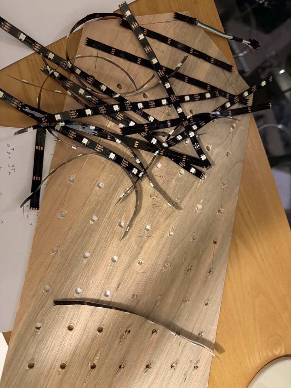
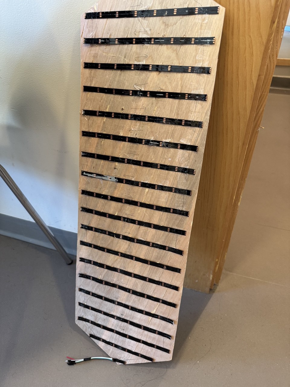
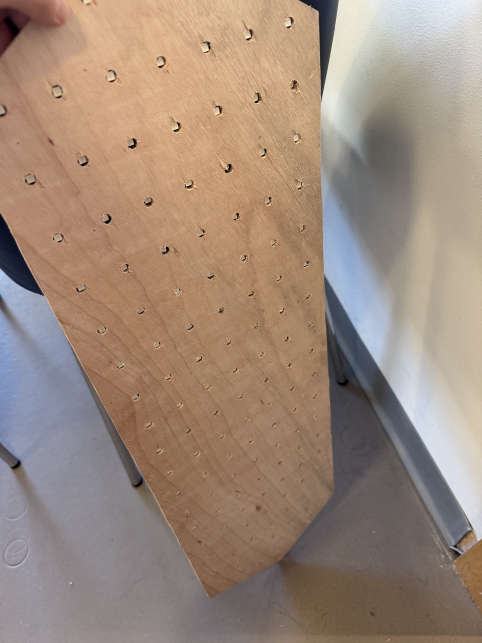
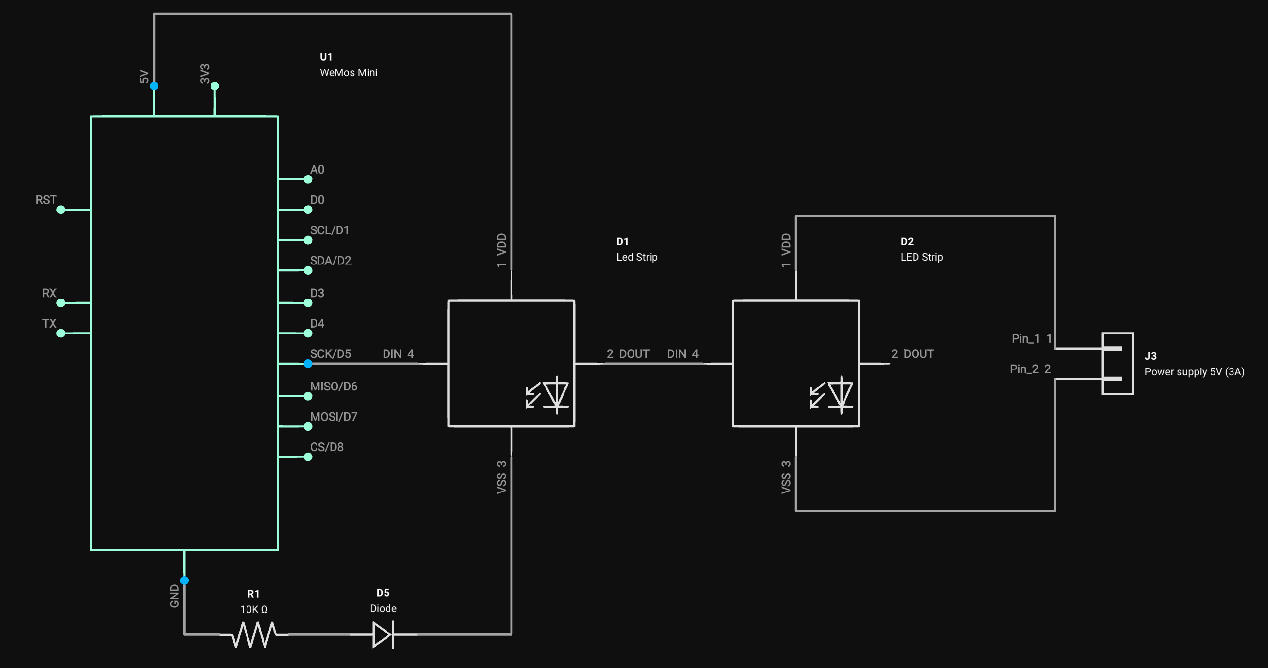
The heart of the project is a Wemos Mini D1 microcontroller that connects to ntp server for accurate time synchronization. The system uses 128 addressable LEDs arranged in a hexagonal pattern, each LED placed under a cut-up ping pong ball. The entire configuration interface is hosted directly on the Wemos Mini, accessible through any web browser on the local network.
2. Matrix
The core of the project’s display functionality lies in its matrix handling system. The code manages two different display modes: an XY coordinate system and a diagonal system, allowing for flexible number rendering on the hexagonal display.
Here’s the matrix configuration:
#define MX_LED_AMOUNT 128
#define MX_XY_W 39
#define MX_XY_H 13
#define MX_DIAG_W 20
#define MX_DIAG_H 7
The display uses lookup tables to map logical positions to physical LED numbers. This is crucial for the hexagonal layout:
static const uint8_t xyLEDPos[MX_DIAG_H][MX_XY_W] = {
    {0, 0, 0, 13, 0, 14, 0, 27, 0, 28, 0, 41, 0, 42, 0, 55, 0, 56, 0, 69, 0, 70, 0, 83, 0, 84, 0, 97, 0, 98, 0, 111, 0, 112, 0, 125, 0, 0, 0},
    {0, 0, 2, 0, 12, 0, 15, 0, 26, 0, 29, 0, 40, 0, 43, 0, 54, 0, 57, 0, 68, 0, 71, 0, 82, 0, 85, 0, 96, 0, 99, 0, 110, 0, 113, 0, 124, 0, 0},
    {0, 3, 0, 11, 0, 16, 0, 25, 0, 30, 0, 39, 0, 44, 0, 53, 0, 58, 0, 67, 0, 72, 0, 81, 0, 86, 0, 95, 0, 100, 0, 109, 0, 114, 0, 123, 0, 126, 0},
    {1, 0, 4, 0, 10, 0, 17, 0, 24, 0, 31, 0, 38, 0, 45, 0, 52, 0, 59, 0, 66, 0, 73, 0, 80, 0, 87, 0, 94, 0, 101, 0, 108, 0, 115, 0, 122, 0, 127},
    {0, 5, 0, 9, 0, 18, 0, 23, 0, 32, 0, 37, 0, 46, 0, 51, 0, 60, 0, 65, 0, 74, 0, 79, 0, 88, 0, 93, 0, 102, 0, 107, 0, 116, 0, 121, 0, 128, 0},
    {0, 0, 6, 0, 8, 0, 19, 0, 22, 0, 33, 0, 36, 0, 47, 0, 50, 0, 61, 0, 64, 0, 75, 0, 78, 0, 89, 0, 92, 0, 103, 0, 106, 0, 117, 0, 120, 0, 0},
    {0, 0, 0, 7, 0, 20, 0, 21, 0, 34, 0, 35, 0, 48, 0, 49, 0, 62, 0, 63, 0, 76, 0, 77, 0, 90, 0, 91, 0, 104, 0, 105, 0, 118, 0, 119, 0, 0, 0},
};

static const uint8_t diagonalLEDPos([MX_DIAG_H][MX_DIAG_W] = {
    {13, 14, 27, 28, 41, 42, 55, 56, 69, 70, 83, 84, 97, 98, 111, 112, 125, 0, 0, 0},
    {2, 12, 15, 26, 29, 40, 43, 54, 57, 68, 71, 82, 85, 96, 99, 110, 113, 124, 0, 0},
    {3, 11, 16, 25, 30, 39, 44, 53, 58, 67, 72, 81, 86, 95, 100, 109, 114, 123, 126, 0},
    {1, 4, 10, 17, 24, 31, 38, 45, 52, 59, 66, 73, 80, 87, 94, 101, 108, 115, 122, 127},
    {0, 5, 9, 18, 23, 32, 37, 46, 51, 60, 65, 74, 79, 88, 93, 102, 107, 116, 121, 128},
    {0, 0, 6, 8, 19, 22, 33, 36, 47, 50, 61, 64, 75, 78, 89, 92, 103, 106, 117, 120},
    {0, 0, 0, 7, 20, 21, 34, 35, 48, 49, 62, 63, 76, 77, 90, 91, 104, 105, 118, 119},
};
The code includes helper functions to convert between coordinate systems:
int matrix::ledXY(int x, int y) {
    if (x < 0 || y < 0 || x >= MX_XY_W || y >= MX_XY_H) return -1;
    return ((y & 1) ? 0 : xyLEDPos[y >> 1][x]) - 1;
}

int matrix::ledDiagonal(int x, int y) {
    if (x < 0 || y < 0 || x >= MX_DIAG_W || y >= MX_DIAG_H) return -1;
    return diagonalLEDPos[y][x] - 1;
}
This matrix system allows for efficient control of the LED display while abstracting away the complexity of the physical layout. The code handles the translation between logical positions and physical LED addresses, making it easier to create patterns and display numbers on the hexagonal grid.
3. Fonts
A crucial part of the clock’s functionality is its ability to display numbers clearly on the hexagonal LED matrix. To achieve this, the project uses custom font definitions for both the XY and diagonal coordinate systems. These fonts are optimized for the unique layout of the display.
Here’s the font definition for the XY and diagonal coordinate system:
const uint8_t font_xy[] PROGMEM = {
    0x03, 0x09, 0x12, 0x18,  // 0 (15)
    0x00, 0x03, 0x0c, 0x10,  // 1 (16)
    0x01, 0x0d, 0x16, 0x10,  // 2 (17)
    0x01, 0x05, 0x16, 0x18,  // 3 (18)
    0x03, 0x04, 0x06, 0x18,  // 4 (19)
    0x03, 0x05, 0x14, 0x18,  // 5 (20)
    0x03, 0x0d, 0x14, 0x18,  // 6 (21)
    0x01, 0x01, 0x1e, 0x00,  // 7 (22)
    0x03, 0x0d, 0x16, 0x18,  // 8 (23)
    0x03, 0x05, 0x16, 0x18,  // 9 (24)
};

const uint8_t font_diagonal[] PROGMEM = {
    0x0f, 0x11, 0x1e,  // 0 (15)
    0x00, 0x02, 0x1f,  // 1 (16)
    0x0d, 0x15, 0x16,  // 2 (17)
    0x09, 0x15, 0x1e,  // 3 (18)
    0x03, 0x04, 0x1f,  // 4 (19)
    0x13, 0x15, 0x19,  // 5 (20)
    0x0f, 0x15, 0x18,  // 6 (21)
    0x01, 0x01, 0x1e,  // 7 (22)
    0x0f, 0x15, 0x1e,  // 8 (23)
    0x03, 0x15, 0x1e,  // 9 (24)
};
These font definitions are stored in program memory (PROGMEM) to save RAM. Each number is represented by a series of bytes that define which LEDs should be lit to form the digit. The XY font uses a 4×5 grid, while the diagonal font uses a 3×5 grid, both optimized for the hexagonal layout.
4. Color palette
The visual appeal of the clock comes from its rich color palette system, implemented using FastLED’s gradient palette functionality. These palettes define how colors transition across the LED display, creating dynamic and engaging visual effects.
Here’s how the color palettes are defined:
#include <FastLED.h>

DEFINE_GRADIENT_PALETTE(FireGrad) {
    0, 0, 0, 0,
    128, 255, 0, 0,
    224, 255, 255, 0,
    255, 255, 255, 255
};

DEFINE_GRADIENT_PALETTE(SunsetGrad) {
    0, 120, 0, 0,
    22, 179, 22, 0,
    51, 255, 104, 0,
    85, 167, 22, 18,
    135, 100, 0, 103,
    198, 16, 0, 130,
    255, 0, 0, 160
};
Each palette is defined with specific color points and their positions in the gradient. For example, the Fire gradient transitions from black (0,0,0) through red and yellow to white, creating a realistic flame effect. The numbers represent positions (0-255) and RGB values for each color point.
5. Draw function
The drawClock() function is the core of the clock’s display functionality. It handles the rendering of time on the LED matrix, accommodating different display styles and synchronization states.
static void draw() {
    uint8_t font = db[clock_style].toInt();
    if (!font) return;

    matrix.setModeDiagonal();
The function starts by retrieving the clock style from the database and setting the matrix to diagonal mode.
if (!NTP.synced()) {
    matrix.setFont(font_xy);
    matrix.setCursor(1, 1);
    matrix.print("--");
    matrix.setCursor(12, 1);
    matrix.print("--");
    return;
}
If the clock isn’t synchronized with NTP (Network Time Protocol), it displays dashes instead of numbers.
The main part of the function uses a switch statement to handle different clock styles:
switch (db[clock_style].toInt()) {
    case 1:
        // 3x5 font, standard layout
    case 2:
        // 3x5 diagonal font
    case 3:
        // 4x5 font, split hour and minute digits
}
Each case represents a different display style, using various fonts and layouts. For example:
case 2:
    matrix.setFont(font_3x5_diag);

    matrix.setCursor(1, 1);
    if (dt.hour < 10) matrix.print(' ');
    matrix.print(dt.hour);

    matrix.setCursor(11, 1);
    if (dt.minute < 10) matrix.print(0);
    matrix.print(dt.minute);

    dots(9, 9);
    break;
This case uses a diagonal 3×5 font, positions the cursor for hours and minutes, and adds leading spaces or zeros for single-digit values. The dots() function adds separator dots between hours and minutes.
6. Background effect
Gradient(int x0, int y0, int w, int h, int angle) {
    uint16_t hypot = sqrt(w * w + h * h) / 2;
    cx = x0 + w / 2;
    cy = y0 + h / 2;
    sx = cos(radians(angle)) * hypot;
    sy = sin(radians(angle)) * hypot;
    len = sqrt(sx * sx + sy * sy) * 2;
}
This code defines a constructor for the Gradient class, which calculates parameters needed for creating gradient color effects. It takes initial coordinates (x0, y0), width (w), height (h), and an angle as inputs. The constructor first calculates half the hypotenuse, then determines the center point of the rectangle (cx, cy) and calculates the x and y components (sx, sy) of the gradient vector using trigonometry, where the angle is converted from degrees to radians. The length (len) of the gradient is computed as twice the magnitude of this vector.
for (int y = 0; y < matrix.height(); y++) {
    for (int x = 0; x < matrix.width(); x++) {
        if (matrix.xyLED(x, y) < 0) continue;
        uint32_t col = getPaletteColor(palette, inoise16(x * scale * 64, y * scale * 64, count * 32), bright);
        matrix.setLED(x, y, col);
    }
}
This code snippet controls the visual effects on the LED matrix by creating a dynamic noise-based pattern. It iterates through each position in the matrix using nested loops for x and y coordinates. For each valid LED position (checked using matrix.xyLED(x, y)), it generates a color using Perlin noise (inoise16). The noise function takes the x and y coordinates (scaled by 64) and a time-based count variable to create movement. The getPaletteColor function then maps this noise value to a color from the current palette, taking into account the brightness level (bright). Finally, each LED in the matrix is set to its calculated color, creating a smooth, flowing animation effect across the display. This is what gives the clock its dynamic, animated background patterns.
7. Server parsing
function createURL(endpoint, queryParams = {}) {
    // Get the origin of the current window (protocol + host)
    const origin = window.location.origin;

    // Start building the URL with the endpoint
    let url = origin + "/" + endpoint;

    // A flag to determine if the first query parameter is being added
    let isFirstParam = true;

    // Iterate over the query parameters object
    for (let key in queryParams) {
        // Only add parameters that are not null
        if (queryParams[key] !== null) {
            // Append '?' for the first parameter or '&' for subsequent parameters
            url += isFirstParam ? "?" : "&";
            isFirstParam = false; // Set the flag to false after the first parameter

            // Append the key-value pair to the URL
            url += key + "=" + queryParams[key];
        }
    }

    // Return the constructed URL
    return url;
}
This code defines a createURL method that constructs a complete URL for API endpoints. It starts by getting the current window’s origin (protocol and host) and builds upon it. The method accepts an endpoint parameter and an optional queryParams object. Then method then constructs the URL by combining the origin with the endpoint, and systematically adds any query parameters from the queryParams object. It handles the proper formatting of query parameters by adding ‘?’ for the first parameter and ‘&’ for subsequent ones, but only includes parameters that aren’t null. This ensures that all URLs are properly formatted with the correct separators between parameters.
8. Send function
async function send(action, id = null, value = null) {
    const TIMEOUT_MS = 2000;
    const BINARY_MARKER = "__BSON_BINARY";

    // Helper function to combine two bytes into a 16-bit unsigned integer
    function combineBytes(byte1, byte2) {
        return ((byte1 << 8) | byte2) >>> 0;
    }

    // Helper function to escape special characters in strings
    function escapeString(str) {
        return str.replaceAll(/([^\\])\\([^\"\\nrt])/gi, "$1\\\\$2")
            .replaceAll(/\t/gi, "\\t")
            .replaceAll(/\n/gi, "\\n")
            .replaceAll(/\r/gi, "\\r")
            .replaceAll(/([^\\])(")/gi, '$1\\"');
    }

    try {
        // Attempt to fetch data with a timeout
        const response = await fetch(this.makeUrl("settings", { action, id, value }), {
            signal: AbortSignal.timeout(TIMEOUT_MS)
        });

        if (!response || !response.ok) return null;

        const data = new Uint8Array(await response.arrayBuffer());
        if (!data.length) return {};

        let jsonString = "";
        let binaryData = [];

        // Parse the binary data
        for (let i = 0; i < data.length; i++) {
            const typeBits = 224 & data[i];
            const valueBits = 31 & data[i];

            switch (typeBits) {
                case 192: // Object/Array start/end
                    if (8 & valueBits) {
                        jsonString += 16 & valueBits ? "{" : "[";
                    } else {
                        jsonString = jsonString.replace(/,$/, '');
                        jsonString += (16 & valueBits ? "}" : "]") + ",";
                    }
                    break;

                case 0: // Key (from dictionary)
                case 64: // Value (from dictionary)
                    jsonString += `"${y[combineBytes(valueBits, data[++i])]}"${typeBits == 0 ? ":" : ","}`;
                    break;

                case 32: // Key (string)
                case 96: // Value (string)
                    {
                        const length = combineBytes(valueBits, data[++i]);
                        i++;
                        const str = escapeString(new TextDecoder().decode(data.slice(i, i + length)));
                        jsonString += `"${str}"${typeBits == 32 ? ":" : ","}`;
                        i += length - 1;
                    }
                    break;

                case 128: // Number
                    {
                        const isNegative = 16 & valueBits;
                        const byteCount = 15 & valueBits;
                        let num = BigInt(0);
                        for (let j = 0; j < byteCount; j++) {
                            num |= BigInt(data[++i]) << BigInt(8 * j);
                        }
                        jsonString += `${isNegative ? "-" : ""}${num},`;
                    }
                    break;

                case 160: // Float
                    {
                        let floatBits = 0;
                        for (let j = 0; j < 4; j++) {
                            floatBits |= data[++i] << (8 * j);
                        }
                        const float = new Float32Array(new Uint32Array([floatBits]).buffer)[0];
                        jsonString += isNaN(float) ? '"NaN"' :
                                      isFinite(float) ? float.toFixed(valueBits) :
                                      '"Infinity"';
                        jsonString += ",";
                    }
                    break;

                case 224: // Binary data
                    {
                        const length = combineBytes(valueBits, data[++i]);
                        i++;
                        jsonString += `"${BINARY_MARKER}#${binaryData.length}",`;
                        binaryData.push(data.slice(i, i + length));
                        i += length - 1;
                    }
                    break;
            }
        }

        // Remove trailing comma if present
        jsonString = jsonString.replace(/,$/, '');

        // Parse JSON and replace binary placeholders
        const parsedJson = JSON.parse(jsonString);

        function replaceBinaryPlaceholders(obj) {
            if (typeof obj !== 'object' || obj === null) return;

            for (const [key, value] of Object.entries(obj)) {
                if (typeof value === 'object') {
                    replaceBinaryPlaceholders(value);
                } else if (typeof value === 'string' && value.startsWith(BINARY_MARKER)) {
                    const index = parseInt(value.split("#")[1]);
                    obj[key] = binaryData[index];
                }
            }
        }

        replaceBinaryPlaceholders(parsedJson);
        return parsedJson;

    } catch (error) {
        console.error("Error in sendAndParse:", error);
        return null;
    }
}
This function is an asynchronous method that sends a request to a server and processes the response using a custom binary format. It begins by making a fetch request with specified action, id, and value parameters, setting a 2-second timeout. Upon receiving the response, the function parses the binary data into a JSON structure, handling various data types such as objects, arrays, strings, numbers, floats, and binary data. This function essentially combines network communication with complex data parsing and transformation in a single, comprehensive operation.
Schematic
Achievements
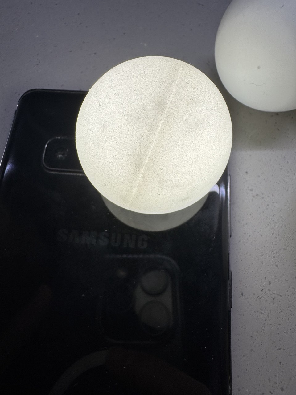
The most satisfying aspect of this project is how the hexagonal display turned out. Despite challenges with LED spacing, ping pong ball imperfections, and a lot of bugs in the code, the final display creates clear, readable numbers while maintaining an artistic quality. The wireless configuration system also worked better than expected, making the clock truly standalone after initial setup.
Future Improvements
Several areas could be enhanced in future iterations. The initial WiFi setup process could be streamlined, perhaps using WPS or a QR code system. The ping pong ball mounting system could be redesigned to better hide the seam lines and create more uniform light diffusion. Adding additional display modes and animations would also make the clock more versatile or even adding a ticker tape and maybe even some games.

