Reading Reflection 4

Computer Vision for Artists and Designers:

In reflecting on this paper on computer vision, I find its potential utility for artists and designers both compelling and distinct from human vision. The difference between computer vision and human vision mostly comes down to senses—humans use their five senses to process information, while computers need fixed algorithms to handle physical or visual data. But once that data is processed, we can program the computer to trigger a specific action based on what it sees.

A lot of the techniques in the paper revolved around pixel tracking, which is basically comparing one pixel to a predefined one until a match is found. This could be useful in something like a salad-sifting machine, where I could train the model to recognize red pixels as tomatoes and have it remove all the red objects, essentially removing all the tomatoes from my salad.

As for how computer vision’s ability to track and surveil affects its use in interactive art, I think it’s a double-edged sword. On one hand, it’s amazing for creating immersive, responsive art that can change depending on how people interact with it—like tracking movement or emotions to alter the artwork in real-time. But at the same time, the idea of constant surveillance can be slightly problematic, especially in art spaces where people want to feel free and unobserved. So, there’s this tension between using computer vision to enhance interactive experiences and making sure it doesn’t cross any lines when it comes to privacy.

Reading Reflection 3

The Design of everyday things:

In “The Design of Everyday Things,” Don Norman critiques the reliance on logic in engineering design, arguing that effective design should anticipate and account for human error. While I understand his perspective, I find myself disagreeing with the notion that design flaws are solely to blame for user errors. Given the vast variability in human behavior, it’s nearly impossible to design for every possible error. For example, consider a standard hinged door: while it might pose no issue for an average person, a shorter individual may struggle with a handle positioned too high. Adjusting the handle height to accommodate one group could inadvertently create challenges for another.

That said, I agree that designers should strive to make their products as intuitive as possible for the average user. This brings me to my frustration with mixer grinders, which I find notoriously difficult to manage. Each new brand presents a unique setup process, often leading to confusion and errors. I believe the design of these devices could be greatly improved by using magnetized parts for easier assembly and reducing the number of buttons to just a power switch and perhaps a safety mechanism, as well as one additional button for varying power levels.

Additionally, one of Norman’s design principles that could enhance interactive media projects is the use of intuitive icons on buttons. These icons should visually convey the action triggered by the button, making it easier for users to understand and interact with the interface.


Assignment 4: Too much Espresso

Concept:

In this project, I visualized the frequency of Google searches for the word “espresso” since the beginning of 2024. My inspiration stemmed from the popularity of Sabrina Carpenter’s song “Espresso,” which has captured attention and sparked interest since its release early this year. This trend led me to hypothesize that the search volume for “espresso” would similarly experience a notable increase.

Sabrina Carpenter sweetens up Coachella 2024 with new retro pop single ...

To explore this hypothesis, I aimed to create a visual representation that illustrates the correlation between the song’s popularity and the search frequency of the term “espresso.” I envisioned an effect that mimics espresso pouring out of a teacup, with the volume of the pour symbolizing the number of searches. This is accomplished using circles: the larger the circle, the greater the volume of searches.

Highlight:

A key highlight of this project was my attempt to ensure that the color of the circles corresponded to the volume of searches for “espresso.” I aimed to create a visual gradient where the shades of brown varied in darkness or lightness based on the search frequency. To achieve this, I mapped the espresso values to a color variable, allowing me to adjust the fill color of the circles by assigning this color variable as an argument to the fill().

  // Color based on espressoValue with brown tones
let colorVal = map(dataPoint.espressoValue, 0, maxValue(), 10, 120); // Adjust the color range for darker tones
fill(colorVal, 40, 20); // More muted brown tones
noStroke();

Finding the right numbers for the brown tones was also a matter of trial and error.
Reflections:

The final sketch of this visualization organizes time in an ascending manner, with the top of the y-axis representing the beginning of 2024 and the lower end depicting the months leading up to the present. The size of the circles indicates the volume of searches, while the shades of brown inversely correlate with search frequency—darker shades represent lower search volumes, and lighter shades signify higher volumes. This relationship may appear counterintuitive to viewers, highlighting one of the significant flaws in this project.

In future iterations, I would aim to reverse this color representation for clearer communication of the data. Additionally, I would like to enhance the aesthetic of the espresso pouring from the cup to create a more natural and visually pleasing effect.

Reading Reflection 2

The art of interactive design:

Chapter One of “The Art of Interactive Design,” Chris Crawford uses the example of conversation to explain the importance of feedback. He points out that just like in a conversation between people, where you expect immediate and relevant responses to keep the dialogue going, interactive systems also need to provide clear and timely feedback to keep users engaged.

Applying this idea to my artwork or interactive sketch, I should think of the system as if it were another person in a conversation with the user. If the system doesn’t respond quickly or appropriately, it’s like talking to someone who doesn’t reply or doesn’t give useful responses. This would make the interaction feel disconnected and less interesting.

In my p5.js sketch with bubbles, if the outer circles don’t react well to user interactions, it’s like having a conversation partner who ignores what you say. For example, if the outer bubbles don’t clearly expand or contract in response to user actions, or if clicking on a bubble doesn’t produce a visible effect, it would be frustrating for users. They wouldn’t get the feedback they need to understand what’s happening or adjust their actions.

To improve this, I should make sure that the artwork responds clearly and promptly to user actions, just like a good conversation partner would. This means making the outer bubbles change size in a noticeable way when interacted with, and adding visual or sound effects when bubbles are clicked. This approach makes the system feel more alive and engaging, similar to how a lively conversation keeps people interested and involved.

Assignment 3: Wallmart OSU

Concept:

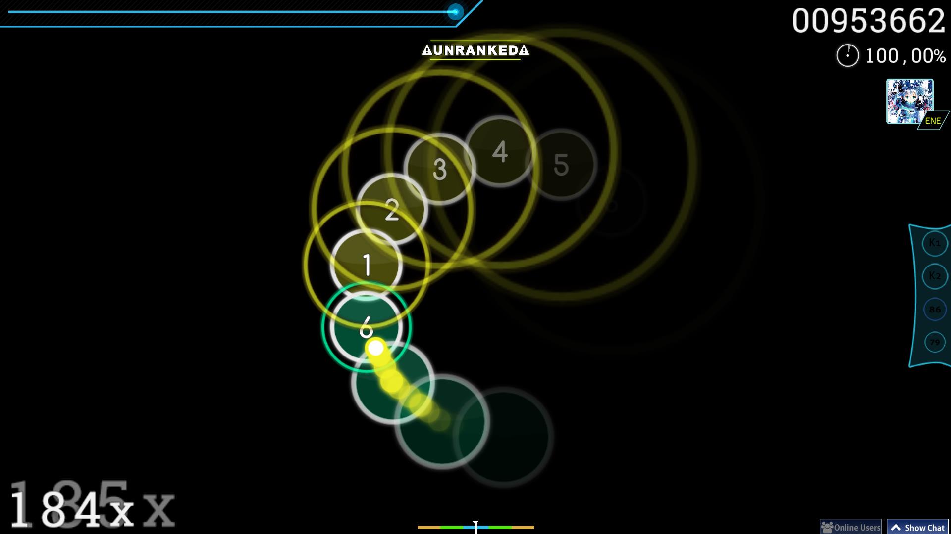
In this project, I utilized objects and classes to recreate one of my favorite rhythm games called OSU. I took inspiration from OSU’s circles mode gameplay where the player needs to click on the ‘beat’ circle once an outer contracting circle coincides with the inner ‘beat’ circle, in time with the rhythm as referenced in the image below.

osu! Skins | Circle People

Highlight:

During the creation of this sketch, I began by simplifying the interface and establishing the core functionality. I decided to start with a canvas containing a set number of circles. When a viewer hovers their mouse over the canvas, outer circles corresponding to the initial circles would appear. These outer circles would contract until their diameter reached zero, then expand again up to a predefined maximum diameter. Additionally, if the viewer clicks on a circle while the outer circle is either within or touching the inner circle, both the inner circle and its respective outer circle would disappear.

To achieve this, I first developed the Bubble class to handle the drawing of the initial circles on the canvas. Next, I created the outerBubble class, which managed the appearance and resizing of the outer circles. I designed functions to make these outer circles appear and update their diameter accordingly.

// Create an outer expanding circle for the bubble
bubblepopper() {
  let outerCircle = new outerBubble(this.x, this.y, 150, this.colorValue);
  this.outerBubble = outerCircle;
  expandingBubbles.push(outerCircle);
}

A key challenge was ensuring that the outer circles correctly enveloped their respective inner circles. I solved this by calling the outerBubble class functions from within the Bubble class, which allowed the outer circles to align precisely with the inner circles.

function mousePressed() {
  // Remove bubble and expanding circle if clicked within the bubble and near the circle
  for (let i = 0; i < bubbleList.length; i++) {
    if (bubbleList[i].click() && expandingBubbles[i].diameter - bubbleList[i].radius < 5) {
      bubbleList.splice(i, 1);
      expandingBubbles.splice(i, 1);
    }
  }

The most difficult part of the project was making the circles disappear when clicked at the right moment. I tackled this by using the splice() method to remove elements from the arrays containing both the inner and outer bubbles. By looping through these arrays, I was able to erase the clicked bubbles efficiently.


Reflections:

In completing this sketch, I aimed to enhance the user experience by introducing complexity through a more interactive and skill-based challenge. The current version allows users to pop bubbles when the outer circle is touching or overlapping with the inner circle. However, I realized that this mechanic doesn’t fully capture the level of precision I initially envisioned for the project.

For future improvements, I would like to introduce a condition where the user needs to be very precise with their timing. Instead of allowing the bubble to be clicked as long as the outer circle touches the inner circle in any way, I want to restrict the interaction so that the bubble can only be popped when the outer circle perfectly aligns with the outline of the inner circle. This would require more skill and quick reflexes from the user, making the game more engaging and challenging. The added difficulty would create a more rewarding experience for players as they master the timing needed to pop multiple bubbles in one session.

Reading Reflection 1

Casey Reas’ Eyeo talk on chance operations:

After watching Casey Reas’s assessment of randomness in art, I’m convinced of its valuable role, especially in the STEM field, where it allows researchers to predict and analyze randomness in their subjects. His explanation reminded me of a study where Japanese researchers used algae to optimize their rail transport system. The algae grew in random, unpredictable ways, yet always found the most efficient pathway to form a network based on the pattern or map of the space in which it was cultured. (In 2010, a team of researchers from Japan and the U.K. fed a slime mold with nutrients arranged to imitate the nodes of the Tokyo subway system. The resulting network closely resembled the actual subway network, leading to the development of biologically inspired adaptive network design.) This study highlights the potential of introducing randomness to the template designs of objects, something Casey Reas often emphasizes in his work.

When it comes to incorporating randomness in my own projects, I find it most effective in creating animations. For example, using a random number generator and initializing it to a variable, then applying that variable as an argument for certain shapes in my self-portrait sketch, allowed me to simulate the movement of the ‘mouth’ shape, giving the illusion of the sketch talking. To me, randomness is most enjoyable and useful when applied in animations.

In the balance between total randomness and complete control, I prefer maintaining more control over an object while leaving some variables to function randomly. This approach not only makes the model more reliable but also allows me to observe and understand the specific randomization patterns more clearly. Much like in research, where we use a “control” scenario to keep experiments fair, having a balance between control and randomness helps detect how certain variables influence the behavior of others.

Assignment 2: Fuzzy Brain

Concept:

In this project, I draw inspiration from the geometric artworks discussed in: COMPUTER_GRAPHICS_AND_ART_Aug1977.  My goal with this project was to explore the potential of ‘for’ loops to generate grids of symmetrical, curved lines, creating a structured, rhythmic design. However, I hoped to disrupt this symmetry by introducing heavy distortion, with the intention of simulating the visual effect of mind fog. The resulting artwork presents a uniform arrangement of curves that distort and displace when the cursor hovers over it, evoking a sense of disorientation and randomness—mirroring the feeling of brain fog.

Highlight:

I’m particularly proud of the distortion animation I added to this sketch. By utilizing the dist() function, I created interactive conditions that are activated when the mouse hovers over the Bézier curves. Using an if statement, I introduced random increments within a range of negative to positive values to the variables used as arguments for the original Bézier curves. This approach helped change the positions of the curve lines at random, adding distortion and creating the brain fog effect that I intended. Additionally, reducing the frame rate helped give the animation a 90’s cartoon effect aesthetic.

// mouse hover animation
    if (dist(mouseX, mouseY, x, y) < 300) {
      // displace lines randomly
      x1 += random(-20, 10);
      y1 += random(-30, 10);
      x2 += random(-40, 10);
      y2 += random(-50, 10);
      x3 += random(-60, 10);
      y3 += random(-70, 10);
      x4 += random(-80, 10);
      y4 += random(-90, 10);
    }
    
    bezier(x1, y1, x2, y2, x3, y3, x4, y4);

Reflections:

While working on this project, I experimented with creating symmetrical grids and distorting the curves to simulate mind fog. Initially, I focused on generating the grids using for loops, but as I introduced interaction through mouse hover effects, I realized how much potential this had to enhance the dynamic nature of the piece. The use of dist() and if() functions to trigger random distortions worked well in creating a more immersive experience.

Looking back, I think there’s room for improvement in making the distortions more fluid and gradual. Currently, the randomness of the distortions can feel abrupt, so in future iterations, I would explore using easing functions to smooth the transitions.

Assignment 1: Aysha’s Self-Portrait

Concept:

For this assignment I use my knowledge of drawing basic shapes in p5*js to create a self-portrait. This portrait is a rough sketch of me, wearing my favorite hairstyle—a high ponytail. Since I’m still relatively new to coding, I chose to keep my approach simple by using basic shapes, lines, and curves to create this sketch. Understanding how the order of code affects the final drawing inspired me to stack shapes strategically, allowing me to capture minute details like the facial features in my portrait.

Highlight:

I’m particularly proud of the eyes in this sketch, as I invested a lot of effort into adding detailed elements that took some time to perfect. My biggest challenge was getting the curves right, especially when it came to the eyebrows and eyelids. Positioning them correctly was tricky, but using the mouseX and mouseY variables was incredibly helpful in determining their relative placement. However, achieving consistent curves across the sketch was the most time-consuming aspect of the entire process.

//eyes
fill(250);
ellipse(180,195,15,20);
ellipse(220,195,15,20);

noFill();
curve(175,230,167,190,194,190,200,230);
curve(180,240,206,190,235,190,220,220);
curve(200,170,167,200,194,200,200,150);
curve(200,155,206,200,235,200,200,170);

//eyebrows
curve(200,175,207,175,239,175,250,220);
curve(150,220,165,175,197,175,280,200);

Reflections:

When drawing the eyelids and eyebrows, I initially used the curve() function, but I later realized that combining noFill() with bezier() would have been a quicker and more efficient approach for creating curves. Additionally, I used the width and height variables to center the head on the canvas, which worked well. However, I believe that applying these variables more consistently throughout my sketch would make the portrait scalable for any canvas size in the future.