Reading Response 6

Don Norman’s exploration of the relationship between emotion and design in “Emotion & Design: Attractive things work better” offers intriguing insights into the intersection of aesthetics and usability in human-centered design. One aspect that resonates with me is Norman’s argument that attractive design not only enhances the visual appeal of products but also influences users’ emotional responses and overall experience. I’ve personally found myself drawn to products or interfaces that exhibit visually pleasing aesthetics, whether it’s the sleek design of a smartphone or the intuitive layout of a website. Attractive design has the power to foster a deeper connection between users and technology.

However, often overly complex or ornate designs detract from usability rather than enhancing it. It’s personally why I prefer Samsung products over Apple (controversial opinion I know). Additionally, Norman’s emphasis on the emotional impact of design raises questions about the role of cultural or social differences in shaping users’ aesthetic preferences. For older people or people not familiar with technology in general, they prefer simplicity and usability over aesthetic. For children, what we call “modern and chic” design, to them it’s boring and not aesthetic.  Overall, the article prompts me to reconsider the importance of balancing form and function in design and to prioritize user-centric approaches that prioritize both practicality and emotional engagement.


Margaret Hamilton’s story in “Her Code Got Humans on the Moon” resonates deeply, serving as a poignant reminder of the pioneering spirit and resilience of women in STEM fields. Her groundbreaking contributions to the Apollo space program not only shattered gender norms but also redefined the boundaries of what was achievable in the realm of technology. Hamilton’s ability to navigate the challenges of being a working mother in the 1960s while spearheading revolutionary advancements in software engineering is nothing short of inspiring to me. Her determination to challenge societal norms and carve out her place in a predominantly male-dominated field resonates profoundly with my own experiences of striving to be valued in a field like computer science.

The reading thus prompted me to reflect on the persistent gender disparities that continue to plague the tech industry today. There is also reluctance to acknowledge the contributions of women in STEM. It’s common for women’s credit being overshadowed by men such as in the case of Rosalind Franklin or Ada Lovelace. Similarly, people only remember Neil Armstrong and Buzz Aldrin, but rarely Hamilton’s pivotal role in making the mission even possible. As I reflect on her journey, I am reminded of the importance of forging ahead despite the barriers we face, and striving to leave my own mark on the ever-evolving landscape of technology.

Midterm Project: Catch ’em

Game:

Link to fullscreen: https://editor.p5js.org/aneekap/full/En7_lTESA

Overall Concept of the Project:
CATCH ‘EM is a catching game with two levels but with a twist. Inspired by two of my favorite shows, Demon Slayer and Avatar: The Last Airbender, in this game, the player needs to catch the “good guys” and avoid the “bad guy” to survive. Elements fall from the top of the screen randomly, and the player controls a basket at the bottom to catch the falling elements. The goal is to accumulate points by catching enough good guys before the timer runs out. The game incorporates changing themes and increasing difficulty as the player progresses. Additionally, power-ups appear occasionally, providing the player with special abilities such as temporary immunity to the villain.

Working :
The game utilizes OOP to create subclasses of the Element class with varying features. The game grid is defined by invisible tiles, allowing precise positioning of falling elements. Elements move vertically in tile increments, and collision detection occurs when their coordinates align with the basket’s position, triggering consequences. The game employs frame-based updates to control element speeds. Levels are managed through conditional checks on scores. The player controls a basket moves horizontally using left and right arrow keys to catch the elements.

More specifically, the game operates within a structured grid system defined by the number of rows and columns. Each element, whether it be a hero, villain, or power-up, is represented by an object that inherits from the Element class. These objects are initialized with random starting positions along the columns of the grid. The update method of the Element class ensures a downward motion, simulating the falling effect. The catch method detects whether an element is caught by the player’s basket.

The code I wanted to highlight is how the gameplay works for each level. I used arrays for the different classes to create the elements at each level and used framecount to control the number of elements on the screen to avoid overcrowding.

display() {
    if (SCORE >= 3 && SLIDE == 2) {
      SCORE = 0;
      this.villains = [];
      this.powerups = [];
      this.heroes1 = [];
      SLIDE = 3;
      TIMESTART = millis();
    }

    if (SLIDE == 3) {
      image(inst2, 0, 0, width, height);
    }

    if (SCORE >= 5 && SLIDE == 4) {
      SCORE = 0;
      this.villains = [];
      this.powerups = [];
      this.heroes2 = [];
      SLIDE = 5;
    }

    if (SLIDE == 5) {
      WIN = true;
      this.Play = false;
    }

    // LEVEL 1
    if (SLIDE == 2) {
      image(bg1, 0, 0, this.w, this.h);

      if (frameCount % 3 == 0) {
        this.heroes1.push(new Heroes1());
      }
      for (let hero of this.heroes1) {
        hero.display();
        if (hero.y >= height + 40) {
          // Removes character once it exits the screen
          this.heroes1.splice(this.heroes1.indexOf(hero), 1);
        }
      }
      if (frameCount % 5 == 0) {
        this.villains.push(new Villain(1));
      }
      for (let villain of this.villains) {
        villain.display();
        if (villain.y >= height + 40) {
          this.villains.splice(this.villains.indexOf(villain), 1);
        }
      }

      if (this.powerups.length < 2) {
        this.powerups.push(new PowerUp(1));
      }
      for (let powerup of this.powerups) {
        powerup.display();
        if (powerup.y >= height + 40) {
          this.powerups.splice(this.powerups.indexOf(powerup), 1);
        }
      }

      textSize(30);
      text("LEVEL 1", width / 2 - 60, 45);
      textSize(25);
      text("Aim: 3", width - 100, 80);
      textSize(25);
      text("SCORE: " + SCORE, width - 120, 45);

      let COUNTDOWN = 20 - (millis() - TIMESTART) / 1000;
      if (COUNTDOWN <= 0) {
        this.Play = false;
      }
      text("Time: " + floor(COUNTDOWN), 20, 45);

      this.basket.display();
      this.basket.update();
    }

    // LEVEL 2
    if (SLIDE == 4) {
      image(bg2, 0, 0, this.w, this.h);

      if (frameCount % 2 == 0) {
        this.heroes2.push(new Heroes2());
      }
      for (let hero of this.heroes2) {
        hero.display();
        if (hero.y >= height + 40) {
          this.heroes2.splice(this.heroes2.indexOf(hero), 1);
        }
      }

      if (frameCount % 4 == 0) {
        this.villains.push(new Villain(2));
      }
      for (let villain of this.villains) {
        villain.display();
        if (villain.y >= height + 40) {
          this.villains.splice(this.villains.indexOf(villain), 1);
        }
      }

      if (this.powerups.length < 2) {
        this.powerups.push(new PowerUp(2));
      }
      for (let powerup of this.powerups) {
        powerup.display();
        if (powerup.y >= height + 40) {
          this.powerups.splice(this.powerups.indexOf(powerup), 1);
        }
      }

      textSize(32);
      text("LEVEL 2", width / 2 - 75, 45);
      fill(0, 0, 0);
      textSize(30);
      text("Aim: 5", width - 100, 80);
      textSize(25);
      text("SCORE: " + SCORE, width - 120, 45);

      fill(255, 255, 255);
      let COUNTDOWN = 15 - (millis() - TIMESTART) / 1000;
      if (COUNTDOWN <= 0) {
        this.Play = false;
      }
      text("Time: " + floor(COUNTDOWN), 20, 45);

      this.basket.display();
      this.basket.update();
    }
  }

I took the graphics from the web and cropped them accordingly.


The background music was taken from YouTube and was taken from the Original Soundtrack of the shows.

Level 1: https://www.youtube.com/watch?v=HcvK20wWQDw

Level 2: https://www.youtube.com/watch?v=OqJec3–RXc


Challenges Faced and Areas for Improvement:
The hardest part was having an organized structure of classes and reducing redundancy by using inheritance wherever possible. The other challenge was having so many elements on the screen at once and ensuring it didn’t glitch by deleting elements correctly. I was also not able to make a full-screen mode since the images and tiles were getting stretched and did not work as well.
An area for improvement is ensuring that elements don’t overlap. Since elements are generated randomly, preventing them from overlapping proved difficult. I would also like to add more levels/modes.

Overall, I am happy with the outcome and it was a fun project to work on.

Reading Response 5: Computer Vision for Artists and Designers

This article provided a fascinating exploration of the evolution of computer vision technology and its integration into the realm of artistic expression. Among the showcased artworks, “Standards and Double Standards” by Rafael Lozano-Hemmer particularly intrigued me due to its metaphorical approach to incorporating computer vision. What captivates me about this piece is its ability to evoke complex narratives and reflections on societal dynamics through a seemingly simple and tangible interaction. The choice of belts and their rotation adds a layer of symbolism, raising questions about control, authority, and the implications of automated surveillance. 

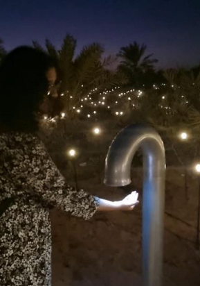
This artwork also reminded me of an immersive installation I experienced on Lulu Island in January, “Pulse Island” by the same artist. It featured stations with PPG pulse sensors that detected the participant’s heart rate, surrounded by an array of over 4,000 Edison lightbulbs. Consequently, the lightbulbs around that area glimmer to the rhythm of the heartbeat as the speakers echo the heartbeat. As people add a new recording of their heartbeat, the oldest recording in the group is replaced, creating a Memento Mori. By capturing and recording this physiological data, it felt like the artwork was engaging in a subtle form of surveillance of the participants’ vital signs.

It is also important to look at the ethical considerations surrounding the use of computer vision. I was recently invited to an event with industry experts where we discussed ethical considerations of AI and it prompted me to reflect on the following. One primary ethical concern highlighted is the potential misuse or unintended consequences of technology originally designed for creative and benign purposes. The shift from artistic experimentation to potential mass surveillance raises questions about the responsibility of creators and the broader ethical framework within which these technologies operate. Another controversial issue in computer vision is bias and fairness. Surveillance Algorithms can exhibit biases based on the data they are trained on. This bias can lead to discriminatory outcomes, influencing areas such as hiring, law enforcement, and financial services. Moreover, there are several privacy concerns associated with surveillance technologies. The integration of computer vision in art installations blurs the boundaries between observation and intrusion. For example, I wasn’t aware that our heart rates were being stored in a database for a while before I participated in the installation.

Assignment 5: Midterm Progress

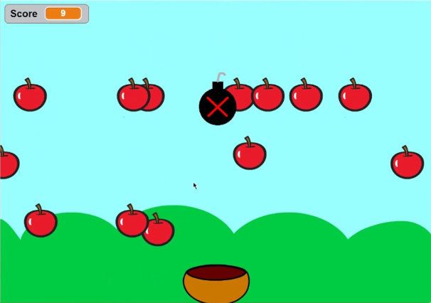
For my Midterm Project, I wanted to create a simple yet fun and interactive game that you could play on the go. I decided to create “Catch It!”, a catch game where elements fall from the top and the player needs to move the basket to avoid bombs and collect enough elements before the time ends to move onto the next level.


(Reference)

My game would consist of elements falling from the top of the screen randomly at different positions. There would be a basket present at the bottom which is controlled by left and right keys. Every element that is caught by the basket gives points to the user. However, if a bomb is falling, the user should move to another position and try to avoid it. There will be a time limit for every level. If the user gains enough points within the time limit, they move on to the next level. The difficulty increases with each level. The speed of falling elements will increase, the frequency of bombs will increase, and the time given will decrease. Furthermore, once in a while, a special power-up element will fall, which if you are able to catch will make you immune to 1 bomb. For each level, the player gets to choose a theme.

I implemented a prototype just to test the falling and collision detection, the most crucial parts of the game. The screen is divided into rows and columns forming tiles. The element would fall tile by tile down the screen from a random column and will either be caught by the basket or miss the basket and go out of the screen. Once the element goes off-screen, it respawns at the top.

Here is what my sketch looks like so far:

Reading Response 4: The Design of Everyday Things

Upon delving into “The Psychopathology of Everyday Things,” I found Don Norman’s exploration of design principles and challenges to be thought-provoking and relevant. The idea that technological advancements, while promising increased benefits, also introduce more complexities and challenges in usability, is a stark reality in today’s rapidly evolving tech landscape. This made me think of the evolution of smartphones, which our generation was the last to experience. Initially, phones were simple – calls, texts, and perhaps a basic camera (remembering my flip phone). However, we now have smartphones that can do almost everything but are accompanied by a myriad of complexities. Consider the addition of facial recognition, Bluetooth, and a multitude of applications on our smartphones. While these features enhance functionality, they often lead to confusion and frustration– such as the times I’m fumbling through settings and menus on my smartphone, realizing that the very advancements intended to make life easier can, at times, make it more challenging.


I believe that technology should enhance, not complicate, our lives. Thus I agree that as we embrace innovation, designers must prioritize user experience and human-centred design to ensure that technological progress truly benefits users. For example, the shift from traditional wired earphones to wireless counterparts provided a significant leap in user convenience. Wireless earphones, like Apple’s AirPods, offer users unparalleled freedom of movement and freedom from tangled cords. However, it introduced new challenges, such as using touch gestures, which might not always be intuitive. Moreover, since the two buds are not connected, it was very easy to misplace them.

To strike a balance between innovation and user-friendliness, designers should adopt a user-centric approach. Conducting extensive user testing and feedback sessions can provide invaluable insights into which features are genuinely beneficial and how users prefer to interact with them. Prioritizing essential functions and ensuring that they are easily accessible, perhaps through intuitive gestures or a clear menu hierarchy, may help prevent users from feeling inundated. For example, the ‘Find My AirPods’ feature was added to address the challenge of potential loss. Overall, achieving equilibrium involves understanding that not every technological advancement needs to be incorporated if it compromises usability.

Assignment 4: Cards For Humanity

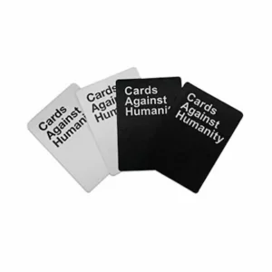
For this assignment, I wanted to create a generative text output. I was thinking of games that play with words and phrases and I immediately thought of Cards Against Humanity. So I wanted to create a PG version that just uses playful humor and thus called it “Cards For Humanity”:)

The way my game is played is that the user first clicks on the deck of black cards and reads the prompt. Then, they will click on the deck of white cards and read the comical response. They can then click the button below to try multiple rounds. It is based on the party game below:
The part of my code that I want to highlight shows how I fit the varying text within the card. Since I didn’t want to limit the length of the text or the size of the font, I could only make the text fit by separating it into different lines. Words are added to the same line until it exceeds the max length.

function drawSelectedCard(x, y, cardText, isBlack) {
  fill(isBlack ? 0 : 255); //checks if card is from black deck and assigns color
  rect(x, y, cardWidth, cardHeight, 10);

  fill(isBlack ? 255 : 0); //text color opposite to card

  // Split the card text into lines to fit within the card
  let lines = splitLines(cardText, 70); //Maximum characters per line set to 70

  // Display each line of text within the card
  for (let i = 0; i < lines.length; i++) {
    text(lines[i], x + cardWidth / 2, y + cardHeight / 2 - (lines.length - 1) * 10 + i * 20); //vertical centering
  }
}

function splitLines(text, maxLength) {
  let words = text.split(' '); //split text into array of words
  let lines = [];
  let currentLine = '';

  for (let i = 0; i < words.length; i++) {
    if (textWidth(currentLine + words[i]) <= maxLength) { //checks if adding the current word to the current line exceeds the maximum length
      currentLine += words[i] + ' '; }
    else {
      //if the max length is exceeded, push the current line to the array and start a new line
      lines.push(currentLine);
      currentLine = words[i] + ' ';
    }
  }

  lines.push(currentLine); //push the last line to the array
  return lines; 
}

Overall, I am happy with the output. I would like to work further on this by adding more amusing prompts and responses. I would also like to improve the game by letting the user choose the best response from their set of already-selected white cards, like the actual game. Lastly, I could organize my code better by using OOP and making the cards objects.

Reading response 2: The Art of Interactive Design

Even though we are studying “Interactive Media”, I didn’t ponder much about how interactivity should be defined until I read this article. Crawford’s definition, framing it as a cyclic process where two actors alternately listen, think, and speak, seemed interesting but not all-encompassing. His skepticism about labeling everything as interactive, especially in the context of books or movies, got me thinking. It nudged me to consider a spectrum of interactivity rather than a black-and-white definition.

Low interactivity, for me, could be akin to interacting with a traffic light. While it responds to user input (pressing the button to cross the street), the interaction is limited to a predefined set of responses (changing the signal). Medium interactivity might resemble using a smartphone. While navigating through apps, users can input commands, receive feedback, and customize settings. The smartphone’s interface allows for a degree of personalization and responsiveness to user actions, but it still operates within the confines of preprogrammed functionalities. High interactivity can be exemplified by AI LLM chatbots since their capacity to comprehend intricate language inputs, showcase contextual understanding, respond coherently, and even generate creative content reflects a higher level of engagement. They can generate human-like text and personalized responses yet still lack the consciousness of a human being. However, it is starting to get borderline difficult to differentiate their responses from genuine understanding with bots like Character.ai.

Furthermore, Crawford’s distinction between user interface design and interactivity design struck a chord. It made me reflect on projects where the interface might be visually appealing but lacks the holistic experience that interactivity design aims to achieve. It aligns with my belief that interactive design should engage users not just visually but also cognitively. True interactivity is like a dance of ideas, not a one-way street.

Assignment 3: Dynamic Blend


(Click on screen)

For this assignment, I wanted to create a simple yet appealing and interactive artwork. When the user clicks on the canvas, a few balls of random color appear. These balls move independently, colliding and combining with other balls to form a new ball with the additive color of the two original balls, gradually filling the canvas with a visually striking pattern. I wanted to experiment with the Additive color theory and show how simple colors can create unexpected results.

I created a BouncingBall Class so that each ball is an object with the same properties. The part of the code I am most proud of is initializing the speed and direction for the ball using random and the ternary operator.

constructor(x, y, color) {
    this.x = x;
    this.y = y;
    this.color = color;
    this.radius = 20;
    //vaying speed and direction
    this.speedX = random(2, 4) * (random() > 0.5 ? 1 : -1); //50% chance of true and false; If the result is true, assigns 1, otherwise, assigns -1
    this.speedY = random(2, 4) * (random() > 0.5 ? 1 : -1);
  }

Initially, only one ball was formed using each click, but to make it more interesting, I decided to create balls around the click location in a triangular formation. I used polar coordinates for this, similar to my previous assignment.

function mouseClicked() {
  let randomColor = color(random(255), random(255), random(255));
  //creating multiple balls around location
  let formationRadius = 60; //distance from click
  for (let angle = 0; angle < 360; angle += 120) { //3 balls at equal angles
    //polar coordinates for position
    let x = mouseX + cos(radians(angle)) * formationRadius; 
    let y = mouseY + sin(radians(angle)) * formationRadius;
    let backgroundBall = new BouncingBall(x, y, randomColor);
    ball_array.push(backgroundBall);
  }
}

The only technical challenge I initially faced was making sure the two balls that collide create a new ball with their combined color and that the original balls disappear. The other challenge was to make it look aesthetically pleasing. This is why I decided to add the blurred trails for the balls.


I also wanted to highlight that final result was inspired from my initial idea: red and blue balls combine to make a growing purple ball.

(click on screen)
This idea was inspired by the same anime character in my portrait from the first assignment.

Overall, I am satisfied with my final output. It might not be as unique as I wanted it to be since it was also inspired by previous assignments we did in class. However, it looks visually pleasing and was fun to make. I would like to improve the artwork by creating a pattern in the background using the combined colors.

Assignment 2: Reading response

Casey Reas’ talk provides an interesting glimpse into the intersection of art and chance, challenging conventional notions of control and order in artistic creation.  The artists’ work utilizes the juxtaposition of order and chaos, a theme prevalent throughout art history, using chance operations and randomness. The transition from early controlled coding to the exploration of emergent behaviors reflects a shift in the artist’s mindset, raising questions about the role of intentionality in the creative process.

The exploration of algorithms, particularly in the tissue simulation based on Valentino Braitenberg’s Vehicles,  was fascinating for me. The simulated behaviors of conceptual vehicles responding to their environment introduce an element of unpredictability and organic growth. Reas’ emphasis on the paths taken by these vehicles rather than their static positions resonates with the idea that the journey, filled with constant restructuring, holds artistic significance. This challenged my conventional understanding of art as a static, predetermined outcome, urging me to appreciate the dynamic nature of the artistic process. 

Also, Reas’ exploration of biological data in the “Signals” artwork, visualizing the communication among proteins within a cancer cell was another intriguing piece due to the deliberate combination of structure and randomness in determining the position and scale of protein cluster. It’s as if the artwork becomes a dynamic representation of the delicate dance of life at the cellular level.  Overall, the concept of chance in art prompted me to reconsider the traditional boundaries of creative control as well as made me rethink the dynamic outputs we can create from algorithms.

Assignment 2: Fireworks Frenzy


(Click on screen)

For this assignment, I wanted to create something that looks appealing but is interactive as well. Ever since we learnt loops and manipulating speed and colors, I wanted to create a display of fireworks, because fireworks are something I admire not just as a kid but even now.

When the user clicks on the canvas, a new firework is created at that position. The firework ascends from below the screen, and when it reaches its designated height, it explodes into a burst of lines, each growing in length until it reaches a random maximum length. Once a firework is exploded, it is removed.

I implemented this by using an array to store and delete the fireworks and an array for the lines for each firework. I used 5 for loops: the first one is to iterate over the fireworks array and call the functions (in reverse order since we are deleting items), the second one is to iterate over the lines array and increase their length, the third one is to recheck that all lines reached its max length and updating the ‘done’ flag (this was to fix some glitches), the fourth one is to have the lines of the firework at different angles around the center, the fifth one is to find the endpoint of each line using the length and angle to finally create the firework.

I am happy with the entire code since I had to learn how arrays and functions work to implement this. What helped was that I am familiar with using arrays in Python and C++. The part that I am particularly proud of though is the function that brings everything together, since I had to recall how polar coordinates work to find the endpoint of a line:

function showFirework(firework) {
  R = random(10,250);
  G = random(10,250);
  B = random(10,250);
  stroke(R,G,B);
  strokeWeight(2);
  fill(R,G,B);
  if (!firework.isExploded) {
    ellipse(firework.x, firework.y, firework.radius * 2, firework.radius * 2); //center of firework
  } 
  else {
    for (let i = 0; i < firework.lines.length; i++) {
      //determining end point of line using angle and length
      const xEnd =
        firework.x +
        cos(radians(firework.lines[i].angle)) * firework.lines[i].length; //polar coordinates
      const yEnd =
        firework.y +
        sin(radians(firework.lines[i].angle)) * firework.lines[i].length;
      line(firework.x, firework.y, xEnd, yEnd);
    }
  }
}

Overall, I am satisfied with the output. In the future, I would like to make it more realistic by adding some fireworks using particle explosion as well as adding sound.