Assignment #5 – Code – ☆Midterm Progress☆

Concept and Inspiration

For my midterm, I want to create some sort of audio-reactive (?) artwork. I am unsure about the audio-reactive part because I don’t think I want it to actually live react to audio; rather, I want the artwork to depend on the preloaded sounds.

Essentially, I created a playlist of 12 songs. I want to upload these songs and their matching cover images as well as the title and the artist. The idea is that the user can switch between songs with the left and right arrows keys, and the visuals in the background will change depending on which song is playing.

Here are the songs I picked:

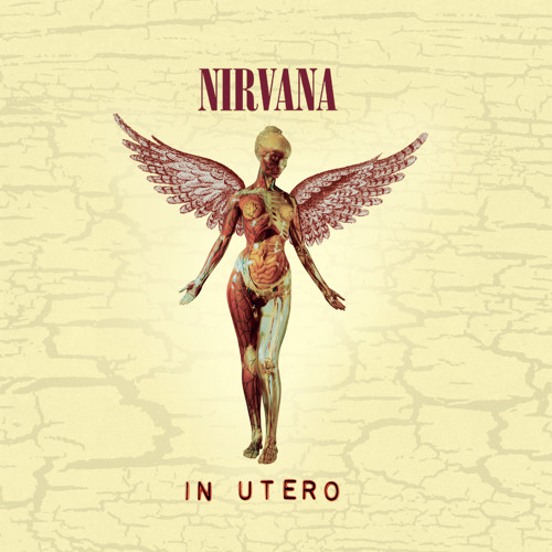
  1. Heart-Shaped Box – Nirvana
  2. Cool Colorado – La Femme
  3. Weak For Your Love – Thee Sacred Souls
  4. Spooky – Dusty Springfield
  5. Karma Police – Radiohead
  6. Buddy’s Rendezvous – Lana Del Rey
  7. Althea – Grateful Dead
  8. Naive – The Kooks
  9. Drink Before The War – Sinead O’Connor
  10. Right Down The Line – Sam Evian
  11. She – The Blaze
  12. Belong In The Sun – ¿Téo?

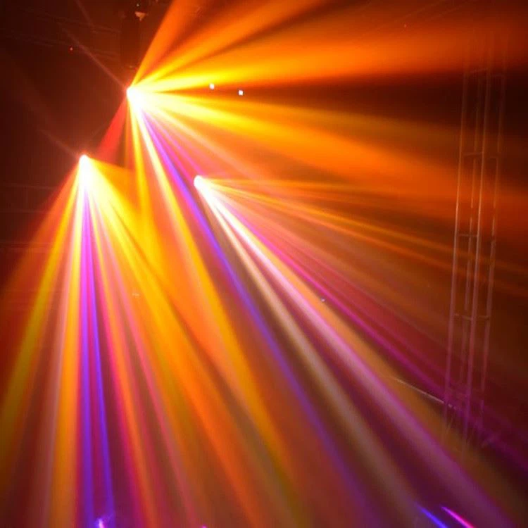
My inspiration comes from the feelings I get when I listen to music. Sometimes, I just lay in bed and close my eyes and I start visualizing the energy of the music. So I simply wanted to create an artwork that matches visuals to music.

Back to my first uncertainty, I think I want the visuals to depend on the characteristics of the song itself. In other words, I would like to extract the amplitudes and frequencies of each songs and load them in the functions of the visuals in order for them to control what the visuals will look like.

For the visuals, I want to have some sort of melting effect. That is what will be controlled by the characteristics of the music. I am also thinking, for the color, whether to also have it controlled by one of the music’s characteristics or whether it should be based on the colors of the cover image (by extracting the pixels).

Risks and Problems
  1. I tried loading the songs as mp3 files and most of them didn’t work. The only two that worked I had compressed through a website as they were over 5mb. The other ones wouldn’t load for some reason, so I need to figure that out.
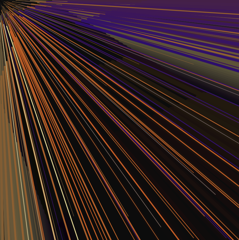
  2. I tried playing with the visuals a bit, but I am not satisfied. As I am still exploring how to make them, I think it will take some time for me to achieve something close to what I want to get. Basically, I tried to create lines that have a melting effect by using Perlin noise, in order to make it dynamic
  3. I think the hardest part will be having the amplitude/frequency of the music control the visuals. I will be working on that next!
Sketch Progress

Anyway, here is what my sketch looks like so far (I hate!!!! the way the background looks like currently):

You can use the left arrow and right arrow keys to switch between songs, though no music will play :/

What’s Left to Add and Change
    • At least one sound (12, technically)
    • A screen giving instructions and wait for user input (button / key / mouse / etc.) before starting
    • A way to start a new session (without restarting the sketch), though I’m not sure what exactly this would entail
    • The shape, perhaps, and to have it controlled by the music
    • The colors, and to have them controlled either by the music or by the cover image – then the text will be more readable hehe

Assignment #5 – Reading Response – Surveillance Against Surveillance

I really enjoyed reading this text, particularly discovering the artworks on surveillance. I find it quite ironic (but in a good way) that a lot of artworks that want to talk about surveillance, employ some sort of surveillance themselves. Of course, here, surveillance has to be looked at in the wider sense. Usually, when we think surveillance we imagine CCTV or hidden cameras. However, as the text mentions, human tracking is also included under surveillance. So, even artworks that simply track your body movements, as basic as the Cheese installation by Möller, can be said to be «surveilling» you in a way. There are also the other forms of human tracking, like Lozano-Hemmer’s Standards and Double Standards, which involve more intense forms of surveillance and tracking. To have items following you takes the «scrutiny» to a different level. Reading about this artwork reminded me of the Manar Abu Dhabi exhibition which took place last fall. It included 35 artworks, many of which were installations. The one that Lozano-Hemmer’s work reminded me of is the Abu Dhabi Dots by Carsten Höller, which was exhibited on the shore of the Corniche beach. Essentially, there are projected spotlights on the sand, and when you stand on them and move, they move with you.

After reading about it now, I found out that it is actually a game. Here is the description:

“Operating as a reward and punishment game, you can upgrade from red to blue by overlapping your dot with a blue dot, and can then move to green, and white. People you are playing with who are overlapped are downgraded. 

But if a series of red dots join an interrupted chain or cluster, the dots all become white. If not, the game continues until 7 or more white dots don’t overlap with other white dots any more.”

Before reading this text, I hadn’t thought much about it, but now I realize that it is a form of tracking after all. And although it seems like a game for children, the whole «reward and punishment» part of it actually reminds me a bit of surveillance and scrutiny, where your actions can favor you but also disadvantage you, while also impacting other people around you. It is therefore interesting to see how computer-based tracking artworks feed into the idea of surveillance, and potentially how they use our data (and store them?).

Assignment #4 – Reading Response – Mundane Acts Made Hard

This text reminded me of the book «Thinking, Fast and Slow» by Daniel Kahneman, in which he talks about the two modes of thinking. The first is «System 1», which is the intuitive and fast way of thinking, and the other is «System 2», which takes more effort and conscience. Often, when we learn new things, we think with System 2. Eventually, it becomes more «automatic» and therefore turns into System 1. One example of this is how we learn how to multiply as children. For instance, to solve «2 x 3», at first we count on our fingers. It is a more conscious effort, therefore involving System 2. Over time, we learn the solution to «2 x 3». Thinking the solution to that multiplication becomes automatic, therefore turning into a System 1 way of thinking. The bottom line is through repetition, we do things more intuitively, without thinking much about them. In relation to Norman’s descriptions of poor design, there seems to be some things which will never be systematic, though they should be easy to use. The example of the doors is well fitting. We push and pull through a number doors everyday, yet there will still be moments in which we push instead of pull, or push on the wrong side of the door. An example that came to mind when I read this was SD cards and SD card readers. As a film major, I cannot begin to count the amount of times I have had to insert an SD card into a reader. Yet, I never manage to put it in the right way. The worst part is: it gets stuck if you put it in the wrong way. For something that should be so easy, it takes a lot of mental effort to do. Even when the SD card symbol is on the reader in order to instruct in which way to insert it, it just does not come to me. I would think that maybe it is just a me issue, but I have seen this happen with so many people, whether they be filmmakers who do this repetitively or not.

At the end of his text, Norman talks about how technology is supposed to make things easier yet manages to make it harder sometimes. He gives the example of the phone, to which so many unnecessary functions are added making it so complicated. But even in much more simple things, this also happens. Automatic doors for instance are enabled by sensors. But there have been so many times in which the sensors don’t work, leaving you stranded outside or locked inside. Poor design and some bad technology therefore make mundane acts so complicated sometimes…

Assignment #4 – Code – ☆Meticulous Misleading☆

When we learned how to do data visualization, I immediately knew that this is what I wanted to do for this assignment. I find data very interesting, but probably not for the reasons you think. Ever since I am little, my dad tells me to think about and interpret data critically. In fact, data is very nuanced in the media. In many aspects of journalism, digital or not, the data may be honest. However, it is not about the data itself. It is about how it is presented.

I remember one instance two years ago: my dad showed me a  two-sided graph comparing deaths due to two different factors over time (I can’t remember what the factors were, nor can I find the picture unfortunately). At first glance, the two graphs seemed pretty similar. But after looking closely, the x-axis for factor A went from 0 to 10, whereas the x-axis for factor B went from 0 to 100. Therefore, the visual representation was very misleading. So, data is in fact about how it is presented, and often, it will be presented in a way that favors the author’s argument despite it being deceitful – whether that be by withdrawing or skewing information

For this assignment, then, I wanted to visualize data in a way that would say ABSOLUTELY NOTHING to the reader. I just wanted to make a sort of artwork with it to prove my point. I searched for “art” on Kaggle, and found a sheet containing the artists whose works are featured in the MoMA collection. Here is the link to the file: https://www.kaggle.com/datasets/momanyc/museum-collection

And here is my sketch:

The data I first wanted to visualize was the gender of the artists, in order to create some sort of visual comparison between the number of male and female artists featured in the collection. For that, I mapped the birth and death years to the canvas, which I then used to represent circleX and circleY respectively (I ended up switching from circles to points, so I just used circleX and circleY as the coordinates for the latter). I then used an if else function to attribute the colors green to female artists and orange to male artists.

Then, I started working on turning the visualization into an inaccurate/incomplete one:

  1. I changed the mapping to include birth years only after 1850, although some were born between 1730 and then. Similarly, I only included the artists who died after 1900, though some died between 1795 and then.
  2. I added 50 to both the width and the height in the mapping in order to “enlarge” the position of the sketch.
  3. I added a random component to circleX and circleY, which slightly randomized the position of each point, making it dynamic.
  4. I used the sin function to randomize the size of each point. Some are therefore bigger, and some are smaller, creating some sort of “illusion” when it comes to the data.
  5. I animated the background to transition from orange to green to black continuously. This way, you sometimes see all the points, sometimes only the green ones, and sometimes only the orange ones. It all depends then on at which point of the sketch you look, and you will see different things.
  6. Finally, I set the alpha of the background to 70 in order to have a trail. This gives the impression of having more points than there actually are.

For parts 5 and 6, here is the code:

//   mapping the sin value to different colors
let sinValue = (sin(angle) + 1) / 2;

let r, g, b;

if (sinValue < 1 / 3) {
  // transitions from black to green
  r = map(sinValue, 0, 1 / 3, 0, 215);
  g = map(sinValue, 0, 1 / 3, 0, 234);
  b = map(sinValue, 0, 1 / 3, 0, 193);
} else if (sinValue < 2 / 3) {
  // transitions from green to orange
  r = map(sinValue, 1 / 3, 2 / 3, 215, 232);
  g = map(sinValue, 1 / 3, 2 / 3, 234, 103);
  b = map(sinValue, 1 / 3, 2 / 3, 193, 42);
} else {
  // transitions from orange back to black
  r = map(sinValue, 2 / 3, 1, 232, 0);
  g = map(sinValue, 2 / 3, 1, 103, 0);
  b = map(sinValue, 2 / 3, 1, 42, 0);
}

background(r, g, b, 70);

I feel like I’ve achieved what I wanted to, and as usual, it has been a learning process. I would say I didn’t really encounter any difficulties, I just had fun practicing data visualization especially in my own little way 🙂


Assignment #3 – Reading Response – Are All Interactions Interactive?

After reading this text, it seems to me that there are two views on interactivity. The first is the overused, underunderstood meaning of interaction or interactivity, which Crawford criticizes. In that definition, interactivity bases itself on the premise that any person or object coming into contact with another object forms an interaction. The “interactive” rug, for example, is fitting, because the child logically “interacts” with the rug. Yet, the rug doesn’t return anything. That is the same for the fallen tree. In fact, in those cases, humans act or react, but do not interact. The other meaning of interact, which Crawford defines, claims that both entities should “listen, think, and speak” (that is, literally or metaphorically). But even when the two entities are capable of doing so, it doesn’t mean that they are doing it well. So, can “bad” interactivity be disregarded as interactivity altogether? Though bad, doesn’t it warrant already that the interactivity is present?

Another point that follows is that of interactivity design. Based on the aforementioned definitions, it is interesting to think about the role of the interactive designer. The latter, in “interactivizing” their design, acts on a computer. But then, can that be called interaction? Or is the interaction merely the exchange between the viewer and the final design? I believe that in a lot of cases, yes, we can say that the designer creating the design forms an interaction with the computer, but are there cases in which one of the three components of interaction lack?

Assignment #3 – Code – ☆Manic! At The Disco☆

For this assignment, I wanted to create a visual experience inspired by orange, purple, pink, and yellow club lights:

I love how the lights all stem from one source, but I did not want to limit myself to that, so I thought I could create some sort of tridimensional effect with trailing that could better represent the “feeling” of experiencing those club lights.

So I created a line class and made 10 lines (with bezier curves) that all begin at (0,0) with varying speeds. I also lowered the background alpha to 10, as transparency allows for trails, which I wanted in order to create this dynamic effect. I tried multiple shapes, but ended up opting for bezier curves. The points for the bezier curves all follow the same line, which is why there is no “curve” per se. However, the movement of the bezier curves looked much nicer than that of the lines, which is why I chose that. The bezier curves also emphasized the 3D effect better than the lines.

Every once in a while, then, the lines meet around the top corner, reproducing the effect of disco lights, before each going their own way once again:

For the colors, I created an array of five different colors which I then incorporated into a linear interpolation function in order to create a gradient:

With the help of ChatGPT, I set two data points, “this.currentColorIndex” and “this.nextColorIndex”. For the first, I randomized from the array so that the first color of each line varies. The second data point set the following color, incrementing the index of the previous “current” color by 1, ensuring that the “next” color that appears depends on the previous color.

this.currentColorIndex = floor(random(colors.length)); // set the starting color of each line as a random color from the "colors" array
this.nextColorIndex = (this.currentColorIndex + 1) % colors.length; // ensure the "next" color for each line depends on the initial randomized color
this.lerpAmount = 0; // begin with no interpolation

Then, in the display function inside the class, I set three variables: “currentColor”, “nextColor”, and “displayColor”, in which I set the data from above. The first two variables are then implemented in the third, which is itself incorporated in the stroke function. Altogether, this is what allows the lines to be displayed in the different colors.

display() {
  let currentColor = color(colors[this.currentColorIndex]); // setting the "current" color variable
  let nextColor = color(colors[this.nextColorIndex]); // setting the "next" color variable
  let displayColor = lerpColor(currentColor, nextColor, this.lerpAmount); // setting the "display" color variable
  stroke(displayColor);
  strokeWeight((this.x + this.y) / 40);

Finally, I created a last function called “updateColor” in which I set the linear interpolation amount and create an “if” function for it to reset (and hence for the colors to keep varying).

updateColor() {
    this.lerpAmount += 0.04; // linear interpolation amount to define the speed of the transition

    if (this.lerpAmount >= 1) { // when linear interpolation amount exceeds 1, reset it to 0
      this.lerpAmount = 0;
      this.currentColorIndex = this.nextColorIndex;
      this.nextColorIndex = (this.nextColorIndex + 1) % colors.length;

Overall, I really enjoyed creating this code. It was definitely hard as last week’s material was a bit dense, but it was good practice. I wanted to incorporate an “if mousePressed” function for the colors to change to a different color palette, but for some reason, it would lag after some time and the sketch would just freeze. That is something I would like to work on for another time, though!


Assignment #2 – Reading Response

This talk was very interesting to me, particularly the parts about chance in art and code.

The second Reas started talking about Jean Arp’s artwork, the one about dropping the pieces of paper and just leaving them there, I immediately thought of the concept of “happenings”. Allan Kaprow introduced “happenings” in the 50s as an artistic event which employs randomness and improvisation, particularly in performance art. They typically required the participation of the audience, so the spontaneity of the happenings and the random environments in which they unfolded created an unpredictable result – one that Arp’s work resonates with. I was happy to see that Reas mentioned John Cage and Marcel Duchamp, as they are the predecessors of happenings. John Cage invented the technique of “prepared piano”, in which he would place different items on piano strings in order to change the way they sound. Marcel Duchamp emphasized the role of the viewer in art, affecting the way audience participation contributed to the artwork. His idea, which Reas evokes, that this kind of randomness and chance allows in a way to take a stand against authority, power, and order and to come back to our chaotic nature, is very striking to me.

Moving on to chance in code, I had actually never thought about it. Although I cannot say that chance in code is a happening, I really felt like it resonated with this “fight” against order and rationality. Reas says: “the idea of using a rational machine to do something unexpected was at the time very subversive”. In the demos he shows next, it is then interesting to see how the slightest randomizing in code impacts the images generated. Although codes are very structured, it is then very easy to create something completely unpredictable. This, then, echoes the very unpredictable nature of the results that happenings tried to achieve. In one of the demos, he mentions how one of the codes once mirrored creates images that we start giving meaning to, whether we see a face, a skull, an animal… It reveals how we as a society can make meaning out of art that perhaps was meant to have another meaning, or no meaning at all.

Assignment #2 – Code – ☆Trichromatic Dance☆

For this assignment, I was inspired by one of the films I watched in my first film studies class: Synchromy (dir. Norman McLaren, 1971). This film is  a series of rectangles/squares/lines that vary in position, size, and color – each corresponding to the specific part of the soundtrack. I liked this film as it redefined art for me, particularly avant-garde/experimental film which is the field I lean towards nowadays. I just never thought this is what film could look like until I watched this. Here is the link to the film so you can have an idea:

The visuals were actually not made with a PC. In fact, they were done by scratching over the soundtrack of the film (impressive!), and I thought it could be cool to see how this would work through code instead. Obviously, my artwork is much less elaborate and has no music, but I was visually inspired:

For the color transitions, I used chatGPT to help me understand how to do them. Here is a snippet of the code I incorporated:

let r = sin(frameCount * 0.012 + PI / 2) * 127 + 128;
let g = sin(frameCount * 0.06) * 127 + 128;
let b = sin(frameCount * 0.03 + PI / 2) * 127 + 128;

fill(r, g, b);

First, I set the variables ‘r’, ‘g’, and ‘b’ to animate the three colors (which I then plugged into the ‘fill’ function). I then understood that using the sine function is what will create the oscillation of the colors between 0 and 255. The ‘frameCount’ argument, which is then modified, accounts for the frame rate. As we have seen in class, the generic frame rate is usually 60. By multiplying it, this changes the speed at which the colors transition. The smaller the number by which it is multiplied, the greater the frame rate will be, the quicker the colors will change. For each series (column) of rectangles, I just picked random numbers between 0.01 and 0.09 to multiply ‘frameCount’ with, in order to have different speeds for each ‘r’,’g’, and ‘b’ components of each series. Then, the ‘PI’, ‘PI/2’, and ‘PI/4’ arguments allowed to determine at which phase the sine wave would start. Modifying the phase offset in each series (randomly too) also allowed me to vary the starting color of each column. Finally, the ‘sin()’ function is all multiplied by ‘127+128’. At first, I didn’t really understand why I had to write ‘127+128’ instead of just ‘255’. Then, I used chatGPT to understand that because the sine wave oscillates between -1 and 1, first multiplying it by 127 allowed to get a range between -127 and 127. Then, 128 would be added, and because 128-127=1 and 128+127=255, we could get the range of 1 to 255 which fits the color components of RGB.

It was overall super interesting to learn how to make this, as well as to try and understand how the ‘sin()’ function works altogether in order to create the color transitions. Unfortunately, I accidentally wrote ‘y >= 0’ in one of the for loops at some point towards the end of my code, and I think it sent my code into an infinite loop as the sketch completely froze and I was unable to retrieve any of it. But well, it was a lesson that I had to learn eventually and honestly I had fun practicing all over again.

☆Alexandra’s Self Portrait☆

For this assignment, since I am (very!) new to coding, I decided to take it easy and to simply explore the options available on p5 in order to create my self-portrait. I therefore opted for something rather realistic than creative so I could focus on the code itself.

However, I couldn’t help but go further and add some extra things that would make this portrait more like me. The main thing I added are the three stars in the background. My last name, “Najm”, means star in Arabic. Therefore, the star has become a very symbolic element in my life. Even as an artist, my signature is an eye with a star as a pupil. So, the star means a lot to me in my personal life, extending into my art.

 // star!
fill(255, 217, 102);
stroke(0, 10, 134);
strokeWeight(3);
beginShape();
vertex(470, 430);
vertex(500, 430);
vertex(510, 400);
vertex(520, 430);
vertex(550, 430);
vertex(530, 450);
vertex(540, 480);
vertex(510, 460);
vertex(480, 480);
vertex(490, 450);
vertex(470, 430);
endShape();

Above is my code for one of the stars. I particularly enjoyed coding this part as I had to figure out how to use the beginShape() function, and I found it fun. I then copied the code and simply changed the coordinates in order to play around with size and position. I would eventually like to learn how to animate them, although as of now I still can’t grasp the whole variable animation thing.

Here is what my self-portrait looked like in the end:

There are two things to note, which I would like to improve for next time:

  1. In the code itself, I repeat the fill() and stroke() functions unnecessarily. I understand that these functions will apply to the following ones until I want to create a new shape or element with different characteristics. However, I just found it easier for today to add the same color multiple times in a row. It did clutter my code a bit though.
  2. I really couldn’t figure out how the arguments for the curve function work. The anchor points made sense but the control points didn’t. I ended up just playing around with those (for the eyebrows, eyelashes, and necklace) until they looked satisfying; trial and error basically. I wanted to also do the front pieces of my hair with the curves but I couldn’t get it right for the life of me.