W8 Reading Reflections

Norman’s book delves into the relationship between aesthetics and user-usability in design. As he delves into such a relationship, we come to understand the importance of merging both aesthetics and usability when designing projects, ensuring that one element is not prioritized over the other. What I found really interesting is that in his discussion of the relationship between both aesthetics and usability, he brings up the concept of affect and emotion. Although some might find this cliche, we tend to forget how much a design’s aesthetic or look can impact our reactions or emotions. We can find pleasure while looking at a design, filling us with a sense of comfort. However, there are times when a design can make us strongly uncomfortable. This, in a sense, showcases the extent in which you can use design to ‘manipulate’ or bring out certain emotions in people. That being said, I believe that the author’s message of going beyond mere aesthetics and emphasizing both design and functionality when creating any project is important and is something I am definitely taking with me as we go through the second part of the semester. 

Hamilton’s legacy as a pioneer in the field of software engineering created what we know today as the Apollo mission. It was really exciting to see how software developed to what it is today, especially given that its beginnings came from one of the most ambitious human projects at the time. However, something I reflected on a lot after reading this was the importance of user-experience and usability. Hamilton warned others about PO1 and the dangers that would ensue if touched by astronauts. They touched it anyway and data was lost. This reminded me of two things: Norman’s emphasis on usability and functionality in design, and the ways in which we can utilize design and aesthetics to ensure errors do not occur. Although many might say that a better solution would be utilizing code to ensure errors do not happen, I truly believe that with a combination of design, we can ensure that errors do not occur. This can be through certain design choices, emotional language, specific color and text choices. All of these things, although many might not admit it, have an impact on the ways people perceive something, which can ultimately help ensure human errors do not occur when a design is utilized. 

Mid-Term Project: Star Chaser ˗ˏˋ ★ ˎˊ˗ by Aysha AlMheiri

Link to Sketch (Please Press Space Bar for it to be in Full Screen): https://editor.p5js.org/am.almh/full/7XY6Q1OrX

Before actually developing my game, my initial idea was to create  a Mario-inspired pac man game, in which Mario and Luigi go around a maze to collect stars while being chased by ghosts. In my eyes, the game would be a perfect blend of two retro games, creating a very nostalgic experience for users, particularly those who played both games growing up. However, as I was attempting to implement such a game in p5, I realized that such a project would be too advanced for my skill level and given the time constraints, I would not be able to create a fleshed out version of the game. 
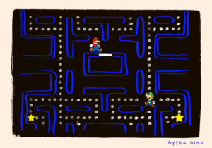
Initial Game Design

After countless hours of thinking of another idea, I came up with a simple, yet exciting, game in which the player chases stars across the sketch in order to win the game, which is why I called the game, Star Chaser. Ultimately, the focus shifted into a much simpler game centered around chasing stars and avoiding shells, still retaining the essence of retro Nintendo games that I was initially going for. It ensured that even with the changes to the game I was creating, the main concept of classic Nintendo games remained prominent. Thus, while the project may have evolved from its original idea, the concept of celebrating retro Nintendo games still remains. 
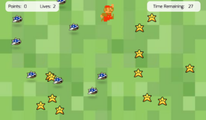
Final Game Design 

In my game, Star Chaser,  players are able to control a Mario character using the arrows on the keyboard in order to collect stars and avoid incoming shells. The objective of the game is to catch all the stars within the given time limit, 30 seconds, trying to preserve Mario’s lives. Each time Mario gets hit by a shell, he loses one of his two lives. To win the game, the player must avoid the shells and achieve the maximum score of 60 points. This is done by maneuvering Mario around the sketch to collect all the stars. 

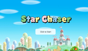
Screen 1- Landing Page
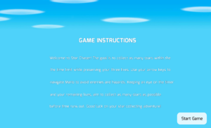
Screen 2- Instructions Page
Screen 3- Game Page

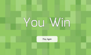
Screen 4- Win Page

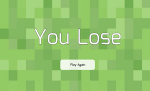
Screen 5- Lose Page
The aspect of my project I am particularly proud of is the actual game design. Initially, it was incredibly difficult for me to get things to move for the game, set up the lives and scores board, and even simply get the character to move. Although we did discuss some of these things in class, it was still quite difficult to do it myself given the fact that as I was attempting to put the game together, there were a lot of bugs and errors that kept occurring. Due to the fact that this was my first time creating a game, I had to sit for hours trying to figure out what kept causing the errors. However, after countless hours of attempting to understand the root cause of the problems, I was able to figure out that it was due to the order of the code and wrongly declaring variables. Although this was frustrating, I am proud that I was able to fix this issue and implement somewhat smooth controls for the game, which can be seen in the code below: 

// Function to display the game screen
function gameScreen(){
// Sets background color to Green
  background('#92CA5B');
  
// Displays grass images
  //Right Side
  image(grass, 0, 0, 1500, 1800);
  //Left Side
   image(grass, 780, 0, 1500, 1800);
  
 // Displays stars
  for (let i = 0; i < stars.length; i++) { // Loop through stars array
    stars[i].display();
  }
  
 // Displays shells and handle their movement
   for (let i = 0; i < shells.length; i++) { // Loop through shells array
    shells[i].move(); //Moves Shells
    shells[i].bounce(); //Helps Shells Bounce around Sketch
    shells[i].display(); //Helps Display Shells on Sketch
  }
  
//Draws a Rectangle for Information Boxes on Top of Sketch
  //Right Box
  fill('rgba(255,255,255,0.83)');
  stroke('rgba(255,255,255,0.83)')
  rect(40, 35 , 370, 70, 20);
  
  //Left Box
  fill('rgba(255,255,255,0.83)');
  stroke('rgba(255,255,255,0.83)')
  rect(1030, 35 , 370, 70, 20);
  

// Ensures in-game music is looping
  if (!inGameMusic.isPlaying()) {
    inGameMusic.loop(); 
  }
  
// Ensures in-game music is playing
   if (!inGameMusic.isPlaying()) {
        inGameMusic.play();
    }
  
// Displays the Player's Score
  textFont("Mina");
  fill('black');
  stroke('white');
  strokeWeight(3);
  textSize(30);
  text('Points:', 58, 80);
  text(score, 168, 80);
  
// Displays the Player's Remaining Lives
  textFont("Mina");
  fill('black');
  stroke('white');
  strokeWeight(4);
  textSize(30);
  text('Lives:', 280,80 );
  text(lives, 370, 80);
  
// Calculates and display the remaining time
  landingTime = landingTime;
  
//Calculates the Game Time by Subtracting the Landing Time from the Current Total Time to then Converting the Results to Seconds by Dividing by 1000 and rounding down using the int() function.
  gameTime = int((totalTime-landingTime)/1000);
  
// Displays text indicating time remaining
  textFont("Mina");
  fill('black');
  stroke('white');
  strokeWeight(3);
  textSize(30);
  text('Time Remaining:', 1070, 80);
  
//Displays the calculated remaining time
  text(timeLimit - gameTime, 1316, 80);
  
//Game Outcomes
//If the score reaches 60 (maximum number of points) then the game will stop and take you to the win screen
  if (score>=60){
    inGameMusic.stop();
    gameStage = 3;
    winSong.play();
  }
  
//If lives reach 0 then the game will stop and take you to the lose screen
  if (lives<=0){
    inGameMusic.stop();
    gameStage = 4;
    loseSong.play();
  }
  
//If time reaches 0 then the game will stop and take you to the lose screen
  if (gameTime>=timeLimit){
    inGameMusic.stop();
    gameStage = 4;
    loseSong.play();
  }

// Arrow keys pressed to move the player accordingly
//Left Arrow
if (keyIsDown(LEFT_ARROW)) {
  playerDirection = -1; // Set direction to left
  p1X -= 12; // Move left
//Right Arrow
} else if (keyIsDown(RIGHT_ARROW)) {
  playerDirection = 1; // Set direction to right
  p1X += 12; // Move right
}
  
//Up Arrow
if (keyIsDown(UP_ARROW)) {
  p1Y -= 12; // Move up
} 
//Down Arrow
else if (keyIsDown(DOWN_ARROW)) {
  p1Y += 12; // Move down
}

// Moves the player within canvas boundaries
  p1X = constrain(p1X, pWidth / 2, width - pWidth / 2); // Constrain x position
  p1Y = constrain(p1Y, 0, height - pHeight); // Constrain y position


// Draws the image based on player direction
if (playerDirection === -1) {
  // Flips the image horizontally when moving left
  scale(-1, 1); // Flips horizontally
  image(mario, -p1X, p1Y, pWidth, pHeight); // Draws image
  scale(-1, 1); // Resets scale
} else {
  // Otherwise, draws the image normally
  image(mario, p1X, p1Y, pWidth, pHeight); // Draw image 
}

// Check for collision between player and stars
    for (let i = 0; i < stars.length; i++) {
        if (stars[i].checkCollision(p1X, p1Y, pWidth, pHeight)) {
            // Remove the collided star from the array
            stars.splice(i, 1);
            // Increase the score by 5 points
            score += 5;
        }
    }
   
}

Another aspect that I am proud of is the visual and auditory elements of the game. I have incorporated hand drawn elements and sound effects from different Mario games in order to create a holistic experience for users and immerse them into the nostalgic game I created. 
Hand Drawn Title 

I believe doing this successfully captured the concept of Nintendo games I was trying to showcase to users and offers users an engaging experience. The code for this can be seen below: 

//Helps transition back to the landing page when the button is pressed
  if (mouseX >= 580 && mouseX <= 910 && mouseY >= 500 && mouseY <= 695 && mouseIsPressed == true){
  //Moves to gameStage 0, which is landing page page
  gameStage = 0;
    
  //When button is pressed mainButtonSound will play
  mainButtonSound.play();
}

Example of Where I Used Audio in my Game

In terms of improvements, I feel like I can incorporate more audio and visual elements to create a more immersive experience. I could potentially add a loading or waiting screen in between the game and instruction screens to make the game design more comprehensive. I also could have added some form of computer vision. I feel like it would make the design complex and creative, which can make it an engaging, unique, and enjoyable experience for users.

In regards to problems, I feel like my main issue, although quite silly, is the sprite sheet. I could not find any sprite sheet online that worked well with my game concept. Although that is the case, I tried finding anything just so I could get started with my game design. When I found one that could work as a placeholder, p5 would not load the image onto the sketch. I kept getting an error message from p5. I then tried to draw my own sprite sheets, which also did not work on p5. This problem was very frustrating because it was essentially the most important element of the game. Therefore, I had to stick to using a singular image to help move the character around. The image was of the character facing the right. Thus, I  made the character flip horizontally when the left arrow key was pressed to add more movement to the character and the game experience as a whole.
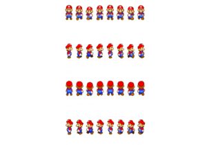
Initial Sprite Sheet
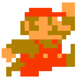
Final Character Design

Overall, this project pushed me to learn more about p5 programming and how I am able to manipulate code to create what I wanted. This project, although difficult, was one of the most rewarding thing I have ever done. I am proud of how far I have come with p5 and I genuinely believe that this project shows my progress thus far.

W5- Midterm Progress

Concept:

Growing up, I used to spend my days playing Nintendo games with my siblings, whether it was a game like Mario Sunshine or even Mario Party. The nostalgia of the games and characters’ associated with Nintendo made me want to create something similar. Therefore, for my midterm project, I decided to create a pac-man like game, in which Mario and Luigi chase after stars. This will need two players to take the role of Mario and Luigi. My idea for this is that it would be some sort of competition to see who can collect the most stars. The whole concept behind this idea is to let users interact with the art directly, which is why I will try to emphasize user-experience and user-centered design as I start to build this project. 

Design:

For this project, I have decided to keep the design simple and clean. The color scheme will be soft but vibrant against the dark background. I am leaning towards going for a “retro” color scheme. I want my game to make users excited to play it, thus, the colors are significant.  For user-interaction, I want the two players to use keys on the keyboard, such as WASD and the arrows, to move the characters up, down, left and right. This will be the main form of interaction for my project. In terms of sound, I want each character to have a distinct sound for when they collect their stars. I also want to potentially have a sound for when the game is over. This will create an immersive and memorable experience for users, enhancing their engagement throughout the game. I might incorporate subtle background music that complements the pace of the game in order to further enrich the overall auditory experience of the users. However, I want to prioritize getting the sound of the characters catching the stars first. Carefully considering both the visual and auditory aspects of the game will allow me to conceptualize the experience I want to create for users, one that is captivating and memorable. 

In order to visualize the concept and design of my game, I drew basic wireframes. These drawings are very basic and overly simplistic but they give me a rough idea of what design and feel I want to showcase to users. 

Sketch of Game Layout: 

Fears and Minimizing Risk:

Reflecting on this project, I think I am most frightened about two things: how I will be able to implement the keyPressed function properly to ensure that each character moves according to their keys and how I would be able to indicate that the game has ended. To tackle these two issues, I am practicing using both sound and the keyPressed functions in different ways to ensure that I understand how to use them in order to be able to manipulate them the way I want for this project. For the keys, I have been studying from slides and practicing using videos from Youtube. By doing this, I will get a better understanding of the function, so I will be able to implement it successfully in my project. In regards to the sound, I am still figuring out how to make it so that a noise indicates the end of the game. I am thinking of potentially putting a timer that would stop all activity once it reaches the end. However, I am still figuring this out but with time and trial and error, I will be able to implement such a feature in my project.

W5- Computer Vision Reading Reflection


I have personally never encountered the concept of computer vision before this reading. So, as I was reading it, I could not help but be amazed by the ways in which a concept as complex as computer vision can be manipulated to be used in different ways. It was very interesting for me to see the range of computer vision usage, going from military purposes to interactive art. To me, such a range showcases the duality of computers. It showcases that computers go beyond technicality but can actually encompass concepts that are typically seen as “non-technical.” The author also brought up different techniques to use computer vision such as frame differencing and brightness thresholding. The author’s introduction of different techniques for computer vision instilled the idea that we cannot simply rely on computers to create optimal outcomes. That is why a well prepared environment is almost always needed to help create optimal outcomes that could be generated by the computer itself. 

Thus, the relevance of user interaction comes into play. Are humans vital for the success of computer vision systems? Do we need to play an active role to ensure that computer vision systems are optimized correctly? In my eyes, the significance of the physical environment in regards to computer vision underscores the role human interaction plays in shaping the functionality of computer vision systems. Humans are able to manipulate and optimize the environment to enhance the performance of computer vision systems. Whether it is simply adjusting lighting or placing sensors in the environment, human intervention plays a vital role in computer vision systems. Other than this, it is users’ interaction with computer vision systems that determine the interpretation and utilization of its output. Therefore, human intervention is essential for harnessing the full potential of computer vision, ensuring it runs successfully. To me, the idea of computer vision as displayed by the author showcases the interconnected nature of computers and users and that one is somewhat always dependent on the other for success.

Assignment 4- Generative Text

For this assignment, I went back to the basics and utilized the main coding concepts we learned in class last week to create a simple and EXTREMELY plain piece that showcased my understanding of generative text using p5js. I used a poem from Mahmoud Darwish, a popular poet from Palestine, as text for my sketch. The main concept of my sketch was to create a simple piece of art that displays his poem using generative text that includes elements of interactivity, while simultaneously prioritizing simplicity and minimalism. This can be seen through the simple text font and color used in the sketch to display the words of the poem. 

The process of creating this sketch involved a lot of trying to understand the coding concepts that come with generative text. This was because I was confused about the concepts we learned that week. Through practicing and studying the material once more I was able to better understand the technicalities behind generative text and how to successfully implement it in my sketch. With that being said, I used this assignment as a way to integrate all the other things we learned in class such as the ‘mousePressed’ command and different ways to position elements within my sketch. Side note, pressing the mouse allows for users to see the whole poem, if they wished to view it in the non-generative text form. Back to my sketch, implementing past material with new material helped me better conceptualize how these different elements within p5js are able to compliment one another, which in a sense enriches the flow and user experience of the sketch. 

Another side note, I used functions but decided to keep them on the main Javascript file instead of a separate file due to the fact that it made it easier for me to organize the code. Anyway, back to the sketch coversation!

As I mentioned, I was struggling initially with understanding and implementing generative text concepts, which is why the parts I am most proud of are ones that relate to it: 


function drawWords(x, y) {
  // Splits the poem into words and removes any empty strings from the poem
  let wordGroup = poem.split(' ').filter(word => word.trim() !== "");

  // A random number from the array is selected as a starting word and ending word
  let firstWord = random(int(wordGroup.length));
  let lastWord = firstWord + random(2, 8);

  // Makes gold the color of the text
  fill('gold');
  
  // Displays the selected words from the poem at specified positions
  text(wordGroup.slice(firstWord, lastWord).join(' ').trim(), x, y);
}


My Final Sketch: 

In terms of improvements, I think I would have loved it if I was able to have made my art more complex. Although not necessary, I feel like using generative text to create something more complex would have helped add more effects and style to the piece as a whole. By doing so, it would have made my sketch more dynamic and potentially more appealing to users. Overall, this sketch has made me want to practice using generative text in my future projects as I want to develop my skill in it and add more complexity, effect, and different forms of user interface design to my sketch. I really enjoyed learning and experimenting with generative text as I was able to combine a poem from one of my favorite poets to create text that is creative and sometimes even humorous.

W4- Reading Reflection: The Psychology of Everyday Things

After reading the first chapter of Don Norman’s The Design of Everyday Things, I have come to realize that our thoughts on design align with one another. Throughout the chapter, Norman emphasizes the importance of understanding human behavior and psychology in order to create designs and even experiences that work successfully with one another. This is basically the backbone of my thinking process when creating or designing anything. Without proper thought being put into how users might think when it comes to using different prototypes or designs, then there is, in my opinion, no point in creating in the first place. Although this might seem extreme, my thinking process’ main idea is that we create things for users in order for them to use it. Thus, to be able to do so, we need to put ourselves in the position of the users. This, however, must be done without putting any expectations on the users’ behavior. Doing so will create unreasonable and unrealistic designs for humans to use. This will allow us to create and cater to the average user, ensuring that interactions between users, systems, and designers flow successfully. 

That being said, this reading raises the question of the importance of empathy in designing and creating. How important is it to consider others’ feelings, thoughts, and even past experiences when creating or designing anything? How can we empathize with others to successfully cater to their needs? These questions, I believe, help us navigate the complexities of human psychology, emotion, and interaction in relation to designing. I would go as far as to say that without considering one or the other, any effort for designing, especially one centered around human interactions, will not be able to go as smoothly. We saw it with the example Norman gave with the nuclear power plant, not designing for human behavior and psychology in mind can have adverse consequences. Thus, it is only by considering these things will, as I mentioned previously, allow us to create better designs that are sustainable for humanity, ensuring that these designs are safe and reliable for human use. 

Assignment 3- Arrays, and Object Oriented Programming

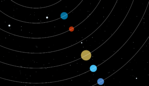
For this assignment, I wanted to push myself out of my comfort zone and create something a bit more complex than what I typically make. By using a combination of arrays and object oriented programming, I was able to create an art piece that combines animation and user interaction to create a piece of art. My main concept came about when I was looking for inspiration on the internet. I knew I wanted to do something ‘nature’ related as it is something I love. When I came across the user Drea007’s work of a 2D solar system (see reference link at the end of the sketch), I knew what trajectory my sketch was going to head to.


The image above was directly taken from Drea007’s sketch, which has been linked at the end of this post. 


The main concept of the sketch was space, specifically the solar system. I wanted to emulate the ways in which the solar system worked but put a twist on it. Instead of the planets moving around the sun, as seen in Drea007’s work, I made them move around on their own in an unorganized way. Thus, I call this piece, ‘Cosmic Chaos’, due to the fact that the planets are moving around chaotically and in a non-synchronous manner. 

The process of creating this sketch involved a lot of practicing the material, especially object oriented programming. Through practicing, I was able to better understand how object oriented programming works within a sketch. I will also say that I learned a lot about movement with this assignment, particularly mouse or pointer movements. What I mean by this is that I have learned how to integrate user interaction into my sketches in a different way than I am used to. Through utilizing the command, ‘mousePressed’, I was able to allow users to directly engage with the objects within the sketch. By employing this command, I was able to essentially manipulate the objects in the sketch to follow the movements of the mouse cursor. To do this though, I needed to understand how to integrate mathematical principles within my code and utilize them to my advantage. The ones I learned how to incorporate were ‘atan2’ and ‘sin’ and ‘cosine’. Understanding these mathematical concepts in the context of p5js, I was able to conceptualize and compute angles in my sketch, enhancing the responsiveness and flow of user interaction within my sketch. Due to this new found skill, this is the part of my code that I am most proud of. 

You can see the code here:

function mousePressed() {
  // When mouse is pressed, make planets move towards mouse position
  for (let i = 0; i < planets.length; i++) {
    let dx = mouseX - planets[i].x;
    let dy = mouseY - planets[i].y;
    let angle = atan2(dy, dx);
    planets[i].xspeed = cos(angle) * 20;
    planets[i].yspeed = sin(angle) * 20;
  }
}


My final sketch: 

In terms of difficulties, I was having a lot of trouble with navigating how to begin the sketch as a whole. I had an idea of what I wanted to do but never knew how to execute it. I was having trouble wrapping my head around using the different classes and functions at the beginning but started to get a hang of it when I practiced. It was only when this happened that I felt like my creativity was able to flow. Therefore, in a sense, this assignment forced me to explore animation styles and effects on a deeper level as I wanted to incorporate elements that I do not know much about. Although I keep saying this, I think by actually exploring different elements of p5js with this assignment, I was able to feel more comfortable doing more complex things with code, something I was hesitant with doing. I was able to add a combination of complex shapes, features, styles, and user interaction, creating something that is interactive yet complex at the same time. This really helped me overcome my misconception that a sketch can simultaneously be both complex and interactive for users. I really enjoyed this process and am really happy that I pushed myself out of my comfort zone by creating something complex yet interactive.


References: 

https://editor.p5js.org/Drea007/sketches/5-vqHY3Te


Reading Response 2- The Art of Interactive Design by Chris Crawford

Chris Crawford’s approach to explaining interactivity was something that struck me as it is not something I considered before. Crawford repeatedly likened interactivity to a conversation, one between users and systems. What I found really interesting about the way Crawford described interactivity is the fact that he showcased a somewhat strong relationship between the two. This kind of relationship goes beyond what I was accustomed to, which is that interactivity between users and systems was merely input-output interactions. In a sense, reading this challenged my preconceived notions about interactivity as it forced me to see how both users and systems actively engage and influence each other, making interactivity more dynamic than I thought it was. 


Although I appreciate the perspective Crawford brings in regards to the analogy of interactivity as a conversation, I still think that the author oversimplified  the nature of interactivity. Yes, Crawford showcased the dynamics and complexities of the interactions between users and systems. However, I feel like the way he showcased these interactions tended to be idealized, in a sense. The analogy of conversation made it seem as if there was seamless interaction happening between users and systems, which in reality is not the case. This disrupts the very same “flow” of interaction Crawford brought up in the chapter in regards to interactivity design. This made me question the practicality of Crawford’s analogy in interactive systems in the real world, particularly in regards to its ability to accommodate to different challenges that might appear when discussing the concept of interactivity. Thus, even if the concept of interactivity as highlighted by Crawford brought about an interesting perspective on the concept,  I still believe that, to a certain degree, Crawford needs to address the complexities that underlie the concept he speaks of throughout this chapter. 

Reading Response- Casey Reas’s Talk/Presentation

Casey Reas’s talk opened my eyes on the ways in which the idea of randomness is perceived in art. Reas talks about randomness in nature and how it tends to be chaotic and not in the “order” us humans like to believe nature is. This idea of the importance of “order” dates back centuries as throughout history humans have been very concerned about the idea of maintaining order in art. So, in my eyes, this idea of randomness that Reas mentions throughout his talk attempts at fighting this supposed human urge for order and pushes us to embrace randomness and, in a sense, chaos, that randomness in digital art brings. 


Thus, this makes me think a lot about the nature of this urge for order that has ruled human civilization for centuries. Why is it that we desperately need order? Why do we need to translate our urgency for order into the art that we produce? These questions cannot be answered with a ‘yes’ or ‘no’ answer but I believe that there is something that Reas says that may help with answering these questions. “Make your reality, Make your own world,” this very sentence said by Reas suggests that the reason we so desperately need order is for comfort. When we do not know what to expect, whether that is in our routine lives or even in art, a sense of discomfort arises, and to a certain extent fear as well. This attachment to monotony and repetition of life is holding us back and therefore the only way to embrace chaos, randomness, and unpredictability, is to move away from comfort and actually build our own reality, not the one we are accustomed to. Thus, by becoming uncomfortable and embracing chaos, we are able to create art that embodies the concepts of randomness that Reas mentions throughout his talk. It is only when we do so that we will see randomness being embraced worldwide.

Assignment 2- Loops


For this assignment, I wanted to combine both loops and if/else statements to create a simple interactive and somewhat animated piece. The main concept of the sketch is to create a kind of geometric art piece that includes elements of interactivity and animation, while simultaneously being simple and minimalistic. This can be seen through the color and the simple grid choice that I decided to create. The concept of simplicity can be further seen through the intentional placement of the rectangles. I did not want the different rectangles to go over the main grid, which is why I made it so it only filled the gaps between the grid of rectangles.


The process of creating this sketch involved a lot of practicing outside of class, specifically with for and while loops. I will say that I did struggle to understand how each of the loops worked at first. However, as I started to practice and learn from my mistakes, I was able to understand how the grids worked and eventually got to create my desired visual outcome of a grid of rectangles, in which the rectangles are whole and take up all the space that they can on the canvas. With that being said, the code I am most proud of has to be the ‘animation’ element of my sketch due to the fact that I learned so much about the importance of defining each element carefully. I, initially, had trouble with having the rectangles move both vertically and horizontally but after discovering the root of my problem, which was not defining each properly and carefully, I was able to successfully create movement on my canvas. 


Here is the code that demonstrates this: 

//Rectangle 1
stroke(200);
strokeWeight(2);
noFill();
rect(x, 110, 380, 30); //Dimensions of first rectangle.

if (x > width || x < 0) {
  speedX = -speedX; //Reverse direction of first triangle to create a bounce effect when it hits the start or end of the canvas.
}

x = x + speedX; //Allows for first triangle to move. 

//Rectangle 2
stroke(200);
strokeWeight(2);
noFill();
rect(110, y, 30, 380); //Dimensions of second rectangle.

if ((y>height) || (y<0) ) {
speedY = -speedY; //Reverse direction of second triangle to create a bounce effect when it hits the start or end of the canvas.
}

y = y + speedY; //Allows for second triangle to move. 

//Rectangle 3
stroke(255);
strokeWeight(2);
rect(a, 260, 380, 30); //Dimensions of third rectangle.

if (a > width || a < 0) {
  speedA = -speedA; //Reverse direction of third triangle to create a bounce effect when it hits the start or end of the canvas.
}

a = a + speedA; //Allows for third triangle to move. 

//Rectangle 4
stroke(255);
strokeWeight(2);
rect(260, b, 30, 380); //Dimensions of fourth rectangle.

if ((b>height) || (b<0) ) {
speedB = -speedB; //Reverse direction of fourth triangle to create a bounce effect when it hits the start or end of the canvas.
}

b = b + speedB; //Allows for fourth triangle to move.


My final sketch: 


In terms of improvements, I think I want to work on playing around with different ‘animation’ styles or effects. I feel like if I had more time to sort of practice and play around with these functions, I would be able to add more effects to my sketch, potentially making it even more dynamic. Reflecting on my sketch and progress overall, this assignment has most definitely made me more comfortable with using different shapes and parameters, something I initially struggled with. I also was able to successfully add in effects and create User Interface Design as I added elements of interactivity to my sketch this time around. I really enjoyed experimenting with the skills I’ve learned thus far, and I am genuinely happy with the user interactivity and somewhat complex design I managed to create.