HW4: Generative Text

CONCEPT

I was inspired by the Stroop text I learned about from the intro to psychology class I am currently taking. The test requires its participants to name the colors of the words on the grid as fast as possible. The trick is that the words on the grid are actually the names of colors different from the ones they are colored in. This test allows for measuring a person’s selective attention capacity and executive processing skills. In my assignment submission, I am making this test into a written game.

Taking the Stroop Test | Musings of an Aspie

IMPLEMENTATION

The most challenging part of the idea implementation for me was to make the time counter work. I couldn’t figure out how to make it count the seconds since the beginning of the game as opposed to every frame since the beginning of the game. My mistake was that I didn’t divide it by 60, which sounds silly but took me lots of time to notice. Besides that, I didn’t have any other issues while figuring out the game design. Below is attached a snippet of my time counter:

//update and display time since the beggining of the game
function updateTime() {
  //check if 30sec passed
  if (timeLeft > 0) {
    //count seconds passed since start
    let alltime = floor((frameCount - startTime) / 60);
    //count time left
    timeLeft = 30 - alltime;
    //display time left
    textSize(14);
    text("time: " + timeLeft, width / 1.25, 270);
  }
  //if 30sec passed -> end game
  else {
    gameOver(false);
  }
}

ASPECTS TO WORK ON

I feel like my code could have been written more beautifully (neater and more concise). I have also tried assembling it as a class but I couldn’t figure out how to make it work, so I turned it back into a bunch of functions. Perhaps, I could have actually displayed the words in a grid as opposed to one word at a time to make it more challenging to focus for the user.

 

HW3: Generative Art using OOP

CONCEPT

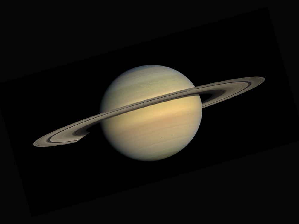
I was inspired by the Solar System, specifically by Saturn. I wanted to draw a planet in the night sky, however, I don’t really know how to do smooth gradients and complex coloring in p5.js, so instead, I took the shape of one of the most easily recognizable planets to create my own version of it.

30k+ Saturn Pictures | Download Free Images on Unsplash


IMPLEMENTATION

My sketch may not look too complicated, but it took me a long time to figure it out. The main challenge was “filling” the body of the planet with parallel lines. I thought that I could imitate volume by drawing a circle out of parallel ellipses. However, I didn’t know how to make them change their width in a smooth way so as to form a circle (look at the reference image below). I have tried checking the coordinate ranges with if-statements and manipulating X points of the ellipses there, but it didn’t quite behave as I expected it to. I then moved on to using lines instead, expecting that it could be easier to implement, which it was, but it took me at least 10 minutes of staring at the screen expecting to recall something useful from math classes. The answer to my question was the Pythagorean theorem, where c^2 = a^2 + b^2. In my case, I have c and a and am looking for b, so the function that I have used to find X_1 and X_2 for a line was:

//use Pythagorean theorem to find point X_n
function differenceOfSquares(num1, num2) {
  let diff = num1 * num1 - num2 * num2;
  return sqrt(abs(diff));
}

My sketch uses two classes to build planet body stripes and planet rings. Sketch elements are drawn in the next order: stars -> planet body -> planet rings -> arc to cover the back side of planet rings -> planet rings. I found it to be the easiest scheme. Planet rings and body rings have random red values in the stroke color, and random stroke weight (0 or 1) to imitate rotation. Planet rings have a wider range of red values than body rings. I figured that it look better this way. On top of the rings, there are floating rocks drawn as points with random stroke weights and coordinates. These rocks make the planet feel more alive and less plain. Rotating the whole thing was easier this time, now that I know that rotate function uses radians and not degrees as I assumed when working on my first homework submission. The frame rate is 8, which is fast enough to feel like the planet is rotating and slow enough to see the details and get overwhelmed by the picture.

639 Slice Sphere Illustrations & Clip Art - iStock
Circle Made Out of Ellipses – Reference Image

ASPECTS TO WORK ON

There is a feeling of movement in the sketch. However, I can’t tell where or how exactly it is moving. Everything is “rotating” at the same time at the same speed, making me feel disoriented. I feel like I could have used Perlin noise for the sky and the planet’s body stripes to make the picture move smoother. I also feel like there could have been some text there because it gives me wall poster vibes but that’s just a thought.

HW2: Loops

CONCEPT

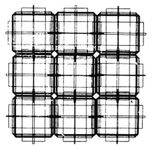
I took inspiration from this one example shown in the COMPUTER GRAPHICS and ART magazine for May, 1976  suggested by the professor. It made me think of buildings and cables under walls. In my sketch, I attempt to imitate a nightlife of a residential building, with the light in the windows randomly turning off and on, and the cables exposed over the walls indicating some activity.

IMPLEMENTATION

I created three functions to draw each element of the sketch: cables, windows, and walls. FrameRate function is set to 1 because the change is too fast-paced otherwise and the sketch looks less like a building in a night time.

I started by making the overlapping cables, which created the outline for the brick walls and windows. The cables are done in a for loop nested three times: the first time to draw multiple rectangles over itself, the second time to make a row of those rectangles, and the third time to make it a grid. The rectangles overlap with each other in a row, to make a narrow compartment for a window to fit snugly into. The outline of the rectangle is different each time because, in my mind, it makes sense that a change of color signals whether the cable is on or off.

For windows, I have used a nested loop to make a grid of rectangles. An array of two colors and a random function are used to update the fill value. This helps to imitate the lights being turned off and on in each apartment unit and gives the building some life.

I had the most struggles drawing the bricks. Initially, I wanted to make a 6 by 4 grid of brick walls so that they don’t go beneath the windows but stay separately from one another. However, when I tried implementing that, the editor would crash. I assume that it’s because I have nested the for loop 4 times. I tried a few more times until I realized that it would be easier to make a singular 50 by 27 brick wall and call this function before the other two.

Essentially, all three of my functions are similar to one another. I attach the brick wall function snippet because it took me the longest to come up with.

//drawing the bricks
function brickBuild() {
  noStroke();
  fill(222);
  let brX = 0;
  //initial Y indentation
  let brY = 33;

  for (brGridH = 0; brGridH < 50; brGridH++) {
    //move the row down
    brY = brY + 9;
    //initial X indentation for each row
    brX = 28;

    for (brGridW = 0; brGridW < 27; brGridW++) {
      //draw 12*8 brick
      rect(brX, brY, 12, 8);
      //move to the left
      brX = brX + 13;
    }
  }
}

WHAT WOULD I CHANGE

Perhaps, to make the sketch imitate a residential building more closely I could make each of the windows update the fill value at a different point so that they would change the colors asynchronously. The cables could do the same things (change asynchronously), but I would also add a pulsation effect when they change their color and width/height values.

HW1: Self-Portrait

CONCEPT

For this assignment, I was inspired by sketching in Adobe Illustrator. One way of making complex figures in Illustrator is by drawing lots of intersecting ellipses to outline the figure that you want to build. At the intersection of those ellipses, you get irregular shapes, which will help you in achieving the organic feel in your final drawing. You then reach for the Shape Builder Tool to connect the wanted areas at the intersection of the ellipses. Even before using this tool, you can already see the outline of your figure peeking through the bunch of ellipses.

In my work, I wanted to achieve this rough sketch feel and imitate the way I draw regularly (on paper or in Illustrator).

IMPLEMENTATION

My code was pretty repetitive. The order in which the shapes are placed is important, so I have started by writing in comments all the portrait parts that I need to add in a particular order. I then call for random color with random opacity, choose the angle of rotation, and draw the shape. This process is repeated for each part of the portrait. As a code it looked like the snippet below:

//jaw
fill(random(0,255), random(0,255), random(0,255), random(0,255));
// fill(249, 213, 192, 130);
translate(width / 2, height / 2);
rotate(120);
ellipse(20, 20, 150, 200);

The most challenging part of the implementation was figuring out the angle of rotation for each shape. It didn’t rotate in the way that I would imagine it to. The one-degree difference could make the shape do an actual 180-degree turn on the sketch. I’ll ask for more clarification regarding this issue during the class. Perhaps, it was an easy fix.

REFLECTION

I like the way my sketch ended up. It reminds me of stained glass window drawings that I did with gel paint as a kid. It kind of also gives me cubism vibes. Some random color pallets work better than others, perhaps, I could work on limiting the randomness of colors next time.