assignment 8 – creative switch

concept:

These days, there is this board in D2 with cardboard cutouts that mention ways to eat sustainably. I coincidentally happened to pay attention to the board right after our last IM class, which gave me an idea – a switch that lights up when the cutlery touches the plate. The premise is that if you get a portion proportional to your appetite, and are then able to finish your food (the cutlery touching the plate), the LED lights up.

implementation video

process:

It is a simple series circuit consisting of an LED and a resistor. I used aluminum foil on the base of the plate and the spoon so that a larger surface area is conductive. whenever the spoon makes contact with the plate, the circuit completes and the LED lights up. I used a green LED to indicate successful completion of a meal.

reflections:

There is certainly room for improvement. I didn’t try it out with actual food, so I’m not sure if the food content would actually affect the way the switch works. Also, the foil doesn’t actually cover the length of the plate. Because of this, even though it technically *works* it doesn’t capture the essence of the concept fully. In addition, I’d also love to improve the visuals of the project, because the aluminum foil and tape do make it look a bit tacky.

week 8: reading response

“Emotion and Design: Attractive Things Work Better” by Donald A. Norman

I really enjoyed reading Norman’s work, because it perfectly encapsulates many discussions we have been having in class about design and usability. My overall takeaway from the piece was that good design exists at the intersection of aesthetics and functionality, though there is a place in the world for highly functional but ugly or highly aesthetic/creative but unusable items.

Norman’s piece, however, brought an interesting dimension to the conversation that I hadn’t heard of before: the link between design (or more accurately, perceived attractiveness) and emotion. I really agree with his sentiment that in neutral situations, “Attractive things work better”. In my opinion, in everyday objects, the more aesthetically pleasing an object is, it is not only more likely to be purchased but also more likely to be held on to for longer (i.e. it’ll be a long while before it ends up at some random Goodwill). It’ll also be more likely to be treated with care – amongst myself and my peers, I’ve noticed the more aesthetically pleasing an object looks, the more likely we are to be able to take care of it. For neutral objects, in most situations, the efficiency cannot outweigh the ugly – and the moment the user feels no need for the tool, it is more likely to be gone or treated carelessly.

“Her Code Got Humans on the Moon—And Invented Software Itself” by Robert McMillan

I thought this article was quite informative (I didn’t know the inventor of modern software was a woman!) and I didn’t have much thoughts on it, but one point that was really interesting to me was the lack of emphasis on error-checking mechanisms at the time. The idea that higher-ups at NASA believed it was unnecessary the astronauts were “perfect” is so unbelievable to me, not only because the stakes were so high, but also because the fallibility of users is one of the main considerations in software engineering today! I think this reflects a shift in the mindset that has occurred between then and now. Their inability to believe that the astronauts could make a mistake reflects that they believed that user was smarter than the tool, whereas in modern computing we always believe the tool has to be smarter than the user.

midterm project: a life odyssey

link to sketch: https://editor.p5js.org/parchinkos/full/6Wh1hDMjG

link to p5.js web editor: https://editor.p5js.org/parchinkos/sketches/6Wh1hDMjG

(for some reason the initial start screen music doesn’t play on full-screen)

concept:

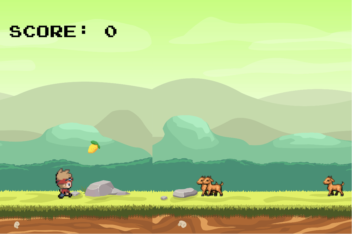
I knew from the beginning that I wanted to make a game. The aesthetics I had in mind for my project were always there, too – I’m a huge fan of 16-bit and 8-bit pixel art, and I knew I wanted to incorporate that art style into my work. I was also torn between the type of game I wanted to make; I could make it a complex story told through an RPG game format, or I could lean towards something more simple but with more gameplay. In the end, I ended up doing the latter, because it held one’s focus on the project for much longer. The gameplay for my project was inspired by simple platform games like Google’s T-Rex runner game or even Flappy Bird. Essentially, the player stays in one position throughout the game but has to avoid obstacles and/or hurdles throughout the way. My game has collectibles, which the player gathers for points, and obstacles which the user has to jump/avoid or else they lose points.

The main thing that I thought about was what I wanted the setting of the game to be. This semester, I’m taking a core class called Hindsight which focuses a lot on autobiographical story. So naturally, my mind went towards something similar: different life phases for different levels. Initially I was making it my own, but then I realized it would be infinitely more interesting if I loosely based the levels around my father’s life. He’s lived through much more different ‘settings’ (I’ve been in a city for my entire life). The game isn’t super focused on his life story, but the general inspiration for each level can be seen below.

chapter 1: the simple life

My dad grew up in a village, and on a farm, so the setting of this level is inspired by that! You also collect mangoes because that’s his favorite fruit.


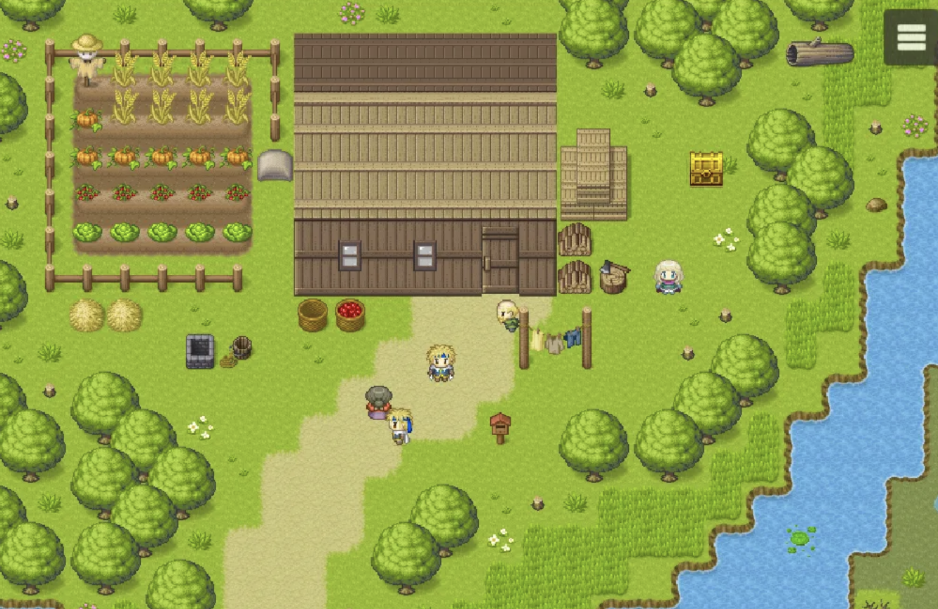
chapter 2: the concrete jungle

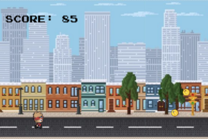
In his late teens/early twenties, he moved from his village to Karachi, a large metropolitan city. It was his first time being in such an environment, so the level is based on the novelty of that. Cars, crows and rats are things one often finds in big cities like this which is why they’re the obstacles.

chapter 3: setting sail

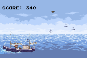
After completing training at his cadet college (which was why he moved in the first place), my dad officially joined the Navy. He spent a lot of time at sea in his early years, which is why the last level he’s on a boat. At first I wanted there to be fish or something, but that seemed a bit difficult so I just settled on making the obstacles birds.

how it works

The functionality is relatively straightforward. There is a player object, which actually stays in place the entire game. The only movement from the user is that it can jump (and double-jump!) using the spacebar. The player object is given the illusion of moving because everything else – the obstacles, the collectibles, the background – move towards the player. The collectables and obstacles essentially have speeds at which they move towards the user, and if the player collides with a collectible points are added and deducted for obstacles. The placement of the obstacles and the collectables are random. Once the user has passed all obstacles in the game, the game advances to the next level.

My player class can be seen below.

class Player {
  constructor(spritesheet, spritesAcross, spritesDown, x, y, speed) {
    this.w = int(spritesheet.width / spritesAcross);
    this.h = int(spritesheet.height / spritesDown);
    this.across = spritesAcross;
    this.down = spritesDown;
    this.direction = 2;
    this.sprites = [];
    for (let y = 0; y < spritesDown; y++) {
      this.sprites[y] = [];
      for (let x = 0; x < spritesAcross; x++) {
        this.sprites[y][x] = spritesheet.get(
          x * this.w,
          y * this.h,
          this.w,
          this.h
        );
      }
    }
    this.x = this.w + 15;
    this.y = y;
    this.ground = y;
    this.speed = speed;
    this.step = 0;
    this.jump = 15;
    this.vy = 0;
    this.canDoubleJump = true;
    this.g = 1;
    this.isMoving = true;
    // this.score = 0;
  }

  setGround(newY) {
    this.ground = newY;
  }

  updatePosition() {
    this.y += this.vy;
    // gx -= obstacleSpeed;

    if (this.y < this.ground) {
      this.vy += g;
    } else {
      this.vy = 0;
      this.y = this.ground;
      this.canDoubleJump = true;
    }

    if (this.isMoving) {
      if (frameCount % this.speed == 0) {
        this.step = (this.step + 1) % this.across;
      }
    }
    // print(isMoving);

    image(this.sprites[this.direction][this.step], this.x, this.y);
  }

  doAJump() {
    if (this.y >= this.ground) {
      this.vy = -this.jump;
      this.canDoubleJump = true;
    } else if (this.canDoubleJump) {
      this.vy = -this.jump;
      this.canDoubleJump = false; // Consume double jump
    }
  }


things i’m proud of

One of my favorite things to do when I’m working on a technical creative project is figuring out the ambiance/aesthetics of the piece. Sometimes, I spend more time on that than the actual code. So needless to say, I’m the most proud of the aesthetics of this project. Not only does it it looks very in line with my initial vision of a retro game project, but I’m proud of how I was able to create the atmosphere for every setting. The background graphics, the obstacles, the collectibles, and the music. I think it all ties together very well and makes the game super immersive.

improvements

While I’m happy with how my project turned out, there is definitely room for improvements, or small changes that could completely elevate the level of my work.

  • Canvas size! I think because I was thinking of platform games on small screens, I kept the canvas size small. But I now wish it was bigger – unfortunately my code wasn’t typed in the most adaptable way, so it became a bit difficult to change the size towards the end.
  • Small features like being able to turn off the music would help a lot as well as I know the game is a bit heavy on the sound, which can be a bit disruptive.
  • Making the scoring system much more refined, i.e. adding points based on how elevated the collectable object is.

These changes seem relatively straightforward to implement, but I couldn’t mostly because of time restrictions.


week 5 – midterm progress

concept

My favorite thing about media is its ability to tell stories. Particularly, in interactive media such as video games, the storytelling is incredibly immersive as the viewer has some agency in navigating the way they experience those stories. For this reason, for my midterm project, I wanted to engage in some sort of storytelling. What I envision is something that is at the intersection of being a game/a visual story. I want to have a character that moves in an explorable region and interacts with different objects in the scene to get bits and pieces of the story.

Ideally, it would look similar to something like below, but it would have more distinct objects and probably only one playable character. I also want the setting and the story I’m trying to convey to be somewhat personalized to me and some of my own experiences, though I’m not exactly sure what yet.

design

For the design, I think I am going to heavily utilize images for more rich scene-setting/worldbuilding. I would like the interactive objects, however, to be made in p5.js, so it’s easier to allow the player to interact with.  I also would make visuals to convey the story, that would need to be drawn.

challenging

My main worry in this project is that it relies very heavy on visuals. I’m not exactly the best artist, so I’d need to find specific sprites for the story that I want to tell and background images. In addition, because I want some element of story telling through visuals similar to graphic novels, I’ll have to think about how to get those as well.

In addition, I’m worried about how to handle all these different aspects, especially transitions between different states (as this was something I struggled with in our last assignment as well).

how I plan to handle it 

I think some part of it would be through finding assets online, and other would be finding creative ways to develop those as well, such as perhaps drawing them myself to make the project more personal.

For the more complicated/technical challenges, I think the best solution is to make the story as succinct as possible and start small. I’ll implement the small functionality first – such as making a few objects interactive – and only having one animating object. If I figure out how to do that, the rest should be easy hopefully.

week 5 – reading reflection

This week’s reading particularly piqued my curiosity, as I have often heard/read about computer vision, but never in the context of Interactive Art. The reading adequately introduces the difficulties within the field and brings up notable artworks that utilize technology like this. It was interesting to see the different ways computer vision could be used.

The pieces that caught my attention were the ones about surveillance. My favorite piece was Sorting Daemon. The composition of the given snapshot generated by the project reminds me of many avant-garde artworks, which is not only aesthetically pleasing – but also eerie, considering that the artwork is being generated from real people’s faces, regular unaware passers-by. I can not imagine how odd it must be to see a machine reconstruct your physical self, using your likeness to construct silhouettes that only appear vaguely human. The existence of this artwork in of itself feels like a paradox – critiquing surveillance while enabling it as well.

Another piece that causes similar conflicting feelings is the morbid Suicide Box. I think the art piece, while exploring themes of surveillance, presents ethical questions at the cross-section of technology, art, and interactive media. Does the piece’s intention – measuring the ‘despondency index’ – justify the technology used?

Both these pieces inspire a conversation about computer vision in interactive media art – not only raising the question of how far we should go, but also if we should.

week 4: reading reflection

As a Computer Science major, optimization and logic are two things that we are constantly trained to hammer into our brains. We are conditioned to increase efficiency at the cost of understandability (why do something in 4 lines of code when you can do it in one?). Needless to say, Donald Norman’s take on technology and devices felt like a breath of fresh air. I especially liked his criticisms of conventional engineering, wherein the center of all design and development is logic. I agree with his stance that humans do not function inherently with logic and instead are unpredictable and experimental. I especially like this line of thinking because it brings to the forefront the question – is there any way we can even define basic human logic? There are so many factors at play in the way humans function, in this case, some of the most important being neurodivergence and disability. The way neurodivergent or disabled individuals navigate life is so drastically different than the way we do, their fundamental understanding of logic will be very different than ours. So when an engineer is asked about his design and his answer is logic, is he pompous to assume the way he functions is fundamental logic?

I also like his emphasis on being able to explore a device, a concept I feel is much lost in this day and age. With the initial advent of technology, with it being all clunky and whatnot, emphasis was placed to showcase not only how it worked, but the various ways one could interact with it. These days, it is assumed that everyone knows how to use a touchscreen or share via Bluetooth, so more emphasis is placed on how seamless it is. This assumption that everybody knows how to use these devices, and more importantly, how not to break these devices, makes them inaccessible to the general public.

week #4: data visualization: pulses of sounds and visuals

concept:

For this assignment, I saw this piece by Aaron Koblin and I immediately knew I wanted to visualize some form of auditory data. Initially, I wanted to do musical data, but I knew it was difficult to do because of the lack of datasets and the rate limits of using APIs for platforms like Spotify. However, browsing on Kaggle I found a dataset of heartbeat sounds and I knew it’d be perfect for the job.

Initially I wanted to do something similar to Koblin’s piece, I graphed the waveforms as lines corresponding to the amplitude. But frankly, they looked ugly and it was because the audio wasn’t as dense as the ones Koblin was using. I instead graphed them as a continuous graph, and the line reminded me of a heartbeat monitor, so I stylistically updated my project to look like that.

All of the lines when static are green, and when you click the screen, a random heartbeat is chosen and it is dynamically drawn in red with different parameters so that the peaks and changes are more pronounced.

code highlights

I’m proud of the draw function, because it took me a while how to figure out how to do it (statically and then dynamically).

  drawSelf() {
    noFill();
    stroke(0,100,0);
    drawingContext.shadowBlur = 15;
    drawingContext.shadowColor = '#8FBC8B'
    if (!this.audio.isPlaying()){
    beginShape();
    for (let i = 0; i < this.peaks.length; i++) {
      vertex(this.startX + i, this.startY - this.peaks[i] * this.scalingFactor);
    }
    endShape();
    } else {
      let vol = currentAmp.getLevel();

      this.volumeHistory.push(vol);
      stroke(128, 0, 0);
      drawingContext.shadowBlur = 15;
      drawingContext.shadowColor = color(255, 0, 0);
      beginShape();
      for (let i = 0; i < this.volumeHistory.length; i++) {
        vertex(this.startX + i, this.startY - this.volumeHistory[i] * this.scalingFactor * 4);
      }
      endShape();
    }

}

improvements

I think the transition from a sound wave being drawn directly to going back to its static form is too abrupt, so I’d like to find a way to improve that.

week 3 – reading reflection: defining interativity

I really enjoyed Chris Crawford’s interpretation of interactivity, especially because he challenges conventional notions of interactivity. I specifically wanted to comment on his definition, in which he likens interactivity to having a conversation:

“interaction: a cyclic process in which two actors alternately listen, think, and speak.”

I think framing interactivity as a conversation is both interesting and perhaps controversial because it brings the interactivity of many pieces into question. In class, we have had discussions on “types of interactivity”, where some pieces were defined as being once interactive, as in the user clicks and the interaction happen, or perpetually interactive, pieces whose motions and responses went on infinitely. The latter form of interaction, under Crawford’s definition, is barely considered interactive then. It is just a little above a movie in terms of interactivity, where a user can engage once but then is compelled to watch the result.  It is not a conversation, it is just a one-word response.

Another form of interactivity brought into question are the interactive pieces that have one response to user activity. Two contrasting pieces that I can think of are the “Deep Walls” piece and Chris Milk’s “The Treachery of Sanctuary”. Both these works are considered iconic pieces in the space of interactivity. Deep Walls, under Crawford’s definition is a truly interactive piece – it is a conversation between the art piece and it’s viewers at any specific time. It captures the true essence of dialogue because it will always appear different depending on who is engaging with it and how they’re engaging with it. The Treachery of Sanctuary, on the other hand, in my opinion, falls short of Crawford’s definition. It is not accurate to describe it as a conversation – but moreso as a script. Actors in their performances choose how to enunciate their words and the level of emotion they convey with their lines, but, at the end of the day, the dialogue will always be the same. The same is with Milk’s piece – users have wiggle room to play around a bit, but at the end of the day, the ultimate result will always be the same.

I think it is for this reason Crawford begins to speak about degrees of interactivity. Certainly, every piece alluded to in this response is interactive, but exactly how much? These trains of thought are especially important for us as creators in the Interactive Media space, as it forces us to mindfully think about how open-ended the conversations are that we are creating through our art.


assignment 3: a cube party

concept:

Because the last generative artwork piece I made was very 2D, this time I wanted to focus on making something that would give the illusion of being in 3D. I was very inspired by the examples and exercises that we saw/did in our last class, specifically the exercise with the randomized balls and the flock that we saw that moved according to the cursor. My assignment idea is a combination of that, where I wanted to make a group of rotating cubes follow a cursor and also scale according to it.

However, I unintentionally increased the difficulty of this project for myself. I came across this when googling examples for how to make cubes in p5.js, and following the code, I set the mode to WEBGL not realizing it would change a lot of the way I needed to approach things in my code. In addition, the mathematics of making the cubes was also a bit difficult for me to grasp initially (the last time I had to think about velocity and vectors this deeply was back when I was doing A-Level Physics, so saying I was quite rusty is a bit of an understatement).

Though the outcome is a bit different than what I hoped to get initially, I still believe I captured the essence of what I wanted.

code highlights and improvements

while the most complicated part of my code is the movement, I’m actually prouder of the scaling of the cubes because I personally feel it is much more intuitive and noticeable.

//get the scaling factor based on the cursor and where the cube is currently
const scaleFactor = map(dist(mouseX, mouseY, this.position.x, this.position.y), 0, width, 0.5, 2.0);
const scaledSize = this.size * scaleFactor;

I also like the subtle disco ball touch I added, because I think it helps convey the energy/vibe of the piece.

function discoBall(cursorPosition){
  let flashing = frameCount % 60
  push();
  strokeWeight(0.2)
  stroke(255)
  if (flashing < 20) {
    fill("#d2d0d2");
  }else if (flashing < 40){
    fill(color(255, 250, 199))
  }else {
    fill(color(0, 57, 163));
  }
  translate(cursorPosition);
  sphere(15, 10, 10);
  pop();
}

For future improvements, I’d like to fix the movement so that it follow the cursor more precisely, or at least that the movement of the cubes according to the cursor is much more intuitive. The mathematics in it is a bit messy, and i was constantly adding new aspects to fix problems that were arising in the movement (for example, I added the separate method after all the cubes began to be in exactly one point, but then had to add cohere after I saw that they were super far apart) and the end result is something else entirely. While I am happy with how it looks, I want to approach movement in my piece in a more organized manner.


assignment 2 – generative art: a flower bed

Concept:

I was introduced to the phenomenon of Perlin noise from one of the readings in class. I looked deeper into it, and I kind of fell into a rabbit-hole where I was googling the sort of things one could generate using this property. Always a fan of vaguely spherical shapes, I used the noise to make distorted spheres. While playing around, I noticed that from above it it almost looked like a flower. I decided to make multiple of them, and increase the density so that they look thicker. I randomized the locations, so that slowly the screen fills up and once it’s finished, it should somewhat resemble roses (as if you’re looking down at them). This is what it looked like initially:

But after messing around with some parameters and adding a seed the end product becomes something like this:

Code Highlights

Because most of this is randomized and is one shape over and over again, the code isn’t the most technically impressive. I do like the use of Perlin noise to make radial shapes, and the randomization of the locations.

for (let j = 0; j < 2; j++){
  stroke(roseColors[currentColor]);
  push();
  translate(startX, startY);
  beginShape();
  for (let i = 0; i < 130; i++) {
    let angle = map(i, 0, 130, 0, TWO_PI);
    let radius = 150 * noise(i * 0.5, d * 0.005);
    let x = radius * cos(angle);
    let y = radius * sin(angle);
    curveVertex(x, y); 
  }
  endShape(CLOSE);

  
  beginShape();
  for (let k = 0; k < 70; k++) {
    stroke(color(142, 128, 106, 15))
    fill(color(142, 128, 106, 15))
    let seedAngle = map(k, 0, 70, 0, TWO_PI);
    let seedRadius = 15 * noise(k * 0.03, d * 0.005);
    let x = seedRadius * cos(seedAngle);
    let y = seedRadius * sin(seedAngle);
    curveVertex(x, y); 
  }
  endShape(CLOSE);
  pop();

  d += 0.5;
  
  
}


Here is the final product.
Improvements

I’m a very impatient person, so the amount of time it takes to fill up the screen frustrates me a little bit. In the future, I’d like to find a way to speed up the process a bit. In addition, I’d love to find the way to control the randomness a bit. Some spaces on the canvas get oversaturated with flowers too quickly while others remain blank for a long period of time. I’d love to add some control or measure that makes sure every space on the canvas is populated with one flower at least (as soon as possible).