Reading Reflections Week 8a

To begin with, I enjoyed reading another one of Norman’s chapters. Something I liked about his writings is how he always gives really good examples to his point which makes it very clear to the reader what exactly he is talking about and the point he wants to get across. In this chapter particularly, he gives an example of the teapots to show good design and usability.

When Norman wrote about “Affect and Behavior” it started to get a little confusing and seemed a little bit like a psychology lesson up until the “Implications upon Design” when he gave an example on how useful doors are designed for stressful occasions.

I highly agree with Norman when he wrote “Good design means that beauty and usability are in balance.” A lot of people do in fact sometimes pay so much attention to the aesthetics and design of the product rather than its accessibility and usability.  Overall, I like Norman’s way of giving examples when it comes to making his point more clear.

The second reading focused more on physical computing. I found it very frustrating when the simulator crashed, which was essential for them to come back. It was fascinating that just a child playing with the keyboard of the DSKY unit allowed for such a crash. Luckily, they were able to come up with a solution. Overall, I liked the story of how Margaret invented software and had her code get people to the moon.

Midterm Project

Concept:

My midterm project sheds light on the issue of space debris and how there is a lot of space junk resulting from the satellites and other objects in space that are no longer functioning. It is a very important issue as we need to take care of outer space and keep it sustainable as we are using it for so many different aspects such as GPS, weather forecasting, and other important technologies.

How to play:

To play this game, you can control the spaceship with your head movement to shift it either up or down and catch as many space debris as possible. Make sure not to hit any dwarf planets coming your way.

https://editor.p5js.org/alreem/full/aXQa2BjsH

Challenges & solutions:

My biggest struggle for this was having to mirror the createCapture, which eventually worked but I ended up removing it as it affected other parts of the code and would lag very much if it is played as multiplayer. I fixed this problem by removing the control of the x-axis (right or left movement) and keeping the direction moving up and down only. Even if I removed that aspect, it still seems as if the user is moving sideways due to the moving background.

for(let i=0; i<people.length; i++){
    let pose = people[i].pose;
    
    let nose = pose.nose;
  
    image (imgss, width/2,nose.y, 30, 30); 
    
    
    if(debris.contains(nose.x, nose.y)) {
      debris.pop();
      score++; }
    if(planet.contains(nose.x, nose.y)) {
      gameState = 'end';
    }
  }

Overall logic:

For the game itself, I mainly used OOP to control the planet and the debris. The parameters included the size, speed, x and y position, collision detection, and moving the object. For the poseNet, I used it to detect the person’s nose and move the spaceship accordingly.

Improvements:

For future improvements, I would want to let the user move in all four directions and have it as a multiplayer game where more people can join. I would also want the game to keep moving faster as time goes by.

References:

Music: https://www.youtube.com/watch?v=AzL10r8AeQ8

Photos: Google search

Intro page & Instructions:

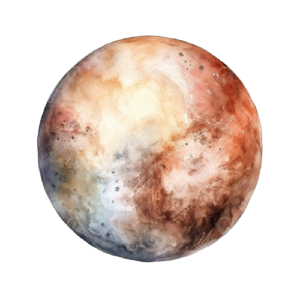
Dwarf planet (what you have to avoid):

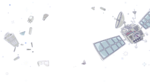
Space debris (what you have to collect):

Final Page (where your score is shown):

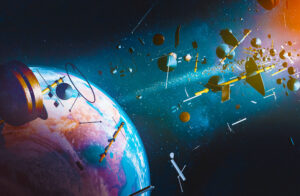
Aerial view of Earth surrounded by space junk from space ships and satellites; 3D; 3D Illustration

Code help: mainly from https://p5js.org/reference/

Week 5: Midterm Progress

For my midterm, I initially drew inspiration from the no internet dinosaur game in which it entertains the user until their wifi works again. The dinosaur game has a main object, obstacles, and keeps moving faster as the game moves on. As for my iteration of the game, I wanted to make it space-themed where the main object is a rocket-ship and the obstacles would be the planets from both sides, top and bottom. For the user to gain points, they must collect items which will be space debris or space junk in order to “clean” outer space. The game will also have a feature in which it would keep moving faster.

For my progress, I was able to get the object moving in all directions. There is currently a problem with loading the rocket-ship image, but it should be there instead of the square.

One of the other challenges is getting the background and obstacles to continuously move while detecting collisions. For this, I will be using an algorithm in which the game would be over every time the object touches an obstacle.

Week 5: Reading Response

This reading on computer vision was very intriguing and made me want to create interactive artworks as such. In particular, I liked the “Stills from Cheese” installation as it has a humourous approach to it. I also enjoyed reading about the “LimboTime” game as this was a game that I used to always play with friends in which it was more of a physical game, where an actual stick was used as the “horizontal line”, rather than an interactive virtual one.

Moreover, many of the artists and artworks in this reading sounded familiar from a class I previously took (Understanding IM), in which we learned about David Rokeby, Rafael Lozano-Hemmer, Camille Utterback, Romy Achituv, etc. However, what stood out differently this time is the idea of computer vision in specific and how there are two main characters, human and computer. For computer vision, those two players have to exist so that the artwork/installation would be interactive and to really be successful.

Week 4: Reading response

Norman’s chapter on the design of everyday things was very relatable to me as I completely understand his frustration of poorly designed daily objects, especially doors that don’t clearly indicate a way of opening them. On the topic of doors, I also think that they should have some sort of design that one can immediately tell how they function. One thing I kept looking forward to in this reading was for Norman to propose a solution to this, by showing us a prototype or just writing down a way in which designers can make doors better. However, he never gives us a clear idea of how he would want a door to be designed like.

On another note, I also understand his struggle with instruction manuals as first of all, humans usually try to mess around with the object rather than actually reading what is written in the manual. Secondly, most instruction manuals are not really that clear. Overall, I agree with a lot of what Norman is telling us in this chapter.

Week 4: Generative Text

For this assignment, I decided to explore generating text in p5.js. I created a CSV file that contains words that are part of a meal such as the topping, side, drink and main. The blackboard generates a new and random “special meal” on every mouse click.

A part that I struggled with is making every meal generate randomly, which I tackled by writing the code below:

Row = split(strings[int(random(strings.length))], ',');

For improvements, I want to add more visuals. In addition, I want the topping to be randomized for every part of the meal rather than having the same topping for the main, side and drink.

Assignment 3

For this assignment, I used OOP and arrays to create an interactive Popcorn experience. On mouse Click, the user can see the popcorn bouncing from the popcorn machine straight to their popcorn box. The user can keep adding popcorn whenever they like.

<

The code that I am most proud of is allowing the user to add more popcorn at any time. I used the mousePressed function for that:

function mousePressed(){
  for(let i = 0; i < 10; i++){
    let x = i;
    let y = i*10;
    let xspeed = i*2;
    popcorns[i] = new Popcorn(x,y,xspeed,-1);

}

For improvements, I want to learn how to make the popcorn objects land on each other so that it shows that they are stacking. I also want to allow the user to enter a number which represents how much popcorn they would want to have.

Week 3: Interactivity Reading

This reading showed me a perspective of interactivity that I had never thought of before. Crawford has given me a new viewpoint that interactivity has certain categories that need to be there for the piece to really be interactive.

The way that Crawford reiterates on the conversation example makes it seem very relatable and made my understanding of interactivity clearer. He also proceeds to give us examples of interactivity and scales them on his “10-point Crawford scale of interactivity”, which shows us how interactive of a piece it is.

Assignment 2: Creative Reading (Casey Reas)

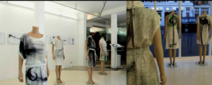
While watching this video, I was very intrigued by the algorithms that were implemented. Particularly, I loved the pieces where they use certain algorithms to create meaningful simulations. This shows us how ordered chaos is all around us. The artwork in which the geometry of the body and tissue images are used to make clothing was very cool.

The way that randomness is portrayed is very interesting, especially when he shows different patterns which are all produced by a single algorithm. This shows how so many different artworks can be produced with randomness, just by doing a small change such as the speed in which the artwork moves or even the characters that are used for the pattern.

Another concept I found fascinating was “Fractal Invaders” where a coin is flipped and outputs either a black or white square depending on heads or tails. When it was made symmetrical, we started to see actual shapes that made so much sense.

Assignment 2: Loops

This piece was inspired by the constant traffic in Dubai. While sitting and watching the road in the car, I had noticed a few patterns that are repeated, such as the circles in a traffic light and the dashed road markings that separates the lanes.

The idea for this interactive piece is for the user to control the traffic by hovering over the traffic light and choosing whenever it turns red, yellow, or green.

I used for loops to portray the road markings and the circles in the traffic light. Something that I spent some time to figure out is how I can make the road continuously animate without it stopping. For that, I used frameCount and the Modulus sign to control it.

//green
  else if (mouseX > 340 && mouseX < 370 && mouseY > 95 && mouseY < 125) {
    for (X = -40; X <= width; X += 160 ) {
      for (Y = frameCount % 80; Y <= height; Y += 80) {
        fill('white');
        rect (X, Y, 15, 30); 
        frameRate(60);
        fill('green');
        circle(355, 110, 30);
      }
  }
  }

For improvements, I would add an instructions page before so that the user would know what to do. I would also add more cars that move in different lanes.