reading

In Emotion & Design, i feel like Norman focuses on how beautiful design enhances usability by creating positive emotions, which make users more flexible and forgiving. I agree with him because, who can argue that a product like the iPhone, with its stunning and iconic design, makes us ignore minor flaws just because it’s so visually appealing? I’m definitely more inclined to overlook its glitches simply because it looks so good.

Norman’s observation regarding the distinction between the design requirements for calm and high-stress settings is also something i agree on. For example, In emergencies, functionality must take precedence over aesthetics; fire exits should be clear and direct, regardless of their visual appeal. However, in a coffee shop,  good design is everything. For instance, Starbucks. The warm, inviting ambiance practically begs people to stick around, engage in conversation, or get some work done. The environment is not just a random occurrence; it’s a purposeful decision to merge practicality with an inviting look, encouraging people to stay.

However, I completely stand by Norman’s critique of designs that prioritize style over substance. I have direct experience with this, which involved a “smart” lamp. Sure, it had a fantastic appearance, but honestly, controlling it was nearly out of the question. Why bother making something aesthetically pleasing if it’s not functional? Function should always take over over mere aesthetics in design. Consequently, well-made products leave a lasting impact, while purely decorative ones quickly lose their appeal.

The story of Margaret Hamilton changed the way I think about design and leadership. She did more than her job; she made sure the program was safe, even though some people didn’t understand why it was important. I really admire that kind of dedication to quality, even when it’s not what everyone wants. It makes me think about how important it is to pay attention to the little things and set high standards, even if other people don’t always get it.

People often think that tech is a “man’s world,” but her story shows that this is not true. It’s inspiring to think that one of the first software engineers was a mother who worked full-time and took care of her family. It shows that diversity isn’t just nice to have; it’s important. In group projects and in real life, I’ve seen how hearing different points of view can lead to better ideas. Hamilton’s story makes me want to support diversity in every area I work in.

UNUSUAL SWITCH

CONCEPT:

For my switch, I wanted it to reflect something meaningful from my culture, drawing inspiration from the way men greet each other with a traditional nose-to-nose gesture. This greeting, known as “Al Khushm,” symbolizes respect and warmth, and it felt like the perfect starting point for a unique switch design. I wanted the setup to embody this gesture functionally, so I used two pieces of aluminum foil, each attached to a wire to act as a touch-sensitive switch.

I positioned the foils so that, with a light press—just like the gentle touch in a nose-to-nose greeting—they connect and complete the circuit, turning on the light. I chose aluminum foil for this setup because it’s simple and a good conductor, making it easy to work with for a touch-sensitive design. This material and setup felt like the best way to capture the essence of a traditional greeting functionally. This design doesn’t just represent the gesture; it brings it to life in a modern form which is why i want to create this.

HIGHLIGHT:

The part I’m most proud of is the touch mechanism that simulates the cultural greeting. By setting up the switch with two pieces of aluminum foil and wiring them so that contact turns on the LED, I’ve managed to capture the concept of a traditional greeting in a unique, interactive way.

  // Read the current state of the switchPin
  // LOW means the metal plates are in contact (touch detected)
  int switchState = digitalRead(switchPin);  
  
  // Output the switch state to the Serial Monitor for troubleshooting
  // Prints '0' when plates touch and '1' when they are apart
  Serial.println(switchState);  
  
  // Check if the switch state is LOW (indicating touch/contact)
  if (switchState == LOW) {     
    digitalWrite(ledPin, HIGH); // Turn on the LED when plates touch
  } else {
    digitalWrite(ledPin, LOW);  // Turn off the LED when plates are apart
  }
}

REFLECTION:

One challenge I faced with this setup was keeping the aluminum foil pieces stable. They kept slipping out of place, which made the switch less reliable and the circuit would often disconnect unintentionally. For future improvements, I’d like to find a better way to secure the foil pieces and wires, perhaps by using a more solid base or even switching to conductive tape that can stay in place more effectively. Additionally, adding a way to adjust the pressure sensitivity would make the interaction feel more realistic and closer to the gentle touch of a greeting. These adjustments would help make the switch more durable and improve its functionality, keeping the cultural gesture intact in a smoother way.

UNUSUAL SWITCH:

(i couldn’t find men to do this)

https://github.com/aaa10159/intro-to-IM/blob/3c5cdd3fb62cd513e27758de7d7c168917ccd288/sketch_oct28b.ino

MIDTERM

CONCEPT:

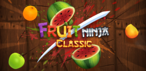
The idea for my project initially came from my nostalgia for Fruit Ninja.

Fruit Ninja Classic - Halfbrick

This was a game I enjoyed during my childhood, and I wanted to capture that excitement in my own way. I began by recreating the core mechanics: objects falling from above, mimicking the action of fruits being thrown up in Fruit Ninja. The player interacts by catching these items, with some scoring points and others, like the scorpions, leading to an instant loss. It took me a while to fine-tune these functions and get the timing, speed, and interactions to feel as responsive and engaging as the original game. At first, I struggled with the mechanics, as I wanted the motion and flow to feel natural and intuitive, just like in Fruit Ninja.

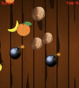
After a lot of trial and error, I was able to get the objects falling at varying speeds and from random positions, which gave the game a sense of unpredictability and challenge. I also added a cutting effect, just like in the game. This process helped me understand the importance of small details in game development, such as timing and object positioning. I also experimented with different speeds and sizes to make the game challenging yet enjoyable. The initial version was simple, but it felt exciting to see it come to life and mirror the familiar feeling of Fruit Ninja while incorporating my own twist. Here’s how it came out:
However, as I progressed, I realized that directly copying Fruit Ninja wouldn’t fully reflect my own creativity or bring anything new to the experience. This led me to reflect on my childhood memories. I recalled family trips to the desert in the UAE, where we would snack on dates and sweets under the open sky. I remembered the joy and the relaxed environment, but also my fear of scorpions, which were common in the desert. It struck me that this blend of joy and tension could provide a compelling twist to the game. I decided to adapt Fruit Ninja’s concept to incorporate elements of these desert trips. Instead of slicing fruits, the player would catch falling dates and sweets in a basket to score points, which was the cultural twist I wanted to add. Dates and traditional sweets, which are common in Emirati gatherings, served as the main items to catch, reflecting my childhood memories of trips to the desert with family. However, there was also a twist that added suspense to the game: scorpions. Just as scorpions are a real concern in the desert, they posed a threat in the game. If the player accidentally catches a scorpion, the game instantly ends, mirroring the risk and danger associated with encountering one in real life. To add more depth, I included power-ups like coins for extra points and clocks to extend the timer. These power-ups fall less frequently, requiring the player to remain alert and responsive. This combination of culturally inspired items, the risk of game-ending threats, and occasional rewards created a gameplay experience that balances fun and challenge. The game’s aesthetic, from the falling items to the traditional Arabic music, all contribute to the cultural theme. Overall, the game became not just a nostalgic tribute to Fruit Ninja but also a playful representation of a personal childhood experience infused with elements of Emirati culture.

HERES MY GAME:
LINK TO FULL SCREEN: https://editor.p5js.org/aaa10159/full/rZVaP6MKc

HIGHLIGHT OF MY CODE:

The gameplay mechanics involve the basket interacting dynamically with various falling items, including sweets, dates, scorpions, and power-ups. Each of these elements serves a unique purpose in the game. For example, catching sweets and dates earns points, catching a scorpion ends the game, and catching power-ups like coins or a clock offers bonuses that enhance the gameplay experience. Integrating these interactions smoothly required attention to detail and precision in coding, as I needed to ensure that each item type was recognized and handled correctly by the basket.

To handle collisions between the basket and the falling items, I implemented a collision detection method within the basket class. This method calculates the distance between the basket and each item, determining if they are close enough to be considered “caught.” If they are, the game then applies the appropriate action based on the type of item. This collision detection is crucial for the game’s functionality, as it allows the basket to interact with different items dynamically.

// Define the Basket class, which represents the player's basket in the game.
class Basket {
  // Constructor initializes the basket with an image and sets its position, size, and speed.
  constructor(img) {
    this.img = img;           // The image used to represent the basket.
    this.x = width / 2;       // Horizontal position, initially centered on the screen.
    this.y = height - 50;     // Vertical position, near the bottom of the screen.
    this.size = 150;          // Size of the basket, controls the width and height of the image.
    this.speed = 15;          // Movement speed of the basket, determining how fast it can move left or right.
  }

  // Method to control the movement of the basket using the left and right arrow keys.
  move() {
    // Move left if the left arrow;is pressed and the basket is within screen bounds.
    if (keyIsDown(LEFT_ARROW) && this.x > this.size / 2) {
      this.x -= this.speed;   // Update the x position by subtracting the speed.
    }
    // Move right if the right arrow is pressed and the basket is within screen bounds.
    if (keyIsDown(RIGHT_ARROW) && this.x < width - this.size / 2) {
      this.x += this.speed;   // Update the x position by adding the speed.
    }
  }

  // Method to display the basket on the screen.
  display() {
    // Draw the basket image at its current position with the specified size.
    image(this.img, this.x, this.y, this.size, this.size);
  }

  // Method to check if the basket catches an item (e.g., a date or power-up).
  catches(item) {
    // Calculate the distance between the basket's center and the item's center.
    let distance = dist(this.x, this.y, item.x, item.y);

    // Check if the distance is less than the sum of their radii.
    // If true, this means the basket has caught the item.
    return distance < this.size / 2 + item.size / 2;
  }
}

In this code, the ‘catches()’ function plays a central role. It calculates the distance between the basket and the center of each item. If this distance is smaller than the sum of their radii (half their sizes), it means the item is “caught” by the basket. This collision detection method is efficient and works well for circular objects, which is perfect for the various falling items in the game.

By using this approach, I was able to ensure that the basket can accurately catch power-ups, dates, and sweets, and also end the game when a scorpion is caught. It’s a simple yet effective way to handle interactions between the player and game objects, which is essential for my game. This method also ensures that players can control the basket smoothly, making it feel natural as they try to avoid scorpions and collect items to score points.

FUTURE IMPROVMENT:

One of the specific challenges I encountered was perfecting the basket’s interaction with falling items, particularly when it came to maintaining accuracy in collision detection. Initially, I found that the items would sometimes pass through the basket without registering a catch, which was frustrating. To resolve this, I adjusted the bounding boxes for each object and tuned the distance calculations in the ‘catches’ function. However, this process revealed another area for improvement: the scorpion’s animation. Currently, the scorpion is static, but animating it would add a dynamic and slightly intimidating effect, enhancing the player’s experience.

Another improvement I’d like to make involves expanding the game by introducing different game modes. Currently, the game focuses on catching dates and sweets while avoiding scorpions, but I envision adding modes with unique objectives and challenges. For instance, one mode could intensify the difficulty by increasing the speed of falling items, while another could introduce new types of falling objects that require different strategies to catch or avoid.

Additionally, I would like to explore a survival mode where players have to last as long as possible, with gradually increasing difficulty as more scorpions and fewer power ups appear over time. By adding these game modes, It would offer players more choices and variety, encouraging them to keep playing and exploring new strategies within the game. This would not only add depth to the gameplay but also align with my goal of making the game more engaging and enjoyable for a broader audience.


WEEK 5: review

I found the reading, which breaks down computer vision and its applications in art, to be interesting; however, I have some opinions. I totally agree that computer vision has expanded from military and law enforcement applications to more creative fields like art and gaming. This shift is really exciting as it creates numerous opportunities for artists and programmers to explore and innovate. Also, I found it interesting in the reading when it shows how beginners can make computers “see” by using basic methods like frame differencing or background subtraction, which increases accessibility to the technology.

However, I feel the reading is somewhat overly positive regarding the capabilities of computer vision in “seeing” things. It’s known that computers can track objects and people, but the reading doesn’t highlight enough how much more challenging it is for computers to grasp what they’re observing compared to humans. Humans, for instance, may easily understand a chaotic scene, whereas computers frequently require specific conditions, such as bright light and different objects and background contrast.

The reading reminded me of the game Just Dance. The game tracks your movements while you dance using computer vision technology. It’s enjoyable, but it doesn’t always hit the mark. If your room lacks sufficient light or the camera isn’t positioned just right, the game may struggle to accurately track your movements, which can be quite frustrating. I think the reading should focus more on how computer vision struggles in imperfect situations, even though technology has the potential to produce amazing interactive experiences.

Finally, the reading points out worries regarding the potential use of computer vision for tracking and surveillance purposes. This is something to keep an eye on. It’s enjoyable and imaginative in gaming and artistic pursuits, but it has the potential to invade personal privacy. In general, the reading could have presented a more balanced view by discussing the downsides more and not just highlighting the positives; however, I found it to be interesting when it was breaking down the computer’s vision in a way I hadn’t thought about before.

MIDTERM PROGRESS

MY CONCEPT:

I made the decision to design a game for my midterm project in the style of the vintage game Fruit Ninja, which was hugely popular a few years ago. I chose Fruit Ninja because it was known for its simple yet addictive gameplay. In the original game, fruits are thrown into the air, and the player must slice them by swiping across the screen. The goal is to slice as many fruits as possible while avoiding bombs. If a player slices a bomb or misses multiple fruits, the game ends. The game progressively increases in difficulty as more fruits and bombs appear on the screen while the timer is running out.

In my version, the game remains similar to the original concept, but instead of swiping, the player uses the mouse to slice fruits as they are thrown into the air. However, I’ll be adding a ninja using a splice sheet, which will make it more fun for the user to interact with. As the game progresses, more fruits and bombs are thrown to increase the challenge. Each sliced fruit increases the score, but if the player slices a bomb, the game ends instantly. My version also gradually increases the difficulty over time by speeding up the fruit and bomb spawn rate, which is a similar addictive experience to the original Fruit Ninja. Also, I’ll be adding music in the background and sound effects for the fruits being sliced and the bomb being triggered. Overall, the goal of the game would be for the user to earn points and beat there high score. It sounds boring, but the interactions within the game are what will make it fun.

In terms of design, I aimed to keep the visuals simple yet engaging, with vibrant fruit images, smooth animations, and a clean background. I wanted to add fruit-slicing effects, which include splatters, to make the game feel dynamic and immersive, similar to the original Fruit Ninja experience. Also, I want to create explosives when the bomb gets triggered. For the background, I will keep it similar to the original game by adding wooden planks. As for the texts, I want to make them bold red or colorful like the fruits (still deciding) and also have them in Japanese text style. Also, as I said, I will incorporate music to make the game lively and as fun as the real game.

USER INTERACTION:

User interaction is central to the experience of my game. Players will use the mouse to slice fruits by hovering and clicking across the screen. The simplicity of using just one hand to interact makes it easy to pick up, while the increasing challenge keeps it engaging. The addition of the ninja character and slicing animations adds a layer of fun to the interaction. As players progress, they’ll need to be more precise and quick as the number of fruits and bombs on the screen increases. Also, I wanted to add something like a bonus fruit, where it would have more value than the other fruits and power-ups to keep it fun. The mouse-based game offers a fluid way to engage with the game, making the experience more immersive. Sound effects will provide immediate feedback for actions, which will make the user’s interaction satisfying while slicing or the warning of an approaching bomb/exploring.

MY MOST COMPLEX PART:

My game’s most challenging component is making sure the game ends smoothly and without needing a page refresh while managing the sound effects. That’s why I’m going to add a gameEnd flag that stops all in-game events, like fruit and bomb spawns, and shows a game-over screen when a bomb is cut or the timer runs out. Background music and sound effects will stop when the game is over, giving the player a clear break. Im also going to add a way to start the game over again from the screen that says “Game Over.” This way,  the user won’t have to refresh the page. Another challenge is ensuring that multiple sound effects, such as slicing fruits and triggering bombs, don’t overlap or cause audio clutter. In order to avoid this, I will manage sound channels and test various scenarios to make sure the sound effects are smooth and don’t collide, enhancing the overall user experience. In the end, I’m still looking for ways where this can successfully go smoothly, and this is what I’ve come up with so far regarding this issue.

MY PROGRESS:

This is just the base of my game. As you can see, the game is still not smooth, and the fruit is getting thrown everywhere; however, I’m still adjusting to it to make it work better. I just incorporated the fruits, the bomb, half of the test, and the background. I still need work on it by adding sounds and the ninjas to finalise this code, as well as fixing on the smoothness issue. Also, I’m still working on the instruction page and how the user can go on from that.


READING

After reading, my initial thought was how, in the real world today, we are always competing to make inventions that already function smoothly look fancy and aesthetically futuristic. This causes us to overlook the importance of simple designs that just work. The examples given in the text, like doors, switches, and stoves, are good examples of how, in today’s world, simple objects can become confusing when designed poorly just for the sake of appearance. In my opinion, I appreciate good design when it works easily, rather than the overcomplicated ones that frustrate me. For example, when he talked about his friend’s experience with a door, it really stood out to me because it shows how humans can take something simple and turn it into something people struggle with, which is also frustrating.

For me, it’s annoying when designers care more about how things look than how they function. It feels like they’re taking away the object’s purpose. It’s not just me who feels this way, because older generations also struggle with this. They have a hard time catching up with how the world functions now, so adding complexity to something that’s supposed to be simple just makes it harder for them. Sometimes it feels like designers expect us to admire their work without caring if we can actually use it. What’s the point of a nice-looking door if I don’t know how to open it? This applies to all kinds of things, not just objects, but whether it’s a phone app or a media project, it needs to be easy to use.

In today’s world, many products are designed with minimalism in mind. While they may look cool and modern, they often hide important functions. For example, take Kim Kardashian’s sink design in her house. The sink looks cool and ultra-modern, but it’s confusing because it doesn’t function like a regular sink. The surface is completely flat with no visible basin, and the water drains into a small slit. While the design looks unique and futuristic, it takes away from the sink’s practicality. When I saw it for the first time, my first thought was, “How does the tap work?” This is a perfect example of minimalist design taken too far, where the design hides or complicates something as simple as a sink’s basic function. The goal of making something aesthetically pleasing can actually make its usability hard and confusing.

Overall, I think the ideas of “discoverability” and “understanding” are important when it comes to the process of designing something. Discoverability helps someone figure out what to do, while understanding helps them know how it works. To me, these two concepts are essential to good design. This also applies to the media work I want to do. If something isn’t clear, the message gets lost. Good design should be so simple and natural that you don’t even think about it. That’s something I want to keep in mind for any future projects I create, whether in film, media, or design. In the end, I think it’s important not to overlook the balance between how something looks and how well it works.

ASSIGMENT #4 – GENRATIVE TEXT

CONCEPT:

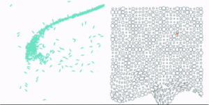
For this assignment, I wanted to create generative art that involved text. While searching for inspiration, I came across Scott Garner’s work on Creative Blog, where he used p5.js to create an art piece with stars forming text against a night sky backdrop. This inspired me to explore how stars, randomness, and interaction could be combined to form dynamic, visually engaging text. For my piece, I will create stars that will scatter and form text shapes based on user interaction, blending order and randomness, just like Garner’s example. Ill also make it a space theme while exploring Gaussian distribution to add in the art background.

EMBEDDED SKETCH:

HIGHLIGHT OF MY CODE:

The best part of my code is the interactive switching feature that lets people switch between an arranged text and scattered stars. When you click on a button, this interaction starts. It’s a dynamic, responsive experience where stars move from randomly scattering to making a word. This is how the code works:

// Function to scatter the white dots randomly across the canvas
function scatterDots(canvasWidth, canvasHeight) {
  whiteDots.forEach(dot => {
    dot.currentX = random(canvasWidth);  // Set random x position within canvas width
    dot.currentY = random(canvasHeight);  // Set random y position within canvas height
  });
}

// Function to reset the white dots and stop forming the text
function resetDots() {
  formingText = false;  // Stop forming the text
  scatterDots(500, 500);  // Scatter the dots randomly across the canvas again
}

// Detect mouse presses and trigger button actions
function mousePressed() {
  buttons.forEach(button => {
    if (button.isClicked(mouseX, mouseY)) {  // Check if the button is clicked
      button.action();  // Execute the action tied to the button
    }
  });
}

In the code snippet shown above, I used three key functions to create interactivity and movement:

  1. scatterDots(): This function scatters the white dots randomly across the canvas by assigning each dot a random x and y position within the canvas width and height. It adds randomness, simulating stars in the sky.
  2.  resetDots(): This function resets the dots to scattered mode by setting ‘formingtext’ to false and calling again scatterDots().
  3. mousePressed(): This function detects mouse presses and triggers button actions when the user clicks on the canvas, adding interactivity.

I used these functions to let users switch between random scatter mode and text formation mode based on button clicks. I figured out how to implement these by looking back at class PowerPoints and just experimenting until I got it right.

REFLECTION:

When I think back on this assigment, I like how the stars and the shooting star worked together to make a lively and interactive visual experience. The way the stars scattered and formed the text was just the right mix of randomness and order, just the way I imagined it would be. It looked more real and unpredictable because the shooting star moved in a Gaussian way.

For future updates, I’d like to look into adding more complex interactions. For example, users could drag to control how the stars or shooting stars move. In addition, improving the shooting star trail could make it look more real by making it fade more smoothly over time.

REFRENCES:

Garner, S. (2016, August 10). Explore creative code with p5.js. Creative Bloq. https://www.creativebloq.com/how-to/explore-creative-code-with-p5js.


READING #2

After reading the article “The Art of Interactive Designs,” I kept thinking about what makes something truly interactive. The author does point out that a good interactive system feels almost like a conversation, like there’s this back-and-forth where the system responds to what you’re doing in real time. It made me realize that a lot of systems or designs we think are “interactive” really aren’t, especially when they don’t actually engage with the user in a meaningful way. If something just sits there and doesn’t respond, it’s basically dead weight, no matter how fancy it looks.


In my opinion, it was interesting how the writer claims that interaction isn’t just about cool or flashy videos. its about making the user feel like there in control and that their input to that piece is important. Sometimes, I would see designs that look amazing but don’t actually respond well to the user. This means that I most likely overlooked my previous artwork I created in p5.js.  Yes, I’m proud that I was able to create art that looks cool, but if it’s not responsive or doesn’t react to what the user does, it’s not really interactive in the way it should be.


This article really pushed me into thinking about how I could improve my p5.js sketches to make them more interactive. Right now, for the assignment I’m doing this week, I feel like its a little bit flat, but they respond, but not in a way that feels satisfying. For instance, you can click a cube and it pops out, but that’s about it. I want to bring in smoother transitions, add more control options, and maybe even layer multiple interactions on top of each other. For example, what if clicking a cube changed its color, or if dragging across the screen triggered more than one animation? That’s the kind of engaging interaction the article talks about, and it’s the direction I want to head in. I really believe that real interaction should be immersive, and I think the article agrees on that too . I mean, from what I understood, its not about one thing happening at a time; its about creating a system that is consistently reacting to the user. In the future, I want my own projects to feel like they are alive and responding, not just a list of functions that don’t change.

Assignment #3

CONCEPT:

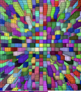
For this art work, I’m going with a concept similar to my previous one and continuing the Velnor Molnar grid art. I was on the lookout for art pieces made with artists who used P5.js, and I found myself inspired by two standout visuals. I was really drawn to this vibrant 3D cube grid. It has so much depth and layers that it just stands out.

The next source of inspiration is a straightforward yet powerful idea known as the “Fading Grid.” The color changes are truly captivating, producing a gentle fading effect that evolves within the user interaction.

I’m thinking of combining both concepts. I’ll incorporate the 3D cube design and introduce some interactive color fading, drawing from both sources of inspiration. When you click on the mouse, the cubes shift, with the color changing within the user interaction to create movement in a way that feels interactive.I’m really looking forward to seeing how blending these two concepts will influence my final piece of art.

EMBEDDED SKETCH:

Click on the cubes!

HIGHLIGHT OF THE CODE:

One part of my piece where I’m really proud is how I changed the lighting of the cubes based on how the user moved their mouse. As the mouse moves toward a cube, it gets brighter. As the mouse moves away, it gets darker. This makes the background look smooth, which makes the cubes seem to be reacting to the user being there.

Continue reading “Assignment #3”

Assignment#2_piece of art

CONCEPT:

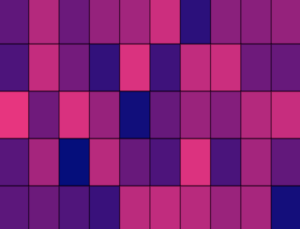
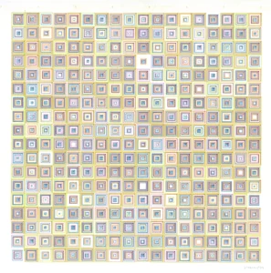
Two artists have caught my eye for my concept: Vera Molnár and Dr. Bill. Vera Molnár’s use of grids and squares with small touches of randomness was something I thought of as cool and want to bring to my own piece, especially after watching Casey Reas and learning how randomness can create unique art pieces. Her piece “(Dés)Ordres” shows an example of balance between order and chaos by introducing little changes in color and shape within a structured grid (Molnár, 1974). I want to do something similar by using a grid of squares and making each square unique, creating a sense of predictability within the order. The second artist’s art, Dr. Bill’s, has inspired me to incorporate interactive elements into my artwork (Kolomyjec, n.d.). I plan to incorporate an interactive element where the colors of the squares shift as the viewer moves their mouse across the screen, making it engaging.

To be more specific about my design, I will use the loop function to add squares all over the canvas. However, like Molnár’s designs, I’ll also add squares within the squares, but I’ll be using randomness to change either how the square moves or how big it is inside the square, or the colors of the square. Also, I wanted to make it more interesting by picking one color on one side of the canvas that changes with the user and the mouse interaction with it. In addition to that, I wanted to make it a vibrant piece by adding random colors, but as I said, I’ll be choosing one specific color that changes within the interaction of the viewer and the mouse. Hopefully, by combining Molnár’s structured randomness with Dr. Bill’s generative interaction, I am aiming to create a dynamic and engaging piece, by working with order and unpredictability, to make something that evolves with each viewer’s interaction.

The images below are Vera Molnár and Dr. Bill’s work that inspired my piece:

Dr.Bill

Vera Molnar

SKETCH:

HIGHLIGHT:

One part I’m really proud of is figuring out how to make the cubes “shake.” I used the “random()” function to add small random movements to the X and Y coordinates of each square. By setting “randomShakeX” and “randomShakeY to values between -3 and 3, the squares move slightly, creating a subtle shaking effect.

It took me a while to get this right and was the most time-consuming part about my code. I started out by testing  different ranges for the movement and tested the effect with various square sizes. After some trial and error, I found the perfect balance where the shaking felt noticeable but not too chaotic. This part of the code may seem little, but it makes the design feel more dynamic and playful, which is something I was excited to achieve. In the end, I was proud of how it turned out because it brought my art piece together, which proved Casey Reas’s message of how small random changes can make a big difference in how a design feels.

heres a code snippet on how to do it:

// Adding random movement to create an effect of shaking (inner squares)
      let randomShakeX = random(-3, 3); 
      let randomShakeY = random(-3, 3); 

// Draw three inner squares with the shaking effect, decreasing in size.
      rect(x + randomShakeX, y + randomShakeY, 30, 30); 
      rect(x + randomShakeX, y + randomShakeY, 20, 20); 
      rect(x + randomShakeX, y + randomShakeY, 10, 10); 
    }
  }
}

REFLECTION:

One thing I learned from this assignment is how randomness can play a big role in art. It adds variety and surprises that make the piece more engaging. One thing I want to improve is to add more interactions with the user in my piece. For example, I had an idea where pressing a key on the keyboard would change the shapes, and using the arrow keys could adjust the size of the shapes. Along those lines, I’d like to eventually turn the art into a game where people can play with the shapes and make their own patterns that fit their personalities. It would be more fun to do this with the art piece.I’m happy with how the code turned out, though. It makes me feel like the art piece fits with who I am by being colorful and unique.

References

Kolomyjec, B. (n.d.). Dr. Bill, Generative Art OG. https://www.drbillkolomyjec.com/

Molnár, V. (1974). Désordres. Digital Art Museum. https://dam.org/museum/artists_ui/artists/molnar-vera/des-ordres/