Reading Reflection – Week #4

Reflection on The Design of Everyday Things, Chapter 1

As a kid, I would agree with the author and say the thing that drives me crazy is the glass doors, that are not at all seen at all, and I kept bumping into them, nearly injuring myself. Another design that is not settled with me is the design of the bed legs. In my room at home, I keep hitting my toe with the bed leg every time I cross the bed. I feel like they are placed too much in the corner, and it is inconvenient for people, since designers didn’t think about how the object would exist in the living space and would not cause any difficulties in passing near it. I think the way to improve is to move the bed legs a bit closer, so there would be more space between the edge of the bed and floor, so when the foot is placed somewhere near, it doesn’t clash with the bed leg. Another thing I don’t really understand is why menu’s do not have photos of the dishes, cause it makes people spend more time on choosing the meal, and I guess this problem is easier to solve by just adding real pictures. 

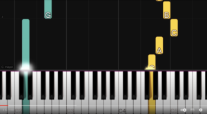
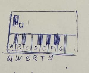
I think the way to introduce principles from the book to our IM projects and to the sphere fully is to create more signifiers, and consequently affordances in our designs. For me, right now my works mostly are appealing to my ideation and artistic thought, while they actually have to consider primarily communication between the user and the design. I think because of limits in my technical abilities, I am not able to consider the issues of affordable design for now. But the way to work on them in the future, is to introduce previews for the code, such as a small introduction about the project and what can you do with it, like lines “Press the key”. Moreover, I think to make the design more understandable for the user, is to create dynamic designs, which in some way will show how design works. And there are also simple things like buttons, keys, scales, that make design approachable. But, I agree with the author on a point that the more functions a design possesses and the more technological it gets, the more complex it becomes to maintain an affordable and easy flow design of a product.

Assignment 3 – An array of Memories

Concept

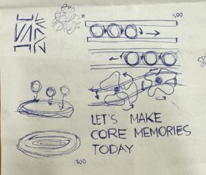
Unlike previous assignment, I was more confused on what kind of visual idea I could implement using arrays, classes and OOP. But, then I was reminded my love for Disney movies, and a complete picture came to my mind and I transferred it on paper.

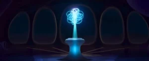
Being obsessed with Inside Out 2 movie the whole summer had its own benefits, and it gave me the idea of creating a storage of memories in my code. I struggled a couple of days, failing to implement the functions and array concept we learned in class to my own work. After watching some videos on  OOP in p5.js, I decided to implement the idea of random moving of circles in the form of “sense of self” that was present in the movie. In my vision, moving circles would symbolize the amount of experiences and emotional background the person accumulates, and with time it only expands.

Sense of Self. (n.d.). Inside Out Wiki. https://static.wikia.nocookie.net/insideout/images/b/b5/Inside_Out_2_-_Sense_Of_Self.jpeg/revision/latest?cb=20240606171333
What I’m Proud of
 function setup() {
  createCanvas(500, 500);
  
  //circle animation
  for(let i=0;i<700;i++){
    memories[i] = new Memory (250,400);
    }
}
//performing functions for an array
  for(let i=0;i<memories.length;i++){
    memories[i].display();
    memories[i].move();
  }
// creating a class for moving circles

class Memory {
  constructor (x, y) {
    this.x = x;
    this.y = y;    
  }
  
// creating a function for circles to move around randomly
  move(){
    this.x = this.x + random (-2,2);
    this.y = this.y + random (-2,2);
  }
  
// creating a function for visual of the circles
  display (){
    stroke (251, 254, 151, 80);
    strokeWeight (2);
    noFill();
    ellipse (this.x, this.y, 80, 80);
  }
}

I think exactly the “Sense of Self” thing that I implemented is the one I am most proud of, because it took me couple of days to really understand what function each element performs and what its role. So I created a class and two function for it on separate files.

First sketch

Updated version

I updated my original sketch, utilizing the concepts we covered in the class, like push(), pop(), scale () function. I created a new array to implement interactivity for changing colors of the Sense of the Self, where each color represents the  emotion from Inside Out, like ennui, sadness, fear, anger, anxiety, etc. I also moved the text line and scaled down the image of happiness to make it more aesthetically pleasing.

Reflection

Overall, I am proud of what I’ve accomplished with my code. You can see different emotions flowing into different directions, and then there is sense of self, which symbolizes character of the person and different emotional experiences. Moreover, I’ve added the sketch of the happiness image from the movie to add to the style.

However, I would like to work more the interactivity of my project. Currently, there is only way you can interact with the sketch, which is by changing color of Sense of Self. But I have some ideas of how I could develop it, for example adding memories balls to the lines when the mouse is pressed in particular location. Moreover, maybe I would elaborate on the concept of emotions, and work on more logical ways to show how different emotions evolve, like when happiness and sadness meet, there is a new emotion of nostalgia, something like that. I would also want to work on the similarity of my project to the movie’s reality, so it could be recognized from first seconds by viewers.

Reading Relfection – Week #3

In my opinion, after reading the chapter, interactivity can be characterized as responsiveness and ability of the system to give a reaction in relation to the reaction given by the user (so when we say that movies are not interactive, it means that there is only reaction from the user and it is not processed by the movie itself). However, as was written in the chapter, I don’t know to what extent the features of conversation between two people are applicable as a basis of interaction features between an object and a user, because the quality will definitely differ. But, I do certainly agree that there are different levels of interaction, and their quality depends on how invested both of the actors are.  

I think the world today is more knowledgeable about interactivity, stemming from the fact that many companies try to make their products interactive. When I read about “If the movie were interactive, you might see our heroine pause and say”, it reminded me of how Netflix introduced interactive series on their platform, where viewers themselves decide what kind of action the character should do next. And the same thing actually is introduced in the books, where a reader, based on their choice, switches to specific pages to continue reading their chosen storyline. I think even though the interactivity of such products can be marked as low, it is still present there. 

Reflecting on the ideas, I thought about using buttons, as a form of interaction in my p5 sketches. Moreover, since I am the one who usually picks the style of the visual, maybe I can try making the user choose the color palette and style that they want to see as well. In that way, sketches will reflect choices the user makes.

Assignment 2 – Looping in the Dunes

Concept

When thinking about what kind of loops and patterns I would like to code for my assignment, I had my ideas brainstormed from floral patterns to portraits created using loops. But, I decided to choose a loop concept stylistically resembling the Dune movie. Since, the movie and its style is very diverse and highly aesthetic, I thought it would present a great room for experimentation (and also I am just a fan of the Dune sequel).

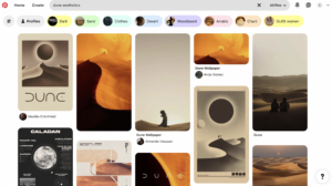
Looking through a Pinterest board, I’ve identified main elements that I would implement in my project, which was the sun and the desert. It was also important for me to work on the colors of the design.

Since, the coded image of the Dune universe was not as realistic as in the movie, I decided to add a pop art element of kind of vintage picture of the scene. So, I additionally added loop of the points.

What I’m Proud of
//desert imitation & animation
 fill ('#ea941b')
 stroke('#dd691e');
 strokeWeight (1);
   
 for(let x=25;x<=550; x += 100){
   for (let y=190;y<=510; y += 15){
     if(mouseIsPressed){
       fill(238,159,28);
       arc(x,y,50,15,PI,0)
   }
     else {
       arc(x,y,50,15,0,PI);
     }
   }
 }
   
 for(let x=75;x<=550; x += 100){
   for (let y=190;y<=510; y += 15){
     if(mouseIsPressed){
       fill(216,99,29);
   arc(x,y,50,15,0,PI);
      } else {
       arc(x,y,50,15,PI,0)
     }
   }
 }

I’ve been struggling a lot with how to visualize the dunes in the code. After experimenting with the arcs, I switched from noFill arcs to filled ones, cause they looked more on point in the visuals. Moreover, I wanted to animate the arcs, so I used conditionals to create some difference in the forms and image of moving dunes in the desert. I feel like I could accomplish my vision, even though it took a lot of trials.

Sketch

Reflection

In the future development of this project, I would like to work more on the image of the dunes, to make them more realistic and appealing (so it would be easier to recognize theme of the Dune). I think this could be accomplished through Bezier curves or experimenting with another forms of arcs. Moreover, I would work on interactivity of the project, since even though it is now interactive in some way, I would like to focus specifically on resemblance of the desert environment, such as wind moving the sand or just the sunrise and the sunset. In addition, I think color scheme could be improved, by adding more gradients.


Reading Reflection – Week #2

Reflecting Eyeo2012 lecture by Casey Reas

Casey Reas starts with the statement that nature constituted the chaos in the world, but after, order was introduced by God. I was surprised by such an idea, because in my worldview people are the ones causing chaos in neatly ordered nature. Learning on biology classes about different systems that existed in nature, like nutrient cycling, I was thinking about humans intervening in these structures and causing disorder. But, now, looking back to Reas’ statement, I feel like maybe it is God and humanity who decided to order all the processes in our ecosystem, so that it would be easier for us to live with them. Moreover, I started thinking about how exactly artists are maintaining order with their works. Don’t they question the initial order of things to break through it? I felt like art was always about the protest, but now I do think I was partly wrong. 

Looking at the artworks that experiment with total randomness in images, I really liked how the same patterns get transformed to different mediums and it adds to the idea of a chance and minimum control of future image (07:07 about process 18). In addition, I couldn’t fully understand what’s the optimum balance between total randomness and complete control, because some works used a little bit of randomness and mostly decision making, which gets us to the point that we can control the amount of randomness, and it is a contradictory statement at its core. 

I really liked the author’s throwback to the past interactions of artists with a chance. It reflected in me in a sense that previous generations were highly afraid of chaos or anarchy, which is why destruction of an order in artworks was considered a radical gesture. But, as previous generations, we did experience different wars and uncertainties, and I think what makes us different from them and what makes artists be more confident and open about using randomness in arts, it is a sense of freedom and being okay with not knowing everything. Before I didn’t really think about historical events being influential on appealing to order and chaos, but now I do. 

In the video, the quote of Richter: “Chance is always planned, but also very surprising” resonated with me because chance is needed to introduce something different and disruptive. 

Observing Mondrian’s work, I didn’t expect to understand that order actually does not limit emotion and spirit, even in total order there is a room for interpretation and imagination. Moreover, looking at different algorithms presented by Reas, an association with the game PacMan came to my mind, since it also employed balance between order and randomness.

Assignment 1 | Self-Portrait

Concept

When I first thought about what kind of recognizable features I would like to emphasize in my work, I chose 3 of them: curly hair, earrings and background.

In this portrait, I decided to solely focus on collaboration between 2D shapes and colors to bring simplistic, yet realistic picture of me.

My first task lied in creating an interesting background for portrait that would resemble my personality in some way. Walking through library, I stumbled upon one journal that was only focused on photographs of ocean and waves. It reminded me of calmness and solitude that I do value myself, so I implemented gradient of water on background.


Furthermore, I was confused on how I could illustrate curly hair in p5, but then I decided to choose two colors and use unfilled circles patterns to show the curls.

Working on facial features, I decided to choose style similar to emoji drawings. I worked with opacity and arc’s to deliver also very calm mood of the face.

At the right bottom corner I decided to add a small signature of letter A, as it is very symbolic letter in my life.

Highlight of some code that I’m particularly proud of
//setting background
  //first row
  strokeWeight(15);
  stroke(91,184,229,50)
  fill(93, 170, 233)
  rect(0,300,100,100)
  fill(90, 177, 231)
  rect(100,300,100,100)
    fill(91, 184, 229)
  rect(200,300,100,100)
  fill(95, 190, 226)
  rect(300,300,100,100)
  //second row
  strokeWeight(15);
  stroke(110, 201, 220,50)
   fill(133, 211, 214)
  rect(0,200,100,100)
  fill(121, 206, 216)
  rect(100,200,100,100)
  fill(110, 201, 220)
  rect(200,200,100,100)
  fill(101, 196, 223)
  rect(300,200,100,100)
  //thrid row
  strokeWeight(15);
  stroke(157, 220, 210,50)
   fill(145, 216, 212)
  rect(0,100,100,100)
  fill(157, 220, 210)
  rect(100,100,100,100)
  fill(170, 224, 210)
  rect(200,100,100,100)
  fill(182, 228, 211)
  rect(300,100,100,100)
  //fourth row
  strokeWeight(15);
  stroke(218, 239, 221,50)
   fill(228, 243, 226)
  rect(0,0,100,100)
  fill(218, 239, 221)
  rect(100,0,100,100)
  fill(206, 235, 216)
  rect(200,0,100,100)
  fill(195, 232, 213)
  rect(300,0,100,100)

I am particularly proud of the background of the portrait, because it reveals additional detail I put in the work to deliver idea about my character.  I had intention in mind about creating a gradient using the tools we already learned on the lessons, so I experimented with colors, strokes, opacity, to create a kind of smooth picture that would resemble a gradient. And I think I could accomplish that.

Embedded sketch

Reflection and ideas for future work

In the future assignments, I would like to explore more efficient and realistic ways to portrait a gradient background and curly hair. In this work, major part of the code required manual instructions to create a specific illustration of curls and pattern in the background. I want to find out more efficient ways of how I could code these things. Moreover, I would further work on more specific and detail-oriented picture of the earrings, as it stays one of the key features in my portrait. I would tie shape of earrings to Kazakh national ornaments to show my identity. In addition, I didn’t have much chance to work with interactivity of my portrait in this concept, so next time I would definitely create more interactive background or interactive face features. As I progress in interactive media, I would also love to implement 3D shapes in my work.