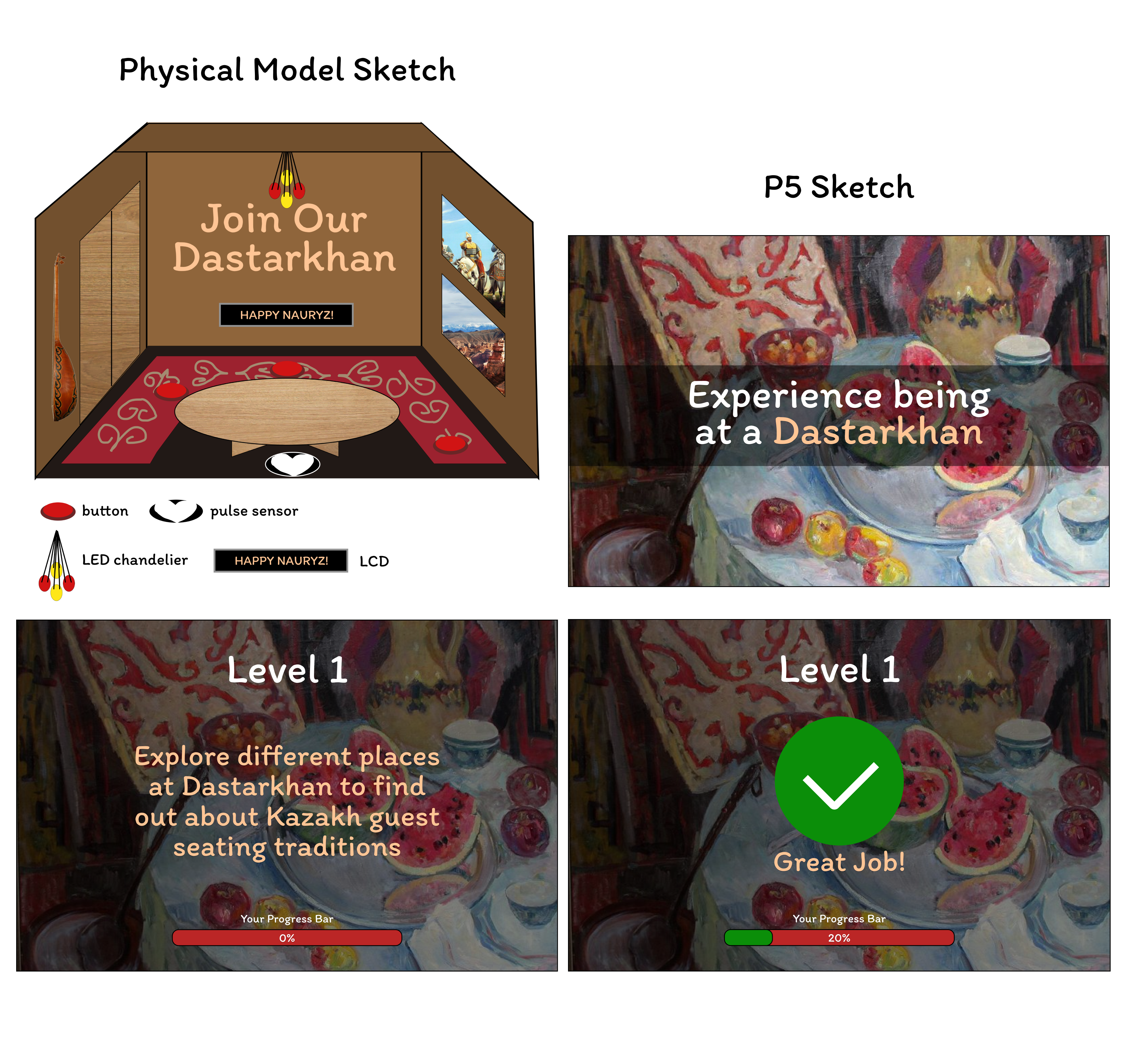
Concept
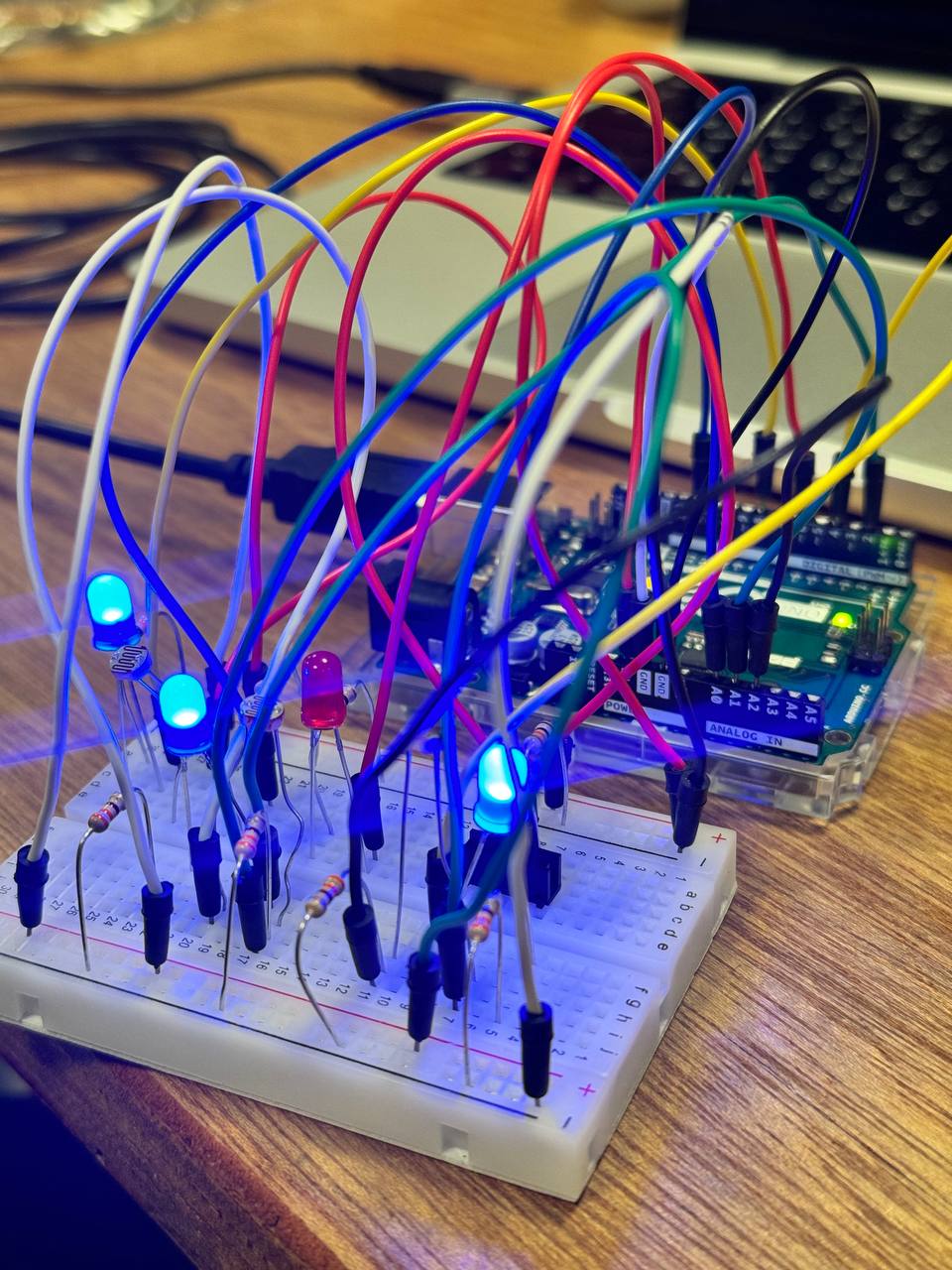
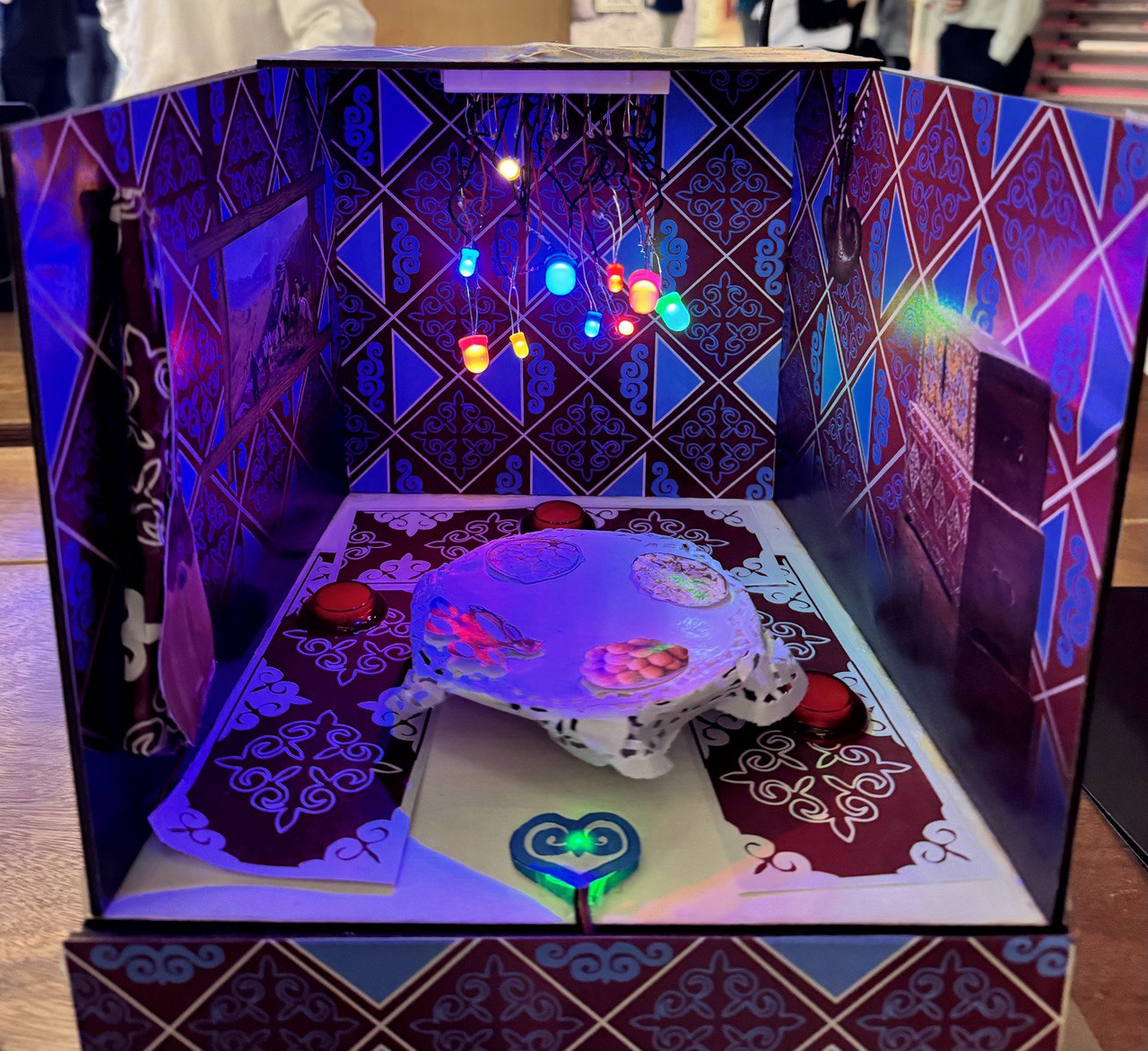
I’ve created this project to explore one of Kazakhstan’s cultural traditions seating around the table (or Dastarkhan in kazakh). This experience alone unpacks different parts of our culture from food to music. To expose the user to those different parts, I’ve created multiple levels to guide the user’s journey in understanding what Dastarkhan is. I’ve built physical room where the table is situated and implemented sensors and buttons around it to support next interactions. Overall, I have 4 levels that user has to complete:
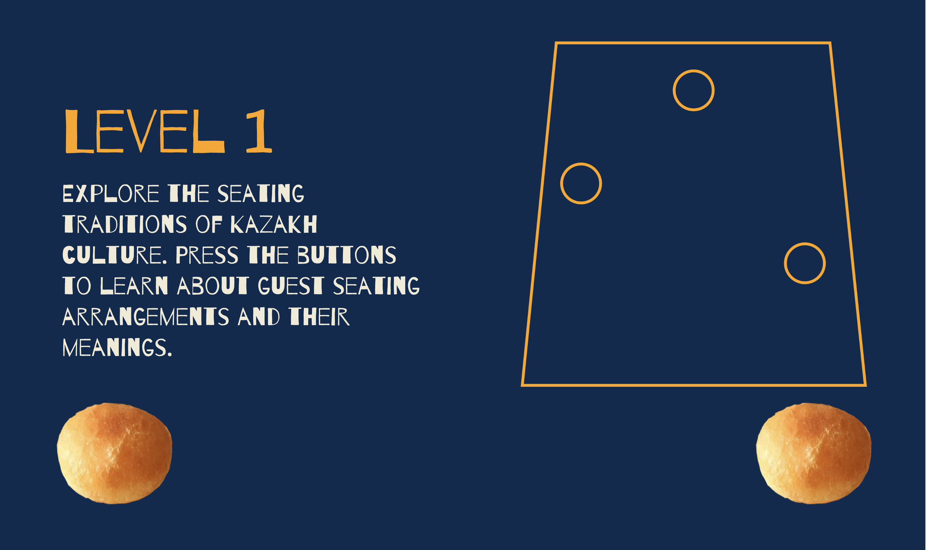
- First level is about interaction with the buttons.
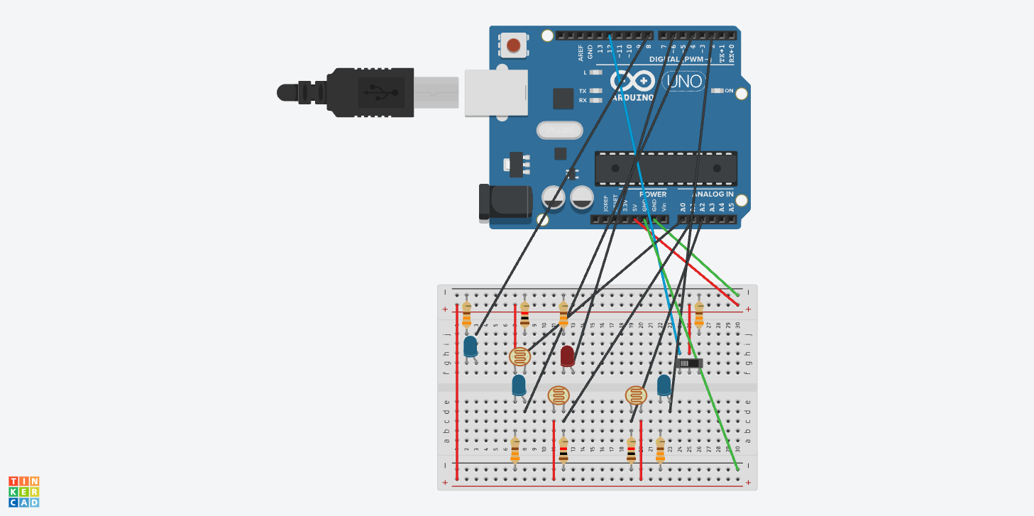
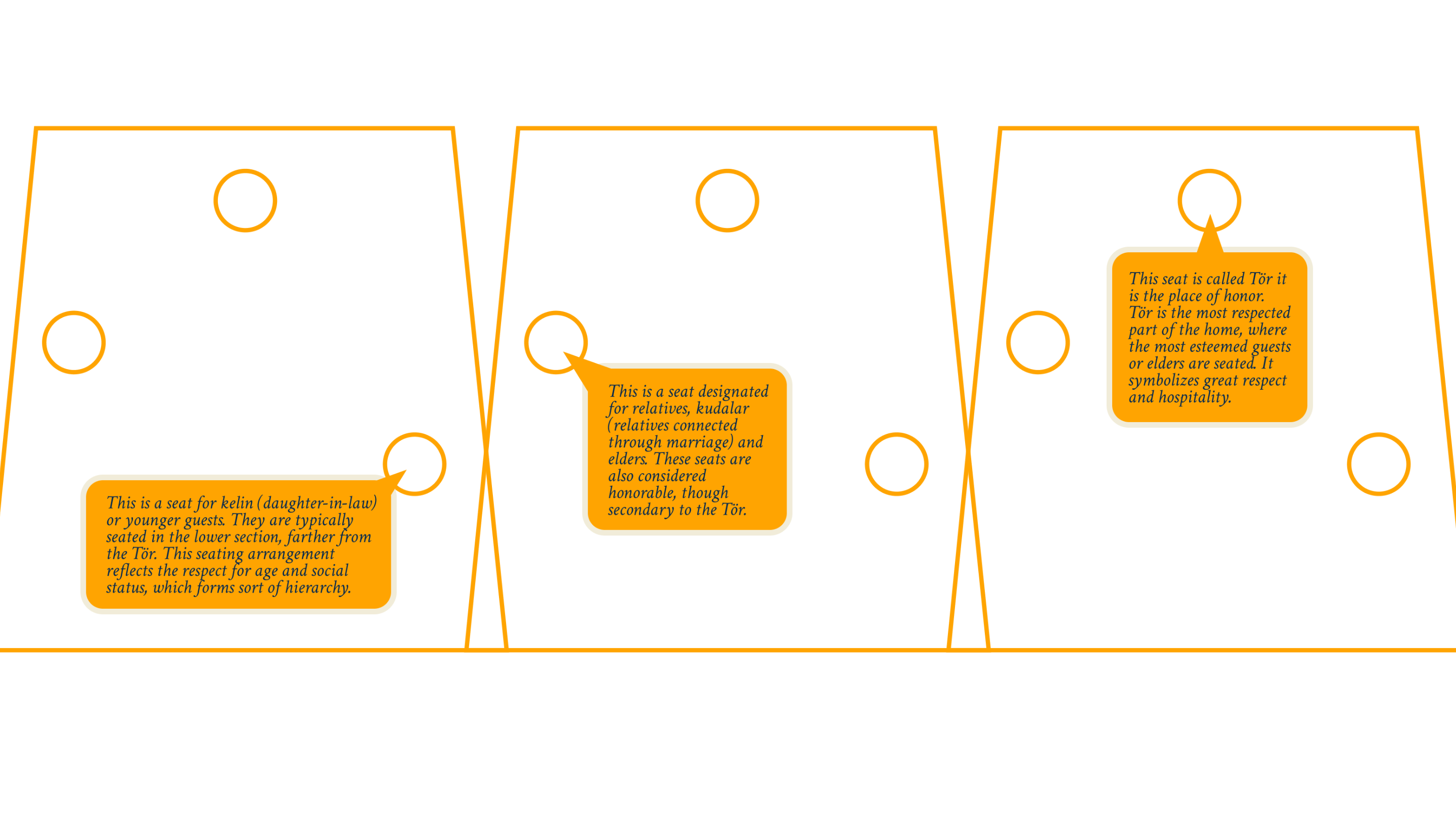
 I’ve positioned three red buttons around the table to symbolize different seating placements around the table in kazakh culture. Depending on your social status and age, your place around Dastarkhan will be different
 Therefore, user had to press different buttons to explore the meaning of the places. When user pressed the button the corresponding image appeared on the P5.
 After pressing all three buttons on the physical project, the button to go to next level appears on the P5 screen.
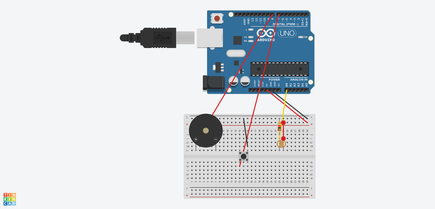
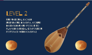
- Second level is about kazakh music. The user has to find kazakh musical instrument dombyra around the table and press it to trigger the play of the composition in the P5. When the user presses dombyra, the force sensor from Arduino sends value to P5 and the video of a musician playing on Dombyra appears.
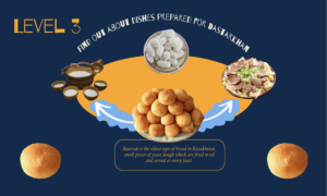
- Third level introduces the user to national dishes on the Dastarkhan. By pressing the arrows on the P5 screen, the user scrolls to different dishes and their explanations.
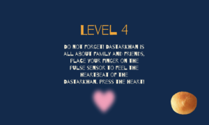
There is no interaction between P5 and Arduino at this level. The table rotates on the physical project using the servo motor, while the P5 is guided by the user. - Fourth level holds more sentimental meaning, as it uses the pulse sensor. The user has to place their finger on the pulse sensor and press on the heart on the screen. The P5 receives the message that Pulse sensor is active and then it triggers the appearance of pictures of my family and friends.


Videos of Project Interaction
P5 Project
Link to P5 code
Arduino Code
Link to Github
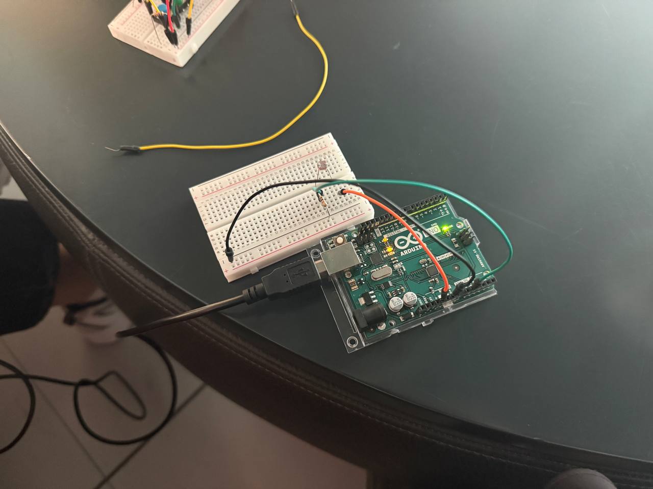
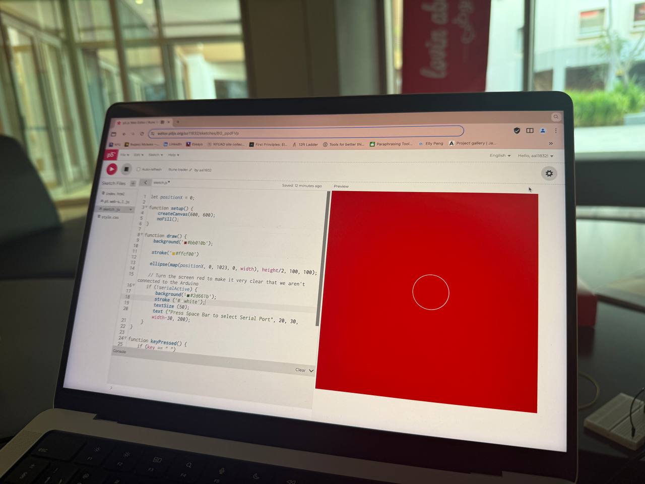
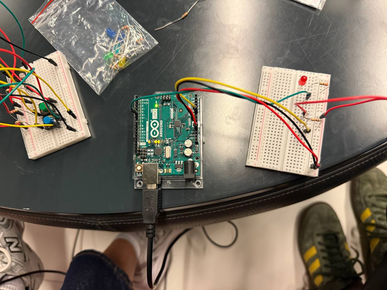
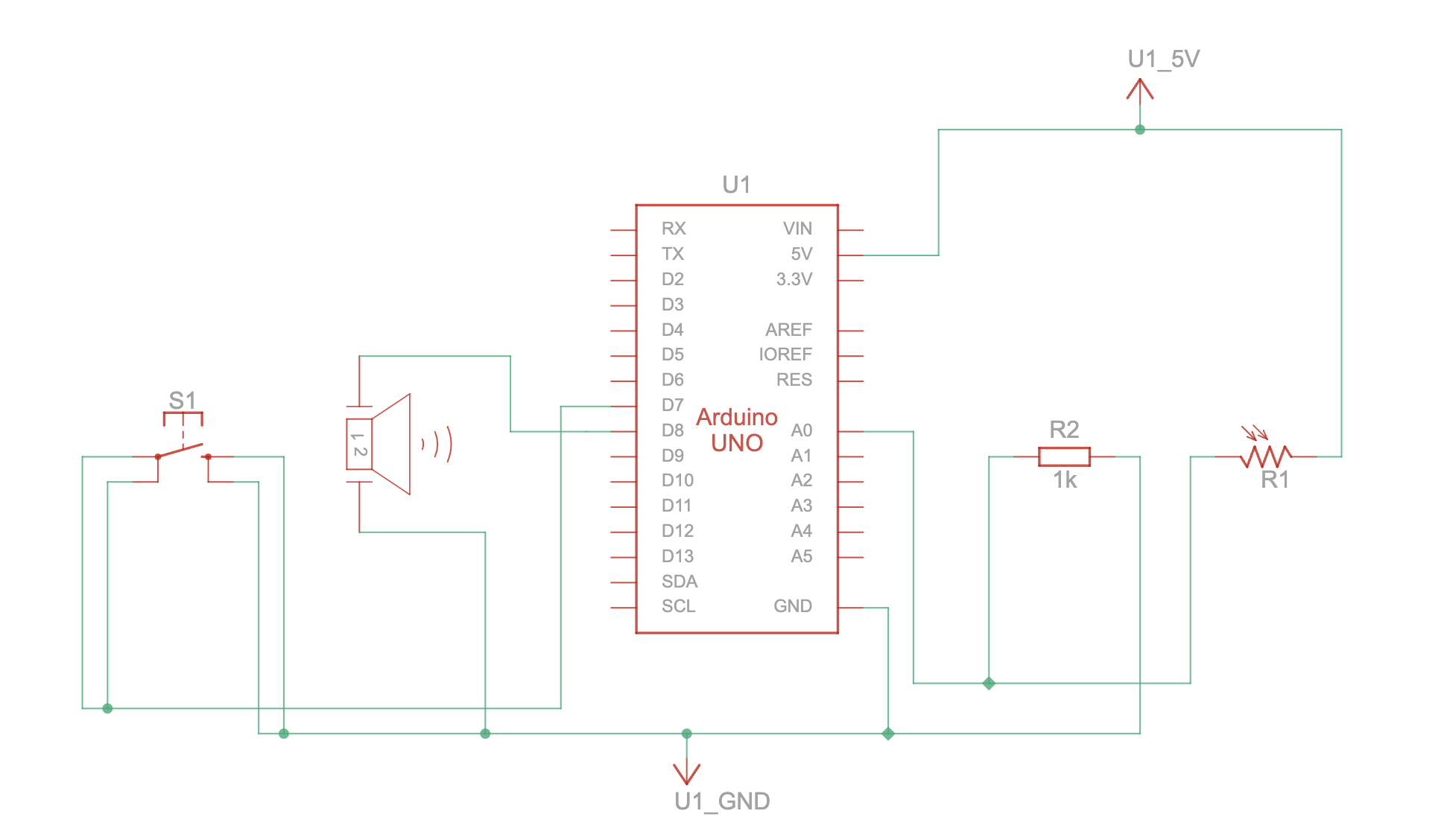
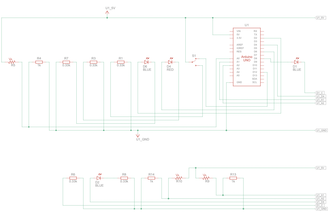
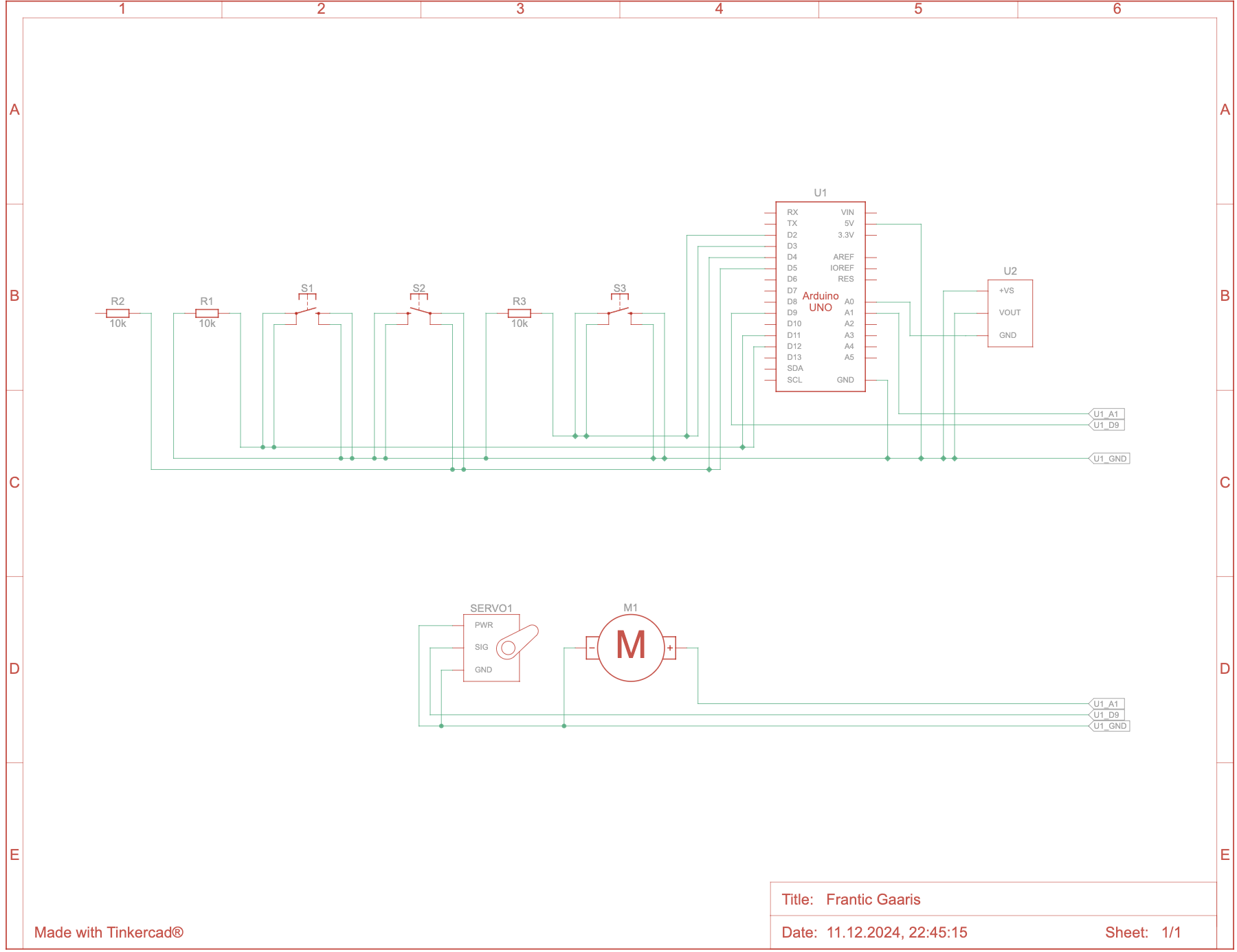
The communication between Arduino and P5 is based on buttons, pulse sensor and force sensor. Values from Arduino are directly sent to the P5 and trigger appearance of certain elements.
What I’m Proud of
I am really proud of my final outcome. It took a lot of time working with the buttons, soldering them and figuring out how to work with them. I spent quite a lot time building physical project and connecting both parts. Moreover, I am proud that I figured out how to code the serial communication, so that multiple sensors could be connected at the same time, while only one of them sends information at a time. I am also proud of aesthetics of my project, since I feel like I could really deliver the atmosphere of Kazakh interior setting and culture. Many Kazakh students came to me sharing that my project really took them to home.
Future Improvements
In the future, I would like to work more on the complexity and depth of interactions between the project and the user. In this project, I only worked out 4 levels of interaction, but there are so many other ways to do it. Also, I would like to work on intuitiveness in experiencing my project. I would like to step aside from my main role of communicating purpose, idea and workings of the project, and leave it to the user himself to figure out. That way I could really achieve high level interaction. Additionally, I would explore more the intersection of traditions and technologies, how are they addressed in today’s world. For now, I just tried to attempt accomplishing this interaction, but there are more sensors and immersive experiences to explore.