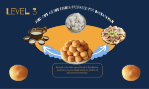
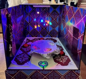
Unfortunately, the videos from user testing were not saved on my phone.
But, here are the main insights that I’ve gained from user testing:
- Due to presence of the physical product, all of the users kind of failed to pay attention to the P5 screen on the computer, while it was the component to start interaction. When looking at the project, users immediately wanted to touch buttons and expected some response.
- The component that attracted the most attention on the physical project was the heart sensor that was placed in front of the table and in the closest reach to the user. This placement was the reason people tried to push the sensor, touch it and expected instant reaction from the physical project or the computer. But since it didn’t occur, they were kind of disappointed.
- Since to have this interaction with heart sensor, user had to go through multiple levels to reach that level, I had to explain them this information manually. This led me to thinking that maybe having levels was not great decision to build interactive experience with users, since they were not intuitively instructed by the physical project that they will have to go through different levels, therefore they were confused.
- I also thought that next time, just the interaction with either of the components, such as buttons and sensors can trigger the screen appearance that supports specific interactions. That way there will be no levels, but self-guided exploration of the project.
- Since to have this interaction with heart sensor, user had to go through multiple levels to reach that level, I had to explain them this information manually. This led me to thinking that maybe having levels was not great decision to build interactive experience with users, since they were not intuitively instructed by the physical project that they will have to go through different levels, therefore they were confused.
- Also, users tried to interact with components that they were not supposed to interact with. For example, users tried to push dishes on the table as if they thought they were buttons. The confusion was supported by the level screen on p5, which encouraged users to explore dishes and the table. In reality, users just needed to press the arrows to go through different dishes. Users also couldn’t understand where to press to switch the dishes, some pressed on the dishes on the screen or anywhere but not arrows

- This led me to the idea that I should make more intuitive arrows, so users can easily and directly press on them.
- Another thing I learned from user testing was that after completing different levels, users didn’t have any clue that the experience has ended. There was just a page with a last level. Therefore, I decided to have a finish page that thanked the user.
- After implementing it and conducting another user testing, I found out that user needs to refresh page every time he want to go through the project again. Therefore, there should be a refresh button to go to the main page again.
- Some of the users were also inquiring if there was any interaction with LED chandelier on the top. They tried to touch it or do anything with it, but failed. So, I had to explain that it was just the lighting.
- I also noticed that the text size for many users was quite small, so they had to come closer and bow to look into the text on the screen, which kind of inconvenient for them.
- The great confusion was brought by the pulse sensor. When the user reached level 4, he had to place his finger on the pulse sensor and press on the heart. The user expected something big and radical to happen, but in my vision I used the pulse sensor for it’s symbolic and sentimental meaning of listening to your heart, so the pictures of the family appeared. But, the users couldn’t believe that it was the only thing that needed to happen.
- The component that attracted the most attention on the physical project was the heart sensor that was placed in front of the table and in the closest reach to the user. This placement was the reason people tried to push the sensor, touch it and expected instant reaction from the physical project or the computer. But since it didn’t occur, they were kind of disappointed.

