
One thing that bothers me, and is also mentioned by Norman, is unwanted feedback. The sound of a microwave notifying you that it’s done is especially annoying when you’re trying to grab a quick bite in the early morning without disturbing your roommates. While the feedback from the microwave is immediate and informative, I wish there were an option to mute the sound.
In this case, even well-intentioned feedback can become annoying if users aren’t given enough control, which drive my attention to another question: to what extent should we allow trial and error in a design? For example, the door on page 12 shows us a aesthetically pleasing but also confusing design of a door. 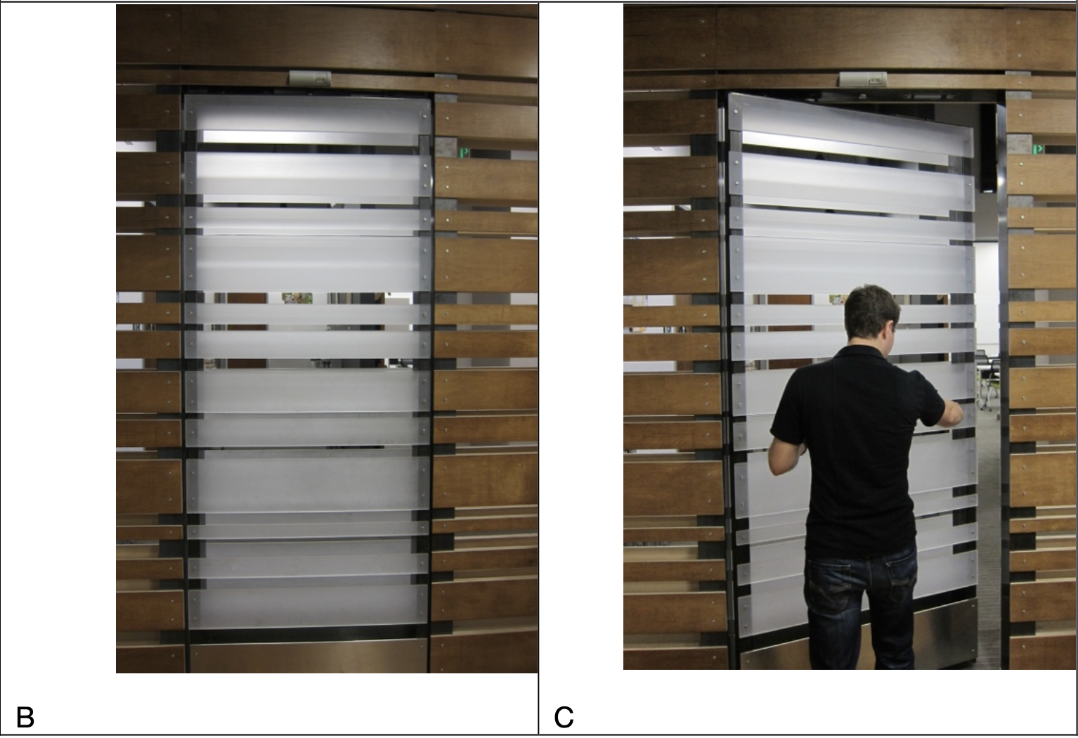 You have to try pushing or pulling to test how it works. In this case, users are given more freedom but it might also cost more time. The same dilemma applies to minimalist website designs. Taking the following figures as examples: one that displays a lot of information and another that shows very little.
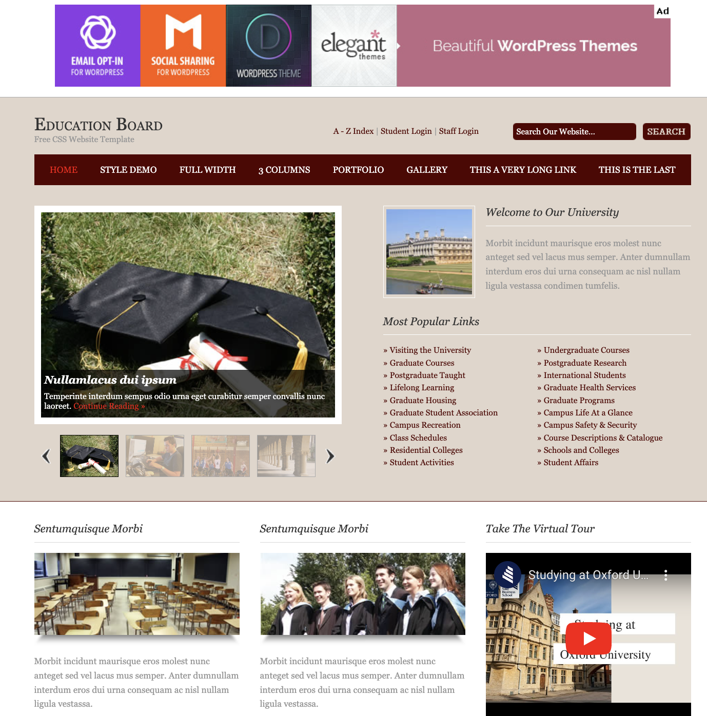
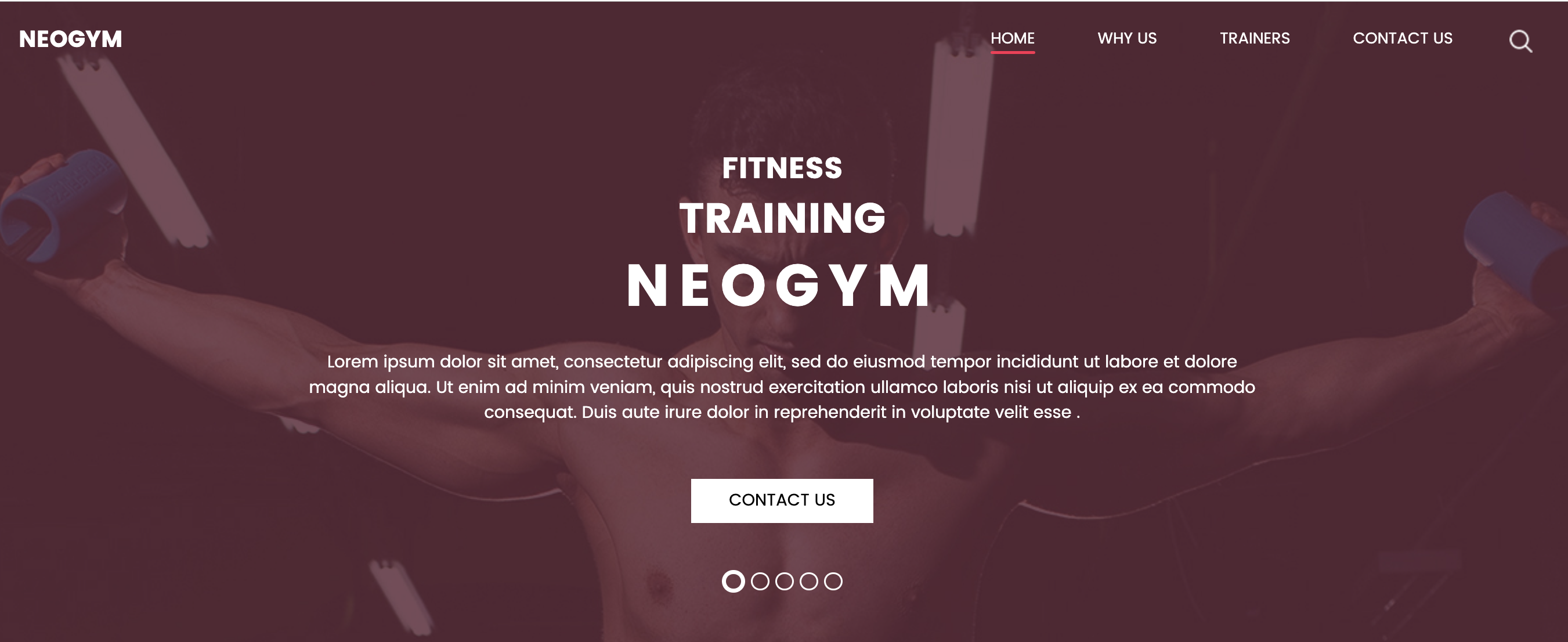
Websites today often rely on intuitive logic for users who have abundance experiences with technology, but for those without a strong foundation, minimalism can create confusion rather than clarity. This touches on Norman’s concept of the technology paradox, where increased functionality sometimes leads to a steeper learning curve. However, the technology paradox is seen less nowadays as everyone seem to have a relatively good foundation of using tech.
It’s complicated to build affordance and use signifiers, much like trying to understand the “black box” of the human mind and its thinking processes. In IM, striking this balance between clarity and aesthetics is key. One practical thing we can do is to work on a conceptual model.