
Concept
I was looking through the datasets linked in Professor Mathura’s repo when I came across the data for the World Happiness Report. It contained numerical data for various happiness indicators across countries around the world and I was immediately interested as I was looking to create some sort of a color visualization. Using this data, I decided to create a data visualization using color that shows where each country stands in terms of happiness, as well as in terms of the other indicators that impact happiness, including health, freedom and economy.
Process
I planned to create individual visualizations for each of the four focus indicators using different colors, and then make them transition into one another smoothly. While searching about ways to do color transitions and gradients, I came across the lerpColor() function that works similarly to the lerp() function, and allows to interpolate between two colors based on a parameter.
Initially, I drew equal size rectangles for each country. Even though I liked that the whole canvas was perfectly divided into uniform rectangles, it felt like it lacked coherent meaning. I thought it might make the visualization much more interesting if it offered a comparison of the indicators across not only countries, but also across continents. The original data file unfortunately did not have continent data, so I manually went through the CSV file to add a continent column entry for each country. Using this data, I divided the canvas vertically into 6 equal columns representing each continent (Asia, Europe, Africa, South America, North America, Oceania), and then further divided each column into smaller segments for each country. This way, the visualization offered a richer narrative – it illustrates how happiness indicators vary across the different regions in the world, and exposes potential trends linked to geography and economic factors.
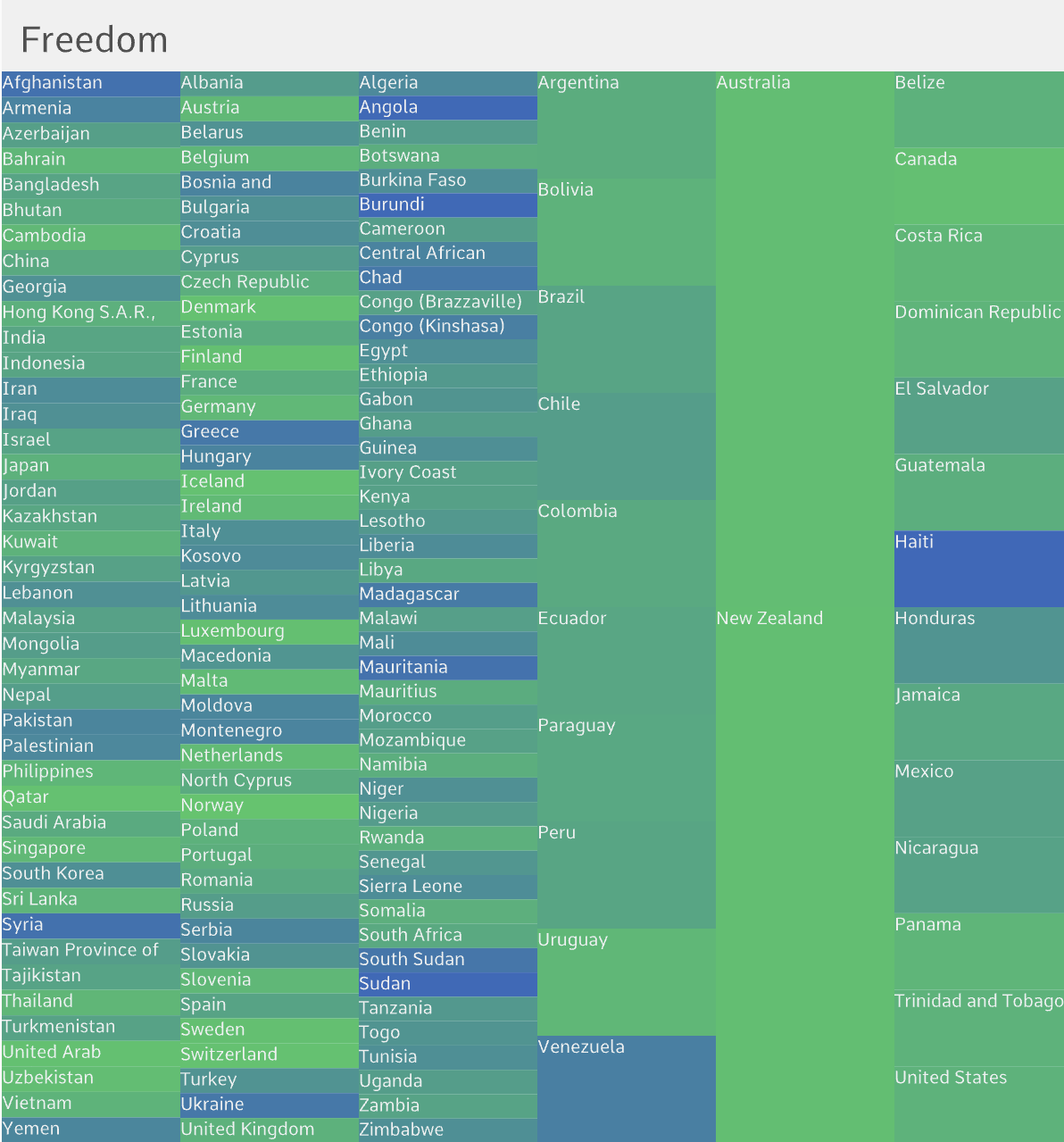
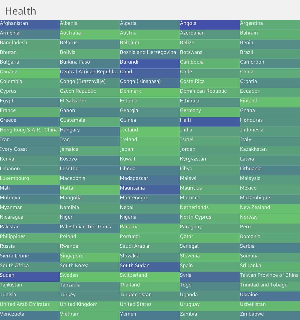
Brighter/lighter colors represent higher scores on the happiness level indicators and darker colors represent lower scores. This means that a country ranks high in happiness if it consistently appears bright throughout the visualization. Toggle feature is added to allow the sketch to also be viewed solely as an art piece, so if you want to see the countries represented by the boxes, you have to click the mouse.
Challenges
Implementing the transition between the visualizations was the biggest challenge of this project.
I created a helper function to get the color based on the score and the indicator, by mapping the score ranges for each indicator to RGB color ranges (0-255). Setting the RGB color values took surprisingly many trials and repeated references to RGB color theory to get the exact color gradient I wanted for each indicator.
// helper function to get the color based on score & indicator
function getColorForIndicator(score, indicator) {
  // higher the score, brighter/lighter the color
  // lower the score, darker the color (nearing 0)
  if (indicator === "Happiness") {
    // yellow <-> dark
    return color(map(score, 2, 8, 0, 255), map(score, 2, 8, 0, 255), 100);
  } else if (indicator === "Health") {
    // green <-> dark
    return color(100, map(score, 0, 1, 0, 255), 100);
  } else if (indicator === "Freedom") {
    // blue <-> dark
    return color(50, map(score, 0, 1, 50, 200), map(score, 0, 1, 50, 200));
  } else if (indicator === "Economy") {
    // magenta <-> dark
    return color(map(score, 0, 2, 40, 255), 100, map(score, 0, 2, 20, 255));
  }
  return color(200);
}
To achieve a smooth color transition, I used the lerp() and lerpColor() functions to get the colors corresponding to the indicator scores interpolated by the current progress of the transition.
// get the country's scores for the current and next indicator
let currScore = getScore(countries[j], currIndicator);
let nextScore = getScore(countries[j], nextIndicator);
// get the current and next score belend by interpolating by the transition progress
let blendedScore = lerp(currScore, nextScore, transitionProgress);

// get the colors for the current and next indicator based on blended score
let col = getColorForIndicator(blendedScore, currIndicator);
let nextCol = getColorForIndicator(blendedScore, nextIndicator);
// retrieve the final color by similarly interpolating by progress
// this ensures smooth color transition between the visualizations
let finalColor = lerpColor(col, nextCol, transitionProgress);
Reflections & Improvements for Future Work
I learned a lot while working on this week’s project, including new functions like lerpColor(), millis() and loadFont(). The process was not only technically challenging, but also required thinking more deeply about how to transform raw numbers into a compelling visual story. Moving forward, I hope to continue being intentional about the design and meaning of my projects.