Midterm Project – Rocky the Pet Rock!

Full Sketch: https://editor.p5js.org/jheel2006/full/zaxMyymUX

Inspiration

When I first started brainstorming this project, I was drawn to the idea of creating something related to pet care. I’ve always thought of pets as a source of joy and responsibility, so I thought a virtual pet could be a fun and meaningful experience. However, I wanted to add a fun twist to the concept. I thought it might be interesting and humorous to make the pet something unexpected, like an inanimate object. This was how Rocky the Pet Rock was born!

I drew and designed Rocky myself, with five distinct mood states: Very Happy, Slightly Happy, Meh, Slightly Sad, and Very Sad. These moods are influenced by the player’s actions, which determine Rocky’s overall well-being. By making Rocky a rock instead of a living creature, I could play with the idea of what it means to care for something that doesn’t typically need attention, and how even the simplest interactions can create an emotional connection. The result is an experience that feels both playful and oddly meaningful.

Concept

The concept behind Rocky the Pet Rock is to create a simple, interactive experience where you take care of a virtual pet rock for a short period of time. Rocky’s mood is initially set to 50 (out of a total of 100). The game has a timer of 100 seconds until which your goal is to keep Rocky as happy as possible.

The game begins with an introduction screen after which  the user can reach the instructions screen by clicking anywhere. Clicking on the instructions screen leads to the main game screen.

After reaching the main game screen, there are three ways to change Rocky’s mood:

Feed: The user can choose from five different types of food to feed Rocky. However, he may or may not like the food that is chosen. If he likes the food, his mood goes up, if he doesn’t like the food, his mood goes down and if he is okay with/indifferent to the food, his mood remains unchanged. These food preferences are randomized in every round of the game. Rocky can only be fed twice during the game.

Play: Here, the user can help Rocky play his favorite game – dodgeball. In this mode, balls keep getting generated from the right side of the screen at Rocky’s current position and the user must use the up and down arrow keys to move Rocky and avoid these balls. A ball hitting Rocky results in a mood decrease and playing with Rocky without hitting any obstacles leads to a consistent mood increase.

Relax: In this mode, the user helps Rocky unwind by choosing between three different music tracks (of different genres) to play. Similar to the feed option, Rocky likes one of these tracks, doesn’t like another and is okay with the third. Choosing any of these track affects his mood depending on his preferences (randomized in every round of the game). The relax option can only be chosen once during the game.

The game ends if the timer reaches 0 or if Rocky’s mood decreases to 0. The game then displays game over screen, allowing the user to begin again by clicking on the screen. The game over screen displays Rocky’s final mood with a message. If the user restarts the game, it resets to the original conditions and begins again.

Implementation:

The implementation of the game is built around the three core modes of interaction: Feed, Play, and Relax. Each one of these had its own set of challenges to implement and integrate into the game as a whole.

  • One aspect of the Feed mode that I’m particularly proud of is the way the food options are arranged around Rocky. I wanted the interaction to be visually appealing, so I placed the five food choices in a circular pattern around Rocky, making the user’s selections feel more natural and connected to the character.
    Randomizing Rocky’s food preferences in each round was another key part of the implementation. Every time the game begins, Rocky likes, dislikes, or feels neutral about different foods, keeping the player on their toes and making each round feel unique. Once the player makes a selection, feedback is immediately displayed on the main screen, showing how Rocky’s mood is affected. It was also essential to disable the feed option after Rocky has been fed twice to prevent over-feeding and keep the game balanced. Implementing this functionality added a strategic element to the game, as players must choose carefully when and what to feed Rocky, knowing their options are limited.

    Here’s some of the feed functionality code!

    function displayFoods() {
      // Display Rocky at the center
      rocky.display();
      
      
      let centerX = rocky.x - rocky.size/8; // Center of the screen (same as Rocky's x)
      let centerY = rocky.y - rocky.size/8; // Center of the screen (same as Rocky's y)
      let radius = 170; // Distance from the center to where the foods will be displayed
    
      let angleStep = TWO_PI / foods.length; // Angle between each food item
    
      for (let i = 0; i < foods.length; i++) {
        let angle = i * angleStep; // Calculate angle for each food item
        let foodX = centerX + radius * cos(angle); // X-coordinate based on angle
        let foodY = centerY + radius * sin(angle); // Y-coordinate based on angle
        
        image(foodImages[i], foodX - 40, foodY - 40, 110, 110); // Display food images
    
        fill(0);
        textAlign(CENTER); // Center the text below each food item
        text(foods[i], foodX+20, foodY + 80); // Display food names under the images
      }
    function setFoodFeedback(food) {
      let moodEffect = foodPreferences[food];
      rocky.mood += moodEffect; // Update Rocky's mood immediately
    
        // Set food feedback based on mood effect
      if (moodEffect > 0) {
        foodFeedback = `Rocky likes ${food}!`;
      } else if (moodEffect < 0) {
        foodFeedback = `Rocky doesn't like ${food}!`;
      } else {
        foodFeedback = `Rocky is okay with ${food}.`;
      }
    
    
      // Clear any previous timeout to avoid overlap
      if (foodFeedbackTimeout) {
        clearTimeout(foodFeedbackTimeout);
      }
    
      // Clear the feedback after 3 seconds
      foodFeedbackTimeout = setTimeout(() => {
        foodFeedback = "";
      }, 3000);
    }
  • The Play mode was an exciting challenge to develop, especially with the random generation of obstacles. I designed the game so that obstacles are generated from the right side of the screen based on Rocky’s current position, ensuring that the game feels dynamic and responsive to the player’s movements. This adds an element of unpredictability, requiring the player to stay alert as they guide Rocky to dodge incoming obstacles.
    I liked the idea of how Rocky’s mood was closely tied to how well the player performs during the game. As long as Rocky successfully avoids the obstacles, his mood gradually increases, rewarding careful play. However, if Rocky gets hit by an obstacle, his mood takes an immediate hit.. This balance between mood progression and obstacle avoidance makes the Play mode both engaging and meaningful, as it directly ties the player’s performance to Rocky’s emotional state.

    Here’s some of the play functionality code!

else if (playing) {
        if (backgroundMusic.isPaused()){
          backgroundMusic.play();
        }

        // Play mode
        timer.display();
        rocky.update();
        rocky.display();
        moodMeter.display(rocky.mood);


        // Generate obstacles
        if (frameCount % 40 == 0) {
          obstacles.push(new Obstacle());
        }

        for (let i = obstacles.length - 1; i >= 0; i--) {
      obstacles[i].update();
      obstacles[i].display();

          // Check for collision
          if (obstacles[i].hits(rocky)) {
            hitSound.play();  // Play hit sound on collision
            rocky.mood -= 10; // Decrease mood on collision
            obstacles.splice(i, 1); // Remove obstacle after collision
            continue; // Skip to the next iteration to avoid calling offscreen() on a spliced element
          }

          // Remove obstacles that go off-screen
          if (obstacles[i].offscreen()) {
            obstacles.splice(i, 1);
          }
    }

        // Check if mood or timer runs out to end the game
        if (rocky.mood <= 0 || timer.isTimeUp()) {
          gameState='gameOver';
          playing = false;
          resetGame();
        }

These are the Rocky and Obstacle classes, which also have elements of the game functionality:

// Rocky class
class Rocky {
  constructor() {
    this.mood = 50;
    this.x = windowWidth / 2;
    this.y = windowHeight / 2 + 100;
    this.size = 100; // The size of Rocky (matches the previous ellipse size)
    this.speed = 5; // Speed for moving up and down
  }

  display() {
    // fill(150);
    // ellipse(this.x, this.y, 100, 100); // Rocky as an ellipse
    if (this.mood >=80){
      rockyImage = rockyImageHappy;
    }
    else if (this.mood >=60){
      rockyImage = rockyImageHappyish;
    }
    else if (this.mood >=40){
      rockyImage = rockyImageMeh;
    }
    else if (this.mood >=20){
      rockyImage = rockyImageSadish;
    }
    else {
      rockyImage = rockyImageSad;
    }
    
    image(rockyImage, this.x - this.size / 2 - 25, this.y - this.size / 2 , this.size+40, this.size); // Display the image with Rocky's coordinates
  }


// Obstacle class for the play mode
class Obstacle {
  constructor() {
    this.x = windowWidth;
    this.size = random(60,75); // Size of obstacle
    // this.y = random(0, windowHeight - this.size); // Random y-position
    this.y = rocky.y; // Spawn the obstacle at Rocky's current y position
  }

  display() {
    // fill(255, 0, 0);
    // rect(this.x, this.y, this.size, this.size);
    image(obstacleImage, this.x, this.y, this.size, this.size);
  }

  update() {
    this.x -= obstacleSpeed; // Move the obstacle to the left
  }

  offscreen() {
    return this.x < -this.size; // Check if the obstacle has moved off-screen
  }

  hits(rocky) {
    let d = dist(this.x, this.y, rocky.x, rocky.y);
    return d < this.size / 2 + 50; // Check for collision with Rocky
  }
}
  • The Relax mode shares similarities with the Feed mode in terms of randomizing Rocky’s music preferences, but the added challenge here was managing the background music. The player can choose from three different music tracks (a lullaby, a funk track and some lo-fi beats), each representing a different genre. Rocky’s mood responds to the track selection—he likes one, dislikes another, and is indifferent to the third, all of which are randomized each round. This randomness keeps the experience fresh and unpredictable, just like the food preferences.
    A technical challenge was ensuring that the background music from the Relax mode would stop properly once the player entered the Relax mode and restarted when the player exited the mode or when the track finished playing. It was also important to return to the main screen after the track ended (after 10 seconds) while displaying the feedback and effect on Rocky’s mood.

    Here’s some of the relax functionality code!

    function randomizeMusicPreferences() {
      let shuffledTracks = shuffle([10, 0, -10]); // One increases, one decreases, one is neutral
      for (let i = 0; i < relaxTracks.length; i++) {
        musicPreferences[i] = shuffledTracks[i]; // Map tracks to mood effects
      }
    }
    function startRelaxMode() {
        relaxing = true;
        playing = false;
        displayTrackButtons(); // Display buttons for selecting tracks
        backButton.display(); // Show back button to return to main screen
      
    }
    
    
    // Function to display track buttons
    function displayTrackButtons() {
      // Display each track button
      for (let trackButton of trackButtons) {
        trackButton.display();
      }
    }
    
    // Function to play the selected track and show feedback
    function playRelaxTrack(trackIndex) {
      if (isRelaxing) {
            return; // If a track is already playing, prevent any other interaction
        }
    
        isRelaxing = true; // Set to true once a track starts playing
        selectedTrack = trackIndex;
        relaxTracks[trackIndex].play(); // Play the selected track
        
        setTimeout(function() {
            relaxTracks[trackIndex].stop(); // Stop the track after 10 seconds
          showRelaxFeedback(trackIndex);
          relaxing = false;      // Return to the main game state
          relaxDisabled = true;       // Disable the Relax button after it's used
          isRelaxing = false;
          rocky.x = windowWidth / 2;
          rocky.y = windowHeight / 2 + 100;
        }, 10000); // Play for 10 seconds
    }
    
    // Function to show feedback based on Rocky's preferences
    function showRelaxFeedback(trackIndex) {
        let moodEffect = musicPreferences[trackIndex]; // Get mood effect for the selected track
        rocky.mood += moodEffect; // Adjust Rocky's mood accordingly
    
        // Set relax feedback based on the mood effect of the track
        if (moodEffect > 0) {
            relaxFeedback = `Rocky likes this track!`;
        } else if (moodEffect === 0) {
            relaxFeedback = `Rocky is okay with this track.`;
        } else {
            relaxFeedback = `Rocky doesn't like this track!`;
        }
    
        // Clear any previous timeout to avoid overlap
      if (relaxFeedbackTimeout) {
        clearTimeout(relaxFeedbackTimeout);
      }
    
      // Clear the feedback after 3 seconds
      relaxFeedbackTimeout = setTimeout(() => {
        relaxFeedback = "";
      }, 3000);
      // Clear any previous timeout to avoid overlap
     
    }

    Reflections and Further Improvements

    Overall I’m quite satisfied with how the game turned out, especially considering the many stages it went through – from my vague, initial idea to its final implementation. Some things that I can consider doing to add to it could be making the Feed mode slightly more interactive by having a drag-and-drop feature (to make the user feel like they’re actually feeding Rocky). I could also add some sound feedback when Rocky’s mood changes (for instance, when he ate a food he liked or listened to a track he didn’t like). Similarly, I could also add sound feedback when the game ends, reflecting Rocky’s current mood state.

All in all, I really enjoyed the experience of bringing my idea to life. There were quite a few bugs as well as some unexpected behavior that came up along the way, but I’m pretty happy with the final result :))

Midterm Project

Concept

My project is a simple car game. I decided on a  game as I wanted to create something that will be fully user controlled to ensure that I engage people into my work.

The game simple to learn and play. The player is tasked to navigate a car along a three lane road with incoming traffic. The player uses the arrow keys to move the car left and right from one lane to another and the space key to “zap” over the middle lane. The zapping basically means that if the player is not on the middle lane i.e in the furthest right or left lane, they can move the car to the furthest end lane jumping over the middle lane. This feature is important when playing the hard level.

Traffic cars move in opposite direction of the player car in random intervals and lanes. The player can choose the level of difficulty between the easy, medium and hard. The levels of difficulty have traffic of different speeds with easy having traffic of less speed and hard with high speeds. Traffic is more frequent in hard level and less frequent in the easy level. To ensure that the game is endless I limited the distance of play to 1500 so that the game ends when a player has driven for 1500. I am proud how I was able to make my game more complex by including different difficulty levels .These conditions ensures that while the player enjoys the game they also feel the challenge and push themselves.

Below are some of the images of the game showing the start screen, game mode and how game ends.

Sketch

Code highlight
I was proud of how I executed my collisions in the game as in the code below

//collision handling
  checkCollision(player) {
    let shrinkFactor = 20; 
    let playerLeft = player.x + shrinkFactor;
    let playerRight = player.x + player.w - shrinkFactor;
    let playerTop = player.y + shrinkFactor;
    let playerBottom = player.y + player.h - shrinkFactor;

    let trafficLeft = this.x + shrinkFactor;
    let trafficRight = this.x + this.w - shrinkFactor;
    let trafficTop = this.y + shrinkFactor;
    let trafficBottom = this.y + this.h - shrinkFactor;

    // Check if the bounding boxes of the player and traffic car overlap
    if (
      playerRight > trafficLeft && 
      playerLeft < trafficRight && 
      playerBottom > trafficTop && 
      playerTop < trafficBottom
    ) {
      return true; // Collision detected
    }
    return false; // No collision
  }

To handle collision between the cars I used a logic of the images being a rectangle or a box with their bounds. The algorithm checks if these boxes overlap and shows that a collision has occurred. I use a shrink factor to make the boxes smaller that the actual object size to avoid wrong collision detection when objects are close but not touching.

Challenges and future improvements

I still have a lot to do to improve my work and make it better. For example, I would like to have different types cars for the traffic and have animation for coins collected. I also wanted to add power up such as indestructibility for some period of time after picking a token. My game start and game end page are also not that visually appealing, I would like to make them more interesting and fun. Lastly I would like to have a crash effect after the player hits the traffic.
I had a couple of challenges while implementing. One challenge was balancing the background movement to the movement of the traffic cars. Since both images were moving at different speeds in opposite directions it created an effect which made the traffic look like it’s not moving. I was able to partially resolve this by making the traffic speed bigger than the background speed but it still doesn’t work well for the hard level.
Another challenge was switching game difficulty. While the player switches difficulty after losing I have scenarios of cars from the previous round still appearing . I resolved this by clearing my traffic array once a player loses and game ends.
Another issue was handling collision which I luckily resolved after a lot of code errors.
Overall the game can be made much better by incorporating some of the ideas that I mentioned above. However, I am still proud of what I was able to come up with.


Midterm Project – Friends Game House

Concept

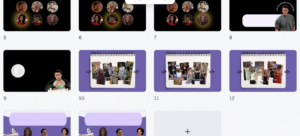
I have come to the decision to change my initial idea with Piano Tiles to one that had more connection with me and my interest. And TA-DA here I go again connecting my project to favorite Friends show. The reason I switched is because I knew it would be easier to create a project that you will have fun building and also passionate about. In this project, I wanted to highlight key moments from the show through the perspective of the characters, since each of them has a different story and individuality. There are six main characters in the show, and creating a game for each of them was kind of challenging and time inefficient, so I came up with different interactive project ideas for characters. I would like to stop on each one:

  1. Phoebe
    I started from creating a page for Phoebe. I still wanted to work with music in my midterm, so I chose a famous song sang by Phoebe, called Smelly Cat. I wanted to make it similar to karaoke, so I implemented an interactive element, where the user could press the specific keys to get the singing of specific lines of the song. So, there is only a karaoke version of the song playing in the background and to make the song complete, the user should add the lyrics sounds by pressing on keys. This page took me a lot of time working and correcting the code, because the sounds in p5js are pretty hard to handle. First of all, I separated the song to the lyrics sound and to the instrumental part, then I cut the lyrics sound to the lines, and assigned each line a specific key. But the hardest part now comes with the playing of the sounds.

    let soundPlayed = {
      'S': false,
      'W': false,
      'F': false,
      'T': false,
      'R': false,
      'Y': false,
      'N': false
    };
    
    
    function smellykeys() {
      // converting the pressed key to uppercase
      let pressedKey = key.toUpperCase();
    
      // logic is to play a specific sound and stop the rest
     if (pressedKey === 'S' && !smelly.isPlaying() && !soundPlayed['S']) {
        stopAllSoundsExcept('smelly');
        smelly.setVolume(0.2);
        smelly.playMode('untilDone');
        smelly.play();
        soundPlayed['S'] = true;
      } else if (pressedKey === 'W' && !whatarethey.isPlaying() && !soundPlayed['W']) {
        stopAllSoundsExcept('whatarethey');
        whatarethey.setVolume(0.2);
        whatarethey.playMode('untilDone');
        whatarethey.play();
        soundPlayed['W'] = true;
      } else if (pressedKey === 'F' && !itsnot.isPlaying() && !soundPlayed['F']) {
        stopAllSoundsExcept('itsnot');
        itsnot.setVolume(0.2);
        itsnot.playMode('untilDone');
        itsnot.play();
        soundPlayed['F'] = true;
      } else if (pressedKey === 'T' && !theywont.isPlaying() && !soundPlayed['T']) {
        stopAllSoundsExcept('theywont');
        theywont.setVolume(0.2);
        theywont.playMode('untilDone');
        theywont.play();
        soundPlayed['T'] = true;
      } else if (pressedKey === 'R' && !yourobv.isPlaying() && !soundPlayed['R']) {
        stopAllSoundsExcept('yourobv');
        yourobv.setVolume(0.2);
        yourobv.playMode('untilDone');
        yourobv.play();
        soundPlayed['R'] = true;
      } else if (pressedKey === 'Y' && !youmay.isPlaying() && !soundPlayed['Y']) {
        stopAllSoundsExcept('youmay');
        youmay.setVolume(0.2);
        youmay.playMode('untilDone');
        youmay.play();
        soundPlayed['Y'] = true;
      } else if (pressedKey === 'N' && !yournot.isPlaying() && !soundPlayed['N']) {
        stopAllSoundsExcept('yournot');
        yournot.setVolume(0.2);
        yournot.playMode('untilDone');
        yournot.play();
        soundPlayed['N'] = true;
      }
    }
    
    function stopAllSoundsExcept(keep) {
     
      for (let key in soundPlayed) {
        soundPlayed[key] = false;
      }
      // stop all sounds except the currently selected one
      if (keep !== 'smelly' && smelly.isPlaying()) {
        smelly.stop();
      }
      if (keep !== 'whatarethey' && whatarethey.isPlaying()) {
        whatarethey.stop();
      }
      if (keep !== 'itsnot' && itsnot.isPlaying()) {
        itsnot.stop();
      }
      if (keep !== 'theywont' && theywont.isPlaying()) {
        theywont.stop();
      }
      if (keep !== 'yourobv' && yourobv.isPlaying()) {
        yourobv.stop();
      }
      if (keep !== 'youmay' && youmay.isPlaying()) {
        youmay.stop();
      }
      if (keep !== 'yournot' && yournot.isPlaying()) {
        yournot.stop();
      }
    }
    

    It is surely part of the code I’m really proud of. It took me couple of days to understand how to solve a problem of repeating sounds and lagging . Some sounds would block others and code didn’t work at all. By introducing variables with boolean values, I could create a check points in the code to get what I wanted (f.e. when the key is pressed, the sound plays only ones and doesn’t repeat until it is called out again) .

  2.  Chandler
    When I thought about Chandler’s character, I immediately thought about his sarcastic sense of humor. So, I decided, I want to prompt the user to ask a question by typing it in the input line, and get an answer from “Chandler’ by sending the question. So, basically how I did it was by creating csv.file with all sarcastic punch lines Chandler character could actually say in the show. I wanted really to appeal to Friends fans, so I tried to create realistic Chandler’s responses. There wasn’t much difficulty with this page.
  3. Joey
    I was confused with what could I possible introduce for Joey character, apart from his immense love for food, especially pizza. I decided to tie it to his character quality of not sharing food with anyone. I wanted to represent it directly in the interaction. So on his page, the user can place pizza slice wherever they want to except place, where actually the user’s plate is located. In that way, I am implying that if they go with Joey to the restaurant, they won’t get even a slice of his pizza to their own plate. For this page, I used arrays.
  4. Rachel
    I definitely wanted to work with “fashion” part of Rachel’s character. As I watching the show myself, I was always inspired by the looks that were created for this character. So, for this page I decided to make a journal layout, where all Rachel’s outfits are collected and sorted by the purposes, like casual, festive, office. This page really reminded me of the scrapbook, and I find it pretty aesthetic.
  5. Ross
    What I remember brightly about Ross’ character is his lines, especially “We were on a break!” one. So, I decided to focus on that side. I decided to implement OOP for this page to introduce more movement on the screen. So basically, when a user presses on this phrase, he will get a happy face of Ross, since by this phrase he used to make excuse of his cheating. And there is another phrase “It is a big deal!”, said by his ex, which made him angry, so when the user presses on it, there are bubbles with Ross’ angry face.
  6. Monica
    When I thought about Monica’s character, I was struck by many ideas, because of so many qualities that she was presented in the show. So I decided to compile them all together. I came up with the creative text that would describe one of the main activities that Monica does during the show, like cleaning, cooking, dancing, organizing.

I extensively used Canva for this assignment to get high quality images.

Also to follow the aesthetics, I chose a color palette for my project and also selected the fonts (Helvetica and Friends theme font).

Final Version

https://editor.p5js.org/aa11832/full/JSemZD8wC


Hopefully, I could convince you to watch at least one episode of Friends!

Future Improvements
  • For the future improvement of the project, I would really like to work on the sound accompaniment across different pages, not only Phoebe one. I could implement sounds starting from Friends show theme song to the sound of the specific key character lines, like maybe adding the sound of line “We were on a break!” to Ross page. I believe that would enhance user’s immersion to Friends universe.
  • I would also to expand my work with object oriented programming in different parts of the project. I feel like there is a room for working with different objects as a parts of the background or the main interaction.
  • I would also like to transfer my project to the full screen.
  • I think what this project lacks is gamification. While there are many ways to interact with the project, there are no scored activities that are usually appealing most to the user. For example there are ways to gamify the karaoke page by evaluating how exact was the user in pressing the keys to match the song lyrics.
  • I would also like to improve the immersion of the user to the show environment. What I created in my project captures very shallow part of the whole Friends show. Adding more unique content and games, I can address this problem.

Midterm Project: Escape From New York

Concept:

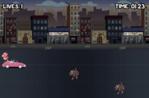
People often have a certain impression of certain places from hearing about it on social media, where people tend to only focus on the good and hide the bad. Meet Madison. Madison is a social media influencer who has fallen victim to the glamorized and romanticized New York City. With such ambition to pursue her career in the huge city, Madison impulsively moved to New York because of the beautiful Christmas movie scenes and “just because it’s New York.”  Now that she has moved to NYC, she is met with several true NYC obstacles…rats, trash, and crackheads. Help Madison escape from New York by preventing her from crashing into the obstacles!

How it Works:

“Escape From New York” is a relatively easy game to learn how to play. After reading the tutorial, users just have to move their arrow keys left, right, up, or down to help Madison avoid the nasty NYC obstacles. If you run into an obstacle, you lose one of your three lives. If you crash three times, you lose and Madison is stuck in the streets of New York. If you manage to stay alive for 1 minute 30 seconds, you win and have successfully helped Madison get out of New York and back to the suburbs!

Highlights:

Project: Overall, I’m quite proud of this project and how I was able to bring the idea to life in the way I had planned it out to be. The idea for the game was something I found funny to me as a Native New Yorker, who has seen and heard many mixed feelings about NYC. It was nice to create a project on a topic that resonates with me and part of my identity. I’m proud of myself in general for being able to create a literal game with code, two things I thought would be impossible for me to do let alone both at the same time. Even though I got a lot of help from the professor and from other students, I’m still proud of myself for piecing everything together and gaining more experience in this new field.

Code:

// Constrain character's Y position to the range [200, height]
charY = constrain(charY, 175, height - charHeight);

// Constrain character's X position to the range [0, width]
charX = constrain(charX, 0, width - charWidth);

The piece of code that I would like to highlight is this small piece of code that helps constrain Madison to the roads. It really bothered me that she was able to drive up into the buildings and to the sides and hide from the obstacles in frame, so I knew I just had to find a way to constrain her so that it looks more logically correct. Not only would it look right, it would also make it harder for players to cheat and win.

The Piece:

Issues & Improvements:

A lot of the issues I faced were due to some silly mistakes from having a } in the wrong place or having old code that wasn’t cleaned up mixed up with my new code. For example, I was extremely frustrated with my project for a solid hour and a half, trying to figure out why the game and sounds loaded, but nothing happened if I pressed anywhere on the screen. It had to do with a missing } that I put in a random space to get rid of the red error. Instead of seeing where the actual problem came from, I tried taking the easy (but wrong) way out that led to more harm than good. I also had issues with music overlapping, which I later realized because of the professor that I had overlapping codes, hence, overlapping music. I also struggled to come up with a creative way to implement a shape into my project, as all of the visuals come from images. I thought of doing confetti for the winner’s page, but it ended up being too messy and complicating. In the end, I ended up just making two “points” to use some kind of shape to make the colon on the “Tutorial” page. Although I could’ve easily just used an actual colon, I couldn’t think of any other way to incorporate a shape.

Although I’m quite satisfied with the outcome of the project, there are many improvements I wish I had the time to make, and would like to implement into my future projects. For one, the game is 1 minute 30 seconds, but the audio is 1 minute 33 seconds, where the last three seconds are pitch silence. This affected the flow of the suspenseful finale, but I didn’t have time to trim and reupload the audio. Another thing would be to make the canvas bigger and be able to resize with the user’s window size, as well as being able to full screen it. This would really help with the overall game experience by making it feel more engaging and fulfilling. One last improvement would be to stop the ending sounds to loop so frequently, as it gets really repetitive and annoying to hear the same sound on loop after every 4 seconds with no silence in between.

Midterm Project

Concept

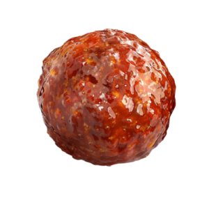
For my midterm I created a simple game inspired by the movie “Cloudy with a Chance of Meatballs.” The goal of the game is to avoid the falling meatballs. The longer the player survives without getting hit, the higher their score will be and the harder it will become. The game consists of a start screen, avatar selection, the main gameplay, and an end screen showing the player’s final score.

Sketch

https://editor.p5js.org/fatimy/sketches/8T66V9Gl1

Mechanics

  1. Avatar Selection: Players choose between two avatars, Flint or Sam.
  2. Gameplay: Meatballs fall randomly from the top of the screen. The Player is controlled by the mouse. Users must react quickly to dodge the falling meatballs.
  3. Scoring System: users earn points for surviving longer without getting hit by a meatball. The score increases based how many meatballs avoided. The game tracks the users best score, stored locally, encouraging players to improve their survival time in future attempts.
  4. End of Game: The game ends when the player is hit by a meatball, triggering the “Game Over” screen. The users current score is displayed along with the best score.
  5. Music and Sound Effects:  light background music plays during the start and player selection screens. Fast-paced music plays during the gameplay to heighten the tension as players dodge the meatballs. Both audios are soundtracks from the movie.


Highlighted code

Im happy with the speed of the meatball. even though it does seem pretty slow at first, I like how it increases and gets difficult after a while. Making it difficult to beat the best score.

Im also happy with the look of the end screen. I found it hard to choose the background, fonts and colors to try to make it look good, and im still not satisfied with the overall look of the game, but I tried my best to make it look ok.

  // reset ball position and increase speed if it goes off the screen
  if (y > height) {
    // check if the ball goes off-screen
    y = -20; // reset the ball to the top of the screen
    speed += 0.5; // increase the ball's speed
    score += 1; // add to score
    pickRandom(); // randomize ball's x-position
  }
}
// end screen (screen 3)
function endScreen() {
  background(0);
  fill("rgb(177,10,10)");
  textAlign(CENTER);
  textFont(myFont1);
  textSize(60);
  stroke("red");
  text("GAME OVER", width / 2, height / 2 - 40);
  fill(255);
  textFont(myFont2);
  textSize(30);
  stroke("red");
  text("YOUR SCORE = " + score, width / 2, height / 2 + 20);
  // check if the player's score is a new best score
  if (score > bestScore) {
    bestScore = score; // update
    localStorage.setItem("bestScore", bestScore); // save it to localStorage
  }
  fill(255);
  stroke("red");
  text("BEST SCORE = " + bestScore, width / 2, height / 2 + 60); // display best score
  // detect hover for "PLAY AGAIN"
  if (
    mouseX > width / 2 - 100 &&
    mouseX < width / 2 + 100 &&
    mouseY > height / 2 + 100 &&
    mouseY < height / 2 + 160
  ) {
    fill("red");
    textSize(40); // make "PLAY AGAIN" bigger when hovered
  } else {
    fill(225);
    textSize(30);
    noStroke();
  }
  text("PLAY AGAIN", width / 2, height / 2 + 150);
}


Improvements

The selection for the Avatar isn’t perfect and the collision detection isn’t perfect. Also I didn’t include the fullscreen function (I tried, didn’t work).

I wrote everything in one javascript, I kept saying I’ll organize it when Im done. Once I was done I didn’t want to change a lot of things to not affect the gameplay etc. I wish I created classes for the balls, avatar and had everything organized. I also think I could’ve written my code a lot simpler.

I think adding sound when the collision happens would be good. Also having other foods fall other than meatballs or having powers ups, to make the game more interesting and fun.

Problems

The main problems I faced were

  1. the images (for some reason they only showed on the top left corner) RESOLVED
  2. Full screen didn’t work (I tried different types of fullscreen functions (maybe its just my laptop) NOT SOLVED
  3. problems with the audio overlapping and lagging RESOLVED
  4. P5.js kept saying that image or sound wasn’t loaded even though it was (very frustrating)
  5. trying to figure out the area for the player selection and collision HALF SOLVED

Sources

https://editor.p5js.org/ehersh/sketches/Hk52gNXR7

chat-gpt:

  • saving best score to local storage
  • song playing (to fix overlapping problem)

Midterm Project: SAVE BRAN STARK

Concept

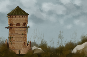
HBO’s Game of Thrones has countless iconic scenes that have been forever ingrained in the memory of 21st century pop culture, but arguably one of the most iconic and significant is the fall that crippled Bran Stark and set off the ripple of scandals that made the series’s plot as complicated as it is. While I obviously do not condone acts of violence against minors, I found the scene quite funny because of how absurd everything was: a 10 year old child who somehow managed to climb up the exterior of a tower accidentally witnesses an incestuous affair and then gets thrown out of a window.

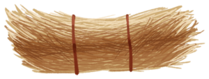
I figured that I would eternalize this scene in a more lighthearted way by creating a simple game in which multiple Brans will fall and the player, with their mouse, has to catch the boy by moving a pile of hay as a cushion for him to fall on. At the same time, players will also have to avoid catching the severed head of Bran’s father Ned Stark. Each game lasts 45 seconds; for every Bran saved, the score increases by one, and for every Ned head caught, the score decreases by one.

Highlights:

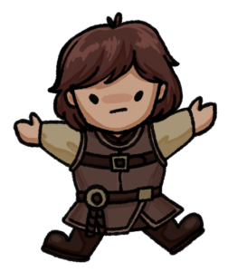
I illustrated most of the visual assets for the game in Procreate on iPad, employing a more cartoonish art style that I felt was fitting for the simplicity of the game despite the gritty aesthetic of Game of Thrones.

– Background: I tried to keep the whole image simple and not too crowded with details as to not affect the visibility of the falling Brans and Ned heads.
– Bran Stark

– Hay cushion

  • Ned Stark’s severed head

In terms of gameplay, Ned’s falling heads were not part of the initial concept. However, after a few play-throughs it became apparent that having saving bran as the sole objective proved to be quite dull, so I decided to introduce obstacles in the form of Ned’s heads. While the mechanisms for Ned’s heads were almost identical to the falling Brans’, I think it’s an important addition as it adds to the stakes and makes the gameplay a bit more interesting.

As for the code, there wasn’t anything particularly challenging, but I am proud of having incorporated a countdown timer that resets with every new game; I used this video by flanniganable as a reference for the timer and added additional parameters to have it reset automatically.

let startTime; //track when the game starts
let timeLimit = 45; //countdown timer duration
let countdown;
let gameState = "start";

function drawGame() {
  //start 45 second countdown
  let currentTime = int((millis() - startTime) / 1000);
  countdown = timeLimit - currentTime;
  
  //end game after time is up 
  if (countdown < 0) {
    gameState = "end";
  }

  //display score and countdown in real time
  fill(0);
  textFont("times new roman");
  text("Score:" + score, 500, 60);
  text("Time:" + countdown, 500, 80);
}

function restartGame() {
  //reset countdown and Brans and Neds
  score = 0;
  startTime = millis();
  timeLimit = 45;
  countdown = timeLimit;
  gameState = "start";
}

function keyPressed() {
  if (gameState == "start") {
    // Start the game
    startTime = millis();
    gameState = "playing";
  } else if (gameState == "end") {
    restartGame();
  }
  // preventing the key press from being counted again
  return false;
}

Finished Game:

Areas for Improvement:

  • The gameplay becomes repetitive and there is very little replay value as of now; expanding on the game with increasingly difficult levels and power-ups as incentives would greatly add to the replay value.
  • I was not able to add fullscreen display for the game, as I had already illustrated the background image before we learned about fullscreen in class. Enabling fullscreen would allow players to see the falling Brans more clearly.

Midterm Project: Labyrinth Race

Concept:

Sketch Link: p5.js Web Editor | Labyrinth Final (p5js.org)

Inspired by the Greek myth of Theseus, who navigated the labyrinth to defeat the Minotaur, I envisioned a game that captures the thrill of navigating a maze to reach a goal. In this two-player game, only one can survive the labyrinth. Players must race to the safe zone at the center of the maze while avoiding touching the walls of the maze. The first player to reach the center wins, while the other faces death. Alternatively, if a player touches the walls at any point, they are immediately eliminated, granting victory to their opponent by default. This intense competition fosters a sense of urgency and strategy as players navigate the ever-changing labyrinth.

Design features:

  • Dynamic Maze Generation: Each time a new game begins, the maze layout changes, ensuring that no two playthroughs are the same. This feature keeps the gameplay fresh, challenging players to adapt to new environments every time they enter the labyrinth.
  • Boundary Enforcement: Players are confined to the game canvas, ensuring they stay within the limits of the maze. Exiting the bounds is not an option.
  • Customizable Player Names: Players can personalize their experience by entering their own names before starting a match. For those who prefer to jump right into the action, the game also offers default character names, maintaining a smooth and accessible start.
  • Animated Player Sprites and Movement Freedom: Each player is represented by a sprite that shows movement animations. The game allows Movement in 8 directions.
    EightDirMovement21
  • Fullscreen Mode: For a more immersive experience, players can opt to play the game in Fullscreen mode.
  • Collision Detection: The game includes collision detection, where touching the maze walls results in instant disqualification. Players must carefully navigate the labyrinth, avoiding any contact with the walls or face elimination.

Process:

The most challenging and time-consuming aspect of this game was designing the maze. The logic used to ensure that a new maze is generated with every iteration involves several key steps:

Maze Initialization: The process begins by drawing six concentric white circles at the center of a black canvas, with each subsequent circle having a radius that decreases by 60pt. This creates the foundational layout of the maze.

let numCircles = 6; // Number of white circles in the maze
let spacing = 50; // Spacing between circles

// Loop to draw white circles
for (let i = 0; i < numCircles; i++) {
    let radius = (i + 1) * spacing; // Calculate radius for each circle
    noFill(); 
    stroke(255); 
    strokeWeight(2); 
    ellipse(width / 2, height / 2, radius * 2, radius * 2); // Draw each circle
}

Black Circle Placement: Black circles are then placed randomly on top of the white circles. The innermost black circle is erased to create a clear entrance. The number of black circles on each white circle increases as we move outward, adding complexity to the maze design.

// Function to generate positions for the black circles
function generateBlackCircles() {
    // Loop through each circle in the maze
    for (let i = 0; i < numCircles; i++) {
        let radius = (numCircles - i) * spacing; // Start with the outermost circle first
        let maxBlackCircles = numCircles - i; // Outermost gets 6 circles, innermost gets 1
        
        // Generate random positions for the black circles
        for (let j = 0; j < maxBlackCircles; j++) {
            let validPosition = false;
            let angle;

            // Keep generating a random angle until it is far enough from other circles
            while (!validPosition) {
                angle = random(TWO_PI); // Generate a random angle
                validPosition = true; // Assume it's valid

                // Check if the angle is far enough from previously placed angles
                for (let k = 0; k < placedAngles.length; k++) {
                    let angleDifference = abs(angle - placedAngles[k]);
                    angleDifference = min(angleDifference, TWO_PI - angleDifference);
                    if (angleDifference < minAngleDifference) {
                        validPosition = false; // Too close, generate again
                        break;
                    }
                }
            }
            // Calculate the coordinates and store them
            let x = width / 2 + radius * cos(angle); 
            let y = height / 2 + radius * sin(angle);
            blackCircles.push({ x: x, y: y, angle: angle, radius: radius });
            placedAngles.push(angle); // Save the angle for future spacing
        }
    }
}

Collision Detection for Black Circles: An overlap function checks to ensure that no two black circles spawn on top of one another. This is crucial for maintaining the integrity of the maze entrances.

// Function to check if the midpoint of a line is overlapping with a black circle
function isOverlapping(circle, x1, y1, x2, y2) {
    let { midX, midY } = calculateMidpoint(x1, y1, x2, y2);
    let distance = dist(midX, midY, circle.x, circle.y);
    return distance < circleRadius; // Return true if overlapping
}

Maze Line Generation: For each black circle, a white maze line is generated that is perpendicular to the white circles. Another overlap function checks whether the maze lines overlap with the black circles, adjusting their positions as necessary.

// Function to draw the lines from the edge of the black circle
function drawMazeLines() {
    stroke(255); // Set the stroke color to white
    for (let i = 1; i < blackCircles.length - 2; i++) {
        let circle = blackCircles[i];
        // Calculate starting and ending points for the line
        let startX = circle.x - (50 * cos(circle.angle)); 
        let startY = circle.y - (50 * sin(circle.angle));
        let endX = startX + (50 * cos(circle.angle));
        let endY = startY + (50 * sin(circle.angle));
        // Check for overlap and adjust rotation if necessary
        while (isAnyCircleOverlapping(startX, startY, endX, endY)) {
            // Rotate the line around the origin
            let startVector = createVector(startX - width / 2, startY - height / 2);
            let endVector = createVector(endX - width / 2, endY - height / 2);
            startVector.rotate(rotationStep);
            endVector.rotate(rotationStep);
            // Update the coordinates
            startX = startVector.x + width / 2;
            startY = startVector.y + height / 2;
            endX = endVector.x + width / 2;
            endY = endVector.y + height / 2;
        }
        line(startX, startY, endX, endY); // Draw the line
    }
}

Test Sketch:

 Final Additions:

  • Player Integration: I introduced two player characters to the canvas. Each player was assigned different movement keys and given 8 degrees of movement as players needed to utilize their movement skills effectively while avoiding collisions with the maze walls.
  • Collision Detection: With the players in place, I implemented collision detection between the players and the maze structure.
  • Game States: I established various game states to manage different phases of the gameplay, such as the start screen, gameplay, and game over conditions. This structure allowed for a more organized flow and made it easier to implement additional features like restarting the game.
  • Player Name Input: To personalize the gaming experience further, I incorporated a mechanism for players to input their names before starting the game. Additionally, I created default names for the characters, ensuring that players could quickly jump into the action without needing to set their names.
  • Sprite Movement: I dedicated time to separately test the sprite sheet movement in a different sketch to ensure smooth animations. Once the movement was working perfectly, I replaced the placeholder player shapes with the finalized sprites, enhancing the visual appeal and immersion of the game.
  • Audio and Visual Enhancements: Finally, I added background music to create an engaging atmosphere, along with a game-ending video to show player death. Additionally, I included background image to the game screen.

Final Sketch:

Future Improvements:

One significant challenge I encountered with the game was implementing the fullscreen option. Initially, the maze generation logic relied on the canvas being a perfect square, which restricted its adaptability. To address this, I had to modify the maze generation logic to allow for resizing the canvas.

However, this issue remains partially unresolved. While the canvas no longer needs to be a perfect square, it still cannot be dynamically adjusted for a truly responsive fullscreen mode. To accommodate this limitation, I hardcoded a larger overall canvas size of 1500 by 800 pixels. As a result, the game can only be played in fullscreen, which may detract from the user experience on smaller screens or varying aspect ratios.

Moving forward, I aim to refine the canvas resizing capabilities to enable a fully responsive fullscreen mode.


Midterm Project – Linus’s Dorm Experience

Sketch:

https://editor.p5js.org/lj2369/full/LBmJSPAC2

Concept:

A significant portion of my time outside of class is spent in my dorm— listening to music, playing games, browsing through my closet, and experimenting with making music. When brainstorming ideas for my midterm project, I realized how much of my life revolves around these everyday activities. This inspired me to recreate that personal experience in my project, aiming to capture the essence of my time in the dorm.

Description: 

At the title screen of my project, you are greeted to 3 doors, the 2 dorms surrounding me, and my dorm, 705. The sketch highlights the dorm you are supposed to enter when you hover over it(it will not open the other doors). Once you step foot in the dorm, you are greeted with an amazing(AI photograph) of a dorm room.  In the Dorm, there are 5 things you can access, the computer, the photo above the computer, the speaker, the bed and the closet. If you mouse hover either one of those, the border of each will highlight, prompting you to click on it.

If you press on the computer, a menu page with a wallpaper and text greets you. If you follow the prompt on the computer, pressing 1 brings you to a drum machine/ beat sequencer and pressing 2 brings you to a menu page of a game of snake. The beat sequencer page has 6 different rows of different instruments, and 16 grids for each part of a drum. For each grid you select, when you press play, the specific part of the drum will play if you have selected the grid. In snake, you press enter to start the game, and control your snake using WASD. The objective is just trying to eat as many fruits as you can and grow as big as you can. In both applications, it will bring you back to the computer menu page if you press escape. Pressing escape on the menu page will bring you back to the dorm.

If you select the closet, you will enter a closet, where you can browse through my clothes. There are buttons on each side of the closet. The left button brings you to the previous clothing item, and the button on the right displays the next clothing item available. Once again, you can exit back to the dorm by pressing escape.

If you select the speaker, a music playback page is displayed, with a spinning record in the middle. I derived this part from a previous assignment where I drew 2 spinning records. However, I altered its functionality to fit what I wanted. It plays back a few songs I have selected and play/pause, next and previous track buttons work as you expect it to. The records spin while music is playing and stops when music stops. The color ring of the record corresponds to the color of the album in which the song was found on.  There is also a vertical slider for volume, and a horizontal one, to skip forwards or backwards into the track, and to watch how far into a song you are.

If you click on the bed, a stickman will be sleeping on the bed.

Lastly, if you click on the photo frame above the computer, an image of my favorite album cover will show.

Code Highlight: 

  //drum machine setup
  
  // Initialize grid with "off" cells
  for (let i = 0; i < numRows; i++) {
    grid[i] = [];
    for (let j = 0; j < numCols; j++) {
      grid[i][j] = false; 
      }
  }
   //Calculate the interval between steps based on BPM
  interval = (60 / bpm) * 1000 / (4); // Divide by 4 for 16th notes
  
  playPauseButton = createButton('Play');
  playPauseButton.position(3,320);
  playPauseButton.mousePressed(togglePlayPause);
  playPauseButton.hide();
  
  // Start sequencer
  setInterval(playStep, interval);
  
  // Define different colors for each row
  rowColors = [
    color(255, 100, 100),   // Red for Kick
    color(100, 255, 100),   // Green for Snare
    color(100, 100, 255),   // Blue for Open Hat
    color(255, 255, 100),   // Yellow for Closed Hat
    color(255, 100, 255),   // Pink for Crash
    color(100, 255, 255)    // Cyan for Clap
  ];


function playStep() {
  if (isPlaying) {
    // Play sounds for the active beats in the current step
    for (let i = 0; i < numRows; i++) {
      if (grid[i][currentStep +1 ]) {  // Adjust for the dead node
        
        soundFiles[i].play();
      }
    }
  
    // Move to the next step
    currentStep = (currentStep + 1) % numCols;
  }
}

This segment of code is responsible for the core functions of the Drum Machine/ beat sequencer. In the setup, the grids are initialized to an off position. Interval is set to create an even spacing between each note on the grid to a 16th note, based on the bpm initialized. The setInterval function(native to JS) is called, where the first parameter is our function, and the second parameter being the delay that we set. The function playStep checks whether our drum machine is playing, then checks if each row is selected, and plays the instruments that are selected, then moves on to the next step. It loops back once it reaches the last step.

Problems/Improvements: 

A problem I encountered multiple times while working on this project is, when entering and leaving a different scene, the strokeweight or stroke color is not reset, resulting in some of the artwork being messed up. However, i fixed this by resetting the stroke weight and stroke colors at the escape function when leaving the scene, or at the end of the draw functions.

For my hover detection, since the picture is 3D on a 2D space, for my hover detection, as i was using a rectangle to define the coordinates, it results in some inaccuracy. I was unable to come up with a solution.

Another problem I encountered was not having my code be as organized, resulting in difficulty debugging. I fixed some of this by creating classes, as opposed to having them be functions within the sketch file. However, I didn’t do this for all my different scenes, so that is a future improvement.


Midterm Project

Sketch:
link to fullscreen: https://editor.p5js.org/GhadirMadani/full/e7SLueayo

Concept:

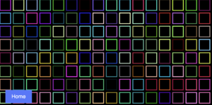
The concept of my project was to make the user interact with more than one game using only one game. So my idea was to make an arcade game with five arcade machines, and when the user clicks on the screen of one of the arcade machines they will be able to play the game linked to that screen, and then they can go back to the arcade room to play the other games. By creating this game, I incorporated a lot of what we have studied in class and I made it more user-friendly and interactive.

How the Project Works:

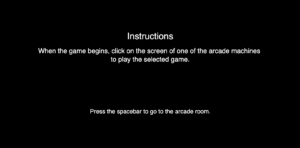
When you enter the game this is the first screen that is shown, if you follow the instructions correctly it will link you to the arcade room code.

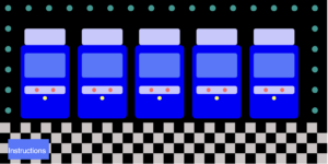
This is the arcade room. You can go back to the instructions page by clicking the “Instructions” button and it will link you back to the instructions code. Or you can play on the screen of one of the arcade machines (as mentioned in the instructions page) to play the game linked to it.

function mousePressed() {
  
    // Check clicks only when in the arcade room
    // First arcade machine (redirects to skeleton.html)
    if (mouseX >= 60 && mouseX <= 160 && mouseY >= 130 && mouseY <= 190) {
      window.location.href = "skeleton.html";
    }

    // Second arcade machine (redirects to squares.html)
    if (mouseX >= 190 && mouseX <= 290 && mouseY >= 130 && mouseY <= 190) {
      window.location.href = "squares.html";
    }

    // Third arcade machine (redirects to error.html)
    if (mouseX >= 320 && mouseX <= 420 && mouseY >= 130 && mouseY <= 190) {
      window.location.href = "error.html";
    }

    // Fourth arcade machine (redirects to jukebox.html)
    if (mouseX >= 450 && mouseX <= 550 && mouseY >= 130 && mouseY <= 190) {
      window.location.href = "jukebox.html";
    }

    // Fifth arcade machine (redirects to jackpot.html)
    if (mouseX >= 580 && mouseX <= 680 && mouseY >= 130 && mouseY <= 190) {
      window.location.href = "jackpot.html";
    }
  
  // Check if the "Instruction" button is clicked
  if (mouseX >= 20 && mouseX <= 120 && mouseY >= height - 60 && mouseY <= height - 10) {
    // Redirect to the arcade home page 
    window.location.href = "index.html"; 
  }
  }


The code I am mostly proud of is linking each screen with a different game, for example the first one is linked to the skeleton game, the second to the squares and so on.

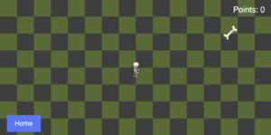
When you click on the first screen you are directed to the skeleton game. You will have an instruction page before playing the game and if you follow the instructions carefully you will be able to play the game. The way this game works is you have to move the skeleton (spritesheet) to collect the bones, when you reach 10 points you win the game and you can press the “R” key to restart the game. But you can also lose the game if you touch the borders of the screen and you can also restart the game by pressing the “R” key. If you want to go back to the arcade room you have to press the “Home” button.

The second game (the second arcade machine) is a previous assignment that I added to this project. You will have to press on the mouse to let the squares change and press it again to change the speed of the squares. What I added to this project was the instruction page, where if you follow the instructions you will be able to play the game. If you want to restart the game you will have to press the spacebar twice, one to stop the game and one to reset the squares and then you will be able to play the game again. If you want to go back to the arcade room you have to press on the “Home” button.

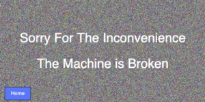
For my third game I created non functional game, and this is because whenever I go to an arcade room most of the machines are broken. You can go back to the arcade room by pressing the “Home” button.

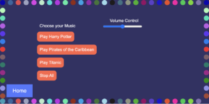
For my fourth game I created a jukebox, this was to implement music to my game. When you click on one of the “Play” buttons the corresponding music will be played and if you press on the stop button the music will stop playing. You can control the volume levels using the “Volume Control” slider. You can go back to the arcade room by pressing the “Home” button.

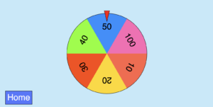
For my last game I created a Jackpot where you have to press your mouse so the wheel spins. You can then go back to the arcade room by pressing the “Home” button.

Areas of Improvement and Problems:

Since my project had many javascript codes and the games were dependent on the size of the screen that was chosen (width=800 and height=400), it was really difficult for me to code all the different javascripts to be in full size and responsive to the size of the screen. So as an improvement for my future project I want to implement the full screen option and make my project responsive to the size of the screen being used.

Midterm: 5R Photo Lab!

Final product 

Make sure to open on the P5 web editor for sound and press f for full screen please!

Concept

My main concept for my midterm was based on the photo lab that I work at in New York. I wanted to create an interactive lab experience in which the user could go through some of the steps of developing/processing film while also hopefully learning a bit more about film in the process. My main goal when designing the program was to make something that was useful to the lab and could be used by my customers.  Therefore, I ended up creating a ‘behind the curtain’ experience for customers to see what developing film is like and get small experiences in the different activities.

How it works

My program functions solely on mouse interaction and features 2 mini-games and 2.5 ‘resource tabs. The first mini-game is what I’ve considered as stage 1 of the development process, making the chemistry. Users are able to reveal the recipe card and then have to memorize the ratios for each chemical in order to make the chemistry needed for the development process. They have only 2 chances to refresh their memory but if they over pour it at all they immediately lose (because in the real world we’d have to throw the chemistry out). The second mini game is the fourth station where they are editing scans. Basically users have 15 seconds to edit 10 randomly generated pieces of ‘dust’ from the scans to prepare them to be sent off to the customer.

The two middle stations, splicing and feeding the machine do not have any major interactive piece. I made this decision for multiple reasons. The first, of course being time management and having figure out what I’d actually have time to compelte, and the second being that these stages don’t really have much that could be digitally represented like with the other two games. Step 2 typically just requires cutting a piece of film and labelling it while step 3 is literally just putting it in the machine. Therefore, by giving them this informative, resource functionality I believe it further instills how this program can be a resource for film photographers.

I also have a small easter egg which appears when you click on the film negatives hanging on the wall that just feature some photos, some of which were shot on film so that were not. While this doesn’t really add anything to the program I thought it was on theme with the design and added another layer of creativity to the project.

What I’m proud of

I am particularly proud of the mix chemicals station because it took many many hours of trial and error to reach the stage its at currently. Originally I wanted to incorporate the g, r, b, and y keys to represent filling up the vials but decided that jumping between input functions might be too much for the user. Also, while working on this station I completely deleted the relevant functions three times which I am honestly quite proud of because it took quite a bit of guts to just start over like that, but I am glad I did.

if (grow.blue && blueHeight < maxHeight) blueHeight += growthRate;
  if (grow.red && redHeight < maxHeight) redHeight += growthRate;
  if (grow.green && greenHeight < maxHeight) greenHeight += growthRate;
  if (grow.yellow && yellowHeight < maxHeight) yellowHeight += growthRate;

  // drawing rectangles
  fill('#4ba0f7');
  rect(windowWidth * 0.2 + 1.5, baseY - blueHeight, 57, blueHeight);
  fill('#f12721');
  rect(windowWidth * 0.31 - 5.5, baseY - redHeight, 57, redHeight);
  fill('#52c204');
  rect(windowWidth * 0.41 + 2, baseY - greenHeight, 57, greenHeight);
  fill('#ffeb67');
  rect(windowWidth * 0.52 - 3.75, baseY - yellowHeight, 57, yellowHeight);

The algorithm I ended up with is actually pretty simple it was just hard for me to conceptualize because I was originally unable to breakdown the mini-game into each separate requirement for what I wanted to happen. Above you can see the main part of the function that illustrates the rectangle growth.

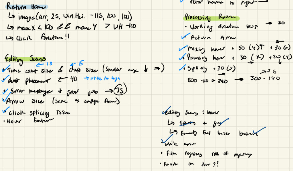
I am also proud of the fact that everything is appropriately ratioed in full screen (or at least on my 13 inch MacBook Air screen it is) because it was a topic of growing anxiety for me as I continued to ratio everything in a split screen when I was actually implementing my ideas. Furthermore, while this is technically an area of improvement, I think that that way I problem solved was particularly effective. Due to poor design and planning I quickly became overwhelmed with the various errors I was dealing with and didn’t really know how to approach them but eventually just went back to the basic and wrote down whatever needed to be changed and I think that really helped reset  my mentality and also the direction of my program.

Please excuse my awful handwriting, it was nearing 3 AM when I wrote this…

Areas of improvement 

Although I am very happy with how my program turned out, I also have a lot of areas of improvement that I’d like to see happen in the future. During the implementation process my code was extremely disorganized and messy which cause for a lot of unnecessary confusion and frustration while I was debugging errors. Also, while the worst of it has since been improved, I did quite a bit of hardcoding that I think with the right approach could be simplified in some creative ways that I’d like to test out. Lastly, I would like to think of some more ways I can further develop the user experience. In conceptualizing this project I considered having some drag and drop features, using the the laptops camera to take a picture, and other unique components that I would like to further explore eventually.