Reading Reflection – Week 8

Attractive things work better

The idea of the reading is simple – if you want to achieve great results in your product development, good design and usefulness should go hand in hand. However, most people forget about it and mess up one of the parts. I saw many ideas that were great but lacked design and attractiveness. As an example, I can take the startup competition. The team with a great idea but a bad slide deck design and pitch can easily lose to the team with a great slide deck and pitch, even though the latter might have an idea that is technically worse for implementation.

I would also like to mention that design can play a crucial role in marketing. As I have learned from one great professional, marketing is a systematic creation and capture of value. While value can be perceived straightforwardly as a utility and purpose, it can also mean something aesthetically pleasing or something that is very well differentiated from other ideas or products. It is important to remember that we are, after all, human beings, and our emotions and feelings can sometimes play a crucial role in deciding what is worth purchasing, using, wearing, etc. Thus, a great design can be a decisive factor for a customer to buy your product while encountering your advertisement.

Her Code Got Humans on the Moon

I was impressed by what I learned from reading this article. Margaret Hamilton basically saved the Apollo mission and also opened the door to the world of computer engineering. I am sure that many people still do not know about this fact, and this is true that the role of women in the STEM field was underrepresented throughout the 20th century and before, not to mention that educational opportunities became available for women much later than for men. Nowadays, this is being changed and many women have a chance to contribute to the development of science. Talking from my personal experience, I know a lot of women in science, particularly in space development and exploration fields in my country, Russia. Even in the 20th century, there were female astronauts, physicians, and mathematicians. Although their role and contribution might not be as significant as the one of Margaret Hamilton, they all also played a role in empowering women in STEM in my country.


Week 8 – Unusual Switch

PROJECT: UNUSUAL SWITCH

For this unusual switch project, I conceptualized a system where clicking or snapping my fingers would activate an LED light. This idea explores novel ways of interacting with electronic devices using natural gestures.

Components Used:

Arduino board: Used to control the circuit and process inputs

LED: The light source activated by the finger snap

Resistor (330 ohm): To limit current flow and protect the LED

Jumper wires: For making connections between components

Copper tape: Used as a sensor to detect the finger snap without a traditional button

REFLECTION: 

  • Importance of resistors: I initially forgot to add a resistor, which resulted in the LED burning out. This made me understand the critical role of resistors in protecting sensitive components.

IMG_7912

Reading Reflection – Week 8

The reading “Emotion & Design: Attractive Things Work Together” presents a compelling argument about the interplay between emotion, design, and usability, particularly emphasizing that attractive things work better. This resonates with my own experiences and observations in various contexts, such as product design and user interfaces. For instance, I have noticed that when using a software like a food delivery app with a visually appealing interface, I tend to feel more satisfied with the experience, even if the functionality is similar to less attractive alternatives.

On the other hand, the reading “Her Code Got Humans on the Moon” has shifted my perspective on the historical significance of software engineering. I had previously viewed software as a more modern development, but the article illustrates how foundational work was being done as early as the 1960s. Additionally, the reading raises several questions for me. How did Hamilton’s experiences as a working mother in a male-dominated field influence her approach to software development? Furthermore, how can we ensure that the contributions of women and other underrepresented groups in technology are recognized and celebrated in contemporary narratives? These questions highlight the need for a more inclusive history of technology that acknowledges diverse contributions.

Week 8 – Night Light with Arduino

Project Overview

This project is a hands-free, light-activated night light designed to automatically turn on an LED when it’s dark and turn it off when it’s light. Using a light-dependent resistor (LDR) as a sensor, the circuit detects ambient light levels and toggles the LED accordingly. This is ideal as a night light or as an indicator light in dark conditions.

Materials Used

  • Arduino Uno: The microcontroller board used to control the circuit.
  • Jumper Wires: For making connections between components.
  • Resistors:
    • 330 Ohm resistor (for the LED, to limit current).
    • 10k Ohm resistor (as a pull-down resistor for the LDR to ensure stable readings).
  • LED: Acts as the night light, illuminating when ambient light is low.
  • Light-Dependent Resistor (LDR): Detects the light level in the environment and changes its resistance accordingly.

    Arduino Code

    The following code reads the light level from the LDR and turns the LED on when the light level drops below a specified threshold (indicating darkness) and off when the light level is above this threshold (indicating light):

int ldrPin = A0;           
int ledPin = 9;           
int threshold = 500;       

void setup() {
  pinMode(ledPin, OUTPUT);    
  Serial.begin(9600);         
}

void loop() {
  int ldrValue = analogRead(ldrPin);  
  Serial.println(ldrValue);           
  
  // Check if the light level is below the threshold
  if (ldrValue < threshold) {
    digitalWrite(ledPin, HIGH);  
  } else {
    digitalWrite(ledPin, LOW);   
  }
  
  delay(100);  
}

Improvements

    • Automatic Brightness Adjustment: Incorporate PWM to adjust the LED brightness gradually based on light levels, creating a dimmer effect in low light.
    • Sensitivity Adjustment: Experiment with different threshold values based on the ambient light conditions in various environments. This ensures accurate and responsive behavior.

Video Demonstration

Week 8 – Reading response

Small things overlooked

We often overlook small details and focus too much on assumed important features such as usability or practicality. In the reading “Her Code Got Humans on the Moon”, the suggestion to put a warning on a project was disregard because the assumption that the users are trained enough. This resulted in a disastrous problem, deleting all data when the astronauts actually press it. I think this example is similar to small lines of code or comments that we often consider insignificant. These parts may not make a project immensely better, but without them, issues could arise, as seen in the astronaut example.

Another takeaway from the reading is the importance of not making assumptions about users. Good design should account for worst-case scenarios or consider the perspective of someone with no prior knowledge of the product.

Similarly, Norman’s reading said that small details like warnings or the aesthetics of an interaction may not add specific usability to an object. However, it’s important to view design from multiple perspectives, not just functionality. While it’s logical to prioritize functionality, good aesthetics can sometimes offset weaknesses in other areas. In some cases, strong aesthetics prompt users to engage more based on emotional appeal rather than logical reasons. A good example of this is the vintage trend, such as using vinyl records or old flip phones. While these items don’t offer more functionality than recent models, they attract users by evoking nostalgia and a unique aesthetic.

Week 8 – Sleep No More

intro

How tough can designing a switch be? Presumably not much—but it’s the contrary. While the circuit to utilize a switch may be one of the simplest ones in the electronics world, to what extent can that switch ‘make sense’ as well as be creative and ergonomically intuitive? From the distance-triggered switch I rushed in class to a coin-classifier that utilizes the different diameters of different coins, both of these prototypes I made in the course seem too ‘basic’ in terms of being so realistic (aka. boring). At the end of the day, setting off from the concept of ‘using body parts,’ I came up with the idea of a ‘Sleepiness Detector’ that would act as an automatic alarm (visually with LEDs and sonically with a buzzar) when the user (if there is one) closes their eyes.

process

Although the first two prototypes are discarded, I would still give credit to them here as a chronicle:

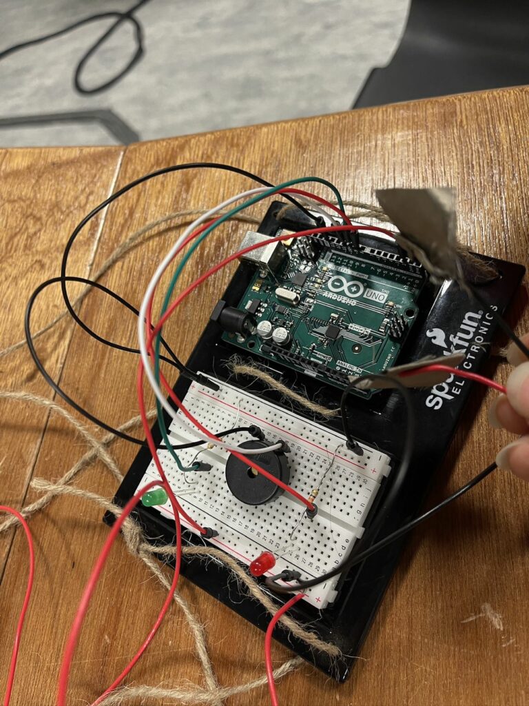
Still, the second prototype did give me some inspiration about using the conductive fabric to form the later artificial eyelids. While the code below is relatively simple, I would say the most difficult part of this product is to ‘install’ artificial eyelids to my eyes—maybe this is where collaboration was a necessity.

/*
+---------+               +--------+
| Switch  |  eyes         | LED R  |
|         |               |        |
| Terminal|--- Pin 2 ---  | Anode  |--- Pin 9 (Arduino)
|         |               |        |
| Terminal|--- GND        | Cathode|--- GND (through 220Ω resistor)
+---------+               +--------+
                         
                         +--------+
                         | LED G  |
                         |        |
                         | Anode  |--- Pin 10 (Arduino)
                         |        |
                         | Cathode|--- GND (through 220Ω resistor)
                         +--------+
                         
                         +---------+
                         | Buzzer  |
                         |         |
                         | Positive|--- Pin 11 (Arduino)
                         |         |
                         | Negative|--- GND
                         +---------+
*/

#define SWITCH_PIN 2   // Pin connected to the switch
#define RED_LED_PIN 9  // Pin connected to the red LED
#define GREEN_LED_PIN 10 // Pin connected to the green LED
#define BUZZER_PIN 11   // Pin connected to the buzzer

void setup() {
    pinMode(SWITCH_PIN, INPUT_PULLUP); // Set switch pin as input with pull-up resistor
    pinMode(RED_LED_PIN, OUTPUT);       // Set red LED pin as output
    pinMode(GREEN_LED_PIN, OUTPUT);     // Set green LED pin as output
    pinMode(BUZZER_PIN, OUTPUT);        // Set buzzer pin as output
}

void loop() {
    // Read the state of the switch
    int switchState = digitalRead(SWITCH_PIN);

    if (switchState == LOW) { // Switch is ON (active low)
        digitalWrite(RED_LED_PIN, LOW);      // Turn off the red LED
        digitalWrite(GREEN_LED_PIN, HIGH);   // Turn on the green LED
        tone(BUZZER_PIN, 1000);              // Play sound at 1000 Hz
    } else { // Switch is OFF
        digitalWrite(RED_LED_PIN, HIGH);     // Turn on the red LED
        digitalWrite(GREEN_LED_PIN, LOW);    // Turn off the green LED
        noTone(BUZZER_PIN);                   // Turn off the buzzer
    }
}

schematics & illustration

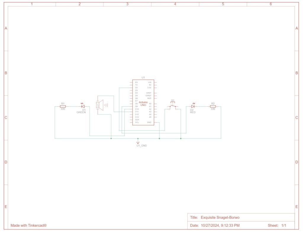
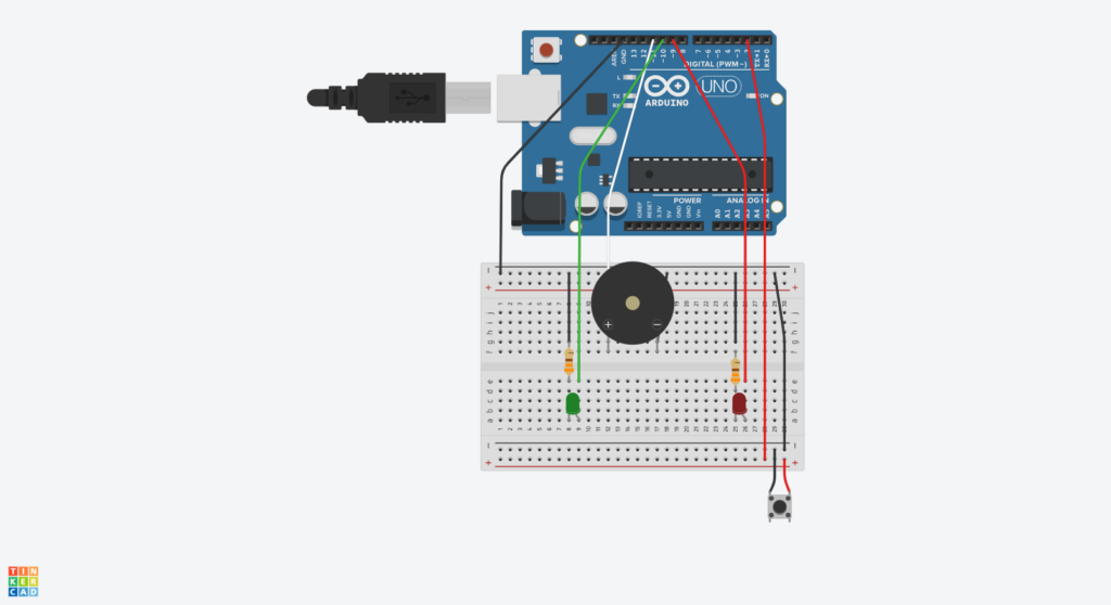
Both of the graphs are generated with TinkerCAD

Product Demo

Hindsight

Obviously, the method I used to install eyelids was not wise enough to replicate easily. If this is actually to be a thing, then there must be some more mature way to detect if eyes are closed.

Week 8 – Reading Response

It’s all about the balance – right?

Aesthetics vs. function, durability vs. lightness, artistic vs. technical—it’s so easy to fall into a binary mindset. To some extent, my intuitive argument would be: ‘Yes, that indeed makes life easier—but in terms of?’ While we humans like clear frameworks and roadmaps to navigate through the complexities, it seems that at the end of the day, despite the urge to simply pick a side (or polarize, in a fancy way), things—in many cases—turned out the most favorable when we took a step down and found the middle ground.

In fact, it seems quite contradictory to me, especially considering Norman’s arguments as a whole: yes, we tend to be hard-headed and pick sides intuitively, and the ‘fact’ seems to praise the balanced, but to perceive that balanced beauty/harmony/coherence or whatever induced, it comes back to our first-hand perception system (or effects in Norman’s words).

Okay, I’ll try to step down from delving into the philosophical rabbit hole. However, maybe more practically, how can these inquiries benefit our—or my—practice? From poetry to music to tennis, I constantly struggle between the fine lines. And now, not surprisingly, but ‘coding’ turned out to be the same. If I am to name a takeaway from this, then although I may not be able to point out a solution to any of the fields at the point or even forever, it must be, again, transforming the mindset:

When we use the term balance, what’s its connotation? If something, two or more, needs to ‘be balanced,’ at least it sounds to me that we are assuming that those things are intrinsically conflicting to some extent. But what if they do not conflict with each other in the first place? I’m not saying that this is the new version of ‘fact’ but suggesting maybe we should try to get rid of that guggling mindset and try as hard as possible to really, really look at what we are dealing with as a whole.


Week 8: Unusual Guitar Switch

Concept

It came to me while I was playing on my guitar as a way to destress after hours of failing to think of ideas for an usual switch: why not use the guitar as a switch? The strings of the guitar are made of steel and can therefore act as conductors. All I had to do was to find a way to incorporate it into a circuit so that an LED light switches on with every strum of the guitar.

In retrospect, I realize that I was, in fact, using my hands despite the assignment instruction being to create an unusual switch that does not require the use of one’s hands. I was too preoccupied with trying to make my switch as unconventional as possible and accidentally neglected this instruction. Still, I am proud of coming up with the idea to incorporate my interest in guitars into my assignment.

I took the same circuit from our class exercise for digital input and removed the button, replacing it with the guitar and the guitar pick. I covered my guitar pick with aluminum foil to make it conductive and then taped it to a wire. As for the guitar itself, my initial idea was to tape a wire to the bottom E string; however, it proved to be not ideal as this meant that the LED will only light up if I strum this one specific string and not for the other five. I ended up taping the wire to a larger sheet of aluminum foil and then taping the sheet to the bridge of the guitar, which is a metal part that acts as a saddle for all six strings.

The code is also fundamentally the same as our in-class exercise, but instead of switching off when the circuit is complete, the LED light switches on.

void loop() {
  int buttonState = digitalRead(A2);

  if (buttonState == HIGH){
    digitalWrite(13, HIGH);
  } else {
    digitalWrite(13, LOW);
  }

}

Setup:

Github link


Demonstration


Reflection

There are many elements in this assignment that I would like to improve upon if I had more time. For example, the aluminum foil I wrapped around my guitar pick kept shifting despite the tape, the parts around the tip wore off and exposed the plastic pick after some strumming; using metal guitar picks would easily solve the problem, but I unfortunately do not have one. Another option would be to fashion a guitar pick out of multiple layers of aluminum foil.

It would also be interesting to expand on the functions of this device to help guitar players be on tempo. Since the LED lights up with every strum, adding a small speaker to the circuit that acts as a metronome; guitar players can listen to the tempo and look at the LED light to make sure it is also blinking on tempo, in case it is difficult for them to hear the subtle differences.

Reading Reflection #5

Her Code Got Humans on the Moon

Reading about Margaret Hamilton’s incredible life and career was eye-opening; I was not aware that a woman played such a central role in the United State’s Space Race efforts, not was I aware that “software engineering” was already a thing back then in the 1960s (albeit in its early stages). I feel like there are no words that can begin to describe just how impressive it was for her to juggle motherhood and her career in an era with layers of glass ceilings for a woman to break through (especially in engineering), all while setting the foundations of a discipline that is so integral to modern life. The unfathomable amount of responsibility assigned to Hamilton and her ability to set up all those crucial programs and troubleshoot while under immense pressure really put things into perspective for me. Whatever struggles I have with the more technical aspects of this course are nothing compared to hers, and her story gives me more drive and inspiration to take on my fears in coding and physical computing.

Emotion and Design: Attractive Things Work Better

Donald A. Norman makes a compelling argument about the balance between practicality and visual aesthetics that I absolutely agree with. Just the right amount of consideration for each is dependent on the context and purpose of the design; tools that are to be used in serious, concentrated efforts should of course be straightforward in design, but there are great benefits to be gained from adding style to the tools and activities we engage with in everyday life. We are naturally enticed by attractive things, and when using things that look good our “behavior seems to go along more smoothly, more easily, and better” (Norman). We derive joy from using aesthetically pleasing tools, but only if usability has not been compromised for visual style. Video game interfaces very well exemplify the need for this balance: visually, they must be appealing and in line with the style of the game, but they must also be easy to navigate as to not hinder gameplay and turn players away. I think the UI design of the Persona series (attached below) are the prime examples of good visual and interactive design:

Let's talk about Persona 5's menus - Eurogamer : r/JRPG

The UI and UX of Persona 5. You don't gotta say it over text too! | by Ridwan | Ridwan Khan

Persona 3 Reload's amazing UI might have the best menus in the history of JRPG menus, and shows the value of keeping devs around long-term | GamesRadar+

Reading Response: Week 8

Her Code Got Humans on the Moon—And Invented Software Itself

After reading the article on Margaret Hamilton, I can genuinely say her work left me inspired. One of the most fascinating aspects of her journey in software engineering is that the career path was not taught formally at the time; pioneers like Hamilton navigated complex, unprecedented problems relying solely on their resourcefulness and intellect. To me, this makes her story all the more exciting and inspiring. In the article, Hamilton reflects, saying, “When I first got into it, nobody knew what it was that we were doing. It was like the Wild West.” This captures an intriguing concept: how something entirely unfamiliar can eventually grow into a field recognized by the world. It emphasizes the invaluable contributions of innovators like Hamilton, whose dedication transformed this “Wild West” of programming into a modern, booming industry.

Today, what was once unknown is now a leading field, with software engineering being a top choice for bachelor’s degree pursuits. Interestingly, there’s a marked contrast between Hamilton’s era and ours: while she and her peers pursued this path out of passion and a pioneering spirit, the $400-billion industry today is often seen as a gateway to financial stability, with passion sometimes secondary. Despite the fact that software wasn’t even included in the Apollo mission’s budget or official documentation, its impact is undeniably felt across industries today. This article brilliantly highlights the work of women in technology and helps bridge the gender gap by celebrating these overlooked pioneers.


Norman, “Emotion & Design: Attractive things work better”

When I first began reading Norman’s essay on “Attractive Things Work Better,” I was initially skeptical, believing functionality should outweigh aesthetics—why prioritize appearance if it compromises performance? Yet, as I delved deeper, I found myself agreeing with Norman’s insights on how attractive designs can enhance usability. One key point he raises is that while aesthetics sometimes need to be sacrificed in contexts where functionality is paramount, there are cases where the two can harmoniously coexist. This perspective helped clarify any initial doubts I had about the essay’s premise.

Norman’s explanation of positive and negative affect, and their impact on user experience, is particularly compelling. His argument on how emotions like anxiety and fear can be leveraged to overcome procrastination, especially when working within time constraints, feels remarkably applicable. At first, I was hesitant about his idea that a product’s utility can be influenced by mood, and the suggestion of owning multiple versions of a product seemed inefficient to me. It felt impractical to rely on mood when selecting functional items, especially considering cases where only the “undesirable” product might be available, potentially leading to a poor experience. This extends beyond the teapot example he provides. However, his quote, “When we feel good, we overlook design faults. Use a pleasing design, one that looks good and feels, well, sexy, and the behavior seems to go along more smoothly, more easily, and better. Attractive things work better,” presents a thought-provoking angle that I acknowledge has merit, though I feel it doesn’t apply universally.

I do disagree with Norman’s claim that color displays offer no additional value compared to black-and-white screens. This seems particularly outdated in today’s digital world; for example, working in design software like Photoshop often requires accurate color information, and relying on a black-and-white display could lead to unintended, muted results. This is just one of several cases where Norman’s argument might fall short.

Finally, Norman’s emphasis on products being affordable, functional, and pleasurable resonates in our present context. This balance is essential, as seen in decisions by major companies like Apple, which might discontinue products like the Vision Pro if they fail to meet these criteria, particularly in terms of affordability.