Reading Response 5

Emotion & Design: Attractive things work better

In Emotion & Design: Attractive Things Work Better, Donald Norman argues that good design goes beyond just function, attractive objects actually work better because they make us feel good, which improves how we interact with them. He explains this through three levels of emotional response: visceral (our immediate reaction to an object’s appearance), behavioral (how enjoyable and smooth it feels to use), and reflective (the personal meaning or identity we attach to it). Norman suggests that when we find something visually appealing, we’re more likely to approach it with a positive attitude, which makes us more flexible, creative, and forgiving of any minor flaws.

I agree with Norman’s argument because I’ve noticed that when something is well-designed, it feels more intuitive and satisfying to use. For example, using a beautifully designed phone or website often makes me feel more engaged, and I’m less likely to get frustrated over small issues. Norman’s insight that aesthetics can improve functionality resonates with me; it emphasizes that our experience with an object is about more than just practicality. When design speaks to us emotionally, it creates a connection that makes the interaction smoother and more enjoyable, showing that beauty and usability truly go hand in hand.

Her Code Got Humans on the Moon

In Her Code Got Humans on the Moon, the story of Margaret Hamilton’s contributions to the Apollo space missions is explored, showcasing her pioneering work in software engineering at NASA. Hamilton led a team that developed the code for the Apollo Guidance Computer, which ultimately helped land humans on the moon in 1969. Her code was not only innovative but also designed to handle potential errors and prioritize critical tasks, a crucial feature during the Apollo 11 mission when the computer was overloaded with data right before landing. Hamilton’s careful programming allowed the computer to focus on essential functions, averting what could have been a mission-ending disaster.

Hamilton’s story highlights the critical role of women in STEM and the power of resilience and ingenuity in high-stakes situations. Her work laid the foundation for modern software engineering practices, particularly in error detection and real-time computing. I find her story inspiring, as it demonstrates that technological achievements often rely on unseen contributions and relentless dedication. Hamilton’s emphasis on building fail-safe systems feels especially relevant today, reminding us of the value of anticipating and addressing challenges in programming. Her contributions underscore that space exploration is not just about astronauts but also the people who build and support the technology that takes us there.

Creative Switch – Antiprocrastination Iphone Case

For this assignment, I decided to create something that would make sense rather than just something funny. Many people, especially students, are known to have trouble concentrating on their work. Thanks to our phones and social media, YouTube, Netflix, and other stuff inside, the focus span of a young person is deteriorating. The idea behind my device is specifically targeting people who lack self-discipline and cannot spend even a little time without looking at the screens of their phones – this can be adults, teenagers, or even kids. I decided to call it the Antiprocrastination iPhone Case.

Concept

The concept is simple – the tracking device, which can be attached to any surface, and the case itself.

1) You can put the tracking device on your desk if you are using it for yourself. However, for people like parents or teachers who want to use the device to not allow their children or students to look at their phones, it is recommended to put the device in the common area.

2) Put the iPhone case on. It is equipped with a special electrified silk on the backside that transfers the signal to the green LED lamp whenever it is lying on the surface of the tracking device. Thus, if you see the green light, it means that everything is good and the phone is connected to the tracking device.

3) As soon as the phone leaves the surface of the tracking device, the lamp turns off, indicating that the person is trying to use the phone.

Refer to the video below to check how it works:
P.S. don’t mind my tired voice, it’s been a pretty packed weekend haha


Reflection

The idea was simple to implement – I used the same logic that the professor showed us during the class. What I did differently was the usage of electrified silk that would be cut into 3 pieces. 2 would lie on the table with wires connected to them and with a short distance between them, so the chain would not be closed until the third bigger piece of silk would cover both of the smaller ones from the top. I attached the bigger piece to the iPhone case, and whenever it lies on the smaller pieces, the chain gets closed, and electricity circles and flows as intended, which allows the LED light to turn on.

It is the Antiprocrastination iPhone Case 1.0 as it does not include advanced features. For example, I could add the sound effect whenever the iPhone is removed to warn a user. I could also make the vice-versa LED light effect by, for instance, putting on the red LED light and turning it on whenever the iPhone is removed from the surface.

Anyway, I enjoyed my first experience with Arduino and I am extremely excited to learn more in the upcoming classes to start building more advanced things.

Week 8: Why Water?

The Journey Back to Basics

My investigation into water-based conductivity started with a straightforward observation of the water I used to take my daily magnesium dose. It was pleasant to go back to the basic concepts of electricity and conductivity after working with Arduino extensively on a variety of intricate projects.

Why Water?

As I drank my water supplement with magnesium, the thought came to me. It was amazing to see how something so ordinary could be transformed into an interactive component. Since water is a universal solvent and necessary for life, it looked like the ideal medium for investigating conductivity in a way that relates science to everyday life.

The Magnesium Connection

Scientific Curiosity

The water that was enhanced with magnesium was not chosen at random. Being an essential component for our bodies, magnesium tells an intriguing story of how the same elements that keep us alive may energize our circuits. The water is an efficient conductor for our switch because of the Mg2+ ions in it, which greatly boost conductivity as compared to ordinary water.

Learning Through Simplicity

Despite my previous experience with Arduino projects, this exploration offered valuable insights. It reaffirmed fundamental electrical ideas that I hadn’t considered in years.reminded me that common materials can be transformed into interactive components. It also proved that sometimes the most elegant answers are the most straightforward ones 😅

Technical Growth

  • Despite being simple in theory, this assignment forced me to:
    Go over basic conductivity principles
  • When handling liquids, take safety precautions into account.
  • Design clean, efficient circuits
  • Produce reliable readings despite fluctuating conductivity.

This assignment demonstrated that going back to basics can be both humbling and instructive, demonstrating how even experienced makers can find delight and learn from simple experiments.

Demo:


Reading Reflection – Week 8

These readings about Don Norman’s design insights and Margaret Hamilton’s crucial contribution to Apollo’s software development have two different but related effects on me. Resilience and creative thinking are crucial for overcoming both technological and cultural obstacles, as demonstrated by Hamilton’s voyage through the unexplored field of software engineering. Hamilton was not simply coding when she took on programming problems that would have jeopardized the mission; she was also breaking new ground under extreme pressure, proving that effective software design necessitates flexibility and foresight. Her story of having to model every system before takeoff emphasizes how crucial thorough testing is, particularly in high-stakes scenarios. This strengthens my conviction that strong design principles and a proactive approach to mistake handling are essential in any technical endeavor.

The way that Norman explores emotive design, especially his assertion that “attractive things work better,” offers an alternative viewpoint. His focus on how aesthetics affect usability shows that well-designed products enhance the user experience by adding emotional appeal in addition to functionality. The success of design frequently rests in its adaptability and alignment with user context, as demonstrated by his collection of teapots, each of which has a distinct function depending on the occasion and mood. His defense of balanced design principles—where functionality, aesthetics, and usability all coexist peacefully—particularly strikes me as thought-provoking. I find myself wondering how I can apply this balance to my own work so that beauty doesn’t come at the expense of functionality or vice versa.

The combination of Norman’s holistic design approach and Hamilton’s technological rigor serves as a reminder to me that when developing any interactive system, we should give equal weight to emotional resonance and functionality. I want to apply this combined emphasis on accuracy and user empathy to my own work, not just in this course, but in general.

week 8 reading response

Her Code Got Humans on the Moon- And Invented Software itself

This article gave a look into how one of the largest industries now, software engineering, came to be. At the time the article was talking about, smartphones, laptops were not a part of the conversation, the smallest computing device even remotely close to the processing power of our smartphones was a 70-pound “portable” computer aboard the Apollo spacecrafts. I was unaware that a woman had such a footing in the development of the initial stages of software, being that men make up most of the industry now. It was very interesting to learn how software played a part in helping the US win the arms race to the moon. The description of hardwiring “RAM” showed just how far we have come since then in terms of computing.

Emotions & Design: Attractive things work better

The author, Norman’s message in this article is the importance of balance between usability and aesthetic. Although he makes it clear that most of the time, the aesthetic doesn’t have any practical benefits, for example, the introduction of color displays. The displays didn’t make tasks any easier, however, the emotions he felt from a color display said other wise. When it comes to creating projects in IM, I believe we should focus on usability foremost, however, aesthetic is definitely not something we should ignore. Although it may not have much impact on performance or at all, humans are emotional creatures, we not only care about the useful ness of something, but also how good it looks, if it invokes our emotions, it could be deemed as better.

Creative Switch – Posture Checker

Concept

For this week’s project I had a lot of different ideas of how I wanted to create an “unusual switch.” I thought the mustache and eye-blink-polaroid designs were both really interested and tried to use the creativity and usability from either one in my design. For my project, I created a switch that notifies a user when they need to correct their posture. In my family I am known for having terrible posture and am often corrected for constantly looking at the ground while I walk. The idea of this design is to work as an independent reminder, because it tracks when you are looking down (by creating a connection in the switch), versus when you are looking up (breaking the connection.

Final Product

Design & Build Process

For this project I used the following materials: 4 jumper wires, 2 alligator cables, 1 LED light, Arduino Uno, 1 resistor, 2 cardboard circles, masking tape, and conductive fabric. For the code, I used Arduino’s pre-designed button example code. Originally, I considered using tinfoil as the conductive piece between my jumper wires but then found some conductive fabric in the IM lab so I decided to work with that instead. I found the conductive fabric a bit difficult to work with because it was so flimsy and didn’t provide a stable connection between the wires. However, I was too lazy to go buy tinfoil so before compromising on the conductive fabric I tried to work with what I assumed to be copper wire (it was actually just copper colored magnetic wire). I coiled up little pieces and clipped them on each end of the alligator clips but quickly realized that they were not conductive and resorted back to the original plan.

The circle pieces of cardboard were originally from a different idea I had of “glasses” that connect a switch when you raise your eyebrows or scrunch your nose. After I abandoned that idea I decided to use them to hook the wires onto your ears because I originally just had them hanging down.

The last thing I wanted to quickly highlight was the usage of the alligator clips to extend the jumper wires. The length of the wires caused me a lot of confusion in the design process because I wasn’t sure how I would have anything attached to my face with such short wires. My first solution was to build a small platform for my Arduino board to sit on that would raise it closer to my face but after running into a few issues with that as well a quick Google search reminded me of the convenience of alligator cables.

Reflection

Overall I am pretty satisfied with the design of my project. Although this is a very rough prototype, I have a real need for this design in my life so I was pleased to find a creative solution to the issue at hand. In terms of improvements, I would definitely like to make this design a bit more visually appealing. Although I somewhat solved the issues of the wires by using the alligator cables and ear loops, it still is quite ugly to look at and difficult to put on so that would definitely be my number one priority in improving the design.


Week 8: Reading Responses

Her Code Got Humans on the Moon

The reading on Hamilton’s journey and the early days of computer programming highlights some important points about physical computing. The reading shows how important the software was in the Apollo mission and the project was  very complex and expensive. Therefore the designed software was to be very accurate  leaving no room for errors as they would be extremely expensive and could  even cause the entire mission to fail. As I look forward to the second half of this course, where we’ll work on physical programming, I plan to approach my projects with similar care, knowing there’s little room for errors. I hope to use strategies to avoid mistakes, like how the Apollo mission used simulations to test things before putting designs into the project.

Norman,“Emotion & Design: Attractive things work better”

The reading caught my attention with its focus on how emotions, aesthetics, and usability affect designs. The idea that “attractive products are not just nice to look at; they also work better because they make people feel good” really stood out to me. It reminded me that when I create my own designs, I should encourage people to explore them.  One approach could be adding elements that spark curiosity  and  raise questions like “How does it work?” while offering hints for exploration.

The idea that, when people feel good, they are often more flexible and creative, leading to better interactions with products,  made me think about how designing attractive designs can also boost user engagement and functionality. Based on this for my upcoming projects, I hope to create designs that mix good looks and usability to build a stronger connection with users, making the experience more enjoyable and improving overall satisfaction.

Week 8 – Reading Reflection

Reflecting on Donald Norman’s Emotion and Design: Attractive Things Work Better, an important takeaway was the idea of balancing beauty with usability. For example, in a high-stress setting like healthcare, should a designer prioritize simplicity over aesthetics, or is there value in making things look good too? Norman’s argument that beautiful things “work better” because they make users more forgiving of small flaws is intriguing, but this could also lead designers to mask deeper usability problems with aesthetics. We also see this often in consumer tech, where sleek design sometimes hides complex interfaces. Could a beautifully designed device make users miss important issues if they assume it’s as reliable as it looks? And in general, does an attractive design make people more likely to trust or value a product, even if it has flaws? How do designers keep things both beautiful and easy to use across all types of situations, from routine tasks to high-stress ones?

The article on Margaret Hamilton’s journey was definitely inspiring and got me thinking about how often we overlook the contributions of people who don’t fit the traditional expectations of an industry. What struck me most was her foresight about potential astronaut errors (that had initially been dismissed). She saw risks that others didn’t, not because she knew more, but because she questioned the assumption of perfection in human operators. This made me think about the ways might current technology still rely on assumptions that could lead to serious errors. Are we relying too heavily on “perfect” tech and “infallible” systems, overlooking potential risks just because they seem unlikely?

Overall, I think these readings emphasize the need to balance beauty and function in design while staying aware of human error, showing that technology works best when it adapts to real, everyday challenges.

Week 8: Switch – Healthy Screen Distance

Concept

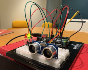
For this week’s assignment, I designed a simple switch to be positioned in front of a screen, like a laptop. This switch uses an HC-SR04 distance sensor and an Arduino board to control either a red or green LED. When the user is at a healthy distance from the screen—set to 50 cm or more—the green LED lights up. If the user gets too close, the red LED turns on as a warning to move back. This setup helps promote good screen-distance habits to protect eye health.


To implement the logic, I modified an example code for Sensors from the Arduino IDE. Below is a demonstration video for my switch.

Code
void setup() 
{
  // initialize serial communication:
  Serial.begin(9600);
  pinMode(trigPin,OUTPUT);
  pinMode(echoPin,INPUT);
  pinMode(GreenLED, OUTPUT);
  pinMode(RedLED, OUTPUT);
  
}
void loop() 
{
  long duration, inches, cm;
  digitalWrite(trigPin, LOW);
  delayMicroseconds(2);
  digitalWrite(trigPin, HIGH);
  delayMicroseconds(10);
  digitalWrite(trigPin, LOW);
  duration = pulseIn(echoPin, HIGH);
  cm = microsecondsToCentimeters(duration);
  Serial.print(cm);
  Serial.print("cm");
  Serial.println();
  // Controlling LEDs from Distances
  if(cm<50 )
  {
     digitalWrite(GreenLED, LOW);
     digitalWrite(RedLED, HIGH);
  }else
  {
   digitalWrite(GreenLED, HIGH);
  digitalWrite(RedLED, LOW);
  }
  delay(100);
}

long microsecondsToInches(long microseconds) 
{
  return microseconds / 74 / 2;
}

long microsecondsToCentimeters(long microseconds) 
{
  return microseconds / 29 / 2;
}


Reflection for future works

I have gained knowledge on how Simple switches are fundamental devices used to control the flow of current in a circuit.  It was also interesting to use the HC-SR04  sensor and see how it works. Going forward, I hope to use switches in combination with other logics to design complex and interesting projects.

Week 8 – Readings

Her Code Got People on the Moon

Hamilton has made imperative and remarkable contributions to the field of space. As the director of the Software Engineering Division at MIT’s Instrumentation Laboratory, Hamilton led the team that developed the on-board flight software for NASA’s Apollo missions, including the historic Apollo 11 moon landing. 

Margaret Hamilton’s contributions to the Apollo program and computer science have been widely recognized and celebrated. She coined the term “software engineering” to elevate the field and give it the respect it deserved alongside other engineering disciplines. Hamilton’s story not only highlights the crucial importance of software development in the success of the Apollo missions but also sheds light on the often-overlooked contributions of women in the early days of computer science and space exploration. Her pioneering work and leadership helped pave the way for future generations of software engineers and computer scientists.