Concept
link to full sketch: https://editor.p5js.org/takuthulani/full/gdL68sjHc
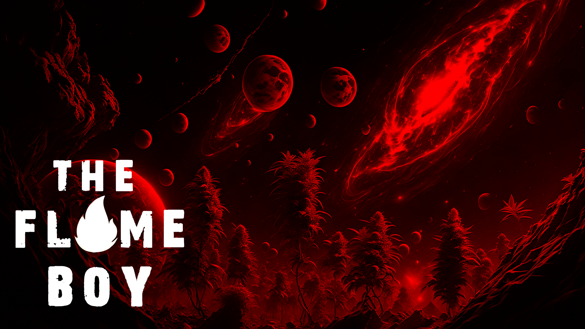
This project is an adaptation of a fictional world I’ve created, designed to offer an immersive storytelling experience. Instead of passively observing, users actively engage with the narrative, making it more like an interactive movie or book. The story centers around the protagonist and key events from his life. To preserve the element of surprise and keep the experience enjoyable, I encourage you to explore the story firsthand!The narrative also takes place in a sci-fi setting, featuring an alien planet inhabited by human-like beings with enhanced abilities. This concept influenced the design, with fire playing a central role and red as the dominant color theme.
How the Game Works:
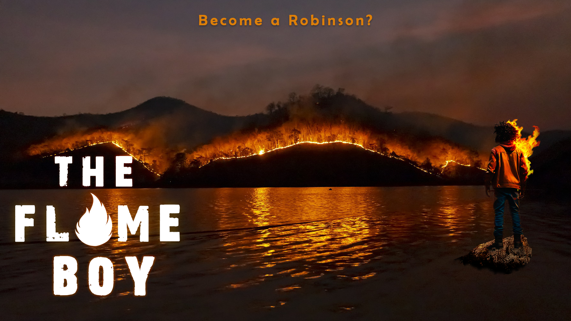
The game starts by greeting the user with a cover page that plays The Flame Boy’s theme song (it’s catchy, so you might get lost in it—don’t forget to progress, though you’re welcome to just listen!). The theme song was created using Suno AI (credit to them). On the cover image, there are instructions to click on the screen, which takes the user to a menu page (with its own theme song as well from Pixabay). The menu presents two options: “His Story” and “His Home,” and the user is expected to click on one.
If the user clicks on “His Home,” the page transitions to an image showing his home—simple and straightforward. This image was made using DALL-E. To exit this view and return to the menu, the user can press the escape button. If the user clicks on “His Story,” a video begins to play, so sit back and enjoy! After the video, the user must make a choice: either “Trust” or “Don’t Trust” the character they interact with. Clicking “Don’t Trust” progresses the game to the conclusion and eventually to a thank you message. The user can return to the cover screen by pressing the mouse key.
If the user chooses “Trust,” the game transitions to a section where they need to earn 100 points to reach the story’s conclusion. The experience continues until the user decides to stop the sketch.
Parts I’m Proud of:
There are several aspects of this project that I’m truly proud of. First and foremost is the video element, which made everything possible. Initially, I planned to use images and recordings to narrate the story, but p5.js kept crashing, so integrating video became the best solution. Even though it’s technically “out of scope” based on what we covered in class, it was a practical way to bring the project to life. I turned to resources like Stack Overflow, the p5.js help section, and ChatGPT to guide me through the video implementation. Below is an example of the code I used to incorporate video into the project:
// Video elements
let storyVideo; // Video for the story sequence
let conclusionVideo; // Video for the conclusion sequence
let decisionImage; // Image for the decision screen where the player chooses their path
...
function playStory() {
  // Stop the story video if it's currently playing to reset the playback
  storyVideo.stop();

  // Reset the playback time of the story video to the beginning (0 seconds)
  storyVideo.time(0);

  // Start playing the story video from the beginning
  storyVideo.play();
}
...
function playConclusion() {
  // Stop the conclusion video if it is currently playing
  conclusionVideo.stop();

  // Reset the video playback time to the start (0 seconds)
  conclusionVideo.time(0);

  // Start playing the conclusion video from the beginning
  conclusionVideo.play();
}
Secondly, I’m particularly proud of the shooting game and its mechanics. I’ll include snippets of the code for the parts I’m most proud of below, and I’ll also provide a link to the full sketch so you can explore the many amazing functions I’ve implemented. Here’s a sample of the code for the game within the game:
function playShootingGame() {
  // Draw the background night sky for the shooting game
  drawNightSky();

  // Set the fill color to white for the score text
  fill(255);

  // Set the text size for the score display
  textSize(16);

  // Align text to the right and top of the canvas
  textAlign(RIGHT, TOP);

  // Display the current score at the top-right corner of the canvas
  text("Score: " + score, width - 10, 10);

  // Check if 2 seconds have passed since the last star was spawned
  if (millis() - starTimer > 2000) {
    // Spawn new stars for the shooting game
    spawnGameStars();

    // Update the star timer to the current time
    starTimer = millis();
  }

  // Loop through the stars array in reverse order to avoid issues with splicing
  for (let i = stars.length - 1; i >= 0; i--) {
    // Get the current star object from the stars array
    let star = stars[i];

    // Set the fill color to yellow for larger stars, white for smaller stars
    fill(star.size === 40 ? 'yellow' : 'white');

    // Draw the star as an ellipse at its specified x and y coordinates with its size
    ellipse(star.x, star.y, star.size);

    // Check if the star has been on screen for more than 2 seconds
    if (millis() - star.appearTime > 2000) {
      // Remove the star from the array if it has been displayed long enough
      stars.splice(i, 1);
    }
  }

  // Check if the score has reached 100 points
  if (score >= 100) {
    // Change the game state to 'conclusion'
    state = 'conclusion';

    // Play the conclusion video or sequence
    playConclusion();
  }
}
link to the sketch: <iframe src=”https://editor.p5js.org/takuthulani/full/gdL68sjHc”></iframe>
Problems I encountered and possible solutions:
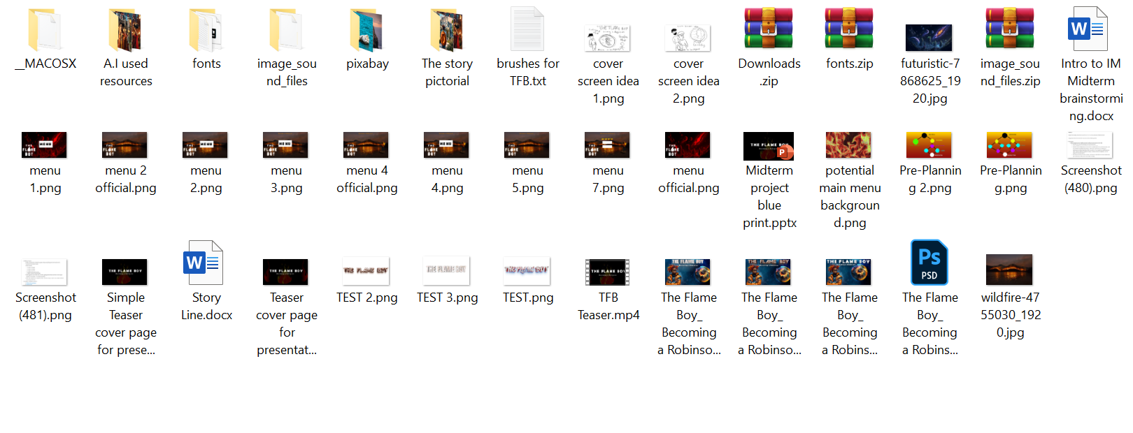
The main challenge I faced was implementing video into the sketch after my original plan didn’t work out. I found solutions using the online resources mentioned earlier. Another problem was integrating the mini-game within the story. The best approach was to treat the game as a separate entity and then integrate it into the sketch, rather than seeing it as one large game (which added unnecessary stress while coding). Additionally, I encountered performance issues, as I used too many audio and visual files. Optimizing the game speed and performance became a key focus. Below is a screenshot showing some of the media I used:

This includes various assets like fonts, PowerPoint presentations, a mini script for the game, and a massive 500MB PSD file (trust me, you don’t want to know how many images are in that!). I also went through multiple iterations of the menu and cover page designs.
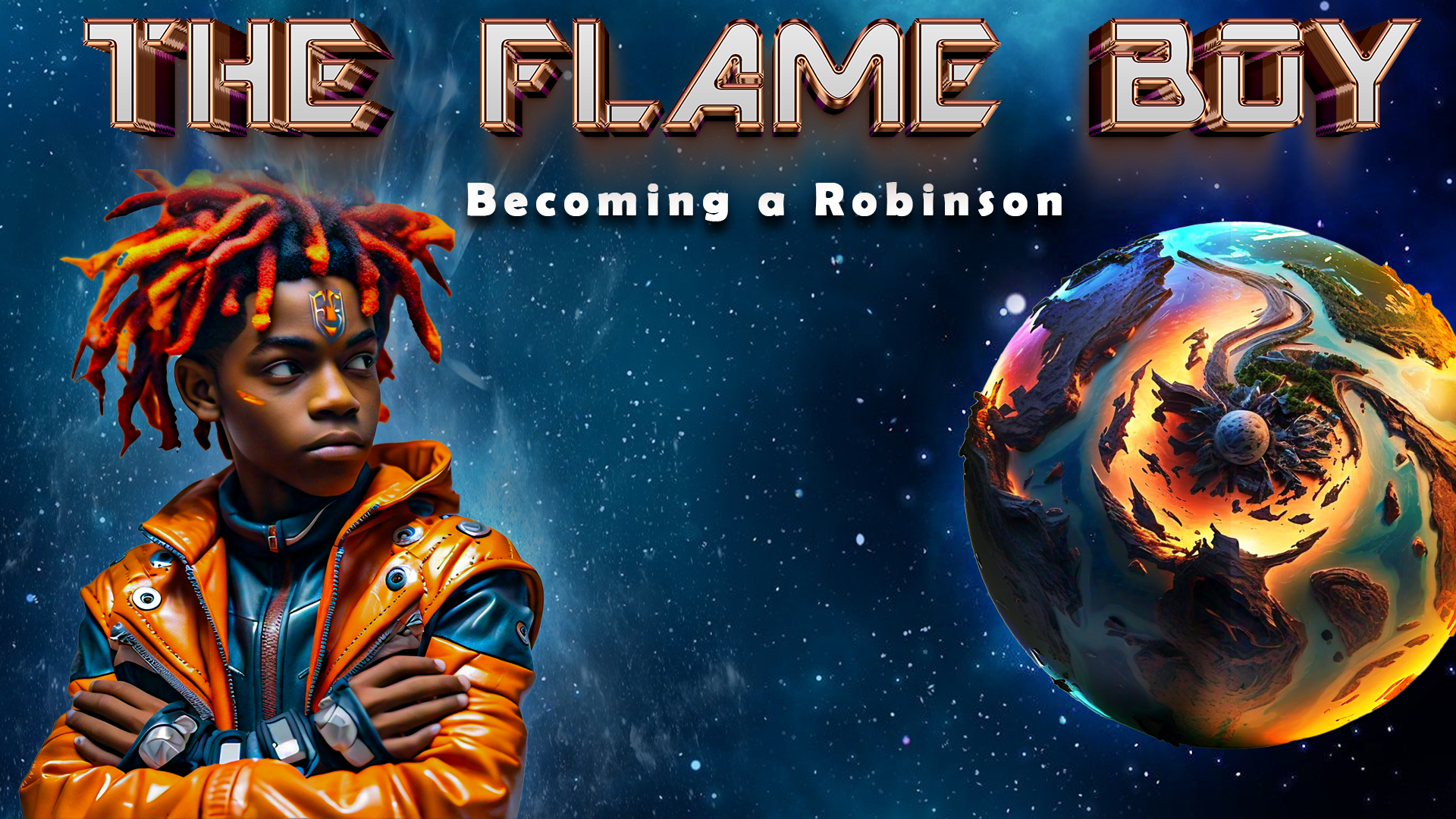
Since I’m not the best at drawing, I used Meta AI to generate the images, which I then manually edited in Photoshop. I recorded the vocal narrations using Audacity and assembled the video using CapCut before uploading it into my program. Some of the images, sounds, and music were sourced from Pixabay.com, which allows usage for projects like this.
Areas needing improvements:
The overall workflow of the game could use some enhancements. For example, the “His Home” area could feature more interactive functions to increase engagement and enjoyment. Additionally, the story’s flow would benefit from a clearer rationale for why the user needs to earn 100 points to advance to the conclusion. While some of these creative flaws may have been overlooked, they can be incorporated as features in future updates.
Overall, I thoroughly enjoyed working on this project and was fully invested, as I was creating something I loved, among other reasons. It provided a fun and technical way to learn, and I am excited for you all to see what I build as time progresses.
The following images are alternative designs that did not make the cut:


