Reading Response 6: Norman and Hamilton

Norman:
When I first opened the article titled “attractive things work better”, I was completely unaware that I would leave with such profound insights.
Norman’s premise—“attractive things work better”—initially appears straightforward, but as he dives deeper, it’s clear that he challenges the pure function-over-form mindset often seen in technology and design. Reading his analysis, I found myself reflecting on my own relationship with technology and my understanding of utility, aesthetics, and the human experience in design.

One example Norman uses to illustrate the power of emotional design is color screens on computers. He recalls initially perceiving color screens as unnecessary, a view that aligns with a utilitarian perspective focused on measurable, practical outcomes. However, he soon realized that, despite offering no overt advantage, color screens created a more engaging experience. I can see this reflected in my choice of smartphones, where choosing a sleeker more aesthetically pleasing model is a priority even if the it performs identically to a model that is cheaper but less aesthetically appealing. Though a basic model could perform many of the same tasks, I choose a high-end model because it simply feels right. While utilitarianism would label this decision inefficient, Norman’s work suggests that emotion has its own kind of utility.

An interesting case where Normal emphasizes utility over looks is his example of emergency doors, where design has to be immediately intuitive, especially in emergencies. It’s an example where utilitarianism, focused on maximum efficiency, clearly benefits the user. However, in low-stress situations, attractive designs with aesthetic details enhance the user’s experience. This reflects John Stuart Mill’s “higher pleasures” in qualitative utilitarian philosophy, which suggests that intellectual and emotional satisfaction are inseparable from true utility. Norman’s view implicitly critiques a rigid, form-over-function approach by suggesting that design must incorporate both utility and aesthetics to meet the full spectrum of human needs.

As a student, I see Norman’s work inspiring me to think differently about the intersection of technology, utility, and emotion.  Rather than dismissing emotional design as indulgent, Norman helps us see that “attractive things work better” not because of a superficial appeal to aesthetics but because they engage our emotions in ways that functionality alone cannot.

Hamilton:
Margaret Hamilton’s contributions to the Apollo Program and software engineering are monumental feats accomplished against all odds. Her ability to work under high pressure, to predict and plan for critical failures and her creative thinking made the moon landing a resounding success. At the same time it saddens me how little I had heard of Margaret before this article, everyone always talks about Neil Armstrong or Buzz Aldrin, and famous lines they said while diminishing the ever important work of a brilliant woman.

Hamilton built in a priority task scheduling system and robust error handling which came in handy when multiple alarms threatened to abort the Apollo 11 mission. She also coined the term software engineering, providing more legitimacy to a field which now permeates through every major and minor world avenue. As a woman leading a crucial team in a male dominated field, she broke significant barriers and paved the way for more gender diversity within STEM.
Her legacy extended beyond the Apollo Guidance System, she continued working on error prevention and development of UML  showcasing a lifelong devotion to her field and love for computers.
I am truly inspired by the immense impact that Hamilton has had on the field, contributing to one of humanity’s greatest feats while also shaping how we think of software development today. Her story is a powerful reminder to push boundaries, think creatively and to plan rigorously for every outcome even in the face of insurmountable challenges.


Assignment 6 Unusual Switch

Concept: 

While thinking of unusual switches, the first thing that came to mind was how suitcase locks work. How setting some sort of combination and pressing a button would make that into a ‘password’ that you could repeatedly use to open the suitcase. Inspired and fascinated by the workings of such a simple concept I came up with the idea of mimicking a combination lock but instead using buttons on a breadboard. Although using our hands wasn’t technically a part of the assignment, I do believe that being able to set a combination using the code, and having the circuit only work when the correct combination is entered is a creative switch.
Code Highlight:

Approaching this problem I had to think very creatively about how the Arduino code would work with multiple switches. In the end the best solution I arrived at was setting a lock using the pins each switch was connected to and then checking if each switch pressed in order was one corresponding to its index in the combination array.

const int buttonPins[] = {2, 3, 4, 5}; // Digital pins connected to the buttons
const int ledPin = 13; // Digital pin connected to the LED
int combo[] = {0, 1, 2, 3}; // The correct sequence of button presses (in order)
int input[4]; // Array to store the user's button press sequense
int index = 0; // Keeps track of how many correct buttons have been pressed
bool isUnlocked = false; // Flag to indicate if the correct combination has been entered

void setup() {
  // Set up each button pin as an input
  for (int i = 0; i < 4; i++) {
    pinMode(buttonPins[i], INPUT);
  }
  // Set up the LED pin as an output
  pinMode(ledPin, OUTPUT);
}

void loop() {
  if (!isUnlocked) { // Only check for button presses if the lock is not yet unlocked
    for (int i = 0; i < 4; i++) { // Iterate over each button
      if (digitalRead(buttonPins[i]) == HIGH) { // Check if the current button is pressed
       delay(50) //Small delay to ensure one press is not registered multiple times
        if (digitalRead(buttonPins[i]) == HIGH) { // Confirm the button is still pressed
          if (i == combo[index]) { // Check if this button is the next in the correct sequence
            input[index] = i; // Record the correct press in the input array
            index++; // Move to the next position in the sequence
            delay(500); // Delay to avoid multiple readings from a single press
          } else {
            index = 0; // Reset if a wrong button is pressed
            break; // Exit the loop to start checking from scratch
          }
        }
      }
    }

    if (index == 4) { // If all buttons have been pressed in the correct order
      digitalWrite(ledPin, HIGH); // Turn on the LED to indicate success
      isUnlocked = true; // Set flag to indicate that the lock has been unlocked
    }
  }
}

Demonstration:

The led only lights up when the correct combination is pressed
In this case the correct combination is yellow, red, green, blue for clarity of demonstration.

Assignment 5: Unusual Switch

Concept:

The inspiration for this project came from a common issue in my home: my siblings often leave kitchen drawers and cabinet doors open after grabbing snacks. This habit leads to my cat sneaking into these spaces, where she can hide for hours. To solve this, I came up with the idea of creating a simple sensor-based system that alerts my siblings when they forget to close a drawer or cabinet. By using a light sensor, this system can detect when a drawer or door is left open and activate a notification, such as an LED, to remind them to close it. This project combines basic electronics with a practical problem-solving approach to keep both the kitchen organized and my cat safe.

Highlight:

The highlight of this project was developing a functional switch system that alerts users when a drawer is left open. I began by connecting a light sensor to a 10k resistor in a voltage divider circuit, which allowed me to monitor light changes accurately. I added a red LED and a green LED, each with its own 330-ohm resistor, connected to digital pins 10 and 11.

void setup() {
  // initialize serial communication at 9600 bits per second:
  Serial.begin(9600);
  
  // Set pin modes for LEDs
  pinMode(10, OUTPUT); // Red LED
  pinMode(11, OUTPUT); // Green LED
}

// the loop routine runs over and over again forever:
void loop() {
  // read the input on analog pin A2:
  int sensorValue = analogRead(A2);
  
  // print out the value you read:
  Serial.println(sensorValue);
  delay(1);  // delay in between reads for stability

  if (sensorValue > 600) {
    // Turn on red LED and turn off green LED
    digitalWrite(10, HIGH);
    digitalWrite(11, LOW);
  } else {
    // Turn on green LED and turn off red LED
    digitalWrite(10, LOW);
    digitalWrite(11, HIGH);
  }
}

Then, using code adapted from Week 9 lecture slides, I programmed the LEDs to respond to light levels: the red LED illuminates when the sensor detects that a drawer is open, and the green LED lights up when the drawer is closed. Finally, I mounted the light sensor inside the drawer and tested the setup. As designed, the red LED serves as an alert when the drawer is open, while the green LED confirms it is securely closed. This project successfully provided a practical solution to alerting users to close drawers, helping prevent pets from accessing open spaces.

Setup

Demonstration:


reading

In Emotion & Design, i feel like Norman focuses on how beautiful design enhances usability by creating positive emotions, which make users more flexible and forgiving. I agree with him because, who can argue that a product like the iPhone, with its stunning and iconic design, makes us ignore minor flaws just because it’s so visually appealing? I’m definitely more inclined to overlook its glitches simply because it looks so good.

Norman’s observation regarding the distinction between the design requirements for calm and high-stress settings is also something i agree on. For example, In emergencies, functionality must take precedence over aesthetics; fire exits should be clear and direct, regardless of their visual appeal. However, in a coffee shop,  good design is everything. For instance, Starbucks. The warm, inviting ambiance practically begs people to stick around, engage in conversation, or get some work done. The environment is not just a random occurrence; it’s a purposeful decision to merge practicality with an inviting look, encouraging people to stay.

However, I completely stand by Norman’s critique of designs that prioritize style over substance. I have direct experience with this, which involved a “smart” lamp. Sure, it had a fantastic appearance, but honestly, controlling it was nearly out of the question. Why bother making something aesthetically pleasing if it’s not functional? Function should always take over over mere aesthetics in design. Consequently, well-made products leave a lasting impact, while purely decorative ones quickly lose their appeal.

The story of Margaret Hamilton changed the way I think about design and leadership. She did more than her job; she made sure the program was safe, even though some people didn’t understand why it was important. I really admire that kind of dedication to quality, even when it’s not what everyone wants. It makes me think about how important it is to pay attention to the little things and set high standards, even if other people don’t always get it.

People often think that tech is a “man’s world,” but her story shows that this is not true. It’s inspiring to think that one of the first software engineers was a mother who worked full-time and took care of her family. It shows that diversity isn’t just nice to have; it’s important. In group projects and in real life, I’ve seen how hearing different points of view can lead to better ideas. Hamilton’s story makes me want to support diversity in every area I work in.

Assignment #6: Mind Your Posture!

Concept & Inspiration.

For this small project, I was thinking of making something feasible to construct yet useful for me. As I was almost lying on the chair after barely 5 minutes in the IM Lab, it didn’t take me long to come up with an idea of a switch that would regulate posture and indicate how well the person is seated (a so-called “posture fixer”) by using the LED lights, a regular paper tape, and conductive fabric.

Highlights.

I set two variables (“yellowState” and “greenState”) in my code to regulate the LED switches by using the “if” condition functions.

My main goal was to make the LED lights react accordingly to a certain number of “buttons” pressed. For instance, when no button is pressed, the red LED is blinking as a sign of warning. When only one of the buttons is pressed (either green or yellow), the yellow sign is switched on, meaning that the posture is satisfactory yet not perfect. In case if both buttons are pressed, green LED is switched on, indicating decent posture.

if (yellowState == HIGH && greenState == HIGH) { // When both buttons pressed
digitalWrite(4, HIGH); // Turn on green LED
digitalWrite(2, LOW); // Turn off yellow LED
digitalWrite(LED_BUILTIN, LOW); // Turn off red LED

} else if (yellowState == HIGH || greenState == HIGH) { // When only one button pressed
digitalWrite(4, LOW); // Turn off green LED
digitalWrite(2, HIGH); // Turn on yellow LED
digitalWrite(LED_BUILTIN, LOW); // Turn off red LED

} else { // When no button is pressed
digitalWrite(4, LOW); // Turn off green LED
digitalWrite(2, LOW); // Turn off yellow LED
digitalWrite(LED_BUILTIN, HIGH); // Blinking red LED (for 1 second)
delay(1000);
digitalWrite(LED_BUILTIN, LOW); 
delay(1000); 
}
}

Embedded Sketch.

GitHub


Reading Reflection – Week #8

Norman,“Emotion & Design: Attractive things work better”

Don Norman, famous for outlining principles of user-friendly design, argues that aesthetics play an important role in the functionality of designs, impacting directly not only usability of the product but also user’s emotional response. An attractive object evokes positive emotions simply when looking at it, which further motivates the user to explore and engage. This is explained through the concept of emotional design, which highlights not only the decorative but also functional role of aesthetic in design.

I agree that it is important to think about the way your work looks like from the point of aesthetics – in both physical and digital works, “pretty” things catch user’s attention, which is then carefully navigated to functionality. Going back to the famous manifesto “form follows function”, in the context of Norman’s ideas I agree with it – attractive things do tend to work better, especially when the aesthetic and functionality of the product are intertwined.

Her Code Got Humans on the Moon

Margaret Hamilton is an incredibly important figure in computer science, and I am glad that I have learned about her work back in middle school. She is a motivating example of a person who has managed to combine her work and home duties back when the opportunities for women to enter technical fields were extremely limited.

Hamilton’s approach to error management is intriguing to me, since she highlighted the importance of simulating all experiences before bringing them to life. Planning potential errors in advance is crucial when it comes to such big inventions as Apollo. The example of tracking an accidental error and then resolving it under pressure says a lot about the importance of paying attention to all details and planning everything that can go wrong in advance.

In my projects, I wish to learn to pay more attention to such minor things that can potentially go faulty, especially since we have started working with physical electronic models – the risks are higher here compared to purely digital simulations.

Assignment 6 – Unusual Switch

Concept

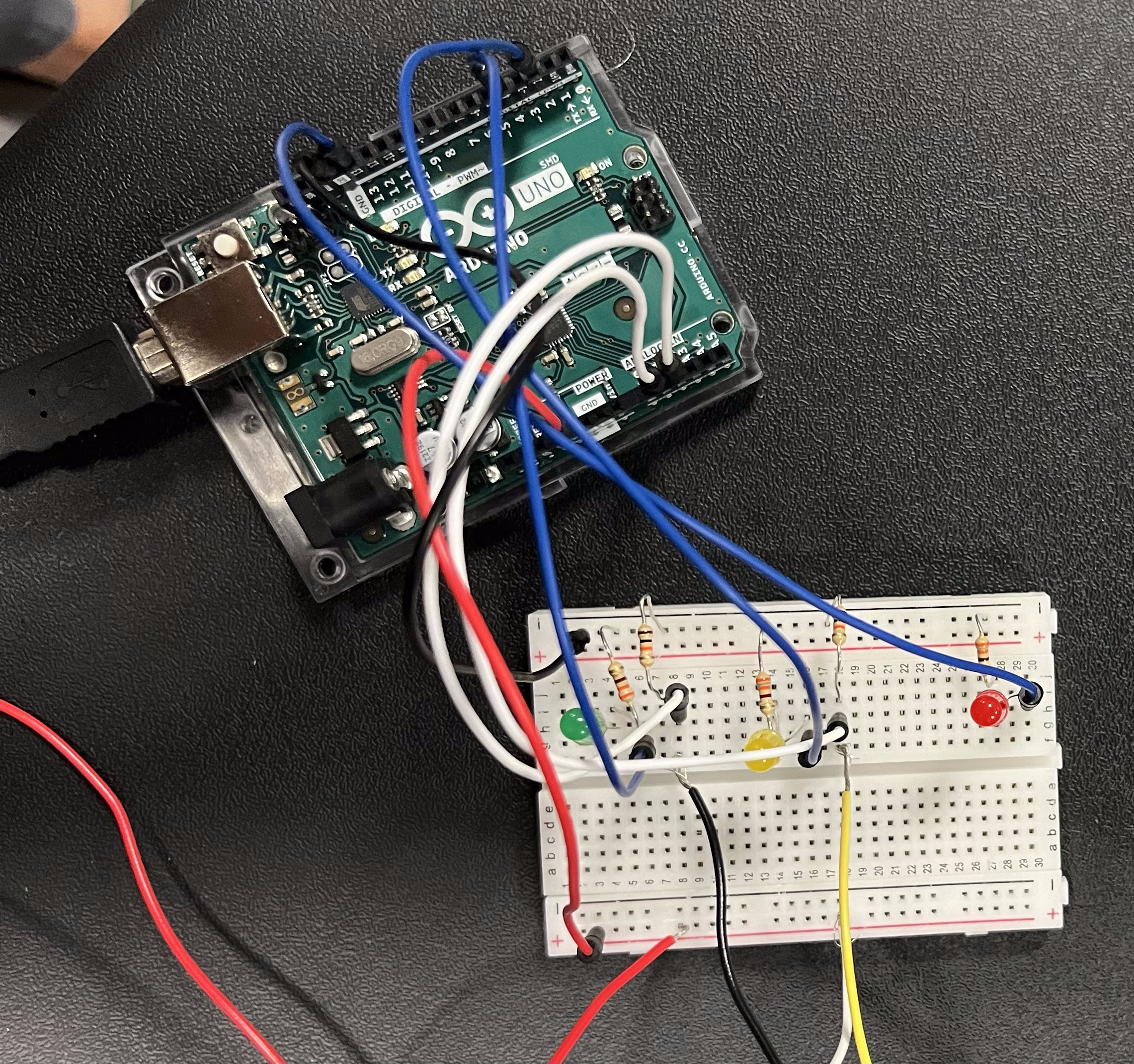
I carry my mug with morning coffee to every class, and since it is not fully insulated but just spill-proof, I am often anxious about someone hitting it on the table accidentally and spilling the drink on my or someone else’s laptop. In order to prevent such accidents, I came up with a scheme that indicates when my mug is open and when it is closed using two LED – Red lights up when the mug is open and liquid can be spilled from it, and Green lights up when the mug is closed and there is no threat of spillage.

(For safety purposes, I did not pour any liquid into the mug during the demonstration to avoid risk of getting electrocuted)

Highlight of the code

https://github.com/am13870/UnusualSwitch

I have used the Button example of the code from the Basics category in Arduino IDE Application as the basis for my code. Two LED were used in my scheme, so I had to alter the code accordingly, considering that they have different conditions of being turned on and off.

void setup() {
  // initialize the LED pin as an output:
  pinMode(4, OUTPUT); //Red LED
  pinMode(6, OUTPUT); //Green LED

  // initialize the pushbutton pin as an input:
  pinMode(A1, INPUT);
}

void loop() {
  // read the state of the pushbutton value:
  int buttonState = digitalRead(A1);

  // check if the pushbutton is pressed:
  if (buttonState == HIGH) {
    digitalWrite(4, HIGH); //turn Red LED on
    digitalWrite(6, LOW); //turn Green LED off

  } else {
    digitalWrite(4, LOW); //turn Red LED off
    digitalWrite(6, HIGH); //turn Green LED on
  }
}
Demonstration

IMG_8859

Reflection

For future improvements, the scheme can be insulated from water to make sure that no liquid ruins the electrical components or the whole circuit. Furthermore, sensors can be added to make the construction even more safe – for example, when a hand approaches a sensor, Red LED lights up signifying that a potential spilling threat is too close to the mug.

Reading Reflection – Week #8

I was intrigued to revisit Donald Norman’s work after reading the excerpt from The Design of Everyday Things earlier in class. Personally, I find this article more compelling for how it emphasizes the importance of blending usability with attractiveness to create what Norman terms “good design.” Several ideas stood out to me, particularly the argument that design is inherently contextual, relying on the specific person interacting with it at a unique moment and place. Moreover, what influences how a design functions is the individual’s mood, or “affect,” which constantly shifts. I find this concept extremely helpful for designers as it highlights the fluid and responsive nature of truly effective design.

Another eye-opening point was Norman’s suggestion to consider the context of a design based on the overall stress level of the situation where it will be used. The example he gives — struggling to decide whether to push or pull a door due to one’s stress level — felt especially relatable. I agree with Norman’s implication that a good designer anticipates and accommodates the immediate needs of the user in such moments. For me, the article’s key takeaway lies in the concluding section, where Norman redefines beauty in design as something not superficial and “skin deep”, but holistic and comprehensive. It may seem slightly sarcastic at first when he concludes with “attractive things work better,” yet it underscores the essence of good design. Functionality and attractiveness are always in balance, and functional design, in the end, evokes a unique appeal that aligns with its purpose and context, crafted to enhance the user’s experience.

It is interesting to note how Margaret Hamilton’s experience complements Norman’s ideas about design as a process shaped by context, adaptability, and human limitations. Just as Norman emphasizes how design must account for users’ moods and stress levels, Hamilton’s work highlights the need for resilience in coding to accommodate human error. As for me, both illustrate that effective design — whether in physical objects or software — requires a deep awareness of the user’s state and context. Hamilton’s insistence on error-checking, despite opposition, resonates with Norman’s view that design is not just about fulfilling a basic function but about anticipating a range of human interactions, including mistakes.

I also found similarity between Hamilton’s approach to coding as a blend of technical precision and intuition and Norman’s idea of beauty in design as holistic rather than superficial. Just as Norman advocates for designs that appeal and function seamlessly, Hamilton’s coding enabled the Apollo missions to perform flawlessly in unpredictable situations. Her case proves us that true innovation comes from crafting systems that are both effective and resilient, achieving beauty and function through an intuitive understanding of human and technological dynamics, similarly to the ideas developed by D. Norman.


Reading Response #: Affect & Behavior & Emotion & The person that got hunman to the moon

Positive affect is critical in accomplishing challenging tasks, highlighting the importance of considering emotions in design. When people are under stress, design functions differently and should adapt to diverse emotional states. This reminds me of our earlier discussions on the adaptability of design, which should accommodate various user groups. Previously, we focused on factors like age, gender, and culture, but reflecting on this, I see how essential it is to consider potential emotional responses & their changes as well.

I also thought of Hamilton’s story in the other article—how might we apply similar design principles in that context? To what extent does a designer or coder’s background shape their work, and how do they balance ‘beauty’ with usability, especially when functionality is crucial to safety? Additionally, how does the visual appeal of a design impact its emotional effect on users?

Returning to Margaret Hamilton’s story, beyond her remarkable achievements in breaking gender barriers in a male-dominated field, her dedication to error handling is very inspiring. Her example speaks to something beyond just design, affect, and beauty. It’s about resilience and the vital role of precision in high-stakes contexts.

Week 8 – Unusual Switch

Concept

My switch was a pretty simple implementation. I was fascinated by the light sensor and I thought I should use it to implement the switch. The idea was simple; turn on the LED when it is dark and off when there is light and using a light sensor was the best choice.

Setup

Code

const int ldrPin = 2;    // Pin connected to the LDR
const int ledPin = 13;   // Pin connected to the LED

void setup() {
  pinMode(ldrPin, INPUT);   // LDR pin as input
  pinMode(ledPin, OUTPUT);  //LED pin as output
}

void loop() {
  int lightStatus = digitalRead(ldrPin); // LDR value

  if (lightStatus == LOW) {
    // It’s dark, turn on the LED
    digitalWrite(ledPin, HIGH);
  } else {
    // It’s bright, turn off the LED
    digitalWrite(ledPin, LOW);
  }
}

My code was simple to implement as I just modified the example given in class. The code takes in the light sensor pin as input and LED pin as output then it reads the value of the light sensor which is dependent on if light is present or not. Depending on the light sensor value the code will turn on or turn off the LED.

Arduino file on GitHub

Sketch

IMG_3439

Reflection and Future improvements

Implementing the Arduino was really fun. I was able to learn more on connecting circuits properly and also using the digital read. I am proud of being able to use the light sensor which was very fascinating and fun to implement. For the future I hope to learn more about the capabilities of Arduino and possibly create a light sensitive switch which will light the LED depending on the amount of light in the room and not just light up and turn off.