Reading Reflection – Week #4

In his book “The Design of Everyday Things” Don Norman discusses complex characteristics of human-centred design – in fact, the user’s power to interfere with design is in feedback. I agree that in many cases with industrial and product design the most important thing is to be user-friendly. If the function is unclear because of the complex form, the object may become ineffective and even harmful. Furthermore, nowadays the job of interaction designers becomes more and more difficult: people indeed tend to memorise how to work with one specific interface, and then try to apply this knowledge to other machines and applications. This often results in confusion – but does it mean that all design has to become universal?

An example of something that drives me crazy in this sense is the design of the Snapchat interface.  It is very different from other social media apps, which makes it unique yet confusing for new users. When I just started using this app, I did not know about many features – for instance, that message history was not saved by default – and there was no warning or guidance. The only way to figure this out was through personal exploration, which is not always the most effective option. This could be changed by adding onboarding that would explain some unconventional functionality. 

I have read Norman’s book before, but I did not get in depth with analysing ideas about human-machine interaction. Now that I develop my own programs, I realise the importance of accepting human behaviour “the way it is, not the way we would wish it to be” (Norman, 1988). Being too logical while creating interactive media may become problematic when the user suddenly stops following the very logic.

Assignment 4: Too much Espresso

Concept:

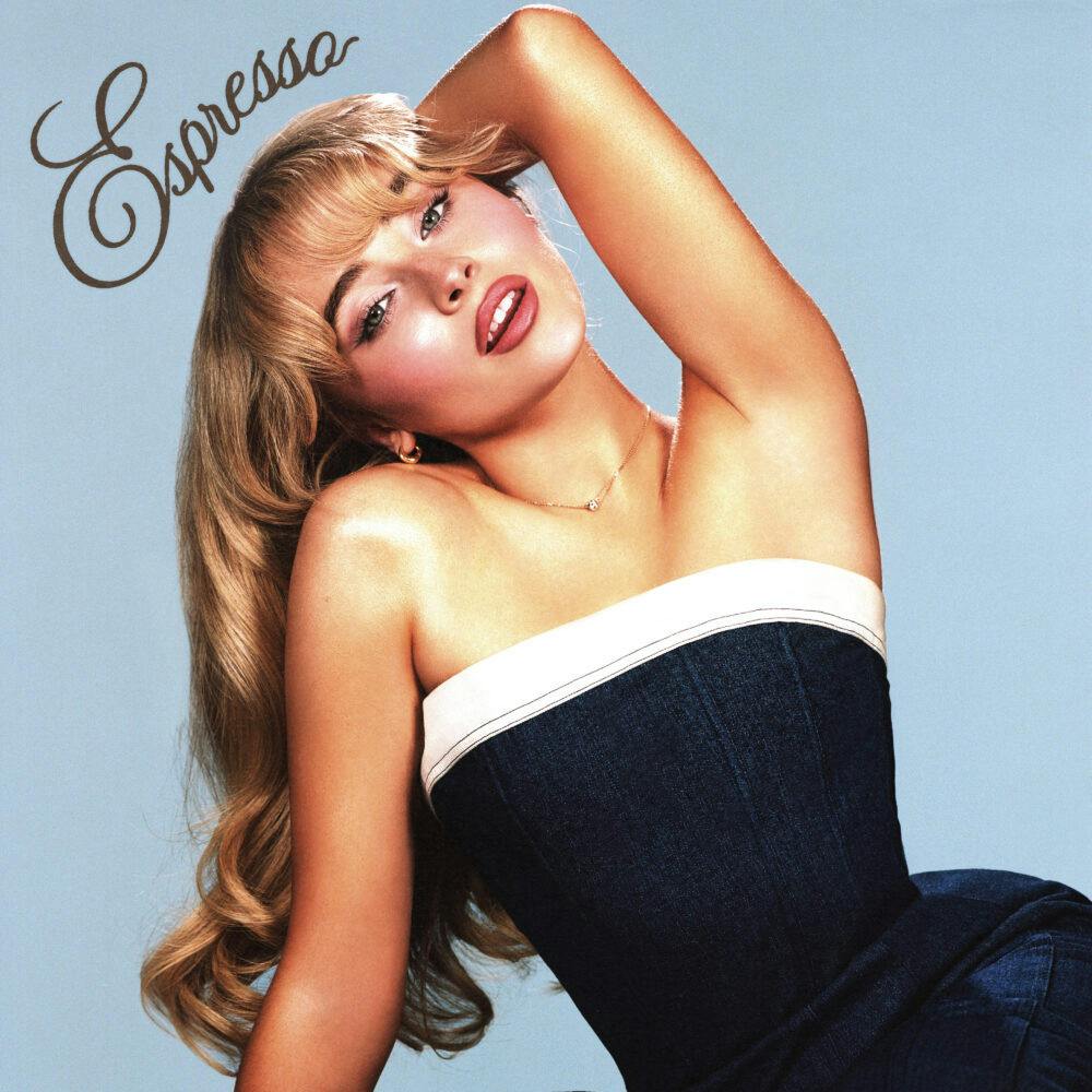
In this project, I visualized the frequency of Google searches for the word “espresso” since the beginning of 2024. My inspiration stemmed from the popularity of Sabrina Carpenter’s song “Espresso,” which has captured attention and sparked interest since its release early this year. This trend led me to hypothesize that the search volume for “espresso” would similarly experience a notable increase.

Sabrina Carpenter sweetens up Coachella 2024 with new retro pop single ...

To explore this hypothesis, I aimed to create a visual representation that illustrates the correlation between the song’s popularity and the search frequency of the term “espresso.” I envisioned an effect that mimics espresso pouring out of a teacup, with the volume of the pour symbolizing the number of searches. This is accomplished using circles: the larger the circle, the greater the volume of searches.

Highlight:

A key highlight of this project was my attempt to ensure that the color of the circles corresponded to the volume of searches for “espresso.” I aimed to create a visual gradient where the shades of brown varied in darkness or lightness based on the search frequency. To achieve this, I mapped the espresso values to a color variable, allowing me to adjust the fill color of the circles by assigning this color variable as an argument to the fill().

  // Color based on espressoValue with brown tones
let colorVal = map(dataPoint.espressoValue, 0, maxValue(), 10, 120); // Adjust the color range for darker tones
fill(colorVal, 40, 20); // More muted brown tones
noStroke();

Finding the right numbers for the brown tones was also a matter of trial and error.
Reflections:

The final sketch of this visualization organizes time in an ascending manner, with the top of the y-axis representing the beginning of 2024 and the lower end depicting the months leading up to the present. The size of the circles indicates the volume of searches, while the shades of brown inversely correlate with search frequency—darker shades represent lower search volumes, and lighter shades signify higher volumes. This relationship may appear counterintuitive to viewers, highlighting one of the significant flaws in this project.

In future iterations, I would aim to reverse this color representation for clearer communication of the data. Additionally, I would like to enhance the aesthetic of the espresso pouring from the cup to create a more natural and visually pleasing effect.

Reading response #3: principles of design

One thing that bothers me, and is also mentioned by Norman, is unwanted feedback. The sound of a microwave notifying you that it’s done is especially annoying when you’re trying to grab a quick bite in the early morning without disturbing your roommates. While the feedback from the microwave is immediate and informative, I wish there were an option to mute the sound.

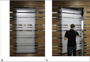
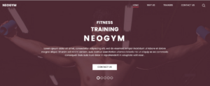
In this case, even well-intentioned feedback can become annoying if users aren’t given enough control, which drive my attention to another question: to what extent should we allow trial and error in a design? For example, the door on page 12 shows us a aesthetically pleasing but also confusing design of a door. You have to try pushing or pulling to test how it works. In this case, users are given more freedom but it might also cost more time. The same dilemma applies to minimalist website designs. Taking the following figures as examples: one that displays a lot of information and another that shows very little.

Websites today often rely on intuitive logic for users who have abundance experiences with technology, but for those without a strong foundation, minimalism can create confusion rather than clarity. This touches on Norman’s concept of the technology paradox, where increased functionality sometimes leads to a steeper learning curve. However, the technology paradox is seen less nowadays as everyone seem to have a relatively good foundation of using tech.

It’s complicated to build affordance and use signifiers, much like trying to understand the “black box” of the human mind and its thinking processes. In IM, striking this balance between clarity and aesthetics is key. One practical thing we can do is to work on a conceptual model. 


Week 4 Assignment: Generative Text

Concept

This assignment is mainly based on the text patterns of early games like “Space Invaders” or “Tetris,” where the text and images were made out of square pixels. The way the blocks move and respond to user input is like the jumpy, random effects we see in old games where graphics were powered by simple hardware.

The key interactions involve entering any word which you want to display, and pressing “Generate” forms the word in the grid. The grid can be toggled on/off with a separate “Toggle Grid” button. When the mouse hovers over the text, the blocks near the cursor change color and become more diverse. When we hold down the “Enter” key, it causes the blocks representing the text to scatter randomly, simulating random jumpy movements. As soon as the key is let go, the boxes come back to their original positions.

Sketch

Code I am proud of

// Setup Function
function setup() {
  // Create the canvas
  createCanvas(600, 400);
  cols = floor(width / gridSize);
  rows = floor(height / gridSize);
  
  // Taking the input and generating the other buttons
  input = createInput();
  input.position(20, height + 20);
  button = createButton('Generate');
  button.position(input.x + input.width + 10, height + 20);
  button.mousePressed(startAnimation);

  toggleButton = createButton('Toggle Grid');
  toggleButton.position(button.x + button.width + 10, height + 20);
  toggleButton.mousePressed(toggleGrid);

  textSize(fontSize);
  textAlign(CENTER, CENTER);

  pg = createGraphics(width, height);
  pg.pixelDensity(1);
}

// Function to show/hide the grid
function toggleGrid() {
  showGrid = !showGrid;
}

// Draw function
function draw() {
  // Smooth background blending
  bgColor.r = lerp(bgColor.r, targetBgColor.r, 0.01);
  bgColor.g = lerp(bgColor.g, targetBgColor.g, 0.01);
  bgColor.b = lerp(bgColor.b, targetBgColor.b, 0.01);
  background(bgColor.r, bgColor.g, bgColor.b);

  if (showGrid) {
    drawGrid();
  }

  if (animating && word.length > 0) {
    fillLetterPixels();
  }

  for (let i = 0; i < pixelIndex; i++) {
    let px = letterPixels[i].x * gridSize;
    let py = letterPixels[i].y * gridSize;
    
    // Jumpy explosion effect
    if (exploding) {
      // Randomize position for the explosion effect
      px += random(-10, 10);
      py += random(-10, 10);
    } 
    else {
      // Smooth return to original positions
      px = lerp(px, originalPositions[i].x * gridSize, 0.1);
      py = lerp(py, originalPositions[i].y * gridSize, 0.1);
    }

    let d = dist(mouseX, mouseY, px + gridSize / 2, py + gridSize / 2);
    if (d < gridSize * 4) {
      let blockColor = blockColors[i];
      fill(blockColor.r, blockColor.g, blockColor.b, map(d, 0, gridSize * 4, 255, 50));
    } 
    else {
      fill(0);
    }

    noStroke();
    rect(px, py, gridSize, gridSize);

    if (random(1) < sparkleChance) {
      fill(random(255), random(255), random(255));
      rect(px, py, gridSize, gridSize);
    }
  }
}
  • Setup() function sets up the canvas, makes the Graphics buffer and initializes the canvas color to white.
  • Draw() function is the function which is the main loop that runs continuously. It controls the background color blending, sparkle effect, jumpy explosion effect, stores which keys are pressed, checks grid is toggled on/off, and so on.
// Startup animation after the generate button is clicked
function startAnimation() {
  word = input.value();
  pixelIndex = 0;
  animating = true;
  getLetterPixels();

  blockColors = letterPixels.map(() => {
    return { r: random(255), g: random(255), b: random(255) };
  });

  originalPositions = letterPixels.map((p) => ({ ...p })); // Store original positions

  targetBgColor = {
    r: random(255),
    g: random(255),
    b: random(255)
  };
}

– This function is responsible for the short simulation of making the letters of the word when “Generate button” is pressed.

function getLetterPixels() {
  letterPixels = [];

  // Use the off-screen buffer (pg) to render the text
  pg.background(255);
  pg.textSize(fontSize);
  pg.textAlign(CENTER, CENTER);
  pg.fill(0);
  pg.text(word, pg.width / 2, pg.height / 2);

  pg.loadPixels();
  for (let y = 0; y < pg.height; y += gridSize) {
    for (let x = 0; x < pg.width; x += gridSize) {
      let index = (x + y * pg.width) * 4;
      let r = pg.pixels[index];
      if (r < 128) {
        let gridX = floor(x / gridSize);
        let gridY = floor(y / gridSize);
        letterPixels.push({ x: gridX, y: gridY });
      }
    }
  }
}
  • This function uses the off-screen buffer (pg) to render the input text and identifies the grid positions where the pixels are black (indicating a letter).
function fillLetterPixels() {
  if (pixelIndex < letterPixels.length) {
    let px = letterPixels[pixelIndex].x * gridSize;
    let py = letterPixels[pixelIndex].y * gridSize;
    fill(0);
    noStroke();
    rect(px, py, gridSize, gridSize);
    pixelIndex++;
  } 
  else {
    animating = false;
  }
}
  • This function simulates the pixels that form the letters. It gradually reveals the blocks one by one.
// Run the function if ENTER key is pressed
function keyPressed() {
  if (keyCode === ENTER) {
    exploding = true; // Start the explosion effect
  }
}

// Run the function if ENTER key is released
function keyReleased() {
  if (keyCode === ENTER) {
    exploding = false; // Stop the explosion and return to original positions
  }
}
  • When the Enter key is pressed or released, it starts or stops the jumpy explosion effect. When the Enter key is pressed, the exploding flag is set to true, causing the blocks to scatter randomly. When the Enter key is released, the exploding flag is set to false, and the blocks return to their original positions.

Challenges/ Future Improvements

Some of the major challenges I had faced were:

  • Creating the random “jumpy” explosion effect and making sure that the boxes making up the letters stay in place after key is released.
  • The “sparkle” effect was another challenge as it required creating intermittent flashes of random color across specific blocks.
  • The color changing due to the “hovering  mouse” was another one. However, by measuring the distance (dist()) between the mouse and the block’s center, the program smoothly blends colors based on proximity to the cursor, giving the effect of interaction with the text.

However, the code can be further improved upon by introducing some collission, introducing different layers to create a 3D pixelated text feel, and so on.

READING

After reading, my initial thought was how, in the real world today, we are always competing to make inventions that already function smoothly look fancy and aesthetically futuristic. This causes us to overlook the importance of simple designs that just work. The examples given in the text, like doors, switches, and stoves, are good examples of how, in today’s world, simple objects can become confusing when designed poorly just for the sake of appearance. In my opinion, I appreciate good design when it works easily, rather than the overcomplicated ones that frustrate me. For example, when he talked about his friend’s experience with a door, it really stood out to me because it shows how humans can take something simple and turn it into something people struggle with, which is also frustrating.

For me, it’s annoying when designers care more about how things look than how they function. It feels like they’re taking away the object’s purpose. It’s not just me who feels this way, because older generations also struggle with this. They have a hard time catching up with how the world functions now, so adding complexity to something that’s supposed to be simple just makes it harder for them. Sometimes it feels like designers expect us to admire their work without caring if we can actually use it. What’s the point of a nice-looking door if I don’t know how to open it? This applies to all kinds of things, not just objects, but whether it’s a phone app or a media project, it needs to be easy to use.

In today’s world, many products are designed with minimalism in mind. While they may look cool and modern, they often hide important functions. For example, take Kim Kardashian’s sink design in her house. The sink looks cool and ultra-modern, but it’s confusing because it doesn’t function like a regular sink. The surface is completely flat with no visible basin, and the water drains into a small slit. While the design looks unique and futuristic, it takes away from the sink’s practicality. When I saw it for the first time, my first thought was, “How does the tap work?” This is a perfect example of minimalist design taken too far, where the design hides or complicates something as simple as a sink’s basic function. The goal of making something aesthetically pleasing can actually make its usability hard and confusing.

Overall, I think the ideas of “discoverability” and “understanding” are important when it comes to the process of designing something. Discoverability helps someone figure out what to do, while understanding helps them know how it works. To me, these two concepts are essential to good design. This also applies to the media work I want to do. If something isn’t clear, the message gets lost. Good design should be so simple and natural that you don’t even think about it. That’s something I want to keep in mind for any future projects I create, whether in film, media, or design. In the end, I think it’s important not to overlook the balance between how something looks and how well it works.

ASSIGMENT #4 – GENRATIVE TEXT

CONCEPT:

For this assignment, I wanted to create generative art that involved text. While searching for inspiration, I came across Scott Garner’s work on Creative Blog, where he used p5.js to create an art piece with stars forming text against a night sky backdrop. This inspired me to explore how stars, randomness, and interaction could be combined to form dynamic, visually engaging text. For my piece, I will create stars that will scatter and form text shapes based on user interaction, blending order and randomness, just like Garner’s example. Ill also make it a space theme while exploring Gaussian distribution to add in the art background.

EMBEDDED SKETCH:

HIGHLIGHT OF MY CODE:

The best part of my code is the interactive switching feature that lets people switch between an arranged text and scattered stars. When you click on a button, this interaction starts. It’s a dynamic, responsive experience where stars move from randomly scattering to making a word. This is how the code works:

// Function to scatter the white dots randomly across the canvas
function scatterDots(canvasWidth, canvasHeight) {
  whiteDots.forEach(dot => {
    dot.currentX = random(canvasWidth);  // Set random x position within canvas width
    dot.currentY = random(canvasHeight);  // Set random y position within canvas height
  });
}

// Function to reset the white dots and stop forming the text
function resetDots() {
  formingText = false;  // Stop forming the text
  scatterDots(500, 500);  // Scatter the dots randomly across the canvas again
}

// Detect mouse presses and trigger button actions
function mousePressed() {
  buttons.forEach(button => {
    if (button.isClicked(mouseX, mouseY)) {  // Check if the button is clicked
      button.action();  // Execute the action tied to the button
    }
  });
}

In the code snippet shown above, I used three key functions to create interactivity and movement:

  1. scatterDots(): This function scatters the white dots randomly across the canvas by assigning each dot a random x and y position within the canvas width and height. It adds randomness, simulating stars in the sky.
  2.  resetDots(): This function resets the dots to scattered mode by setting ‘formingtext’ to false and calling again scatterDots().
  3. mousePressed(): This function detects mouse presses and triggers button actions when the user clicks on the canvas, adding interactivity.

I used these functions to let users switch between random scatter mode and text formation mode based on button clicks. I figured out how to implement these by looking back at class PowerPoints and just experimenting until I got it right.

REFLECTION:

When I think back on this assigment, I like how the stars and the shooting star worked together to make a lively and interactive visual experience. The way the stars scattered and formed the text was just the right mix of randomness and order, just the way I imagined it would be. It looked more real and unpredictable because the shooting star moved in a Gaussian way.

For future updates, I’d like to look into adding more complex interactions. For example, users could drag to control how the stars or shooting stars move. In addition, improving the shooting star trail could make it look more real by making it fade more smoothly over time.

REFRENCES:

Garner, S. (2016, August 10). Explore creative code with p5.js. Creative Bloq. https://www.creativebloq.com/how-to/explore-creative-code-with-p5js.


Assignment #4: Magic NYUAD 8 Ball

Concept:

  • Time management and planning are two of the most important skills a college student should have. However, I often find myself torn between needing to finish my assignments and wanting to take a step back and just relax. It is during these moments when I desperately wish for someone/something else to decide for me my plans for the day. Therefore, I decided to make a magic 8 ball that decides for what you should do, who you should do it with, where you should do it, and until when should you do it at the click of the mouse. The program will be based on the generative text exercise we did in class.

Highlight:

  • While I didn’t do anything too innovative for this project, I am proud of having incorporated elements that I’ve incorporated in my past projects. For example, I utilized the dist() function within the mousePressed() function to determine if the user clicked on the 8 ball, just as I did to determine whether players clicked on the orbs for last week’s assignment.
//click 8 ball for new day plan
function mousePressed() {
  if (dist(mouseX, mouseY, width / 2, 320) < 40) {
    loop();
  }
}

Sketch:

Click on the magic 8 ball!

Future Improvements:

  • In the future, it would be interesting to expand the list of words to be randomized in the generative sentence so that there is more variation. I would also like to explore more efficient ways to split the words, perhaps with a loop.

Reading Reflection #3: The Design of Everyday Things

Don Norman opens his book by talking about “Norman doors” — doors that are unjustifiably confusing to operate. These doors often do not have clear indicators for operation, lacking in the principle of “discoverability” that is so crucial to design. What immediately came to mind as I was reading this were NYUAD’s very own Norman doors located at the entrance of C2.

These doors have been the very bane of my existence ever since I first arrived on campus back in August 2023. Stickers plastered on their glass planes label them as automatic doors, yet they seldom sense approaching figures and only ever open after 5 seconds have already passed and I have already made the motion to grab the handles and yank the heavy doors open myself. And when the doors do open, they awkwardly thrust outwards, knocking into people who have already taken a step closer in hopes of triggering the sensor.

I think the problem with the design of C2 doors is not the lack of discoverability, but the opposite: the bright yellow “Automatic Door” stickers and the long vertical handles are inherently contradicting instructions. It becomes unclear whether these doors are truly automatic or manual, and the stiff outwards swing of the opening doors is also not ideal, as people entering often have to step back. In short, there are many problems with design of C2’s doors, and it would make much more sense to install automatic sliding glass doors as they are much more intuitive and efficient for those who do not have time to stop and examine how to operate a door.

Reading Reflection: Week 04

From the readings, when I came across the issues with door handling, it immediately reminded me of the doors at NYUAD, especially in D2. They’re supposed to be semi-automatic with sensors, but I often find myself having to pull them with all my strength just to get them to open. It’s incredibly frustrating, especially when I’m carrying something heavy or have my hands full. Struggling with these doors can be really annoying.

What really drives me crazy is that we live in a world that talks about inclusivity and accessibility, yet my own university isn’t fully disability-friendly. I can’t understand how a person in a wheelchair can access the dining halls when the doors require someone else to pull them open. Drawing from Don Norman’s ideas, I really connect with his emphasis on human-centered design to create better usability. He points out that “Engineers are trained to think logically,” which is something I’ve noticed over the years. However, I believe there’s been a shift in recent times.

As someone aspiring to be an engineer, I resonate with this statement. We often focus more on mathematical modeling rather than on accessibility and the psychological aspects of human behavior. Many engineering projects—like billboards and airport dashboards—do help by displaying information clearly, but they often overlook people with dyslexia. For example, using fonts like Sansa can make reading difficult for them.

Norman also talks about cognitive load, which refers to the mental effort required to use a device. In our fast-paced world, having a high cognitive load can be overwhelming. Take, for instance, a multifunctional printer with tons of buttons and features. If I have to remember multiple steps just to print a document, it can be exhausting. A better design would simplify the process, reducing the steps and making controls more intuitive. This aligns perfectly with Norman’s argument that good design should minimize cognitive load, letting users focus on their tasks instead of trying to figure out how to use the device.

Overall, this reading has been the most enlightening for me in the past four weeks.

Week 04: Data Visualisation

Inspiration:

As someone who believes in the transformative power of data visualization, I see it as an essential tool for making complex information accessible and understandable. Visualizing data allows us to grasp patterns, trends, and insights that would otherwise remain hidden in raw numbers. In the context of healthcare, especially with something as critical as blood pressure, effective visualization can significantly impact how we interpret and respond to health data.

One of my inspirations for this project comes from the recent work of renowned data artist, Giorgia Lupi, a renowned information designer known for her innovative approach to data visualization. I loved how she turned data visualisation in an artistic human connector engaging us with tales, emotions, informations through data.

Concept: The blood pressure dataset, originally from Stata, serves as a crucial resource for understanding the impacts of various factors on blood pressure among different demographic groups. I have taken the dataset from the Github Open Source For Data Science account. The idea came into my mind after remembering how blood pressure runs into families and sometimes we don’t care about it. Though the dataset is pretty small and not too complex, I enjoyed creating a visualisation for the first time.

Codes which I’m proud of:

I had trouble with managing datasets so I used the console.log technique that we learned in the class to check if  the CSV data loads correctly before any processing occurs or not. This is crucial because if the data is not available, the subsequent calculations will fail. I created two charts as the dataset had more columns, so I made two error handling for each chart.

    function preload() {
    data = loadTable('blood_pressure.csv', 'csv', 'header');
}

else {
        console.error("Data not loaded properly"); // Error handling if data isn't loaded
    }

I couldn’t find it possible nto fit the data in one chart. To make it easy to understand I created two charts which are connected based on the parameters. Here is the snippet for dynamically creating two separate charts for age and sex while keeping the layout clear. It required careful organization of data and chart settings.

function createAgeGroupChart() {
    const ageGroups = {}; // Object to hold blood pressure data by age group
    
    // Ensure the data is loaded
    if (data) {
        // Iterate through each row of data
        data.rows.forEach(row => {
            const agegrp = row.getString('agegrp'); // Get age group
            const bp_before = row.getNum('bp_before'); // Get blood pressure before
            const bp_after = row.getNum('bp_after'); // Get blood pressure after

            // Initialize arrays for this age group if it doesn't exist
            if (!ageGroups[agegrp]) {
                ageGroups[agegrp] = { before: [], after: [] };
            }
            // Add blood pressure data to the respective arrays
            ageGroups[agegrp].before.push(bp_before);
            ageGroups[agegrp].after.push(bp_after);
        });

        // Extract labels and average values for the chart
        const labels = Object.keys(ageGroups);
        const avgBefore = labels.map(label => avg(ageGroups[label].before)); // Average BP before
        const avgAfter = labels.map(label => avg(ageGroups[label].after)); // Average BP after

        // Get context for the first chart
        const ctx1 = document.getElementById('chart1').getContext('2d');
        chart1 = new Chart(ctx1, {
            type: 'bar', // Bar chart type
            data: {
                labels: labels, // X-axis labels (age groups)
                datasets: [
                    {
                        label: 'BP Before', // Dataset label
                        data: avgBefore, // Data for BP before
                        backgroundColor: 'rgba(75, 192, 192, 0.6)', // Fill color
                        borderColor: 'rgba(75, 192, 192, 1)', // Border color
                        borderWidth: 1 // Border width
                    },
                    {
                        label: 'BP After', // Dataset label
                        data: avgAfter, // Data for BP after
                        backgroundColor: 'rgba(153, 102, 255, 0.6)', // Fill color
                        borderColor: 'rgba(153, 102, 255, 1)', // Border color
                        borderWidth: 1 // Border width
                    }
                ]

Similarly, I did another chart for the average counts according to sex.

function avg(array) {
    return array.reduce((a, b) => a + b, 0) / array.length;
}

Lastly, I tried to ensure that the charts adjust to different screen sizes while keeping everything readable and visually appealing. I used this part of code to implement it. I used Inspiration from Bar_Chart_in_P5.js video.

options: {
    responsive: true,
    scales: {
        y: { beginAtZero: true, title: { display: true, text: 'Blood Pressure' } },
        x: { title: { display: true, text: 'Age Group' } }
    }
}


p5.js Sketch:

Challenges and further improvements: 

The main challenge was to find a proper dataset. I tried to use different data sets from Google Dataset Search, Kaggle, Data.gov etc but they were not showing into charts, sometimes error was coming or the dataset was too big to use for this project. I took help from chatgpt to give me resources for fine datatsets but it didn’t give me any dataset or link, suggested me to check on Github so I used the idea and searched github.