Week 2 Reading Response: Casey Reas

In the realm of digital art, Casey Reas’s perspectives on ‘Order’, ‘Chaos’, and ‘Controlled Randomness’ are quite intriguing. Art was perceived as a conservatively rigorous field that necessitated meticulous, well-planned strategies in contemporary forms. Nevertheless, Casey proposes to broaden the definition of “Digital Art” through his views. His perspective on the use of algorithms and randomization as creative mechanisms enables the emergence of unanticipated patterns and themes that never would have been anticipated. He draws inspiration from historical examples from the 20th century and presents examples of how randomness can be incorporated into a creative process.

Casey’s “Process 18” is an appropriate example for this. Using parameters to control the extent of randomness is a subtle masterstroke as it is able to encompass the artist’s intentions and also show the creative factor. His work raises the question of whether the concept of “randomness” is genuinely random or if it is a more complex form of order that has yet to be fully comprehended. This phenomenon is also observed in other domains, such as the “Lava Lamps” of Cloudfare for secure data encryption, the “Quantum random number generator” of Google for the generation of random numbers based on quantum mechanics, and the “Ivy Bridge” of Intel for the generation of random numbers based on thermal noise.

I intend to integrate Casey’s perspectives into my work by employing parameters to produce unpredictable variations in my projects. These variations would be beneficial in assisting me in the exploration of a variety of aesthetics, patterns, themes, and interactions that are prompted by user inputs. These would ensure that my projects offer a distinctive experience to all users.

Week 3 Reading Response: “Art of Interactive Design”

The Art of Interactive Design” by Chris Crawford is a fascinating book as it explores the distinction between a really interactive system and basic “reactive” gimmicks. Crawford characterizes the interaction as a dynamic process with three fundamental elements: hearing, thinking, and speaking. He also emphasizes on how these three elements are crucial for a meaningful interaction between the technology and the user and extends on them separately. This is why, in my opinion, every single interaction of the system with the user needs to be meticulously prepared and ensure that all three ways in which we interact with the system—listening, speaking, and thinking—are in line with the intended usage.

Regarding implementing the reading’s insights into my work, I think I might increase the degree of interaction by paying more attention on how the system “listens” and “speaks” to the user. My p5.js sketches could react to basic inputs like mouse movements or clicks right now, but they don’t necessarily provide deliberate or meaningful response. For examples, in the pixelated text sketch (Week 4: Generative text), I could have incorporated nuances into the ways user could react with my sketch. Maybe a random song plays when the user presses the “Enter” key, or an interesting home screen with brief instructions, and so on. This would mean that I would have to place myself into the user’s shoes and make design choices according to that.

Week 4: Reading Reflection of Don Norman’s “The Design of Everyday Things”

Hey everyone! 👋

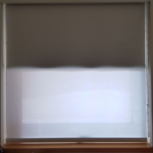
After reading Don Norman’s “The Design of Everyday Things”, I was reminded to take a look around me, and find out other examples of bad user experience. One of the first examples that comes to mind, is from my short time at NYUAD’s dorms. As you can see, there are 2 blinds in the same window, one partially translucent, and one fully opaque.

NYUAD's blinds
NYUAD’s blinds

While the mechanism to control a particular blind is simple enough, and a common enough pattern for us to intuitively use it, what is extremely confusing is which string controls which blind, as they are both identical! Also, it seemed liked different windows had a different arrangement/side of strings controlling each blind! My  solution to fix this, would be to have the opaque one keep it’s metal beads, but to switch the translucent one’s beads to like a white plastic. This way, you can both see and feel the difference between the 2 strings, allowing you to easily choose which blind to control. Additionally, they can be in any order/side, but it must be consistent for all the windows, allowing you to develop muscle memory.

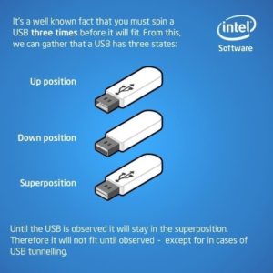
Another example, though not affecting everyone, is USB. You might think I’m referring to the USB A style connectors, that somehow always take 3 tries to get in.

USB A, 3 tries and states
I didn’t know they exhibited quantum properties!

No, that has mostly been solved with USB C (ah, a godsend). Unfortunately, USB C has introduced it’s own complications, by becoming the universal standard!

Wait, a minute, that doesn’t make sense. Isn’t that a good thing?

Well mostly yes, but this also means that USB C’s capabilities have far expanded outside the original scope of a USB connector, allowing the transfer of not just power and files (each at different levels), but also HDMI, DisplayPort, Thunderbolt, Ethernet, and so much more. The result is an incredibly convenient ecosystem and user experience, where everything fits together seamlessly… as long it works. The issue isn’t USB C’s reliability, but rather that since it supports so many protocols and extensions, almost all of which are optional, it can be quite hard to know which cable or device (or even port on the same device!) supports which features (this could  supporting a protocol, like DisplayPort, or a certain power and speed output). As a result, it often leads to frustration, realising only after a long time wondering why it isn’t working, that the cable I have in hand is inadequate for the task.

The solution I would recommend, would be to support everything that makes sense, and the highest speed & power level. Although, of course I would say that, I’m the user! It’s true that going this route is going to considerably increase costs for manufacturers, though as Don Norman said, poor design is sometimes due to decisions aimed at reducing cost, and this is certainly an example of that, so maybe it would be worth it for manufacturers to implement it, at least for our sanity.

Note:

Obviously, the capabilities supported should be within reason. FOr example, it makes no sense for a router which lacks any direct graphical interface, to support HDMI or DisplayPort in their USB C ports. Also, there does exist a standard that supports almost everything, and the best power & speed levels, which makes it much easier to know what works, Thunderbolt Thunderbolt icon. However, it is usually pretty expensive and isn’t offered/supported on many devices. Oh also, USB’s naming needs to be fixed. They have changed it so many times, leading to a massive amount of confusion. Search it up.


Coming to second part of our prompt, I believe the main way we can apply his principles, is by integrating discoverability, affordances, & signifiers, with deliberate thought. Namely, we should make sure that we strive towards adapting our work around the person, having intuitive design, where the user doesn’t need to read an instruction manual (or ideally, read any instructions at all, possibly by using familiar visual elements and design practices people have already gotten accustomed to) to interact with our work. It should instead nudge or guide the user subtly (if required), and perhaps most importantly, provide immediate (and satisfying) feedback, and provide the space for people to make mistakes, but gracefully get back on track.

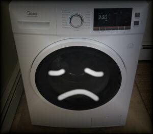
They should enjoy interacting with our work, not be afraid or overwhelmed by it that, so that it doesn’t end up like the unfortunate (but probably technically great) Italian washer-dryer combo 😉

Sad washer-dryer
A sad, abandoned boi, forever waiting for someone to enjoy using it🥺

Reading Response 3

Something that drives me crazy is the confusion around door handles, especially when it’s unclear whether to push, pull, or if the door is automatic. Many doors have handles that imply pulling, but they actually require pushing, or they’re automatic but give no indication of it. This creates unnecessary frustration. Norman’s principles can easily improve this. First, using appropriate affordances would help—push bars for pushing and handles for pulling. This would visually communicate the correct action, reducing hesitation. Additionally, signifiers like clear signs or arrows could guide users, especially in high-traffic areas like stores or airports.

For automatic doors, better feedback could be useful. Subtle lights or sounds could indicate when a sensor has been triggered, letting users know the door will open. For example, in C2, the doors don’t always respond to you, and sometimes you are required to pull the doors so they open. This unpredictability creates unnecessary confusion and frustration.

In this case, enhancing the visibility of door functions and matching the conceptual model to user expectations (handles for pulling, plates for pushing) would make navigating doors far less frustrating. By aligning with Norman’s principles, door design could become far more intuitive and user-friendly.

Assigment 4 – Words and Wizardry

Inspiration

Anyone who knows me also knows that I’m a huge fan of the Harry Potter series and I decided to use that as the base idea for this project involving text and data.  In whatever way I could, I wanted to recreate some sense of wonder and enchantment that I feel like I’m a part of every time I read one of the books or watch one of the movies. In the series, things often move and react in magical ways, and that gave me the idea to animate words and make them interactive, almost like they have a life of their own. Instead of having static text on the screen, I imagined how fun it would be if the words could scatter, repel, and float, just like magic.

Concept

The idea I finally arrived at involved a colorful word collage filled with randomly chosen and placed words from Harry Potter vocabulary (resulting in a different look/arrangement every time the code runs). When the user hovers near a word, it gets “pushed” away as if repelled by a magical force.  When the screen is clicked, these words disintegrate, breaking down into smaller particles, as though they’re dissolving or being pulled apart by magic. The disintegration adds an additional layer of visual intrigue, similar to a magical spell or force at work. Once the words have completely broken down, the particles fall to the bottom of the screen and disappear. In their place, a meaningful Harry Potter quote appears on the screen. This quote stays visible for 6 seconds, offering the viewer a moment to absorb the message, before the entire cycle then resets, creating a loop that gives the  experience a continuous flow.

Implementation

This is how the project turned out!

These are some of the most important parts of the code that I am proud of :))

1. Placing Words on the canvas

The first part of the project was figuring out how to place the words on the screen randomly. I wrote a function called placeWords() that tries to put each word at a random location. If the word overlaps with another, it shrinks until it fits. This way, each time the page is loaded, the words appear in different spots, making each experience unique.

// Function to place words randomly on the canvas
function placeWords() {
  placedWords = [];
  for (let i = 0; i < words.length; i++) {
    let word = words[i];
    let fontSize = 60;
    let success = false;
    
    // Trying to place the word until successful or until the font size is too small
    while (!success && fontSize >= 10) {
      let x = random(width);
      let y = random(height);
      let angle = random(1) > 0.5 ? 0 : HALF_PI;
      
      // Checking if the word can be placed at the given position, size, and angle without overlapping
      if (canPlaceWord(word, x, y, fontSize, angle)) {
        placedWords.push(createWord(word, x, y, fontSize, angle));
        success = true;
      } else {
        fontSize -= 2;
      }
    }
  }
}
2. Animating Words

Next, I wanted the words to move away from the mouse, like they were being pushed by an invisible force. I used the mouse’s position to calculate the distance between the mouse and each word. If the mouse gets too close, the word moves away. If it moves far enough, the word slowly returns to its original spot.

// Drawing "Hogwarts" word (stationary)
    drawWord(hogwartsWord);
    
    // Drawing all other placed words with repel effect
    for (let word of placedWords) {
      // Calculating the horizontal/vertical distance between the mouse and the current word's position
      let dx = mouseX - word.currentX;
      let dy = mouseY - word.currentY;
      let distance = sqrt(dx*dx + dy*dy); // calculating the total Euclidean distance between the mouse and the word using Pythagoras' theorem
      let maxDistance = 100;
      let repelStrength = 35; //strength of repelling force
      
      // If the word is within the repel range (closer than maxDistance)
      if (distance < maxDistance) {
        // Calculating the repelling force proportional to the distance (closer = stronger force)
        let force = (1 - distance / maxDistance) * repelStrength;
         // Applying the repelling force to the word's horizontal/vertical position, pushing it away from the mouse
        word.currentX -= dx / distance * force;
        word.currentY -= dy / distance * force;
      } else {
        // If the word is outside the repel range, gradually moving it back to its original position using linear interpolation
        word.currentX = lerp(word.currentX, word.x, 0.1);
        word.currentY = lerp(word.currentY, word.y, 0.1);
      }


3. Disintegrating Words

Finally, I wanted the words to break apart and float away, like a spell was cast on them. To do this, I turned each word into a set of particles that would fly off the screen when triggered. I mapped each word’s size to a number of particles and gave them random velocities to make the effect look more natural. This disintegration is accompanied by a famous Harry Potter quote (loaded from a file quotes.txt ) being displayed on the screen.

function disintegrateWords() {
  // Converting each word into particles
  for (let word of [hogwartsWord, ...placedWords]) {
    // Calculating the number of particles to generate based on the word's font size
    // Larger font sizes produce more particles (between 5 and 50 particles)
    let particleCount = map(word.fontSize, 10, 120, 5, 50);
    for (let i = 0; i < particleCount; i++) {
      // Pushing a new particle object into the particles array with initial properties
      particles.push({
        x: word.currentX,
        y: word.currentY,
        vx: random(-2, 2),
        vy: random(-5, -1),
        size: random(6, 10),
        color: word.color
      });
    }
  }
  
  // Clearing the words
  placedWords = [];

  // Selecting and display a random quote
  currentQuote = random(quotes);
  // Splitting the quote into lines of about 40 characters each
  currentQuote = splitQuoteIntoLines(currentQuote, 40);
  quoteStartTime = millis();
  quoteEndTime = quoteStartTime + quoteDisplayDuration;
}

Reflections and Further Improvements

One thing I’d like to improve is the collision detection when placing words. Right now, the words sometimes get placed in awkward spots if they shrink too much. I’d like to refine the placement system so the words always look balanced on the screen. It might be a good idea to have words be more crowded around the centered word (Hogwarts) and then spreading out gradually. Also, I think adding more magical effects, like words changing color or spinning, would enhance the overall experience.

This project helped me better understand how interactive elements can transform a simple idea into something engaging and dynamic. I look forward to adding even more magical effects to this canvas in the future!

References

https://www.bloomsbury.com/uk/discover/harry-potter/fun-facts/harry-potter-glossary/

Assignment 4: NYUAD Cookbook

Concept

The other day I was wandering around Daymart with my friend who was trying to pick ingredients to cook soup. Looking at other people in the store, I noticed that some products are more popular than others, so I decided to create a humorous (anti) cookbook. When the reader clicks the mouse, a new recipe is generated with three random ingredients and two random actions from the lists that I have created.  The generated recipe is always absurd, and a funny image on the right complements this vibe.

Disclaimer: do not attempt cooking anything according to the recipe from this cookbook.

Highlight of the code I am proud of

Although the idea is not very complex, I have tried adding something that was not included into any of my works before – an image. It took some time, because I did not know that two preload() cannot exist in the same code since one will overpower another. I was moving the image preload to different segments of the code for a while, but then I have managed to figure out how to solve the issue.

function preload(){
  // loading text from the file
  strings = loadStrings("words.csv"); 
  // loading image
  img = loadImage('cookbook.jpg');
}

Sketch

Reflection

I am satisfied with the final result because it does make the user smile when reading all the generated recipes. One thing I would want to add is a similar method of randomising the image on the second page – instead of a single photo, it could be an actual illustration of the recipe. I am not sure how to do this yet, but I guess that several images would have to be linked to specific items from the lists in order to create an actual representation of the dish.

Assignment #4: Watch Out!

Concept & Inspiration.

For this project, my main goal was to create generative text that transforms everyday, mundane things we’re so used to into something unexpectedly funny and slightly absurd.

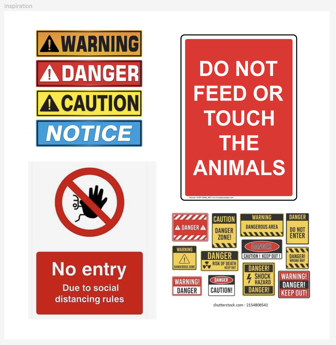
When thinking about text we frequently encounter, warning signs came to mind. They are a common part of our daily lives, but we have become so accustomed to them that we barely notice what is written anymore. In this project, I wanted to experiment with something as rigid and conventional as warning signs, turning them into something absurd through generative text.

Perhaps my surreal warning signs might catch the attention of passersby, if only for a moment?..

Highlights.

In this code, I worked with file uploads in p5.js to import both my spreadsheet (containing three rows of random text) and a custom font (Heavitas), using the loadFont() and loadStrings() functions we learned in class throughout the week.

This is the first project where I focused on making the code as concise and efficient as possible by identifying repetitive patterns. To achieve this, I used a technique we didn’t cover in class but found intuitive—an array of arrays, let rows = [[], [], []];.

Additionally, I applied concepts from previous lessons to optimize the use of for() loops in various parts of the code, which I’m particularly proud of.

// Splitting each row into separate words and storing in 'rows' array
for (let i = 0; i < 3; i++) {
rows[i] = split(strings[i], ','); 
}
// Setting array to store the randomly generated text for three rows
let signText = ["", "", ""];

// Building a function to generate a random sign from three rows
function generateRandomSign() {
for (let i = 0; i < 3; i++) {
signText[i] = rows[i][int(random(rows[i].length))]; // Random selection for each row
}
}

Reflection.

Although this project may seem simple, the code was challenging to work with as I struggled for a while to shorten it without removing any functionality. Nonetheless, despite these difficulties, I enjoyed the process, especially at the initial stage, when coming up with random words and imagining the crazy possibilities of their combinations.

In the future, I would like to focus more on making the text responsive and adding real interactivity. I would also love to incorporate a warning pattern animation to make the code more visually engaging when I have more time. Overall, working on this assignment was extremely valuable for my coding skills, as I can see myself using generative text for other projects, like creating a mini-game.

Embedded Sketch.

Mouse click to generate a random warning sign.

Assignment 4: Box office fireball

Concept

My goal is to practice data visualization in a playful way. I had a clear idea knowing that I want a Marvel character to fire a ball from its hand; the ball’s size is determine by the box office of the movie. 

I access Marvel’s box office data dataset from Kaggle. I deleted unnecessary information such as the length of the film, opening weekend gross, release date, etc and only kept the box office gross and the corresponding movie title (24 in total). I chose the Hulk to be my character because he is the easiest to draw.

Unfortunately, a superhero’s screentime is not determined by what cool power they have, but by the ability for them to make audiences pay 20$ to walk into the cinema.

Highlighted code

As user clicks on the screen, a random movie name from the sheet & a fireball whose size is based on the size of the box office will be generated. For example, The Incredible Hulk has a fireball that is way smaller than Captain America.

The font is accessed from here.

Please click on the canva.

At first, i didn’t set the boolean variable isFiring , so the ball always fires before mouse is pressed and it will no reset once it exits the canvas. I call the variable = false at the beginning, call it true when mouse is pressed, and call it false when the ball exits the frame so that it can be reset.

let isFiring = false; // boolean to check if fireball is in motion
  isFiring = true;
  // Reset fireball once it exits the canvas
  if (circleY < circleSize) {
    isFiring = false; // stop the fireball animation
  }

I also used the min_box = max(float())  method to determine the range so that the fireball can be mapped to fit the size of the screen. Thus, the overall fireball animation look like this:

function fireballAnimation() {
  // map the box office size to a reasonable circle size
  let boxOffice = movies.getColumn('gross_us');
  let max_box = max(float(boxOffice));
  let min_box = min(float(boxOffice));
  circleSize = map(boxOfficeSize, min_box, max_box, 1, 50);
  print(boxOfficeSize,selectedMovie); // just testing if they are corresponding

  // Draw the fireball
  fill(255, 100, 0); // Fireball color
  strokeWeight (2);
  ellipse(circleX, circleY, circleSize);

  // Move the fireball upwards
  circleX += 5;

  // Reset fireball once it exits the canvas
  if (circleY < circleSize) {
    isFiring = false; // stop the fireball animation
  }
}

Improvements

1.Character variety

It would be great if the character can change based on the  movie title on the right. Maybe adding assign if statement to each character might work.

2.Losing stroke

I’m not quite sure why the right arm does not have stroke weight when the canvas is restarted.


Reading Reflection – Week #4

Personally, I found the first chapter of Don Norman’s The Design of Everyday Things to be an insightful introduction to human-centered design and user experience. However, some aspects of it struck me as somewhat contentious. Having already read some of my peers’ reflections on the infamous “Norman Doors” (which are also found on our campus), I was intrigued by the mixed reactions. Some people found the design intuitive and user-friendly, while others have consistently struggled with it over time.

This divergence reminded me of my early experiences with social media. When I was 9, I had an account on the Russian social network VK, which (even then) I found incredibly easy to navigate. I also had a Facebook account at the same time, but I could never quite figure it out due to its cluttered and complex design. Interestingly, when I later traveled to Armenia, I discovered that many people there had the opposite perspective: they viewed VK’s interface as poor in terms of user experience, while Facebook was considered relatively straightforward. To this day, I still find Facebook extremely annoying to use, overwhelmed by its numerous buttons and pages whenever I open the sidebar or attempt to navigate through it.

This brings me to a broader question: is user experience really as universal as Don Norman suggests? Are there only conceptual models — mental representations of how objects work, based on users’ past experiences — that determine the value of design? How do cultural differences influence or limit the usability of objects? When discussing Norman Doors, who do we consider as the elusive “ideal user”? Is there truly a universal standard for which almost anyone can be considered the model for evaluating a design’s discoverability?

Week 4 Reading

In the first chapter of the book” The Design of Everyday Things” by Donald Norman, we are introduced to the frustrations that the author has on everyday objects. Specifically, their ease of use, or in this case, the lack thereof. The concept of human-centered-design(HCD) is introduced, a philosophy where the human’s needs, capabilities and behavior on the forefront of design. Two concepts related to this that Norman also introduces are Affordances and Signifiers, meaning a design suggestion that helps with action and visual cues that guide the person to take an action respectively.

Within Interactive Media, as the name implies, interactivity is a crucial aspect. Numerous times when creating pieces, I rely on the user’s intuition for my interactive elements instead of making designs that would easily teach and guide the user on what to do. I believe within interactive media, there has to be a balance between the piece being intuitive, but also not taking away from the experience, eg. a button that is too out of place on interactive art piece.

There are a few designs that drive me crazy:

  1. USB A orientation, there is no easy way to differentiate the right way from the right way when plugging in a USB A port unless you’re looking right at the port. However, a fix has already been implemented through USB C.
  2. Laptop Trackpads. When you get a new laptop, there are no tutorials on how to use the trackpad. While it may seem silly to need a tutorial for a laptop trackpad, every computer brand includes different trackpad gestures and defaults to a different way of scrolling. An easy fix would be a quick guide during the setup of the computer and the option to choose which style of scrolling one prefers.
  3. TV remote. A new TV remote comes with way more buttons than most people use. The problem with that is that nobody really understands what half of the buttons do. A fix could be to either create a simpler remote, or have better labeling for the buttons.