Assignment 1: Self Portrait (Orange Cat)

Concept

I love cats. I don’t have one but I would love to have one in the future. One of my favorite type of cats are orange cats; they’re silly and funny to me. Hence, I decided to create a silly orange cat with their tongue out making a silly face. The cat is also seen to be waving their paw as if to say hello!

Process

I started making the head using a circle and planned on using triangles for the ears, but soon found it difficult to make it look neat so I opted for a long rectangle pointing from one side of the circle to the other to act as ears. This way the ears are more symmetrical.

Highlight

I particularly liked how I made the mouth section where I used different sizes and orientations of ellipses and combining them with layering in mind to form the shape of the cat’s snout.

// mouth
fill('rgb(255,114,38)')
ellipse(200, 270, 15, 30)
fill('rgb(255,182,49)')
ellipse(190, 250, 35, 30)
ellipse(210, 250, 35, 30)
fill('#FF9700')
ellipse(200, 240, 20, 15)
Sketch

function setup() {
  createCanvas(400, 400);
}

function draw() {
  
  background('rgb(178,223,250)');
  
  // body
  fill('orange')
  rect(90, 260, 220, 400, 100)
  fill('rgb(255,182,49)')
  rect(115, 290, 170, 400, 100)
  fill('rgb(255,151,0)')
  
  // arm
  rect(115, 310, 50, 400, 100)
  fill('#FF9700')
  circle(140, 340, 55)
  fill('rgb(255,182,49)')
  circle(140, 340, 35)
  stroke('orange')
  circle(125, 339, 15)
  circle(133, 327, 15)
  circle(147, 327, 15)
  circle(155, 340, 15)
  
  // head
  noStroke()
  fill('orange')
  ellipse(200, 220, 200, 180)
  rect(100, 140, 200, 80)
  
  // streaks
  fill('#FF9700')
  rect(192.5, 130, 15, 50, 10)
  rect(170, 132, 15, 40, 10)
  rect(215, 132, 15, 40, 10)
  
  // ears
  fill('rgb(255,182,49)')
  ellipse(115, 170, 15, 50)
  ellipse(285, 170, 15, 50)
  
  // eyes
  fill('black')
  circle(155, 220, 25)
  circle(245, 220, 25)
  
  fill('white')
  circle(160, 215, 10)
  circle(250, 215, 10)
  
  // blush
  fill('rgb(255,116,44)')
  ellipse(125, 250, 50, 20)
  ellipse(275, 250, 50, 20)  
  
  // mouth
  fill('rgb(255,114,38)')
  ellipse(200, 270, 15, 30)
  fill('rgb(255,182,49)')
  ellipse(190, 250, 35, 30)
  ellipse(210, 250, 35, 30)
  fill('#FF9700')
  ellipse(200, 240, 20, 15)
  
}
Reflection

Though I did use a variety of shapes, my sketch is still very simple. So in the future, I’d like to incorporate more shapes and learn how to animate them as well to make it more interactive and lively; like maybe make the cat’s paw move!

Assignment 1: Aysha’s Self-Portrait

Concept:

For this assignment I use my knowledge of drawing basic shapes in p5*js to create a self-portrait. This portrait is a rough sketch of me, wearing my favorite hairstyle—a high ponytail. Since I’m still relatively new to coding, I chose to keep my approach simple by using basic shapes, lines, and curves to create this sketch. Understanding how the order of code affects the final drawing inspired me to stack shapes strategically, allowing me to capture minute details like the facial features in my portrait.

Highlight:

I’m particularly proud of the eyes in this sketch, as I invested a lot of effort into adding detailed elements that took some time to perfect. My biggest challenge was getting the curves right, especially when it came to the eyebrows and eyelids. Positioning them correctly was tricky, but using the mouseX and mouseY variables was incredibly helpful in determining their relative placement. However, achieving consistent curves across the sketch was the most time-consuming aspect of the entire process.

//eyes
fill(250);
ellipse(180,195,15,20);
ellipse(220,195,15,20);

noFill();
curve(175,230,167,190,194,190,200,230);
curve(180,240,206,190,235,190,220,220);
curve(200,170,167,200,194,200,200,150);
curve(200,155,206,200,235,200,200,170);

//eyebrows
curve(200,175,207,175,239,175,250,220);
curve(150,220,165,175,197,175,280,200);

Reflections:

When drawing the eyelids and eyebrows, I initially used the curve() function, but I later realized that combining noFill() with bezier() would have been a quicker and more efficient approach for creating curves. Additionally, I used the width and height variables to center the head on the canvas, which worked well. However, I believe that applying these variables more consistently throughout my sketch would make the portrait scalable for any canvas size in the future.

Assignment 1 | Self-Portrait

Concept

When I first thought about what kind of recognizable features I would like to emphasize in my work, I chose 3 of them: curly hair, earrings and background.

In this portrait, I decided to solely focus on collaboration between 2D shapes and colors to bring simplistic, yet realistic picture of me.

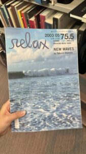
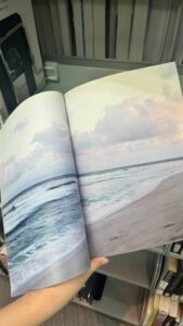
My first task lied in creating an interesting background for portrait that would resemble my personality in some way. Walking through library, I stumbled upon one journal that was only focused on photographs of ocean and waves. It reminded me of calmness and solitude that I do value myself, so I implemented gradient of water on background.


Furthermore, I was confused on how I could illustrate curly hair in p5, but then I decided to choose two colors and use unfilled circles patterns to show the curls.

Working on facial features, I decided to choose style similar to emoji drawings. I worked with opacity and arc’s to deliver also very calm mood of the face.

At the right bottom corner I decided to add a small signature of letter A, as it is very symbolic letter in my life.

Highlight of some code that I’m particularly proud of
//setting background
  //first row
  strokeWeight(15);
  stroke(91,184,229,50)
  fill(93, 170, 233)
  rect(0,300,100,100)
  fill(90, 177, 231)
  rect(100,300,100,100)
    fill(91, 184, 229)
  rect(200,300,100,100)
  fill(95, 190, 226)
  rect(300,300,100,100)
  //second row
  strokeWeight(15);
  stroke(110, 201, 220,50)
   fill(133, 211, 214)
  rect(0,200,100,100)
  fill(121, 206, 216)
  rect(100,200,100,100)
  fill(110, 201, 220)
  rect(200,200,100,100)
  fill(101, 196, 223)
  rect(300,200,100,100)
  //thrid row
  strokeWeight(15);
  stroke(157, 220, 210,50)
   fill(145, 216, 212)
  rect(0,100,100,100)
  fill(157, 220, 210)
  rect(100,100,100,100)
  fill(170, 224, 210)
  rect(200,100,100,100)
  fill(182, 228, 211)
  rect(300,100,100,100)
  //fourth row
  strokeWeight(15);
  stroke(218, 239, 221,50)
   fill(228, 243, 226)
  rect(0,0,100,100)
  fill(218, 239, 221)
  rect(100,0,100,100)
  fill(206, 235, 216)
  rect(200,0,100,100)
  fill(195, 232, 213)
  rect(300,0,100,100)

I am particularly proud of the background of the portrait, because it reveals additional detail I put in the work to deliver idea about my character.  I had intention in mind about creating a gradient using the tools we already learned on the lessons, so I experimented with colors, strokes, opacity, to create a kind of smooth picture that would resemble a gradient. And I think I could accomplish that.

Embedded sketch

Reflection and ideas for future work

In the future assignments, I would like to explore more efficient and realistic ways to portrait a gradient background and curly hair. In this work, major part of the code required manual instructions to create a specific illustration of curls and pattern in the background. I want to find out more efficient ways of how I could code these things. Moreover, I would further work on more specific and detail-oriented picture of the earrings, as it stays one of the key features in my portrait. I would tie shape of earrings to Kazakh national ornaments to show my identity. In addition, I didn’t have much chance to work with interactivity of my portrait in this concept, so next time I would definitely create more interactive background or interactive face features. As I progress in interactive media, I would also love to implement 3D shapes in my work.

Assignment 1: Self-Portrait

Sketch

Idea

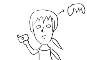
I’m quite new to P5js so I started the project by drawing myself out.

The sketch is easy but I ended up giving up on the complicated version of my bang and chose to use an arc & a transparent triangle. I removed the stroke at the end because I like how an image is created just by these big chunks of color composing together. The blush, the piercing, and the top are all obvious characteristics of mine so I decided to include them apart from just coding my facial features out. The self portrait looks sad because I was sleepy when working on it.

I like photography a lot so I decided to use the background to show that.


Highlighted code

I used the variable & random code that we talked about in class to create the camera that appears at the beginning and the flashes. To make them obvious, I chose a plain green background. The camera’s movement is set using CameraX & CameraY global variables. I used CameraX = frameCount % width to make sure that they will reappear. The flashes appear using random. One thing that I might change in the future is to make the rectangles into a diamond shape and add white highlights so that they = look more like flashes. I might also add interactivity: users click on the camera to produce the flash.

//the flash
//make random camera flashes
frameRate(10);
let x = random(600);
let y = random(600);
fill('yellow');
rect(x,y,90,120);
fill('white');
//the camera
fill('rgb(224,216,216)');
rect(CameraX+4,CameraY-10,40,100,0)
fill('white');
rect(CameraX,CameraY,150,100,10);
fill('grey');
rect(CameraX,CameraY+20,150,60,5);
fill('rgb(175,165,165)');
circle(CameraX+80,CameraY+50,80);
fill('black');
circle(CameraX+80,CameraY+50,60);
fill('yellow');
circle(CameraX+90,CameraY+40,10);
CameraX = CameraX +1
CameraX = frameCount % width
CameraY = frameCount % width
noStroke();


Assignment #1: An Honest Self-Portrait.


Idea & Sketching.

As a newcomer to coding, this small project has been an important exercise in practicing what I have learned in class so far. I primarily focused on experimenting with basic shapes, still trying to find useful tools to add (at least) some interactivity to a static portrait.

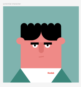
First, I made a quick sketch in Figma of what I roughly aimed to create (see below). As a Film & New Media major, I couldn’t help but show my passion for filmmaking by incorporating a “Kodak” T-shirt (which I actually own and wear) paired with a green jacket made up of two symmetrical triangles.

My cartoon character shows no mercy to my real self: protruding ears, furrowed eyebrows, and a discontented smirk. Nevertheless, I’m still fine with that…

Highlights.

Having finished the layering of the character in p5.js, I felt that something was missing, and I had to soon realize that it was the absence of movement. Since it was my first time coding, I did a quick research to find different options for animating in JavaScript. The most suitable and easiest to comprehend for my case turned out to be the lerp() function.

I implemented the lerp() function to animate my character’s mouth by following a tutorial on p5.js.

if (mouseX > 150 && mouseX < 450 && mouseY > 150 && mouseY < 600) { // to check if the mouse reaches the body
  finalX = 300;  
  finalY = 400; 
} else {
  finalX = 280; 
  finalY = 410;  
}

initialX = lerp(initialX, finalX, 0.5);
initialY = lerp(initialY, finalY, 0.2);

I’m particularly proud of how I figured out the pace of the animation, specifically the “amt” parameter, which I set at 0.5 and 0.2. After experimenting with the function for a while, I decided to use different values for the “x” and “y” positions, so that the mouth movement would look more natural and eye-catching.

Reflection.

To summarize, I truly enjoyed working on this tiny project. I’m quite satisfied with my whatever cartoonish self and excited to dive deeper into the lerp() function as the course progresses to create more sophisticated animations and interactive projects. So far so good – JavaScript seems to be fun.

Embedded Sketch.

P.S. Place the mouse around the body so the mouth moves. 

Weekly Reflection(Creative Reading): Week 2

Reflection:

Casey Reas’ video shows how structure and randomness blend together in digital art. He explains that with the use of software, artists can combine strict rules with random elements to create pieces that are both unique and unpredictable. This approach challenges the traditional view of art, where the artist had full control over every detail. Now, algorithms can introduce unexpected outcomes, making the process less about direct control and more about exploring the balance between order and chance. This new way of creating art mirrors life itself, where both structure and unpredictability constantly interact.

Watching this video made me reflect on how creativity is evolving. Reas shows that creativity is no longer just about human control or intention; it can also come from the interaction between the artist and the machine. This got me thinking about whether using randomness and algorithms might make the art less personal or if it actually enhances the creative process by introducing new possibilities that an artist might not think of alone. I’m curious to discuss these ideas with others and hear different perspectives on whether this shift in the role of the artist adds value to art or takes away from it. The questions Reas raises make me wonder how much of creativity comes from us and how much can come from machines, and I believe exploring this could change the way we understand the art of the future.

Assignment 1: Self Portrait

Concept:

The concept of my first assignment is to use JavaScript (p5) to code 2D primitive shapes to create a self-portrait. This involves carefully selecting the correct shapes and inputs (x-axis, y-axis, etc.), as well as determining how to fill shapes with color, and choosing the color and size of the shape strokes to achieve the final look.

In my self-portrait, I included two elements that are important to me. The first element is the night sky and the moon, as my favorite time of day is nighttime. The second element is the eyes, which hold significance because I have a twin (we are not biologically identical), but people often confuse us. To help others distinguish between us, I always suggest looking at our eye colors—I have greenish-grey eyes, while my twin has brown eyes.

Highlighted code:

I am proud of the final outcome I achieved, but I am especially proud of the eyes. I successfully layered different sizes of circles with various colors, perfectly centering them on top of each other. I am also proud of the eyelashes, as I was able to align them symmetrically opposite each other with the same length and size.

//eyes
fill(255);
circle(165,175,37);
circle(235,175,37);
fill('rgb(87,107,136)');
circle(165,175,27);
circle(235,175,27);
fill(0);
circle(165,175,15);
circle(235,175,15);
stroke(0);
strokeWeight(2);
line(147,170,140,165);
line(150,165,143,160);
line(153,160,146,155);
line(253,170,260,165);
line(250,165,257,160);
line(247,160,254,155);

Sketch:

Future Improvements:

In the future I would like to animate my work (example: make the eyes move), and I would like to learn how to draw curved lines (for example to learn how to draw the eyebrows).

Self Portrait: Assignment_01

Concept: The concept comes from my favourite childhood cartoon Masha and Bear. I always loved how the bear’s room looked so cozy and peaceful in the cartoon. As I grew older, I noticed my younger brothers acting mischievously, much like Masha. In response, I found myself playing a protective role similar to the Bear’s in the series. So, I choose the bear as my concept for this assignment and tried to create a stylized portrait of the bear using basic 2D shapes in P5.js. While the result may not be an exact replica of the Bear, I tried to capture the essence of his character as seen in cartoon.

Highlight Code: One part of the code that I’m particularly proud of is the drawing of the bookshelf. It’s my first time working with Java and doing a full sketch on P5.js, so I had to go through quite a few tutorials from this channel to understand basics of the drawings. I tried to code the bookself using loops technique from this video. I calculated the positions of the shelves and books using variables and loops. This method allowed me to place multiple shelves and books at regular interval but I had to go through a lot of trials and errors so took me quite some time to figure out how to work with the perspective drawing in P5.js. On my first try, I tried to make a 2D bookshelf, but that didn’t look satisfactory so I added some depth in the drawing using beginShape(), vertex(), and endShape() functions to add some thickness on the sides and changed the fill() to create a contrast on the shadow and lighting. To express what I meant to portray I added one line of quote about books, I achieved this by using textStyle()and textAlign() functions.

Code:

function setup() {
  createCanvas(600, 500);
  setGradient(0, 0, width, height, color(255, 182, 193), color(255, 228, 225)); // Gradient background
  drawHelloKitty(); //function that I am using to draw the main character 
  drawBookshelf();
}

function drawHelloKitty() {
  noLoop();
  noStroke();

  // Draw face
  stroke(0);
  strokeWeight(0.2);
  fill("rgb(252,245,225)");   
  ellipse(200, 200, 180, 180); 

  // Draw ears
  fill('rgb(244,230,215)');
  ellipse(120, 130, 70, 70); // Left ear
  ellipse(280, 130, 70, 70); // Right ear

  //inner ear color

  fill(160, 82, 45); // Medium brown
  ellipse(120, 130, 50, 50); // Left inner ear
  ellipse(280, 130, 50, 50); // Right inner ear

  // eyes
  fill(0); 
  ellipse(170, 200, 22, 22); // Left eye
  ellipse(230, 200, 22, 22); // Right eye

  // Draw nose
  fill(160, 82, 45); // Medium brown
  ellipse(200, 230, 22, 18); // Nose

  // Draw mouth
  
  stroke(0);
  strokeWeight(2);
  noFill();
  arc(200, 245, 50, 25, 0, PI); // Mouth

  // Draw whiskers
  
  stroke(0);
  strokeWeight(2);
  line(100, 200, 50, 190); // Left whisker 1
  line(100, 210, 50, 210); //2
  line(100, 220, 50, 230);  //3

  line(300, 200, 350, 190); // Right whisker 1
  line(300, 210, 350, 210); //2
  line(300, 220, 350, 230); //3

  
  // Drawing body
  fill(255, 0, 0);
  stroke(0);
  strokeWeight(2);
 
  fill(160, 82, 45);
  ellipse(200, 480, 260, 400);
  stroke(0);
  strokeWeight(2);
  fill("rgb(250,204,109)")
  rect(155, 270, 90, 100);


  // hand details
  fill('rgb(252,245,225)'); 
  ellipse(140, 300, 70, 40); // Left hand
  ellipse(260, 300, 70, 40); // Right hand 
  
stroke(0); 
  
strokeWeight(2); 

  // lines for left hand
line(140, 295, 170, 290); // First finger
line(140, 305, 173, 305); 
line(140, 315, 165, 315); 
  
// lines for right hand
line(228, 295, 265, 297); // First finger
line(225, 305, 265, 305); 
line(240, 315, 266, 315); 
}

function drawBookshelf() {
  // Adjusted position of the bookshelf
  const shelfX = 400;
  const shelfY = 150; 
  const shelfWidth = 160;
  const shelfHeight = 360;
  const shelfThickness = 19;
  
  // Draw the bookshelf
  fill(150, 75, 0); // Wood color
  rect(shelfX, shelfY, shelfWidth, shelfHeight); // Main body of the bookshelf
  
  // Draw the shelves
  fill(120, 60, 0); // Slightly darker wood color
  for (let i = 1; i <= 5; i++) { // Adjusted to have more shelves
    rect(shelfX, shelfY + i * 60, shelfWidth, shelfThickness); // Horizontal shelves
  }
  
  // Draw the sides for depth
  fill(100, 50, 0); // Darker wood color for sides
  beginShape();
  vertex(shelfX, shelfY); // Top left corner
  vertex(shelfX + 10, shelfY - 10); // Slightly to the right and up
  vertex(shelfX + 10, shelfY + shelfHeight - 10); // Down to the bottom
  vertex(shelfX, shelfY + shelfHeight); // Back to the bottom left corner
  endShape(CLOSE);
  
  beginShape();
  vertex(shelfX + shelfWidth, shelfY); // Top right corner
  vertex(shelfX + shelfWidth + 10, shelfY - 10); // Slightly to the right and up
  vertex(shelfX + shelfWidth + 10, shelfY + shelfHeight - 10); // Down to the bottom
  vertex(shelfX + shelfWidth, shelfY + shelfHeight); // Back to the bottom right corner
  endShape(CLOSE);

  // Draw the books
  fill(200, 0, 0); // first row
  drawBook(shelfX + 10, shelfY + 60, 40, 80);
  drawBook(shelfX + 60, shelfY + 60, 40, 80);
  drawBook(shelfX + 110, shelfY + 60, 40, 80);
  
  fill(0, 200, 0); // second row
  drawBook(shelfX + 10, shelfY + 130, 40, 80);
  drawBook(shelfX + 60, shelfY + 130, 40, 80);
  drawBook(shelfX + 110, shelfY + 130, 40, 80);


  // a quote below the bookshelf
  fill(0); 
  textSize(18);
  stroke(0);
  strokeWeight(0);
  textFont('Arial');
  textStyle(NORMAL);
  textAlign(CENTER);
  
 // Text lines
let line1 = "Read,";
let line2 = "Masha!";

// position of the quote
text(line1, width / 3, 320); 
text(line2, width / 3, 340); 
  
}

function drawBook(x, y, w, h) {
  fill(255);
  rect(x, y, w, h); 
  fill(0); 
  rect(x + 10, y, 20, h); //the book spine

}

function setGradient(x, y, w, h, c1, c2) {
  noFill();
  for (let i = y; i <= y + h; i++) {
    let inter = map(i, y, y + h, 0, 1);
    let c = lerpColor(c1, c2, inter);
    stroke(c);
    line(x, i, x + w, i);
  }
}

P5.js Sketch:

Reflection and ideas for future work or improvements:

I felt as a beginner I learnt a lot while doing this basic shape based portrait. From brainstorming to implementing, I changed some ideas, colors and techniques but at the end, I am pretty happy with this little drawing. However, there are areas for improvement and future exploration.

The bear doesn’t look or match with the bear color from the cartoon, so it can be enhanced by using different color pallets from rgb colors. The face shape of the bear can be refined a bit more with some curves to give a bear like feature.  Interactivity can be added into this portrait to make it more appealing and fun. The color combination makes the brown color heavy on eyesight, it can be changed as well.

Assignment 1: Generic Self Portrait of a Generic Asian Face

Concept:

  • As someone with limited coding experience, a highly simplified self portrait was the best choice for me to familiarize myself with the fundamentals of p5.js. I decided on utilizing blocks of color to illustrate my face in an artistic style reminiscent of the Animal Crossing games.

Highlights:

  • I am proud of myself for managing to use two colored arcs to depict my middle-part bangs, which I had a little trouble coding as I was initially confused about how to flip the arc on the right horizontally.
//bangs
fill('#310707');
arc(70, 120, 260, 120, 0, HALF_PI);
arc(330,120, 260, 120, HALF_PI, PI);

Sketch:

Ideas for future improvements:

  • While my portrait for this assignment effectively communicates the image of a face, it is a very simplified one that barely represents my likeness. If I were to make another portrait, I would like to experiment with layering more complex shapes with varying levels of opacity as a means of shading and coloring as you normally would while drawing on paper.
  • I would also add more elements — be it a moving cloud,  a flying bird or an abstract flurry of colors — to the backdrop to create a livelier composition.

Week 1- Self Portrait: MANG-F2024

Concept

For this self-portrait, I wanted to create something that shows who I am but also adds some fun, interactive elements. I focused on making my hair, face, and upper body look as close to real as I could. I also added cool features like changing the background color when you click the mouse and making the eyes follow the cursor. Plus, there is a custom wand that moves with your mouse, adding a playful touch to the whole thing.

Code

The code begins by setting up a canvas that is 400×400 pixels in size and gives it a light blue background. The default mouse cursor is hidden to make the custom wand cursor more prominent.

The draw() function runs continuously, which allows the portrait to update in real-time. The background color changes to a random color when the mouse is pressed and resets to the original blue when released.

The main features of the face—head, eyes, nose, mouth, ears, and hair—are drawn using basic shapes like ellipses, rectangles, and triangles. The pupils are interactive and follow the mouse cursor, giving the eyes a dynamic effect. The shoulders and chest area are represented with curves and rectangles to add more detail to the portrait.

Finally, a custom wand cursor is drawn at the mouse position, with a black handle and a yellow tip, adding a playful touch to the sketch.

Highlight

One part of my code that I’m really happy with is the way the pupils of the eyes move. I made it so that the pupils follow the mouse as you move it around. This makes the eyes look like they’re actually looking at the cursor, which brings the portrait to life. Here’s the code that does this:


// Interactive Pupils Movement
fill(0);  // Sets the fill color to black for the pupils
let leftPupilX = map(mouseX, 0, width, 165, 175);  // Maps mouseX to move the left pupil within the eye
let rightPupilX = map(mouseX, 0, width, 225, 235);  // Maps mouseX to move the right pupil within the eye
ellipse(leftPupilX, 180, 10, 10);  // Left pupil
ellipse(rightPupilX, 180, 10, 10);  // Right pupil

This part of the code lets the pupils move depending on where the mouse is. It’s a small detail, but it makes the portrait feel more interactive and real.


Embedded Sketch

.


Reflection and Ideas for Future Work

Looking back, I’m happy with how the interactive features turned out, especially the moving pupils and the changing background color. These parts make the portrait more fun to play with. But, I think I could improve the details of the hair and the face to make them look better. In the future, I would like to work on shading and maybe add more interactive features, like changing facial expressions. I also want to get the proportions of the head and face just right to make the portrait even more realistic.