Superman Saves (Enhanced Game)
Concept of the Project
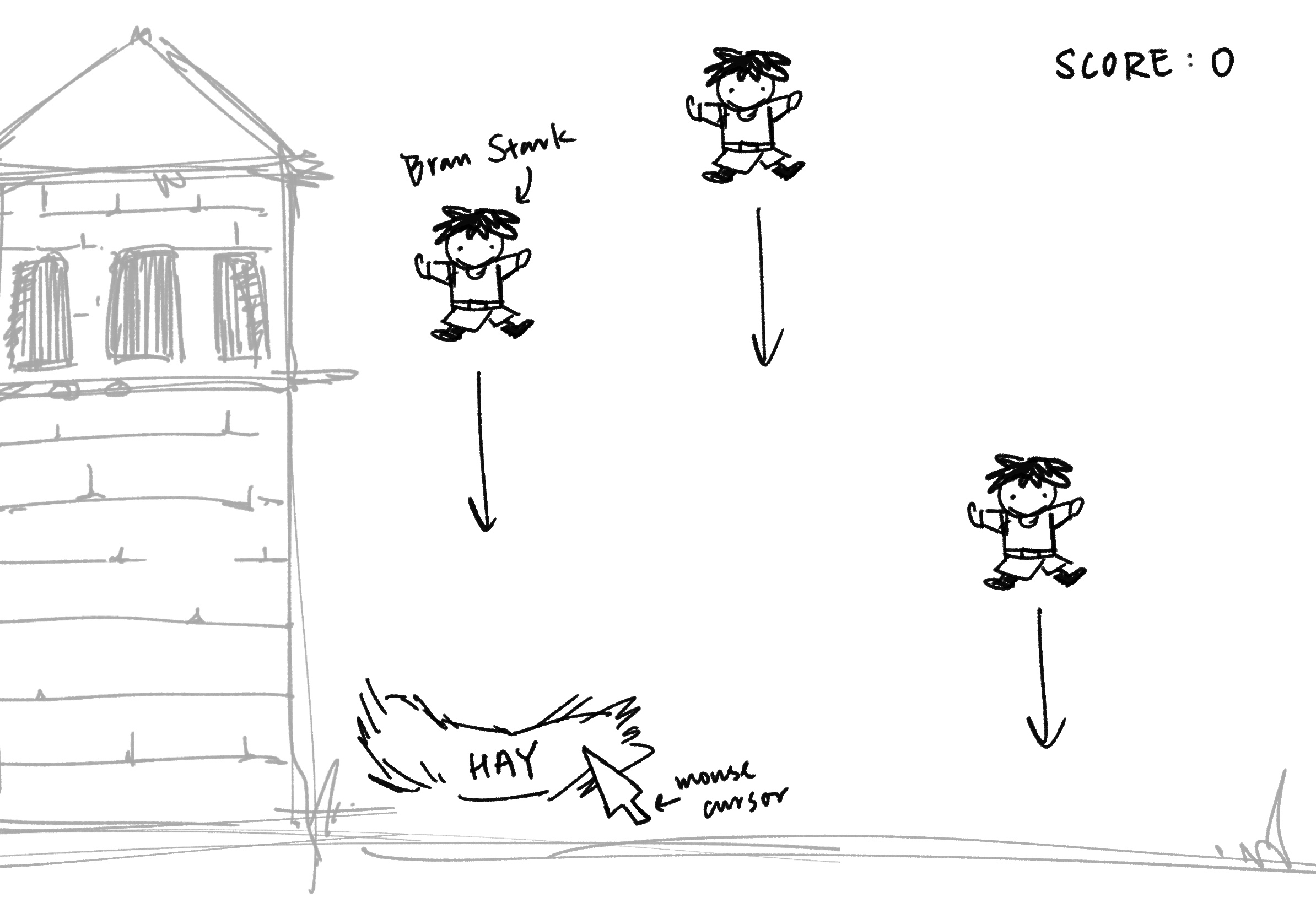
“Superman Saves” is an interactive game inspired by my previous project, which focused on simple character movement and rescue mechanics. In this version, I aimed to elevate the project by adding dynamic challenges, such as time limits, obstacles, and a progressive difficulty system. The objective is to control Superman as he navigates the sky, rescuing individuals while avoiding clouds and birds. The game becomes increasingly difficult with each successful rescue, introducing faster obstacles and reducing the time available to complete the rescue.
The concept is rooted in creating an engaging, responsive game environment that tests the player’s reflexes and strategic thinking. By introducing new features like lives, levels, and a timer, I’ve created a more immersive experience compared to the original version, which was relatively straightforward in terms of gameplay.
How the Project Works
The game begins with Superman stationed at the bottom of the screen, and a person randomly placed near the bottom as well, awaiting rescue. Using arrow keys, the player can move Superman to navigate the sky, avoid clouds and birds, and reach the person. Upon reaching the person, Superman flies upwards, carrying them to the top of the screen to complete the rescue.
A notable feature of the game is its dynamic difficulty adjustment. Each successful rescue increases the game’s difficulty by speeding up the clouds and bird movements, which adds a sense of progression. Additionally, the inclusion of a timer introduces a layer of urgency, forcing players to make quick decisions. I’m particularly proud of how the game manages the timer, lives system, and level progression seamlessly, as these were complex components to implement but significantly enhanced the overall experience.
The code uses object-oriented programming principles to manage the background stars, obstacles, and gameplay mechanics. I took advantage of arrays to efficiently handle the stars’ animations and the positioning of various game elements.
Areas for Improvement and Challenges
One area that could be improved is the game’s overall visual design. Although the current visual elements (e.g., clouds, birds, and Superman) are functional, they could benefit from more detailed and polished artwork. Additionally, I would like to enhance the sound effects in the future, adding background music and sound cues for when Superman successfully completes a rescue or collides with an obstacle.
I encountered a few challenges during development, particularly in managing the game’s timer and ensuring that collisions between Superman and obstacles felt fair and consistent. I resolved this by tweaking the collision detection algorithm and adjusting the movement speeds of the obstacles as the difficulty increases. Another issue was ensuring that the game feels balanced at higher levels, where the speed increase can quickly overwhelm players. However, after adjusting the difficulty curve, the gameplay experience became smoother.
EMBEDDED SKETCH
LINK TO FULL SCREEN
https://editor.p5js.org/b_Buernortey_b/full/p0Rs9Tzbk