CONCEPT:
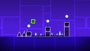
I couldn’t decide between a game or an artwork for my midterm project. However, I was playing on my phone, and there’s this one game that I still play to this day “Geometry Dash”. My siblings and I grew up around this game and we still love it to this day, and as the game design is basically shapes, I thought it would be the perfect game to try and re-create.
The main idea or goal is to control a character that moves through several/ repeating obstacles. The difficulty increases over time as the player’s score rises, with obstacles speeding up and appearing more frequently. There’s also a feature where the game randomly switches to an upside-down mode, adding unpredictability and complexity to keep the player more engaged.
Design:
So far, I haven’t really worked on the design but the layout of my game. I want to have a similar concept to the actual game, where the background is gradient, and changes colour that aligns to the beat of the background music and the obstacles. As for the obstacles, for now, I left them as simple shapes, rectangles, and spikes just to test everything out and see how it flows in the game. For the use of sound, I found online the original music used in Geometry Dash and implemented it in my game as well as adding a sound effect when the player dies. However, I still need to fix the background music so that when the player dies the song stops until he starts playing again, since I used the loop function it’s just playing over and over non-stop.
This is the inspiration for my design and how i would like it to turn out in the end.
User Interaction:
My user interactions are basically the player’s input in the game. The player must press the spacebar to jump. If the spacebar is held down, the player continues jumping until the key is released. As for my instructions and text, I’ve applied it in the beginning, so the game begins when the player presses the spacebar at the start screen. After a game is over, pressing “1” will restart the game. Moreover, I still need to work on the visual design of the Start page, as of now, I just left it as text. I’ve also added a score count which is displayed at the top of the screen, which increases by one as the player successfully passes an obstacle. In the game, the obstacles appear from the right side of the screen, and the player must jump to avoid them. Then the game randomly switches to an upside-down mode at higher scores, adding an extra challenge, but I still think I need to make it more complex and play around with the obstacles, as I fear the game might be too simple and boring the way it is now.
The Most Difficult Part of the Project:
The hardest part of making this game has been figuring out how to make the difficulty increase smoothly as I want the game to stay engaging throughout. I want the game to get harder as you play, but I also need to make sure it doesn’t become too hard too soon, to the point it just gets frustrating.
Collision Detection (When the Player Hits an Obstacle):
The other tricky part is making sure the game knows when the player hits an obstacle, especially the spikes. For the spike obstacles, the spikes are drawn as triangles, but I treated them as if they were inside an invisible rectangle (called a bounding box) that surrounds the spike. This makes it easier for the game to detect if the player hits the spike. Even though the spike is a triangle, the game checks if the player touches the rectangle around the spike. I used the collideRectRect() function in p5.js. This function checks if two rectangles touch each other. Even though the spike is a triangle, the game uses a rectangle around it for simpler collision detection. If the player’s rectangle overlaps with the spike’s rectangle, the game registers a hit. The same goes for the rectangle obstacles.
How I Made It Less Risky:
To make sure the game doesn’t get too hard too fast, I tested how quickly the obstacles speed up and how often they appear. By setting limits on both, I made sure that the game gradually gets harder, but not too difficult right away.
Code so far:

