Hey everyone! 👋
After reading Don Norman’s “The Design of Everyday Things”, I was reminded to take a look around me, and find out other examples of bad user experience. One of the first examples that comes to mind, is from my short time at NYUAD’s dorms. As you can see, there are 2 blinds in the same window, one partially translucent, and one fully opaque.

While the mechanism to control a particular blind is simple enough, and a common enough pattern for us to intuitively use it, what is extremely confusing is which string controls which blind, as they are both identical! Also, it seemed liked different windows had a different arrangement/side of strings controlling each blind! My solution to fix this, would be to have the opaque one keep it’s metal beads, but to switch the translucent one’s beads to like a white plastic. This way, you can both see and feel the difference between the 2 strings, allowing you to easily choose which blind to control. Additionally, they can be in any order/side, but it must be consistent for all the windows, allowing you to develop muscle memory.
Another example, though not affecting everyone, is USB. You might think I’m referring to the USB A style connectors, that somehow always take 3 tries to get in.
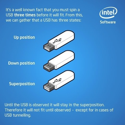
No, that has mostly been solved with USB C (ah, a godsend). Unfortunately, USB C has introduced it’s own complications, by becoming the universal standard!
Wait, a minute, that doesn’t make sense. Isn’t that a good thing?
Well mostly yes, but this also means that USB C’s capabilities have far expanded outside the original scope of a USB connector, allowing the transfer of not just power and files (each at different levels), but also HDMI, DisplayPort, Thunderbolt, Ethernet, and so much more. The result is an incredibly convenient ecosystem and user experience, where everything fits together seamlessly… as long it works. The issue isn’t USB C’s reliability, but rather that since it supports so many protocols and extensions, almost all of which are optional, it can be quite hard to know which cable or device (or even port on the same device!) supports which features (this could supporting a protocol, like DisplayPort, or a certain power and speed output). As a result, it often leads to frustration, realising only after a long time wondering why it isn’t working, that the cable I have in hand is inadequate for the task.
The solution I would recommend, would be to support everything that makes sense, and the highest speed & power level. Although, of course I would say that, I’m the user! It’s true that going this route is going to considerably increase costs for manufacturers, though as Don Norman said, poor design is sometimes due to decisions aimed at reducing cost, and this is certainly an example of that, so maybe it would be worth it for manufacturers to implement it, at least for our sanity.
 Note:
Note:
Obviously, the capabilities supported should be within reason. FOr example, it makes no sense for a router which lacks any direct graphical interface, to support HDMI or DisplayPort in their USB C ports. Also, there does exist a standard that supports almost everything, and the best power & speed levels, which makes it much easier to know what works, Thunderbolt ![]() . However, it is usually pretty expensive and isn’t offered/supported on many devices. Oh also, USB’s naming needs to be fixed. They have changed it so many times, leading to a massive amount of confusion. Search it up.
. However, it is usually pretty expensive and isn’t offered/supported on many devices. Oh also, USB’s naming needs to be fixed. They have changed it so many times, leading to a massive amount of confusion. Search it up.
Coming to second part of our prompt, I believe the main way we can apply his principles, is by integrating discoverability, affordances, & signifiers, with deliberate thought. Namely, we should make sure that we strive towards adapting our work around the person, having intuitive design, where the user doesn’t need to read an instruction manual (or ideally, read any instructions at all, possibly by using familiar visual elements and design practices people have already gotten accustomed to) to interact with our work. It should instead nudge or guide the user subtly (if required), and perhaps most importantly, provide immediate (and satisfying) feedback, and provide the space for people to make mistakes, but gracefully get back on track.
They should enjoy interacting with our work, not be afraid or overwhelmed by it that, so that it doesn’t end up like the unfortunate (but probably technically great) Italian washer-dryer combo 😉